

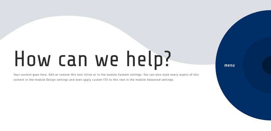
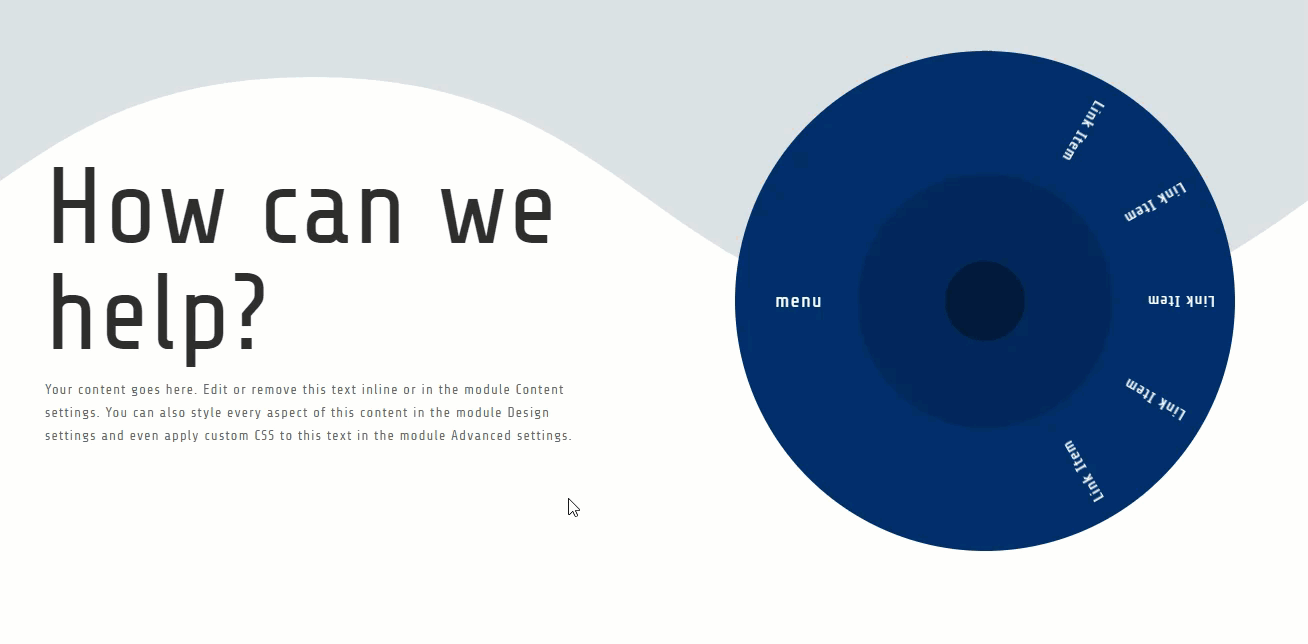
Creating a spinning menu wheel on hover is a fun way to showcase helpful links on your website. This would be a great way to provide multiple calls to action in a header to direct users where they need to go. And it would also be a cool sub category menu for your blog.
In this tutorial, I’m going to show you how to create a spinning menu wheel on hover in Divi. This can be done by using a combination of built-in Divi options and a few snippets of custom css.
Sneak Peek
Download the Layout for FREE
To lay your hands on the designs from this tutorial, you will first need to download it using the button below. To gain access to the download you will need to subscribe to our Divi Daily email list by using the form below. As a new subscriber, you will receive even more Divi goodness and a free Divi Layout pack every Monday! If you’re already on the list, simply enter your email address below and click download. You will not be “resubscribed” or receive extra emails.
@media only screen and ( max-width: 767px ) {.et_bloom .et_bloom_optin_1 .carrot_edge.et_bloom_form_right .et_bloom_form_content:before, .et_bloom .et_bloom_optin_1 .carrot_edge.et_bloom_form_left .et_bloom_form_content:before { border-top-color: #ffffff !important; border-left-color: transparent !important; }
}.et_bloom .et_bloom_optin_1 .et_bloom_form_content button { background-color: #f92c8b !important; } .et_bloom .et_bloom_optin_1 .et_bloom_form_content .et_bloom_fields i { color: #f92c8b !important; } .et_bloom .et_bloom_optin_1 .et_bloom_form_content .et_bloom_custom_field_radio i:before { background: #f92c8b !important; } .et_bloom .et_bloom_optin_1 .et_bloom_border_solid { border-color: #f7f9fb !important } .et_bloom .et_bloom_optin_1 .et_bloom_form_content button { background-color: #f92c8b !important; } .et_bloom .et_bloom_optin_1 .et_bloom_form_container h2, .et_bloom .et_bloom_optin_1 .et_bloom_form_container h2 span, .et_bloom .et_bloom_optin_1 .et_bloom_form_container h2 strong { font-family: “Open Sans”, Helvetica, Arial, Lucida, sans-serif; }.et_bloom .et_bloom_optin_1 .et_bloom_form_container p, .et_bloom .et_bloom_optin_1 .et_bloom_form_container p span, .et_bloom .et_bloom_optin_1 .et_bloom_form_container p strong, .et_bloom .et_bloom_optin_1 .et_bloom_form_container form input, .et_bloom .et_bloom_optin_1 .et_bloom_form_container form button span { font-family: “Open Sans”, Helvetica, Arial, Lucida, sans-serif; } p.et_bloom_popup_input { padding-bottom: 0 !important;}

Download For Free
Join the Divi Newlsetter and we will email you a copy of the ultimate Divi Landing Page Layout Pack, plus tons of other amazing and free Divi resources, tips and tricks. Follow along and you will be a Divi master in no time. If you are already subscribed simply type in your email address below and click download to access the layout pack.
You have successfully subscribed. Please check your email address to confirm your subscription and get access to free weekly Divi layout packs!
To import the layout to your page, simply extract the zip file and drag the json file into the Divi Builder.
Let’s get to the tutorial shall we?
What You Need to Get Started
To get started, you will need to have the following:
- The Divi Theme installed and active
- A new page created to build from scratch on the front end (visual builder)
After that, you will have a blank canvas to start designing in Divi.
Creating the Spinning Menu Wheel Design in Divi
The Basic Idea
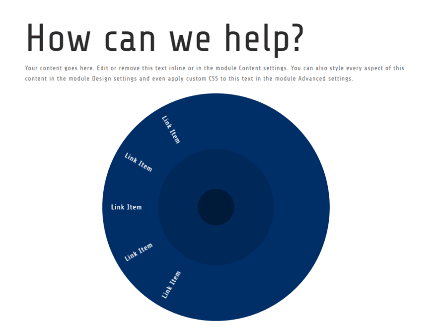
The wheel is created by turning a row into a circular element by giving it a height and width of 500px and 50% rounded corners. Each menu link is created in a separate text module and are aligned along the perimeter of the circular row by rotating each text module along the radius (center) of the row. This setup is similar to how you would create curved text in Divi.
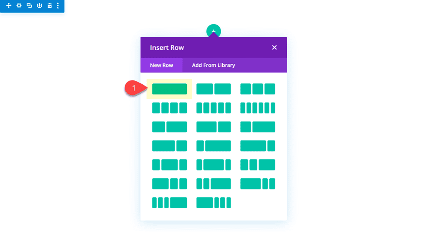
Create the Section and Row 1
Create a regular section with a one column row.
Then add a text module to the row with the following content.
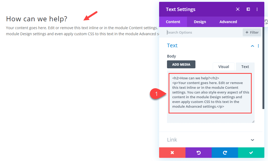
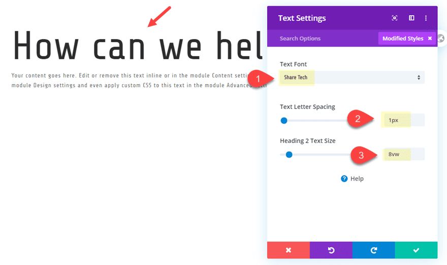
Then update the text design as follows:
Text Font: Share Tech
Text Letter Spacing: 1px
Heading 2 Text Size: 8vw
Add Row 2 to Build the Wheel
Next, we need to add a new one-column row under Row 1.
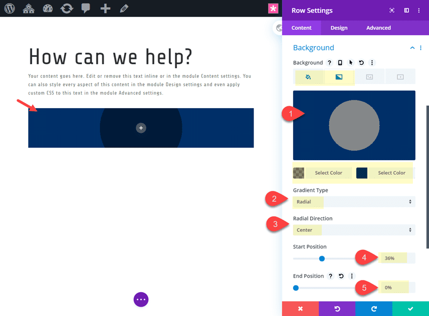
Before we start adding our text modules for our links, we need to design our row as a wheel. There will be a good bit of optimizations needed to the row to make our wheel design. To get started, open the settings for Row 2 and update the following:
Background Color: #02366b
Background Gradient Left Color: rgba(0,0,0,0.45)
Background Gradient Right Color: #02366b
Gradient Type: Radial
Radial Direction: Center
Start Position: 36%
End Position: 0%
Use Custom Gutter Width: YES
Gutter Width: 1
Width: 500px
Max Width: 500px (desktop), auto (tablet and phone)
Height: 500px (desktop), auto (tablet and phone)
Padding (desktop): 0px top, 0px bottom
Padding (tablet and phone): 20px top, 20px bottom, 20px left
Margin (phone): -10% right
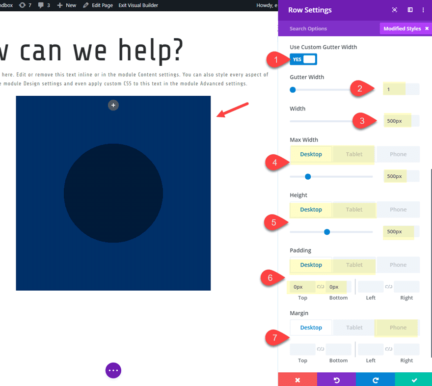
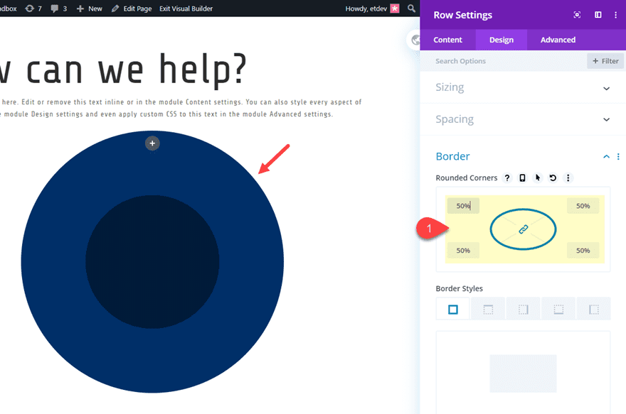
We need to set both the height and width of the row to 500px so that it is a perfect square. This will allow us to give it a perfect circular shape using the rounded corners (border radius) option in Divi.
Rounded Corners: 50%
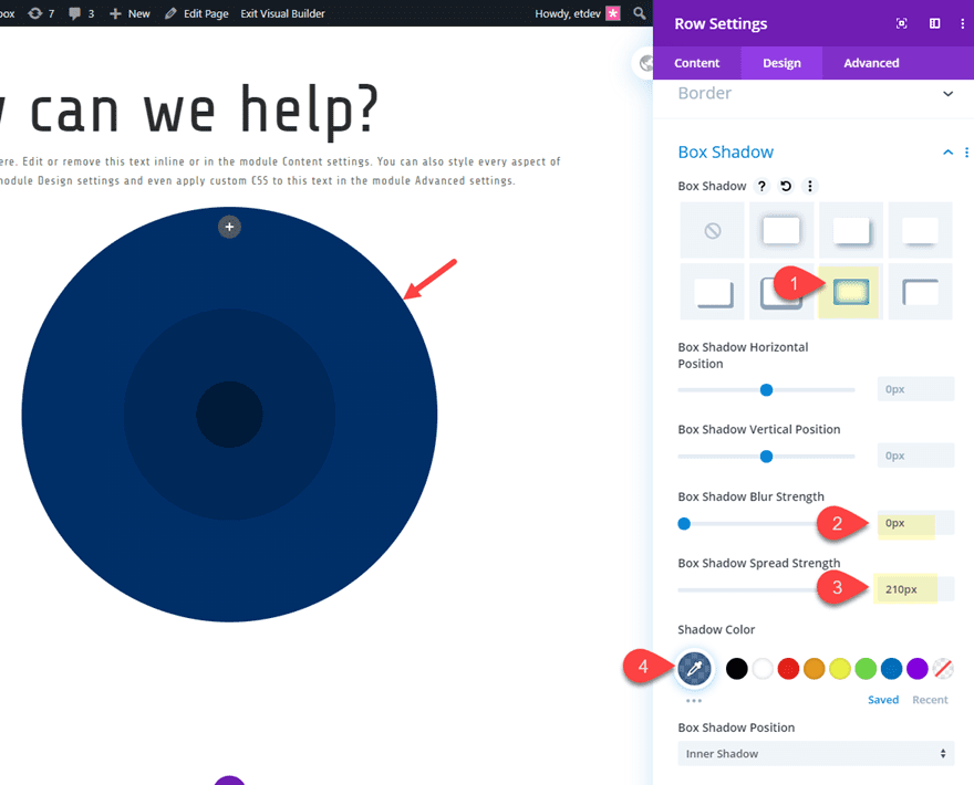
Then we can add another level of circle design using a box shadow as follows:
Box Shadow: see screenshot
Box Shadow Blur Strength: 0px
Box Shadow Spread Strength: 210px
Shadow Color: rgba(2,54,107,0.66)
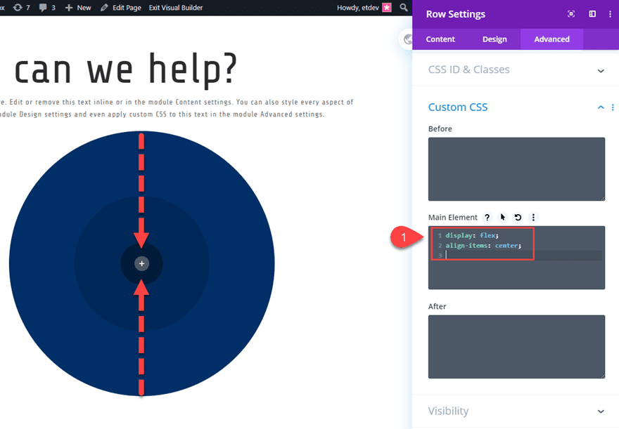
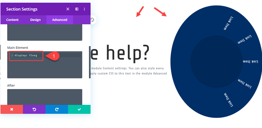
Next we are going to add a small snippet of CSS in order to make our row content vertically centered. Under the advanced tab, add the following custom CSS in the Main Element.
display:flex;
align-items:center;
That takes care of the row settings for now. We will be back to add our spinning hover effect later.
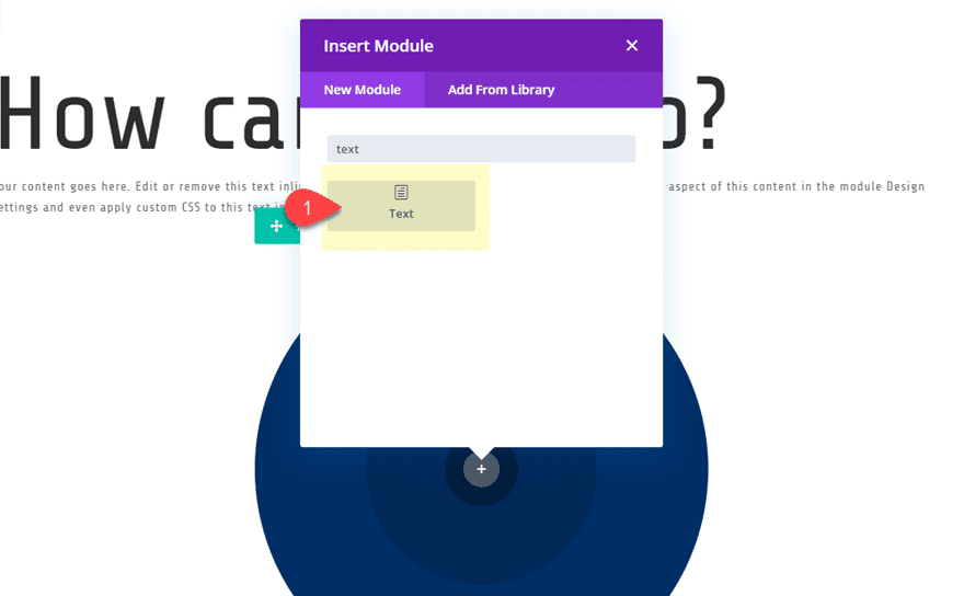
Adding the Links
Each link in the wheel will be created with a text module. We are going to create a total of six text modules. Five of the text modules will hold the links for the wheel and one of the text modules will contain the menu title.
Start by creating a new text module.
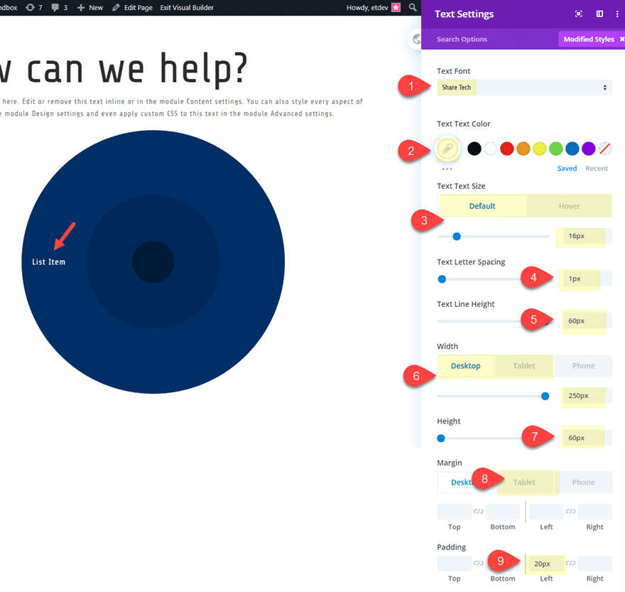
Then update text settings as follows:
Body content: “Link Item”
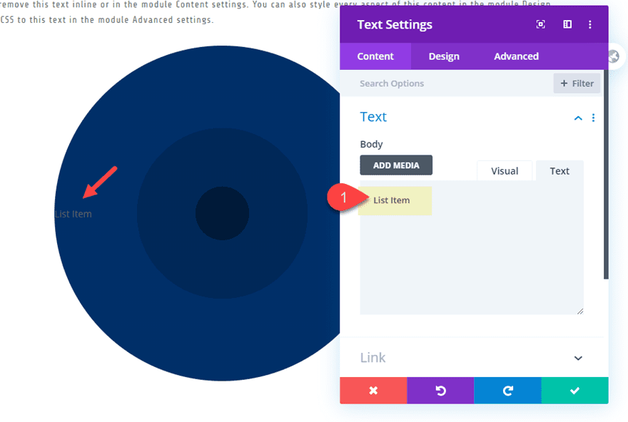
Text Font: Share Tech
Text Text Color: #ffffff
Text Text Size: 16px (default), 20px (hover)
Text Letter Spacing: 1px
Text Line Height: 60px
Width: 250px (desktop), auto (tablet and phone)
Height: 60px
Padding: 20px left
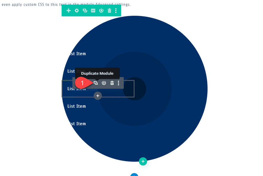
Save the settings for now. Then duplicate the text module 4 times to create a total of 5 text modules.
Positioning the Links/Text Modules
Now we are ready to position our links along the perimeter of the wheel. To do this we will update each text module with transform options that move/translate and rotate the module into place.
To make this easier, deploy the wireframe view mode and label the text modules starting with Link 1 at the top all the way to Link 5 at the bottom.
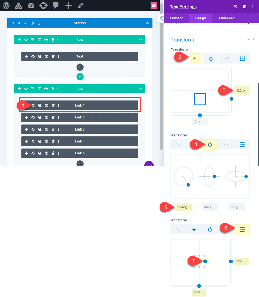
Link 1
We will start with editing Link 1. Open the text module settings for Link 1 and update the following:
Transform Translate Y Axis: 120px (desktop), 0px (tablet and phone)
Transform Rotate Z Axis: 60deg (desktop), 0px (tablet and phone)
Transform Origin: 50% 100% (right center)
Link 2
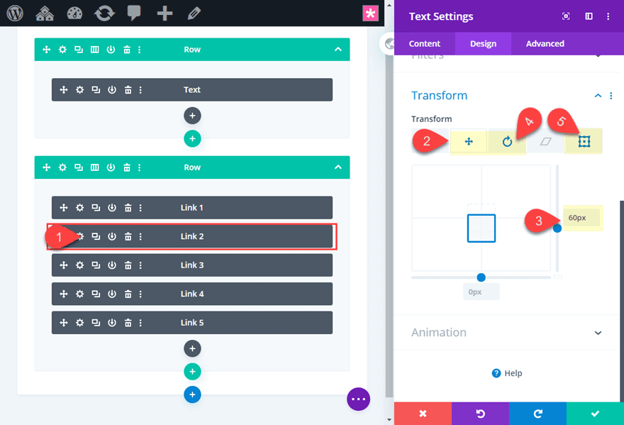
Open the text module settings for Link 2 and update the following:
Transform Translate Y Axis: 60px (desktop), 0px (tablet and phone)
Transform Rotate Z Axis: 30deg (desktop), 0px (tablet and phone)
Transform Origin: 50% 100% (right center)
Link 3
Since the text module for link 3 is in the middle, we can leave it in place.
Link 4
Open the text module settings for Link 2 and update the following:
Transform Translate Y Axis: -60px (desktop), 0px (tablet and phone)
Transform Rotate Z Axis: -30deg (desktop), 0px (tablet and phone)
Transform Origin: 50% 100% (right center)
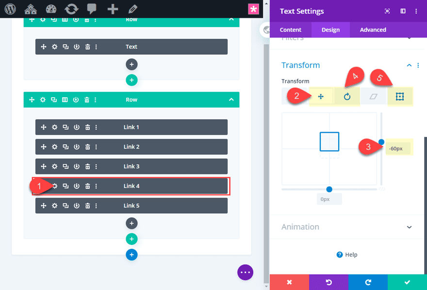
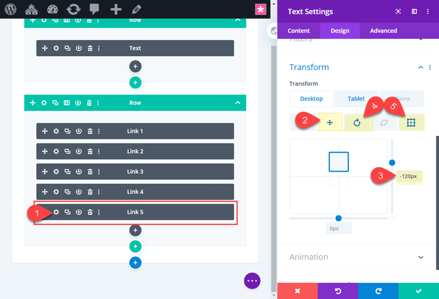
Link 5
Open the text module settings for Link 2 and update the following:
Transform Translate Y Axis: -120px (desktop), 0px (tablet and phone)
Transform Rotate Z Axis: -60deg (desktop), 0px (tablet and phone)
Transform Origin: 50% 100% (right center)
Now let’s check out the result so far. Notice how the links/text within the text modules rotate perfectly along the perimeter of the circle.
Adding the Menu Label
To add the menu label, we will need to add another text module at the top of the five text modules we already have. Go ahead and add a new text module above Link 1.
Then update the body content with the following:
<p>menu</p>
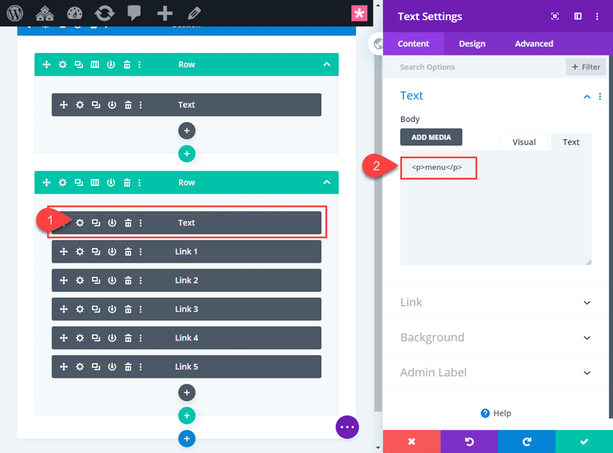
Make sure the menu label is wrapped in a p tag. This will make sure the line height is recognized in the text settings.
Then to speed up the design, copy the modules styles of the text module for Link 3 and paste those module styles to the new text module.
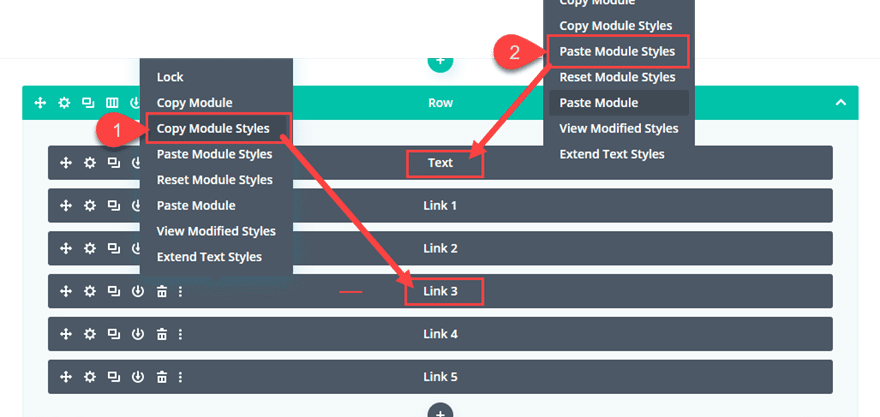
Then update the following:
Line Height: 300px (desktop), 20px (tablet and phone)
Height: restore default setting (auto)
The Line Height needs to be 300px so that it equals the height of the column of content which is also 300px (5 text modules each with a height of 60px equals 300px). This will make sure the text remains vertically centered.
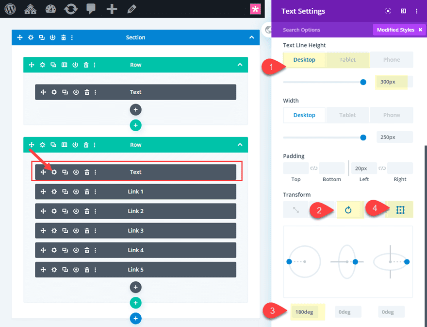
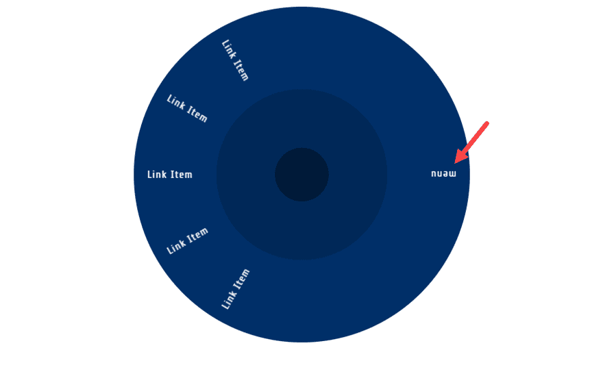
Then we need to rotate the menu label text module 180 degrees so that it will show correctly on the opposite side of the wheel. This will allow the visitor to see the menu label before the hover state which spins the links in view.
Transform Rotate Z Axis: 180deg (desktop), 0deg (tablet and phone)
Transform Origin: 50% 100% (right center)
Once done, we need to give the menu label text module an absolute position. To do this, add the following custom CSS to the Main Element:
position: absolute !important;
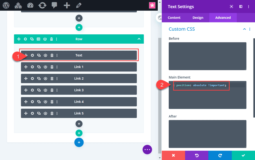
Now check out the result. You should see the menu item is upside down on the right of the wheel.
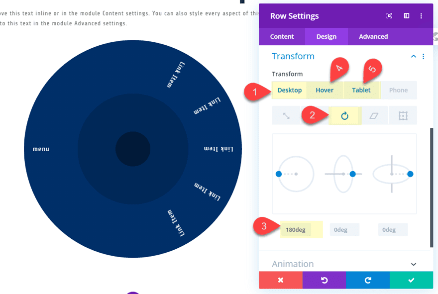
Adding the Spinning Hover Effect to the Row/Wheel
To add the spinning hover effect to the row, update the row settings as follows:
Transform Rotate Z axis: 180deg (desktop), 0deg (hover, 0deg (tablet and phone)
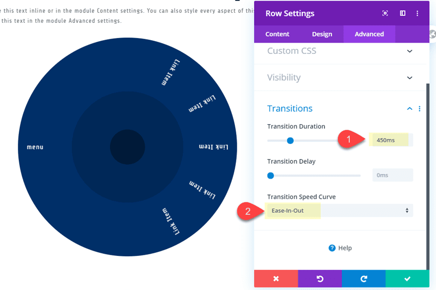
Then update the transition settings as follows:
Transition Duration: 450ms
Transition Speed Curve: Ease-in-Out
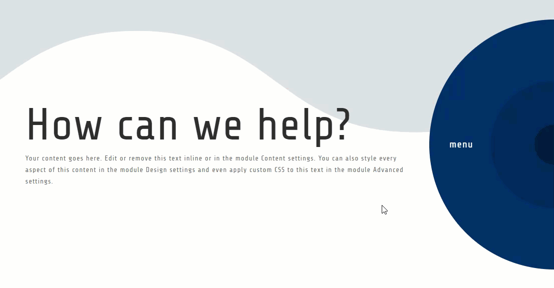
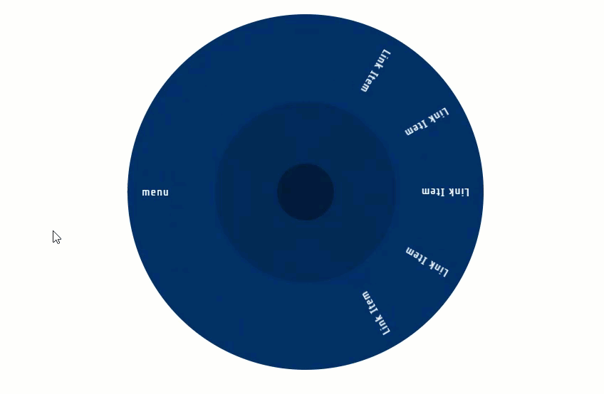
Now check out how the wheel spins on hover.
Making a Two Column Layout for the Section
Right now the layout consists of two one-column rows stacked on top of each other. However, we can use the flex css property to align the two rows horizontally. To do this, we can add a small snippet of custom CSS to the section. Once done we will need to adjust the spacing a bit to get things looking just right.
Open the section settings and add the following custom css to the main element:
display:flex;
Update Row 1 Spacing
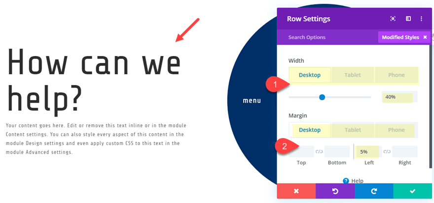
Next, update the size and spacing for row 1 as follows:
Width: 40% (desktop), 100% (tablet and phone)
Margin (desktop): 5% left
Margin (tablet): 5% left, 5% right
Margin (phone): 5% right
Final Touches
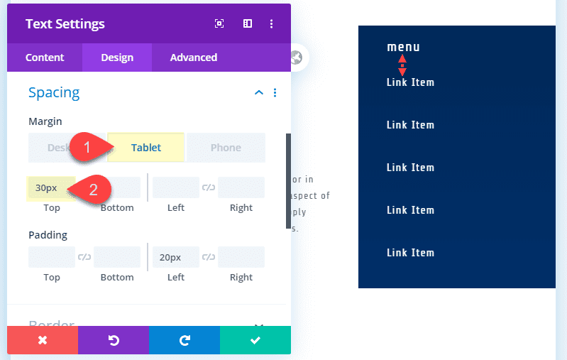
On tablet and phone display you will need to add some top margin to Link 1 Text module.
Margin (tablet): 30px top
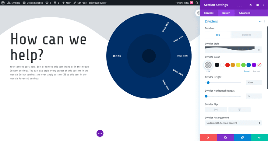
And you can always add a section divider to the section to make the design complete.
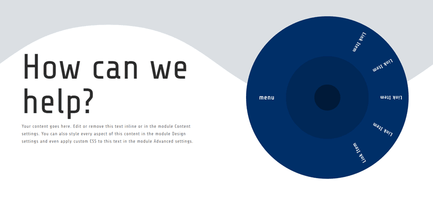
Final Result
Now Let’s check out the final result.
Alternative Half Wheel Design
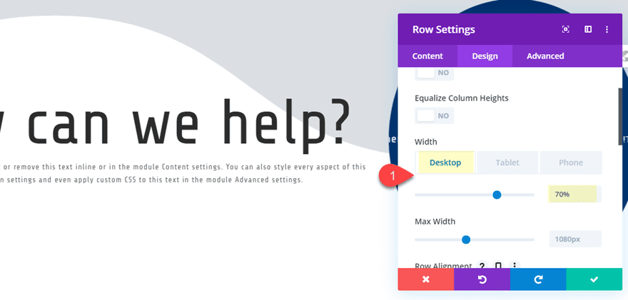
One cool alternative design is to hide the right half of the wheel outside of the section so that the links are hidden and then revealed on hover. To do this, go ahead and duplicate the entire section holding the design we just made. On the duplicate section, update the row 1 settings as follows:
Width: 70% (desktop)
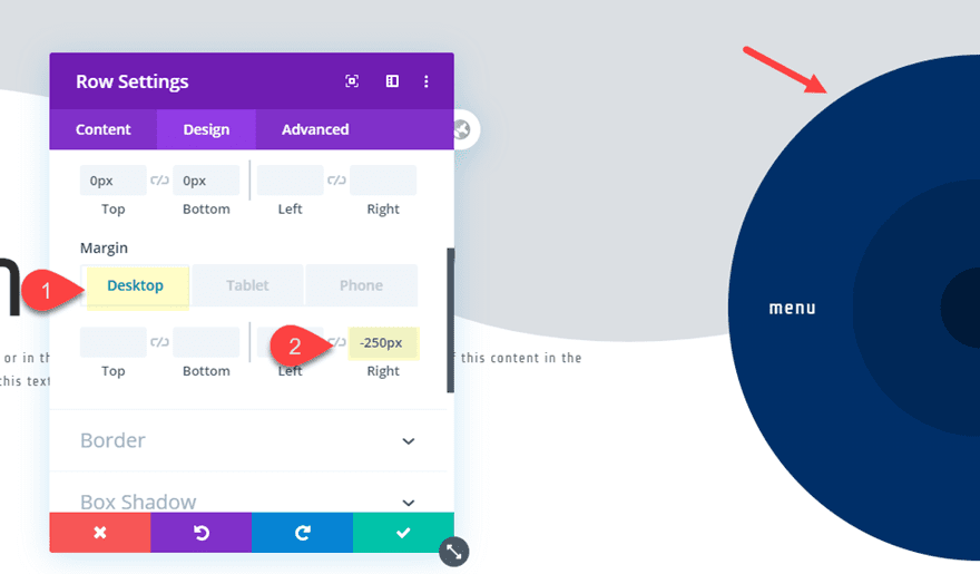
Then update the settings for row 2 in order to push the wheel outside of the section as follows:
Margin: -250px right
We need to use -250px because the total width of the wheel is 500px and we want to hide exactly half of the row.
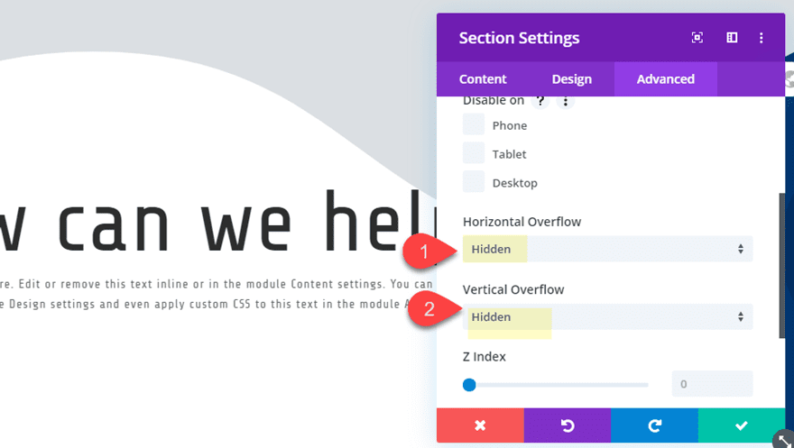
Then set the section visibility to hidden as follows:
Here is the final design.
Final Thoughts
A spinning link wheel is one of those elegant design elements that can engage visitors with a subtle and unique hover effect. And it’s pretty amazing how much of this design you can do just with Divi’s built-in design settings. I hope this adds a little something extra in your design toolbelt for your next project.
I look forward to hearing from you in the comments.
Cheers!
The post How to Create a Spinning Menu Wheel on Hover appeared first on Elegant Themes Blog.