
Divi’s new image replacement hover options give your projects a whole new level of creativity. In this post, we’ll show you how to create a beautiful section with images that change on hover. We hope this design inspires you to create your own creative sections with Divi’s image replacement hover options. You’ll be able to download the JSON file for free as well!
Let’s get to it.
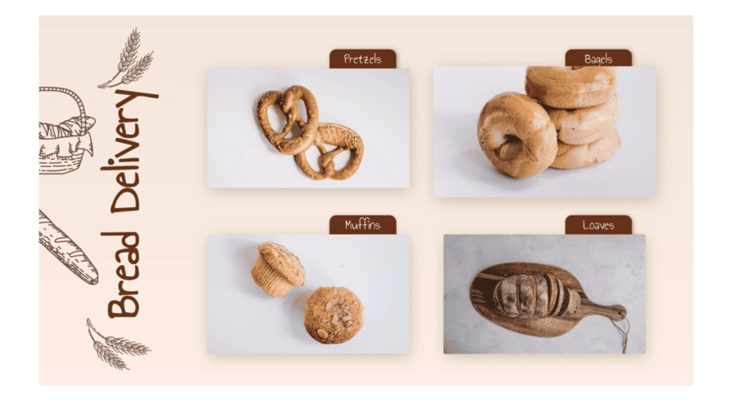
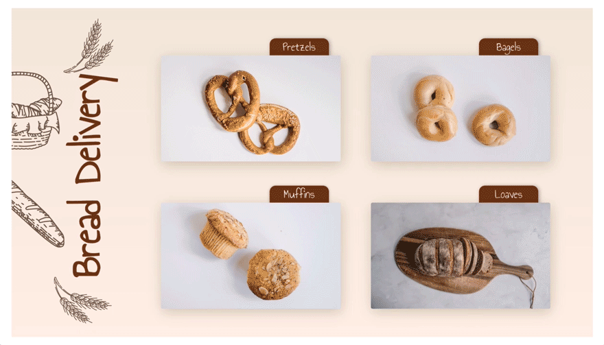
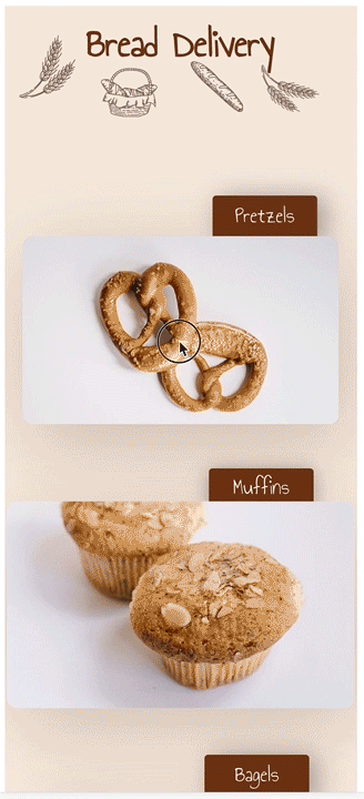
Preview
Before we dive into the tutorial, let’s take a quick look at the outcome across different screen sizes.
Desktop
Mobile
Download The Image Replacement Layout for FREE
To lay your hands on the free image replacement layout, you will first need to download it using the button below. To gain access to the download you will need to subscribe to our Divi Daily email list by using the form below. As a new subscriber, you will receive even more Divi goodness and a free Divi Layout pack every Monday! If you’re already on the list, simply enter your email address below and click download. You will not be “resubscribed” or receive extra emails.
@media only screen and ( max-width: 767px ) {.et_bloom .et_bloom_optin_1 .carrot_edge.et_bloom_form_right .et_bloom_form_content:before, .et_bloom .et_bloom_optin_1 .carrot_edge.et_bloom_form_left .et_bloom_form_content:before { border-top-color: #ffffff !important; border-left-color: transparent !important; }
}.et_bloom .et_bloom_optin_1 .et_bloom_form_content button { background-color: #f92c8b !important; } .et_bloom .et_bloom_optin_1 .et_bloom_form_content .et_bloom_fields i { color: #f92c8b !important; } .et_bloom .et_bloom_optin_1 .et_bloom_form_content .et_bloom_custom_field_radio i:before { background: #f92c8b !important; } .et_bloom .et_bloom_optin_1 .et_bloom_border_solid { border-color: #f7f9fb !important } .et_bloom .et_bloom_optin_1 .et_bloom_form_content button { background-color: #f92c8b !important; } .et_bloom .et_bloom_optin_1 .et_bloom_form_container h2, .et_bloom .et_bloom_optin_1 .et_bloom_form_container h2 span, .et_bloom .et_bloom_optin_1 .et_bloom_form_container h2 strong { font-family: “Open Sans”, Helvetica, Arial, Lucida, sans-serif; }.et_bloom .et_bloom_optin_1 .et_bloom_form_container p, .et_bloom .et_bloom_optin_1 .et_bloom_form_container p span, .et_bloom .et_bloom_optin_1 .et_bloom_form_container p strong, .et_bloom .et_bloom_optin_1 .et_bloom_form_container form input, .et_bloom .et_bloom_optin_1 .et_bloom_form_container form button span { font-family: “Open Sans”, Helvetica, Arial, Lucida, sans-serif; } p.et_bloom_popup_input { padding-bottom: 0 !important;}

Download For Free
Join the Divi Newlsetter and we will email you a copy of the ultimate Divi Landing Page Layout Pack, plus tons of other amazing and free Divi resources, tips and tricks. Follow along and you will be a Divi master in no time. If you are already subscribed simply type in your email address below and click download to access the layout pack.
You have successfully subscribed. Please check your email address to confirm your subscription and get access to free weekly Divi layout packs!
Let’s Start Recreating
Add New Section
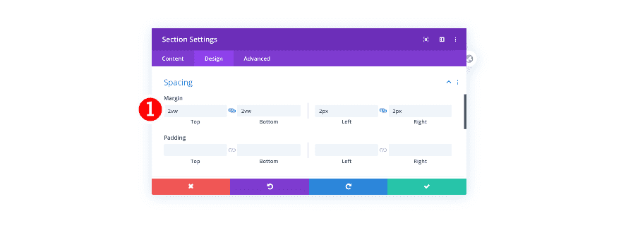
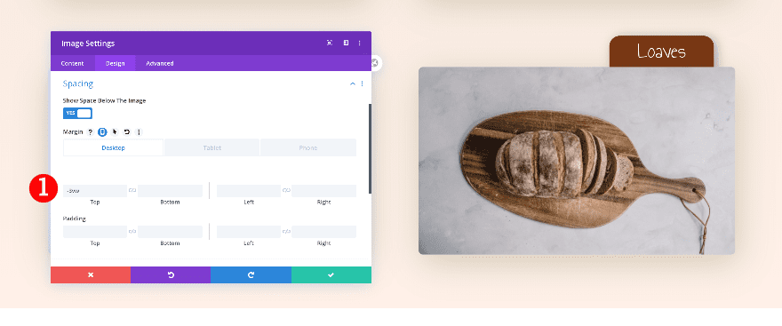
Spacing
Start by creating a new page or adding a new section to an existing page. Before adding a row, adjust the section’s spacing settings.
- Top and Bottom Margin: 2vw
- Left and Right Margin: 2vw
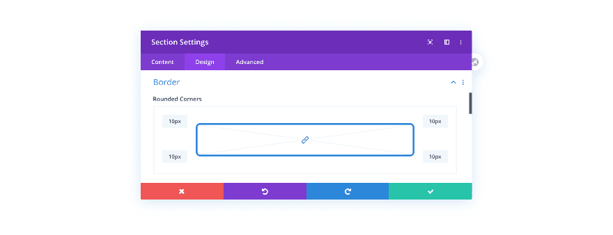
Border
Then, add some border radius.
- Rounded Corners: 10px
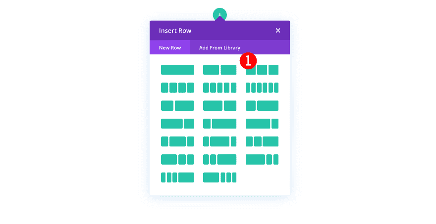
Add New Row
Column Structure
Continue by adding a new row to the section using the following column structure:
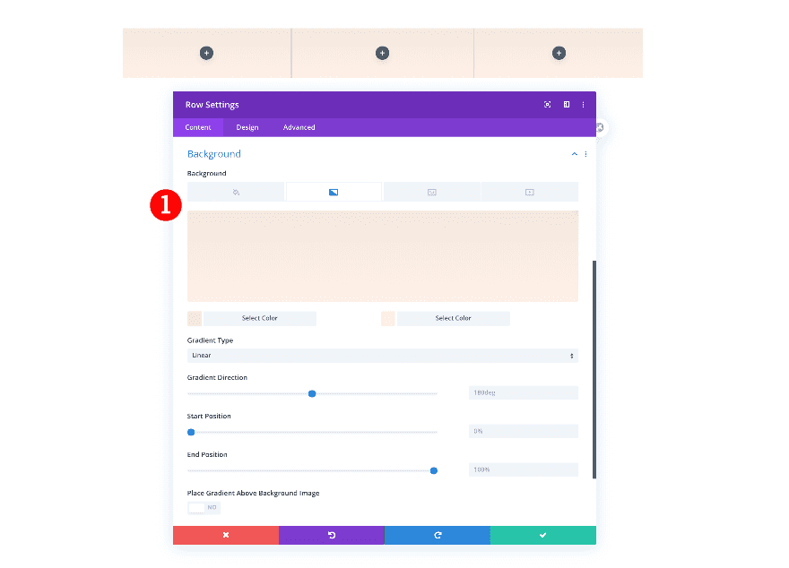
Background
Before adding any modules, add a pale salmon gradient background.
- Background: Gradient
- Gradient Color 1: Pale Salmon #f4e9de
- Gradient Color 2: Even Paler Salmon #fff0e8
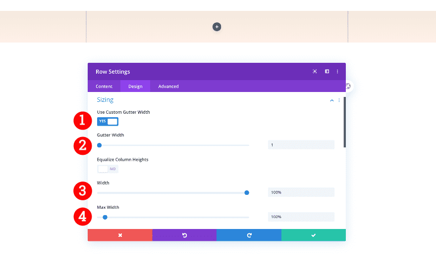
Sizing
Continue by adjusting the row’s width.
- Gutter Width: 1
- Width: 100%
- Max Width: 100%
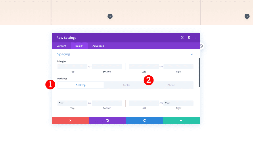
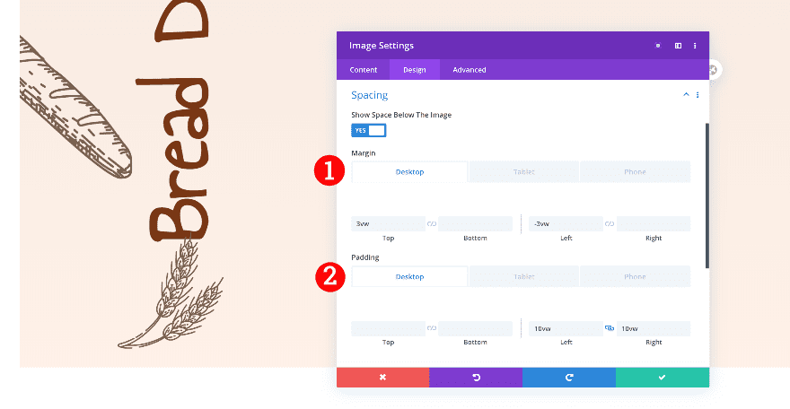
Spacing
Finally, adjust the spacing.
- Top Padding:
- Desktop + Tablet: 5vw
- Left Padding:
- Tablet + Phone: 5vw
- Right Padding:
- Desktop: 7vw
- Tablet + Phone: 5vw
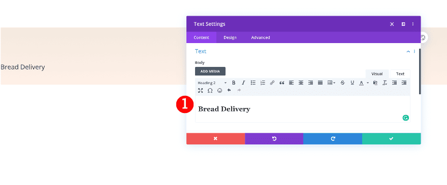
Add Text Module to Column 1
Add H2 Content
Time to start adding modules! Add a text module to column 1 and insert some H2 content of your choice.
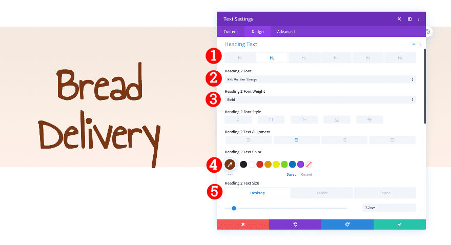
Heading Text
Move on to the design tab and style the H2 text settings accordingly:
- Heading Text Level: H2
- H2 Font: Annie Use Your Telescope
- H2 Font Weight: Bold
- H2 Text Alignment: Center
- H2 Text Color: Brown #793715
- H2 Text Color:
- Desktop: 7.2vw
- Tablet: 12vw
- Phone: 11vw
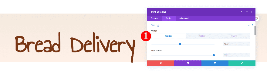
Sizing
Modify the width on desktop next.
- Width:
- Desktop: 45vw
- Tablet +Phone: 100%
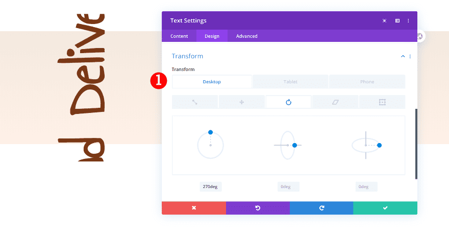
Transform
Last but not least, rotate the text and change its position using the transform settings.
- Transform Rotate:
- Desktop: 270 deg
- Transform Translate:
- x-axis: -10vw
- y-axis: 19vw
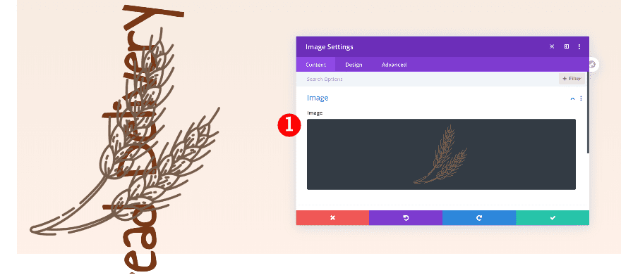
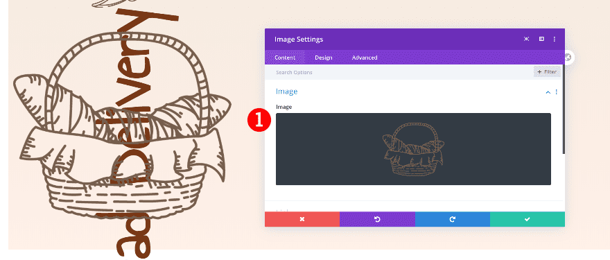
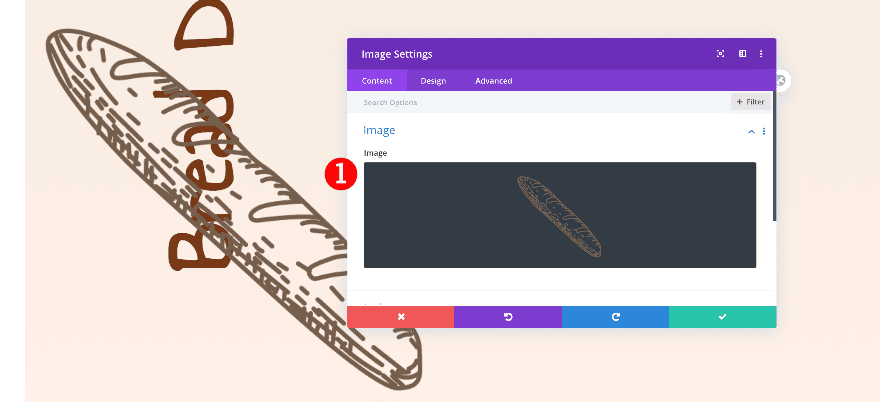
Add 1st Image Module to Column 1
Add a transparent illustration
Add a new image module right below the text module and upload an illustration of your choice. You can find the images that we’re using in this tutorial by downloading the zipped folder at the beginning of this post.
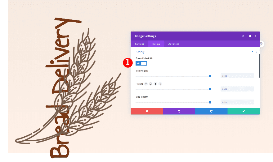
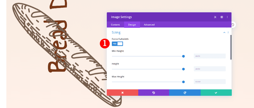
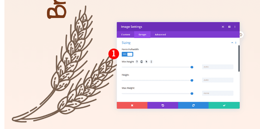
Sizing
Now, force the image size to fullwidth.
- Fullwidth: Yes
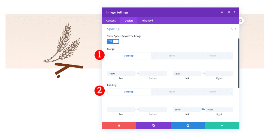
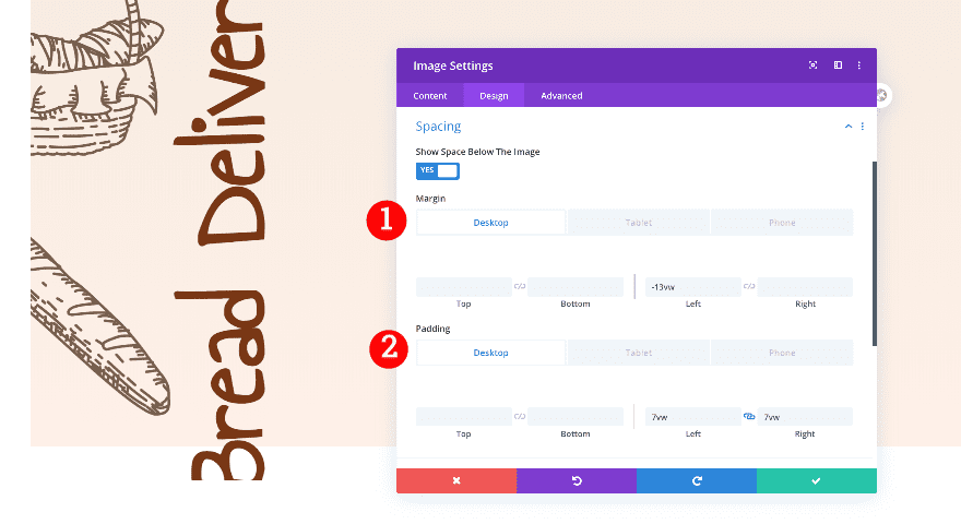
Spacing
Then, adjust the spacing settings.
- Top Margin:
- Desktop + Tablet: -11vw
- Left Margin:
- Desktop: -2vw
- Tablet+ Phone: -36vw
- Left and Right Padding:
- Desktop: 10vw
- Tablet + Phone: 34vw
Add 2nd Image Module to Column 1
Add a transparent illustration
Right below the first image module, add another one. Insert an illustration of your choice.
Sizing
Force the module to fullwidth.
- Fullwidth: Yes
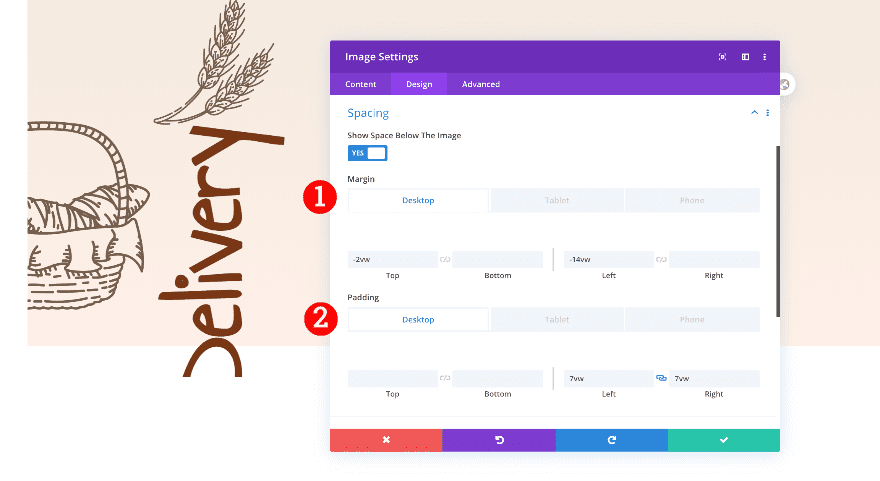
Spacing
Then, adjust the spacing settings.
- Top Margin:
- Desktop: -2vw
- Tablet+ Phone: -10vw
- Left Margin:
- Desktop + Tablet: -14vw
- Left and Right Padding:
- Desktop: 7vw
- Tablet + Phone: 35vw
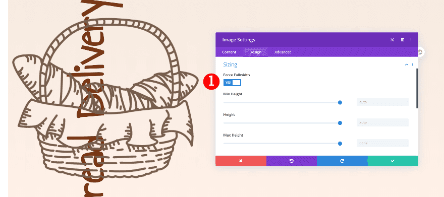
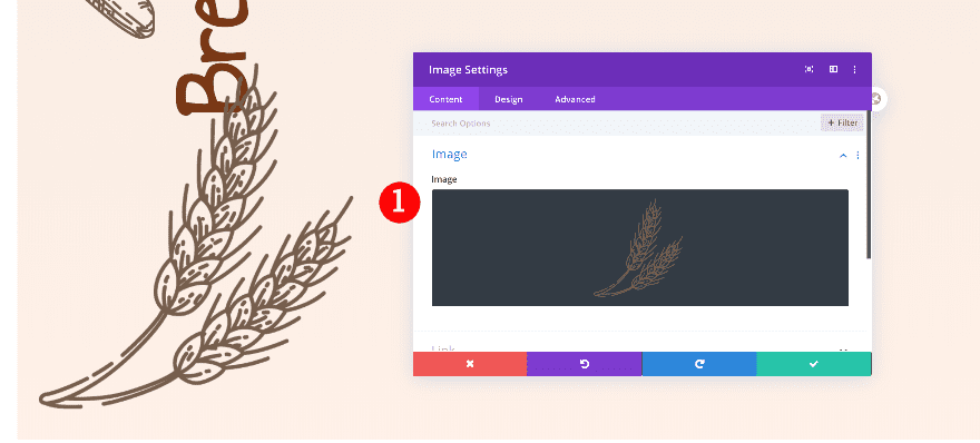
Add 3rd Image Module to Column 1
Add an image
Add another image module to the column and insert an illustration.
Sizing
Then, force the module to fullwidth.
- Fullwidth: Yes
Spacing
Finally, adjust the spacing.
- Top Margin:
- Tablet+ Phone: -18vw
- Left Margin:
- Desktop: -13vw
- Tablet + Phone: 10vw
- Left and Right Padding:
- Desktop: 7vw
- Tablet + Phone: 35vw
Add 4th Image Module to Column 1
Add an image
The final module in column 1 is another image module. Insert an illustration.
Sizing
Force the module to fullwidth.
- Fullwidth: Yes
Spacing
Then, adjust the spacing.
- Top Margin:
- Desktop: 3vw
- Tablet+ Phone: -15vw
- Left Margin:
- Desktop: -3vw
- Tablet + Phone: 30vw
- Left and Right Padding:
- Desktop: 10vw
- Tablet + Phone: 35vw
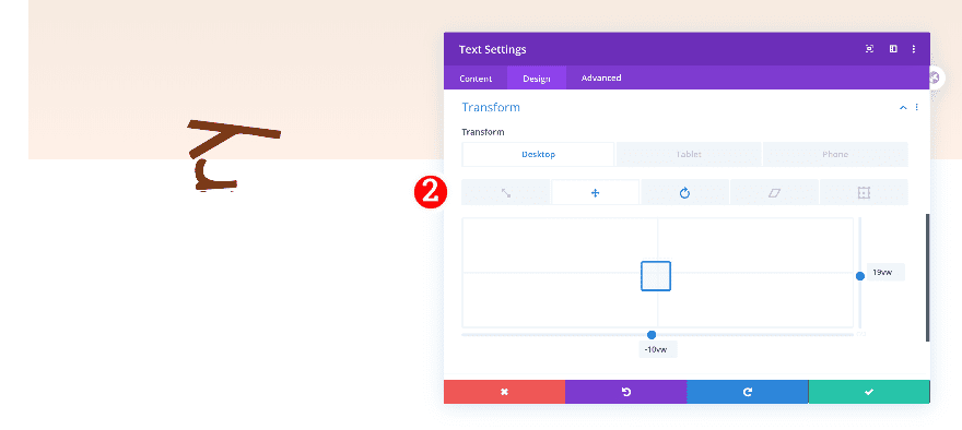
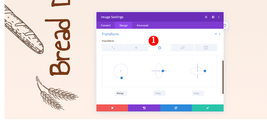
Transform
Last but not least, rotate the illustration.
- Transform Rotate: 84deg
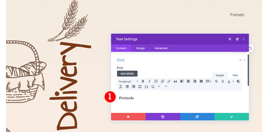
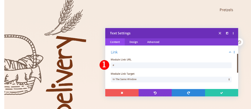
Add 1st Text Module to Column 2
Add Content
On to the next column! Add a text module with some H3 content of your choice.
Add Link
Then, add a link to the module.
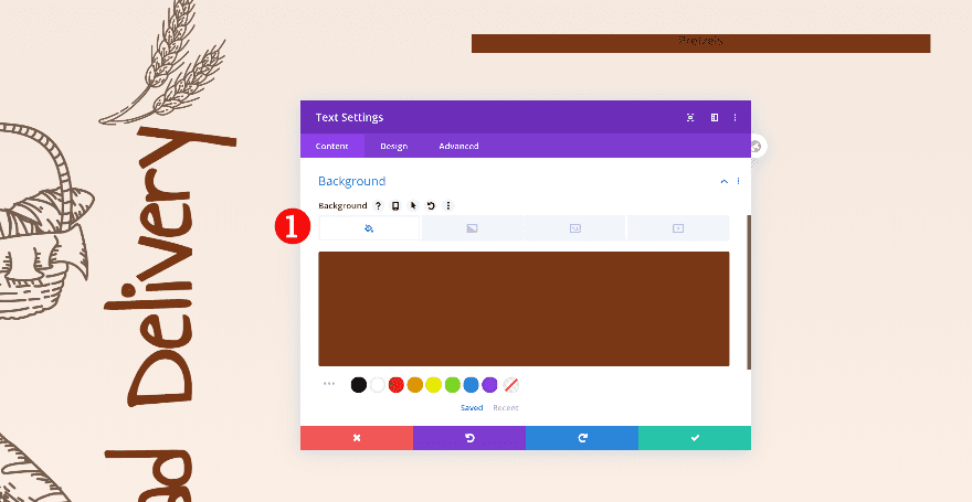
Background
Go to the background settings and add a background color next.
- Background: Color
- Background Color: Brown #793715
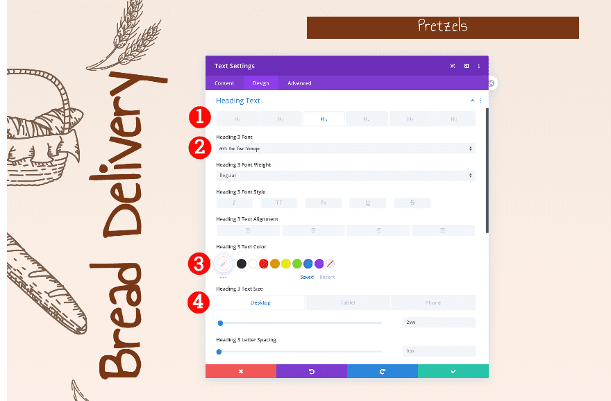
Heading Text
Then, style the H3 text in the design tab.
- Heading Text Level: H3
- H3 Font: Annie Use Your Telescope
- H3 Color: White #ffffff
- H3 Font Size:
- Desktop: 2vw
- Tablet: 5vw
- Phone: 6vw
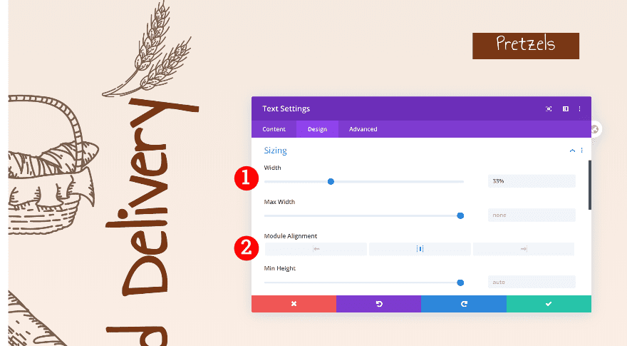
Sizing
Now, adjust the sizing settings.
- Width: 33%
- Module Alignment: Center
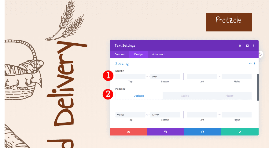
Spacing
Then, add some spacing values across different screen sizes.
- Bottom Margin: 1vw
- Top Padding:
- Desktop: 0.5vw
- Tablet + Phone: 2.3vw
- Bottom Padding:
- Desktop + Tablet: 1.1vw
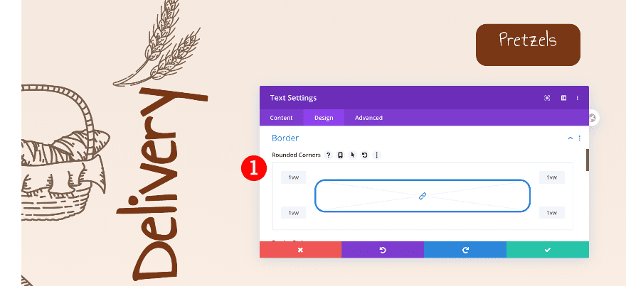
Border
Continue by adding some border radius.
- Rounded Corners: 1vw all corners
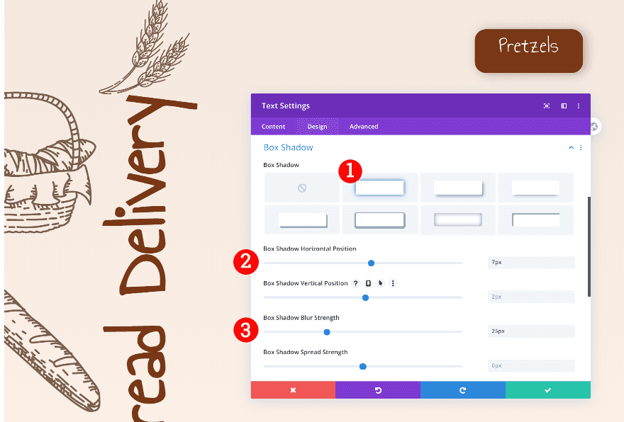
Box Shadow
Finally, add a box shadow.
- Box Shadow: First Option
- Horizontal Position: 7px
- Blur Strength: 25px
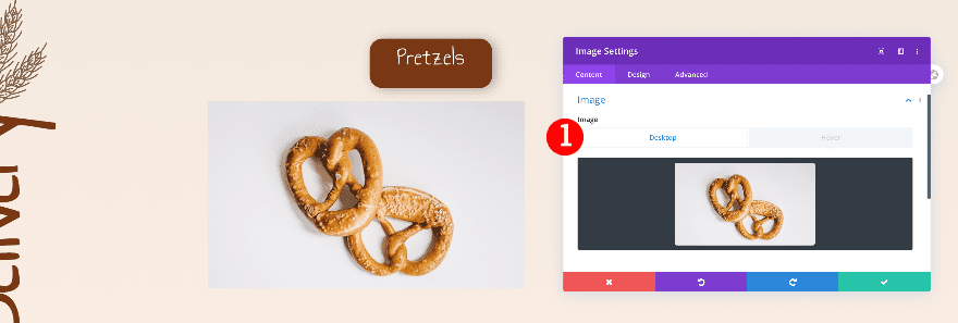
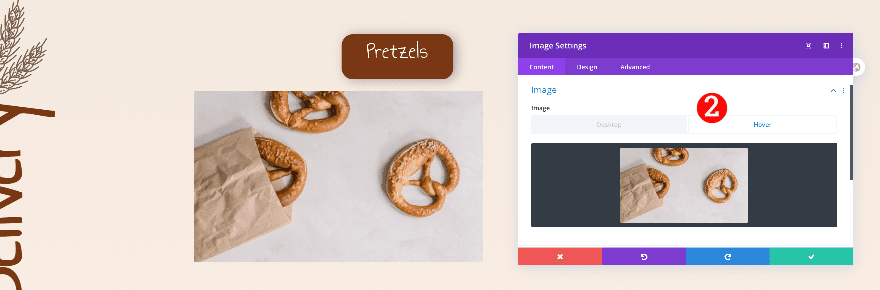
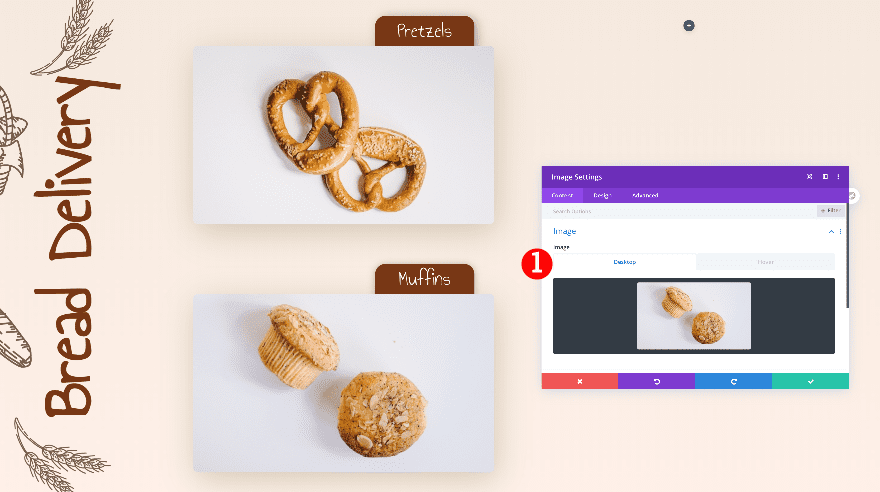
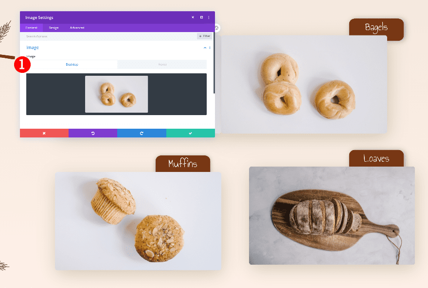
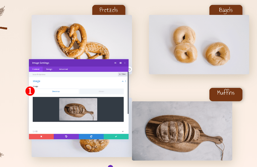
Add 1st Image Module to Column 2
Add Image
The next module we need in column 2 is an image module. Upload two different images: one for the static state and one on hover.
- Static: First Image
- Hover: Second Image
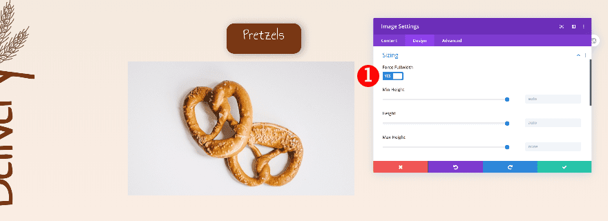
Sizing
Force the image to fullwidth.
- Fullwidth: Yes
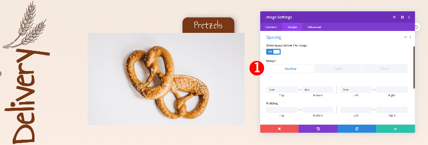
Spacing
Then, adjust the spacing values.
- Top Margin:
- Desktop: -2vw
- Tablet + Phone: 20vw
- Bottom Margin:
- Desktop + Tablet: 4vw
- Left Margin:
- Desktop: -5vw
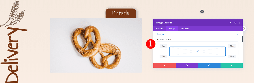
Border
Add rounded corners next.
- Rounded Corners: 10 px all corners
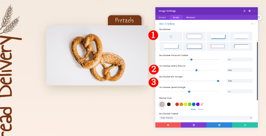
Box Shadow
Give the image a subtle box shadow too.
- Box Shadow: Second Option
- Vertical Position: 20px
- Blur Strength: 80px
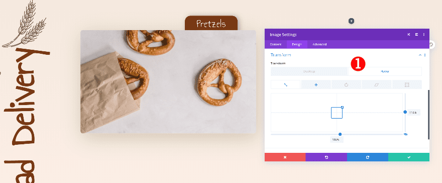
Transform
Finally, adjust the transform scale values on hover.
- Transform Scale on Hover: 110%
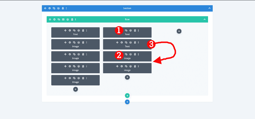
Duplicate Text and Image Modules in Column 2
Clone both modules and place the duplicates in the right order.
Adjust 2nd Text Module in Column 2
Change Content and Link
Change the content in the duplicate text module.
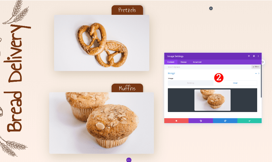
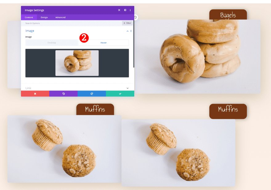
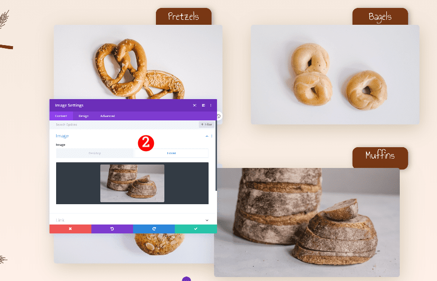
Adjust 2nd Image Module in Column 2
Change Images
Change the images in both the static and hover settings.
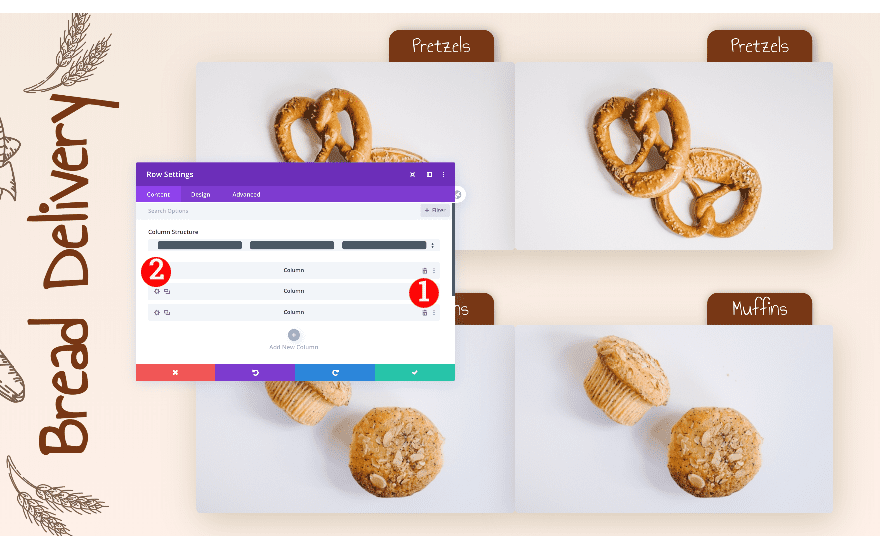
Clone column 2
Delete column 3 and duplicate column 2
Go back to the row settings and delete the 3rd column. Then, duplicate the 2nd column.
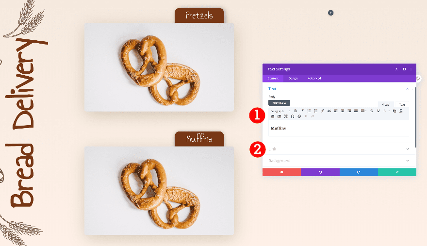
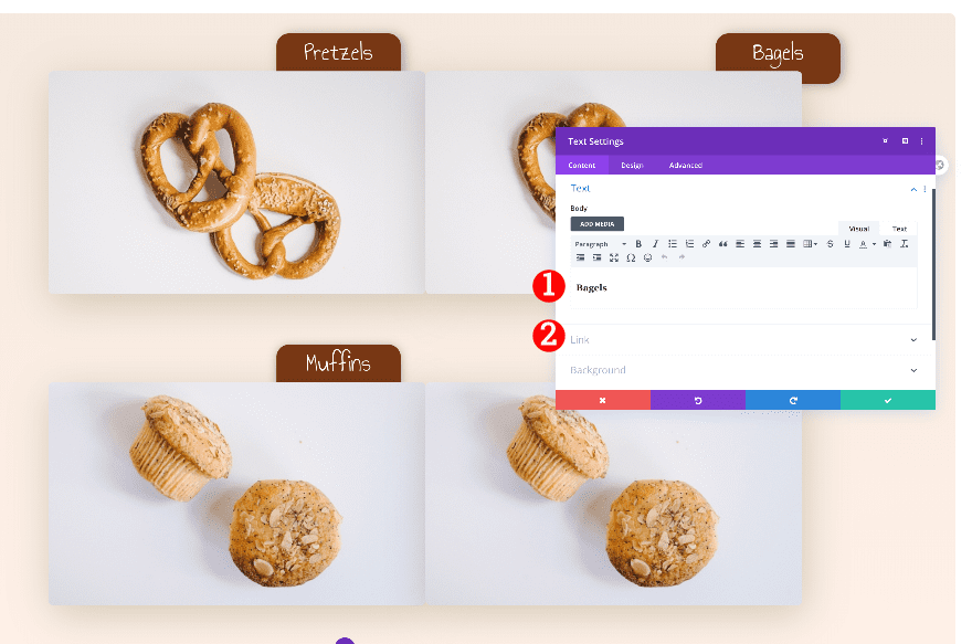
Adjust 1st Text Module in Column 3
Change Content and Link
After duplicating the 2nd column, adjust the text and link in the 1st text module of column 3.
Adjust 1st Image Module in Column 3
Change Images
Change the images in the image module too.
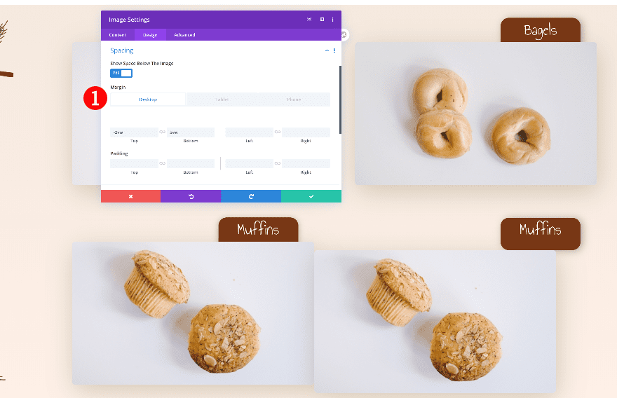
Spacing
Then, adjust the spacing.
- Top Margin:
- Desktop: -2vw
- Tablet + Phone: 11vw
- Bottom Margin
- Desktop + Tablet: 5vw
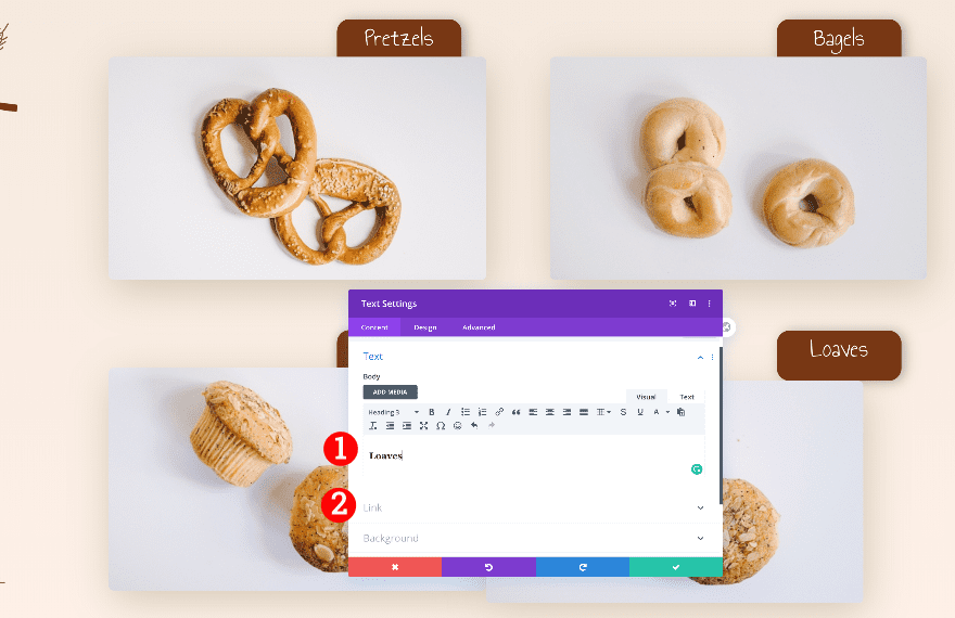
Adjust 2nd Text Module in Column 3
Change Content and Link
Change the text and link of the last text module in column 3.
Adjust 2nd Image Module in Column 3
Change Images
Change the static and hover images of the last image module too.
Spacing
Finally, adjust the spacing of the image module and you’re done!
- Top Margin:
- Desktop: -3vw
- Tablet + Phone: 7vw
Preview
Now that we’ve gone through all the steps, let’s take a final look at the outcome across different screen sizes.
Desktop
Mobile
Conclusion
In this post, we’ve shown you how to create a design with Divi’s new image replacement hover options. This functionality can lead to many creative possibilities. We hope you will use them in your own projects. Remember to use the same image sizes for both the static and hover images. If you have any questions or suggestions, feel free to leave them in the comment section below!
The post Getting Creative with Divi’s New Image Replacement Hover Options appeared first on Elegant Themes Blog.