

Every business, big or small, needs a branding strategy. A big part of that is your logo. Sure, branding experts say that “your brand is not your logo” but also, a brand without a log isn’t a brand. It’s very true that a brand is much more than a visual icon or graphic, there are many more aspects to it for sure. But let’s leave those aside for a moment and concentrate on the logo.
A brand doesn’t need ONE logo, it needs a team of logos working together as a whole. In this article, we’ll take a look at why a brand needs logo variations, what those look like and how to achieve them.
Why Does A Brand Need A Logo In The First Place?
First of all, let’s get this out of the way. A brand needs a logo for a number of reasons:
- It’s a visual representation of what the company does, stands for and offers.
- It acts as a visual mark for recognition across different mediums
- A logo promotes brand awareness and loyalty
- After a while, a logo can become iconic and immutable
Branding is made up of a collection of different things, a logo being one of them. A brand without a logo can have a great backstory, a solid foundation, and an inspiring set of values. But what is all that if no one can recognize the brand in the wild?
Why Do Logos Need Variations?
A brand logo is almost like a living organism. People, for example, need specific types of clothing for different seasons. In the same way, logos need to adapt to their environment. Having variations accomplishes just that. Take a look at this quick list of instances where a logo makes an appearance:
- business cards
- websites
- letterheads
- social media banners and profiles
- postcards
- menus
- proposals
- reports
- presentations
- blogs
- merchandising
- uniforms
- and many more…
As you can imagine, all the instances above are different. They are different in shape, size, texture, usability, and purpose. One logo would never look or fit well on every single one of these. Therefore, logos need variations. Logo variations have one main (primary) logo and then a set of variations that complement it. When the primary logo is too big or too complex for a surface, space or situation, one of the variations comes into play. For example, not all logos fit inside the circle for many social media profiles, a variation that fits in a circle is important in that case.
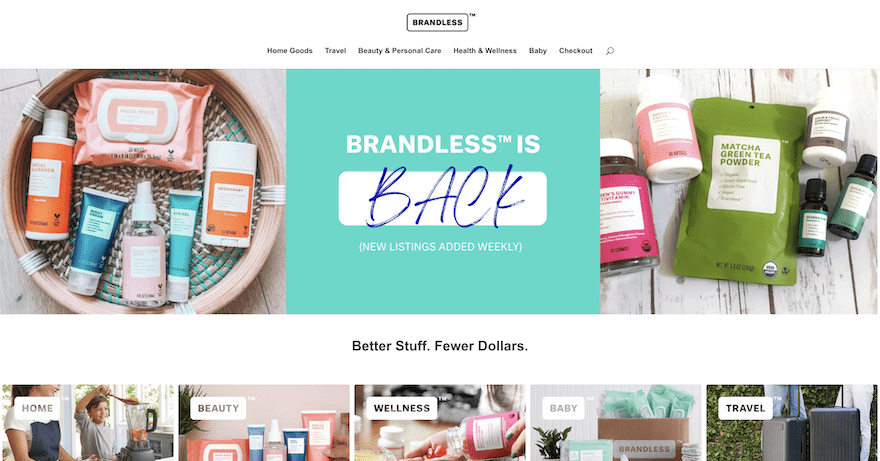
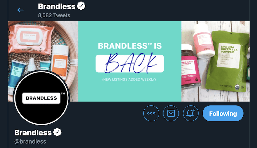
Even a conceptual “unbranded” brand like Brandless needs a logo with variations!
Below is the Brandless website with a black outlined white logo, and a white variation without a border right below it. Then the Brandless Twitter account with the white logo inside a black circle. The variations are minimal in this case, but still noticeable.
Logo Variations And Their Uses
Ok, now that we have that out of the way let’s dig deeper into how logo variations work.
There are two ways of categorizing logo variations; types of logo designs, and logo hierarchy in visual branding.
We’ll start with the designer’s side of things.
Types of Logos
There are three main types of logos that designers use as a base to complete a brand logo collection.
- Word Logos
- Image Logos
- Combination Logos
Inside each of the three categories, there are a few different styles and some are more versatile than others. Brands don’t need to have every single style as part of their logo set but definitely a combination of two or three.
Word Logos
Word logos use only words, specifically the name of the business. The words itself are the logo. Generally, a wordmark logo uses custom or intervened typography.
Wordmark: A wordmark logo is the full name of the business.
Lettermark: A lettermark is the acronym of a long business name.
Letterform: Letterforms are simplified lettermarks. These use only one letter as the context. Letterforms are perfect as favicons.
Image Logos
Image logos are any that use a pictorial element. This can be an icon, a symbol, or even a mascot. There’re no words involved in these logo styles.
Brandmark / Pictorial: A brandmark logo, also called a pictorial logo, is an image of an easily recognizable element. It can be an icon, an illustration or a digitally traced image.
Mascots: Mascot logos are those that include a brand mascot as part of the design. A mascot can be a person, an animal, or an anthropomorphous object
Conceptual / Abstract: Abstract or conceptual logos include a visual that doesn’t exactly resemble something recognizable but rather embodies the brand as a concept.
Combination Logos
The third type is the combination logo. In this case, any image logo is combined with any word logo to make a composite.
Vertical or Horizontal Combination Mark: This is the most common logo style of all. It includes a pictorial visual plus a wordmark. They designed with the visual above the words in a vertical layout, or to the side in a horizontal layout.
Emblem: An emblem logo is a bit more complicated. In this style of logo, the words and visual elements are arranged together inside a shape. There are usually a few extra elements like lines, and dots creating order and separation.
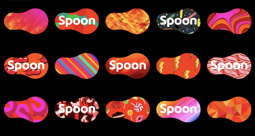
Dynamic Logos: Dynamic logos are the cherry on the pie for logo variations. These are logos that change colors or shapes according to where they’re used. For these to work, there must be one element that never changes. In the example for the brand Spoon below, the one thing that doesn’t change is the shape.
How Logo Variations Are Combined
Now, let’s look at how a logo collection is put together. There is no “perfect” formula for the number of variations each logo should have. But there’s a loose guideline.
A well-rounded logo collection includes:
- One combination logo, or one horizontal + one vertical (stacked) variation
- A word logo. Either one wordmark or a wordmark + lettermark
- An image logo
- A reversed out logo
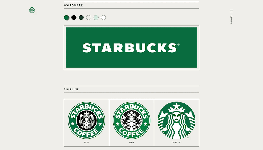
In some cases, a logo has no variations at first. Then, the brand transforms with time. This was the case with Starbucks. They had a singular emblem logo and now use a wordmark with color variations and a brandmark separately.
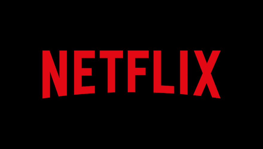
Other brands only have two variations, like Netflix.
And yet other brands have 6 or 8 variations.
Every brand needs logo variations, but how many in total, depends on the needs of the company, and their budget. Designers and agencies charge a higher price for more variations.
Logo Variations According To A Usability Hierarchy
Now let’s look at how the variations are organized in hierarchical order:
1. Primary Logo
The main, or primary logo is the most important and widely used in any logo collection. This is the one that goes on business cards, letterheads, and the website, where the brand must be front and center and quickly recognized. Employee uniforms should also use the primary logo unless the brand has been around long enough for the variations to have made an impact. As I mentioned above, more often than not, the primary logo is a combination mark. It can be either horizontal or vertical, also called stacked.
2. Secondary Logo
A secondary logo is for any instance that the primary logo doesn’t fit. If the primary logo is a horizontal combination mark, the secondary logo can be a vertical combination mark. The secondary logo can also be a wordmark, where the visual is taken out from the primary combination mark.
3. Submark
The submark is a variation of the logo that will fit in a circle. In some cases, a vertical secondary logo, or a brandmark secondary logo will fit in a circle just fine and no submark is needed. But in some cases, the logo needs a special layout to fit in a circle. Think of all the places that a logo needs to be in a circle…social media profiles, stickers, or buttons.
4. The Favicon
The Favicon is the tiny graphic that shows up in the browser tab when a website is open. It’s the most minimal variation of any logo but also super important. The favicon is a letterform and some brands use it only as a favicon while others use it as a secondary logo. This is the case with Netflix who has a wordmark as the primary logo and a letterform as a secondary logo.
5. Reversed Out
A Reversed out logo is a variation based on color. If the logo is colorful, the reversed out is only one color. This variation can have many variations in of itself; with different colors or with or without a transparent background. This variation is super helpful when the logo is being printed without color or if the environment around the logo is super colorful and there needs to be some contrast.
6. Optional Elements
Optional elements are any small graphics that can decorate a logo but are not super important. Some brands use elements like these for general decorative purposes.
Wrapping Up On Logo Variations
When Starbucks, and other brands, created their logos many years ago they didn’t really need to consider variations. But as the uses for logos simply grows with time, variations are now 100% necessary. To get a logo with variations for your business, you can hire a designer/branding designer or use an online logo maker like TailorBrands. It’s important that all variations must look like they are a family and not compete with each other. The key-word here is “complementary”. Every variation is a complement to the primary logo.
Do you have a logo with variations? Are you a designer that offers logo packs for clients? What are your thoughts on the most versatile variations in use today? Leave us a note in the comments!
Featured Image via SVStudio / shutterstock.com
Other Image Credits: Spoon logo image from “Named Studio” profile on Behance; Starbucks logo from Starbucks official brand guidelines; Netflix animated logo from Netflix official brand guidelines
The post Why Your Brand Need Logo Variations appeared first on Elegant Themes Blog.