
Every once in a while a website design calls for some circular elements. It is a nice way to break out of the monotony of the standard box designs on a web page. Creating circular elements may sound simple (and it actually is!), but if you aren’t familiar with a few basic rules, you may run into a few unnecessary hurdles that can be quite frustrating.
For example, it is sometimes difficult to get the content to align and fit inside a circle-shaped element with the correct spacing. Or you may find it difficult to make the circle responsive for mobile devices. For this reason some have resorted to using a circular image background for content instead. But if you don’t want to use a custom image background, your next best bet is to use CSS. The good news is that Divi takes out the need for coming up with your own custom CSS for making circular elements, making the process that much easier. So, if you ever wanted to give an element a circle shape in Divi, this is the post for you.
In this tutorial, I’ll walk you through the basics of how to create circular elements in Divi (including sections, rows, and modules). Then I’ll show you how easy it is to implement those techniques on a premade layout.
Check it out!
Sneak Peek
Download the Example Circular Elements Layout for FREE
To lay your hands on the example circular elements designed in this tutorial, you will first need to download it using the button below. To gain access to the download you will need to subscribe to our Divi Daily email list by using the form below. As a new subscriber, you will receive even more Divi goodness and a free Divi Layout pack every Monday! If you’re already on the list, simply enter your email address below and click download. You will not be “resubscribed” or receive extra emails.
@media only screen and ( max-width: 767px ) {.et_bloom .et_bloom_optin_1 .carrot_edge.et_bloom_form_right .et_bloom_form_content:before, .et_bloom .et_bloom_optin_1 .carrot_edge.et_bloom_form_left .et_bloom_form_content:before { border-top-color: #ffffff !important; border-left-color: transparent !important; }
}.et_bloom .et_bloom_optin_1 .et_bloom_form_content button { background-color: #f92c8b !important; } .et_bloom .et_bloom_optin_1 .et_bloom_form_content .et_bloom_fields i { color: #f92c8b !important; } .et_bloom .et_bloom_optin_1 .et_bloom_form_content .et_bloom_custom_field_radio i:before { background: #f92c8b !important; } .et_bloom .et_bloom_optin_1 .et_bloom_border_solid { border-color: #f7f9fb !important } .et_bloom .et_bloom_optin_1 .et_bloom_form_content button { background-color: #f92c8b !important; } .et_bloom .et_bloom_optin_1 .et_bloom_form_container h2, .et_bloom .et_bloom_optin_1 .et_bloom_form_container h2 span, .et_bloom .et_bloom_optin_1 .et_bloom_form_container h2 strong { font-family: “Open Sans”, Helvetica, Arial, Lucida, sans-serif; }.et_bloom .et_bloom_optin_1 .et_bloom_form_container p, .et_bloom .et_bloom_optin_1 .et_bloom_form_container p span, .et_bloom .et_bloom_optin_1 .et_bloom_form_container p strong, .et_bloom .et_bloom_optin_1 .et_bloom_form_container form input, .et_bloom .et_bloom_optin_1 .et_bloom_form_container form button span { font-family: “Open Sans”, Helvetica, Arial, Lucida, sans-serif; } p.et_bloom_popup_input { padding-bottom: 0 !important;}

Download For Free
Join the Divi Newlsetter and we will email you a copy of the ultimate Divi Landing Page Layout Pack, plus tons of other amazing and free Divi resources, tips and tricks. Follow along and you will be a Divi master in no time. If you are already subscribed simply type in your email address below and click download to access the layout pack.
You have successfully subscribed. Please check your email address to confirm your subscription and get access to free weekly Divi layout packs!
To import the layout to your page, simply extract the zip file and drag the json file into the Divi Builder.
Let’s get to the tutorial shall we?
What You Need to Get Started
To get started, create a new page in Divi. Then give you page a title and deploy the Divi builder on the front end. Select the option “build from scratch”.
We will also be adding a premade layout to our page a bit later but for now we can start building from scratch.
Now you are ready to go!
The Three Basic Steps to Creating a Circular Element
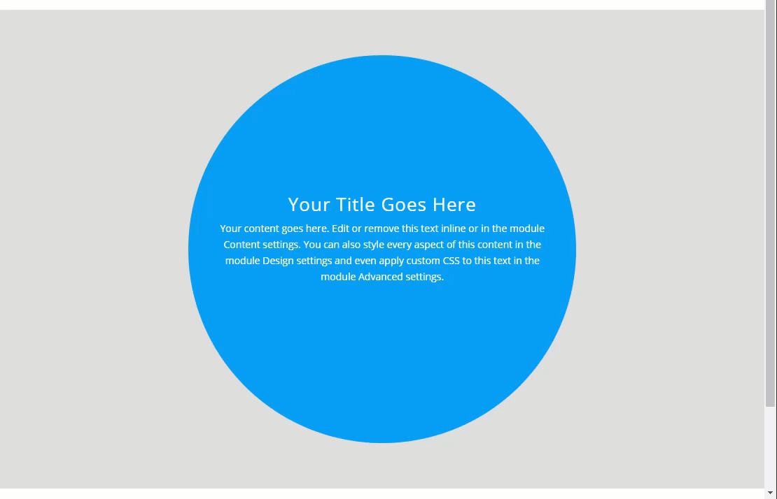
There are really three simple steps to creating a circular element. To illustrate these steps, I’m going to apply these steps to a Call to Action Module using the Divi Builder.
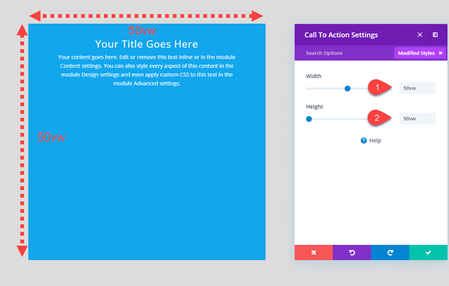
Step 1: Size element with equal height and width values
The first step is to set the height and width to the same equal value. Basically we want to make the element a perfect square before we make it a perfect circle. In this example, let’s give the call to action module a height and width of 10vw.
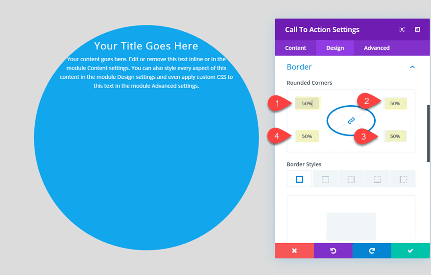
Step 2: Add Border radius of 50% for all four corners
The second step is to set the border radius of the element (or module) to 50% on all four corners. In Divi, you can change the border radius of an element under the option labeled “Rounded Corners”.
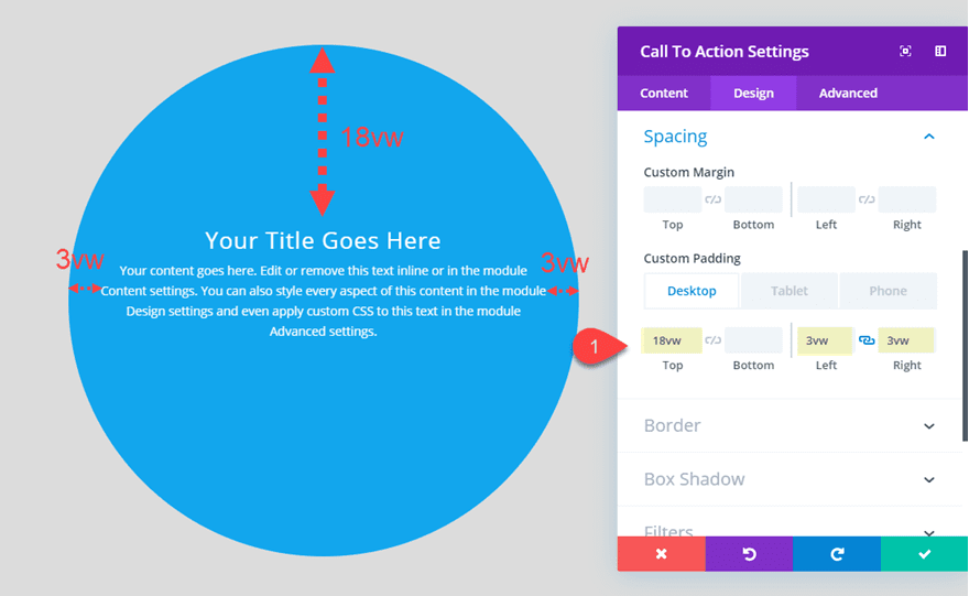
Step 3: Align content within the circular element
The third step is to align the content of the circular element. We can do this by adjusting the padding of the element. (Also, I do cover a way to use flex to vertically center the content later in this post)
In this example, we can add the following padding to get our content closer to the center of the circular element:
Custom Padding: 18vw top, 3vw left, 3vw right
Of course, there are still adjustments that may need to be made to make sure the text/content fits inside the circular element on mobile, but this does cover the basic setup.
You may notice that I used the vw length unit to size and space my circular element. This is helpful for creating a more consistent responsive design. I’ll explain.
Using Relative Length Units to Make Circular Elements Responsive
Using the VW length unit for height and width
Of all the relative length units, the vw length unit is one of my favorites for responsive design. Since the vw length unit is relative to the width of the browser window (not the parent element), you can get a consistent design that adjusts smoothly with the browser window size.
Let’s take a look at how our example circular call to action module looks as I shrink the browser width.
Using the VW length unit for circular element content
Using the vw length unit for circular element size and content is a good combination for responsive design. Basically, this allows the content (like text or images) to adjust seamlessly with the size of the circle element for a consistent design on all browsers. However, you need to be careful with using the vw length unit for body text because the text may become way too small on mobile. I like to use the vw length unit for headings and then adjust the size of the body text with pixels as needed.
Also, if you plan on keeping the circular element design on phone display, you will need to keep your content to a minimum and adjust the size of the circular element for maximum space.
Using our current example, you can give your Title text a vw length value and then resize the module on mobile as follows:
Title Text Size: 4vw
Width (phone): 70vw
Height (phone: 70vw
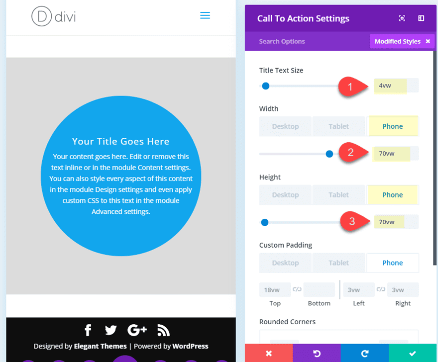
As you can see, all of the content now sits nicely within the circular element on phone display as well.
What about Pixels?
If you want to use absolute length units (like pixels) to size your circle, that is perfectly fine. You will just need to make sure and make the necessary size adjustments at each breakpoint for tablet and phone display in order to make sure the circular element fits inside the browser window. In some cases, using pixels can be easier to get your sizing just right (or more exact) on tablet and phone displays.
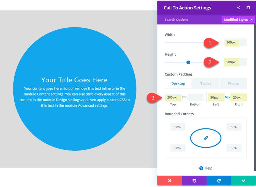
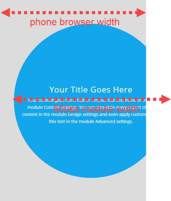
For example, let’s take the same call to action module and use pixels (instead of vw) to size and space our module.
You can update the height, width, and padding as follows:
Width: 500px
Height: 500px
Custom Padding: 200px top, 20px left, 20px right
This design will look similar on desktop, but the problem comes whenever you view the circular element on phone display. Since the circular element is sized using pixels (an absolute length unit), the circular element will extend outside the container and browser on phone display.
TThat’s why it is important to adjust the width and padding pixel values on mobile displays. For example, you may need to change the width and height to 300px instead.
Why the % length unit doesn’t really work well for sizing circular elements
If you want a more responsive solution for circular elements, you may think that using percentages is the answer. However, when sizing elements on a web page, the percentage length unit for height doesn’t work the same way as the percentage length unit for width. This is because the default height of elements is usually left to the default (height: auto). So for example, if you are trying to set give 100% height to a Divi Module, the module will not adjust because the parent containers (column, row, section, etc…) all have an undefined value for height. The browser doesn’t basically is trying to set the module to 100% of nothing (which it can’t). This is not the case for width. The default width of any block element (or div) is 100%. So all sections, rows, and modules have this default 100% width unless changed by the settings. This is why the % length unit isn’t the best option to use when trying to build a responsive circular element. The circular element needs to have the same height and width on all browser sizes so it is difficult to accomplish this with using a percentage length unit for height. However, there are ways of making 100% height and width work with more custom CSS applied to the parent elements. But for making circular elements in Divi, you may find the vw length unit easier to work with.
Aligning Content within a Circular Element
If you want to align content within a circular element, you really have two options that I would consider simple when using Divi. You can use padding to align the content which gives you more control over where you want the content to be displayed within the circle element. Or you can use the flex property (with padding) to make sure the content is displayed directly in the center of the circle.
Aligning Circular Element Content with Padding
To align content inside of a circle element using padding, I would suggest using a relative length unit (like % or vw) so that the padding will increase or decrease with the size of the container or browser width. You don’t want to use absolute length units for padding inside of a circular element that is sized using relative units. The result would be inconsistent and the design would break on mobile. For example, if you had a circular element that had a height of 10vw and a width of 10vw. That element would shrink in size as the browser shrinks in width. If you added 100px padding to the top of the element, the 100px would remain whenever you adjust the browser width and break the design. However, if you added a 3vw padding, this padding would adjust well with the element.
This is why I suggested using vw padding in our call to action module example.
Aligning Circular Element Content with the Flex Property
If you don’t want to worry so much about getting the top and bottom padding in place to make sure the content is centered vertically, you can use the flex property. By adding a few snippets of css to the parent (circular element), you can make sure that all content remains centered vertically. Then you can use alignment, padding, or margin to make sure the content remains horizontally centered as well.
Here’s what I mean.
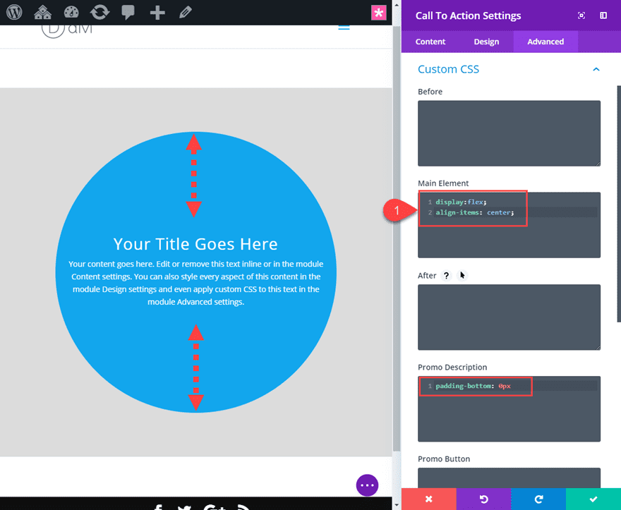
Using our example, open the call to action module settings.
Then set the top and bottom padding to 0px.
Then go to the advanced tab, and add the following snippet of CSS to the Main Element:
display:flex;
align-items: center;
For this particular module, there is some extra padding under the promo description that will throw off the alignment a tad. So you can get rid of it by adding the following CSS to the Promo Description:
padding-bottom: 0px
Check out this post on how to vertically align content for more info.
Putting It Into Practice: Adding Circular Elements to a Premade Layout
Now that you have a better understanding on how to create circular elements in Divi, let’s see how this might work on an actual layout design. For this example, I’m going to use Divi’s Farmer Landing Page from the Farmer Layout Pack.
Load the Farmer Landing Page Layout to Your Page
To get started, first let’s add the Farmer Landing Page Layout to the page. To do this, open the settings menu and the bottom of the Divi Builder and click the load from library button. In the load from library popup, find the Farmer Layout Pack and select it. Then click to use the Farmer Landing Page.
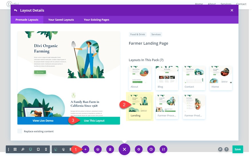
This will load the layout to the page.
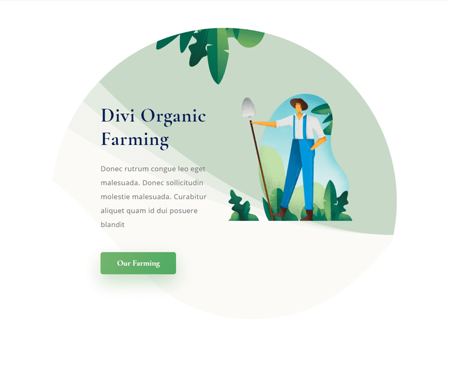
Making a Circular Section Header
For the first example, we are going to convert the top header section of the layout to a circular element. To do this we will be using our three basic rules:
1: Size element with equal height and width values
2: Add Border radius of 50% for all four corners
3: Align Content within the Circular Element
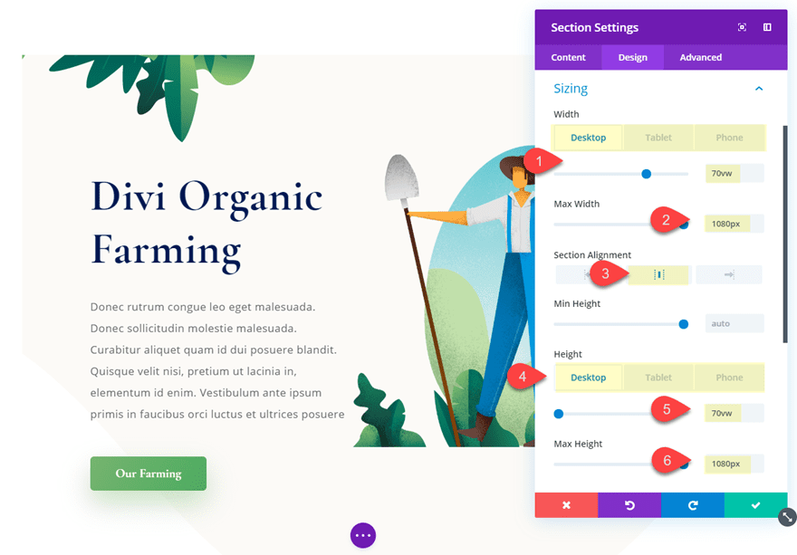
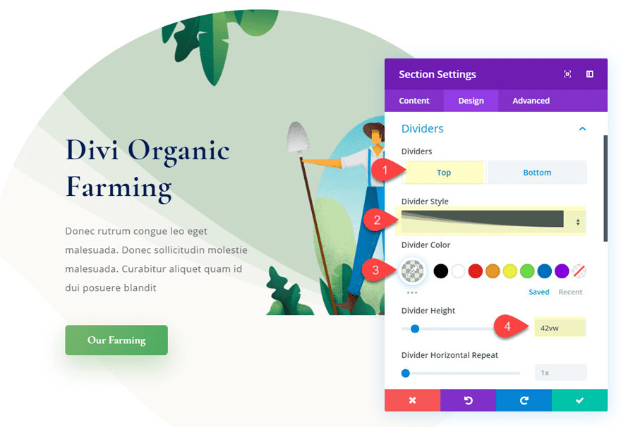
Open the section settings and update the following:
Width: 70vw (desktop), 70vw (tablet), 80vw (phone)
Max width: 1080px
Section Alignment: center
Height: 70vw (desktop), 70vw (tablet), 80vw (phone)
Max height: 1080px
Notice that I added additional height and width values for tablet and phone plus I added a max height and max width as well. The important thing is that you make sure all height values and all width values are equal.
Now we need to add our border radius of 50% on all four corners.
Rounded Corners: 50% (all four corners)
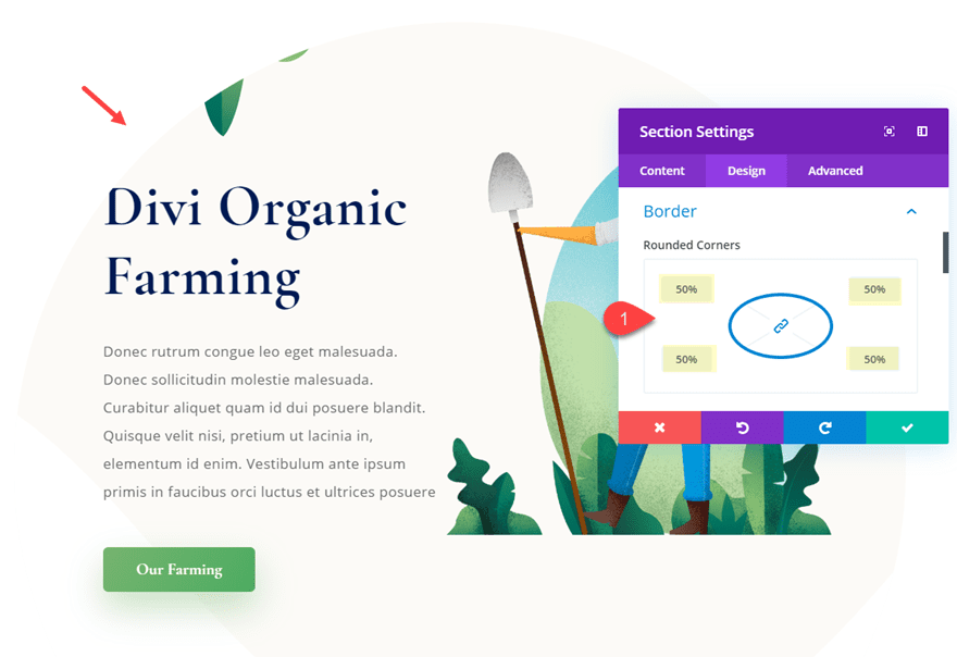
Since this is a section, the content includes a two-column row with multiple modules. With this much content, we need to make some size adjustments to the modules to make sure the content fits within the section.
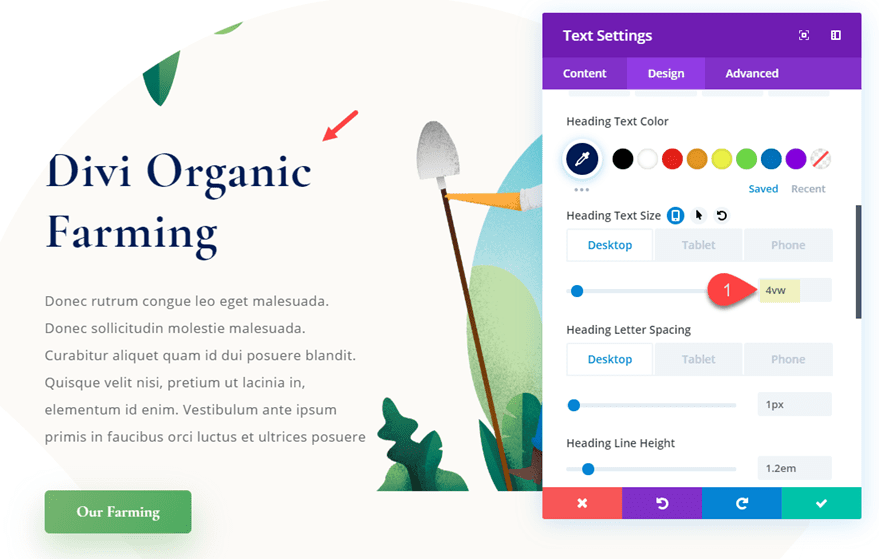
First, open the settings of the top text module in column 1 that contains the title of the section. Then update the title text size as follows:
heading Text Size: 4vw
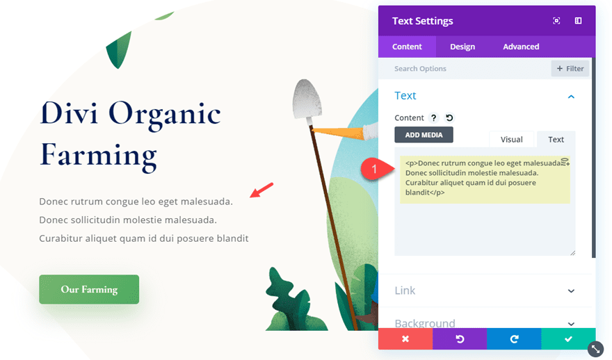
Then decrease the amount of body text in the text module directly under the text module containing the header.
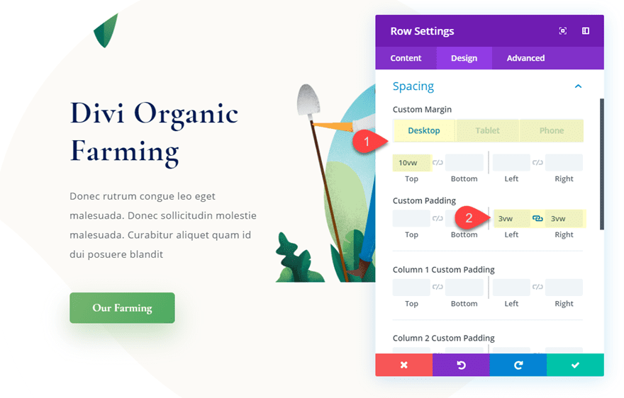
Now we can align the content by adjusting the spacing of the row. Open the row settings and update the following:
Custom Margin: 10vw top (desktop), 5vw (tablet), 0vw (phone)
Custom Padding: 3vw left, 3vw right
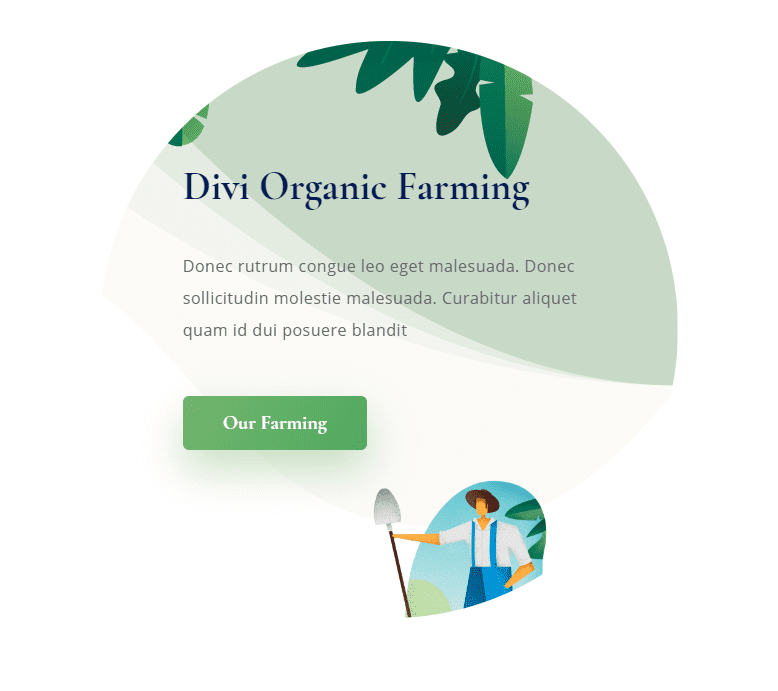
To make the circle shape more noticable, we can add a top section divider and move the background image position to Top Left.
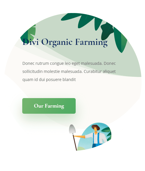
Now let’s check out the result.
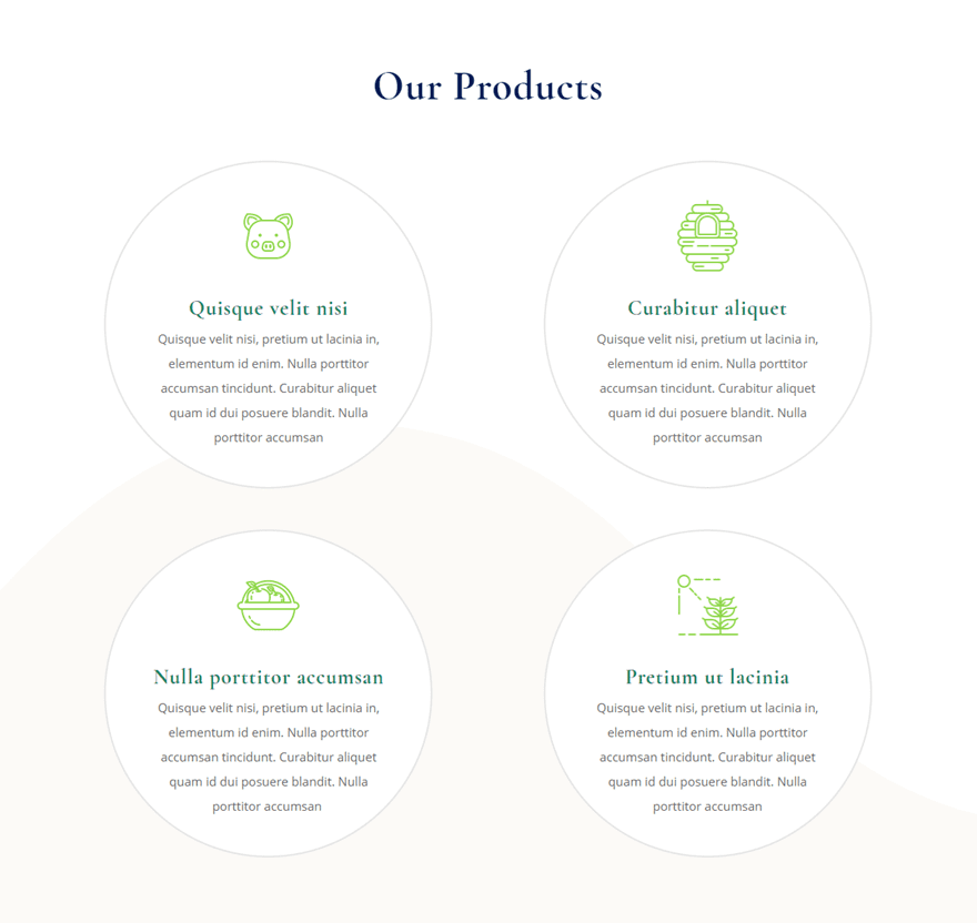
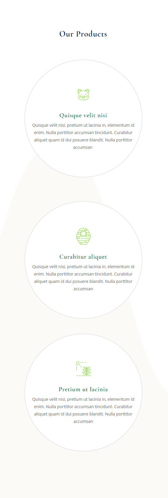
Making Circular Blurb Modules
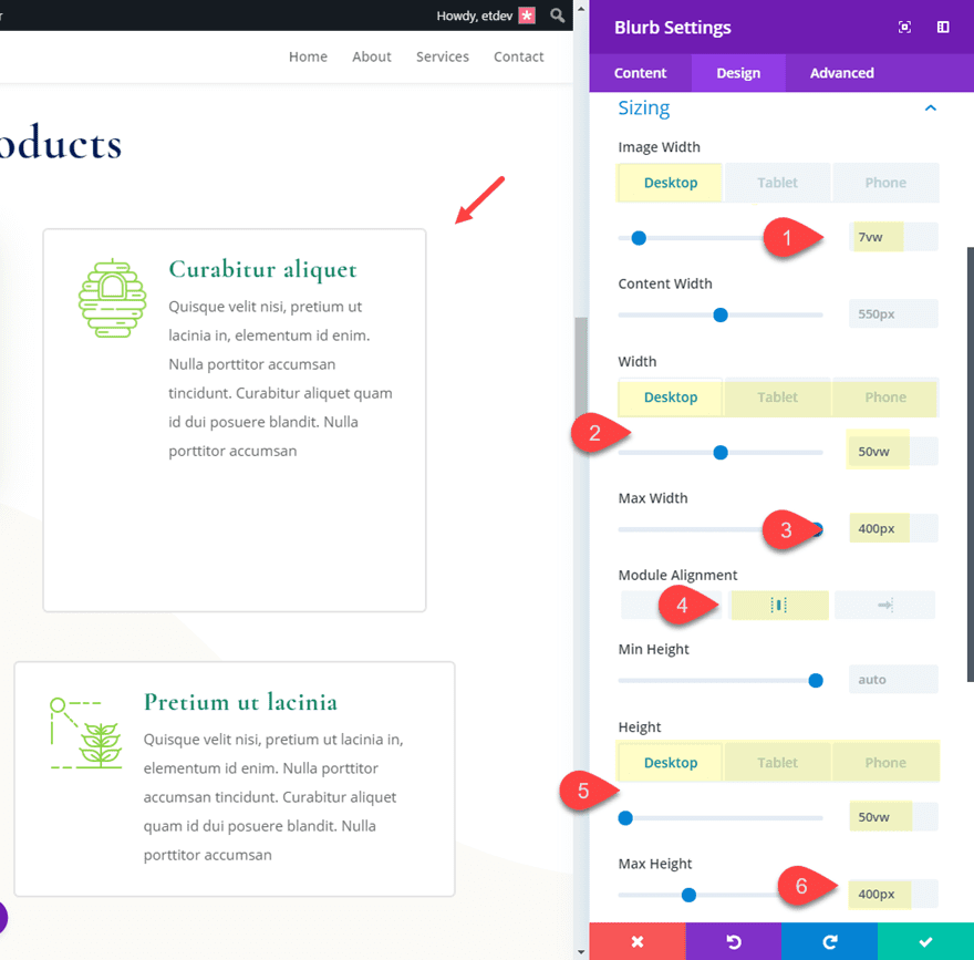
Now let’s take a crack at making some circular blurbs on this layout. For this example, let’s use the four blurb modules under the section titled “Our Products”. Once you find it, open the settings of the blurb module in at the top of column 2.
Then update the size of the module as follows:
Image Width: 7vw
Width: 50vw (desktop), 80vw (phone)
Max Width: 400px
Module Alignment: center
Height: 50vw (desktop), 80vw (phone)
Max Height: 400px
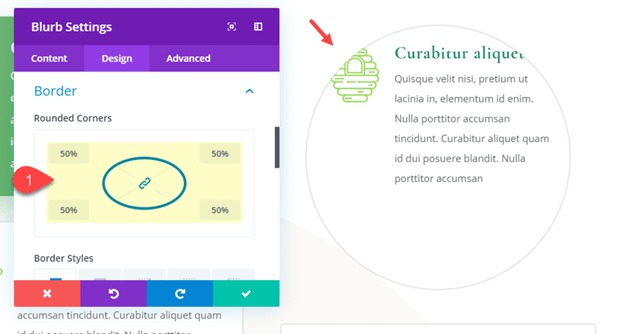
Next, add your border radius or rounded corners:
Rounded Corners: 50%
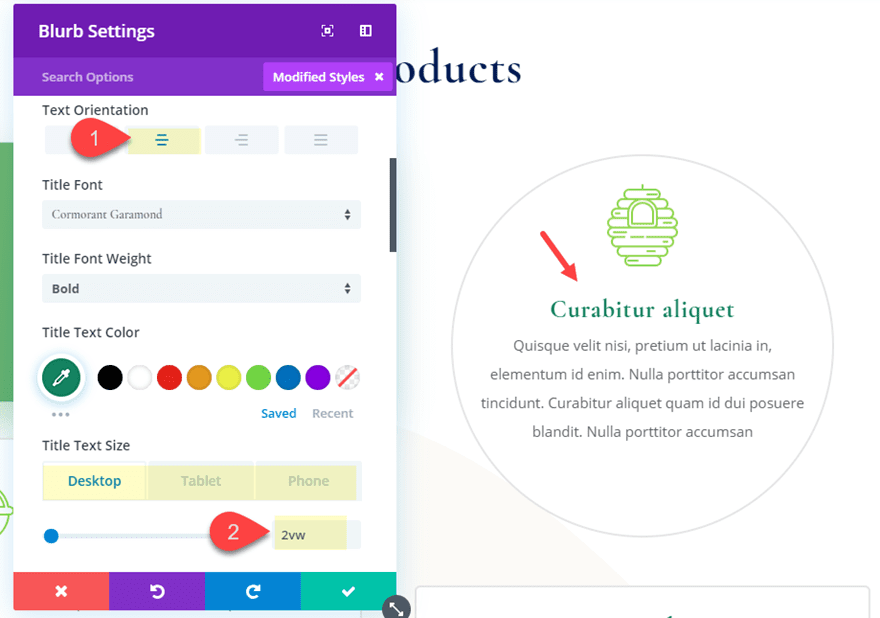
After that, let’s update the content design and spacing as follows:
Image/Icon Placement: Top
Title Text Size: 2vw (desktop), 20px (tablet)
Text orientation: center
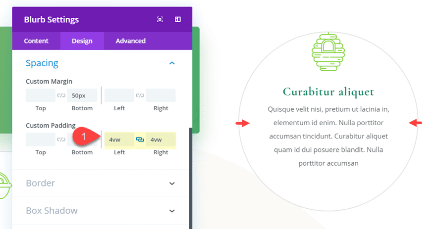
Custom Padding: 0vw Top, 0vw bottom, 4vw left, 4vw right
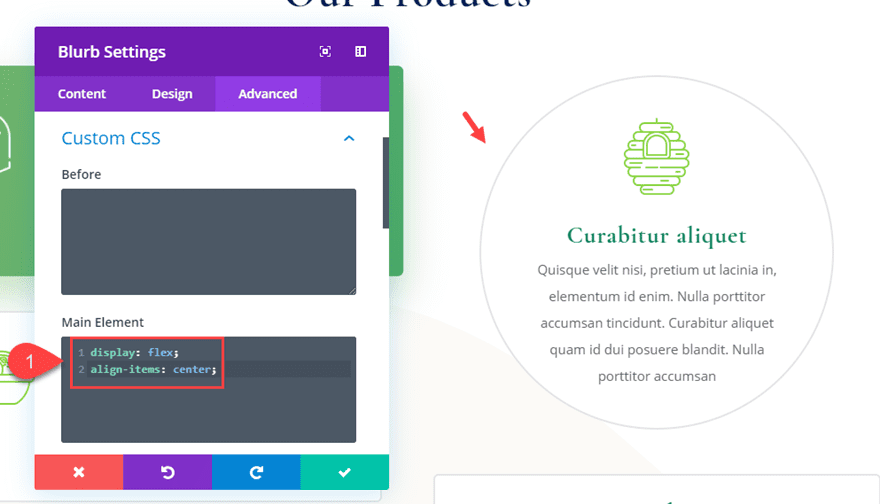
Finally, let’s vertically align the content using the flex property by adding the following custom CSS to the Main Element:
display: flex;
align-items: center;
Extend Circular Style to all Blurbs in the Section
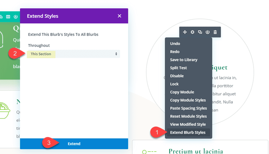
That takes care of the circular design for our first module. Now all we need to do is extend the blurb module design settings to the remaining three blurbs in the section. To do this, right click on the blurb module we just designed and select “Extend Blurb Styles”. In the Extend Styles popup, select to extend the style throughout the section.
Final Result
Now let’s check out the final result.
Final Thoughts
I hope you learned a few helpful tips on how to create circular elements in Divi. By understanding three basic steps and how to properly use length units to size and space your element, you can create the circular design you are looking for pretty easily. And, it can be really fun to incorporate some circular elements on an existing or premade Divi layout. Feel free to explore making circular modules, rows, or even entire sections!
I look forward to hearing from you in the comments.
Cheers!
The post A Helpful Guide for Designing Circular Elements in Divi appeared first on Elegant Themes Blog.