
We’ve all been loving the new transform options. They help us create amazing designs and have a real-time view of the changes we make. And when combined with hover options, you can definitely manage to create some stunning effects. In this tutorial, we’re going to show you how to create interactive blurb modules by combining Divi’s transform and hover options. We’ll handle four different examples that take little to no time to create, and which you can use for any web project you want.
Let’s get to it!
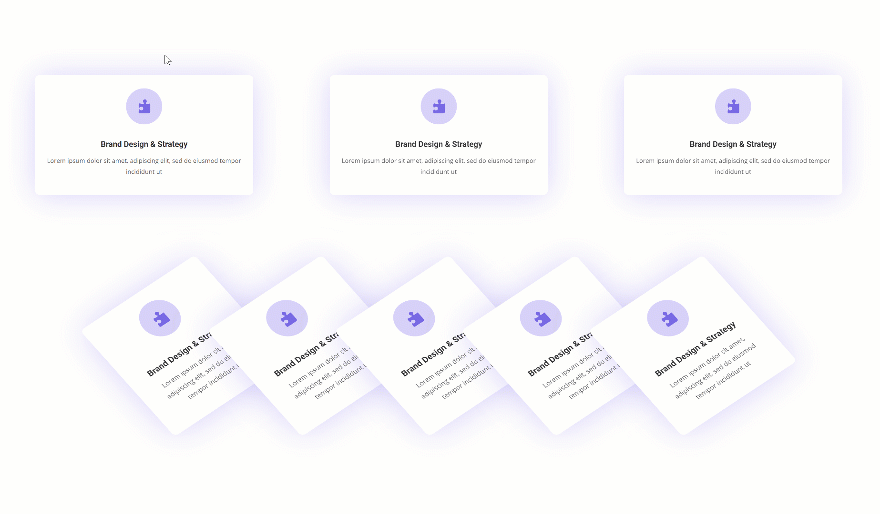
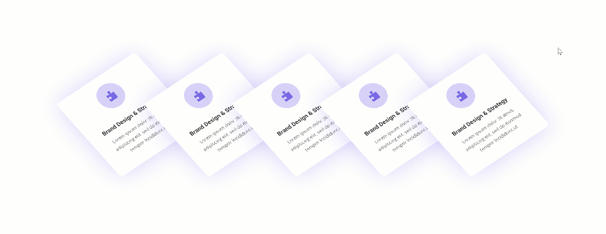
Preview
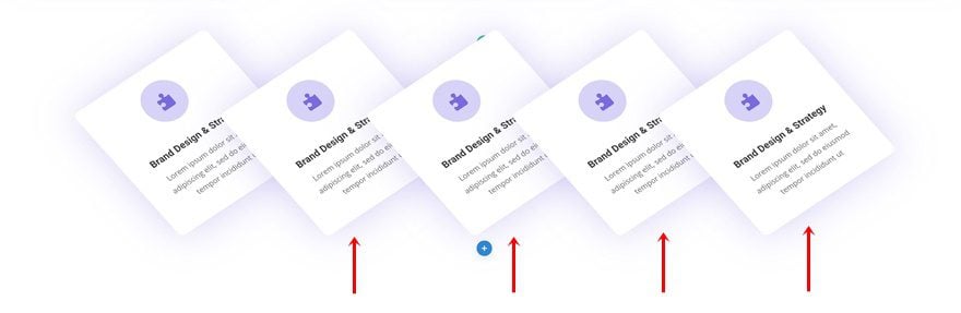
Before we dive into the tutorial, let’s take a quick look at the outcome.
General Steps
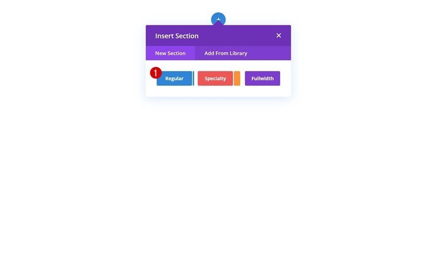
Add New Section
In the first part of this post, we’re going to go over some general steps which will help us focus on the transform blurb examples later on the post. Start by creating a new page or opening an existing one and add a regular section to it.
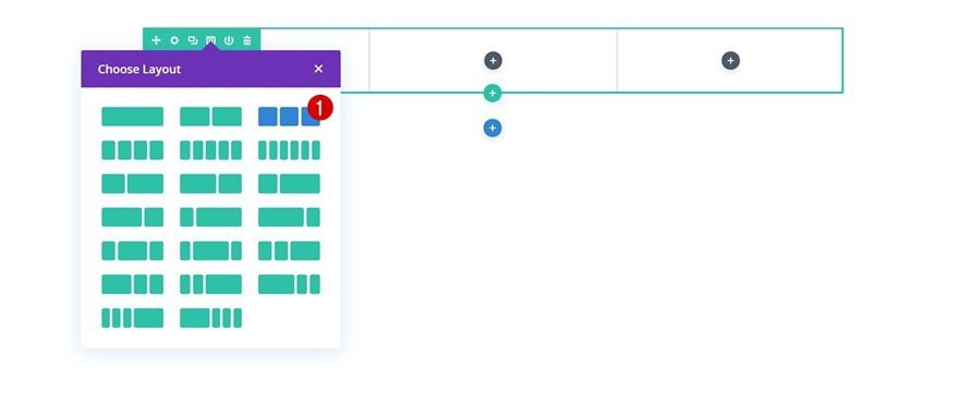
Add Row #1
Column Structure
Continue by adding a new row to the section using the following column structure:
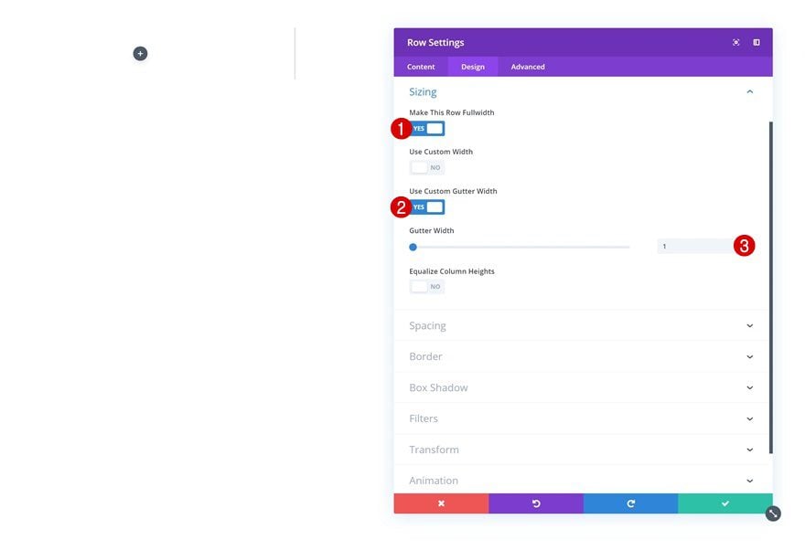
Sizing
Open the row settings and change the sizing settings in the design tab to allow the row to take up the entire width of the screen.
- Make This Row Fullwidth: Yes
- Use Custom Gutter Width: Yes
- Gutter Width: 1
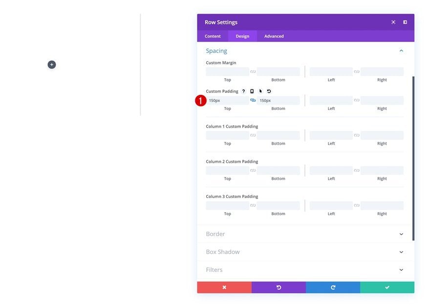
Spacing
Add some custom top and bottom padding as well.
- Top Padding: 150px
- Bottom Padding: 150px
Add Blurb Module to Column 1
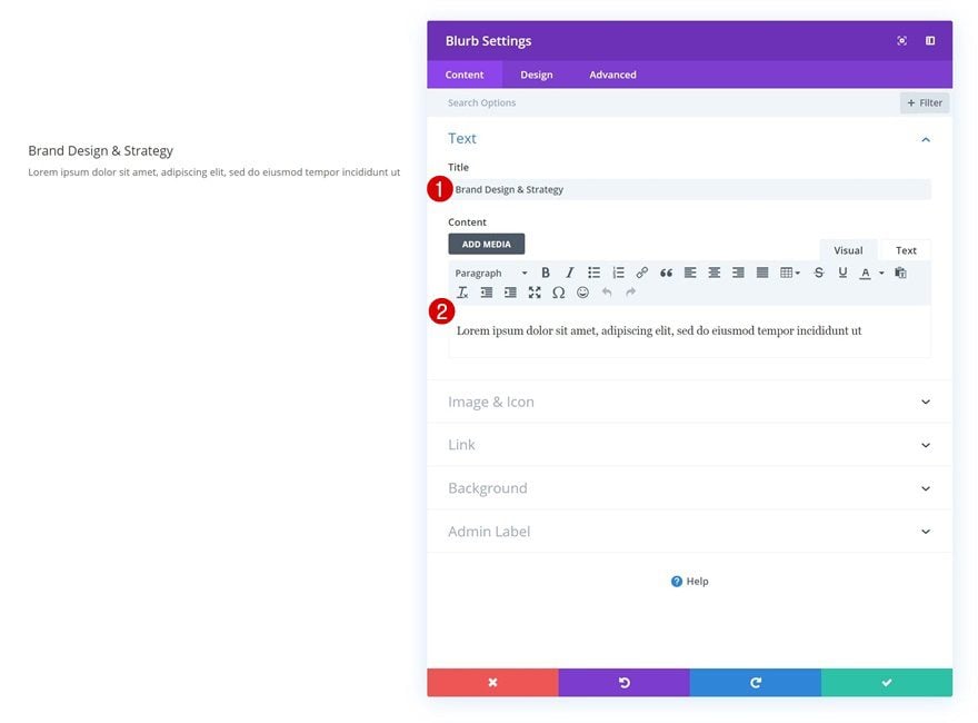
Add Content
The only module we’ll need throughout this tutorial is a Blurb Module. Once we’ve customized the Blurb Module, we’ll reuse to achieve all four of the examples which you were able to see at the beginning of the post. Go ahead and add a Blurb Module to the first column and enter some content of your choice.
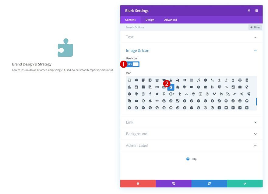
Select Icon
Continue by selecting an icon.
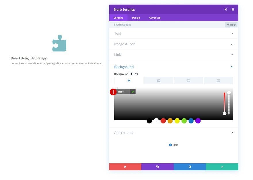
Background Color
Add an entirely white background next.
- Background Color: #ffffff
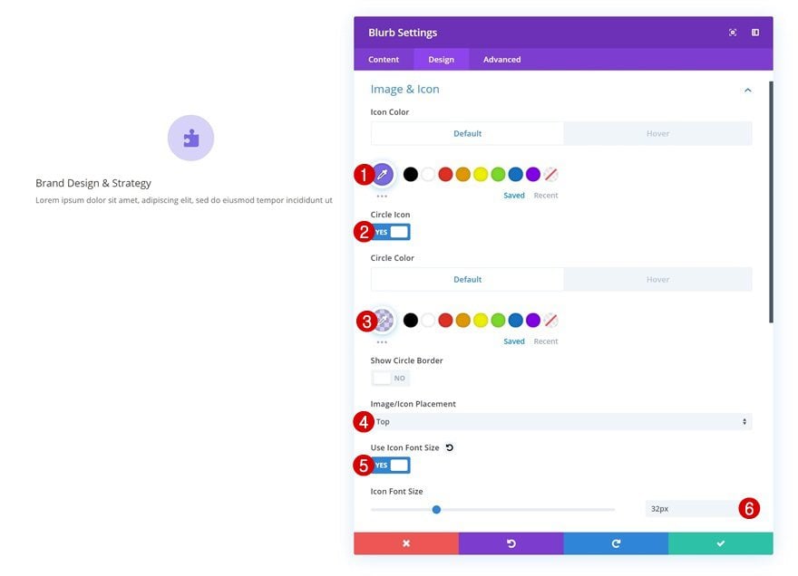
Default Icon Settings
Then, change the icon settings in the design tab.
- Icon Color: #7a69e6
- Circle Icon: Yes
- Circle Color: rgba(122,105,230,0.3)
- Image/Icon Placement: Top
- Use Icon Font Size: 32px
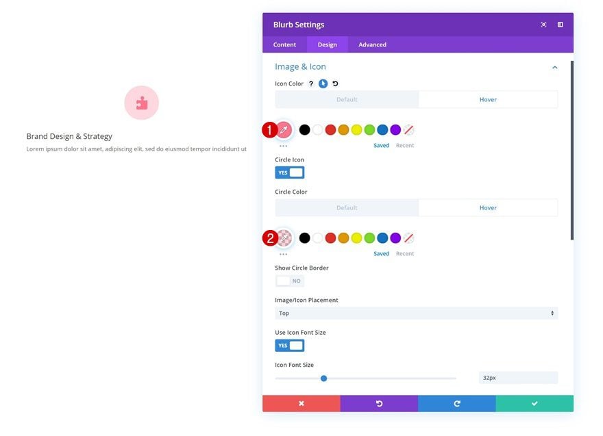
Hover Icon Settings
Modify both the icon and circle color on hover.
- Icon Color: #ff758e
- Circle Color: rgba(255,117,142,0.29)
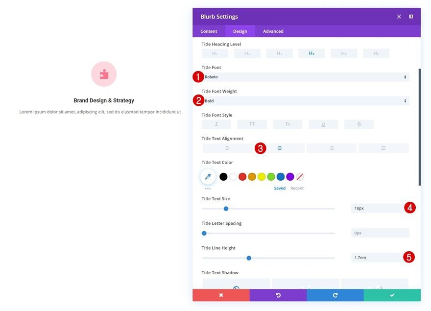
Title Text Settings
Continue by changing the text settings.
- Title Font: Roboto
- Title Font Weight: Bold
- Title Text Alignment: Center
- Title Text Size: 18px
- Title Line Height: 1.7em
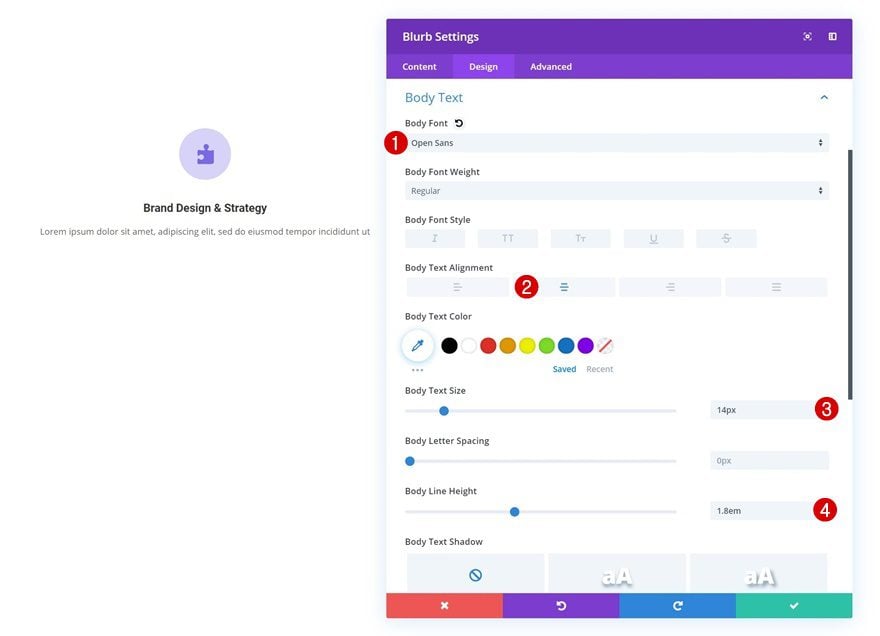
Body Text Settings
And modify the body text settings as well.
- Body Font: Open Sans
- Body Text Alignment: Center
- Body Text Size: 14px
- Body Line Height: 1.8em
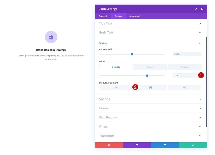
Sizing
We’re also slightly shrinking the size of the module across different screen sizes.
- Width: 74% (Desktop), 85% (Tablet & Phone)
- Module Alignment: Center
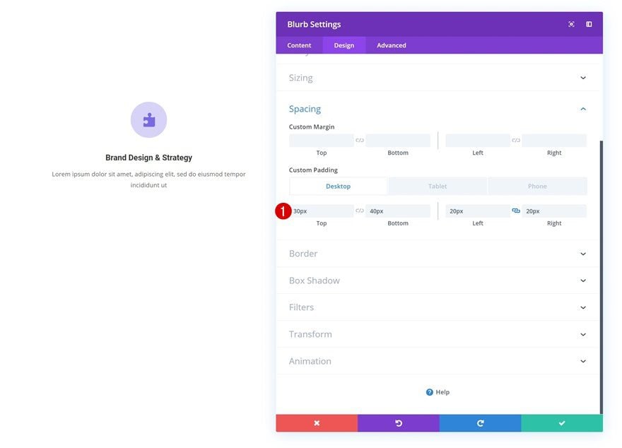
Spacing
And we’ll add some custom padding too.
- Top Padding: 30px
- Bottom Padding: 40px
- Left Padding: 20px
- Right Padding: 20px
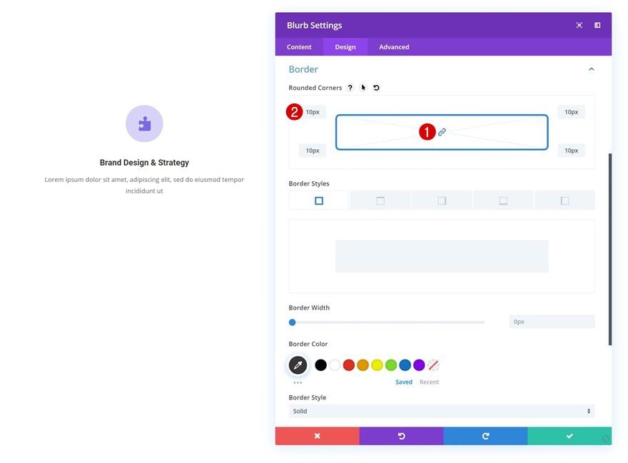
Border
Continue by adding ’10px’ to each one of the corners of the Blurb Module.
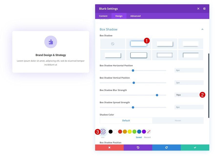
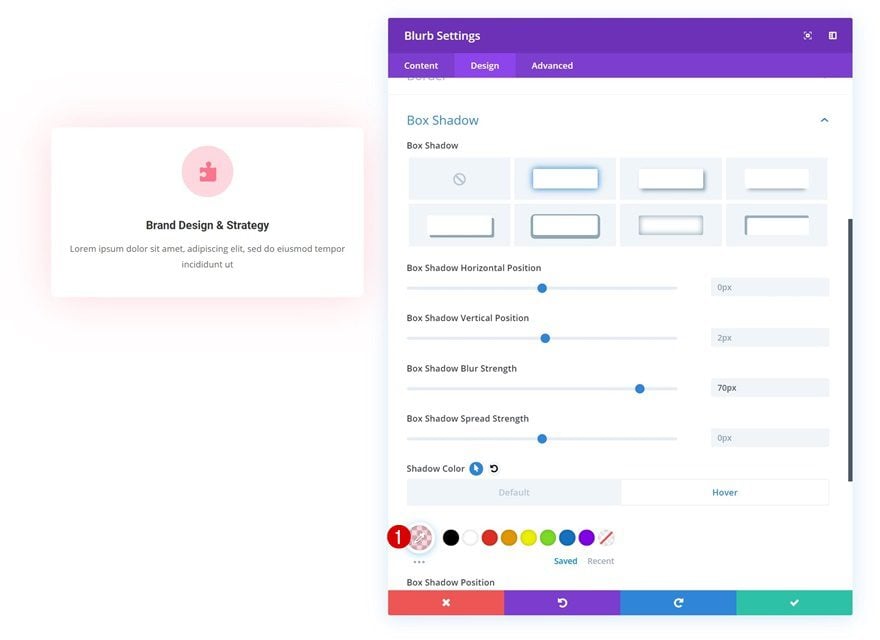
Default Box Shadow
And to top it off, add a subtle box shadow.
- Box Shadow Blur Strength: 70px
- Shadow Color: rgba(122,105,230,0.3)
Hover Box Shadow
Change the box shadow color on hover to make it match with the hover icon and circle colors.
- Shadow Color: rgba(255,117,142,0.29)
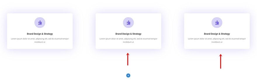
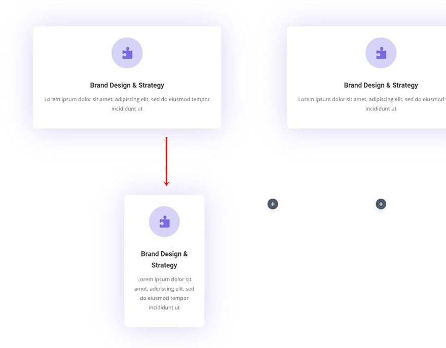
Clone Blurb Module Twice & Place Duplicates in Remaining Columns
Once you’re done customizing the Blurb Module, you can go ahead and clone it twice. Place the duplicates in the two remaining columns.
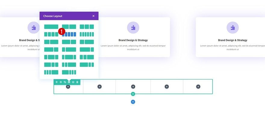
Add Row #2
Column Structure
For the last example, we’ll need a separate row. Choose the following column structure:
Sizing
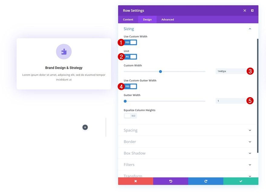
Without adding any modules yet, open the row settings and change the sizing settings in the design tab.
- Use Custom Width: Yes
- Unit: PX
- Custom Width: 1440px
- Use Custom Gutter Width: Yes
- Gutter Width: 1
Clone Blurb Module in Previous Row & Place in Column 1
Then, clone one of the Blurb Modules in the previous row and place the duplicate in the first column of the second row.
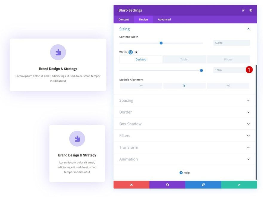
Change Sizing
Modify the width in the sizing settings of your new Blurb Module and once you do, you will have completed the general steps!
- Width: 100% (Desktop), 85% (Tablet & Phone)
Recreate Example #1
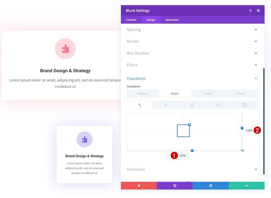
Default Transform Scale
Now that we’ve gone through all the general steps, we can start focusing on the different examples and how to achieve them using Divi’s transform and hover options. The first example, as you can notice in the GIF above, increases the size of the module on hover. To accomplish that, make sure the transform scale values remain ‘100%’ across all screen sizes.
- Bottom: 100% (Desktop, Tablet & Phone)
- Right: 100% (Desktop, Tablet & Phone)
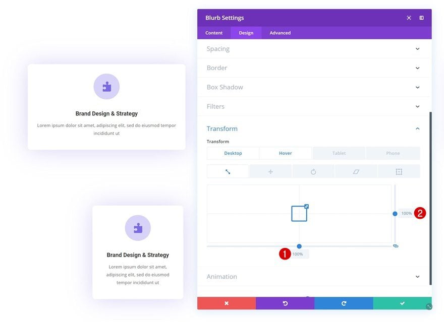
Hover Transform Scale
Modify the transform scale values on hover to create an expanding effect.
- Bottom: 132%
- Right: 132%
Recreate Example #2
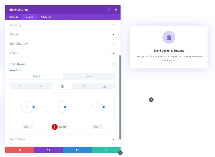
Default Transform Rotate
On to the second example! We’re going to create a horizontal flipping effect as you can notice in the GIF above. To do that, we’ll need to play around with the transform rotate values. We’re using the ‘highest’ value possible before the rotation turns to 0deg. This will allow the flipping effect to take place.
- Right: 359.9deg
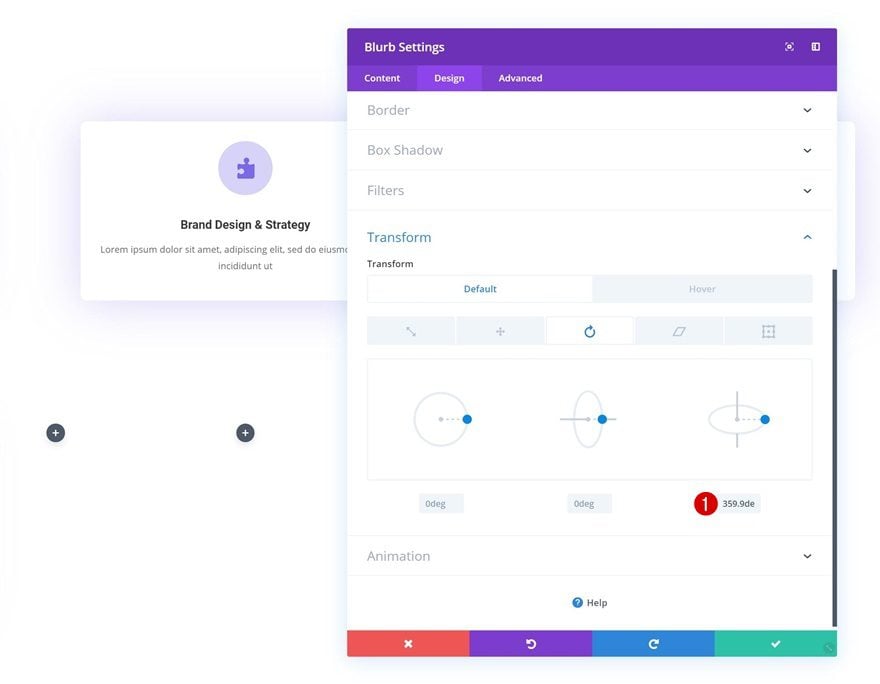
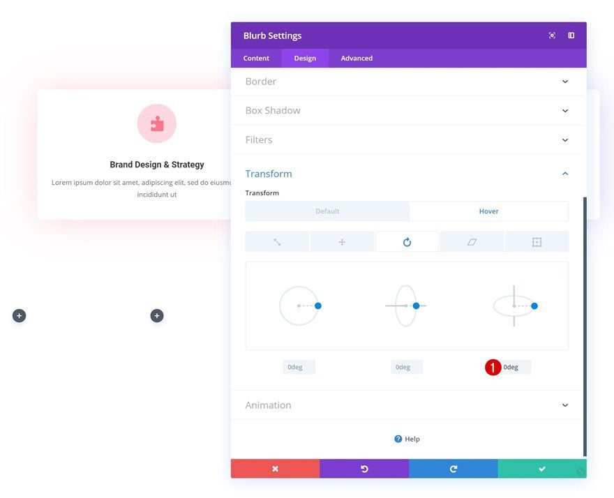
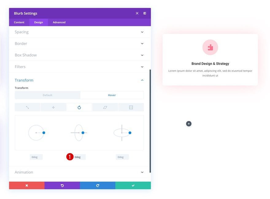
Hover Transform Rotate
Enable the hover options for the transform rotate option and add ‘0deg’. What we’re basically doing is allowing the module to make a 360-degree flip (technically, 359.9).
- Right: 0deg
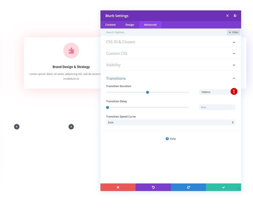
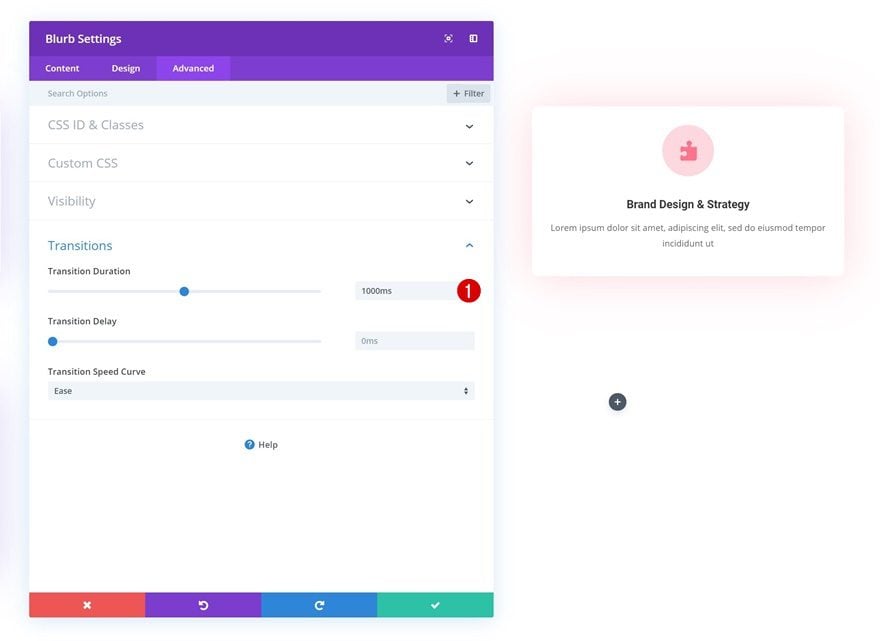
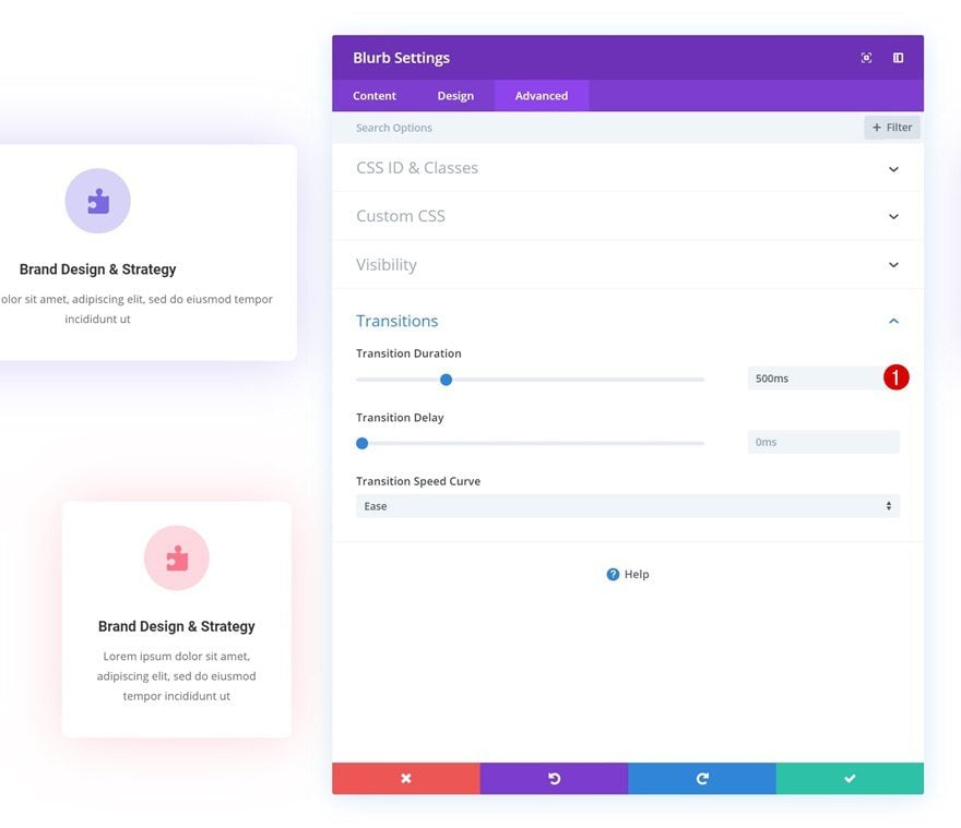
Transitions
We’ll also increase the transition duration the advanced tab to create a smooth transition.
- Transition Duration: 1000ms
Recreate Example #3
Default Transform Rotate
For the third example, we’re going to do almost exactly the same thing as we did in the previuos example, but instead of having a horizontal flip, we’re creating a vertical one.
- Center: 359.9deg
Hover Transform Rotate
Make sure you change the value you’ve modified back to ‘0deg’ on hover.
- Center: 0deg
Transitions
And, again, increase the transition duration in the transitions settings.
- Transition Duration: 1000ms
Recreate Example #4
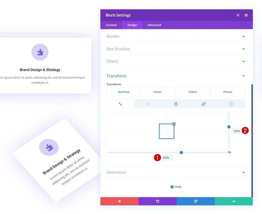
Default Transform Scale
On to the next and last example! Start by transforming the scale of the module but make sure the module remains intact on smaller screen sizes.
- Bottom: 150% (Desktop), 100% (Tablet & Phone)
- Right: 150% (Desktop), 100% (Tablet & Phone)
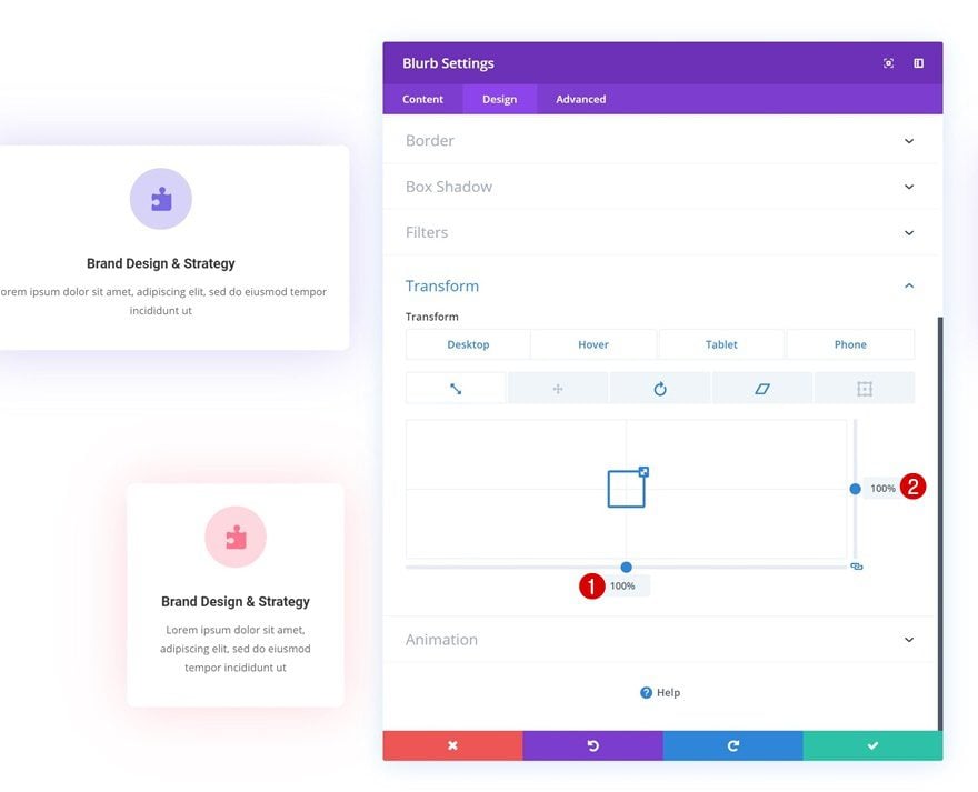
Hover Transform Scale
Change the transform scale on hover to allow the module to fall back into place on desktop.
- Bottom: 100%
- Right: 100%
Default Transform Rotate
Continue by changing the transform rotate values. Again, make sure the module remains intact on smaller screen sizes by modifying the values accordingly.
- Left: 322deg (Desktop), 0deg (Tablet & Phone)
- Right: 59deg (Desktop), 0deg (Tablet & Phone)
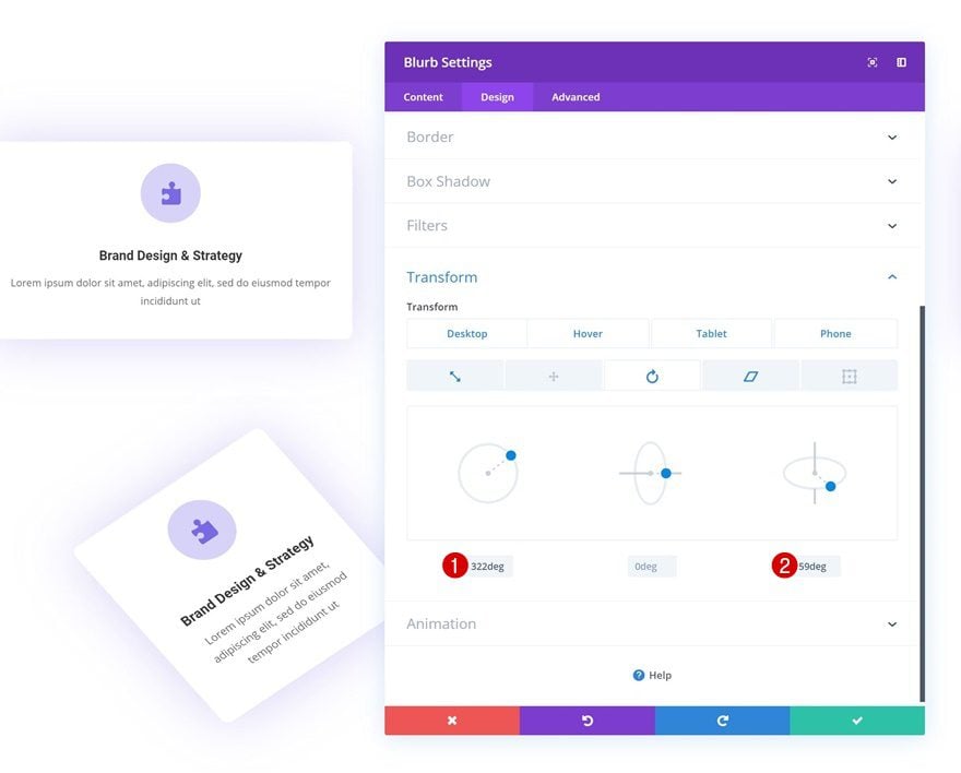
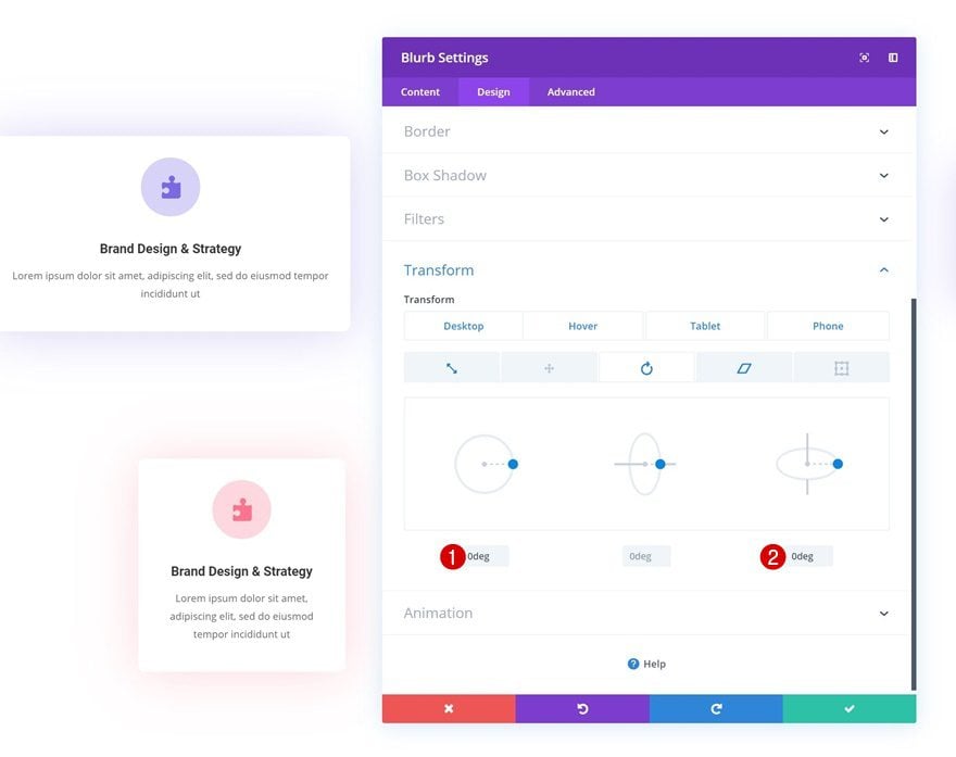
Hover Transform Rotate
Allow the module to fall in to place on hover by replacing the values you’ve added with ‘0deg’.
- Left: 0deg
- Right: 0deg
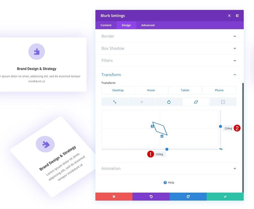
Default Transform Skew
Modify the transform skew values as well.
- Bottom: 22deg (Desktop), 0deg (Tablet & Phone)
- Right: 22deg (Desktop), 0deg (Tablet & Phone)
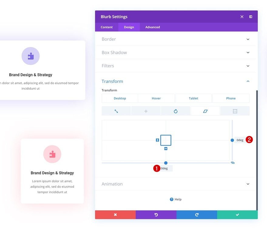
Hover Transform Skew
Bring back the default values on hover.
- Bottom: 0deg
- Right: 0deg
Transitions
Last but not least, increase the transition duration in the transitions settings.
- Transition Duration: 500ms
Clone Blurb Module in Column 1 Four Times & Place Duplicates in Remaining Columns
Once you’ve completed the transition settings, you can go ahead and clone the Blurb Module four times. Place the duplicates in the remaining columns and you’re done!
Final Thoughts
In this tutorial, we’ve shown you how to creatively use Divi’s transform and hover options together. More specifically, we’ve recreated four different examples that show you how to make Blurb Modules more interactive while maintaining the desired outcome on smaller screen sizes as well. If you have any questions or suggestions, make sure you leave a comment in the comment section below!
The post Creative Interactive Blurb Modules Using Divi’s Transform & Hover Options appeared first on Elegant Themes Blog.