
It’s time again for our monthly Divi Showcase where we take a look at 10 amazing Divi websites made by our community members. Each month we showcase the best Divi websites that were submitted from our community and today we want to share with you the top ten websites for the month of August. Throughout the post, I’ll point out some of my favorite design features that draw me to each of the websites.
I hope you like them!
Divi Design Showcase: New Submissions from August 2018
1. Salyn
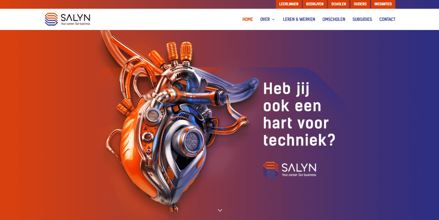
This site was submitted by Barry. It uses a red to blue gradient in backgrounds throughout the site that matches the logo and highlights. The hero area includes a cool graphic with red and blue reflections of those gradients. Alternating sections display an image in one side and a CTA with graphics that match the logo in the other. I also like the 3-column information section that shows links to pages using graphics in the outer columns and bullets in the center.
2. Pymagic
This site was submitted by Josh Hall. The header includes a full-screen image slider with a blue to red gradient for each image. Rounded section styling separates the slider from the next section. Another section includes blue blurbs that overlap a vertical white and yellow gradient. The blurbs turn to a red/blue diagonal gradient on hover. A continuous slider displays images from shows over a red background with section styling. This site makes excellent use of section separator styling, gradients, fonts, and bright primary colors.
3. Twist Travel Magazine
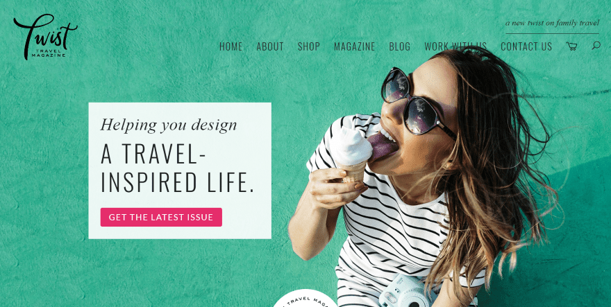
This site was submitted by Kelsey. The header displays a full-screen image with the subject on one side and a CTA on the other. The menu includes a tagline above the links. A graphic overlaps the next section, which includes large fonts and a button to opt-in to the newsletter. A slider shows the most recent issues with an image of the cover, title, issue-number, bullets of the content, and a button to order. A simpler version of this shows a digital version further on down. The blog section places the blog posts over a full-width map of the world to help describe the genre of the website. I love the colors and fonts in this website.
4. The Ad Agency
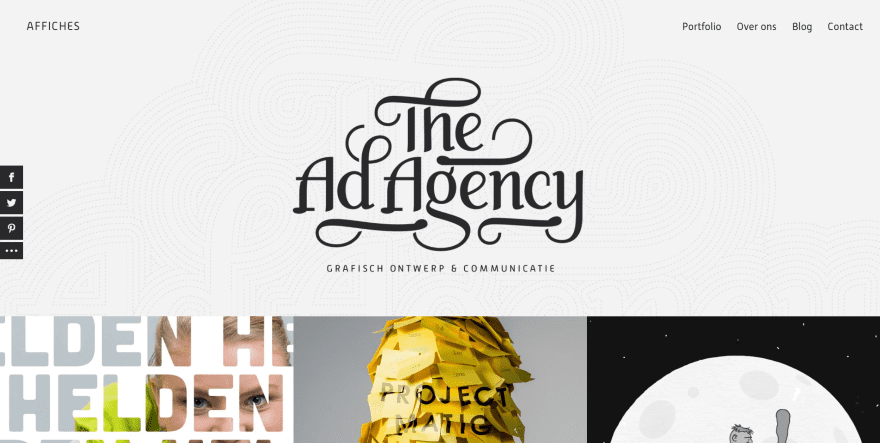
This site was submitted by Maarten van der Kroft. It uses an extra-large header with an interesting background pattern. The logo is drawn onto the screen as you watch. The text in the upper left corner changes to show the various services. The next section displays projects with 3 columns and 3 rows with no space between them. Most show images while one is animated. Hovering reveals the name a category. I love the CTA that shows birds on a wire with clouds in the background in parallax. The site makes excellent use of images.
5. Wasabi Photography
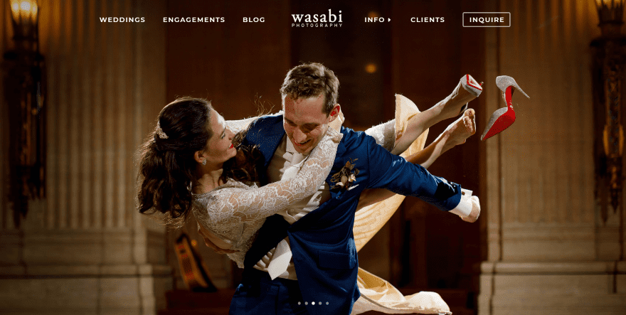
This site was submitted by Travis Haughton. It displays a full-screen image slider with photos of wedding photography. An information section shows the photographer’s approach and includes a CTA. The portfolio section shows two large images with overlays that link to the types of photography offered. The blog section displays posts as images with the title appearing on hover. Green highlights the text throughout the site and in the menu which appears when you scroll upward. Blog posts are used for photo-shoots of specific events. The light backgrounds look elegant.
6. Mira Care
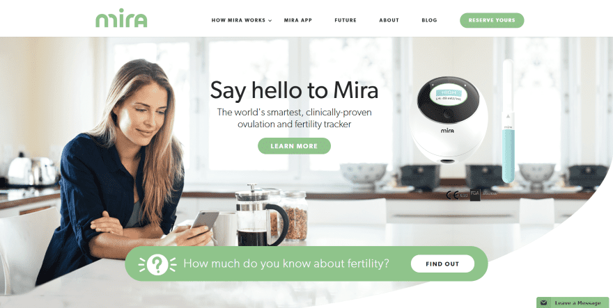
This site was submitted by Leslie Tagorda. The product, description, and call to action is displayed over a full-screen background image with rounded section styling. Media icons are displayed in a slider. The product description and benefits are shown in a 3-column section using blurbs and images. My favorite section is the countdown timer, which includes rounded section styling for the top and bottom, creating an interesting design. Several sections use a striped color pattern. An about section shows images with solid colored shadows. I love the CTA near the footer which uses images that overlap the CTA and the footer’s menu.
7. Psychologiczny
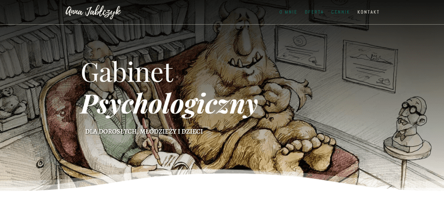
This site was submitted by Alex Hawro. It displays a full-screen background image with title and description in an overlay. The wavy section styling is animated, creating a wave that moves across the screen from right to left. The next section includes a column of information and a column of blurbs that use graphics that match the site’s branding. A section about the psychologist displays a circular image with text and a blinking cursor. This section includes wavy section animation for the top and bottom, and they’re moving in different directions. Numbered accordions show the process and a full-screen image with overlapping list describes what to expect. It makes great use of color and images.
8. WorldTeach
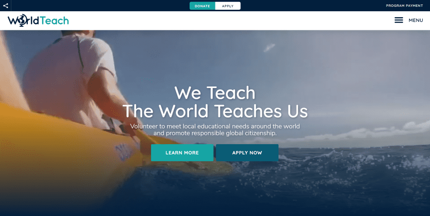
This site was submitted by Jon Langberg. It displays a full-screen background video in true parallax with a tagline, description, and CTA’s in the overlay. The top menu includes donation, application, and social sharing buttons. The menu is elegant and includes a large search box. Information is provided throughout the site using blurbs and large graphics to create icons with shadow effects. An image overlaps two sections and another section includes two images that are overlapped with a centered CTA. Those images link to pages and complete the CTA. A styled testimonial overlaps two sections and includes box shadow to stand apart. I especially like the layout, images, color, and menu in this site.
9. Aperi Toon
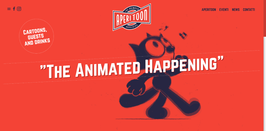
This site was submitted by Michele Tenaglia. It displays a full-screen background animation with an angled tagline in the overlay. The rest of the page includes the same reddish-orange background. Blurbs show graphics that match the time-frame for the old-style animation. Their titles are angled, matching the tagline in the header, and each blurb is slightly higher than the previous blurb. These angled titles are used throughout the site. A full-screen slider displays testimonials within speech balloons and an image of the speaker with the same reddish-orange overlay over the image. The full-screen menu retains the old-style art design and colors. I love the artwork in this site.
10. Crew Training
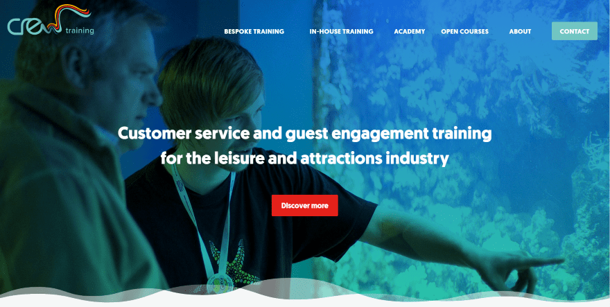
This site was submitted by Chris Peak. The site displays a full-screen image with description and CTA. The section includes a styled separator. The next section includes an interested background pattern and provides information and shows customer icons. A full-width video section includes separator styling for both the top and bottom of the section. My favorite is the section with case studies, which includes a multi-column layout with images to the case studies and no space between them. The images use different styles with includes no overlays, solid colored overlays, and gradient overlays. They also include titles and links. A social section displays feeds that look like blog posts.
In Conclusion
That’s our 10 best community Divi website submissions for the month of August. These sites look amazing and as always we want to thank everyone for your submissions!
If you’d like your own design considered please feel free to email our editor at nathan at elegant themes dot com. Be sure to make the subject of the email “DIVI SITE SUBMISSION”.
We’d also like to hear from you in the comments! Tell us what you like about these websites and if there is anything they’ve done you want us to teach on the blog.
Featured image via VitaminCo / shutterstock.com
The post Divi Design Showcase: New Submissions from August 2018 appeared first on Elegant Themes Blog.