
It’s that time again for our monthly Divi Showcase where we take a look at 10 awesome Divi websites made by our community members. Each month we showcase the best Divi websites that were submitted from our community and today we want to share with you the top ten websites for the month of March. Throughout the post I’ll point out some of my favorite design features from each of the websites.
I hope you like them!
Divi Design Showcase: New Submissions from March 2018
1. Ends+Stems
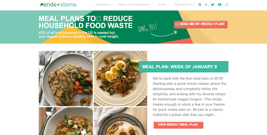
This site was submitted by Laura Versteeg. The header displays an interesting call to action and button design with an outline that’s offset from the button and multiple background colors behind the text. The week’s meal plan displays four images with overlapping title. The weekly plans section uses the same design as the header combined with this week’s plan and displays three weeks. The navigation menu includes icons. I love the colors that match throughout the site and the button design.
2. Plan MC 2
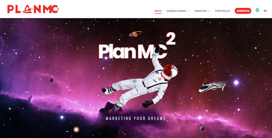
This site was submitted by Alex López. It includes an animated header with elements that react to your mouse. Information is provided within cards with background gradients, overlapping images, shadows, and hover animation. Each of the cards are placed over the white background and develops lots of whitespace so the cards stand out. Blurbs and the portfolio also include hover animation and stound out nicely. The space theme is carried throughout the site with parallax backgrounds and icons. The site makes great use of color, animation, and card design.
3. fjellvann
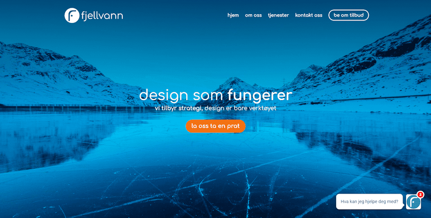
This site was submitted by Daniel Granlund. The full-screen header image is used within the navigation menu on scroll. Blurbs use flat design artwork (the same kind of artwork that’s seen in most of the ET blog featured images) that I find eye-catching. These are some of my favorite blurb designs. The Services page uses larger versions of the drawings and look just as interesting. Several sections use gradients over background photos to create CTA’s. The large testimonials work great with the site’s design.
4. London to Lima
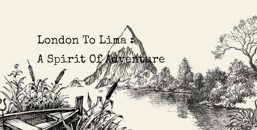
This site was submitted by Stanislav Stempniewicz. It uses a line-at full-screen header with text that types on the screen as you watch. Part of the background artwork colorizes on scroll. Full-with titles reveal the next three backgrounds which also colorize on scroll. Some of the sections display items to the far edge of the screen in parallax. Most of the pages use a hand-drawn map as the background in parallax with foreground elements that use blocks of color from the site with reduced opacity to allow the background to show through. I love the artwork and fonts in this website.
5. Power of Sweden
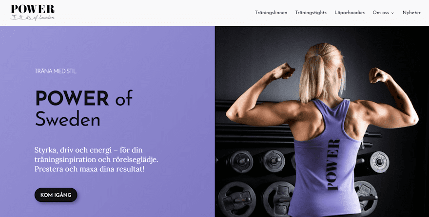
This site was submitted by Victor Duse. It displays a split-screen with title, text, and CTA in one side over a solid background with an image in the other side in parallax. Product categories are displayed with images as links. Each section displays a title with divider that matches the color-branding. A full-width section shows an image of the founder with text. This section uses a nice shadow effect to help it stand out. An embedded video overlaps two sections. The contact section uses an image that wraps around the contact form on one side. The site makes excellent use of color and fonts.
6. Restaurant Woods
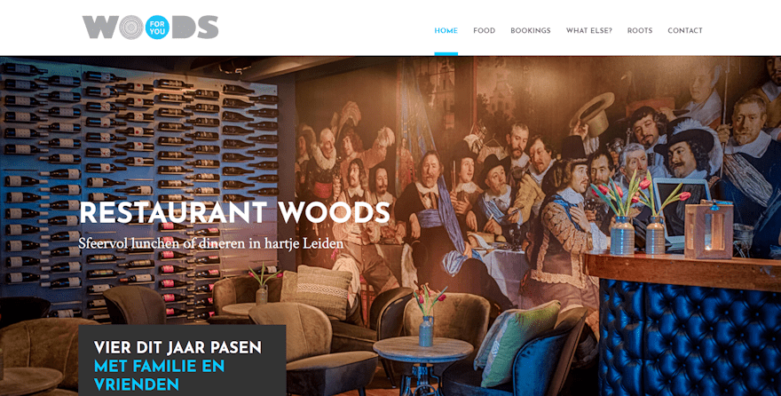
This site was submitted by Camiel Bos. It displays a full-screen image with title and tagline, and an overlapping call to action to a special event. It includes a full-width gallery, a full-screen slider with CTA’s, contact info with image in parallax, and a full-screen background image with testimonial in an overlay in parallax. The site uses blue within the fonts and backgrounds. Several backgrounds, including the food menu and about info, use white with a blue circle to help draw attention. The site makes great use of fonts and color.
7. My Watermark
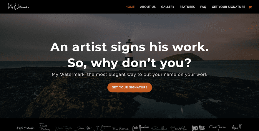
This site was submitted by Eike of My Watermark. The site uses an elegant background image with tagline, information, and CTA in an overlay. Following this is a section with examples of work. A full-width slider displays examples of work over background images and use hover animation. A three-column product features list shows an example in the center with bullets on both sides. The gallery page is filled with excellent examples and provides use-cases. The features page shows video in numbered lists. I love the colors and fonts in this site.
8. Every Nation NYC
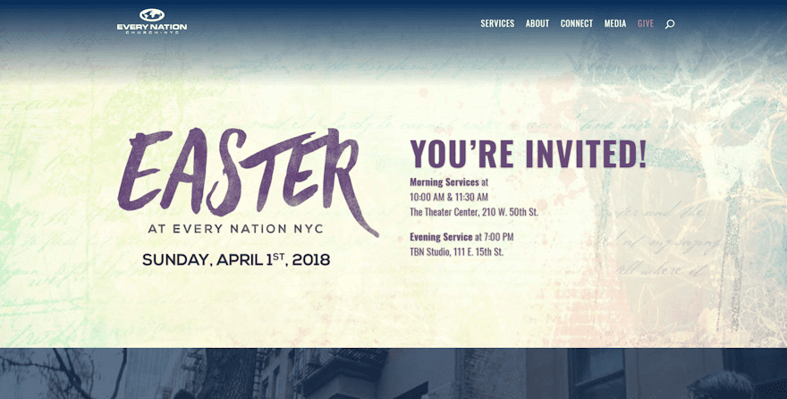
This site was submitted by Tammy Iroku. The site displays a full-width call to action over a styled background image. Scrolling reveals a tagline with CTA over a background with overlay in parallax that uses much larger than normal fonts that draw attention perfectly. Categories are displayed as images with hover animation. A featured message is embedded as audio. The media page adds more messages with audio and includes blog posts. The services page shows the various locations within cards. I love the photography and fonts on this site.
9. Somos Olga
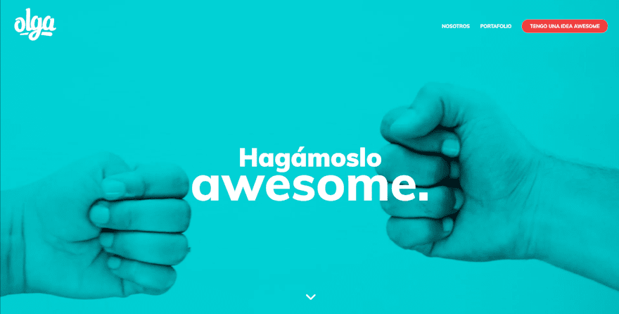
This site was submitted by Pietro Hadzich Girola. A full-screen video plays behind a blue overlay with title. Scrolling displays a full-screen section with image on one side in true parallax and information in the other side with large, colorful, fonts. Projects are displayed in full-width with overlays. Categories are shown as blocks that change color on hover. A portion of the video plays behind the contact info with the same blue overlay. The project pages use lots of color and photos. This site makes awesome use of color, fonts, and photography.
10. Stuart Johnson
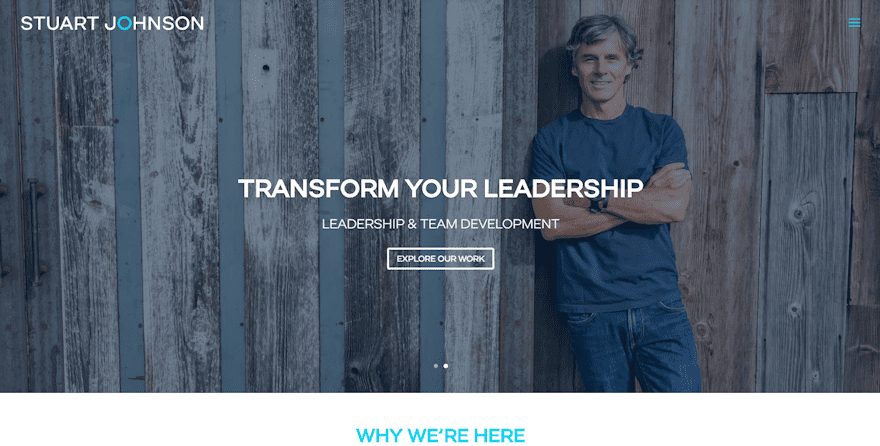
This site was submitted by Seana Peele. It uses a simple homepage that has a slider with image and CTA, a text section with title and information, a testimonial in parallax over a background image, and images as category links. The What We Do page includes some interesting design features. The Our Approach section includes a unique graphic with description, and the Practice Areas display within toggles. The contact page is simple but effective, providing a short amount of text in full-screen. The site makes great use of color and photography.
In Conclusion
Well, that’s our 10 best community Divi website submissions for the month of March. These sites look amazing and as always we want to thank everyone for your submissions!
If you’d like your own design considered please feel free to email our editor at nathan at elegant themes dot com. Be sure to make the subject of the email “DIVI SITE SUBMISSION”.
We’d also like to hear from you in the comments! Tell us what you like about these websites and if there is anything they’ve done you want us to teach on the blog.
Featured image via Peeradach R / shutterstock.com
The post Divi Design Showcase: New Submissions from March 2018 appeared first on Elegant Themes Blog.