
It’s time again for our monthly Divi Showcase where we take a look at 10 awesome Divi websites made by our community members. Each month we showcase the best Divi websites that were submitted from our community and today we want to share with you the top ten websites for the month of March. Throughout the post, I’ll point out some of my favorite design features that draw me to each of the websites.
I hope you like them!
Divi Design Showcase: New Submissions from March 2019
1. Walk on Kunanyi
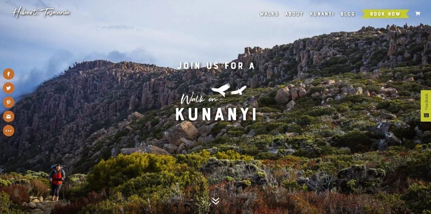
This site was submitted by Sarah Crawford. It shows styled text and graphics with a tagline in an overlay over a full-screen background of the location. The styled text and graphics appear throughout the site, including in a link that appears in the bottom left corner on scroll. Photos of the location are shown in two columns with titles, descriptions, and buttons to see more information. The buttons are styled to match the CTA in the menu. It also includes an embedded calendar to show upcoming events. More information about the location is shown in two-column alternating sections with images, text, and buttons.
2. Lemonade
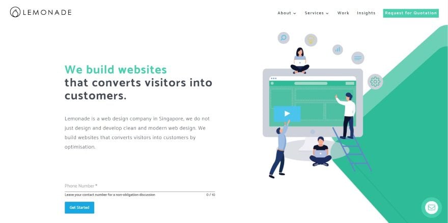
This site was submitted by Teck Seng Chan. This site uses material design graphics for the hero section and CTA’s in branded colors of blue, green, and orange. The text, buttons, and CTA’s match the branded colors throughout the site. I especially like the blurbs with the graphics. They include shadow effects and a styled bottom border. Another section shows a website design with a mobile design over it in true parallax. The site keeps the layout simple and clean while making great use of color and white space.
3. Law Offices of GillespieShields
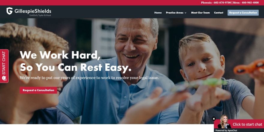
This site was submitted by Robby Doyle. The site uses bold reds, large gray icons, and lots of white space to create a dramatic design that pops. The CTA’s are easy to spot. I like the section under the hero image that shows four columns with a divider with a title. Hovering over one reveals the links for that topic. Testimonials are shown in a slider with a photo within a shield cutout design. It displays the main point in a large gray text above the full quote. I also like the use of blue-gray in the contact form, certification icons, and footer. The certification icons display in color on hover.
4. Forside C2IT
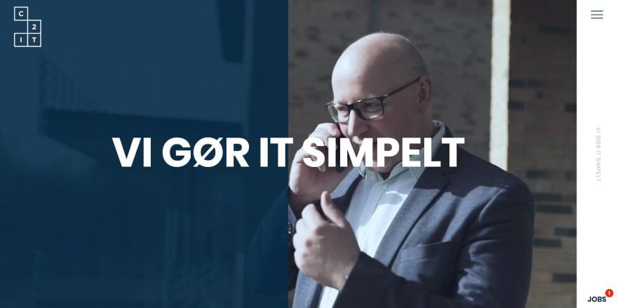
This site was submitted by Janus Lock. The site displays a full-screen video with a dark blue overlay on one side and a large tagline in the center. The dark blue is used with gray for the branding. A slim vertical menu remains on the right side. It also includes the tagline, but in vertical text. It’s animated on hover and expands to the full screen when clicked to reveal links and a prominent search feature over a dark blue background. Services are shown with animated graphics. The individual blocks create a box. Each one will zoom on hover and links to the sample projects. The events section creates a unique calendar design with links.
5. iShop Cloverdale
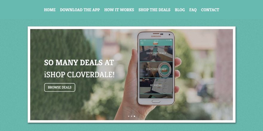
This site was submitted by Kristy Hill. A slider displays the product, CTA’s, and social follow icons in the center of the hero section with a bold border and a box shadow. Green, orange, and yellow are used for the branded colors throughout the design. Featured deals are shown as products within a shop section with box shadows over a dark orange background. I love the section on how it works. It shows a large hand-drawn map that walks you through the process. The Shop the Deals page shows deals as filterable projects. The Download the App page is interesting. It shows the product on a mobile phone. As you scroll, the foreground scrolls over the screen in parallax to show the menu.
6. FLL Aviation
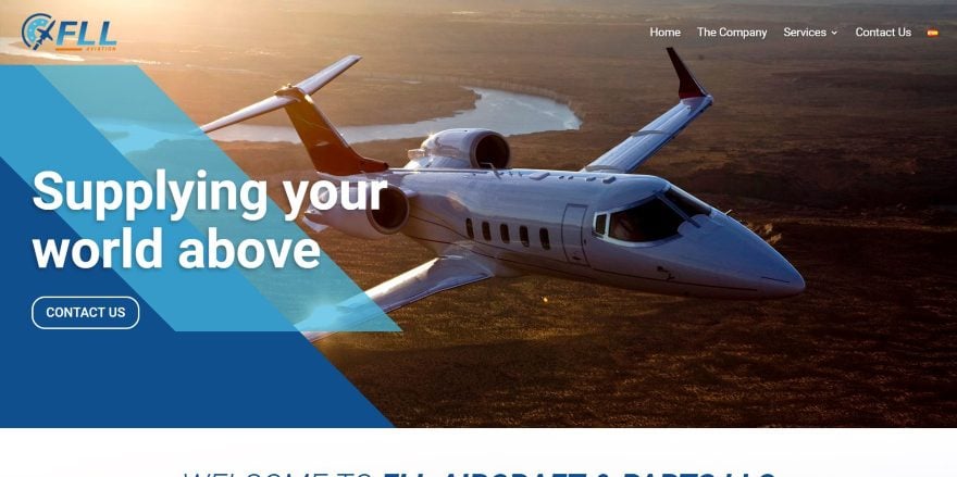
This site was submitted by Juan Pablo Parody. This one displays a full-width background image with some interesting blocks of color patterns in the foreground to create a CTA. The colors are the branded blue hues that are used throughout the website. Scrolling shows alternating sections of images and text. The text is placed over backgrounds of various colors and blend perfectly with the site’s design. I also like the contact section in the footer. It shows a full-width image with the subject on the left and a block of color on the right that contains all of the contact information and social follow links. The site makes great use of large text.
7. Wild Autumn
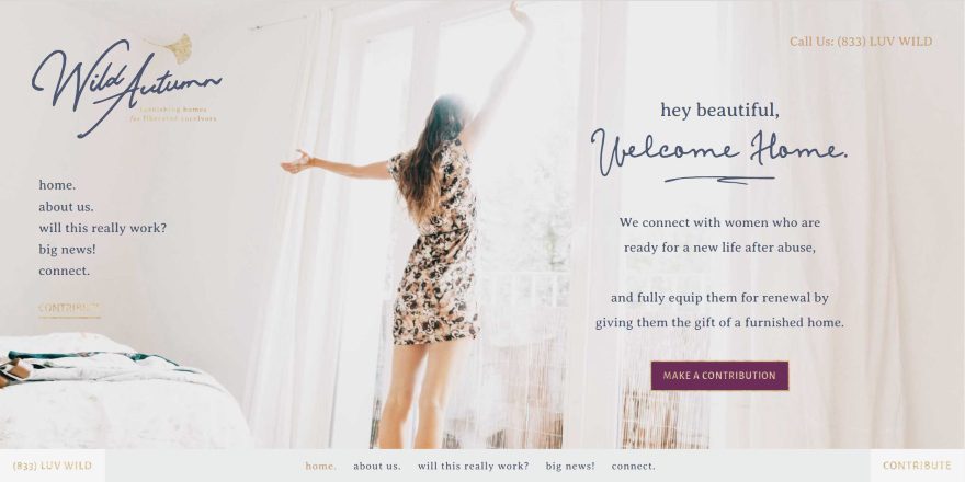
This site was submitted by Kelsey Specter. This site has a lot going on in the landing screen, but it does it in a clean way that works. A full-screen background image places the subject in the center. On both sides of the screen are different types of information provided as text. On the left is the navigation menu. On the right is a CTA. At the bottom is the navigation menu. This menu sticks to the top as you scroll. The layout uses a lot of white space with images and overlapping boxes (of solid color or colored borders) with text. Several of them have graphics that overlap. A large quote adds an extra element of white space. I love the hand-written fonts used in this site and the site makes great use of photography.
8. Insight Design
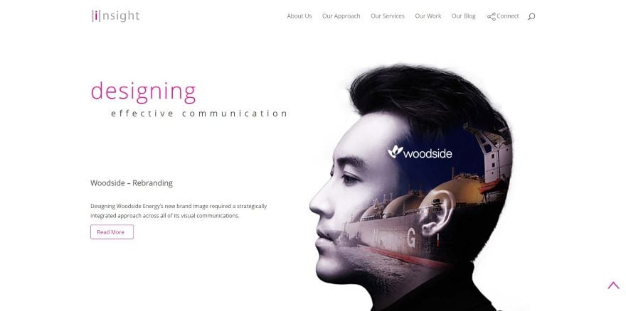
This site was submitted by Steve Doig. It uses a thin style of text with bold colors and lots of white space in the layout to create a clean design. The hero section shows an image to one side with a tagline and CTA on the other. Just under this is a list of links to create a styled menu to the types of services offered. Each link is separated by a verticle line to match the site’s branding. CTA’s for the services show images for the various types of services with a button to learn more. These sections alternate down the page. This site has an interesting footer that has a light gray background with links in a large text. The first word of the text is a styled version of the logo, each with a different color. I like the social icon in the menu.
9. Vexels
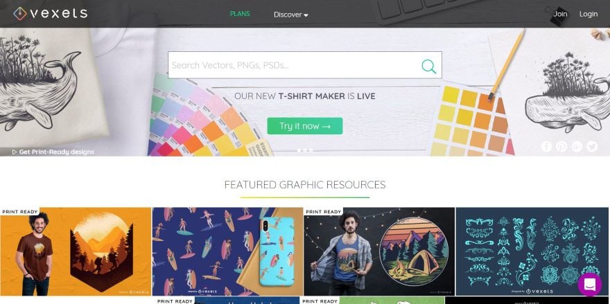
This site was submitted by Agustina Ouvina. This site displays a full-width slider. Each slide shows background images of the products in parallax, a large search box in the center, a CTA link in the bottom left, and social icons in the bottom right. A section of featured products shows the products in four columns. Each product image shows the title and social sharing links on hover. A section showing the plans displays blurbs over the products in a blue background in parallax. I like the section on featured categories. They’re displayed as vector icons in a grid over a purple background with hover effects. A large search box appears in the menu as you scroll.
10. Lions Avenue
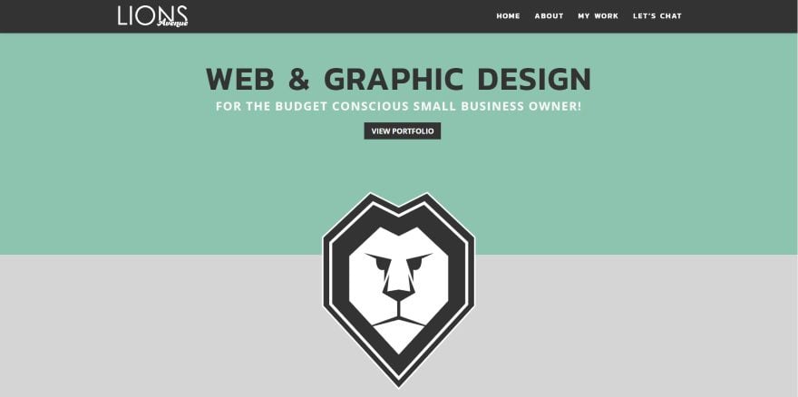
This site was submitted by Ricky Lionetti. This is a one-page design that uses solid color backgrounds throughout the site. The green is also used for text throughout the site. The hero section shows a tagline in a styled text with a link to the portfolio. A large graphic overlaps the next section. An About section shows a circled image and a CTA. Under this is an interesting section that tells more about the site owner using hashtags. Current projects are displayed in a slider followed by recent projects with images and links. Sample logos are shown as images in a grid. The contact form is displayed over a cup of coffee (mmm, coffee…) and includes selections to indicate the types of services you’re interested in. I love the colors on this site.
In Closing
That’s our 10 best community Divi website submissions for the month of March. These sites look amazing and as always we want to thank everyone for your submissions!
If you’d like your own design considered please feel free to email our editor at nathan at elegant themes dot com. Be sure to make the subject of the email “DIVI SITE SUBMISSION”.
We’d also like to hear from you in the comments! Tell us what you like about these websites and if there is anything they’ve done you want us to teach on the blog.
Featured image via ProStockStudio / shutterstock.com
The post Divi Design Showcase: New Submissions from March 2019 appeared first on Elegant Themes Blog.