
It’s that time again for our monthly Divi Showcase where we take a look at 10 amazing Divi websites made by our community members. Each month we showcase the best Divi websites that were submitted from our community and today we want to share with you the top ten websites for the month of May. Throughout the post I’ll point out some of my favorite design features that draw me to each of the websites.
I hope you like them!
Divi Design Showcase: New Submissions from May 2018
1. Ergo
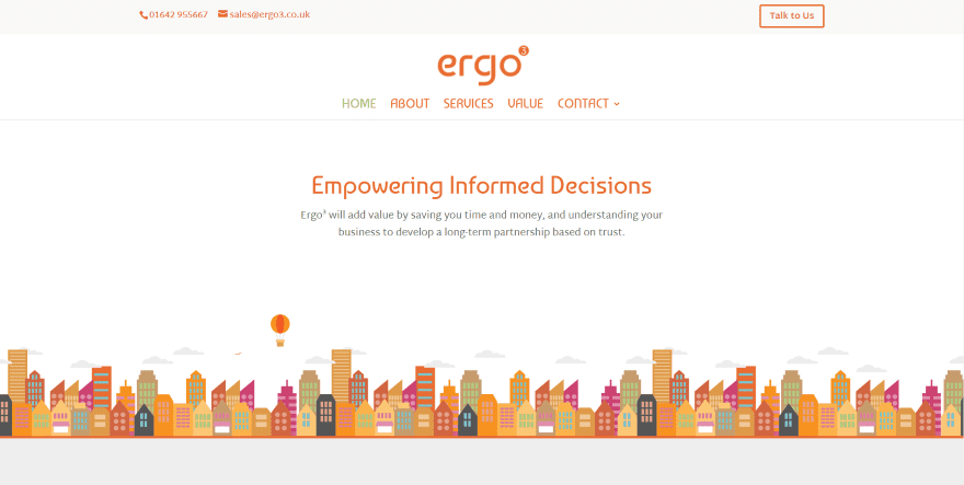
This site was submitted by Clément Gonnet. The orange color palette captures my attention immediately (I’m from TN, so I am partial to orange). The colors do work well with this site’s design. The hero section displays an interesting graphic of a skyline (which also includes a lot of orange) as the information text spins into place. They’ve made an interesting choice of fonts for the titles. Orange and white blurbs show the services followed by a full-width CTA and a client logo slider. An even larger version of the skyline leads into the footer, which includes multiple shades of orange that grow darker as you get closer to the bottom of the page.
2. Moniker Branding
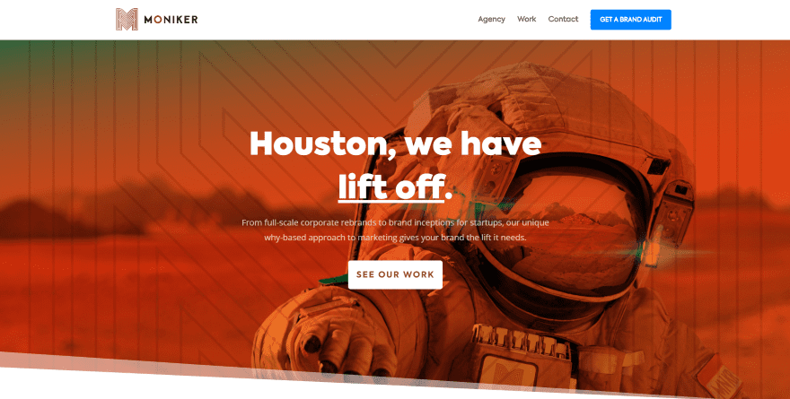
This site was submitted by Josh Allan. This one also makes excellent use of orange but this time it’s in the form of a gradient overlay with a nice pattern and section separator, within the logo, and as a background behind the contact form. Styled blurbs provide information about services and use hover effects and an interesting color top border. Shadow effects are also used for images and person modules which stand out nicely. The elegant fonts and angled sections are icing on the cake. I like watching the CTA in the menu expand and change colors on scroll.
3. Emmanuel Community Church
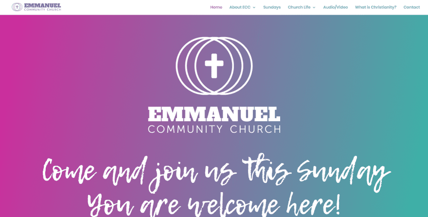
This site was submitted by Rob Rochford. It utilizes two main colors that appear within the menu, as a gradient in the hero section, as background colors for sections, backgrounds for blurbs with line-art, dates with dividers, and as text in contact information and the contact form. Even the embedded video uses the same blue within its images. The typography fits well within the site’s design. Links to pages look great with the styled images. I also like the embedded audio players, map, and angled section dividers.
4. Wolfbyte Web Design
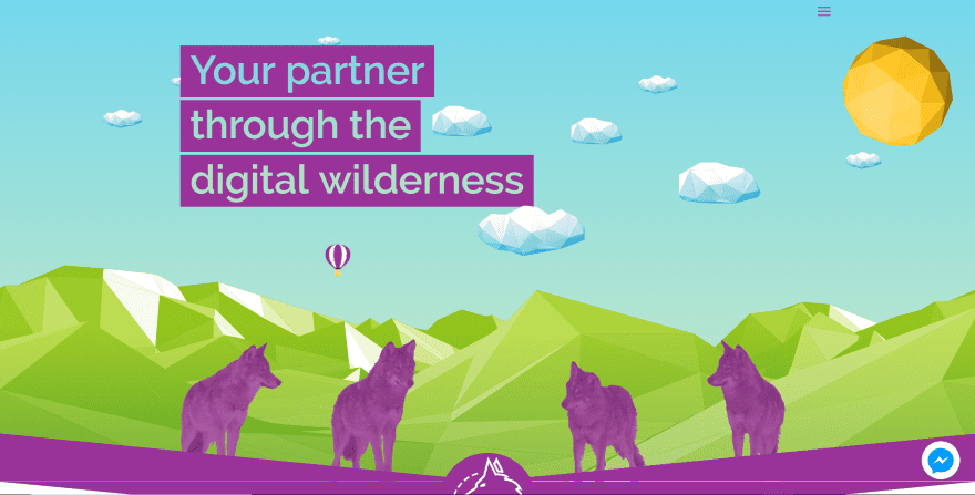
This site was submitted by Joel Whitaker. It uses some interesting links in the hero section that appear when you hover over the balloon or over the wolves. The clouds move in the opposite direction of your mouse as you move around. This site has one of the most interesting section dividers that I’ve seen. It’s a thick purple downward arrow with a large logo in the center. An even larger version of this arrow is used as sections throughout the page. I like the use of purple and green within the sections, icons, and the two-sided button.
5. Mollerup Design
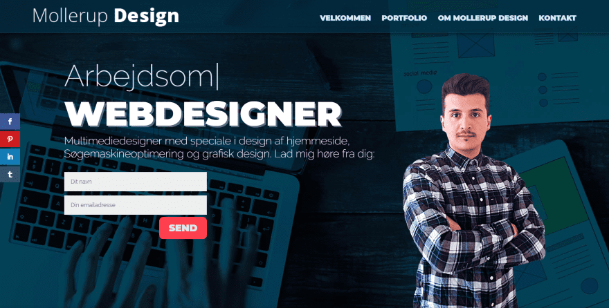
This site was submitted by Rasmus Strøbech. This site uses a one-page design that displays information using a typing effect and a contact CTA within the hero section along with an image in the foreground that looks great against the background that scrolls in true parallax. A similar section is used for the contact section at the bottom of the page. The portfolio section shows work with zoom and shadow effects. Blurbs use interesting hover effects with animation. I also like the blue behind the fonts and the border shadow effects used for the section dividers.
6. Maison Beach Chalet
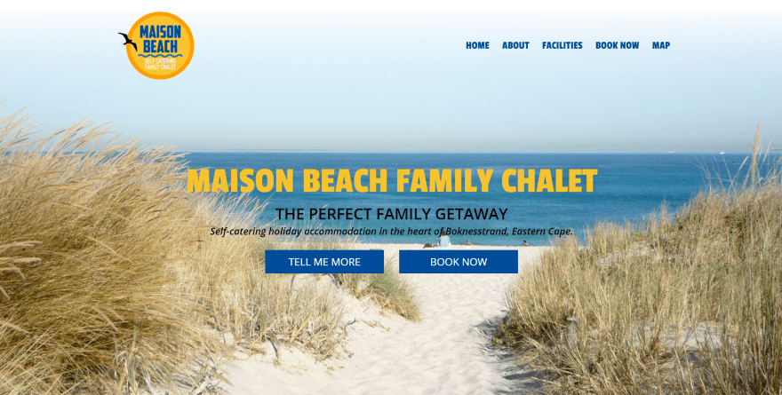
This site was submitted by Tessa MacTaggart. This is a one-page design with a built-in booking feature created with a contact form. The background image in the hero section scrolls downward as the text and the next section scroll upward to cover it. It makes great use of shadow effects for both square and round images. I especially like the use of different sizes for the round images which sets the text in different columns within the layout. The graphics of waves with a bird in silhouette is a nice touch as a section separator. The footer is made from the waves which also divide if from the section above.
7. SDK Atelier
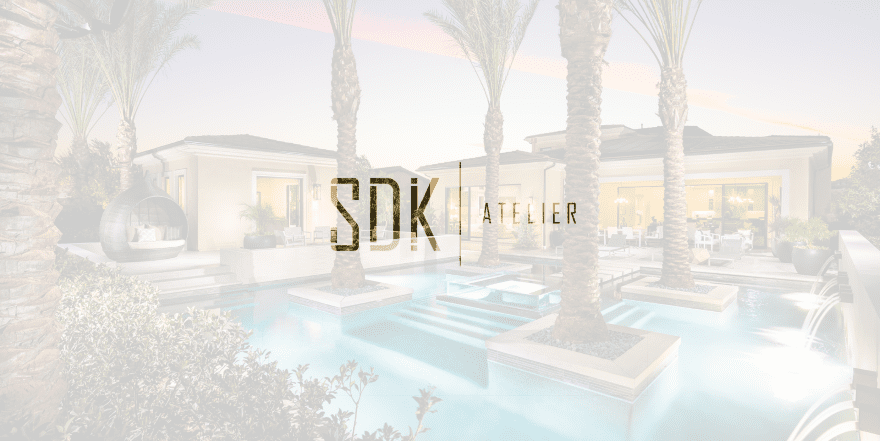
This site was submitted by Nathan Igo. This site has a simple but unique home page. The background is a full-screen image slider while the foreground is a white transparent overlay with a cutout for the logo that allows the background to show through. Clicking the screen removes the overlay, placing the logo in the upper left corner and a hamburger menu in the right corner. The menu opens in full screen and shows another image behind an overlay. This site also has one of the more unique project pages. The projects are displayed with large images that scrolls one project at a time.
8. Bachelor Recipe
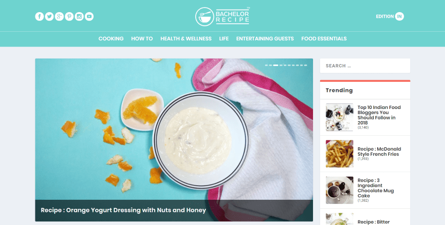
This site was submitted by Jaykishan Prithiani. This is a recipe magazine made with Extra. The header places social buttons on the left, the logo in the center, and a button to choose your country on the right. Links are placed below that. The homepage displays posts in a multi-column layout and a sidebar to take advantage of Extra’s widgets. The slider displays the latest posts followed by two columns for categories, a single column for the shop, three columns for more categories, and a single column with tabbed posts. The pages for each category display posts without excerpts, creating a clean design.
9. Provigis
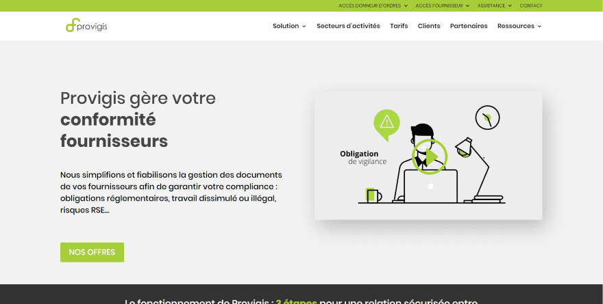
This site was submitted by Aurélien Dumont. The site makes great use of green highlights with black, dark gray, and off-white backgrounds. The tagline uses a combination of regular and bold text to draw attention. I like the box shadow for the embedded video in the hero section. The green highlights continue throughout the design including the text for blurbs, icons, dividers, to highlight text within CTA’s, buttons, and even the background color for the secondary menu. The Sectors page is interesting with its alternating layout in two columns. It displays an image in one column with a divider, text, and company logos in the other. The backgrounds alternate various shades of off-white to help them stand apart.
10. Primal Fitness
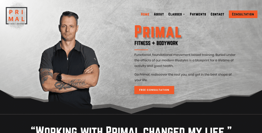
This site was submitted by Justin Bailey. This site makes great use of color. The hero section displays a large image and CTA that stands out nicely. I love the shadow behind the title text. The CTA also stands out in the menu. The first and section sections utilize section separators to create an interesting CTA. The images throughout the layout are placed over blocks of color. When multiple images are used within the same block they’re offset from each other. This site has one of my favorite designs for blurbs. They overlap a black box and include top border styling. The blurbs and the box in the background have shadow effects. Each of the pages follow a similar layout and include the dark orange highlights and section styling.
Conclusion
That’s our 10 best community Divi website submissions for the month of May. These sites look amazing and as always we want to thank everyone for your submissions!
If you’d like your own design considered please feel free to email our editor at nathan at elegant themes dot com. Be sure to make the subject of the email “DIVI SITE SUBMISSION”.
We’d also like to hear from you in the comments! Tell us what you like about these websites and if there is anything they’ve done you want us to teach on the blog.
Featured image via VitaminCo / shutterstock.com
The post Divi Design Showcase: New Submissions from May 2018 appeared first on Elegant Themes Blog.