
It’s that time again for our monthly Divi Showcase where we take a look at 10 awesome Divi websites made by our community members. Each month we showcase the best Divi websites that were submitted from our community and today we want to share with you the top ten websites for the month of May. Throughout the post, I’ll point out some of my favorite design features that draw me to each of the websites.
I hope you like them!
Divi Design Showcase: New Submissions from May 2019
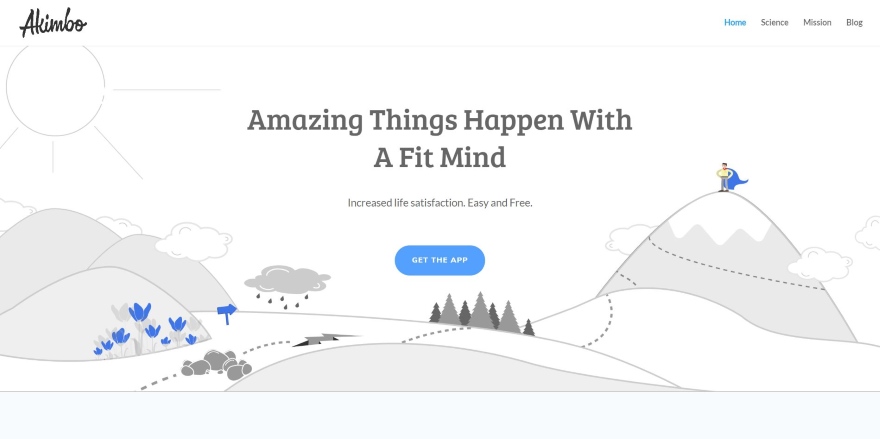
1. Akimbo
This site was submitted by Alan Cox. The site uses line-drawn art in shades of gray for the backgrounds and colorful character drawings throughout. Buttons and other graphical elements are also in color to stand out from the site’s design. This does a great job of bringing the focus on the products and calls to action. It keeps the design simple with a fullscreen hero section, product demonstration, a two-column usability section, a single-column mission statement, testimonials, and CTA that overlaps the footer. The Science page is interesting with its large titles and branded graphics while keeping the design simple.
2. Dapper Tapper Magazine
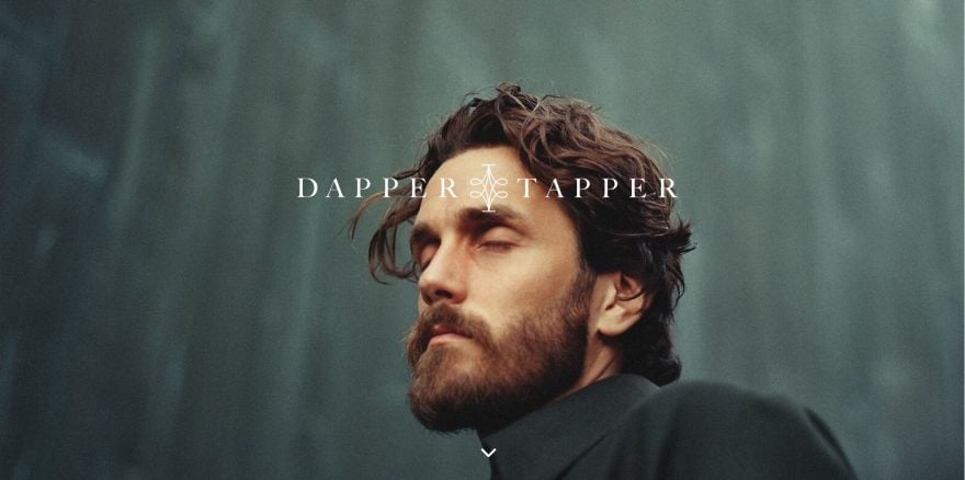
This site was submitted by Carlos Godoy. This site uses Extra to create an elegant magazine design. It displays a full-screen hero section with background image in parallax and logo in the center. Scrolling reveals the menu which remains in place when it reaches the top of the screen. Articles are placed within a multi-column layout in three columns. Other posts are displayed with a single-column slider and then a section for further reading at the bottom. The blog posts place the text to one side and images on the other. The site also features a large drop-down menu and a preloader. I wouldn’t have guessed this was Extra.
3. BaseMap
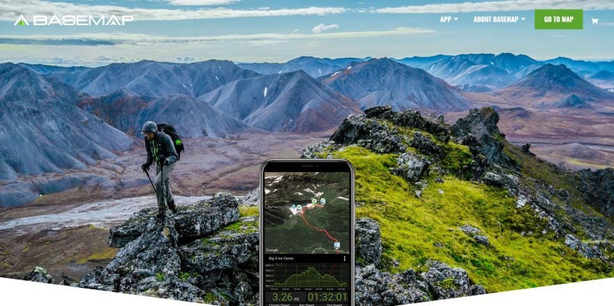
This site was submitted by Dustin Olsen. The site places a demo and CTA of the product in the center of the screen over a background image that helps the reader understand the purpose of the product at a glance. Several other sections with a similar design show the product to one side, but this time it’s two demos with screenshots, animation, or a video and they overlap the next section. The demos work perfectly to show the features of the product. I like the styled pricing tables. The blog is also interesting. It includes a slider followed by a two-column filtered blog grid. The posts include elegant overlays. The sidebar also fits the site’s design and includes an Instagram feed. The photography on this site is amazing.
4. DH Marketing Digital
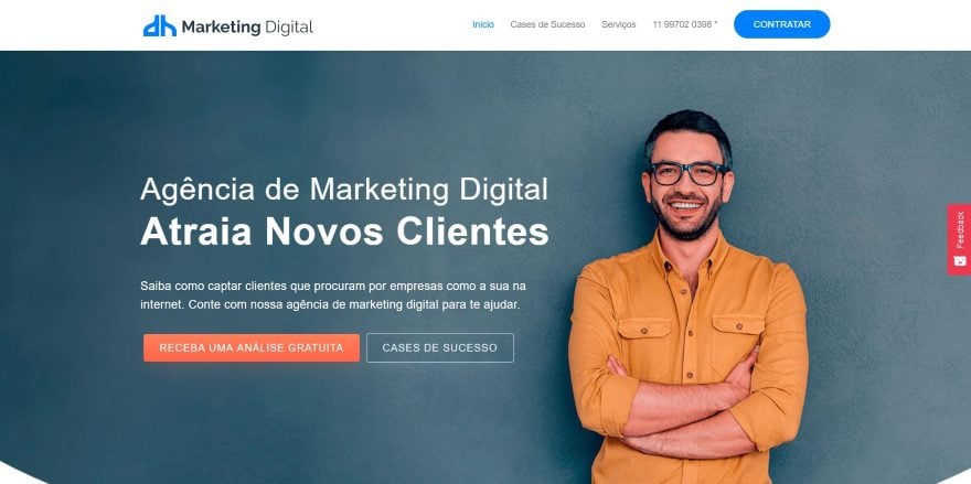
This site was submitted by Douglas Henrique Monteiro e Silva. It shows a full-screen image with the subject to one side and background on the other, giving room for the title, tagline, and CTA. Services are shown with bullets using colorful icons. Stats for the services are shown with interesting graphics of verticle toggles with icons. Testimonials are shown within cards that utilize box shadows and a star rating system. One section has a background pattern behind the graphics. A CTA overlaps two sections and stands out nicely. I like the elegant use of blurbs on the Services page. They use colorful icons and create slim cards with hover effects. The site uses lots of white space and makes elegant use of color.
5. Yooker
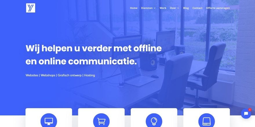
This site was submitted by Sander Goorman. It uses a blue gradient to reveal the full-screen background image and displays the tagline with navigation to services on one side. Blurbs overlap the next section and provide detailed information about each service. The blurbs are clean cards with blue icons. They rise upward on hover and fit perfectly with the site’s design. A section showing their story uses multi-colored large text on one side and regular text on the other. Examples of their work are shown within an alternating layout with links to see the work. I like the blog design. It shows the posts in a grid with an overlay, title, category, author name, and button to see the featured image in a popup. All are placed over the featured image.
6. Idiolektik
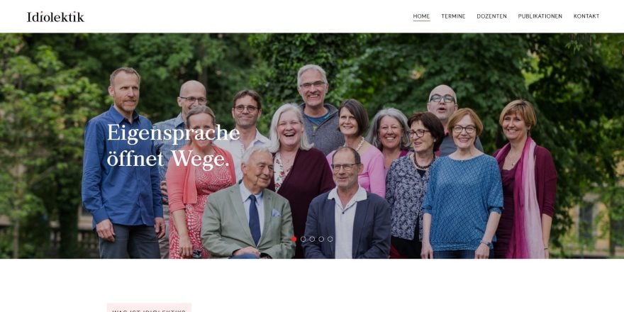
This site was submitted by Oliver Gehrmann. Multiple images with taglines are shown in a full-width slider followed by an about section with a styled block title. A learn more button opens a full-page popup. Learn more buttons are prominent throughout the design and work great for saving space while providing access to lots of information. Further information is provided using graphics that change color on hover and open a popup on click. More services are shown with graphics and information buttons within a slider. A similar slider shows images of the lecturers. The lecturer’s page shows two columns with a large photo and information about each person. I like the Events page. It uses a filter with dropdown boxes.
7. Bio-Bausewein
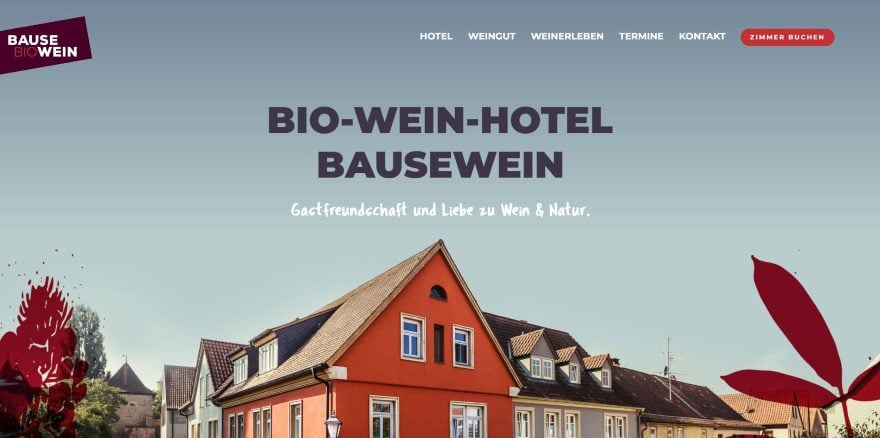
This site was submitted by Michael Koch. This one shows a full-screen image with a tagline above the subject and overlays in the shape of trees to decorate the sides. These and similar shapes appear throughout the site along the sides. The next section shows CTA’s to different pages. The CTA’s use large patterned backgrounds with overlays of different colors. Smaller CTA’s use a similar design as well as a blog card design. One uses a tilted design. I like the section that shows the owners. It shows a full-screen image of both together and below then are blocks of text that overlap the image near the person in the photo. The events page shows events similar to inline blog posts with a bar across the top to show the date. I love the photography and color on this website.
8. EcoHost
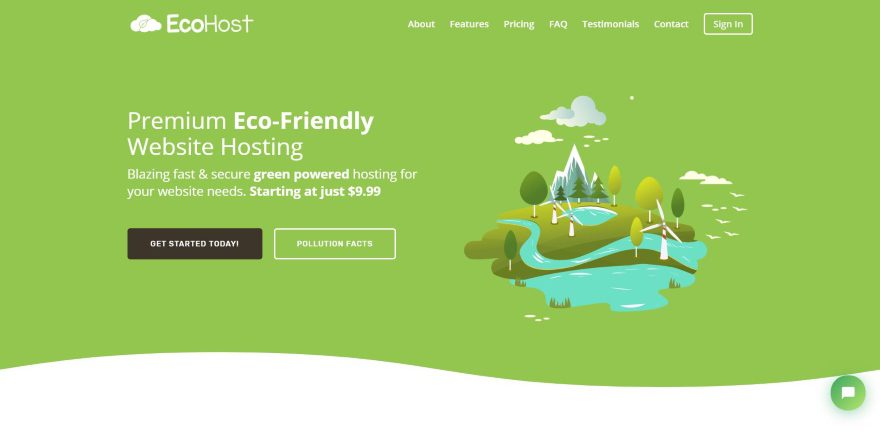
This site was submitted by Emy. This site has a one-page layout that uses a flat design with elegant shades of red, green, and blue for backgrounds and icons throughout the site. Graphics for the backgrounds and other elements help describe the company’s mission. Features are shown with blurbs to create cards with large icons and a title. Similar cards are used for testimonials and contact information. I like the pricing tables. They include a toggle switch and the prices are animated when you click the toggle. Several cards include information in a popup when you click to see the info. The site makes excellent use of graphics, background patterns, and color.
9. 717 Media
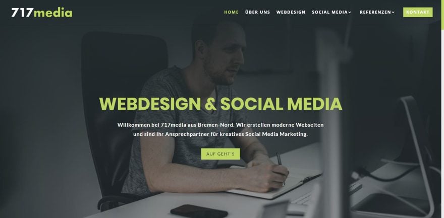
This site was submitted by Eike Müller. It uses light green as the branded color throughout the site within text, buttons, animations, and backgrounds. Even the scroll bar and back-to-top button are styled green. Large cards show services with images, text, and buttons. The cards show a shadow on hover. It includes an interesting CTA that has a full-width background with a dark overlay. As you scroll to it, a green line is drawn around the text to draw attention. I like the About section. It shows information in cards using images and text. The cards overlap the next section and include an animated overlay. The site makes great use of small animations and green highlights on every page.
10. PicknRoll
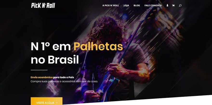
This site was submitted by Roberto Wagner. This one is an online store. The homepage shows a full-screen CTA to the store using a background image with large text in multiple colors. The shop section displays the products in three columns with an icon in the overlay that matches the site’s branded color (bold yellow). An information section shows the benefits over a background image in parallax. The testimonials and newsletter sections follow similar styling with the yellow text. The Store page follows the same design but adds a search feature in the hero section. The blog currently has one post, but the page has a cool design. The blog post overlaps the hero section and the newsletter overlaps two sections including the social follow section above the footer.
In Closing
That’s our 10 best community Divi website submissions for the month of May. These sites look amazing and as always we want to thank everyone for your submissions!
If you’d like your own design considered please feel free to email our editor at nathan at elegant themes dot com. Be sure to make the subject of the email “DIVI SITE SUBMISSION”.
We’d also like to hear from you in the comments! Tell us what you like about these websites and if there is anything they’ve done you want us to teach on the blog.
Featured Image via L-astro / shutterstock.com
The post Divi Design Showcase: New Submissions from May 2019 appeared first on Elegant Themes Blog.