
Divi’s blurb module is one of the most popular modules I’ve seen in use. It’s great for showing images or icons with a title and short text in a single module. They’re often used with button modules to expand their use. I sometimes see image, text, and button modules used in place of blurb modules if more features are needed. Another option is to use a third-party plugin called Divi Blurb Extended.
Divi Blurb Extended is a blurb module with new features that can be used in place of multiple modules. Added features include multiple icon positions, new icon shapes, a read more button, and color changes on hover.
It works with Extra and the Divi Builder plugin. I’m using Divi Blurb Extended version 1.1.0, Divi version 3.3.1, and WordPress version 4.9.6.
Installing Divi Blurb Extended
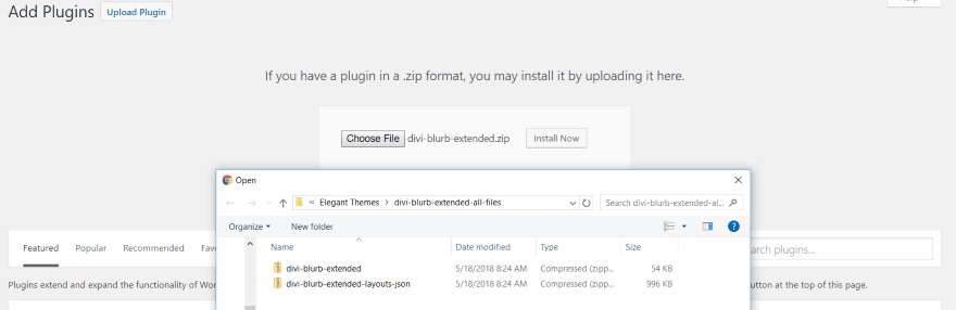
Before uploaded the plugin you must first unzip the download file. Inside the file are two more folders:
- Divi Blurb Extended (this is the plugin file)
- Divi Blurb Extended Layouts JSON (this is an optional layout file that can be uploaded into the Divi Library)
Upload and activate the plugin within the folder. No other setup is needed.
Divi Blurb Extended Module
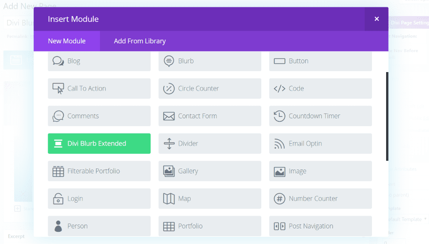
A new module called Divi Blurb Extended is added to the Divi Builder. It’s green, so it stands out.
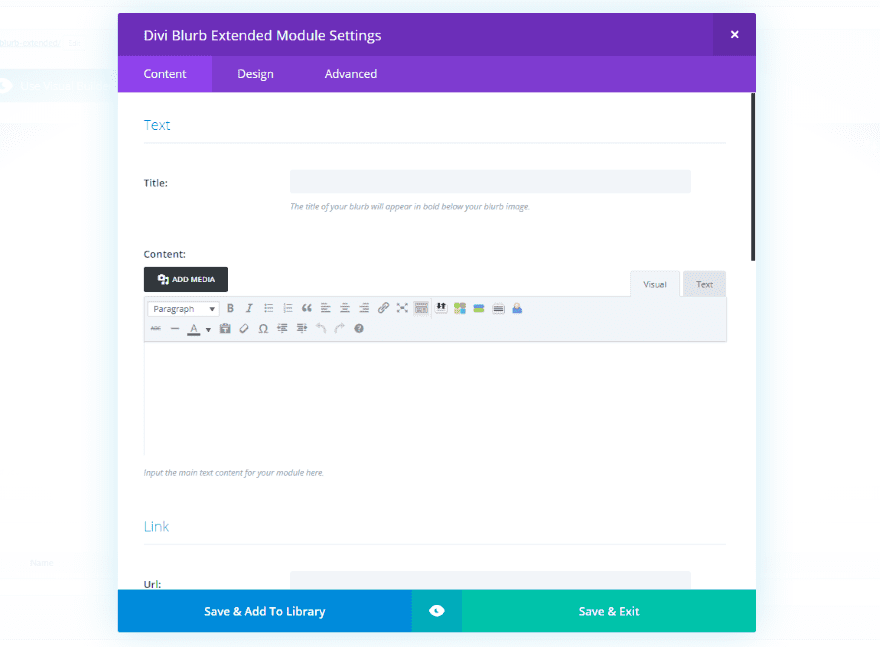
The Content tab includes the familiar blurb settings for the title and content text, URL, image and icon, and background. It adds a feature for the button, complete with text and styling options.
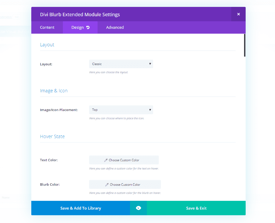
The Design tab includes settings for the layout (choose from classic, flipbox, easbox, borderbox, and image card), image and icon placement (choose from top, right, or left), hover state, text, title text, body text, sizing, border, box shadow, and animation.
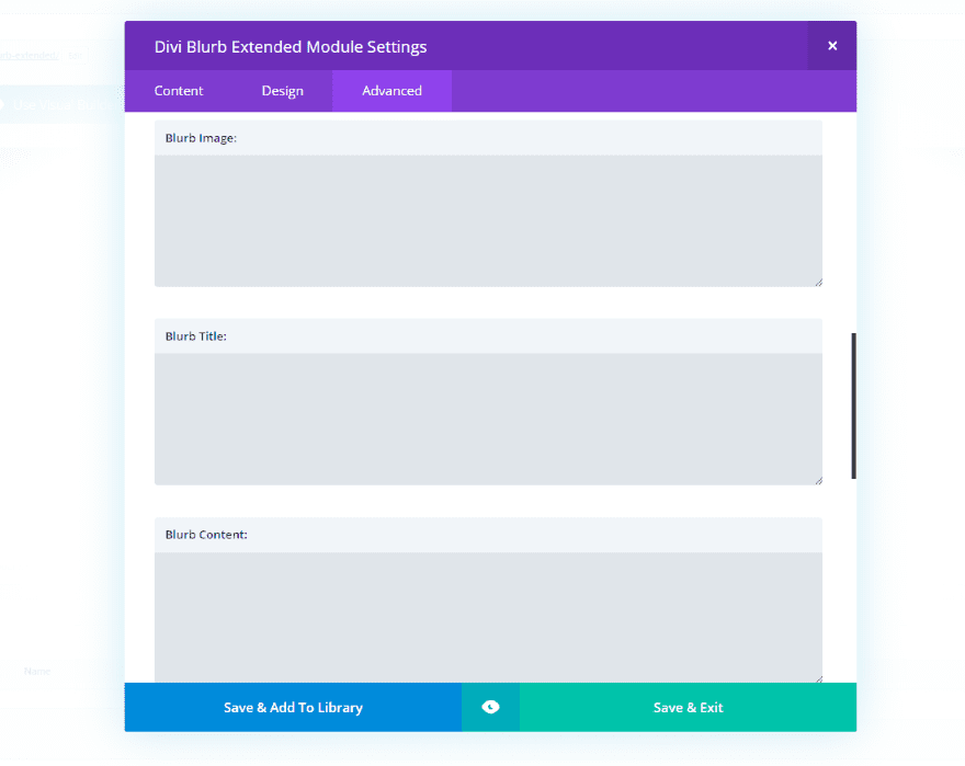
The Advanced tab includes CSS fields for all of the blurb elements. You have access to the blurb image, title, content, read more button, and read more button hover.
Divi Blurb Extended Examples
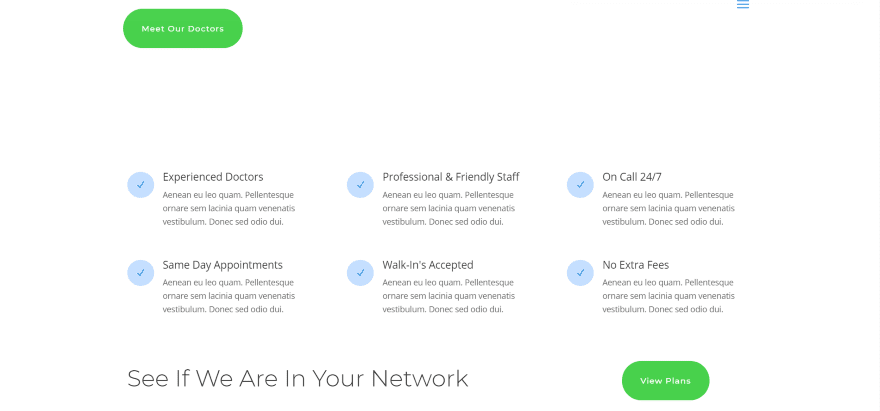
I replaced the blurbs in the Doctor’s Office layout pack with Divi Blurb Extended modules. The only changes I made with the colors and size of the icon. The default icon size was 96 pixels. I set it to 16. If I went smaller the circle remained the same size while the icon within it became smaller. It would be easy to make the blurb look close to the original. I’ll make some custom changes that are more exclusive to this module.
Note – it worked great with the Frontend Builder at first, but I had to revert to the backend builder because the module wasn’t visible after I created the first one. You can place the modules within the Frontend Builder, but you’ll have to use the backend builder to make your adjustments.
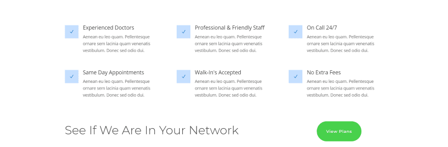
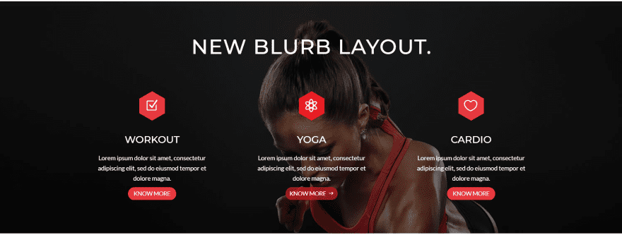
Change the shape of the icon by selecting your choice from a dropdown box. Choose from circle, square, or hexagon. Here’s the same layout with square icons.
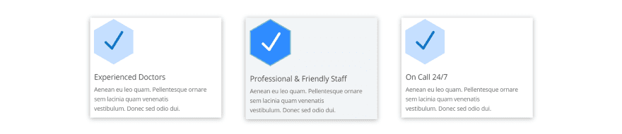
Here’s the icons with the hexagon shape. I’ve changed the size of the icon to 66 and added a hover effect to change the color of the icon and background on hover. I’ve also added a box shadow and some padding to move the text away from the border.
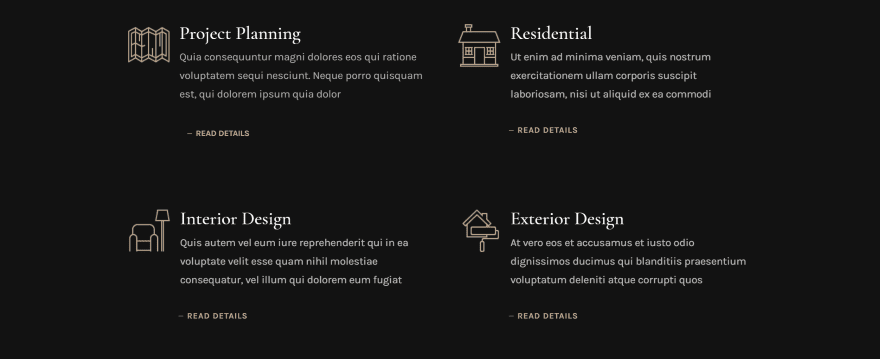
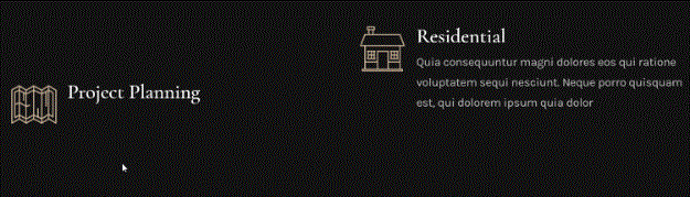
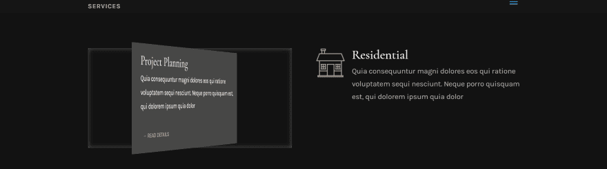
Here’s a look at the standard blurbs in the Architecture layout pack. They use a button module in order to link to more information. With Divi Blurb Extended we can remove the extra button module. One these blurbs is not like the others.
I’ve recreated one of the modules and left the originals to compare. You can tell which is mine. I’m using the same fonts and styles, image, etc. Mine only uses one module, so I didn’t have to add the button module. I did have to add padding in CSS to create the right amount of space between the text and the button. The one thing I didn’t do though was remove the margin of the button, so mine isn’t aligned with the left side of the text like the others are.
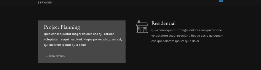
I’ve now recreated all of the blurbs with Divi Blurb Extended modules. For these I’ve chosen layout options that include animation. The left uses Flipbox and the right uses Easebox.
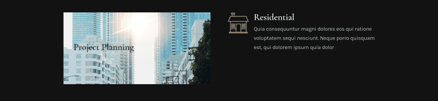
For the Flipbox you can have different colors or images for the front and back of the card if you want. For this one I’ve added an image for the front. I changed the color of the header text and added a text effect so it’s easy to read.
On hover, the card flips to reveal the color that I set as its background.
I added a border effect for the inside of the card, which can be seen as the card rotates.
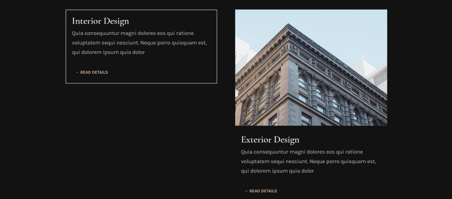
The other two layouts are not animated. The left is Borderbox and the right is Imagecard. I’ve styled the border on the left to match the button text. I removed the icon for both, but you can style the icon too. Without adding CSS for padding it positioned the images in awkward locations.
Divi Blurb Extended Layouts
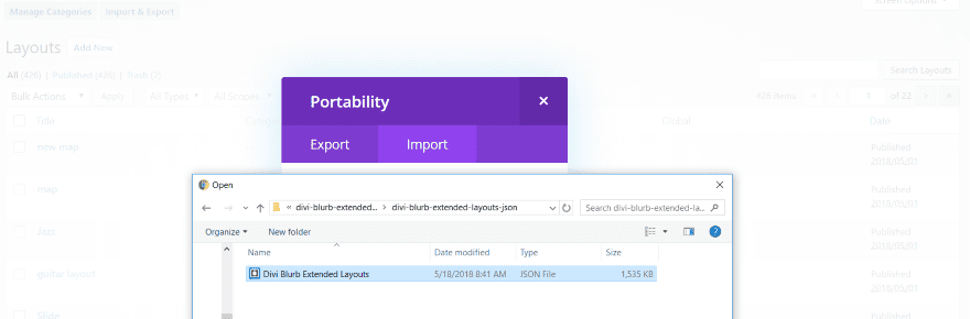
The download file includes a zipped JSON file. Unzip the file named Divi Blurb Extended Layouts JSON and import the JSON file into the Divi Library.
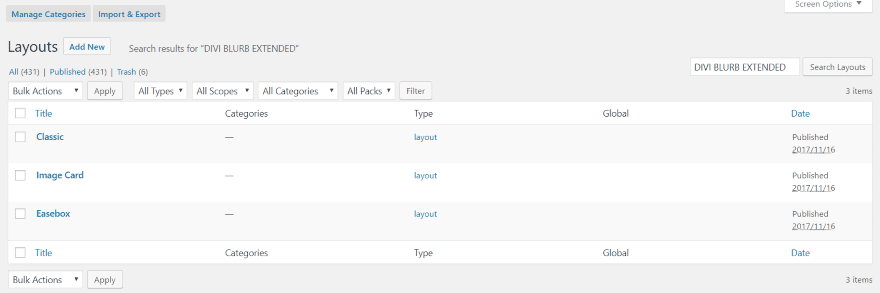
Searching for Divi Blurb Extended in the Divi Library shows three layouts: Classic, Image Card, and Easebox. These are complete pages with pre-styled modules. Some of them include a little bit of CSS for padding.
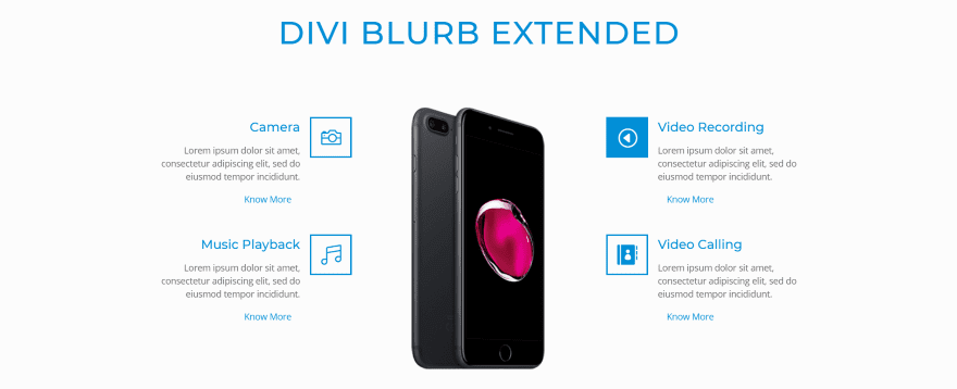
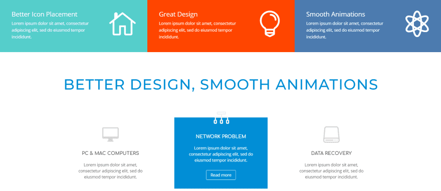
This is a screenshot of the Classic layout. It includes all of the modules on the publisher’s demo page and shows what the module can do. In this example I’m hovering over the blurb in the upper right. It uses a hover effect to change the icon background to blue and the icon to white.
This one uses a nice hover effect for the read more button. I especially like the hexagons for the icons. It displays the modules over a parallax background.
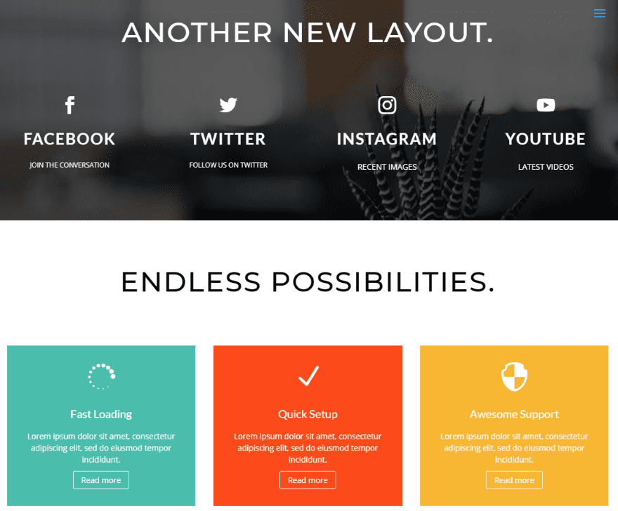
Here’s another section of the Classic layout. The set of modules on the top include a parallax background. The modules on the bottom show a good example of colored backgrounds.
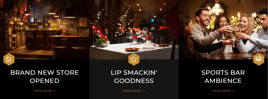
The Imagecard layout is interesting. It displays three cards with no space between them. The icons overlap the image and show all three placement options. The card resembles a blog card. This would work well for links to articles, pages, services, etc.
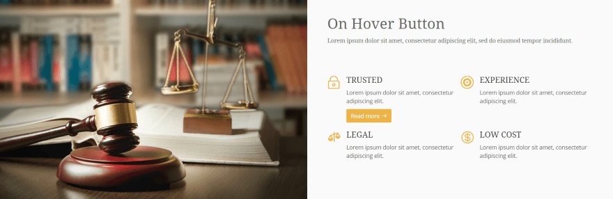
The Easebox layout includes lots of examples. The blurbs at the top use the icons as links while the blurbs at the bottom use hover animation to show the read more button and change the color of the background and text.
Here’s another section of the Easebox layout, which also uses hover animation. The read more button is revealed on hover.
Divi Blurb Extended with Extra
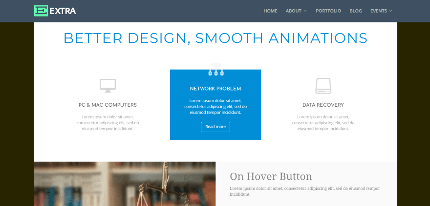
Divi Blurb Extended worked just as well with Extra. This is the Easebox layout.
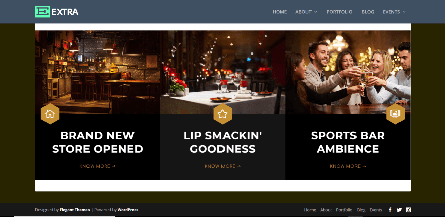
This one is the Imagebox layout. No styling changes were necessary to make it work with Extra.
Divi Blurb Extended License, Documentation, and Support
You can purchase Divi Blurb Extended from the publisher’s website. There are two licenses available:
- Single Site – $19
- Extended – $49
Documentation is provided by an FAQ on the publisher’s site. Support is provided via email.
Ending Thoughts
Divi Blurb Extended works very much the same way as the standard Divi blurb module, but adds several new features including icon shapes, a read more button, and some layouts with animation. The added layouts provide a good starting point and show you some of the things the module can do.
If you know how to use the standard blurb module you won’t have any trouble using this one. I found the settings intuitive to use and if you know CSS you can customize the elements even further. If you want more features for your blurbs, Divi Blurb Extended is worth a look.
We want to hear from you. Have you tried Divi Blurb Extended? Let us know what you think about it in the comments.
Featured Image via SilviaC / shutterstock.com
The post Divi Plugin Highlight: Divi Blurb Extended appeared first on Elegant Themes Blog.