Divi’s filterable portfolio module lets you build a portfolio in either full-screen or in a grid. What if you wanted a different look that adds a button and choices for 3 or 4 columns within the grid? This is exactly what a third-party plugin called DTS Filterable Portfolio Grid Pro does.
DTS Filterable Portfolio Grid Pro adds a new module to the Divi Builder. The plugin gives your portfolio a new look and has options for 3 or 4 columns in a grid. It displays project post types. It includes custom button text and custom advanced options.
The plugin is available from the developer’s website.
In this plugin highlight we’ll take a look at DTS Filterable Portfolio Grid Pro and see what it can do. Images are taken from Unsplash.com.
Installing DTS Filterable Portfolio Grid Pro
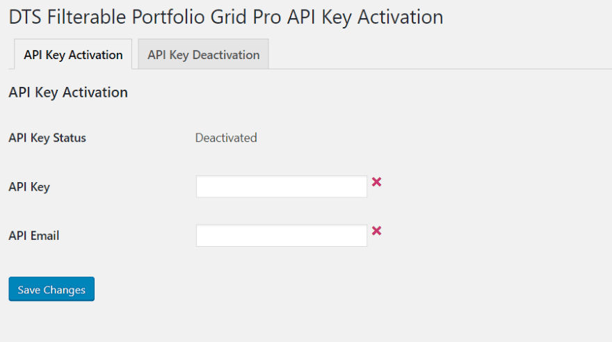
Upload and activate the plugin as normal. Once you’ve activated the plugin, navigate to Settings in the dashboard and select DTS Filterable Portfolio Grid Pro Activation. Enter your API Key and email and save changes.
Module Settings
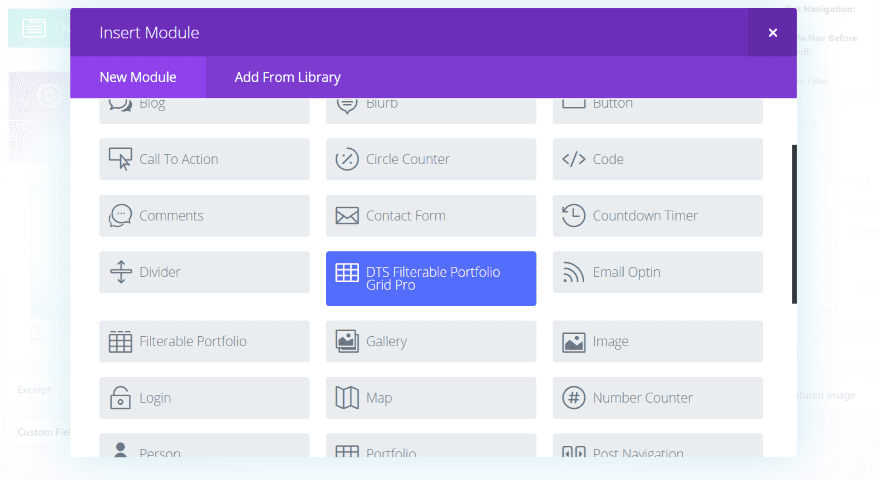
The plugin adds a new module to the Divi Builder. It’s blue, so it’s hard to miss.
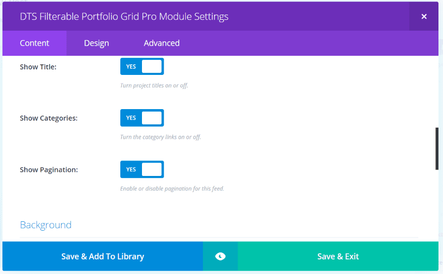
Content settings include the number of posts, category selection, show the title, categories, pagination, background, and custom button text.
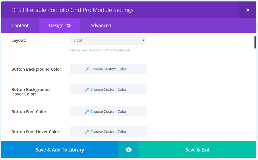
The design tab includes settings for the layout, colors, fonts, icons, overlays, borders, and animation.
Examples – Grid
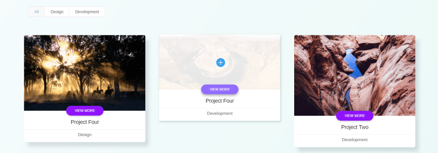
The default settings use a 3-column grid. You can see the hover animation in the center tile. The tiles includes the image with title section and a button placed within the center. The bottom shows the category. The tiles display a shadow which moves away on hover. As you can guess, each of these elements is customizable.
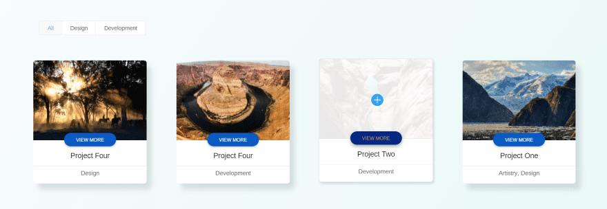
In this example I changed the grid to 4 columns and adjusted the button background color, button background hover color, and button font hover color. The four column layout changes the image sizes to match.
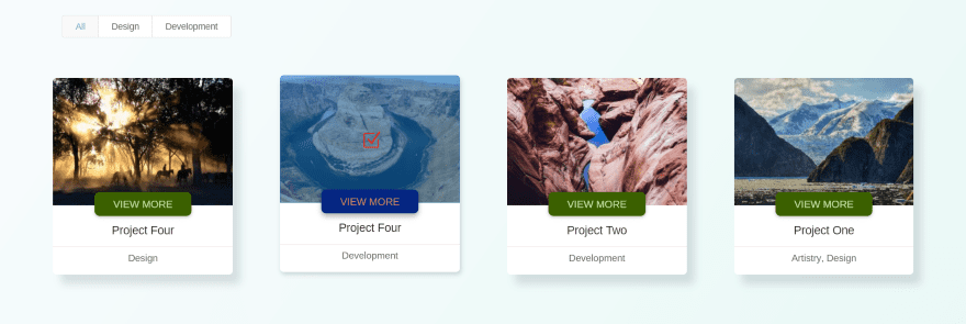
In this one I’ve reduced the button radius, increased the buttons’ font size, changed the hover icon and its color, and changed the hover overlay color. All of these adjustments are simple and intuitive.
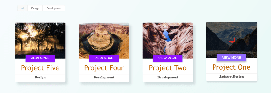
In this example I’ve taken the border radius to 0 to create square corners for the button. I increased the font sizes for the button text, title text, and changed the font styles. I’ve also made the hover overlay black with enough opacity for the image to show through and changed the hover icon.
This one decreases the line height for the title. I’ve also darkened the color for the font and increased the letter spacing. I’ve set the category font back to default and set it to italic. The button radius is set to 100 and I’ve added my own button text. I’ve also changed the overlay color and selected a different icon and changed its color to white. This example also uses a border, which is set to red and 2 pixels wide. Border options include color, width, and style.
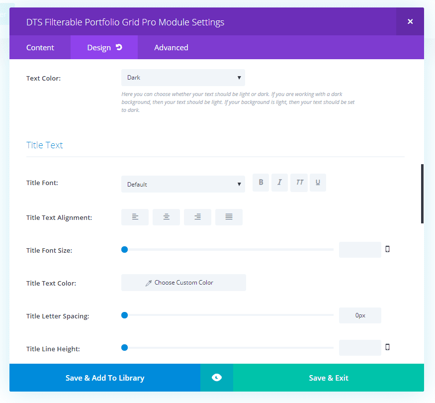
The module does have a text color option for light and dark, in case you’re using a dark background behind the title, but currently there isn’t an option to change the background behind the title. I suspect this is an upcoming feature.
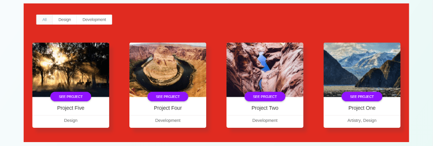
The background settings (the standard color, gradient, image, and video) apply behind the module. The cards touch the edge of the background color and there are no padding adjustments within the module.
This would make the background look awkward, but there are a couple of easy solutions. You can add padding to the section or row, like I’ve done in all of the images in this article, or you can use CSS to add padding to the module.
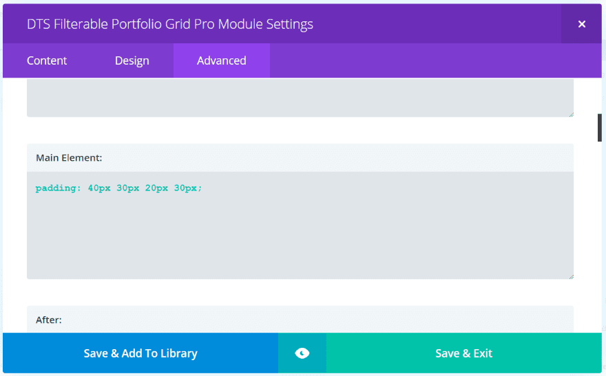
Here’s the CSS I’ve added to the Advanced tab in the Main Element section for the module. It simply tells Divi to add padding to all 4 locations. The values apply in the same order as the padding fields of rows and modules: top, right, bottom, left. This means I’ve given the top padding a value of 40, the right padding a value of 30, the bottom padding is 20, and the left padding is 30.
The result is exactly what I wanted – different levels of padding on all four sides. This makes the background feature more usable and is easy to implement.
Examples – Filter
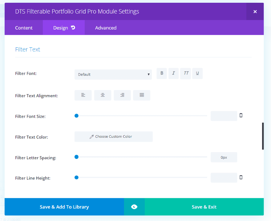
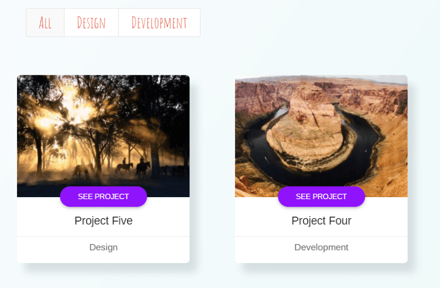
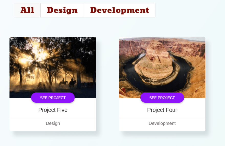
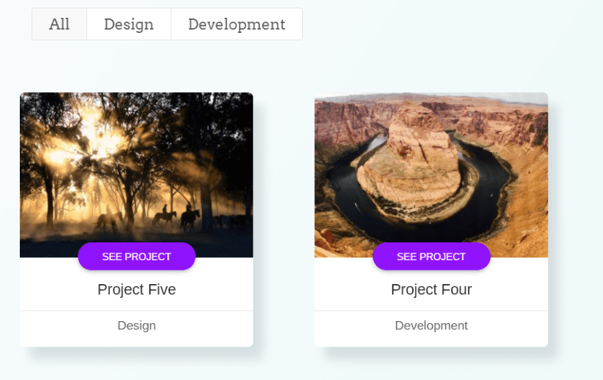
Since this is a filterable portfolio it stands to reason that the filter would also be customizable. As expected, there are adjustments for the font style, size, alignment, color, spacing, and height. Up to this point we’ve seen the filter with its default settings.
This example uses the Amatic SC font in red. I’ve increased the font size but left the spacing and height at their defaults.
This one uses a font called Bevan. I’m using a darker red. The font size is the same as the previous font.
This one uses Arvo. I’ve reduced the font size and selected a dark gray color.
Animations
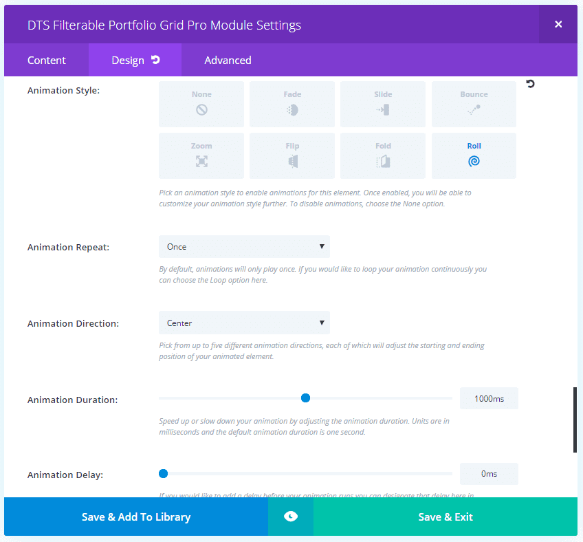
Divi’s animations are also available in the module’s settings. Choose none, fade, slide, bounce, zoom, flip, fold, and roll. You can also adjust the animation to repeat only once or loop, choose the direction, duration, delay, intensity, starting opacity, and speed curve.
This example uses Roll. I’ve left everything else at default.
Using the Portfolio Grid Within a Layout
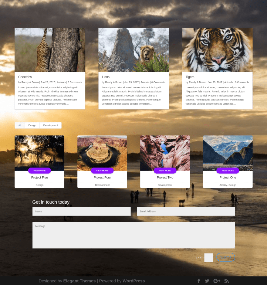
DTS Filterable Portfolio Grid Pro looks great within a layout. Here’s an example photography layout with blog, portfolio, and contact form. I’m using the default settings for the portfolio grid and it blends nicely.
Using the Portfolio Grid With Extra
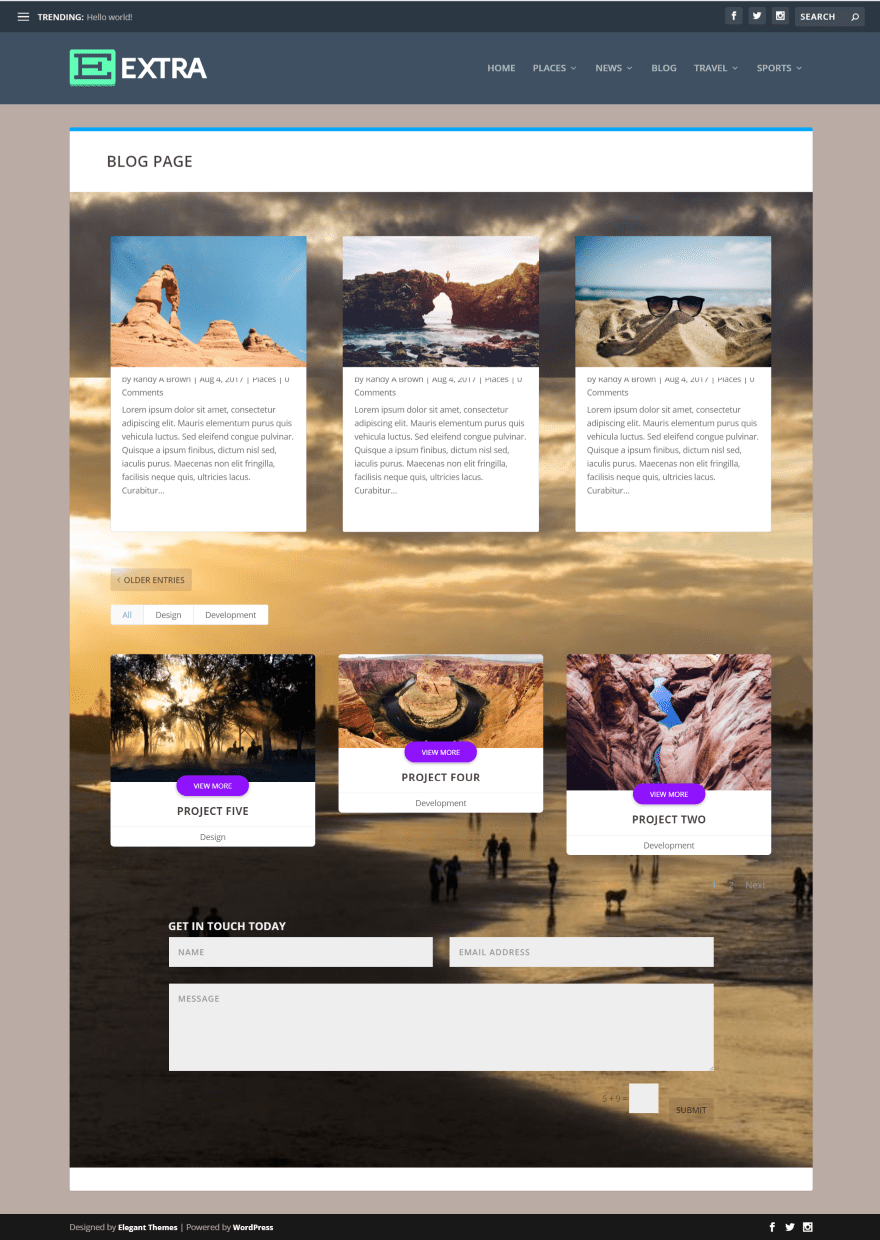
DTS Filterable Portfolio Grid Pro is also compatible with Extra. Here’s a look at a similar layout as the Divi layout above. This also uses the default settings. I’m using a 3 column grid with mismatched image sizes. This is an easy fix – simply use images of the same size.
License
There are two license options to choose from: single site and extended. Both include lifetime updates and 6 months of support.
Final Thoughts
DTS Filterable Portfolio Grid Pro is easy to use and provides lots of elegant styling to make your portfolio stand out. There are a couple of features I’d like to see added, such as title and meta background colors, but it still provides enough features that it’s easy to recommend. If you’re interested in a filterable background grid module with styling beyond the standard Divi module, DTS Filterable Portfolio Grid Pro is worth a look.
We want to hear from you! Have you tried DTS Filterable Portfolio Grid Pro? Let us know what you think about it in the comments.
Featured Image via AF studio / shutterstock.com
The post Divi Plugin Highlight: DTS Filterable Portfolio Grid Pro appeared first on Elegant Themes Blog.

