
Have you ever wanted to style your mobile menus independently from your desktop menus? Divi’s menu system includes settings for mobile that places the menu within a hamburger icon, but what if you wanted to use a different header for mobile, add new styling, or even animate the menu’s opening or closing actions? You can do this with a third-party plugin called Mobile Menu Customizer.
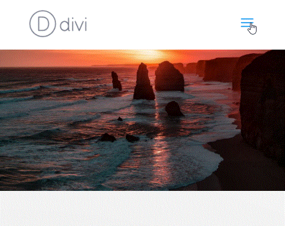
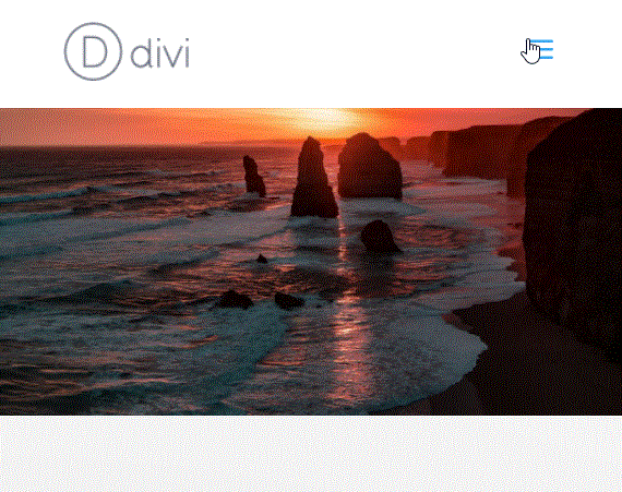
In this plugin highlight we’ll take a look at Mobile Menu Customizer from Divicio.us and see what it can do and the effect it would have on your website’s loading time. The images in these examples were taken from Unsplash.com.
Installing Mobile Menu Customizer
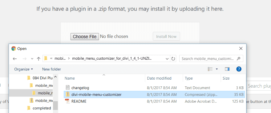
You must first unzip the downloaded file. Within it you’ll see three files:
- Changelog
- Divi-mobile-menu-customizer
- README
Upload and activate the divi-mobile-menu-customizer file.
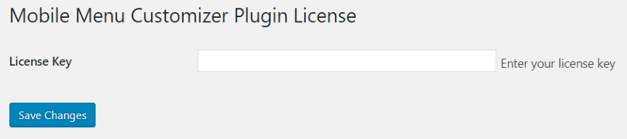
Within the plugin menu in the dashboard is a new link called DMMC Plugin License. Click this and enter your license key in order to receive updates.
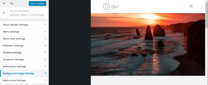
New Theme Customizer Settings
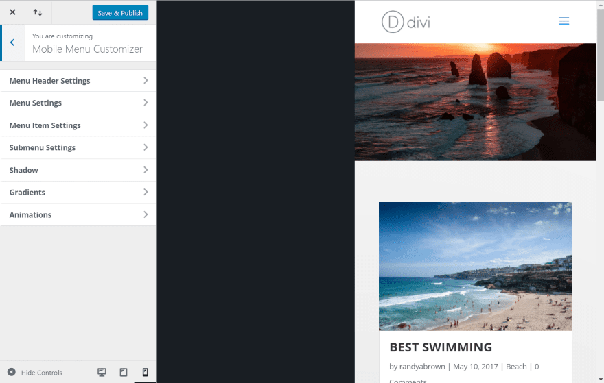
A new menu item is added to the Theme Customizer called Mobile Menu Customizer. Selecting it automatically displays your website in a mobile view using a mobile menu. You can also select tablet mode. Within the menu are seven menus.
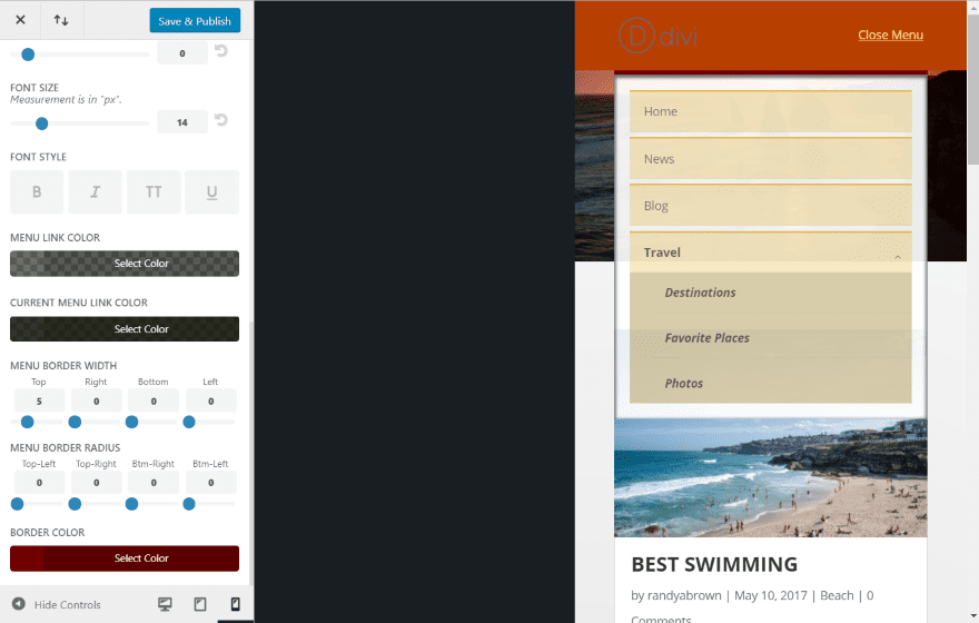
Menu Header Settings
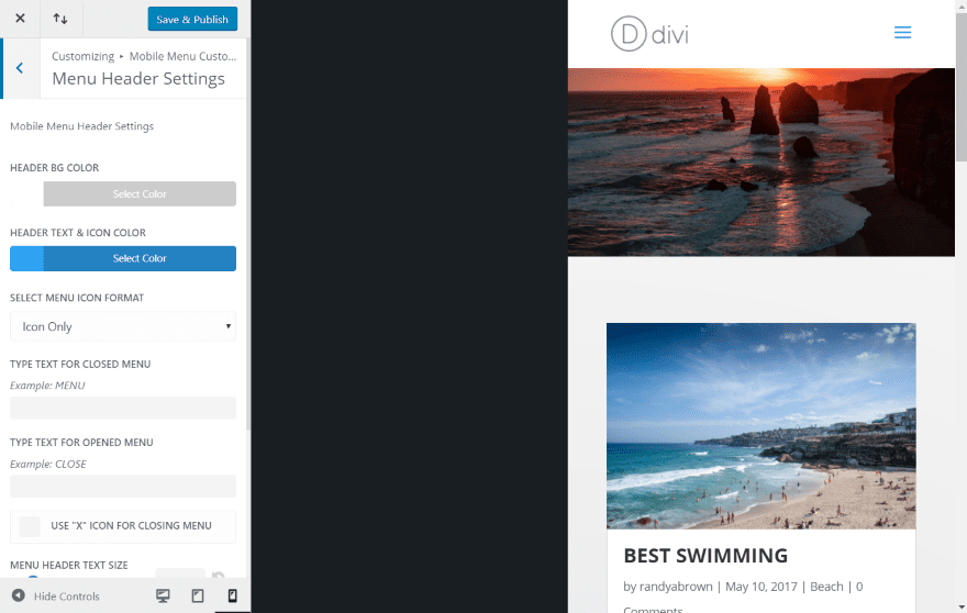
Menu Header Settings include settings for the header background color, text and icon color, icon format, type text for open and closed menu, text size, icon size, menu bar font style, and the dropdown menu top offset.
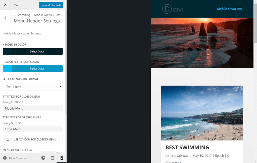
I’ve changed the header background color and text and icon colors. I’ve selected to show the text and menu icon, entered the text I want it to display, and selected bold and italic font styles. I’ve left the text and font sizes at their defaults. I could also show the icon on the left and text on the right, just the text, or just the icon.
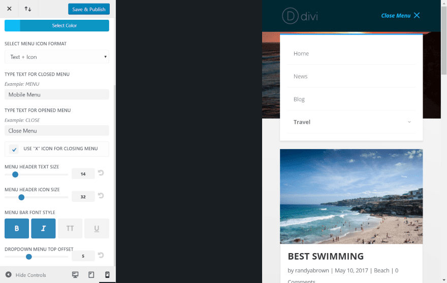
For the open menu I’ve entered text to display and selected to show an X icon. I’ve also set the dropdown menu top offset to 5 just to show that it is adjustable.
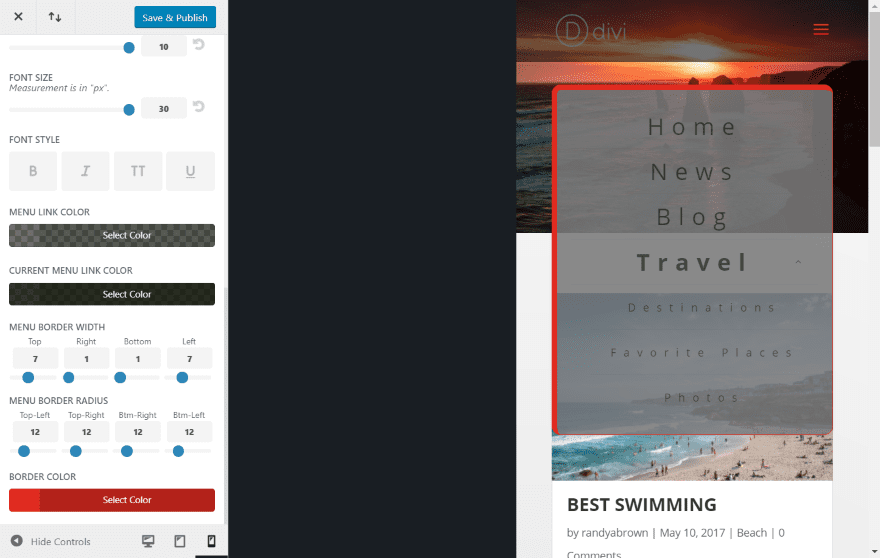
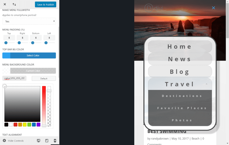
Menu Settings
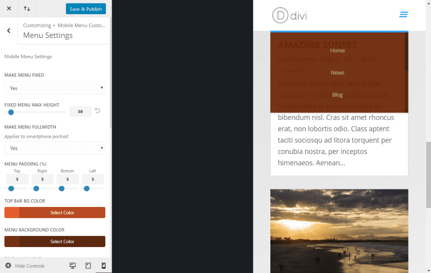
Menu Settings include fixed menu, fullwidth (in portrait mode), padding, top bar background color, text settings, and border settings. I like that it automatically shows you the website in portrait mode, but I didn’t see a way to view in landscape mode, so I’m not able to see the effect of the full-width menu.
I’ve set it to fixed so the menu remains on screen on scroll. I’ve set the top bar and menu background colors, and centered the text. You can see that I’ve set the opacity to show just a little bit of the background.
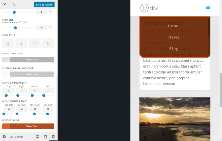
I’ve also increased the spacing and font size, font colors, and adjusted the border width, radius, and color. In this second example I’ve adjust the top border radius and right and left border width. It would be helpful if the small sliders had a button to take them back to their default settings.
Menu Item Settings
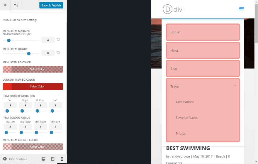
The Menu Item Settings apply to the individual items within the menu. Adjust the margins, height, background color, border width, border radius, and border color.
In this example I’ve increased the margins to 4, set the item height to 22, set the border width to 5, and the border radius to 8 to give it a slightly rounded corner.
Submenu Settings
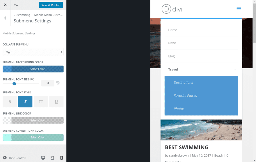
Submenu Settings allow to make the submenu collapsible, change the colors of the background and links, and adjust the font size and style. I’ve adjusted the colors, increased the font size from 14 to 16, set it to italic, and made it collapsible.
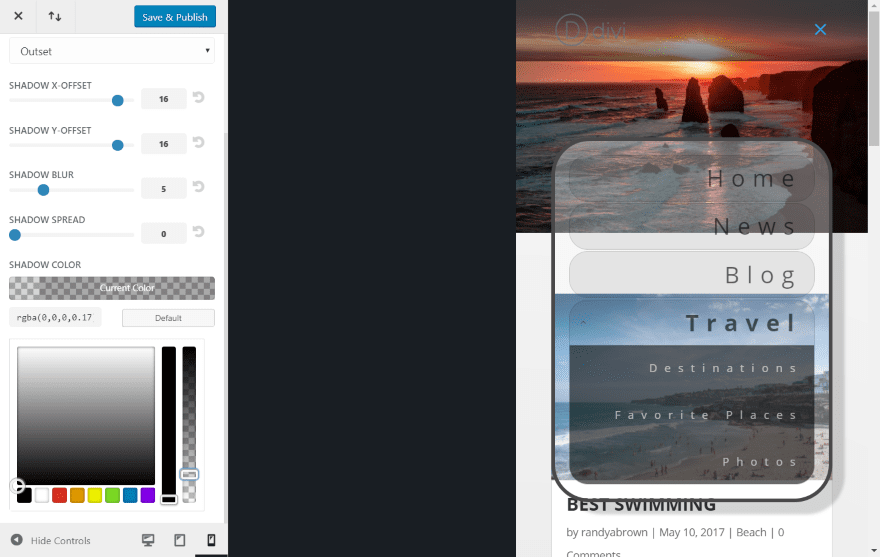
Shadow
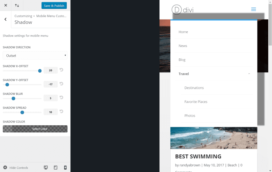
Shadow allows you to control the in and out direction, X and Y offset, blur, spread, and color. I’ve set this one to outset with an X-offset of 20, Y-offset of -17, a shadow blur of 5, and spread of 10. I’ve also darkened it to make it stand out.
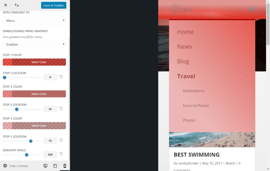
Gradients
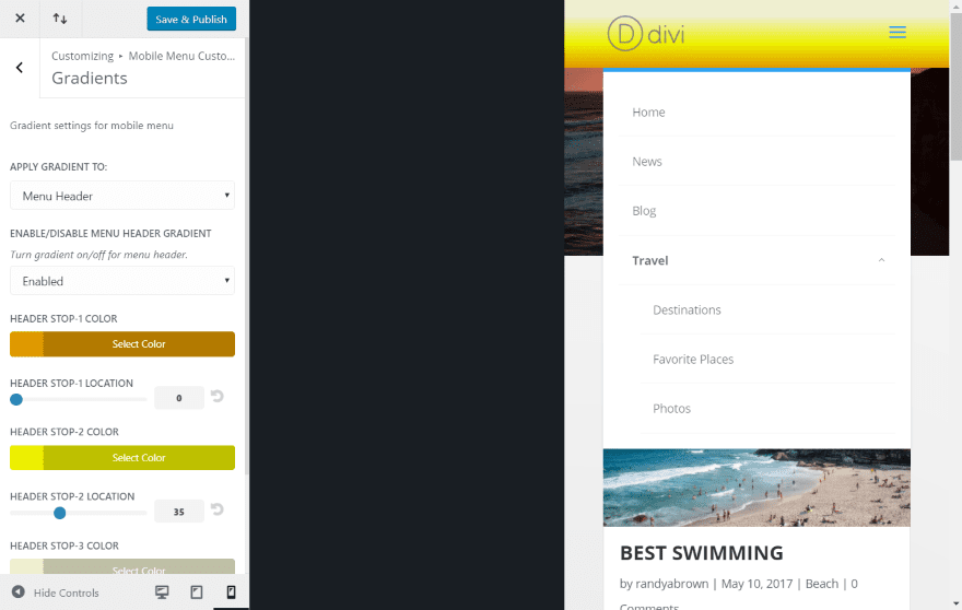
Gradients can be applied to the menu header and the menu itself. It gives you three colors with a stop location for each. You can also change the angle.
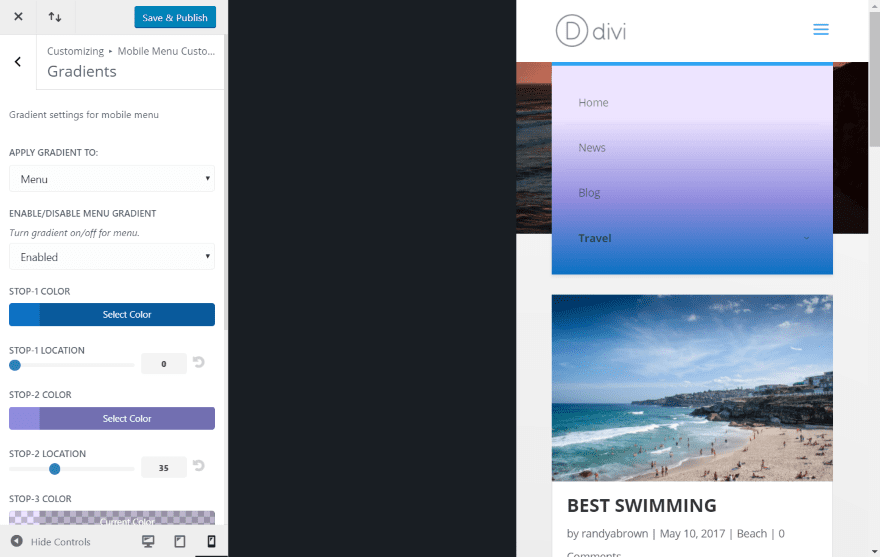
This is a look at the menu gradient.
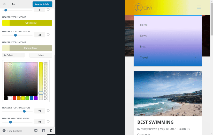
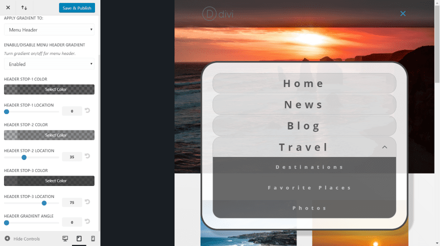
You can also display a different gradient for the menu and menu header. Here’s the same gradient with a different angle and stop locations for the menu header.
Animations
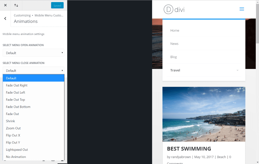
Animations provides two drop-down lists – one for the open animation and one for the closing animation, with 10 animations each. Animations include fade, shrink, zoom, flip, etc. You can use the in and out animations in any combination you want.
This one uses Fade In Right and Fade Out Left.
This one uses Grow and Shrink.
This one uses Flip In X and Flip Out Y.

This one uses Lightspeed In and Fade Out.
Using the Settings Together
Up to this point I’ve highlighted each menu item separately so you can see what they do. Here are a few examples of how they look when they’re combined.
In this example I’ve adjusted the menu background and link colors, swapped the menu icon for text, changed the color of the bar, adjusted the menu item height, provided a top border, set the submenu fonts to bold and italic, set a submenu color, and provided a shadow using inset and adjusted the settings so that it just shows.
This one uses an offset border width with a radius of 12 to round the corners. The border color is red. I’ve increased the font size and width to the max. The background is black with an opacity of .87. The header is black with an opacity of .55. The menu link is red to match the dropdown menu border.
This example increases the font sizes and uses various shades of red gradients for both the header and dropdown menu. I’ve set the top bar color to a dark shade of red to match. I’ve also adjusted the menu height.
This example uses a dropdown menu top offset of 100 and is not fixed. The letter spacing and font size are maxed out. The menu border radius is set to 50 and border width is set to 5. The text is right-aligned. The background is white with an opacity of 30.
The menu item border width is 1 and the radius is 25. I’ve used the same black background but with an opacity of .08 and the border opacity is .12.
The submenu settings have a background opacity of .55 and a white font. The shadow stands out just a little using the same black with an opacity of .17. The shadow offset is set to 16 for both x and y. I’ve placed a gradient in the header using black with various levels of shade and opacity.
A couple of small adjustments changes the look completely. This one uses bold fonts that are centered and a background opacity of .90.
Here’s a look at the menu in tablet mode. It’s a good idea to switch between the modes as you make your customizations.
Update – Two New Settings
Before this article published, two new settings were added: Background Image and Menu Icons.
Background Image Settings
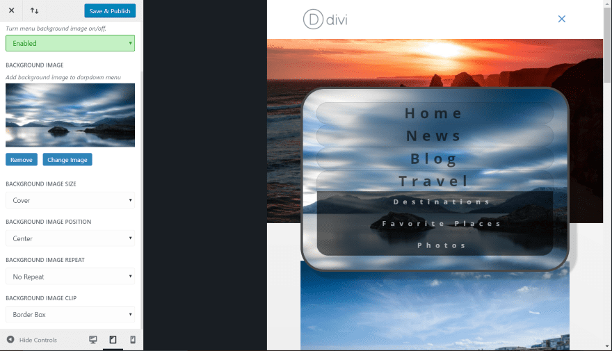
Background Image Settings allow you to upload an image to place behind the drop-down menu. You can choose its size, position, if it repeats, and how it clips for the border.
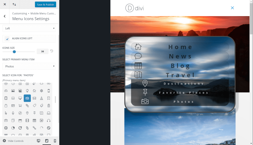
Menu Icon Settings
Menu Icon Settings allow you to choose an icon for each menu item, and adjust the size and location.
Mobile Menu Customizer PageSpeed Test
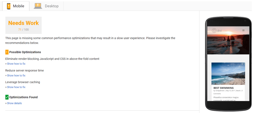
Since the plugin is rendering a lot of effects with all of the features enabled I decided to test it using PageSpeed Insights. With the plugin disabled my test server gets a score of 70. I’m using no minifying or cache plugins.
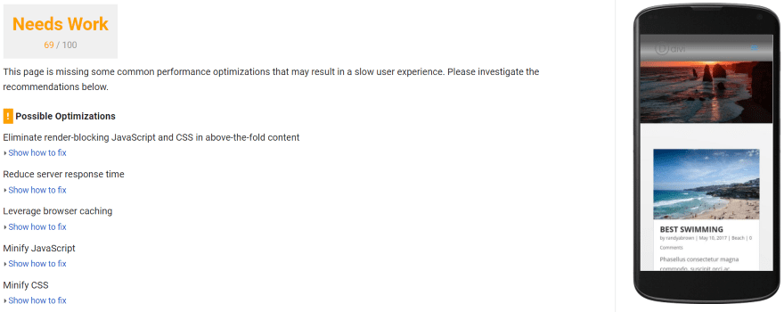
With plugin enabled the score went from 70 to 69. I tried the test twice and got the same result both times. It’s worth 1 point to have this level of customizations.
License
You can install the plugin on unlimited websites for both you and your clients. It includes lifetime updates and 6 months of support. Documentation is provided as videos in the developer’s website.
Final Thoughts
Mobile Menu Customizer adds a lot of features to style the mobile menu. I found the customizations easy to use. I wanted to see menu icons included and now they have been. I would like to see a few features for the logo. I would like to see the customizations available for desktop menus as well. The plugin does not work with Extra.
The customizations look great and there are a lot of settings to choose from. I like that you can style the header and menu independently. If you’re interested in customizing your mobile menu’s styles and adding some animation, Mobile Menu Customizer is worth a look.
We’d like to hear from you. Have you tried Mobile Menu Customizer? Let us know about your experience with it in the comments.
Featured Image via Francois Poirier / shutterstock.com
The post Divi Plugin Highlight – Mobile Menu Customizer appeared first on Elegant Themes Blog.