
When it comes to structuring content, creating a timeline is a great way to keep the information interesting and engaging for your visitors. It also helps them navigate and process the information they read a lot quicker. And when you use a nice design, it elevates the overall look and feel of your page too. In this post, we’re going to show you how to create a stunning timeline section with Divi’s transform options. The design we’ll recreate will remain responsive across smaller screen sizes.
Let’s get to it!
Preview
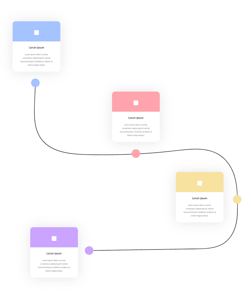
Before we dive into the tutorial, let’s take a quick look at the outcome across different screen sizes.
Desktop
Mobile
Download the Timeline Section Layout for FREE
To lay your hands on the free timeline section layout, you will first need to download it using the button below. To gain access to the download you will need to subscribe to our Divi Daily email list by using the form below. As a new subscriber, you will receive even more Divi goodness and a free Divi Layout pack every Monday! If you’re already on the list, simply enter your email address below and click download. You will not be “resubscribed” or receive extra emails.
@media only screen and ( max-width: 767px ) {.et_bloom .et_bloom_optin_1 .carrot_edge.et_bloom_form_right .et_bloom_form_content:before, .et_bloom .et_bloom_optin_1 .carrot_edge.et_bloom_form_left .et_bloom_form_content:before { border-top-color: #ffffff !important; border-left-color: transparent !important; }
}.et_bloom .et_bloom_optin_1 .et_bloom_form_content button { background-color: #f92c8b !important; } .et_bloom .et_bloom_optin_1 .et_bloom_form_content .et_bloom_fields i { color: #f92c8b !important; } .et_bloom .et_bloom_optin_1 .et_bloom_form_content .et_bloom_custom_field_radio i:before { background: #f92c8b !important; } .et_bloom .et_bloom_optin_1 .et_bloom_border_solid { border-color: #f7f9fb !important } .et_bloom .et_bloom_optin_1 .et_bloom_form_content button { background-color: #f92c8b !important; } .et_bloom .et_bloom_optin_1 .et_bloom_form_container h2, .et_bloom .et_bloom_optin_1 .et_bloom_form_container h2 span, .et_bloom .et_bloom_optin_1 .et_bloom_form_container h2 strong { font-family: “Open Sans”, Helvetica, Arial, Lucida, sans-serif; }.et_bloom .et_bloom_optin_1 .et_bloom_form_container p, .et_bloom .et_bloom_optin_1 .et_bloom_form_container p span, .et_bloom .et_bloom_optin_1 .et_bloom_form_container p strong, .et_bloom .et_bloom_optin_1 .et_bloom_form_container form input, .et_bloom .et_bloom_optin_1 .et_bloom_form_container form button span { font-family: “Open Sans”, Helvetica, Arial, Lucida, sans-serif; } p.et_bloom_popup_input { padding-bottom: 0 !important;}

Download For Free
Join the Divi Newlsetter and we will email you a copy of the ultimate Divi Landing Page Layout Pack, plus tons of other amazing and free Divi resources, tips and tricks. Follow along and you will be a Divi master in no time. If you are already subscribed simply type in your email address below and click download to access the layout pack.
You have successfully subscribed. Please check your email address to confirm your subscription and get access to free weekly Divi layout packs!
Let’s Start Recreating!
Add New Section
Spacing
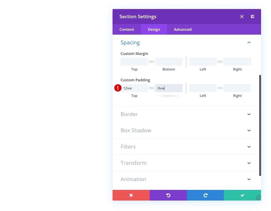
Create a new page or open an existing one and add a regular section to it. Open the section settings, go to the spacing settings and add some custom top and bottom padding.
- Top Padding: 12vw
- Bottom Padding: 0vw
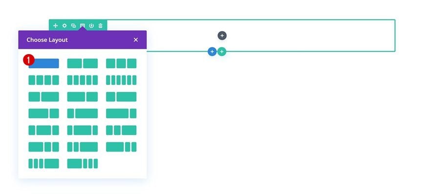
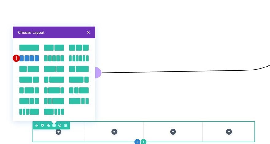
Add Row #1
Column Structure
Continue by adding a new row to the section using the following column structure:
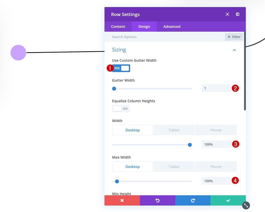
Sizing
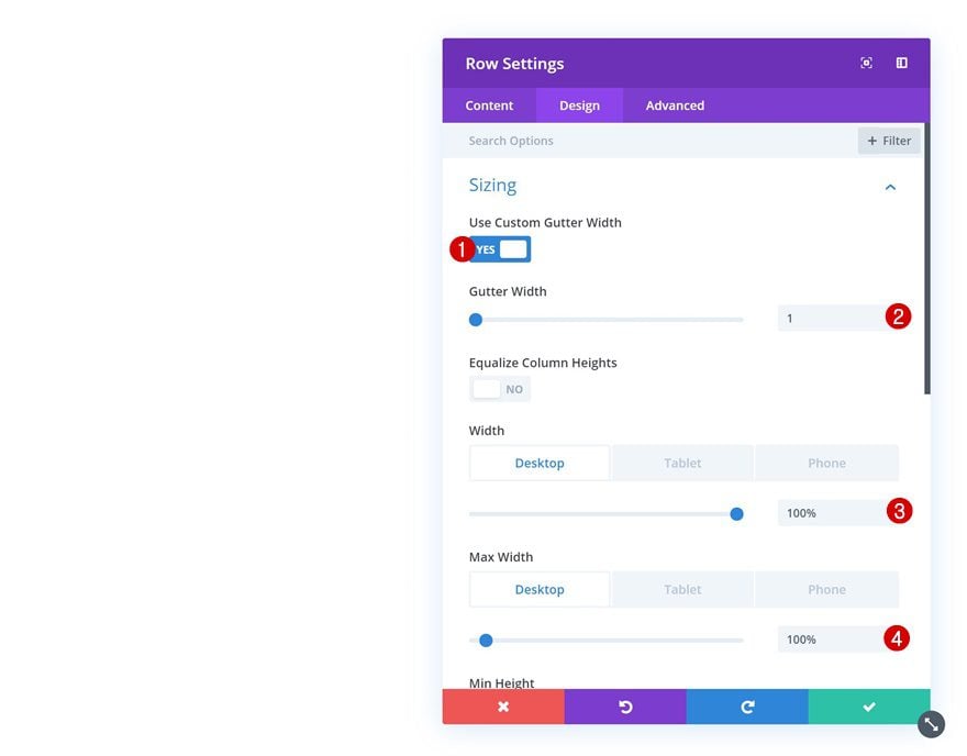
Without adding any modules yet, open the row settings. Go to the sizing settings in the design tab and allow the row to take up the entire width of the screen.
- Use Custom Gutter Width: Yes
- Gutter Width: 1
- Width: 100%
- Max Width: 100%
Visibility
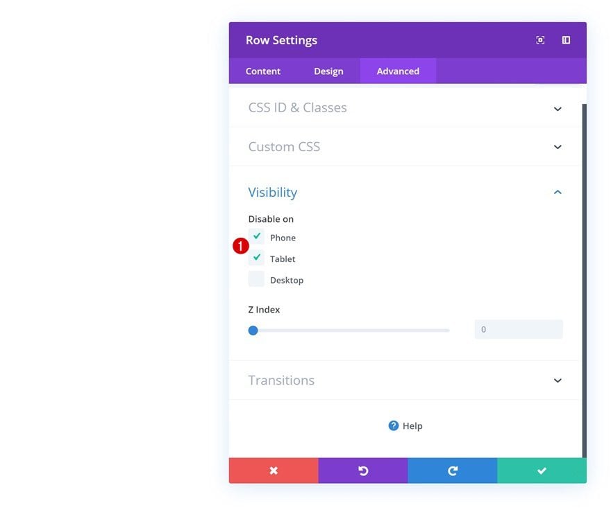
We’ll use this row to add an illustration in the upcoming steps. We only need that illustration for desktop, though. That’s why we’ll hide the entire row on tablet and phone.
Add Image Module
Upload Illustration
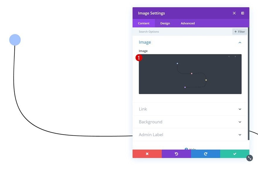
As mentioned in the previous step of this post, the only reason why we need this row is to add the timeline illustration. You can find it in the folder you’ve downloaded at the beginning of this post. Once you’ve located it, upload it to a new Image Module.
Sizing
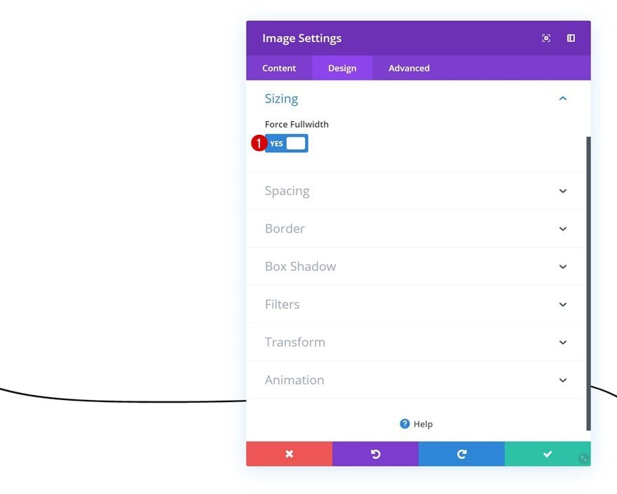
To make sure everything remains responsive across all screen sizes, we’re going to enable the ‘Force Fullwidth’ option in the sizing settings of the Image Module.
- Force Fullwidth: Yes
Add Row #2
Column Structure
Continue by adding a second row to the section, using the following column structure:
Sizing
Without adding any modules yet, open the row settings and allow the row to take up the entire width of the screen.
- Use Custom Gutter Width: Yes
- Gutter Width: 1
- Width: 100%
- Max Width: 100%
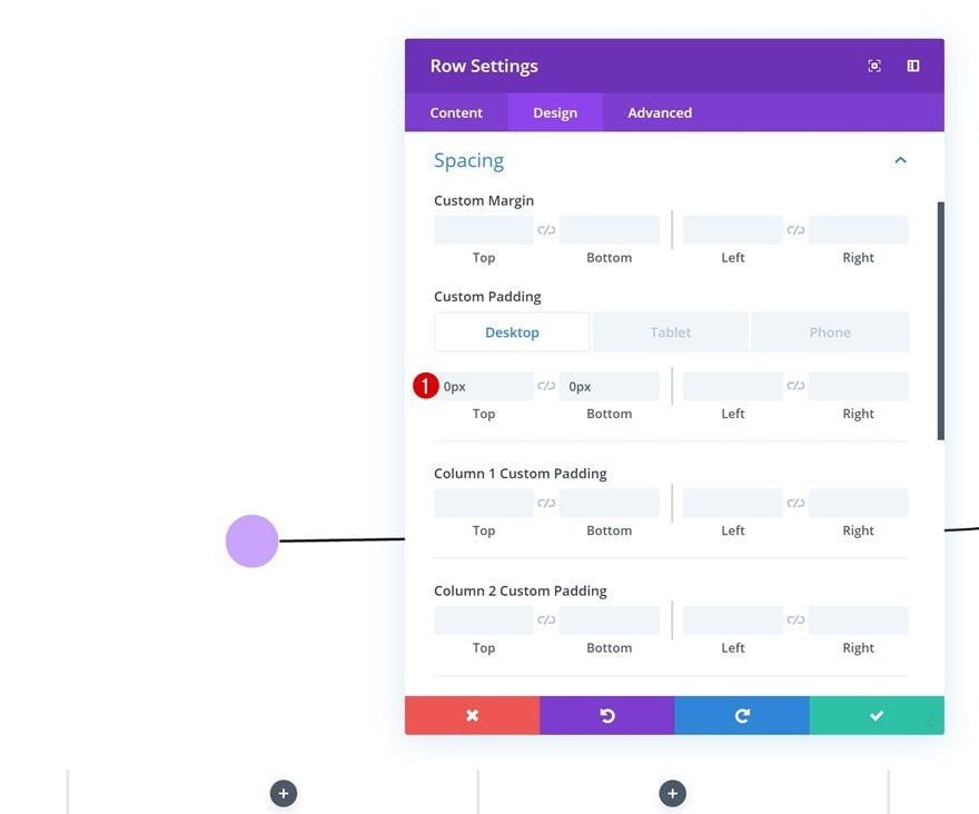
Spacing
Then, go to the spacing settings. Here, we want to limit the space that is taken up by the row (on desktop) by removing all custom top and bottom padding. We’re retaining some top and bottom padding on smaller screen sizes.
- Top Padding: 0px (Desktop), 15vw (Tablet & Phone)
- Bottom Padding: 0px (Desktop), 15vw (Tablet & Phone)
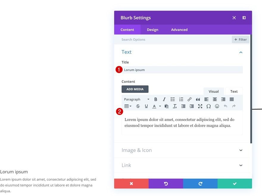
Add Blurb Module to Column 1
Add Content
Time to start adding modules! Add a Blurb Module to column 1. Enter some content of your choice.
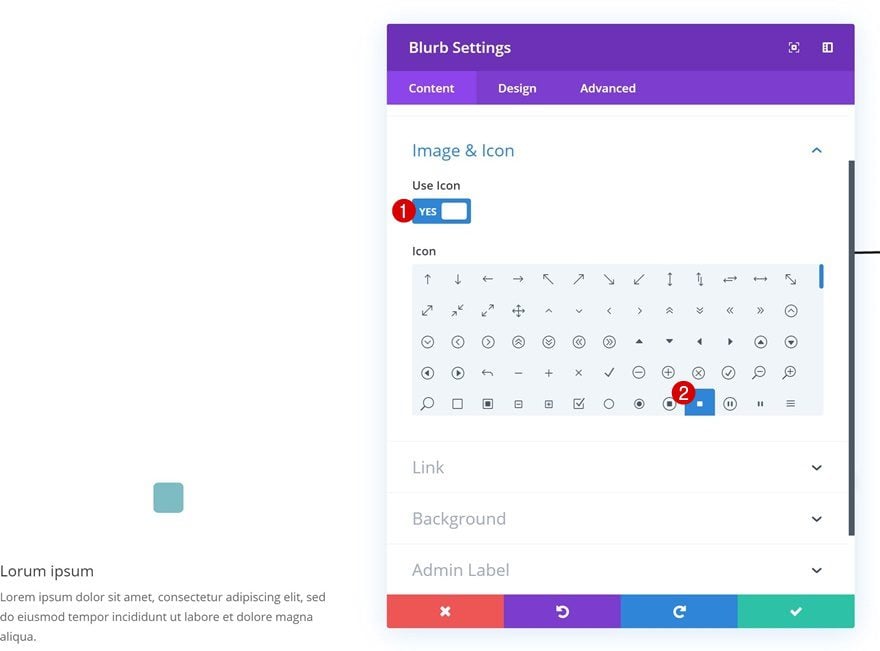
Select Icon
Continue by selecting an icon of your choice.
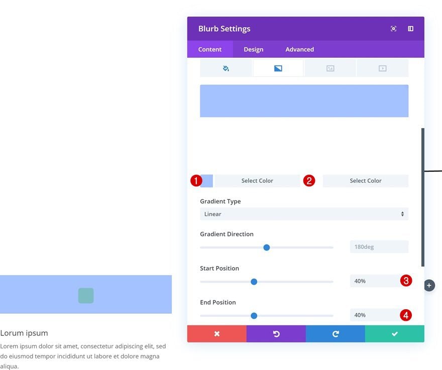
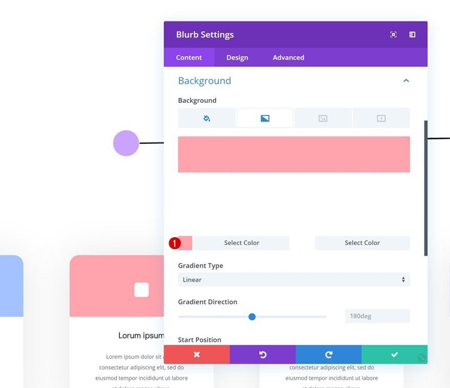
Gradient Background
Add a gradient background as well.
- Color 1: #a5c4ff
- Color 2: #ffffff
- Start Position: 40%
- End Position: 40%
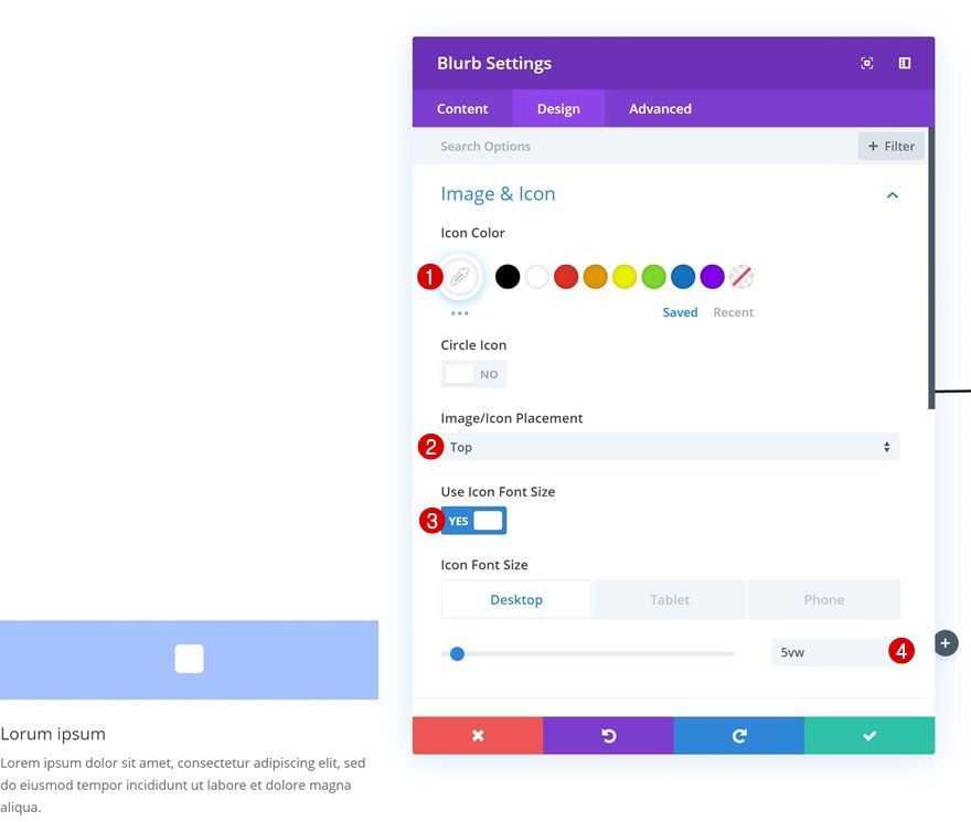
Icon Settings
Then, go to the design tab and change the icon settings.
- Icon Color: #ffffff
- Icon Placement: Top
- Use Icon Font Size: Yes
- Icon Font Size: 5vw (Desktop), 17vw (Tablet), 18vw (Phone)
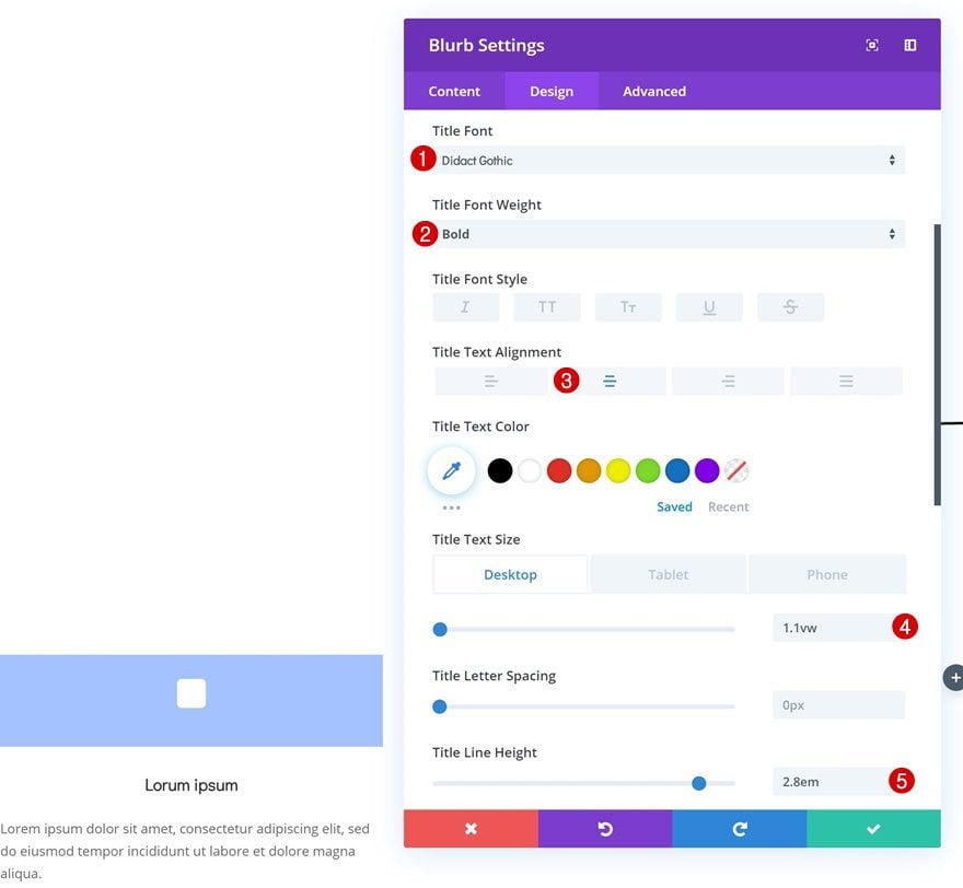
Title Text Settings
Move on to the title text settings and modify the options accordingly:
- Title Font: Didact Gothic
- Title Font Weight: Bold
- Title Text Alignment: Center
- Title Text Size: 1.1vw (Desktop), 2.7vw (Tablet), 4vw (Phone)
- Title Line Height: 2.8em
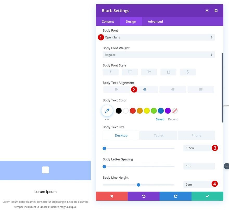
Body Text Settings
Do the same thing for the body text settings.
- Body Font: Open Sans
- Body Text Alignment: Center
- Body Text Size: 0.7vw (Desktop), 1.5vw (Tablet), 2.1vw (Phone)
- Body Line Height: 2em
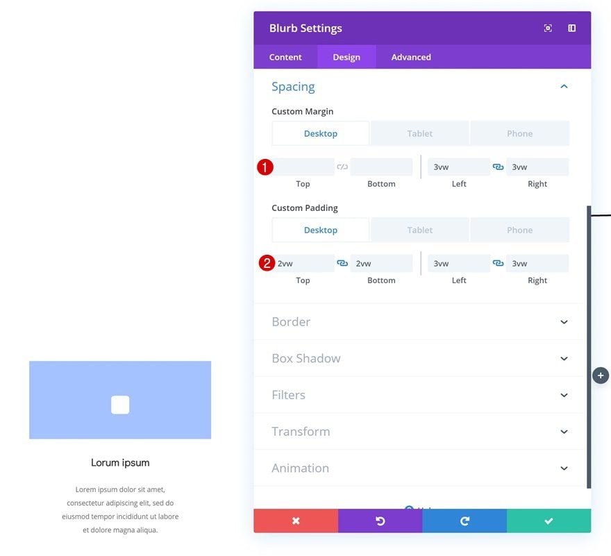
Spacing
We’re also adding some custom margin and padding values which we’ll customize according to different screen sizes.
- Left Margin: 3vw
- Right Margin: 3vw
- Bottom Margin: 5vw (Tablet), 7vw (Phone)
- Top Padding: 2vw (Desktop), 6vw (Tablet & Phone)
- Bottom Padding: 2vw (Desktop), 6vw (Tablet & Phone)
- Left Padding: 3vw (Desktop), 9vw (Tablet & Phone)
- Right Padding: 3vw (Desktop), 9vw (Tablet & Phone)
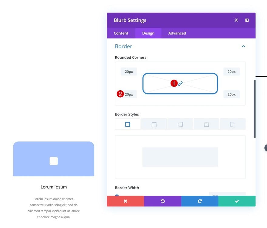
Border
Move on to the border settings and add ’20px’ to each one of the corners.
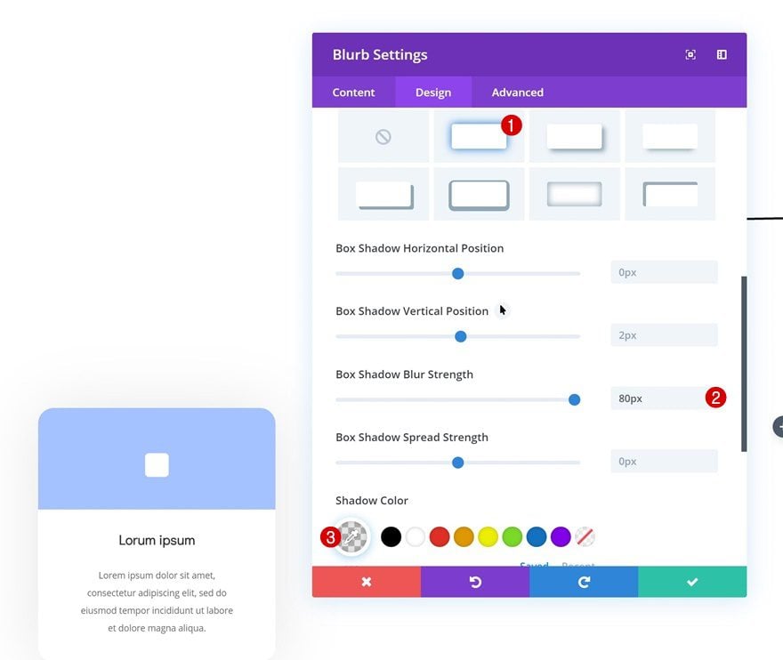
Box Shadow
Last but not least, create some depth on the page by adding a subtle box shadow to the Blurb Module.
- Box Shadow Blur Strength: 80px
- Shadow Color: rgba(0,0,0,0.1)
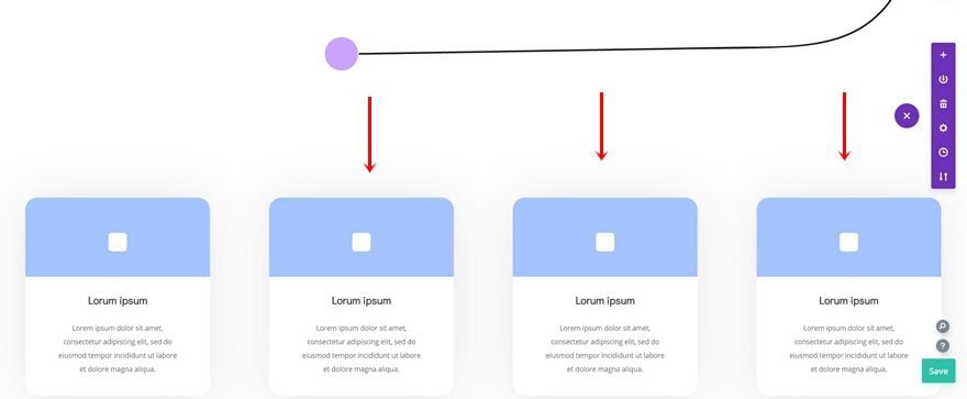
Clone Blurb Module Three Times & Place Duplicates in Remaining Columns
Once you’re done creating and customizing the Blurb Module, you can clone it three times. Place the duplicates in the remaining columns of the row.
Change Gradient Background of Duplicate #1
Open the first duplicate (Blurb Module in column 2) and modify the first color of the gradient background.
- Color 1: #ffa5ae
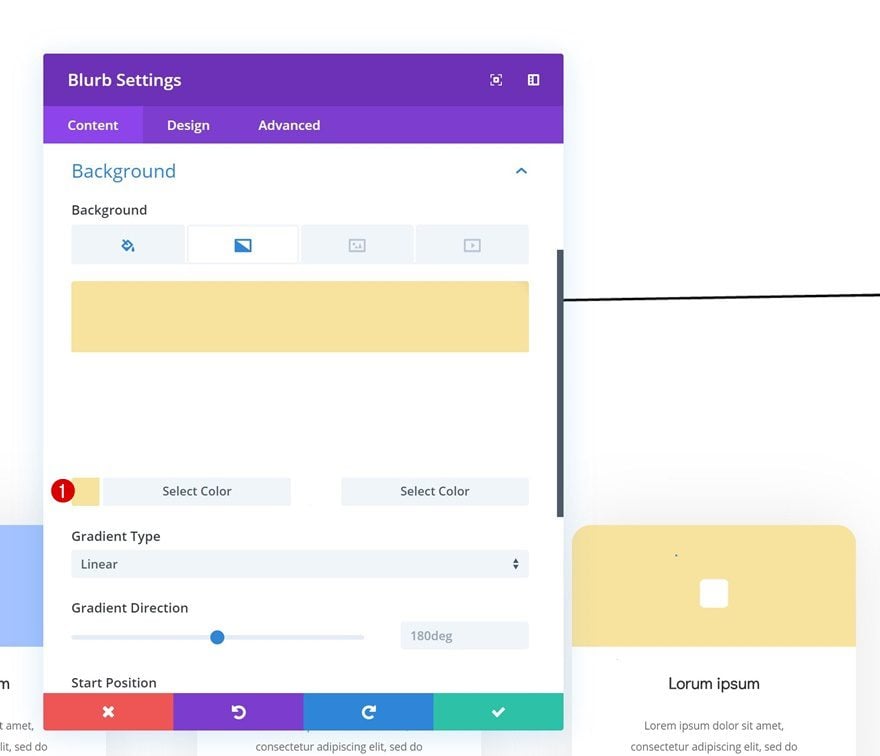
Change Gradient Background of Duplicate #2
Do the same thing for the Blurb Module in column 3.
- Color 1: #f7e3a0
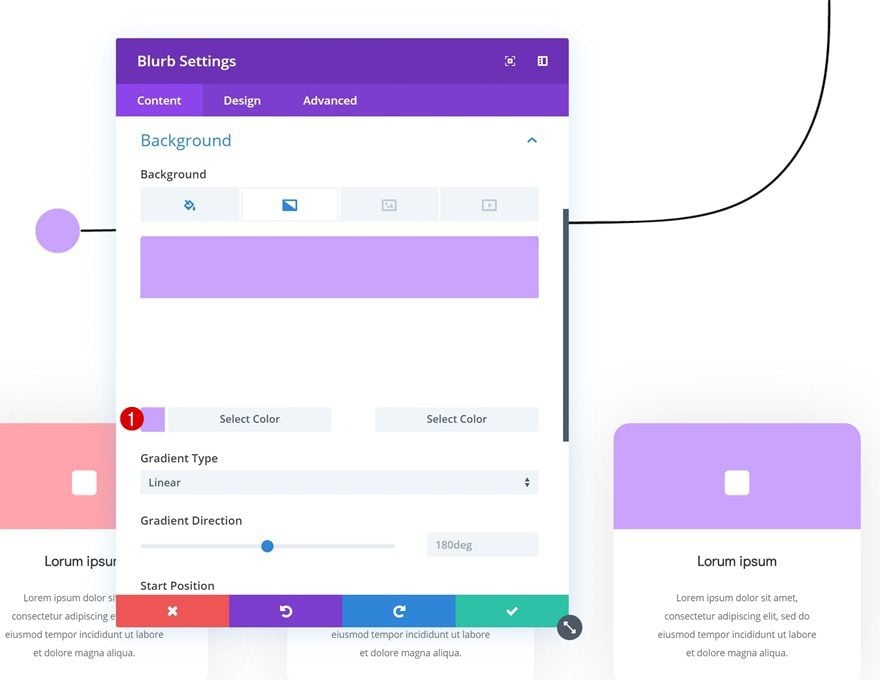
Change Gradient Background of Duplicate #3
And modify the last Blurb Module’s gradient background as well.
- Color 1: #caa5ff
Add Transform Settings to Blurb Modules
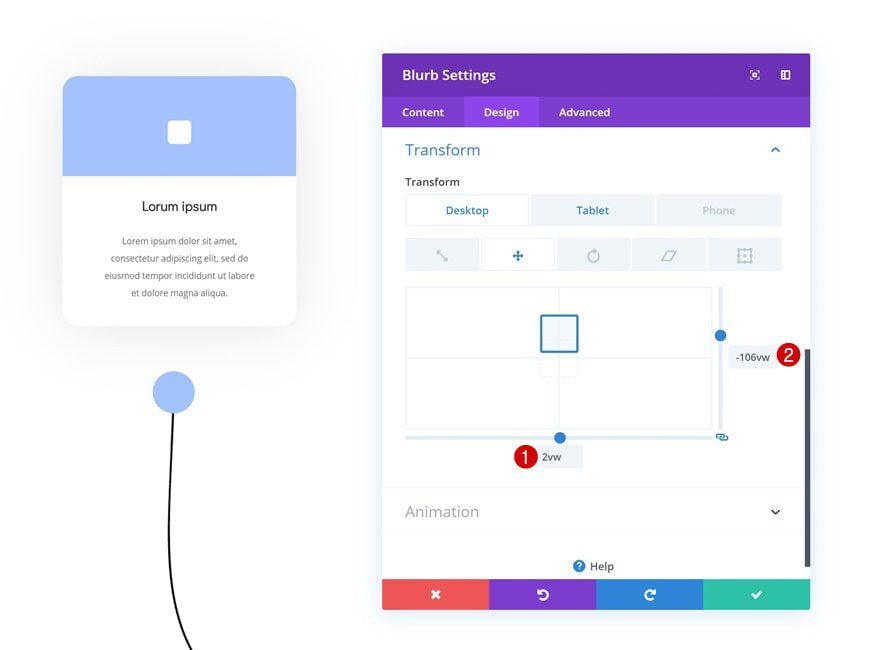
Add Transform Translate to Blurb Module #1
Now that we have all the design elements we need, we can start transforming their position! To do that, we’ll use the transform translate option. Open the Blurb Module in column 1 and modify the values accordingly:
- Bottom: 2vw (Desktop), 0vw (Tablet & Phone)
- Right: -106vw (Desktop), 0vw (Tablet & Phone)
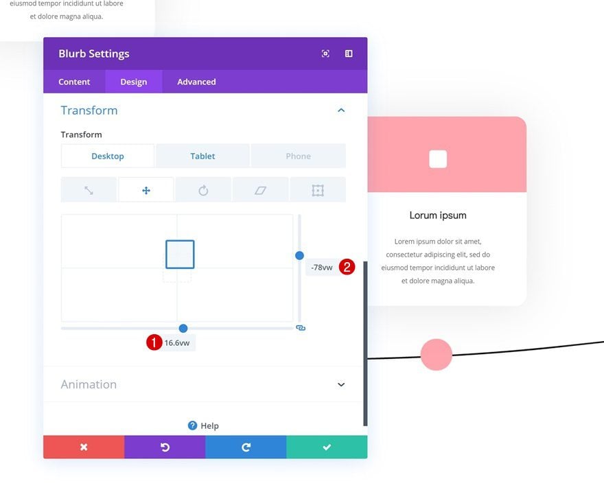
Add Transform Translate to Blurb Module #2
Move on to the second Blurb Module and change the transform translate values accordingly:
- Bottom: 16.6vw (Bottom), 0vw (Tablet & Phone)
- Right: -78vw (Right), 0vw (Tablet & Phone)
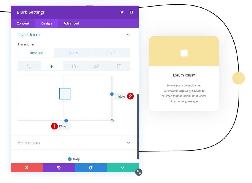
Add Transform Translate to Blurb Module #3
Open the Blurb Module in column 3 next, and use the following transform translate values:
- Bottom: 17vw (Desktop), 0vw (Tablet & Phone)
- Right: -46vw (Desktop), 0vw (Tablet & Phone)
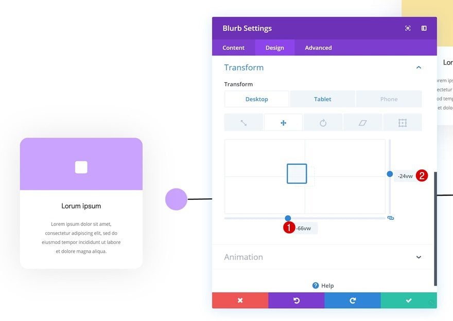
Add Transform Translate to Blurb Module #4
Do the same thing for the last Blurb Module, using the following values:
- Bottom: -66vw (Desktop), 0vw (Tablet & Phone)
- Right: -24vw (Desktop), 0vw (Tablet & Phone)
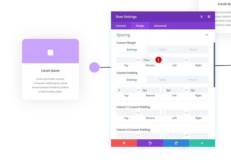
Add Negative Bottom Margin to Row #2
Using the transform translate option will not remove the space that is initially taken up by the Blurb Modules in the row. To get rid of this space, we can add some negative bottom margin to the row and we’re done!
- Bottom Margin: -15vw (Desktop), 0vw (Tablet & Phone)
Preview
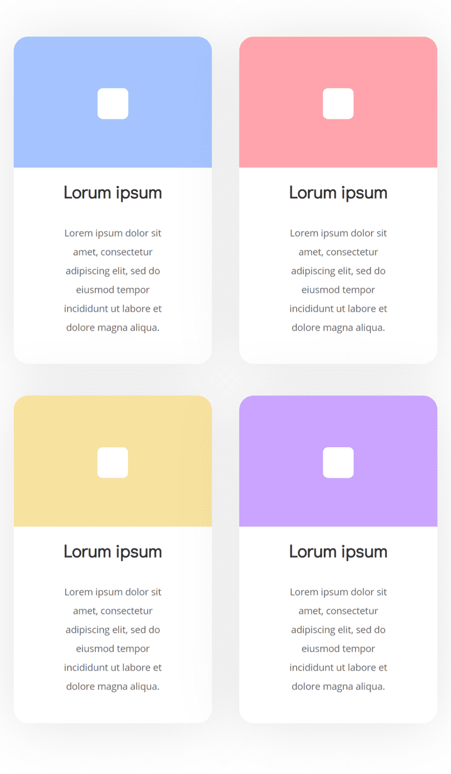
Now that we’ve gone through all the steps, let’s take a final look at the outcome.
Desktop
Mobile
Final Thoughts
In this post, we’ve shown you how to create a beautiful timeline section using Divi’s new transform options. At the beginning of the tutorial, you were able to download the JSON file and illustration for free! This should help you get started right away. If you have any questions or suggestions, make sure you leave a comment in the comment section below.
The post Download a FREE Timeline Section Made with Divi’s Transform Options appeared first on Elegant Themes Blog.