
Having a fixed header (or navigation) on mobile can increase the usability of your site if done correctly. Fixed navigation in general seem to be 22% quicker to navigate than standard headers. In this high speed world of technology, that is a considerable stat even if it was half of that.
And, with Divi, adding a fixed header to your site can be done with a few lines of CSS. Divi already allows you to customize your mobile headers using the Theme Customizer, but currently there is no built in setting for deploying a fixed header for mobile. In this tutorial, I’m going to show you how to add a custom fixed header on mobile that includes the following:
- A different (more mobile friendly) logo than your desktop version.
- A shorter header to allow more available viewing space.
- A larger clickable hamburger navigation icon to make it easier to deploy the mobile nav.
- A semi-transparent background that makes the header even more intrusive when viewing the site.
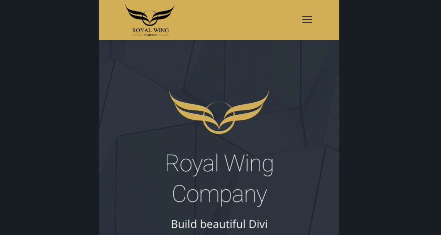
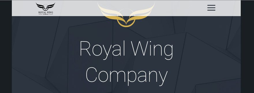
Here is a little sneak peek of what the header will look like.
The Setup
This setup is similiar to my previous post on Switching Your Logo on a Fixed Header. Before you begin, make sure you complete the following:
- Make sure you have the latest version of Divi installed.
- Create an active primary menu for your site.
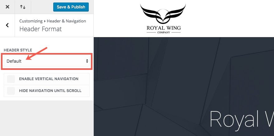
- From the backend of your WordPress site, go to Theme Customizer > Header & Navigation > Header Format and make sure you have the default header style selected.
- Make two versions of your logo that are both 200×131 and add them to your WordPress Media library. One logo will be used for the main header and one will be used for your fixed header. If you can, make the fixed header version of the logo more horizontal so that it won’t get smushed vertically on the smaller fixed header.Here is an example of my main header logo I’m using.
 Here is an example of my fixed header logo. Notice I cropped out the text in order to make a simpler and more horizontal logo that fits nicely on a header with less height. It’s not likely that anyone would be able to read that text anyway and the brand is still being represented.

- Setup your primary menu with menu items.
Since we will be adding custom CSS to accomplish the fixed header, we don’t need to customize the standard header or fixed header options in the Theme Customizer. But, if you want to duplicate the settings for menu and logo sizes in my example, complete the following (this is completely optional):
Go to Header & Navigation settings in the Theme Customizer. Select the Primary Menu Bar and update the following:
Menu Height: 105
Logo Max Height: 80
Text Size: 20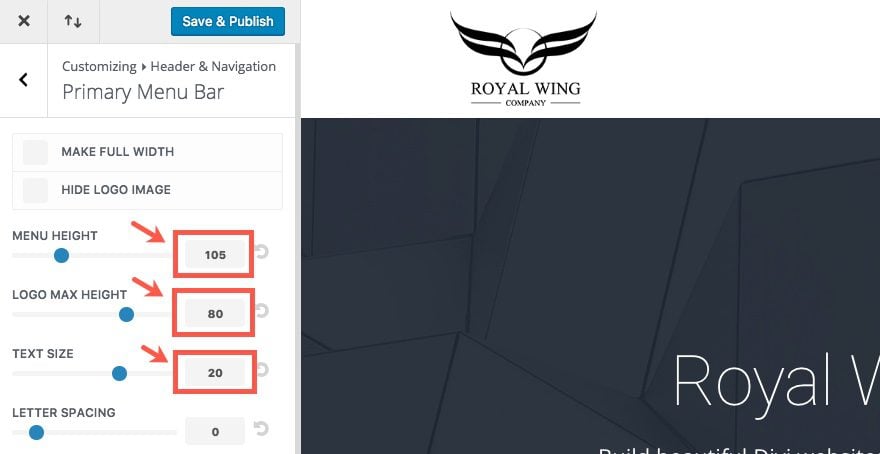
Now go back to Header & Navigation. Select Fixed Navigation Settings and update the following:
Fixed Menu Height: 60
Text Size: 20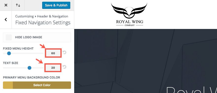
Once you have completed these steps, you are ready to begin.
Implementing the Design in Divi
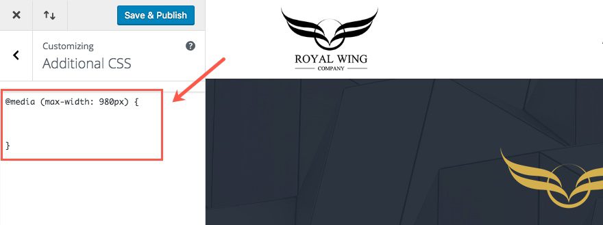
We will be implementing this design entering custom CSS under the Additional CSS section in the Divi Theme Customizer. Because we will be targeting mobile devices only, we are going to wrap all of our CSS in a media query that limits the styling to browser widths less than 980px. Go ahead and start by entering the following in the Additional CSS box:
@media (max-width: 980px) {


}
Creating your Mobile Fixed Header Using CSS
Since Divi already adds a class called “et-fixed-header” when the user scrolls down the page, we can use that selector in our custom CSS to create and style our mobile fixed header.
This first group of CSS below makes the header fixed (or sticky) at the top of the page and then adjusts the height of the fixed header to 55px. It also adds a semi-transparent white background color. Add the following to your Additional CSS in the Theme Customizer within the Media Query brackets.
/*********************************
style mobile fixed header
*********************************/

.et_fixed_nav #main-header.et-fixed-header  {
position: fixed;
background: rgba(255,255,255,0.8); /*change header background color here*/
height: 55px;
}

.et-fixed-header .logo_container {
height: 55px;
}

.et-fixed-header .mobile_menu_bar {
padding-bottom: 5px;
}
Apple suggests that all clickable UI elements for their Apps be at least 44×44 pixels so that our thumbs and fingers can click them easily. This would be a good guide for the elements in the mobile fixed header. The following CSS makes the navigation icon 45px.
/*********************************
make mobile fixed header navigation icon larger
*********************************/

.et-fixed-header .mobile_menu_bar:before {
font-size: 45px;
}

.et_header_style_left .et-fixed-header #et-top-navigation {
padding-top: 5px;
}

.et_fixed_nav #et-top-navigation {
-webkit-transition: none;
-moz-transition: none;
transition: none;
}
Lastly, let’s add more height for our logo on the fixed header so we can see it better. Enter the following CSS:
/**************************
Increase height of logo area on mobile and mobile fixed header
***************************/
#logo, .et-fixed-header #logo {
max-height: 80%;
}
That’s it! We are all done.
Here is the final collection of CSS to create your mobile fixed header:
@media (max-width: 980px) {

/*********************************
style mobile fixed header
*********************************/

.et_fixed_nav #main-header.et-fixed-header  {
position: fixed;
background: rgba(255,255,255,0.8);
height: 55px;
}

.et-fixed-header .logo_container {
height: 55px;
}

.et-fixed-header .mobile_menu_bar {
padding-bottom: 5px;
}

/*********************************
make mobile fixed header navigation icon larger
*********************************/

.et-fixed-header .mobile_menu_bar:before {
font-size: 45px;
}

.et_header_style_left .et-fixed-header #et-top-navigation {
padding-top: 5px;
}

.et_fixed_nav #et-top-navigation {
-webkit-transition: none;
-moz-transition: none;
transition: none;
}

/**************************
Increase height of logo area on mobile and mobile fixed header
***************************/
#logo, .et-fixed-header #logo {
max-height: 80%;
}

}
Save your settings. Now you have a working mobile fixed header.
Switching your Logo on Your Mobile Fixed Header
If you want to use a different logo for your mobile fixed header, you can do this fairly easily with some jQuery. All you need is the URLs for both of the logos you are going to use. The first logo image URL should be the default Logo you are already using for your site. The second logo image URL should be the logo you want to use for the mobile fixed header. Make sure you upload both logos to the media library and retrieve the URL’s.
Once you have both URL’s, go to the WordPress dashboard and navigate to Divi > Theme Options > Integrations. Find the “Add code to the head of your blog” input box and enter the following jQuery script:
<script>
    var imageUrl = [
  'ENTER DESKTOP LOGO IMAGE URL',
  'ENTER MOBILE LOGO IMAGE URL',
    ];

    jQuery(window).on('scroll', function() {
        var $header = jQuery('header');
        var $logo = jQuery('#logo');

        if ((jQuery(window).width() < 981) &&
        ($header.hasClass('et-fixed-header'))) {
            return $logo.attr('src', imageUrl[1]);
        };

        return $logo.attr('src', imageUrl[0])
    });
</script>
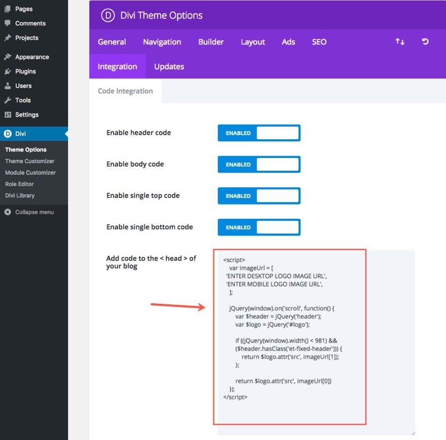
Now replace the text “ENTER DESKTOP LOGO IMAGE URL” with the url of the logo that you are currently using for your site.
Then replace the text “ENTER MOBILE LOGO IMAGE URL” with the url of the logo you want to use only for mobile devices.
Save settings and check out the results.
Browser Support
In this post, I created the fixed header using CSS only, relying heavily on the CSS property “position:fixed”. This CSS property can be inconsistent with older versions of mobile browsers, especially on iOS Safari and Android. But these days “position:fixed” is pretty well supported on newer versions of mobile browsers (except for Opera Mini).
There are other more robust plugins and JavaScript solutions out there but I thought it best to give you the simple CSS version. Please consider exploring those options if this solution doesn’t work for you.
Final Thoughts
It is worth mentioning that mobile fixed headers can be detrimental to usability. Because they continue to block the top portion of your browser at all times, if you are not careful, you may waste valuable real estate for no good reason. Remember, not everyone has a phablet like this guy.

That’s why it is important to customize your fixed header for mobile devices by giving it a shorter height, a different logo, and a bigger nav button. And by adding a few lines of CSS to your Divi website, you can have a fixed header on mobile without having to use a third party plugin. So if it makes sense to add one to your next project, go for it. Having this kind of functionality can improve the UI of your website.
I look forward to hearing from you in the comments.
Cheers!
The post How to Add a Custom Fixed Header for Mobile Using Divi appeared first on Elegant Themes Blog.