Knowing how to change an image on hover can come in handy for any kind of website you’re working on. Furthermore, it helps you add subtle interaction to pages. You can, for instance, use it to give additional perspective to testimonials, about pages and team pages. With Divi’s new hover options, you can change an image on hover using the built-in options only. By combining column backgrounds and the opacity filter, you’ll get there in no time.
Let’s get to it!
Preview
Before we dive into the tutorial, let’s take a look at the four examples we’ll recreate from scratch

General Steps
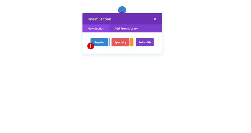
Add New Section
In the first part of this tutorial, we’ll go through some general steps. These general steps will help us save time when focusing on the first three examples. Open a new or existing page and add a regular section to it.
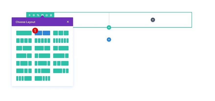
Add New Row
Column Structure
Then, add a new row using the following column structure:
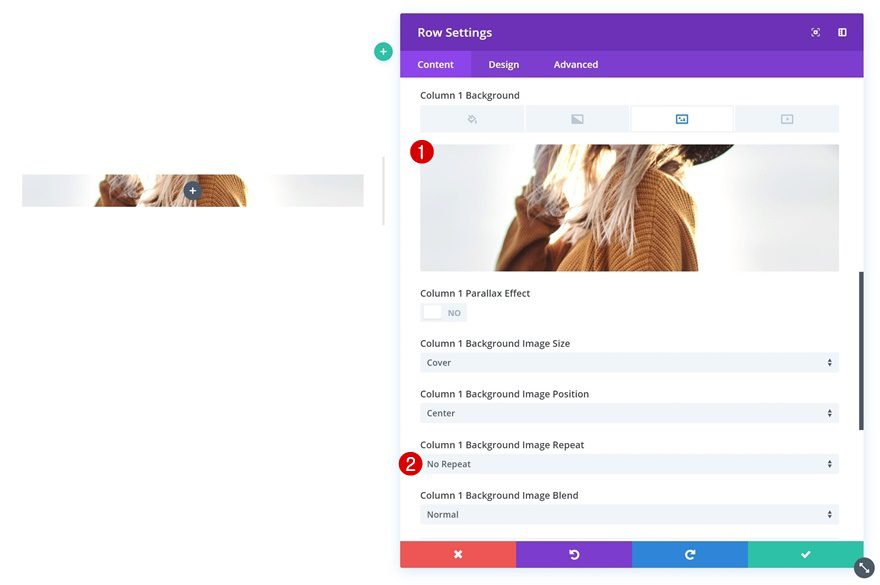
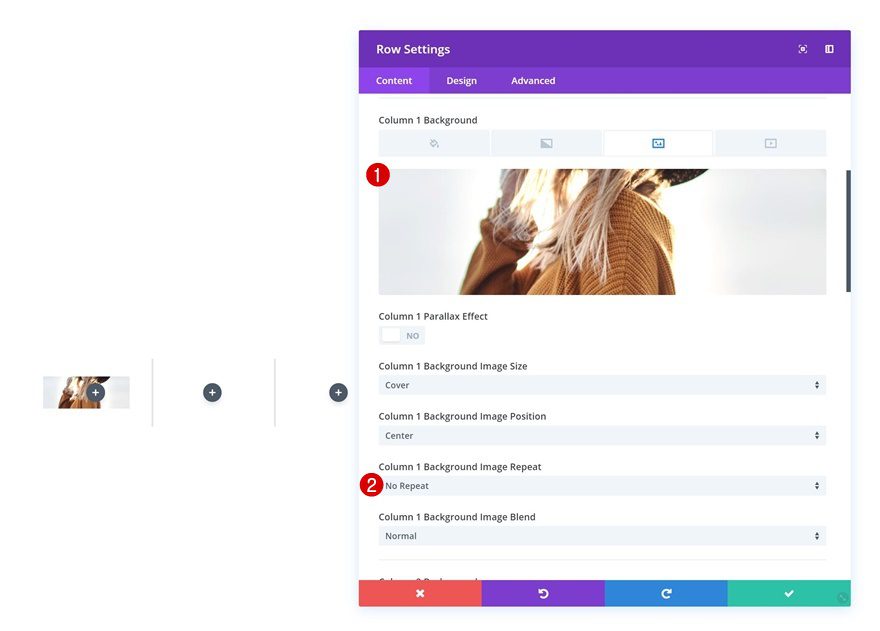
Column 1 Background Image
Without adding any modules yet, open the row settings and add a background image to the first column. Choose the image you want to appear on hover.
- Column 1 Background Image Repeat: No Repeat
Add Image to Column 1
Upload Image
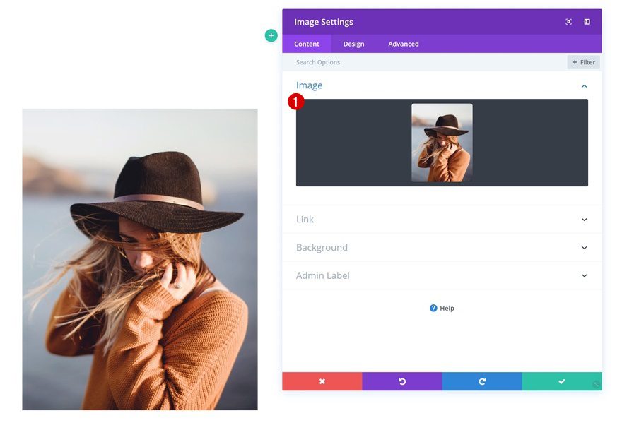
Continue by adding an Image Module to the first column and upload the image you want to appear before hover.
Add Title Text Module to Column 2
Add Content
In the second column, we’ll need a title Text Module first. Go ahead and add some H3 content.
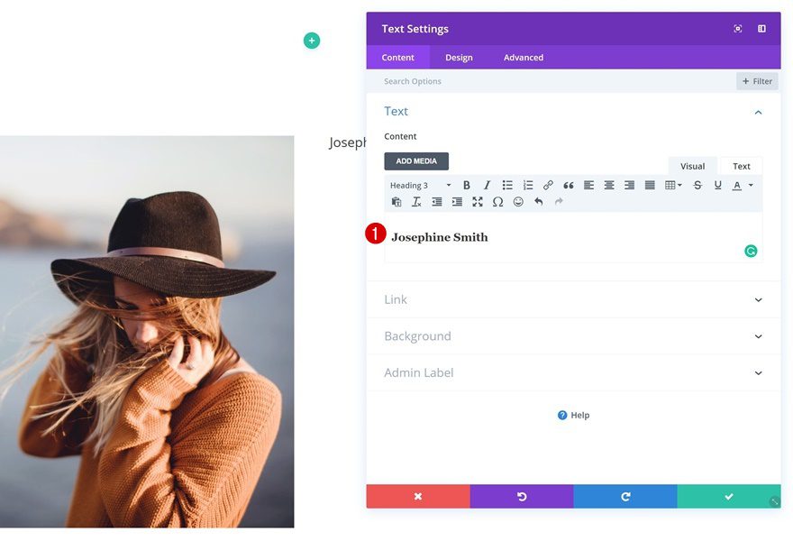
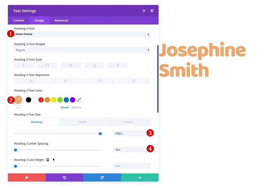
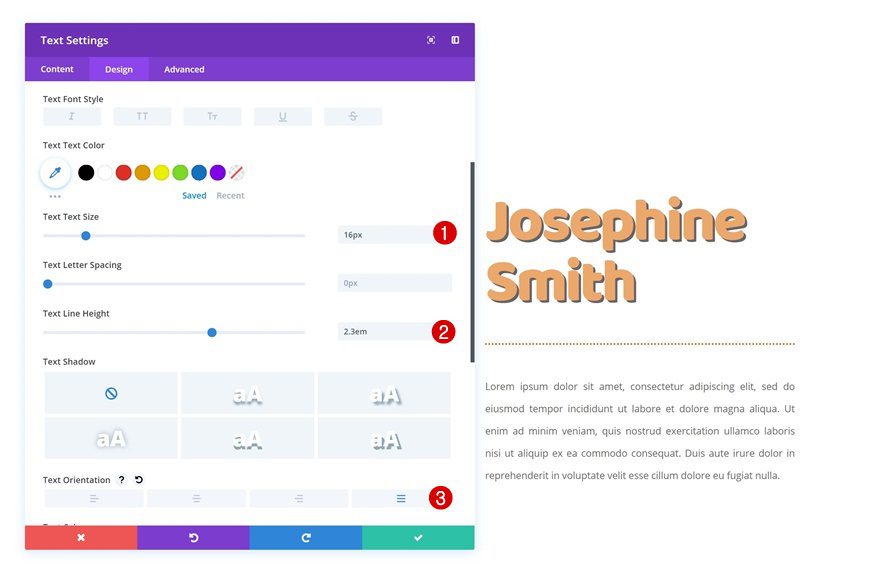
Heading Text Settings
Then, go to the heading text settings and make some changes.
- Heading 3 Font: Baloo Tamma
- Heading 3 Text Color: #eda96a
- Heading 3 Text Size: 100px (Desktop), 70px (Tablet), 50px (Phone)
- Heading 3 Letter Spacing: -4px
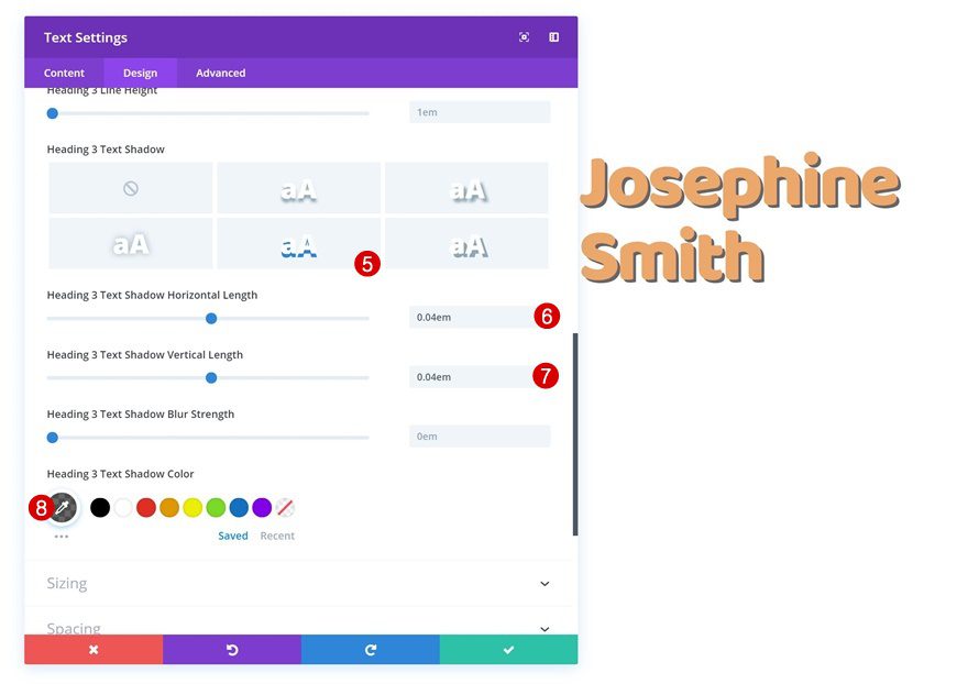
- Heading 3 Text Shadow Horizontal Length: 0.04em
- Heading 3 Text Shadow Vertical Length: 0.04em
- Heading 3 Text Shadow Color: rgba(0,0,0,0.6)
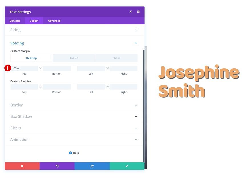
Spacing
Lastly, add some top margin in the spacing settings.
- Top Margin: 100px (Desktop), 50px (Tablet & Phone)
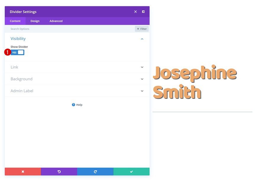
Add Divider Module to Column 2
Show Divider
Add a Divider Module right below the title Text Module in column 2.
- Show Divider: Yes
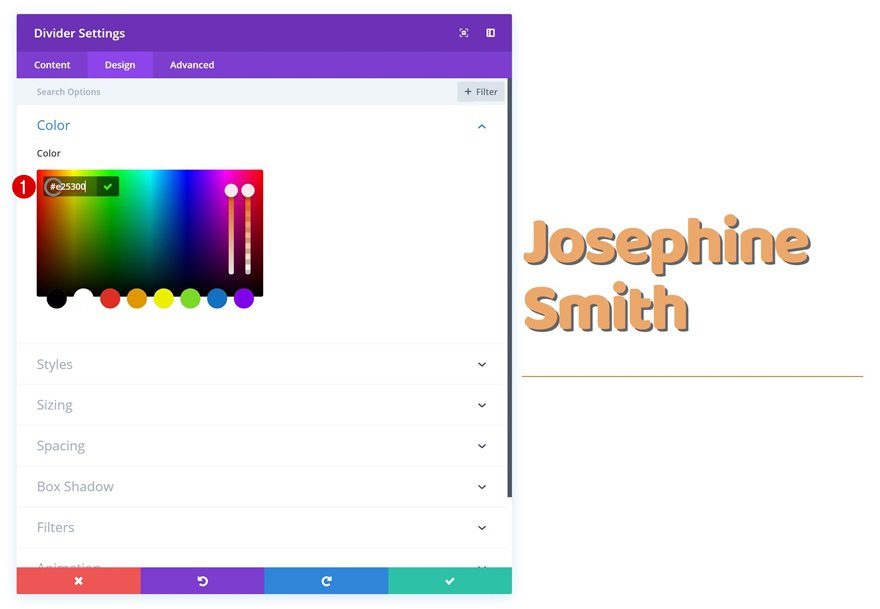
Divider Color
Change the divider color next.
- Divider Color: #e25300
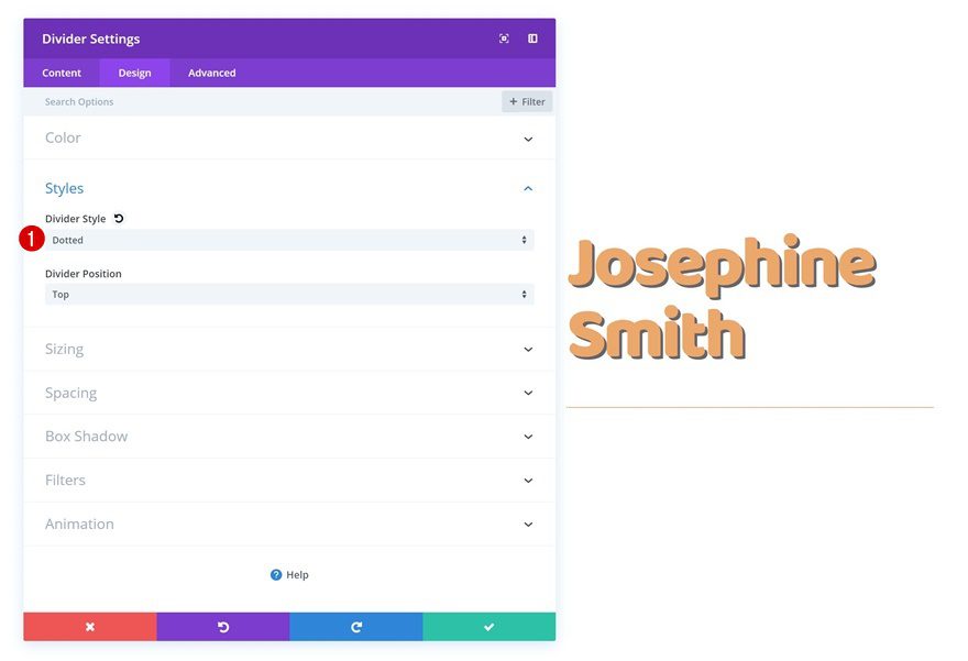
Styles
And select another divider style in the styles settings.
- Divider Style: Dotted
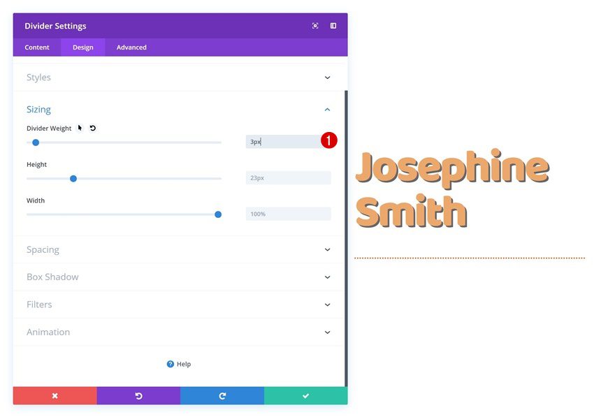
Sizing
Increase the divider weight in the sizing settings as well.
- Divider Weight: 3px
Add Body Text Module to Column 2
Add Content
On to the last module! Add a body Text Module to the second column with some content of choice.
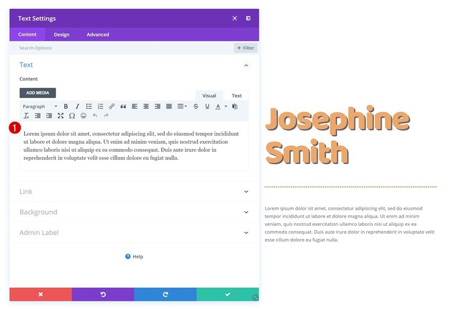
Text Settings
Change the text settings next.
- Text Size: 16px
- Text Line Height: 2.3em
- Text Orientation: Justify
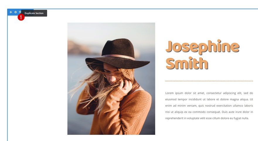
Clone Section Twice
Once you’ve finished all the general steps, clone the section you’ve built twice. Now, we’ll have a separate section for each one of the first three examples.
Create Example #1
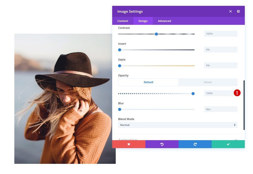
Apply Additional Settings to Image Module
Default Opacity
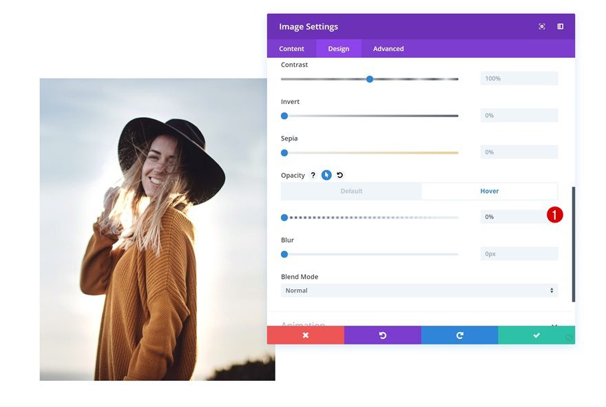
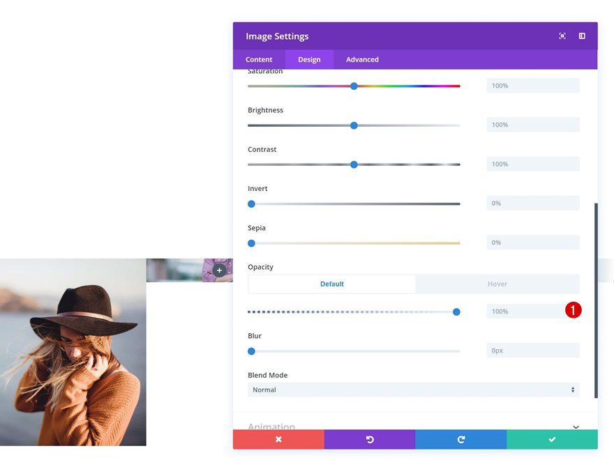
Let’s start creating the first example! The only thing we’ll do here is creating the hover transition, without any additional effects. To do that, open the Image Module and go to the filters settings. Make sure the default opacity value is 100%.
- Opacity: 100%
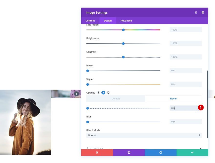
Hover Opacity
Change the opacity on hover.
- Opacity: 0%
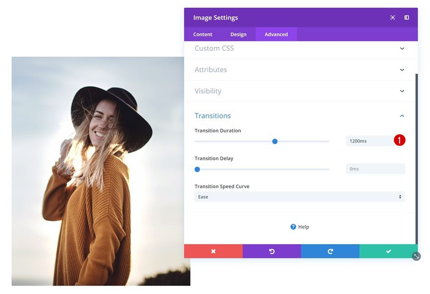
Transitions
Lastly, create a smooth transition by increasing the transition duration.
- Transition Duration: 1200ms
Create Example #2
Apply Additional Settings to Image Module
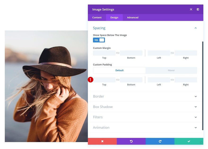
Default Spacing
On to the second example! Open the Image Module in column 1 and make sure there’s no default custom padding there.
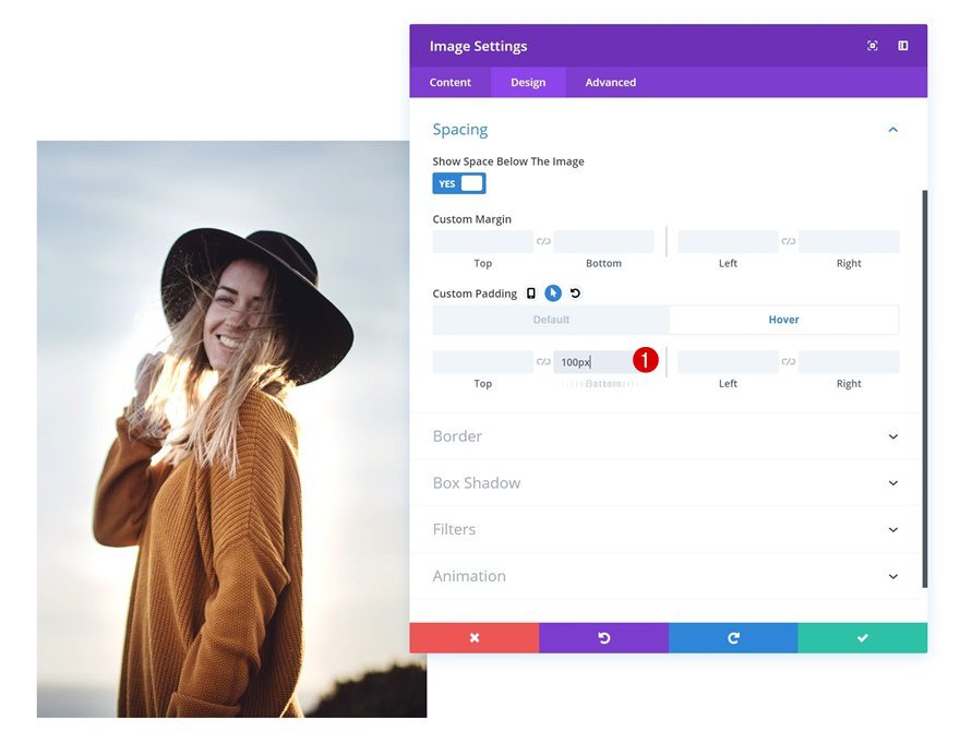
Hover Spacing
Continue by adding some bottom padding on hover to allow the image on hover to increase in size.
- Bottom Padding: 100px
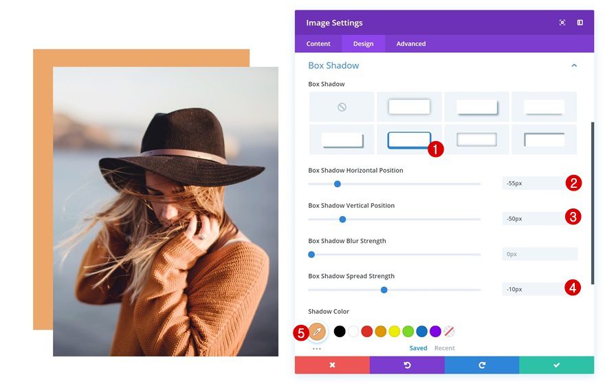
Box Shadow
We’re also adding a default box shadow which will dissapear on hover.
- Box Shadow Horizontal Position: -55px
- Box Shadow Vertical Position: -50px
- Box Shadow Spread Strength: -10px
- Shadow Color: #eda96a
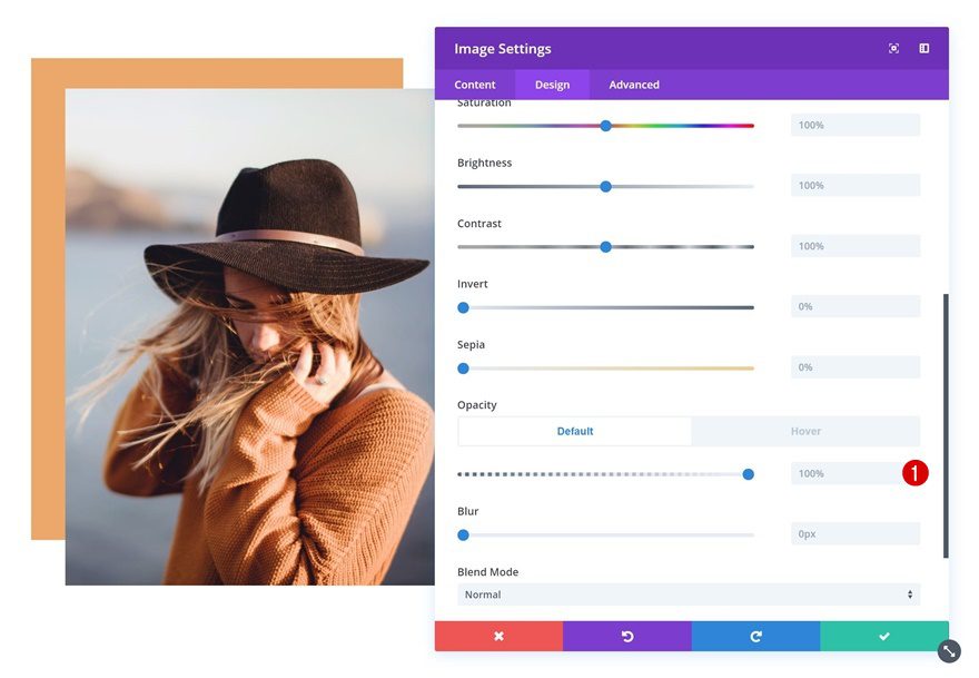
Default Opacity
Next, go to the filters settings and make sure the default opacity is 100%.
- Opacity: 100%
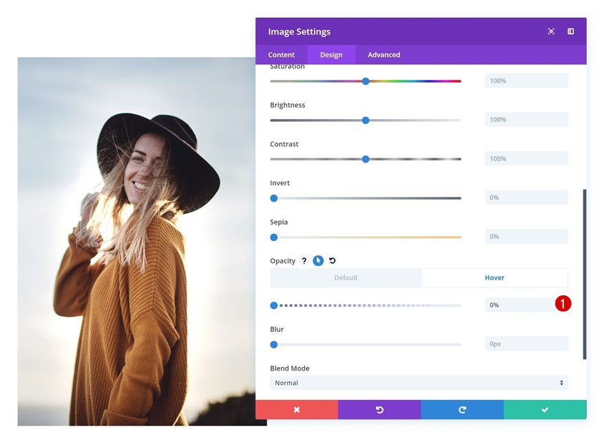
Hover Opacity
Remove the opacity of the module on hover. This will allow the column background to show up and create the ‘image on hover’ effect.
- Opacity: 0%
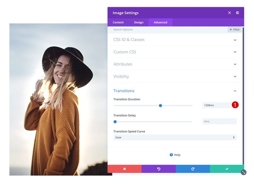
Transitions
Lastly, increase the transition duration in the transitions settings of the Image Module.
- Transition Duration: 1200ms
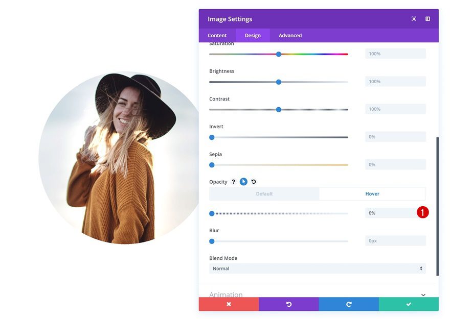
Create Example #3
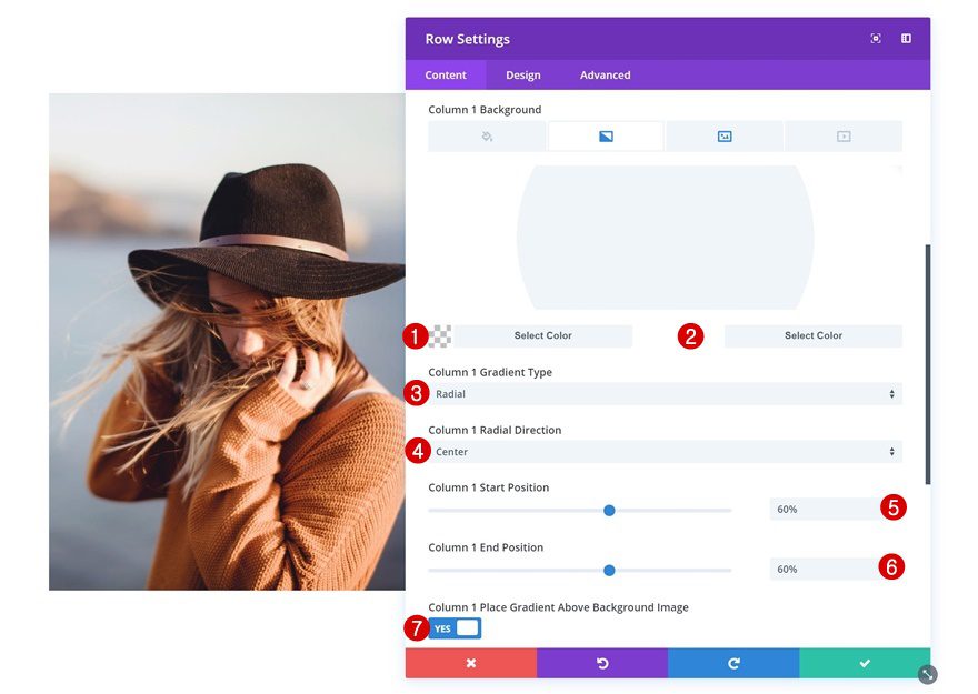
Add Gradient Background to Column 1
For the third example, we’re starting off by opening the row settings and adding a radial gradient background to the first column. This will give the image on hover a circular shape.
- Color 1: rgba(43,135,218,0)
- Color 2: #ffffff
- Column 1 Gradient Type: Radial
- Column 1 Radial Direction: Center
- Column 1 Start Position: 60%
- Column 1 End Position: 60%
Apply Additional Settings to Image Module
Default Opacity
Continue by opening the image module in column 1 and making sure the default opacity is 100%.
- Opacity: 100%
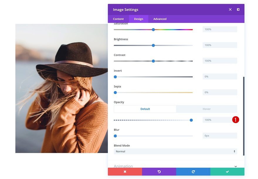
Hover Opacity
Remove all opacity on hover to allow the column background to show through.
- Opacity: 0%
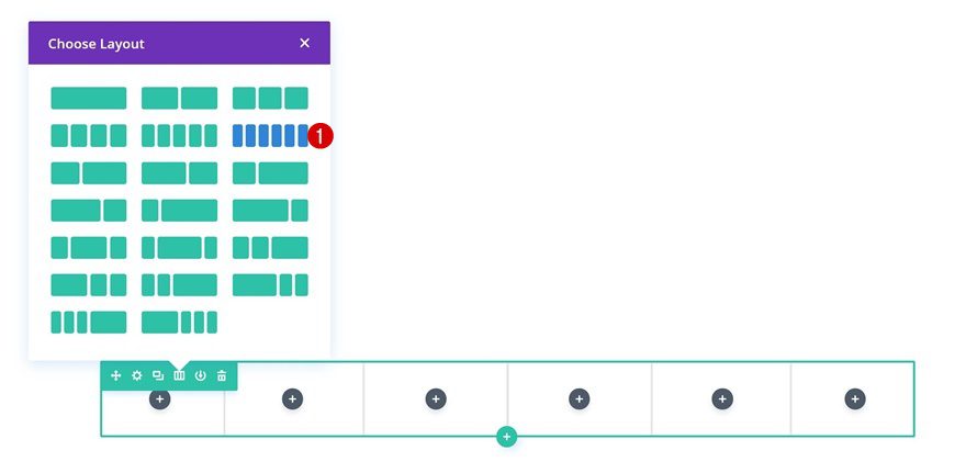
Create Example #4
Add New Row
Column Structure
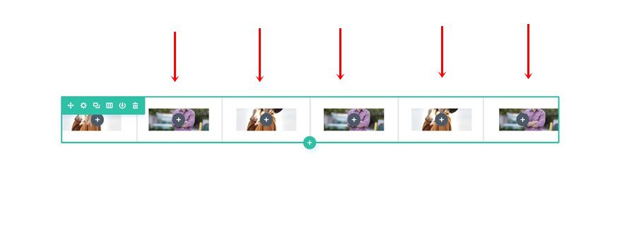
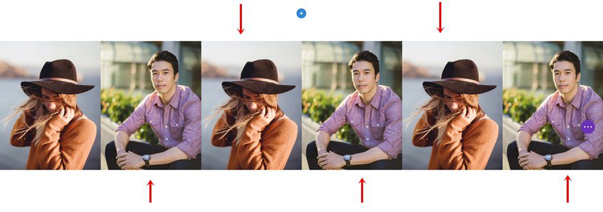
On to the last example! Here, we’ll need a new row with 6 columns.
Column 1 Background Image
Without adding any modules yet, open the row settings and add the background image you want to appear on hover as the column 1 background image.
- Column 1 Background Image Repeat: No Repeat
Repeat for All Columns in Row
Repeat the previous step for each one of the columns in your row.
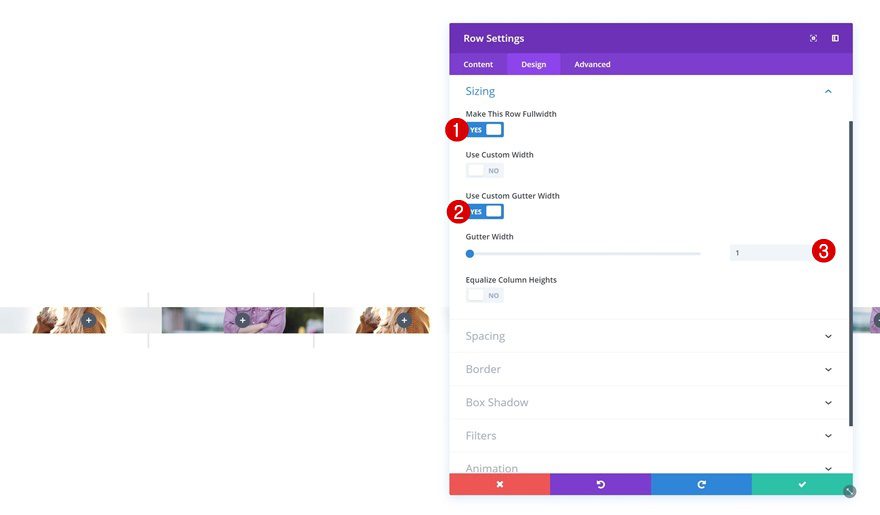
Sizing
Then, go to the sizing settings of the row and remove all space between columns.
- Make This Row Fullwidth: Yes
- Use Custom Gutter Width: 1
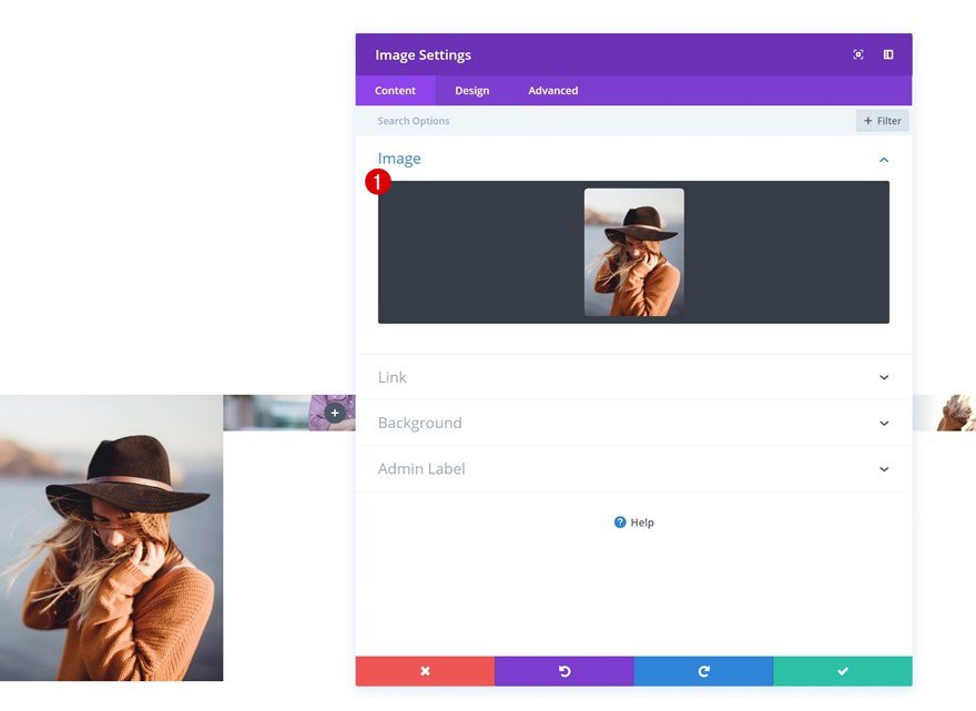
Add Image Module to Column 1
Upload Image
Continue by adding an Image Module to the first column and uploading the image you want to appear by default.
Default Opacity
Make sure this module’s default opacity is 100%.
- Opacity: 100%
Hover Opacity
And remove the opacity on hover to allow the column background to show instead.
- Opacity: 0%
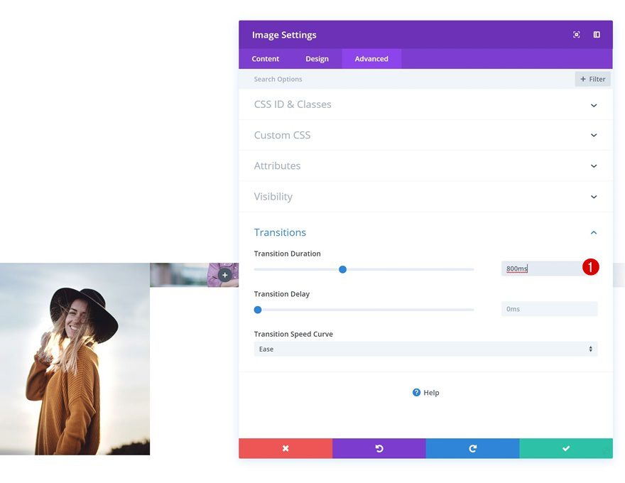
Transitions
Increase the transition duration for a smooth transition.
- Transition Duration: 800ms
Clone Image Module 3 Times & Place Duplicates in Remaining Columns
Once you’re done modifying the Image Module in column 1, you can clone it and place the duplicates in the remaining columns. Make sure to change the images as well.
Preview
Now that we’ve gone through all steps, and all four examples, let’s take a final look at all three examples we’ve created.
Final Thoughts
Changing an image on hover can help bring that extra interaction to testimonial sections, about pages and team pages. In this tutorial, we’ve shown you an easy way to achieve different kinds of images on hover using Divi’s built-in options only! If you have any questions or suggestions, make sure you leave a comment in the comment section below!
Featured Image by LovArt / shutterstock.com
The post How to Change an Image on Hover with Divi appeared first on Elegant Themes Blog.