
Today’s post was submitted by Michelle Nunan of Divi Soup, home of the “Divi Kitchen” where she’s constantly cooking up new and useful Divi tutorials and ecourses.
Carousels are a popular website feature. They allow you to display more content without taking up extra space, and they also add an element of interactivity to your website which can encourage your visitors to engage more with your content.
There are a number of great plugins that can help displaying your content in a carousel but in this post I am going to show you how to create a clickable carousel of Divi modules using only CSS and Javascript.
This effect can be used with almost any of the standard Divi modules, or combination of modules. I am going to show you how to create this carousel using the image module, and then with the blog module as the process for this is slightly different. From there you should understand how you can create your own carousel with almost any of the standard modules.
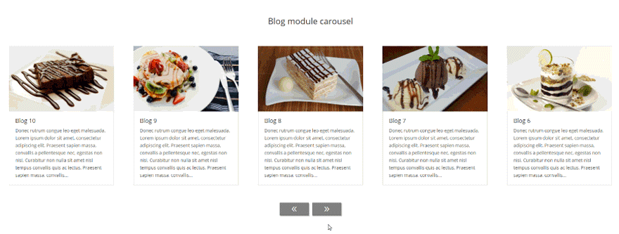
Result
This is what you should end up with after creating a carousel with the blog module
You can see a live demo here showing the effect using various Divi Builder Modules.
So let’s get started.
Add a new page
We will begin by creating a carousel with the image module. Add a new page or open a page to which you want to add the carousel.
Add a new section
Add a new standard section to your page with a single column. Then open up the section settings and in the Advanced tab, add the class ds-carousel-section in the CSS Class field.
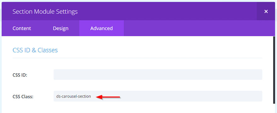
As we are going to be changing the way the section and rows display, we only want these changes applied to our carousel, therefore we add a custom class to prevent our code affecting any other elements on our site.
Then Save & Exit the section.
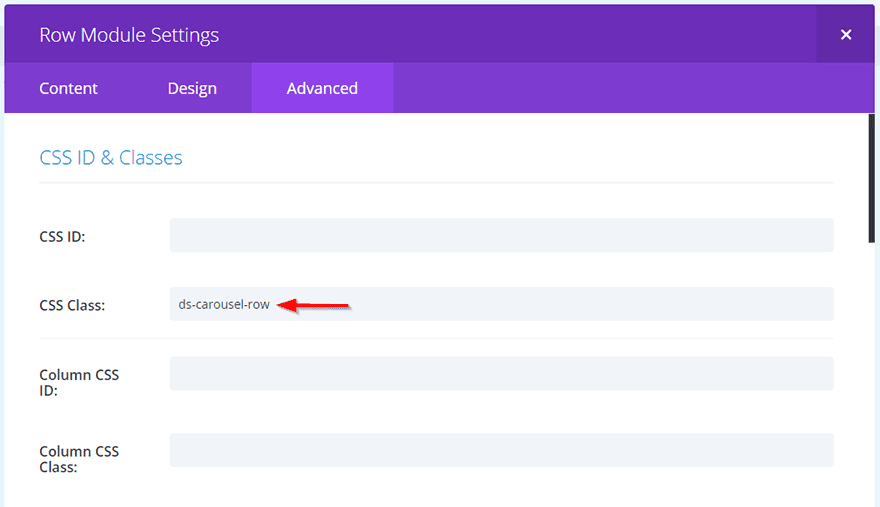
Now open up the row settings and in the Advanced tab, add the class ds-carousel-row in the CSS Class field. Then Save & Exit the row.
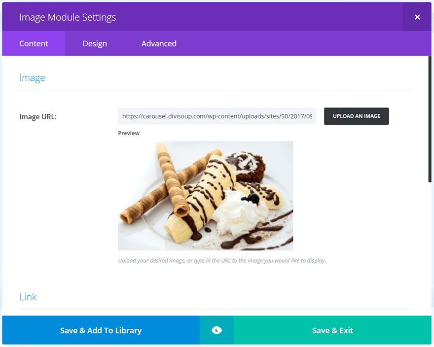
Next we are going to add an image module to our row. Click Insert Module(s) and select the Image Module from the list.
In the Content tab of the image module, click Upload An Image and either select your desired image from the media library or upload a new one.
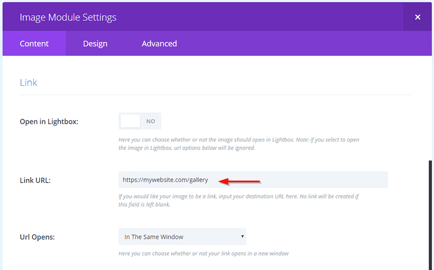
If you want your images to open in a lightbox then select this option in the settings.
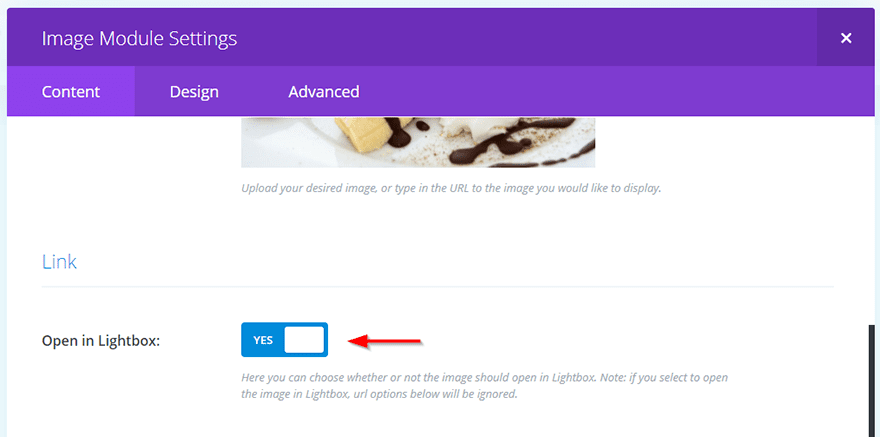
Alternatively you can add a url to open a new page when the image is clicked if you wish.
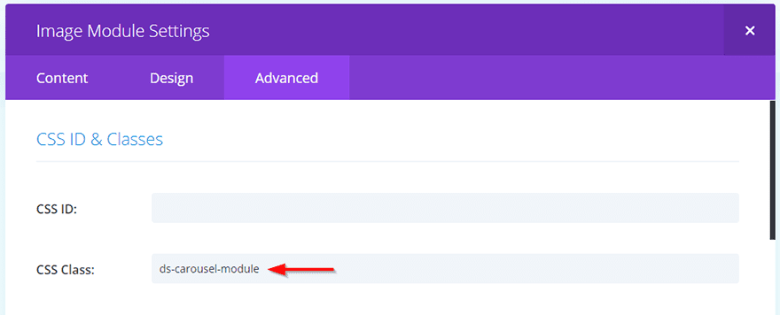
The last thing we need to do to the module is to add a class. Click on the Advanced tab and add the class ds-carousel-module in the CSS Class field. Then Save & Exit the module.
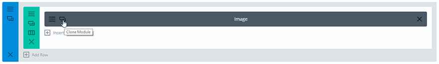
That’s one of our modules done, but we are going to need more than a single image to create the carousel. The code I will provide later in this post will display 5 images at a time, so we are going to need at least 6 images in order for our carousel buttons to have any effect and slide our content.
Using Divi’s clone feature, duplicate the image module as many times as you want images to display in your carousel.
When you are done your section should look like this, with your image modules stacked in a single row.
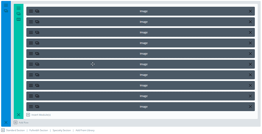
You will need to open the settings for each module and swap out your images and the URL if you added it.
That’s the setup of the content complete, now we are going to create the navigation.
Add a new section
Add a new section directly below your image section, this time with two columns.
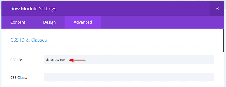
Open up the row settings and in the Advanced tab add the class ds-arrow-row in the CSS Class field. Then Save & Exit the row.
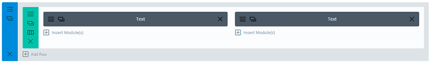
Add the navigation
Next, add a text module to each of the two columns in this row.
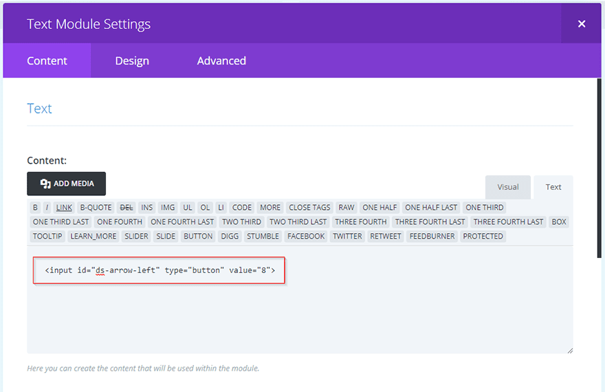
Now we need to create input fields to act as our navigation buttons. Open up the text module in the left column and in the content area, paste the following HTML:
<input id="ds-arrow-left" type="button" value="8">
Then Save & Exit the module.
Next open the text module in the right column and paste the following HTML:
<input id="ds-arrow-right" type="button" value="9">

Then Save & Exit the module.
We are giving these input fields unique IDs of ds-arrow-left and ds-arrow-right so we can both style them with CSS and target them with JavaScript to tell them what we want them to do when they are clicked.
The values of 8 and 9 refer to the double left and right arrows from the ET Modules font family.
That’s all we need to do in the builder. If you check the front end of your page now it will just be a single column of images and then two little grey buttons with 8 and 9 on them and they won’t do anything. So let’s get to the fun part, adding our code.
Add the CSS
I would advise adding the following CSS to your child theme, but if you are not using a child theme then it’s fine to add to Divi > Theme Options > General > Custom CSS and be sure to hit Save.
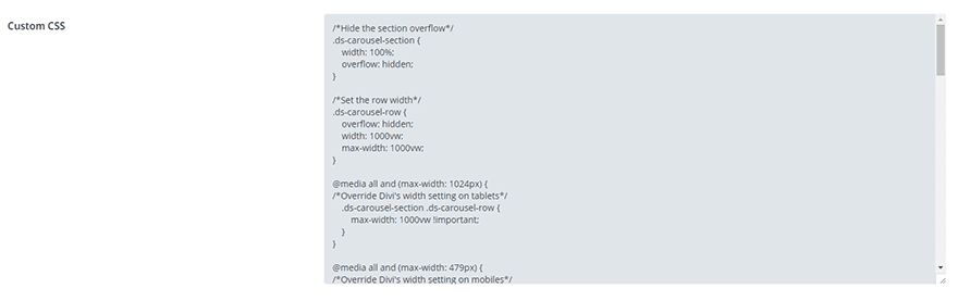
/*Hide the section overflow*/
.ds-carousel-section {
    width: 100%;
    overflow: hidden;
}

/*Set the row width*/
.ds-carousel-row {
    overflow: hidden;
    width: 1000vw;
    max-width: 1000vw;
}

@media all and (max-width: 1024px) {
/*Override Divi's width setting on tablets*/
    .ds-carousel-section .ds-carousel-row {
        max-width: 1000vw !important;
    }
}

@media all and (max-width: 479px) {
/*Override Divi's width setting on mobiles*/
    .ds-carousel-section .ds-carousel-row {
        max-width: 1000vw !important;
    }
}

/*Style the navigation arrows*/
#ds-arrow-left,
#ds-arrow-right {
    color: #fff;
    background: gray;
    font-family: 'ETModules';
    font-size: 30px;
    padding: 5px 30px;
    border-style: none;
    border-radius: 0;
    cursor: pointer;
    -webkit-box-shadow: 2px 2px 2px 0 rgba(0, 0, 0, 0.3);
    box-shadow: 2px 2px 2px 0 rgba(0, 0, 0, 0.3);
    -webkit-transition: all 0.3s;
    transition: all 0.3s;
}

/*Position the left arrow*/
#ds-arrow-left {
    float: right;
    margin-right: 5px;
}

/*Position the right arrow*/
#ds-arrow-right {
    float: left;
    margin-left: 5px;
}

/*Style navigation arrows on hover*/
#ds-arrow-left:hover,
#ds-arrow-right:hover {
    -webkit-box-shadow: 3px 3px 6px 1px rgba(0, 0, 0, 0.2);
    box-shadow: 3px 3px 6px 1px rgba(0, 0, 0, 0.2);
}

/*Style navigation arrows on click*/
#ds-arrow-left:active,
#ds-arrow-right:active {
    -webkit-box-shadow: 2px 2px 5px 0 rgba(0, 0, 0, 0.2) inset;
    box-shadow: 2px 2px 5px 0 rgba(0, 0, 0, 0.2) inset;
}

/*Make sure the modules span their entire container*/
.ds-carousel-module .column {
    float: left;
    width: 100% !important;
    margin-right: 0 !important;
}

/*Set the module width*/
.ds-carousel-module {
    width: 20vw; /*Change this value to increase or decrease the module displayed per page*/
    padding: 0 30px;
    float: left;
    position: relative;
    margin-bottom: 0 !important;
}

/*Adjust for smaller screens*/
@media all and (max-width: 1024px) {
    /*Show 3 modules per page on tablets*/
    .ds-carousel-module {
        width: 33.33vw;
    }
    /*Align the navigation on smaller screens*/
    #ds-arrow-row .et_pb_column {
        width: 50% !important;
    }
}

@media all and (max-width: 479px) {
    /*Show 1 module per page on mobiles*/
    .ds-carousel-module {
        width: 100vw;
    }
}
Edit the CSS for your needs
You may need to edit some of the CSS declarations depending on how many modules you use in your carousel.
Now for a little math!
This declaration sets the width of the row containing the modules.
/*Set the row width*/
.ds-carousel-row {
    overflow: hidden;
    width: 1000vw;
    max-width: 1000vw;
}
In order to float our modules next to each other, with some sitting outside of the visible area, we need to increase the width of the row.
If you are displaying a total of 15 modules with 5 per page then you will end up with 3 pages. So the visible width of the row needs to be:
(15 / 5) x 100 = 300.
Therefore you will need to change the 1000vw values to a minimum of 300vw. (It doesn’t matter if you insert a greater number as the JavaScript will take care of not displaying any extra empty pages). So your adjusted CSS would look like this:
/*Set the row width*/
.ds-carousel-row {
    overflow: hidden;
    width: 300vw;
    max-width: 300vw;
}
With the media queries it is slightly different. As the CSS is configured to display 3 images per page on screens 1024px wide and less, and 1 image per page on screens 479px wide or less, we need to adjust the math to reflect that:
(15 / 3) x 100 = 500 (for tablets)
(15 / 1) x 100 = 1500 (for mobiles)
Your adjusted CSS would look like this:
@media all and (max-width: 1024px) {
/*Override Divi's width setting on tablets*/
    .ds-carousel-section .ds-carousel-row {
        max-width: 500vw !important;
    }
}

@media all and (max-width: 479px) {
/*Override Divi's width setting on mobiles*/
    .ds-carousel-section .ds-carousel-row {
        max-width: 1500vw !important;
    }
}
You can if you wish just amend all of these values to a width greater than the total number of modules you are using for simplicity. So in the aforementioned example that value would be 1500vw or more.
You may also want to change the number of modules displayed per page. This CSS declaration is where you can adjust that.
/*Set the module width*/
.ds-carousel-module {
    width: 20vw; /*Change this value to increase or decrease the modules displayed per page*/
    padding: 0 30px;
    float: left;
    position: relative;
    margin-bottom: 0 !important;
}
The width value of 20vw displays 5 images per page, and it’s just a percentage of 100. So 25vw would display 4 images per page and 16.66vw would display 6 images per page, and so on.
You can do the same for the media queries:
/*Adjust for smaller screens*/
@media all and (max-width: 1024px) {
    /*Show 3 modules per page on tablets*/
    .ds-carousel-module {
        width: 33.33vw;
    }
    /*Align the navigation on smaller screens*/
    #ds-arrow-row .et_pb_column {
        width: 50% !important;
    }
}

@media all and (max-width: 479px) {
    /*Show 1 module per page on mobiles*/
    .ds-carousel-module {
        width: 100vw;
    }
}
Do remember that if you change the number of images displayed per page, you may also need to adjust the row width value discussed previously.
If you check your page again now, everything should be styled nicely and looking like a carousel, but in order for it to function, we need to add some JavaScript.
Add the JavaScript
Copy and paste the following code into Divi > Theme Options > Integrations > Add code to the < head > of your blog and be sure to Save.
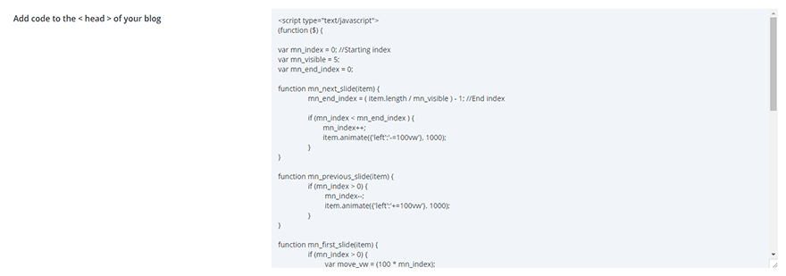
<script type="text/javascript">
(function ($) {

var mn_index = 0; //Starting index
var mn_visible = 5;
var mn_end_index = 0;

function mn_next_slide(item) {
		mn_end_index = ( item.length / mn_visible ) - 1; //End index

		if (mn_index < mn_end_index ) {
			mn_index++;
			item.animate({'left':'-=100vw'}, 1000);
		}
}

function mn_previous_slide(item) {
		if (mn_index > 0) {
			 mn_index--;
			 item.animate({'left':'+=100vw'}, 1000);
		}
}

function mn_first_slide(item) {
		if (mn_index > 0) {
			 var move_vw = (100 * mn_index);
			 item.animate({'left':'+='+move_vw+'vw'}, 1000);
			 mn_index = 0;
		}
}

function mn_set_visible() {
	if ($(window).width() < 480) {
		mn_visible = 1;
	} else if ($(window).width() < 1025) {
		mn_visible = 3;
	}
}

function mn_carousel_init() {
	mn_set_visible();

	var item = $('.ds-carousel-module');

	$('#ds-arrow-right').click(function() {
		mn_next_slide(item);
	});

	$('#ds-arrow-left').click(function() {
		mn_previous_slide(item);
	});

	$(window).resize(function() {
		mn_set_visible();
	  	mn_first_slide(item);
	});

}

$(document).ready(function() {
	mn_carousel_init();
});

})(jQuery)
</script>
This code adds functionality to our buttons, moving the row left and right on click to display the modules.
There are a couple areas you may want to edit:
var mn_index = 0; //Starting index
var mn_visible = 5;
var mn_end_index = 0;
The mn_visible = 5; variable corresponds with the number of modules displayed per page on desktop. So if you changed this in the CSS as mentioned previously, you will also want to change this value too.
Likewise, this function adjusts the number of images displayed on tablets and mobiles. So if you changed this in the CSS, then adjust the mn_visible values here also.
function mn_set_visible() {
	if ($(window).width() < 480) {
		mn_visible = 1;
	} else if ($(window).width() < 1025) {
		mn_visible = 3;
	}
}
Finally, we have the speed at which the carousel moves. It is set here as 1000. This is the speed in milliseconds: 1000 milliseconds = 1 second.
You can adjust this value to speed up or slow down the animation.
function mn_next_slide(item) {
		mn_end_index = ( item.length / mn_visible ) - 1; //End index

		if (mn_index < mn_end_index ) {
			mn_index++;
			item.animate({'left':'-=100vw'}, 1000);
		}
}

function mn_previous_slide(item) {
		if (mn_index > 0) {
			 mn_index--;
			 item.animate({'left':'+=100vw'}, 1000);
		}
}

function mn_first_slide(item) {
		if (mn_index > 0) {
			 var move_vw = (100 * mn_index);
			 item.animate({'left':'+='+move_vw+'vw'}, 1000);
			 mn_index = 0;
		}
}
That’s it! Now if you view your page you should have a clickable carousel of image modules.
As I said, you can use this method with almost any of the standard Divi builder modules, but you may need to adjust the settings with modules designed to display some kind of feed, like the blog module.
As the blog module pulls in posts and displays those in multiple columns (when using the grid feature), this would require adjusting the module settings and a tiny bit of extra CSS.
Carousel Using the Blog Module
Follow the same steps to set up your section and row.
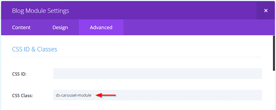
The instead of adding an image module, choose the blog module and add the ds-carousel-module class in the Advanced tab of the module settings.
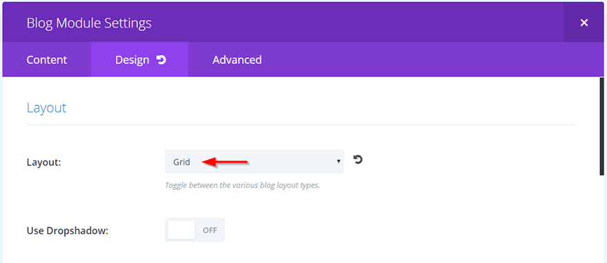
Next, in the Design tab choose Grid from the layout dropdown.
You can leave it as Fullwidth if you like, but the Grid option automatically adds styling that fits better with the carousel layout.
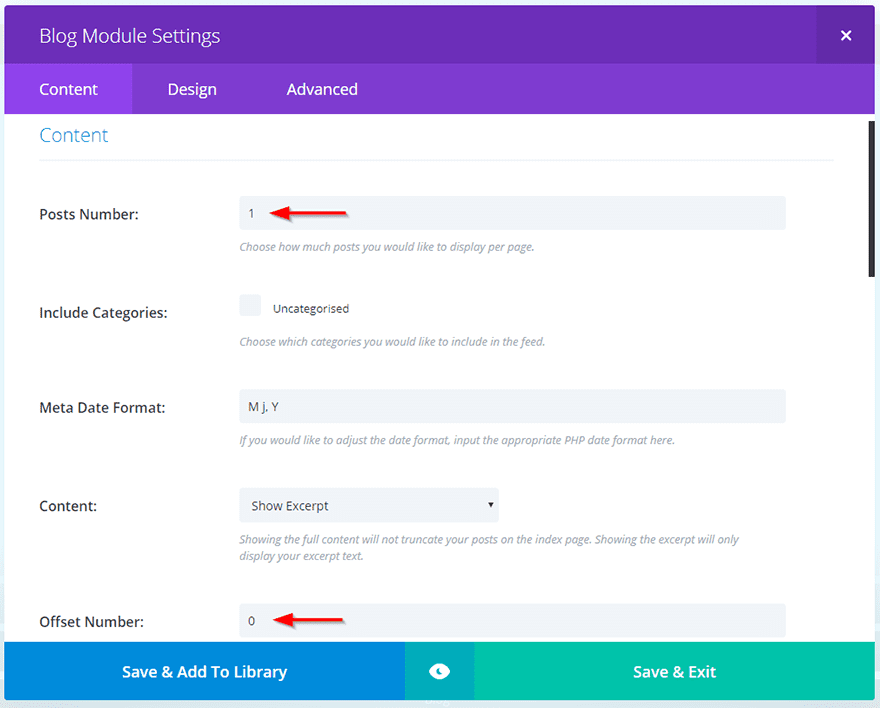
Now we need to adjust some settings in the Content tab.
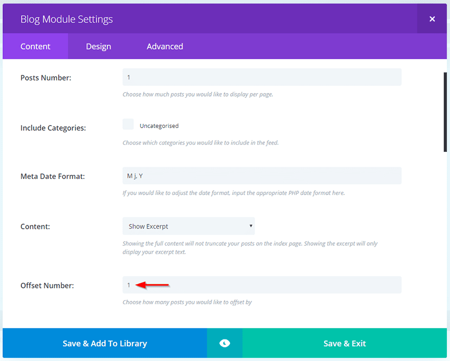
For this first module, we need the Posts Number set to 1, and the Offset Number set to 0.
How you adjust the rest of the settings and which content you display is entirely up to you. Then Save and Exit.
As we did before, use Divi’s cloning functionality to duplicate the module as many times as you need.
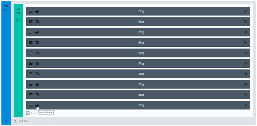
Once you have the number of blog modules you need, open each one and increment the offset number by 1 each time so that each blog module displays the next post in the feed.
So your settings would look like this:
1st = Offset Number: 0
2nd = Offset number: 1
3rd = Offset Number: 2
4th = Offset Number: 3
Etc.
A Little Extra CSS
As the blog module displays in columns when using Grid format, we need to add this extra media query to our CSS to override Divi’s column setting on smaller screens:
@media all and (max-width: 980px) {
    /*Set post to fullwidth on smaller screens*/
    .ds-carousel-section .et_pb_blog_grid .column.size-1of2 {
        width: 100% !important;
        margin: 0 !important;
    }
}
If you decided to use the blog module in Fullwidth mode, you won’t need to add this.
Result
Now check your page and see your lovely new Blog Carousel 
Final Thoughts
There are so many ways you can use this carousel effect to display more content without increasing the length of your page.
You could display a showcase of your site designs, client testimonials, employee biographies, videos, podcasts or even products from your shop.
I would love to hear how you use this tutorial to create a clickable carousel of Divi modules so please leave a comment in the section below!
Featured Image By aunaauna / Shutterstock.com
The post How to Create a Clickable Carousel of Divi Modules appeared first on Elegant Themes Blog.