
Now that the Theme Builder is here, we can’t wait to dive into new tutorials that’ll help you set up your website from A to Z. This includes creating custom headers using Divi’s built-in option. In this tutorial, we’ll focus on creating a global header using Divi’s Theme Builder. A global header will show up everywhere on your website unless you’ve assigned a different header to that page or post.
Let’s get to it!
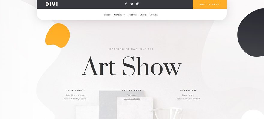
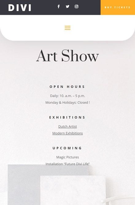
Preview
Before we dive into the tutorial, let’s take a quick look at the outcome across different screen sizes.
Desktop
Mobile
Download The Custom Header Design for FREE
To lay your hands on the free custom global header design, you will first need to download it using the button below. To gain access to the download you will need to subscribe to our Divi Daily email list by using the form below. As a new subscriber, you will receive even more Divi goodness and a free Divi Layout pack every Monday! If you’re already on the list, simply enter your email address below and click download. You will not be “resubscribed” or receive extra emails.
@media only screen and ( max-width: 767px ) {.et_bloom .et_bloom_optin_1 .carrot_edge.et_bloom_form_right .et_bloom_form_content:before, .et_bloom .et_bloom_optin_1 .carrot_edge.et_bloom_form_left .et_bloom_form_content:before { border-top-color: #ffffff !important; border-left-color: transparent !important; }
}.et_bloom .et_bloom_optin_1 .et_bloom_form_content button { background-color: #f92c8b !important; } .et_bloom .et_bloom_optin_1 .et_bloom_form_content .et_bloom_fields i { color: #f92c8b !important; } .et_bloom .et_bloom_optin_1 .et_bloom_form_content .et_bloom_custom_field_radio i:before { background: #f92c8b !important; } .et_bloom .et_bloom_optin_1 .et_bloom_border_solid { border-color: #f7f9fb !important } .et_bloom .et_bloom_optin_1 .et_bloom_form_content button { background-color: #f92c8b !important; } .et_bloom .et_bloom_optin_1 .et_bloom_form_container h2, .et_bloom .et_bloom_optin_1 .et_bloom_form_container h2 span, .et_bloom .et_bloom_optin_1 .et_bloom_form_container h2 strong { font-family: “Open Sans”, Helvetica, Arial, Lucida, sans-serif; }.et_bloom .et_bloom_optin_1 .et_bloom_form_container p, .et_bloom .et_bloom_optin_1 .et_bloom_form_container p span, .et_bloom .et_bloom_optin_1 .et_bloom_form_container p strong, .et_bloom .et_bloom_optin_1 .et_bloom_form_container form input, .et_bloom .et_bloom_optin_1 .et_bloom_form_container form button span { font-family: “Open Sans”, Helvetica, Arial, Lucida, sans-serif; } p.et_bloom_popup_input { padding-bottom: 0 !important;}

Download For Free
Join the Divi Newlsetter and we will email you a copy of the ultimate Divi Landing Page Layout Pack, plus tons of other amazing and free Divi resources, tips and tricks. Follow along and you will be a Divi master in no time. If you are already subscribed simply type in your email address below and click download to access the layout pack.
You have successfully subscribed. Please check your email address to confirm your subscription and get access to free weekly Divi layout packs!
Subscribe To Our Youtube Channel
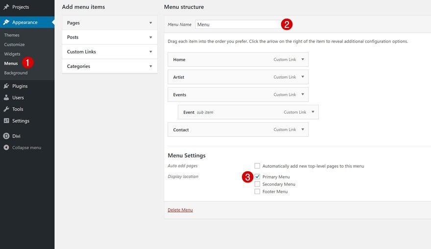
1. Setup Your Primary Menu
Start by creating your menu in the appearance settings of your WordPress website.
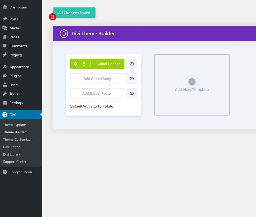
2. Go to the Theme Builder Options
Then, navigate to the Theme Builder in Divi’s Theme Options. Once there, you’ll notice an empty default website template.
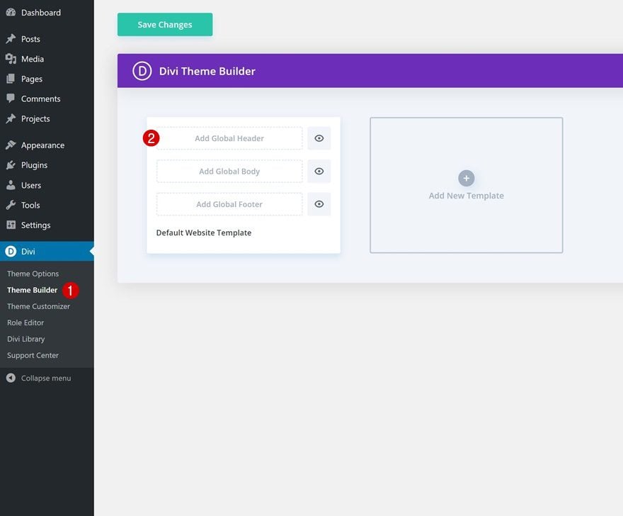
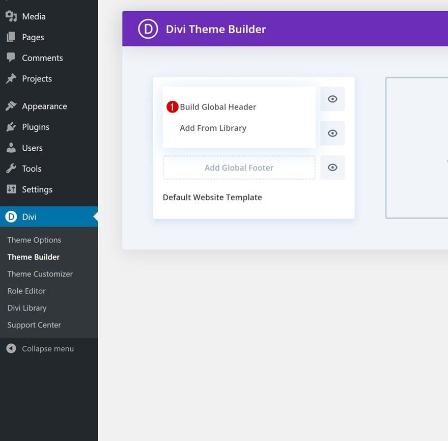
3. Add & Build Global Header
The default website template is where you can start creating your custom global header, global body and global footer. Click on ‘Add Global Header’ and continue by clicking on ‘Build Global Header’ to get started with the process.
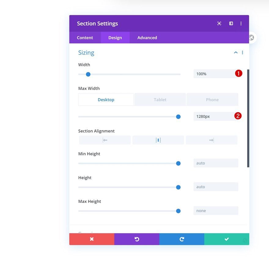
Section Settings
Sizing
Open the section you can notice on the page, move on to the design tab and change the width across different screen sizes.
- Width: 100%
- Max Width: 1280px (Desktop), 100% (Tablet & Phone)
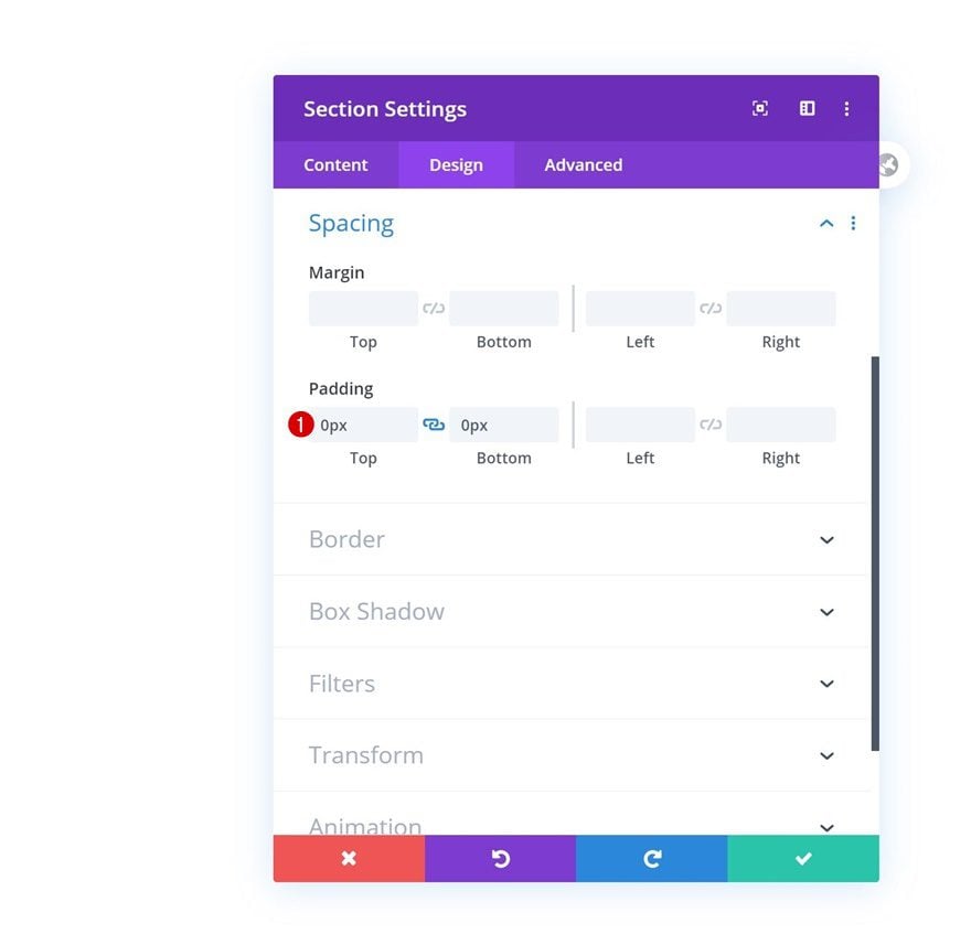
Spacing
Remove all default top and bottom padding next.
- Top Padding: 0px
- Bottom Padding: 0px
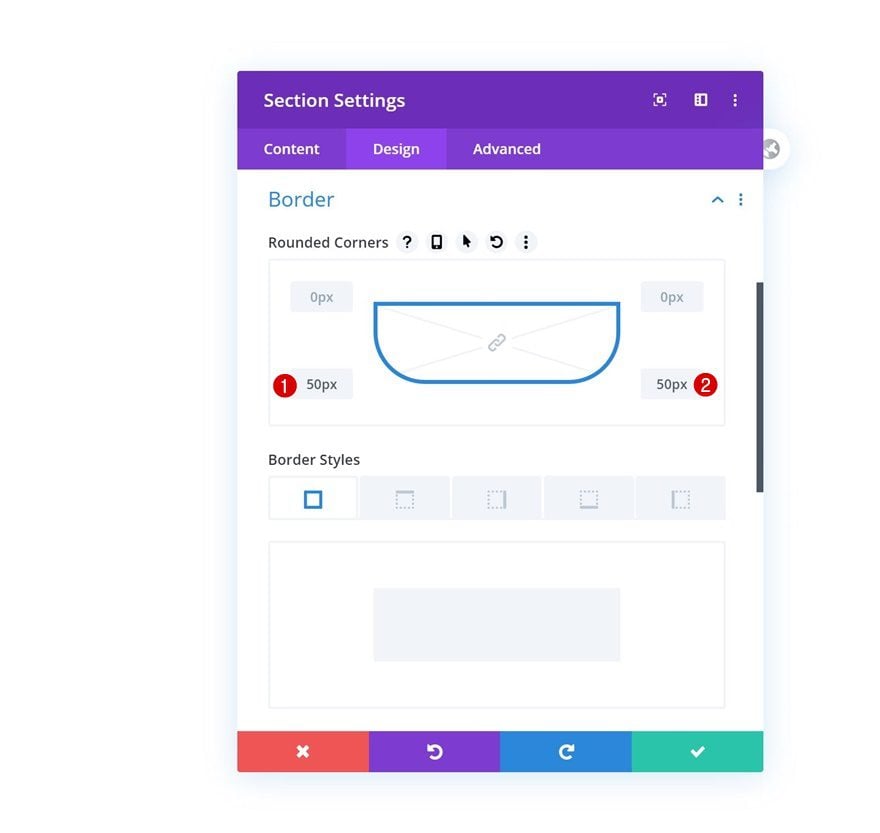
Border
Add some border radius to the bottom left and right corners of the section next.
- Bottom Left: 50px
- Bottom Right: 50px
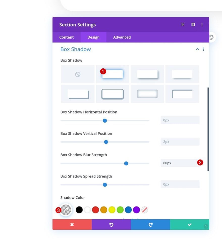
Box Shadow
We’re also adding a subtle box shadow.
- Box Shadow Blur Strength: 60px
- Shadow Color: rgba(0,0,0,0.13)
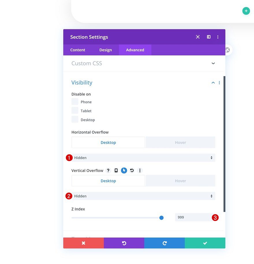
Default Visibility
Then, go to the advanced tab and hide the overflows. Increase the z index too, this will help ensure that the section remains on top of all page content.
- Horizontal Overflow: Hidden
- Vertical Overflow: Hidden
- Z Index: 999
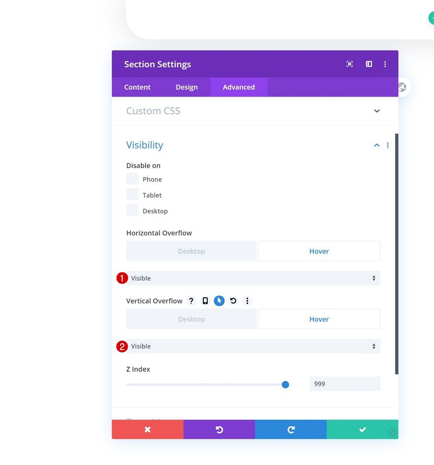
Hover Visibility
Change the section’s overflows on hover.
- Horizontal Overflow: Visible
- Vertical Overflow: Visible
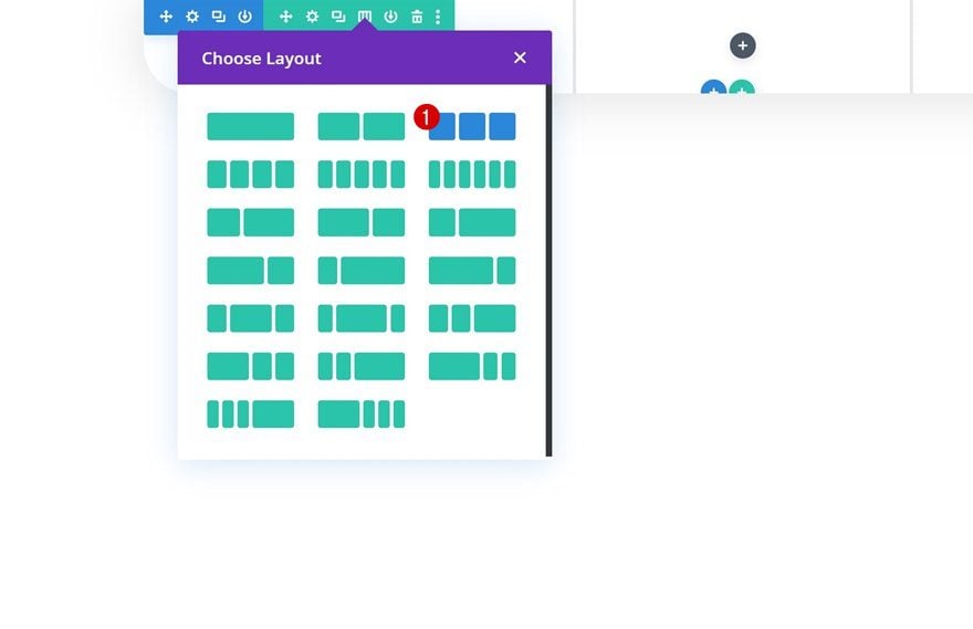
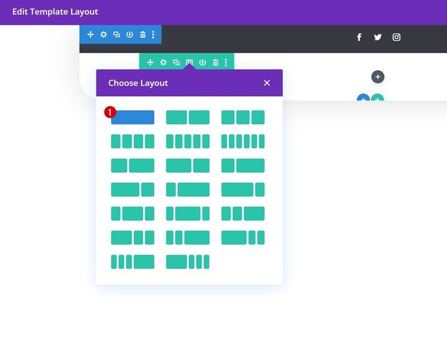
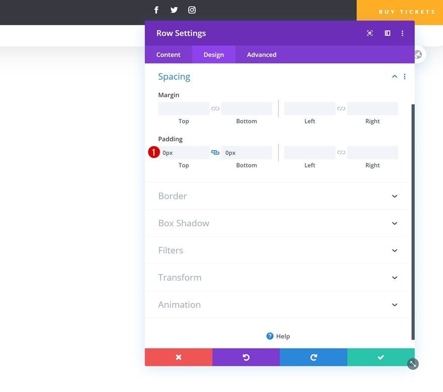
4. Dedicate New Row to Header
Now that we’ve completed the general section settings, we can start adding rows. In total, we’ll need two rows; one that’s dedicated to the header, and one that allows the menu items to show up. We’ll start with the header by adding a new row using the following column structure:
Row Settings
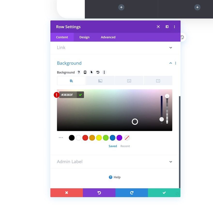
Background Color
Without adding any modules to the row, open the row settings and change the background color.
- Background Color: #38383f
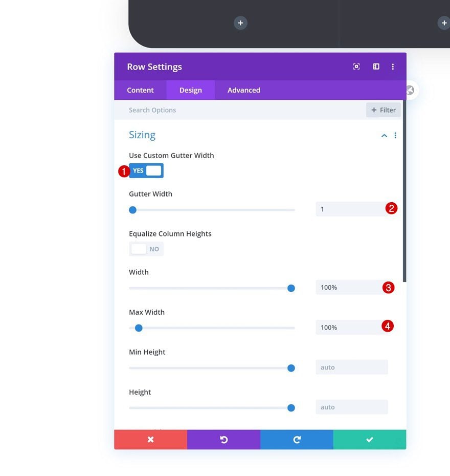
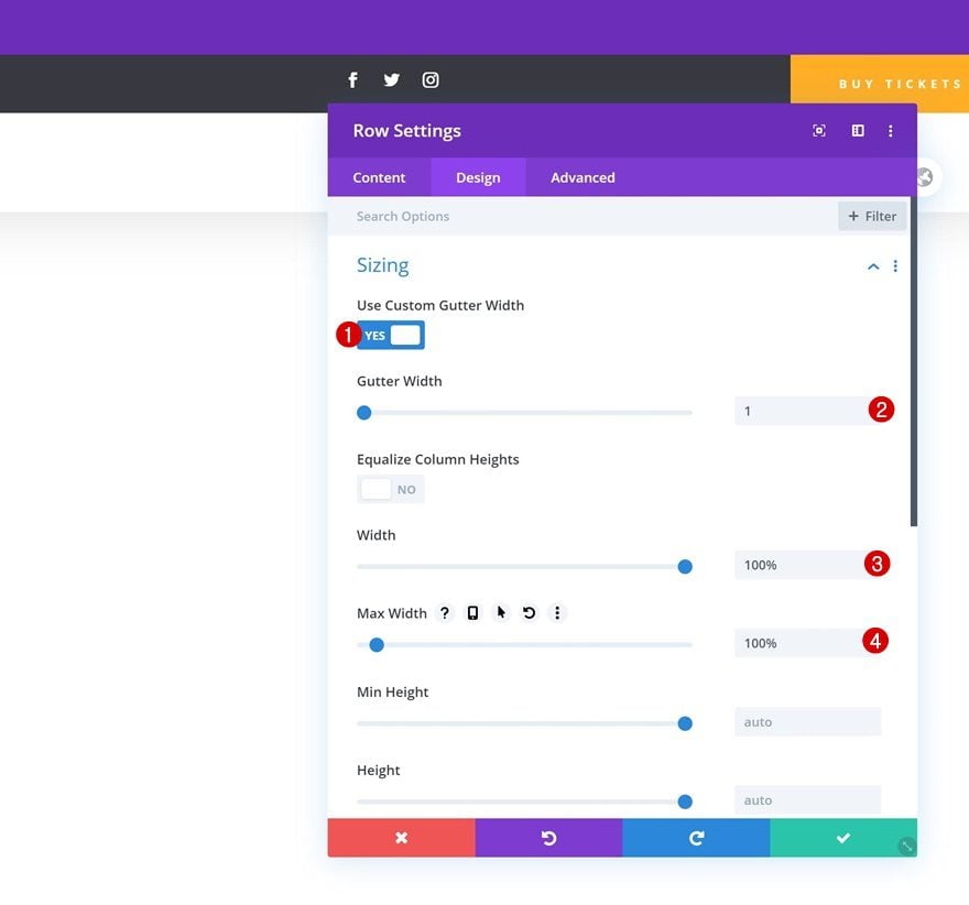
Sizing
Modify the row’s sizing settings next.
- Use Custom Gutter Width: Yes
- Gutter Width: 1
- Width: 100%
- Max Width: 100%
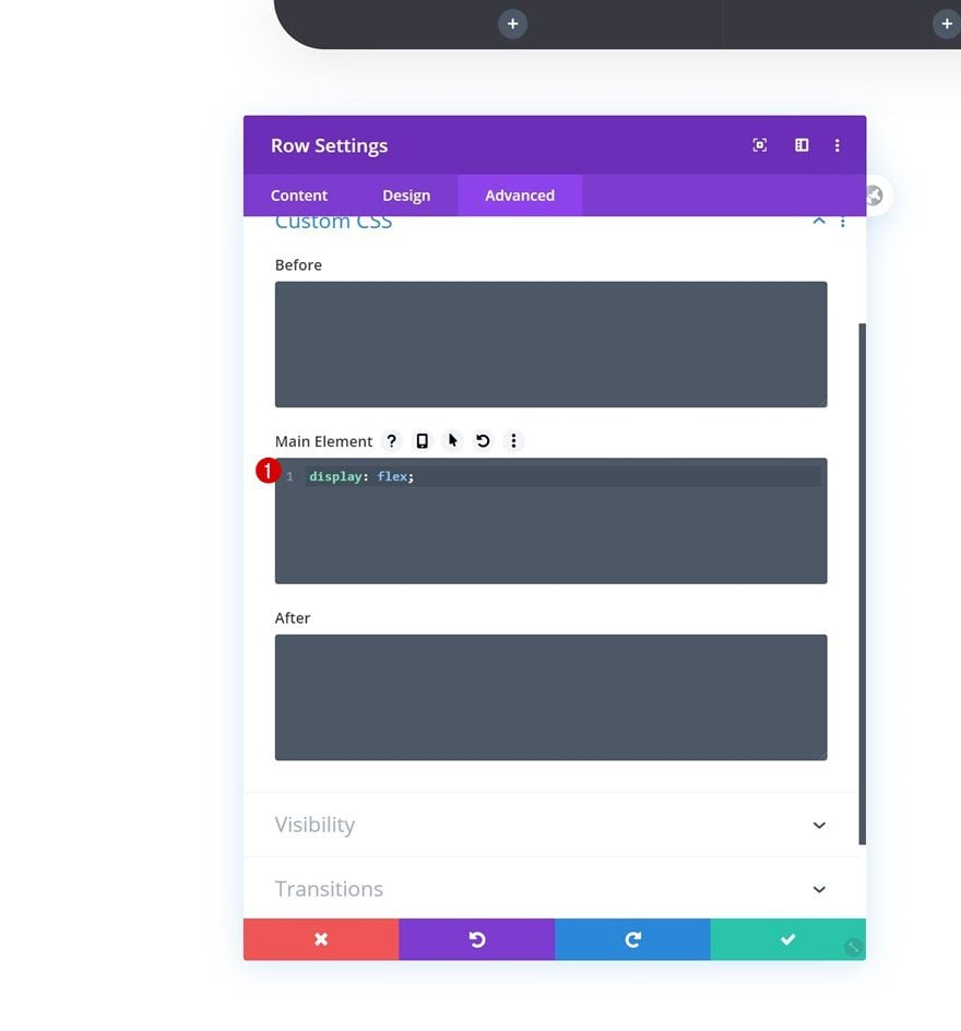
Display
And make sure the columns appear next to each other on smaller screen sizes as well by adding one single line of CSS code to the row’s main element.
display: flex;
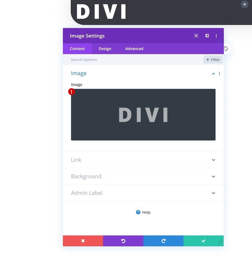
Add Image Module to Column 1
Upload Logo
Once you’ve completed the row settings, it’s time to start adding modules. Add an Image Module to column 1 and upload your logo.
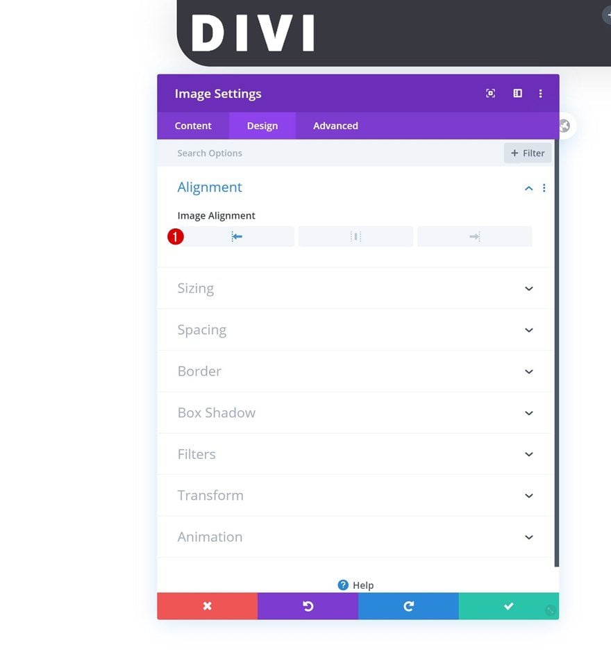
Alignment
Move on to the design tab and make sure you’re using left image alignment.
- Image Alignment: Left
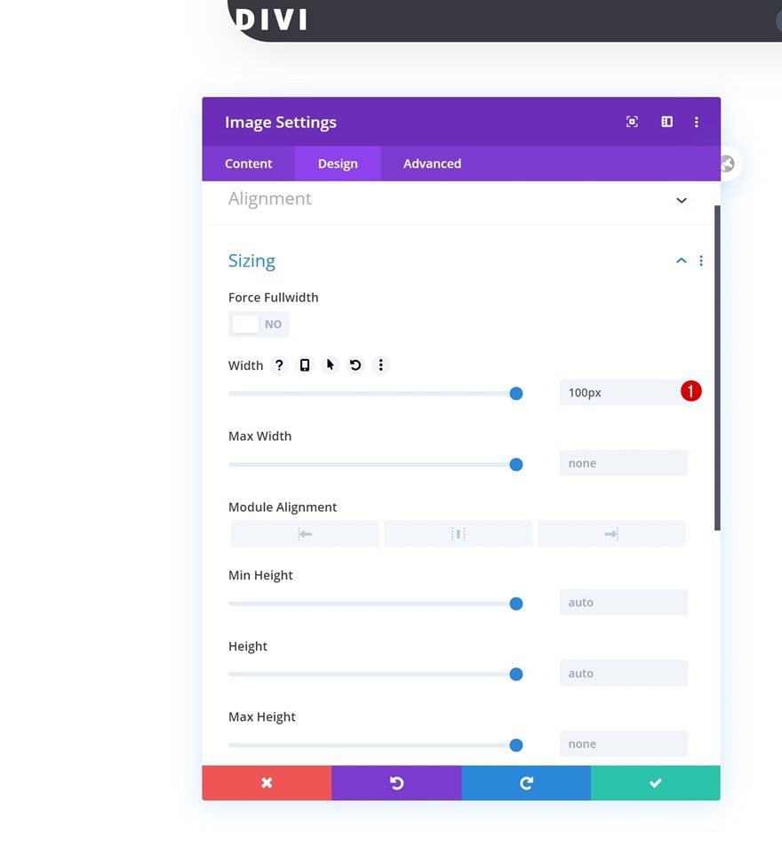
Sizing
Modify the module’s width too.
- Width: 100px
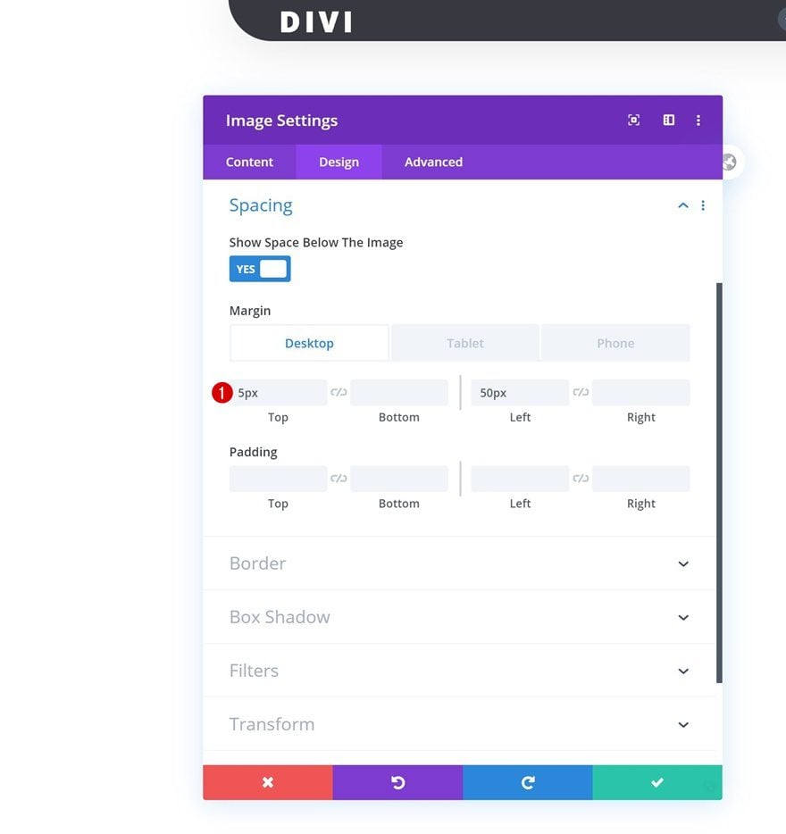
Spacing
And add some custom margin values across different screen sizes.
- Top Margin: 5px
- Left Margin: 50px (Desktop), 20px (Tablet & Phone)
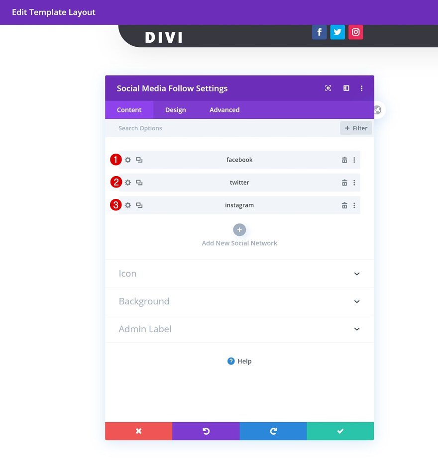
Add Social Media Follow Module to Column 2
Add Social Networks
On to the second column. There, we’ll need a Social Media Follow Module. Add the social networks of your choice.
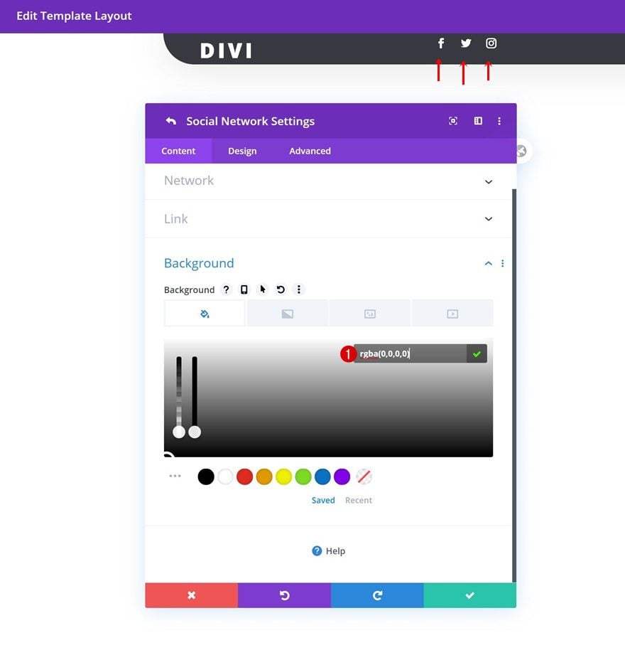
Social Network Background Color
Then, open each social network individually and change the background color into a completely transparent one.
- Background Color: rgba(0,0,0,0)
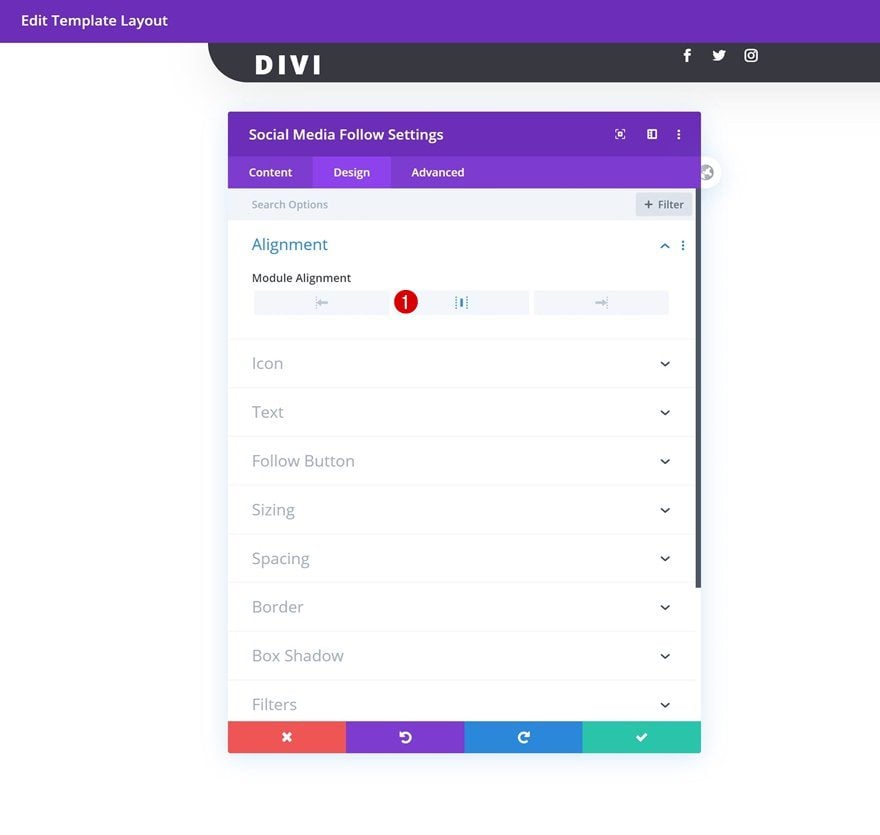
Alignment
Go back to the module’s normal settings and change the entire module alignment next.
- Module Alignment: Center
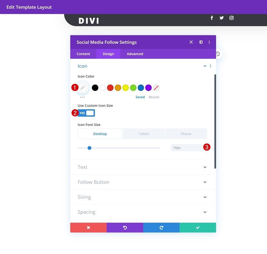
Icon
Modify the icon settings too.
- Icon Color: #ffffff
- Use Custom Icon Size: Yes
- Icon Font Size: 16px (Desktop & Tablet), 12px (Phone)
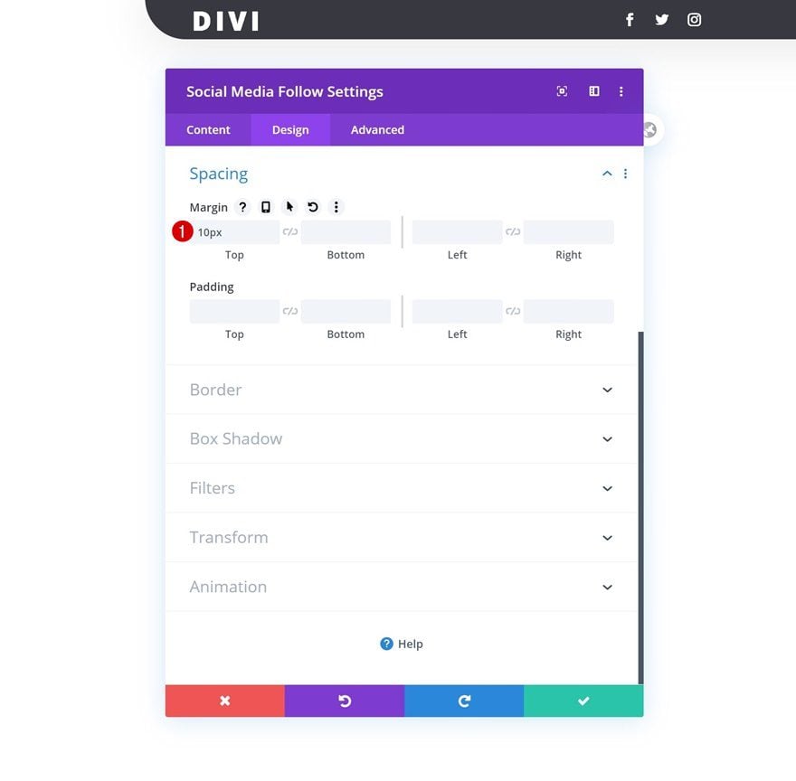
Spacing
And add some top margin.
- Top Margin: 10px
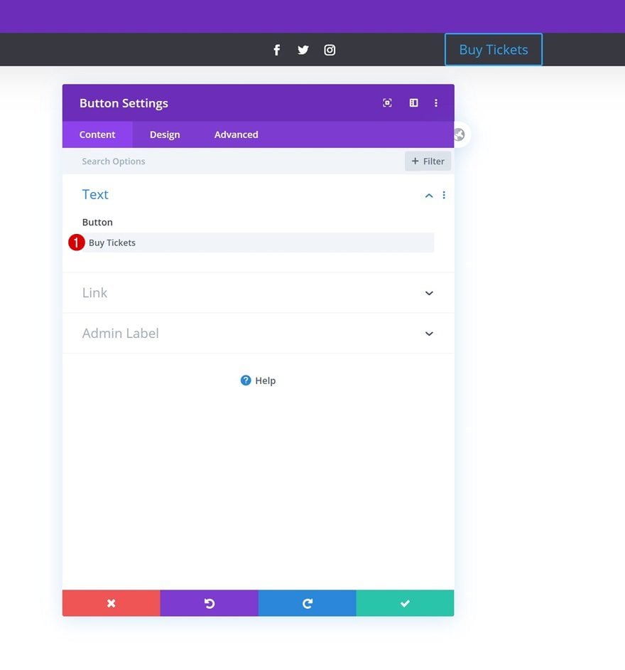
Add Button Module to Column 3
Add Copy
Move on to the third column and add a Button Module with some copy of your choice.
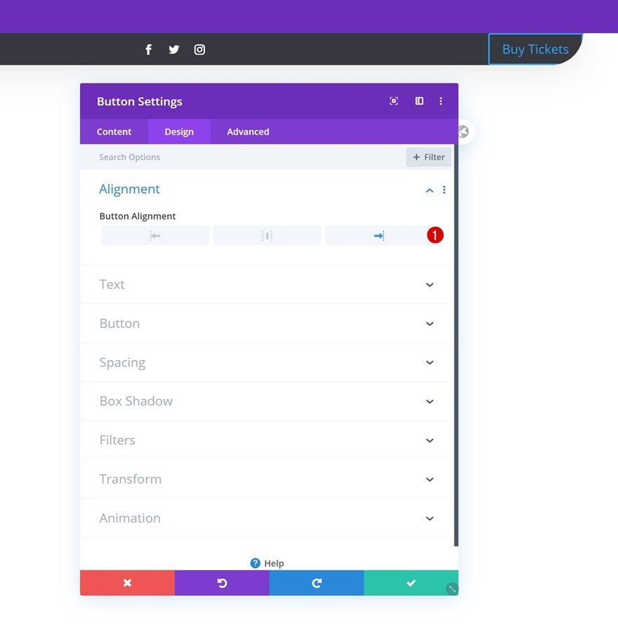
Alignment
Change the button alignment in the design tab.
- Button Alignment: Right
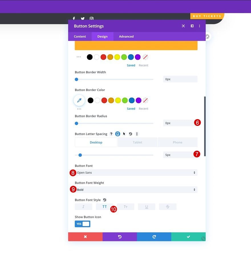
Button Settings
Style the button settings accordingly:
- Use Custom Styles For Button: Yes
- Button Text Size: 12px (Desktop), 10px (Tablet), 8px (Phone)
- Button Text Color: #ffffff
- Button Background Color: #ffae25
- Button Border Width: 0px
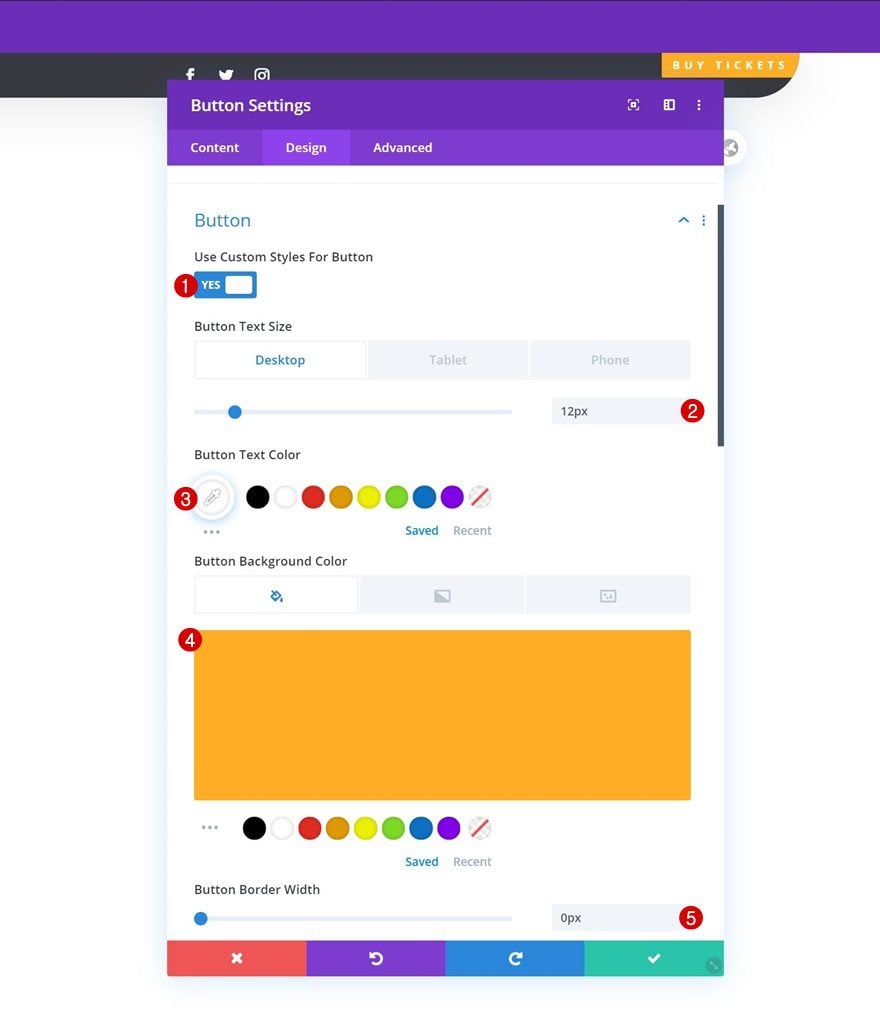
- Button Border Radius: 0px
- Button Letter Spacing: 5px (Desktop), 3px (Tablet & Phone)
- Button Font: Open Sans
- Button Font Weight: Bold
- Button Font Style: Uppercase
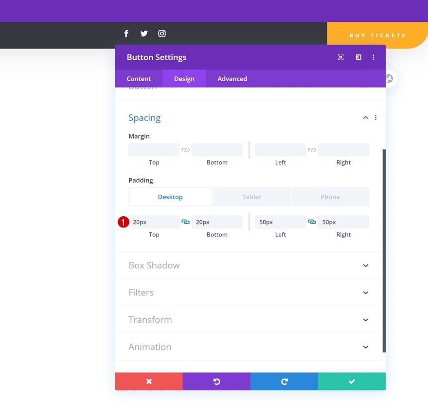
Spacing
And add some custom padding values across different screen sizes.
- Top Padding: 20px
- Bottom Padding: 20px
- Left Padding: 50px (Desktop & Tablet), 15px (Phone)
- Right Padding: 50px (Desktop & Tablet), 15px (Phone)
5. Dedicate New Row to Menu Bar
Once you’ve completed the row that’s dedicated to the global header, you can add another row right below it using the following column structure:
Row Settings
Sizing
Without adding any modules yet, open the row settings and change the sizing settings in the design tab.
- Use Custom Gutter Width: Yes
- Gutter Width: 1
- Width: 100%
- Max Width: 100%
Spacing
Remove all default top and bottom padding next.
- Top Padding: 0px
- Bottom Padding: 0px
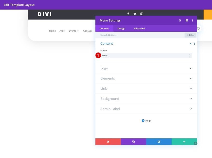
Add Menu Module to Column
Select Menu
Then, add a Menu Module to the column and select the menu you’ve created in the first part of this tutorial.
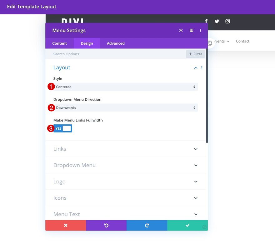
Layout
Move on to the design tab and change the layout settings as follows:
- Style: Centered
- Dropdown Menu Direction: Downwards
- Make Menu Links Fullwidth: Yes
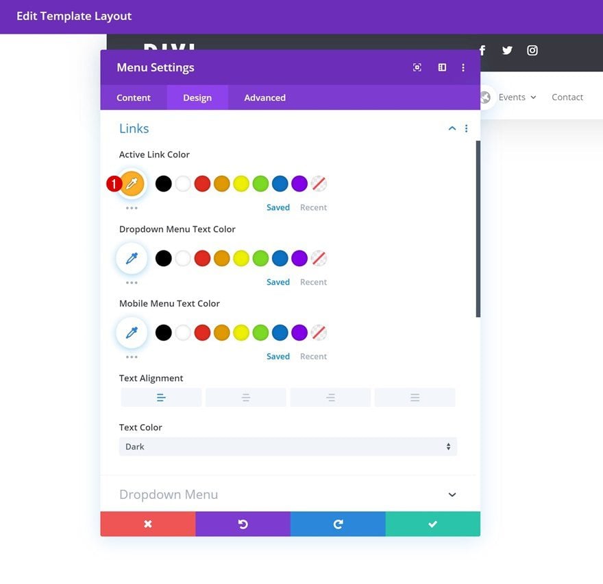
Links
Modify the active link color in the design tab too.
- Active Link Color: #ffae25
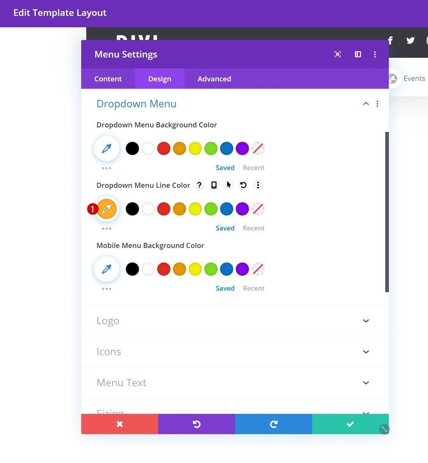
Dropdown Menu
Do the same for the dropdown menu line color in the dropdown menu settings.
- Dropdown Menu Line Color: #ffae25
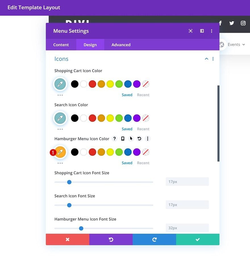
Icons
Modify the hamburger menu icon color next.
- Hamburger Menu Icon Color: #ffae25
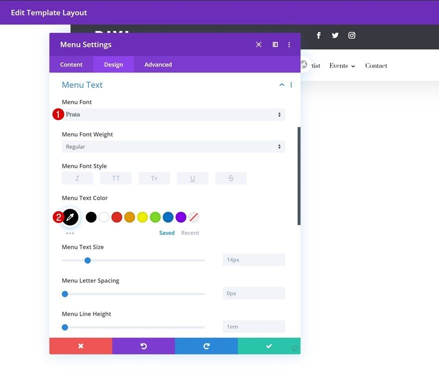
Menu Text
Along with the menu text settings.
- Menu Font: Prata
- Menu Text Color: #000000
6. Make Header & Menu Bar Stick to Top
Open Section Settings
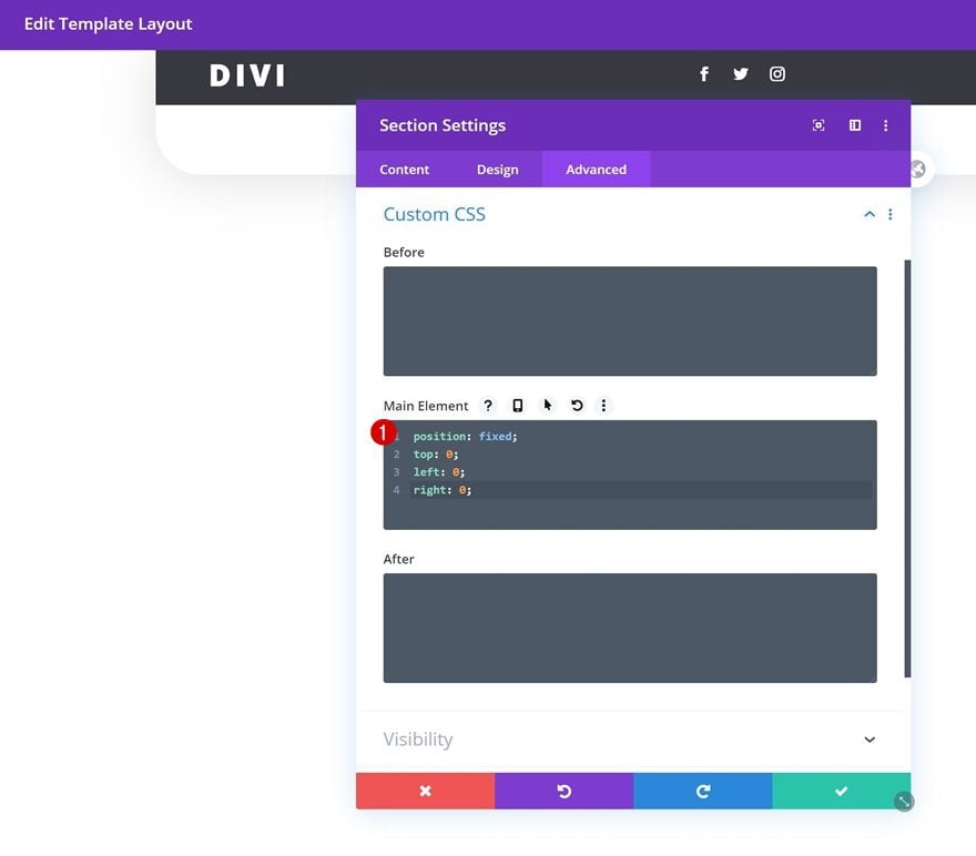
Once you’ve completed the second row, the only thing left to do is make the section stick to the top of our pages and posts. To do that, we’ll open the section settings again.
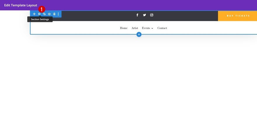
Add Custom CSS to Main Element
Then, we’ll go to the advanced tab and we’ll add a few lines of CSS code to the section’s main element.
position: fixed;
top: 0;
left: 0;
right: 0;
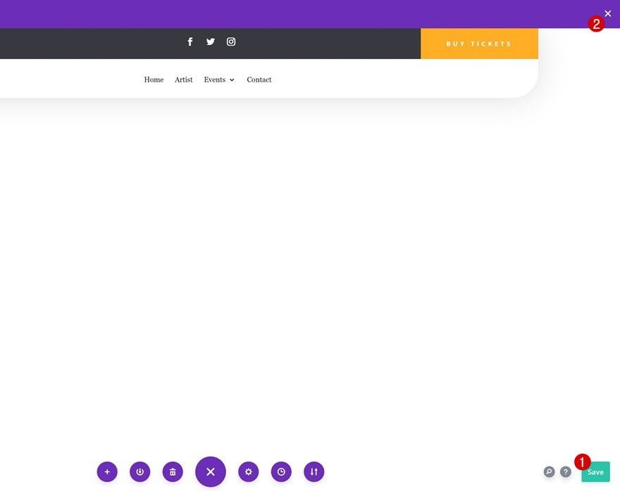
7. Save Global Header & Theme Builder Options
Once you’ve completed the entire global header design, make sure you save the design before exiting the template layout. Once you’re outside of the template layout, save the changes of your entire theme builder and you’re done!
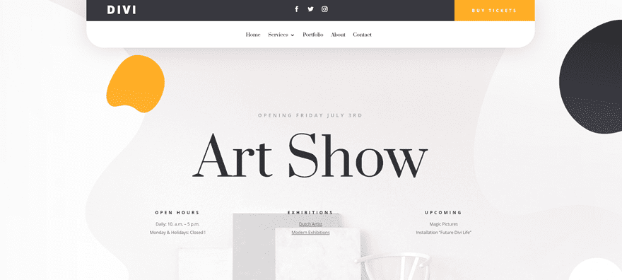
Preview
Now that we’ve gone through all the steps, let’s take a final look at the outcome across different screen sizes.
Desktop
Mobile
Final Thoughts
In this post, we’ve shown you how to create a custom global header with Divi’s new Theme Builder. This tutorial goes to show how easy it is to create beautiful headers and apply them to your entire website or specific custom post types. We hope this tutorial inspires you to get started with the Theme Builder right away! If you have any question or suggestions, make sure you leave a comment in the comment section below.
If you’re eager to learn more about Divi and get more Divi freebies, make sure you subscribe to our email newsletter and YouTube channel so you’ll always be one of the first people to know and get benefits from this free content.
The post How to Create a Custom Global Header with Divi’s Theme Builder appeared first on Elegant Themes Blog.