Product pages are amazing when it comes to highlighting one specific product and its details, but when you’re creating a landing page, you might want to fit in more products in one place and allow people to directly add products to their cart. With Divi’s new WooCommerce modules, you’re now able to add any product to any page you’re working on and style it however you want using Divi’s built-in options. To help you get started, we’re going to show you how to create a vibrant dynamic product grid with add to cart buttons. The design looks great across all screen sizes and you’ll be able to download the JSON file for free as well!
Let’s get to it.
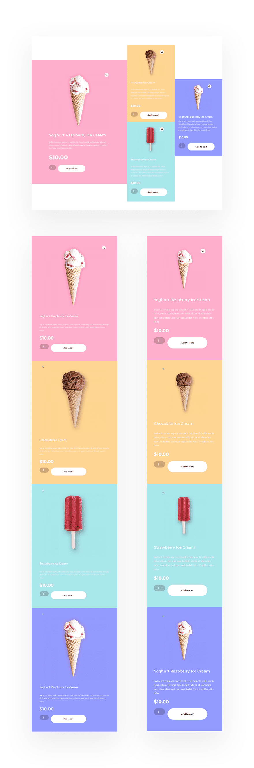
Preview
Before we dive into the tutorial, let’s take a quick look at the outcome across different screen sizes.
Download The Dynamic Product Grid Section for FREE
To lay your hands on the free dynamic product grid section, you will first need to download it using the button below. To gain access to the download you will need to subscribe to our Divi Daily email list by using the form below. As a new subscriber, you will receive even more Divi goodness and a free Divi Layout pack every Monday! If you’re already on the list, simply enter your email address below and click download. You will not be “resubscribed” or receive extra emails.
@media only screen and ( max-width: 767px ) {.et_bloom .et_bloom_optin_1 .carrot_edge.et_bloom_form_right .et_bloom_form_content:before, .et_bloom .et_bloom_optin_1 .carrot_edge.et_bloom_form_left .et_bloom_form_content:before { border-top-color: #ffffff !important; border-left-color: transparent !important; }
}.et_bloom .et_bloom_optin_1 .et_bloom_form_content button { background-color: #f92c8b !important; } .et_bloom .et_bloom_optin_1 .et_bloom_form_content .et_bloom_fields i { color: #f92c8b !important; } .et_bloom .et_bloom_optin_1 .et_bloom_form_content .et_bloom_custom_field_radio i:before { background: #f92c8b !important; } .et_bloom .et_bloom_optin_1 .et_bloom_border_solid { border-color: #f7f9fb !important } .et_bloom .et_bloom_optin_1 .et_bloom_form_content button { background-color: #f92c8b !important; } .et_bloom .et_bloom_optin_1 .et_bloom_form_container h2, .et_bloom .et_bloom_optin_1 .et_bloom_form_container h2 span, .et_bloom .et_bloom_optin_1 .et_bloom_form_container h2 strong { font-family: “Open Sans”, Helvetica, Arial, Lucida, sans-serif; }.et_bloom .et_bloom_optin_1 .et_bloom_form_container p, .et_bloom .et_bloom_optin_1 .et_bloom_form_container p span, .et_bloom .et_bloom_optin_1 .et_bloom_form_container p strong, .et_bloom .et_bloom_optin_1 .et_bloom_form_container form input, .et_bloom .et_bloom_optin_1 .et_bloom_form_container form button span { font-family: “Open Sans”, Helvetica, Arial, Lucida, sans-serif; } p.et_bloom_popup_input { padding-bottom: 0 !important;}

Download For Free
Join the Divi Newlsetter and we will email you a copy of the ultimate Divi Landing Page Layout Pack, plus tons of other amazing and free Divi resources, tips and tricks. Follow along and you will be a Divi master in no time. If you are already subscribed simply type in your email address below and click download to access the layout pack.
You have successfully subscribed. Please check your email address to confirm your subscription and get access to free weekly Divi layout packs!
Let’s Start Recreating!
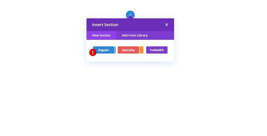
Add New Section
Start by adding a new section to the page you’re working on.
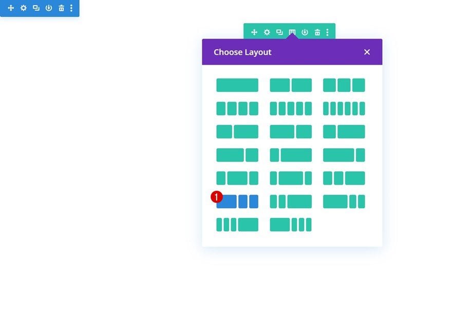
Add New Row
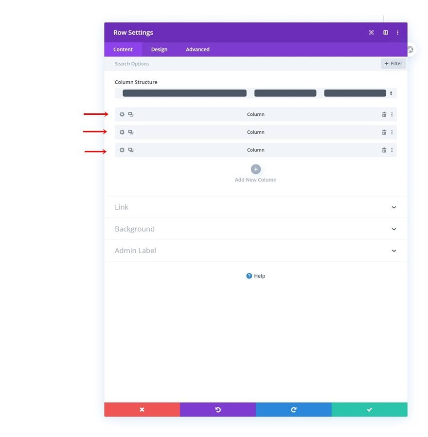
Column Structure
Continue by adding a new row using the following column structure:
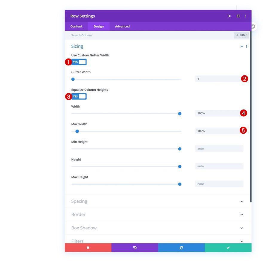
Sizing
Without adding any modules yet, open the row settings and allow the row to take up the entire width of the page.
- Use Custom Gutter Width: Yes
- Gutter Width: 1
- Equalize Column Heights: Yes
- Width: 100%
- Max Width: 100%
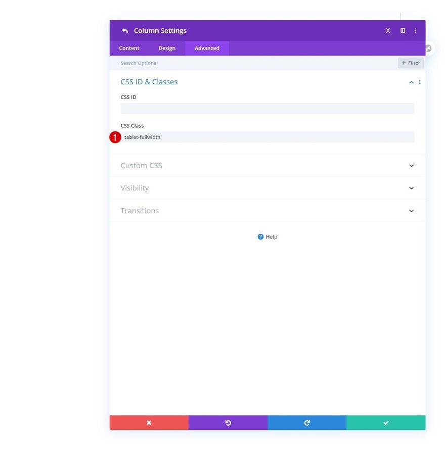
Add CSS Class to Each Column
Then, open each one of the columns individually and assign the same CSS class to them. We’ll use this CSS class at the end of this tutorial to make sure all products automatically show up below each other on tablet.
- CSS Class: tablet-fullwidth
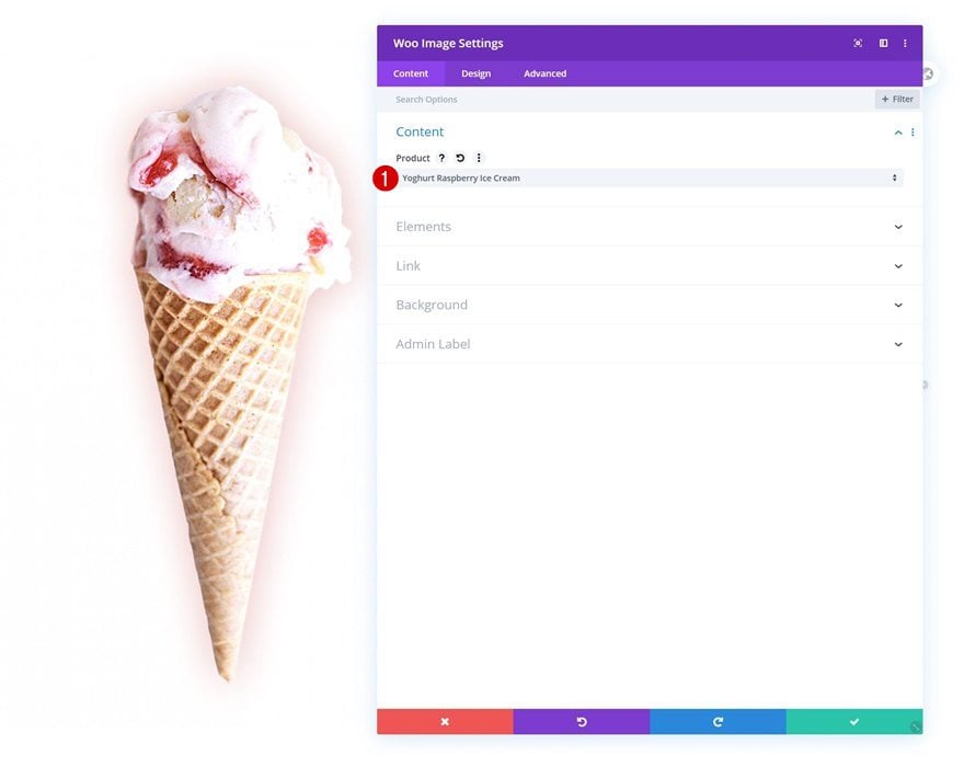
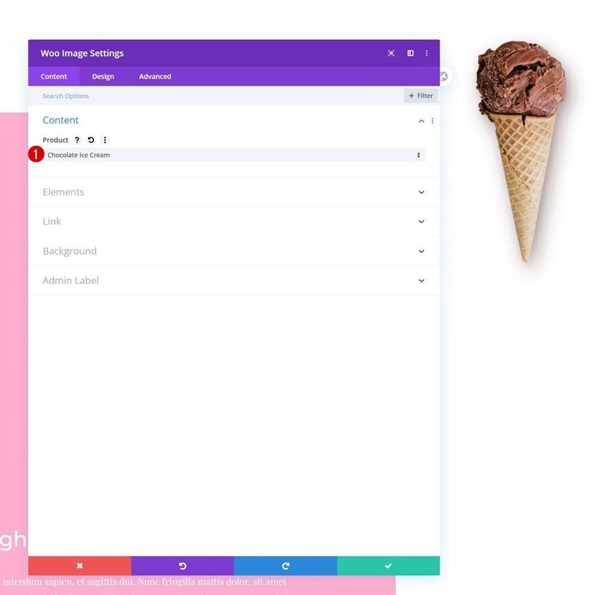
Add Woo Image Module to Column 1
Dynamic Content
Time to add modules! We’ll start with column 1. Add a Woo Image Module and select a product of your choice. To achieve the exact same outcome as in the preview, make sure your product image has a transparent background.
- Product: Find in list
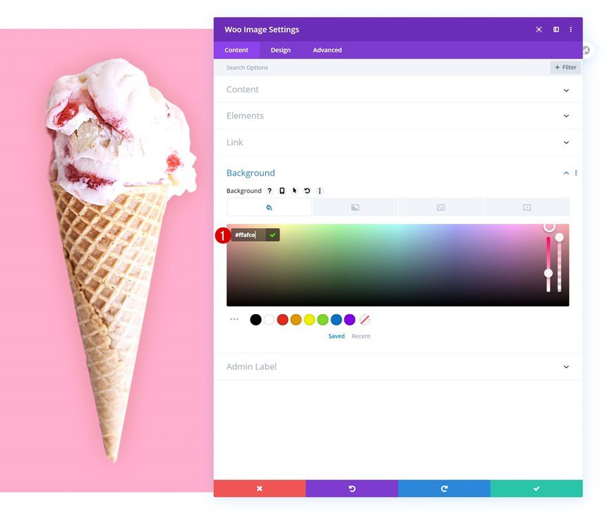
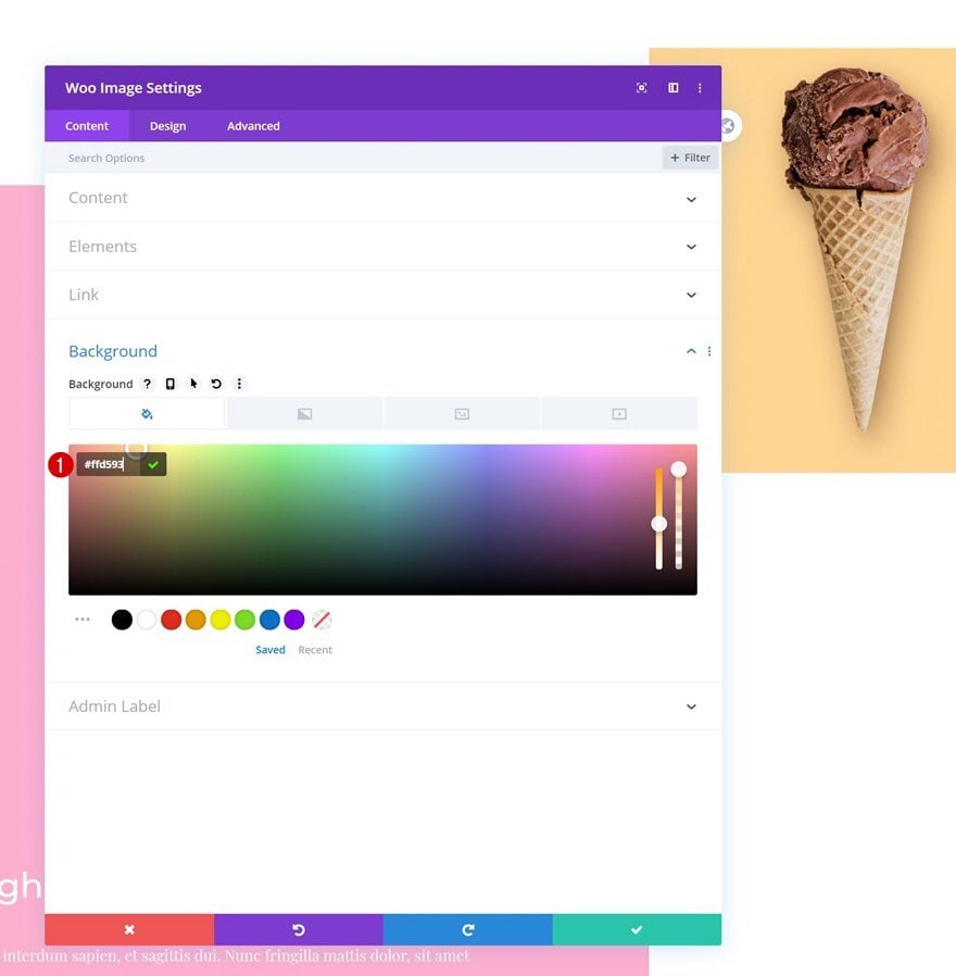
Background Color
Continue by changing the module’s background color.
- Background Color: #ffafce
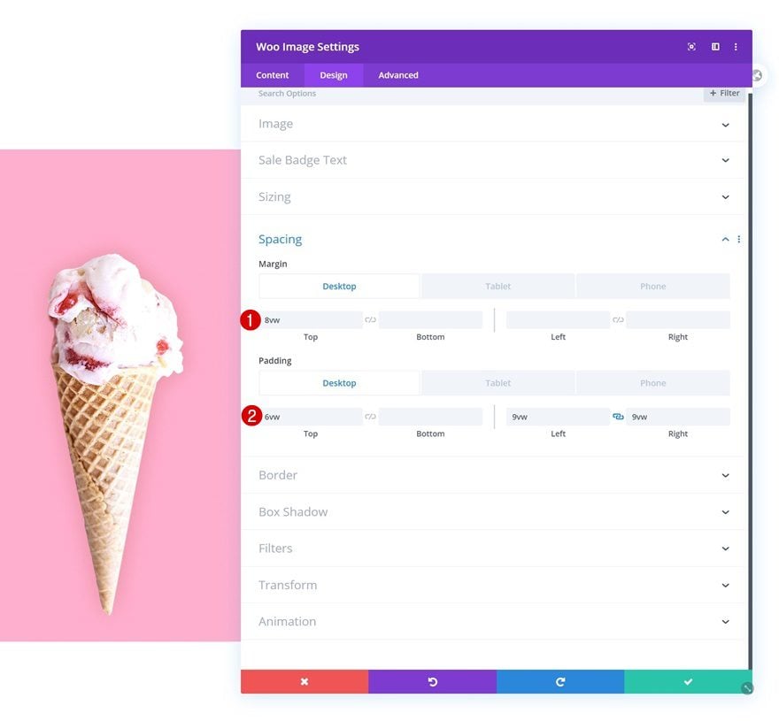
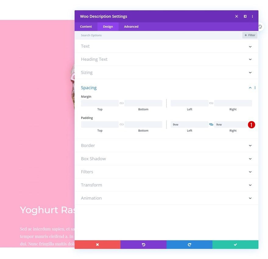
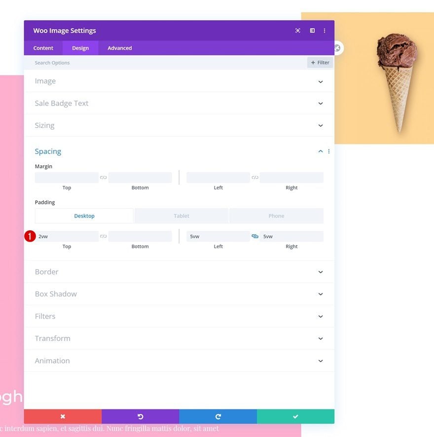
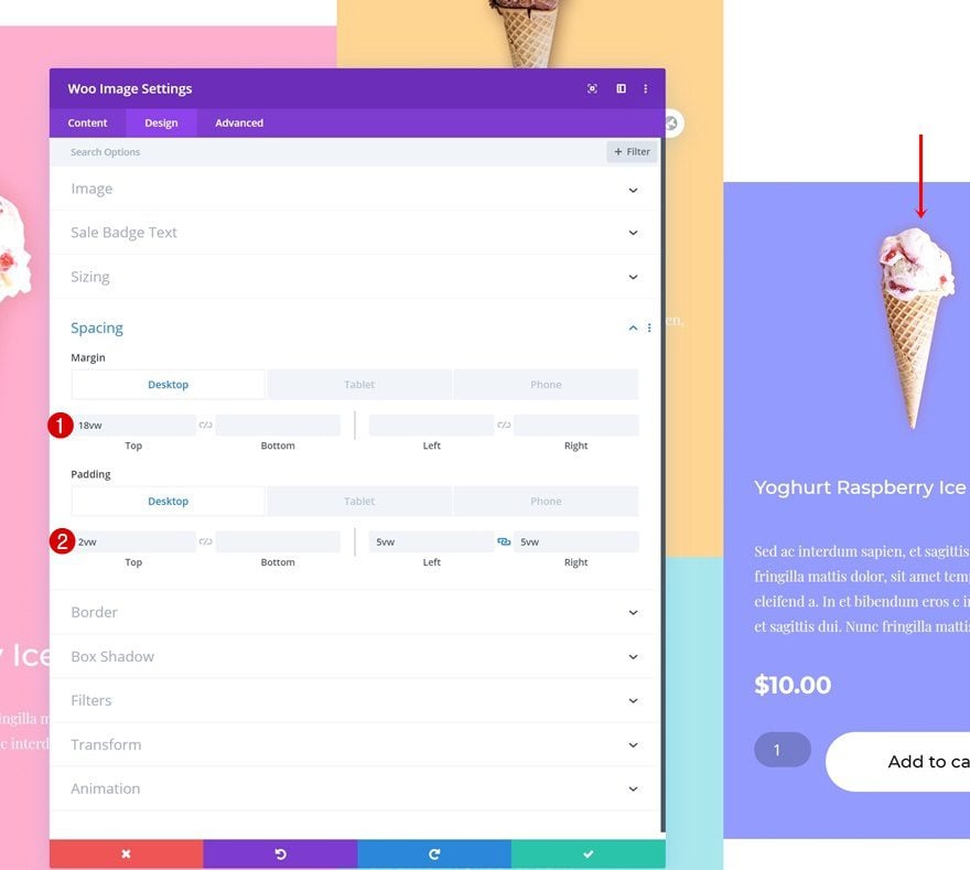
Spacing
Then, go to the spacing settings and change the values as follows:
- Top Margin: 8vw (Desktop), 0vw (Tablet & Phone)
- Top Padding: 6vw (Desktop), 10vw (Tablet), 16vw (Phone)
- Left Padding: 9vw (Desktop), 12vw (Tablet), 20vw (Phone)
- Right Padding: 9vw (Desktop), 12vw (Tablet), 20vw (Phone)
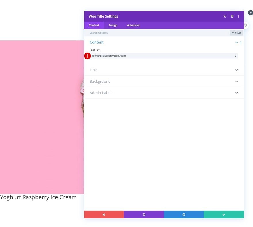
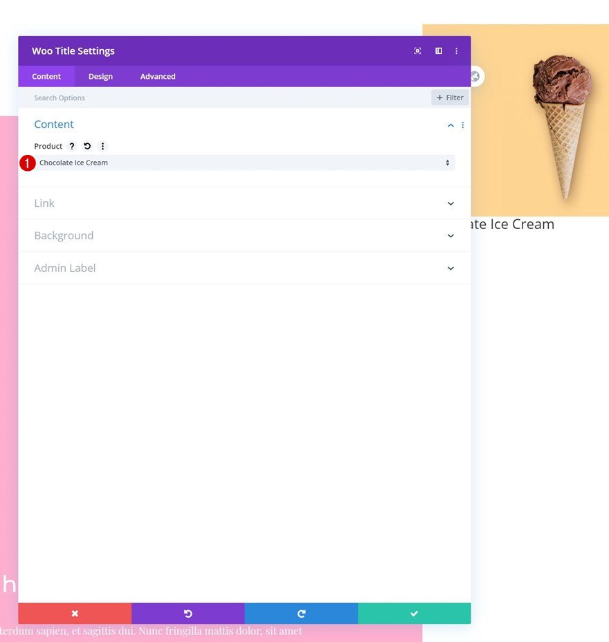
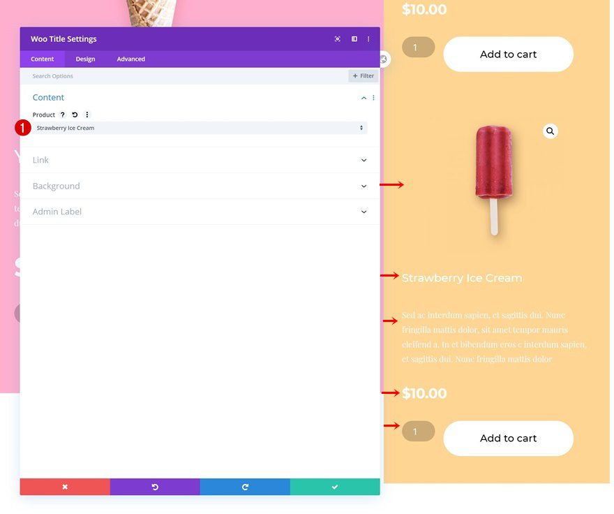
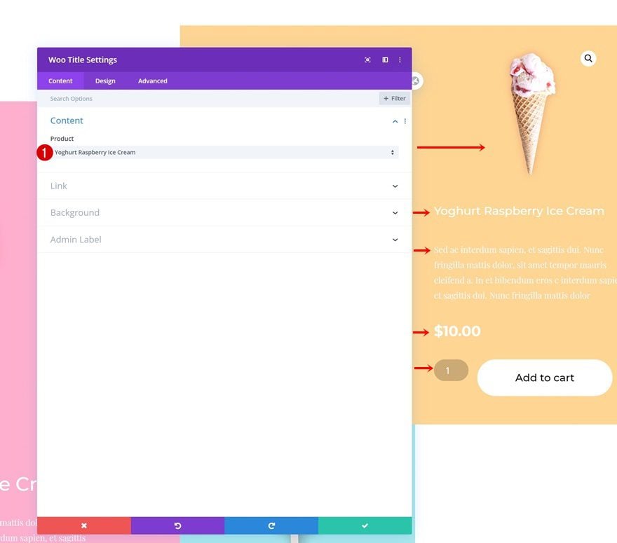
Add Woo Title Module to Column 1
Dynamic Content
The next module we need in column 1 is a Woo Title Module. Select a product of your choice.
- Product: Find in list
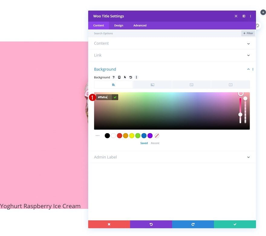
Background Color
Continue by adding a background color.
- Background Color: #ffafce
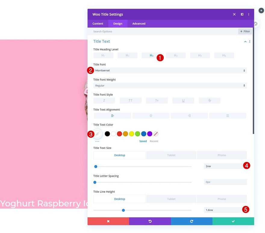
Title Text Settings
Move on to the design tab and change the title text settings accordingly:
- Title Heading Level: H3
- Title Font: Montserrat
- Title Text Color: #ffffff
- Title Text Size: 2vw (Desktop), 3vw (Tablet), 5vw (Phone)
- Title Line Height: 1.6vw (Desktop), 3.4vw (Tablet), 5vw (Phone)
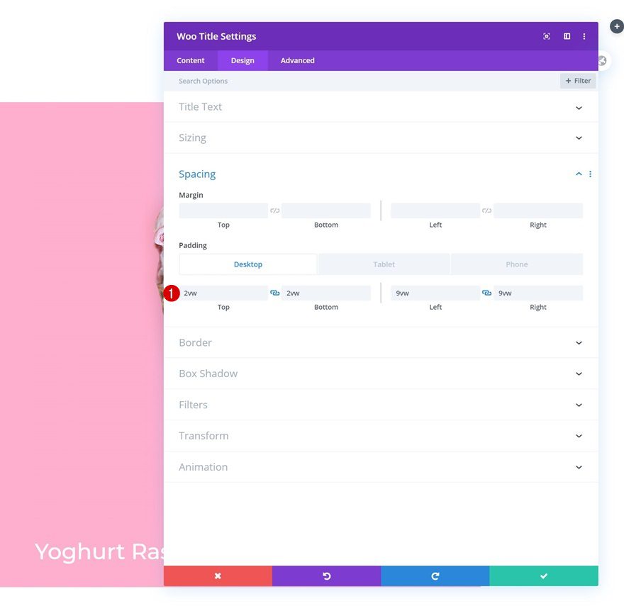
Spacing
Play around with the padding values too.
- Top Padding: 2vw (Desktop), 6vw (Tablet), 8vw (Phone)
- Bottom Padding: 2vw (Desktop), 6vw (Tablet), 8vw (Phone)
- Left Padding: 9vw
- Right Padding: 9vw
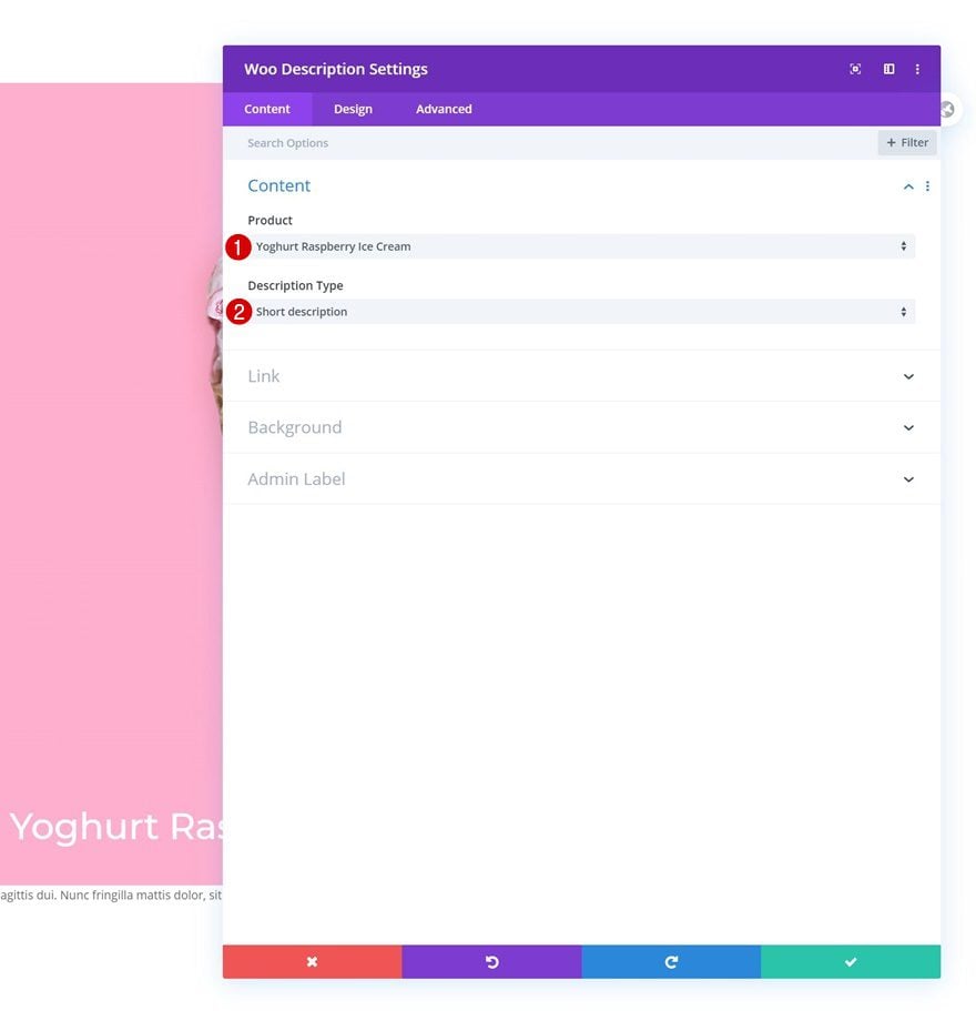
Add Woo Description Module to Column 1
Dynamic Content
The next module we need is a Woo Description Module. Select a product of your choice.
- Product: Find in list
- Description type: Short description
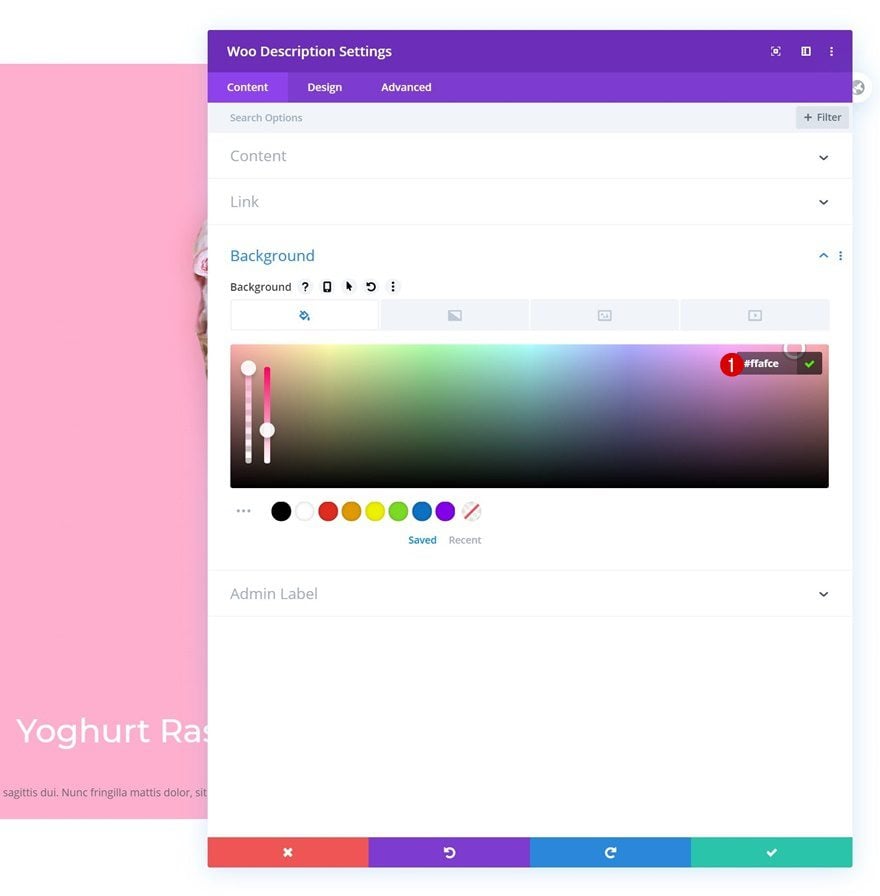
Background Color
Add a background color next.
- Background Color: #ffafce
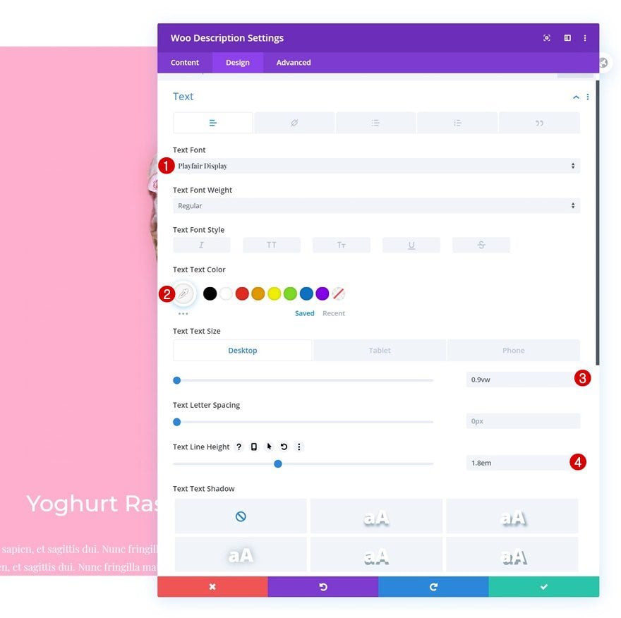
Text Settings
Move on to the design tab and change the text settings as follows:
- Text Font: Playfair Display
- Text Color: #f7f7f7
- Text Size: 0.9vw (Desktop), 2vw (Tablet), 3vw (Phone)
- Title Line Height: 1.8em
Spacing
Add some left and right padding next.
- Left Padding: 9vw
- Right Padding: 9vw
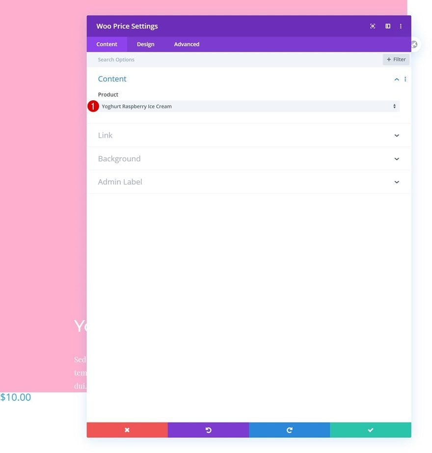
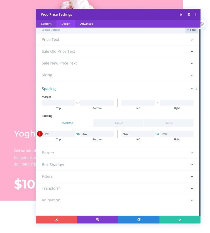
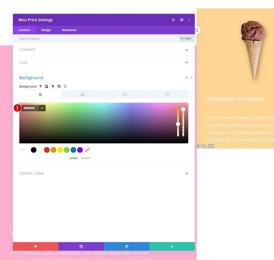
Add Woo Price Module to Column 1
Dynamic Content
On to the next module in column 1, which is a Woo Price Module. Select a product of your choice.
- Product: Find in list
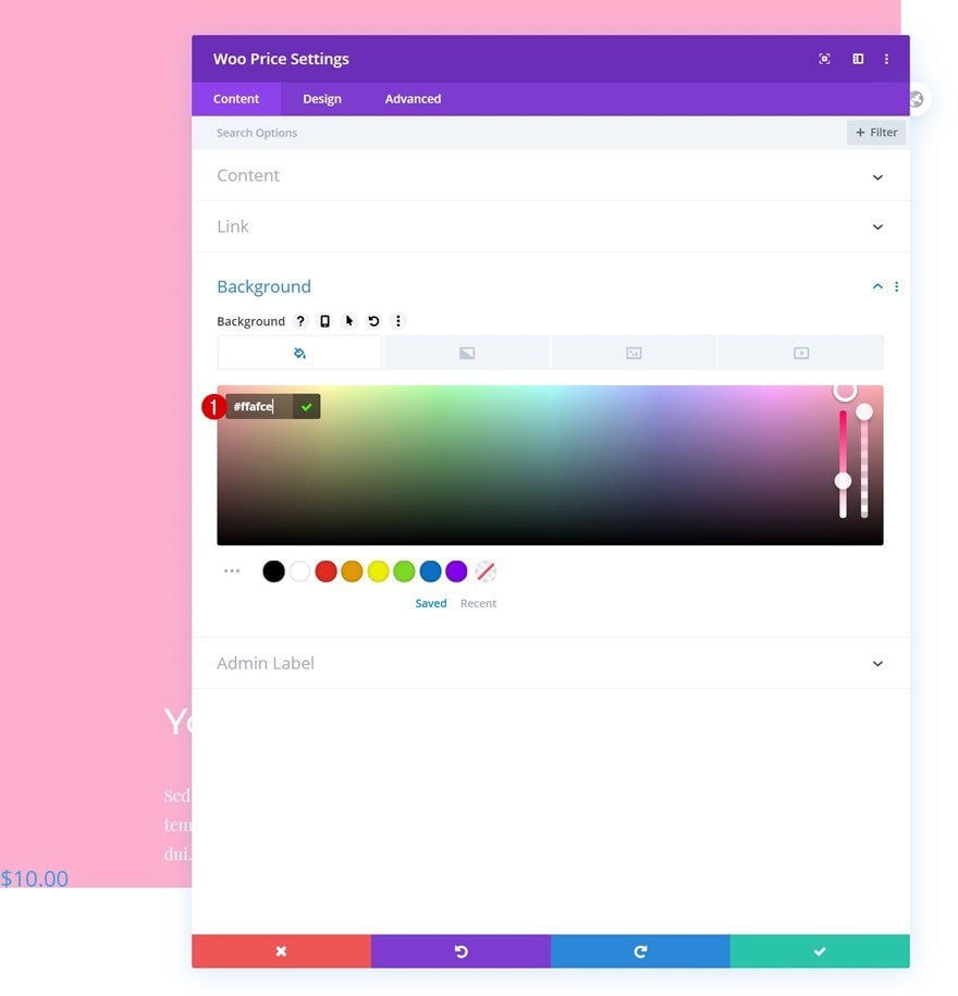
Background Color
Add a background color next.
- Background Color: #ffafce
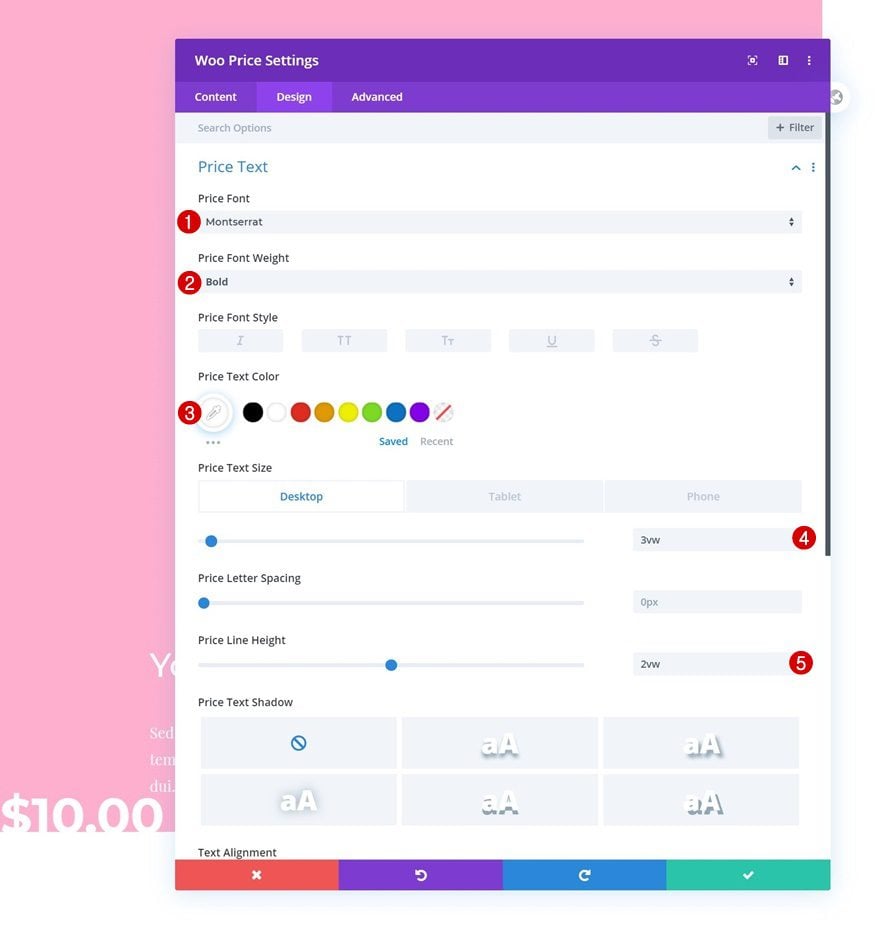
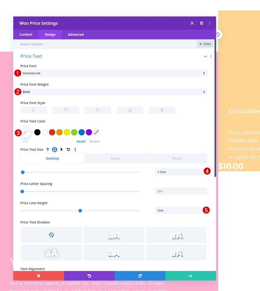
Price Text Settings
Move on to the design tab and change the text settings as follows:
- Price Font: Montserrat
- Price Font Weight: Bold
- Price Text Color: #ffffff
- Price Text Size: 3vw (Desktop), 5vw (Tablet), 6vw (Phone)
- Price Line Height: 2vw
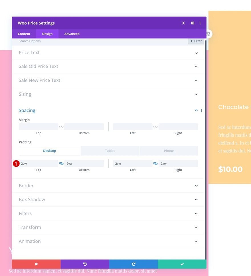
Spacing
Modify the spacing settings too.
- Top Padding: 3vw (Desktop), 6vw (Tablet), 8vw (Phone)
- Bottom Padding: 3vw (Desktop), 6vw (Tablet), 8vw (Phone)
- Left Padding: 9vw
- Right Padding: 9vw
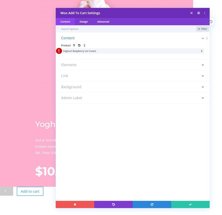
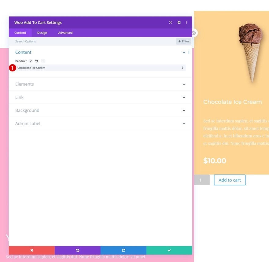
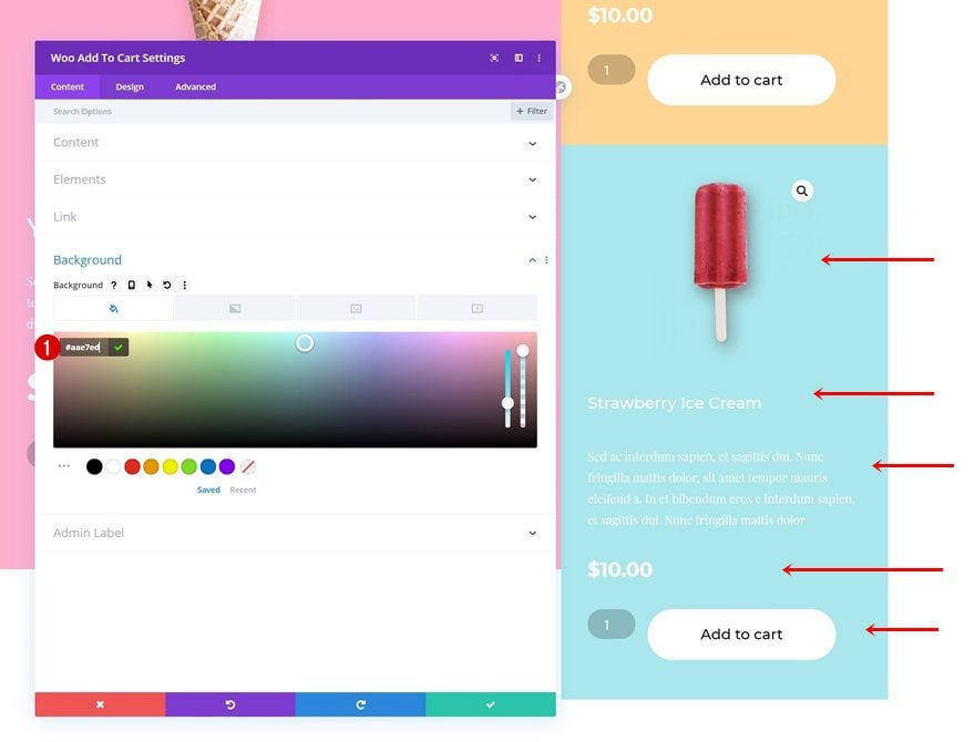
Add Woo Add To Cart Module to Column 1
Dynamic Content
The last module we need in column 1 is a Woo Add To Cart Module. Select a product of your choice.
- Product: Find in list
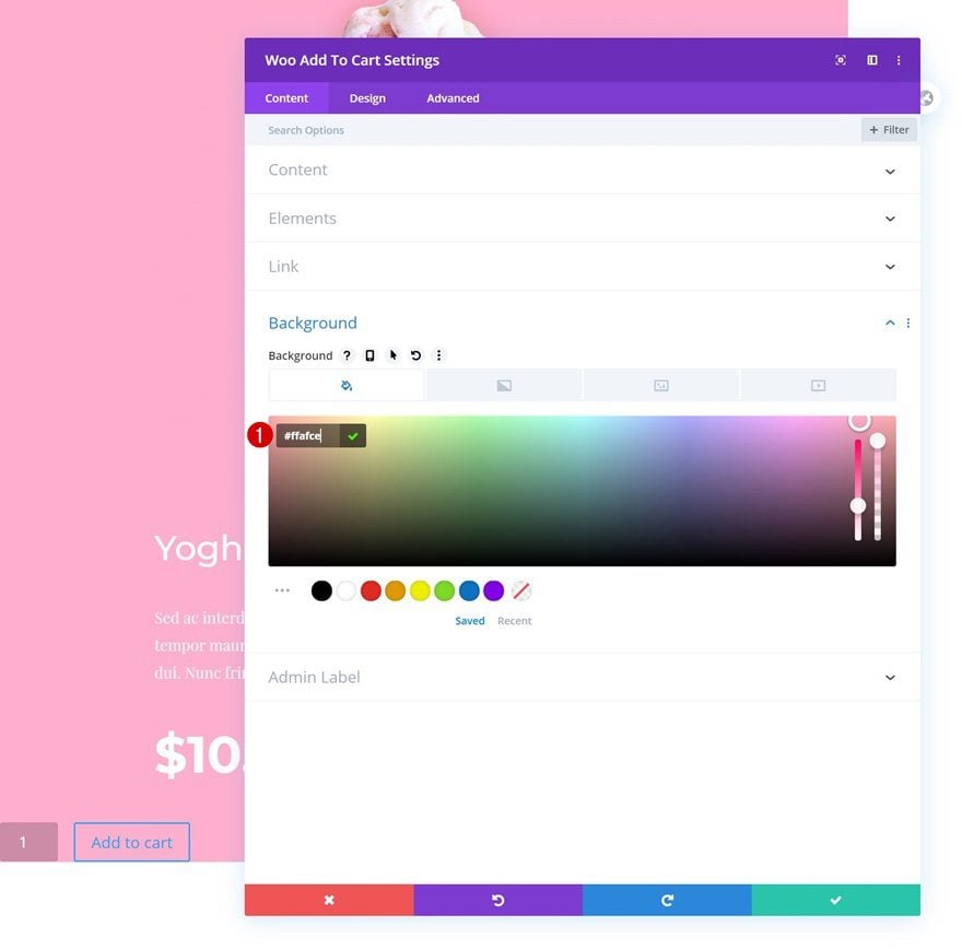
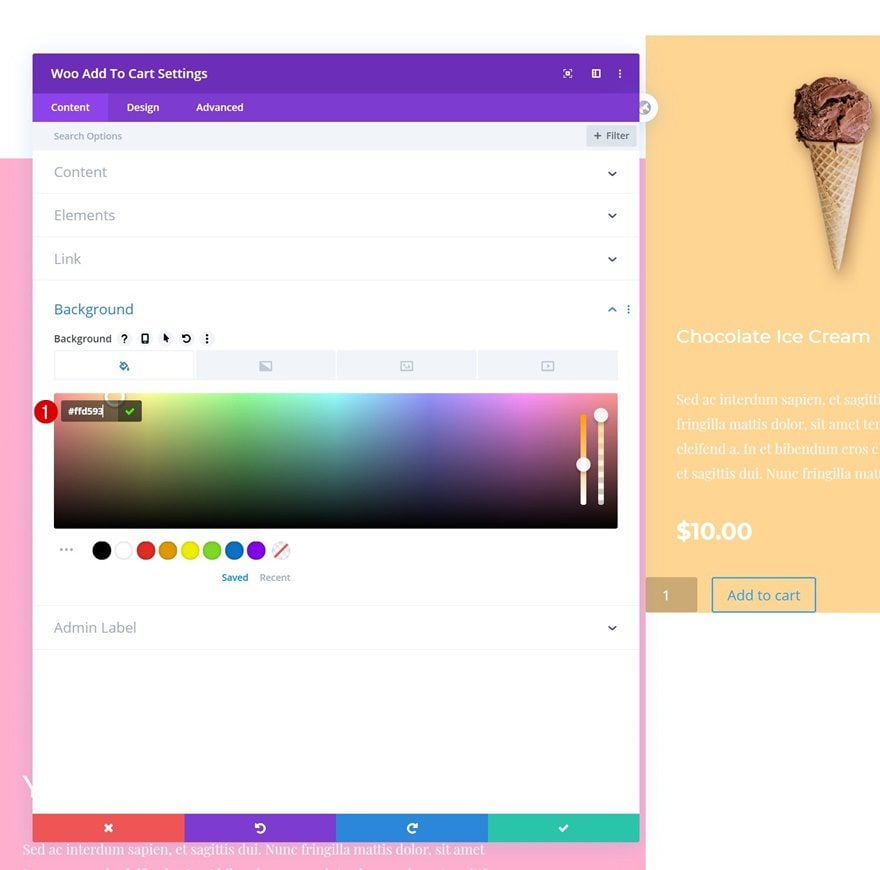
Background Color
Add a background color next.
- Background Color: #ffafce
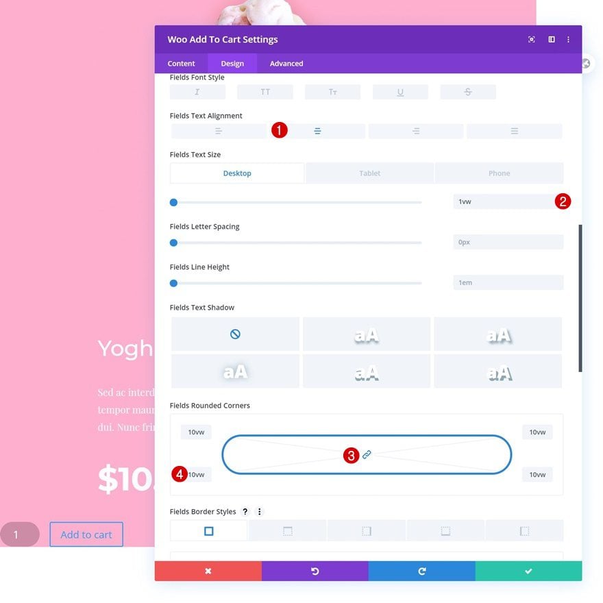
Fields Text Settings
Modify the fields text settings as follows:
- Fields Text Alignment: Center
- Fields Text Size: 1vw (Desktop), 3vw (Tablet), 4vw (Phone)
- Fields Rounded Corners: 10vw (All Corners)
Button Settings
Continue by styling the button settings.
- Use Custom Styles For Button: Yes
- Button Text Size: 1.1vw (Desktop), 2vw (Tablet), 3vw (Phone)
- Button Text Color: #000000
- Button Background Color: #ffffff
- Button Border Width: 0px
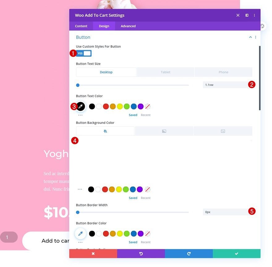
- Button Border Radius: 50vw
- Button Font: Montserrat
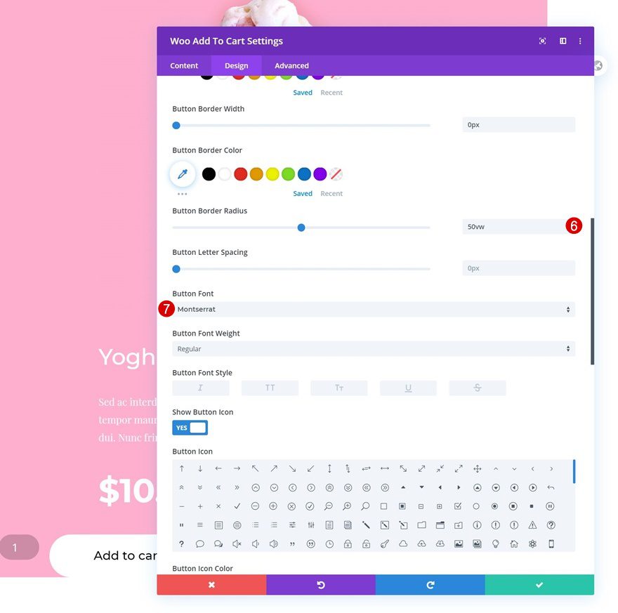
- Top Padding: 1vw (Desktop), 3vw (Tablet), 5vw (Phone)
- Bottom Padding: 1vw (Desktop), 3vw (Tablet), 5vw (Phone)
- Left Padding: 4vw (Desktop), 15vw (Tablet), 18vw (Phone)
- Right Padding: 4vw (Desktop), 15vw (Tablet), 18vw (Phone)
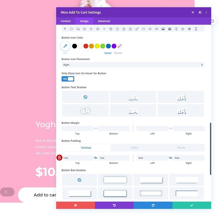
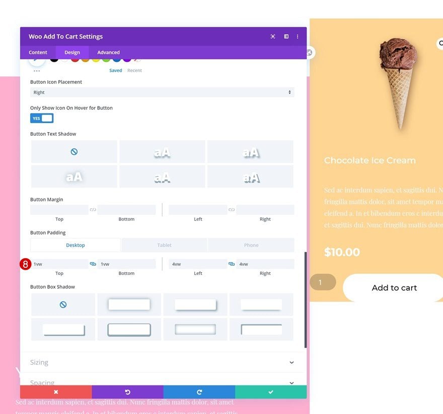
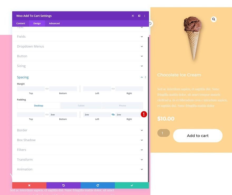
Spacing
And complete the module’s settings by adding some custom padding values across different screen sizes.
- Bottom Padding: 6vw (Desktop), 10vw (Tablet), 15vw (Phone)
- Left Padding: 9vw
- Right Padding: 9vw
Add Woo Image Module to Column 2
Dynamic Content
Now that we’ve completed all modules in column 1, we can move on to column 2. The desktop values of the modules in column 2 are completely different from the modules in column 1. That’s why we’re not cloning the modules but adding them from scratch instead. Note, however, that all the tablet and mobile settings will match the modules in column 1. Add a Woo Image Module to column 2 and select a product of your choice.
- Product: Find in list
Background Color
Add a background color next.
- Background Color: #ffd593
Spacing
Modify the spacing values too.
- Top Padding: 2vw (Desktop), 6vw (Tablet), 10vw (Phone)
- Left Padding: 5vw (Desktop), 12vw (Tablet), 20vw (Phone)
- Right Padding: 5vw (Desktop), 12vw (Tablet), 20vw (Phone)
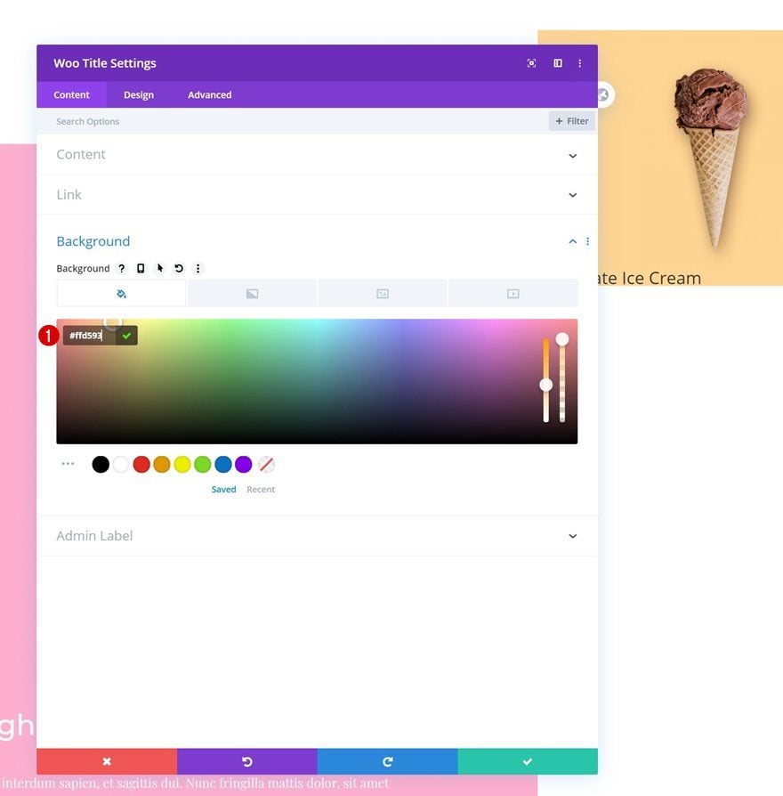
Add Woo Title Module to Column 2
Dynamic Content
The next module we need is a Woo Title Module. Select a product of your choice.
- Product: Find in list
Background Color
Modify the background color next.
- Background Color: #ffd593
Title Text Settings
Change the title text settings too.
- Title Heading Level: H3
- Title Font: Montserrat
- Title Text Color: #ffffff
- Title Text Size: 1.2vw (Desktop), 3vw (Tablet), 5vw (Phone)
- Title Line Height: 1.6vw (Desktop), 3.4vw (Tablet), 5vw (Phone)
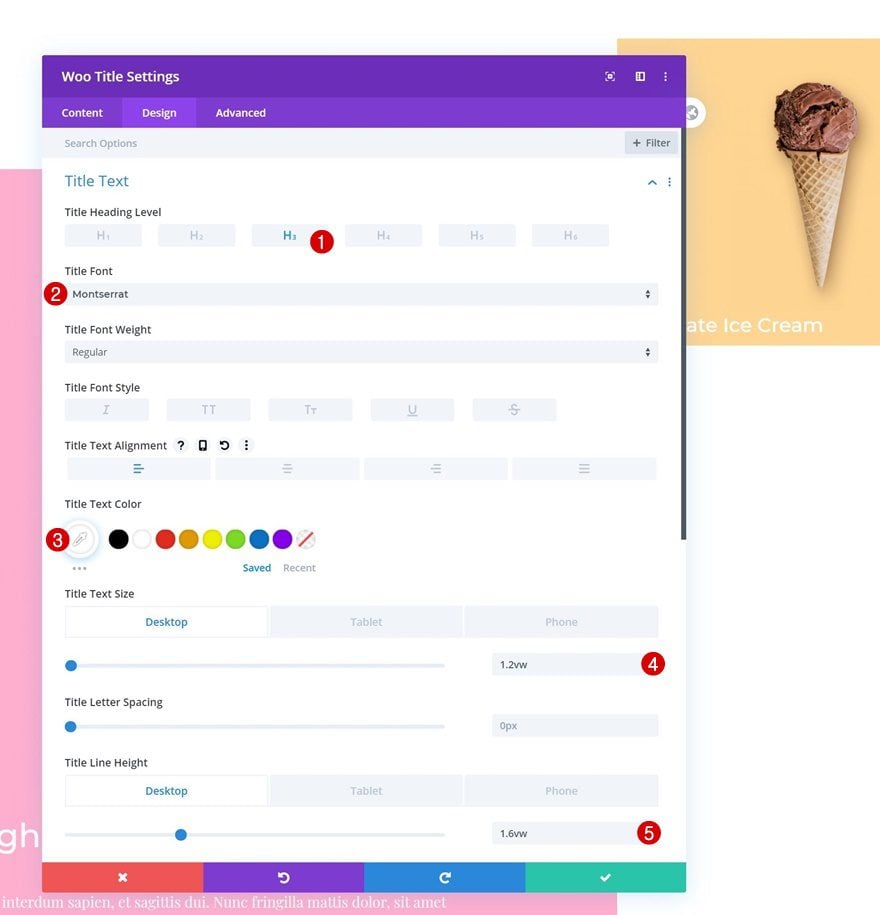
Spacing
And apply some custom padding values to the spacing settings.
- Top Padding: 2vw (Desktop), 6vw (Tablet), 8vw (Phone)
- Bottom Padding: 2vw (Desktop), 6vw (Tablet), 8vw (Phone)
- Left Padding: 2vw (Desktop), 9vw (Tablet & Phone)
- Right Padding: 2vw (Desktop), 9vw (Tablet & Phone)
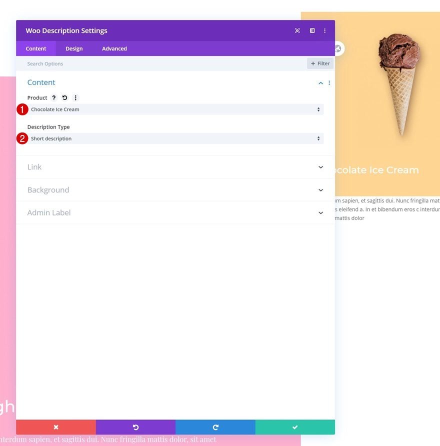
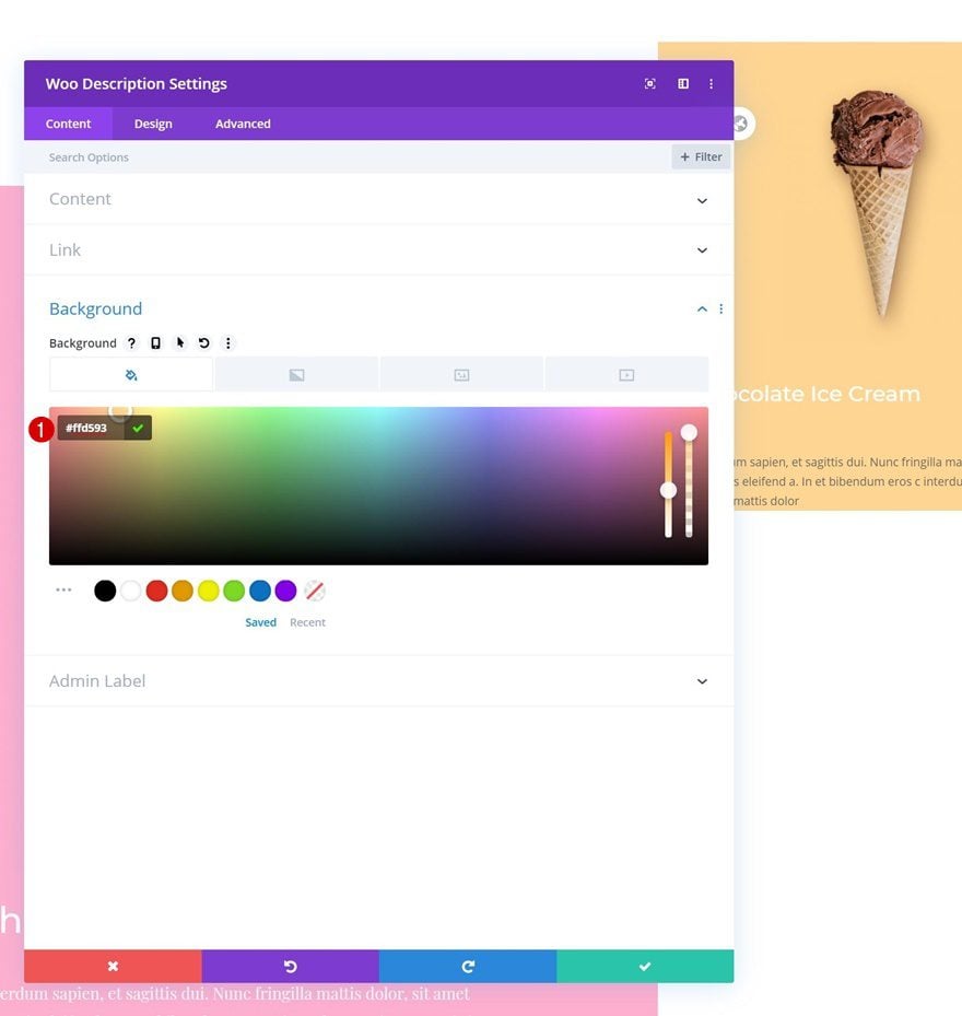
Add Woo Description Module to Column 2
Dynamic Content
On to the next module, which is a Woo Description Module. Select a product of your choice.
- Product: Find in list
- Description Type: Short description
Background Color
Modify the background color next.
- Background Color: #ffd593
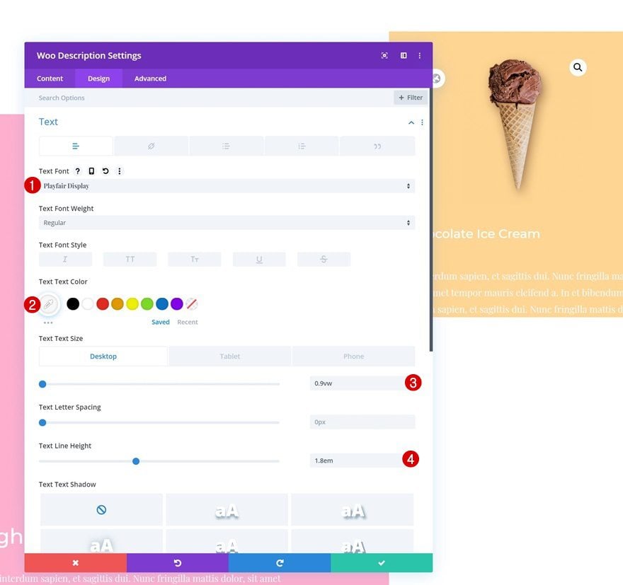
Text Settings
Move on to the design tab and change the text settings as follows:
- Text font: Playfair Display
- Text Color: #f7f7f7
- Text Size: 0.9vw (Desktop), 2vw (Tablet), 3vw (Phone)
- Title Line Height: 1.8em
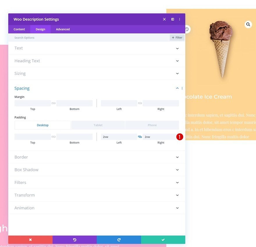
Spacing
Add some left and right padding across different screen sizes too.
- Left Padding: 2vw (Desktop), 9vw (Tablet & Phone)
- Right Padding: 2vw (Desktop), 9vw (Tablet & Phone)
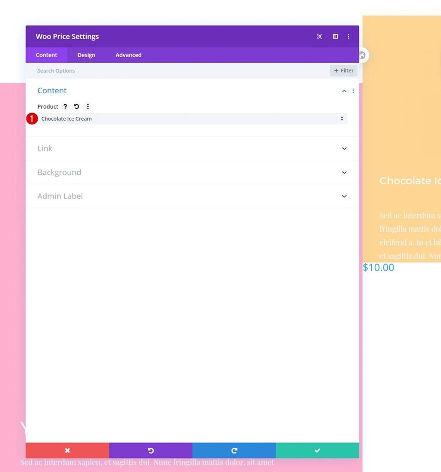
Add Woo Price Module to Column 2
Dynamic Content
The next module we need is a Woo Price Module. Select a product of your choice.
- Product: Find in list
Background Color
Add a background color next.
- Background Color: #ffd593
Price Text Settings
Move on to the design tab and change the price text settings accordingly:
- Price Font: Montserrat
- Price Font Weight: Bold
- Price Text Color: #ffffff
- Price Text Size: 1.5vw (Desktop), 5vw (Tablet), 6vw (Phone)
- Price Line Height: 2vw
Spacing
Add some custom padding values too.
- Top Padding: 2vw (Desktop), 6vw (Tablet), 8vw (Phone)
- Bottom Padding: 2vw (Desktop), 6vw (Tablet), 8vw (Phone)
- Left Padding: 2vw (Desktop), 9vw (Tablet & Phone)
- Right Padding: 2vw (Desktop), 9vw (Tablet & Phone)
Add Woo Add To Cart Module to Column 2
Dynamic Content
Complete the product display in column 2 by adding a Woo Add To Cart Module. Select a product of your choice.
- Product: Find in list
Background Color
Modify the module’s background color next.
- Background Color: #ffd593
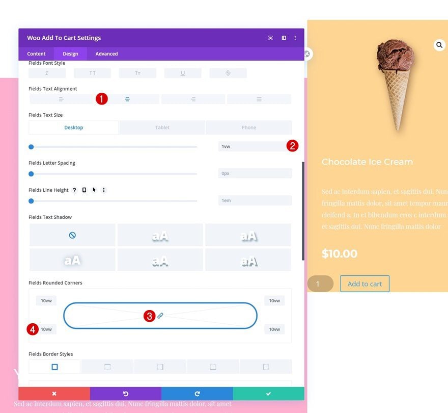
Fields Text Settings
Change the fields text settings too.
- Fields Text Alignment: Center
- Fields Text Size: 1vw (Desktop), 3vw (Tablet), 4vw (Phone)
- Fields Rounded Corners: 10vw (All Corners)
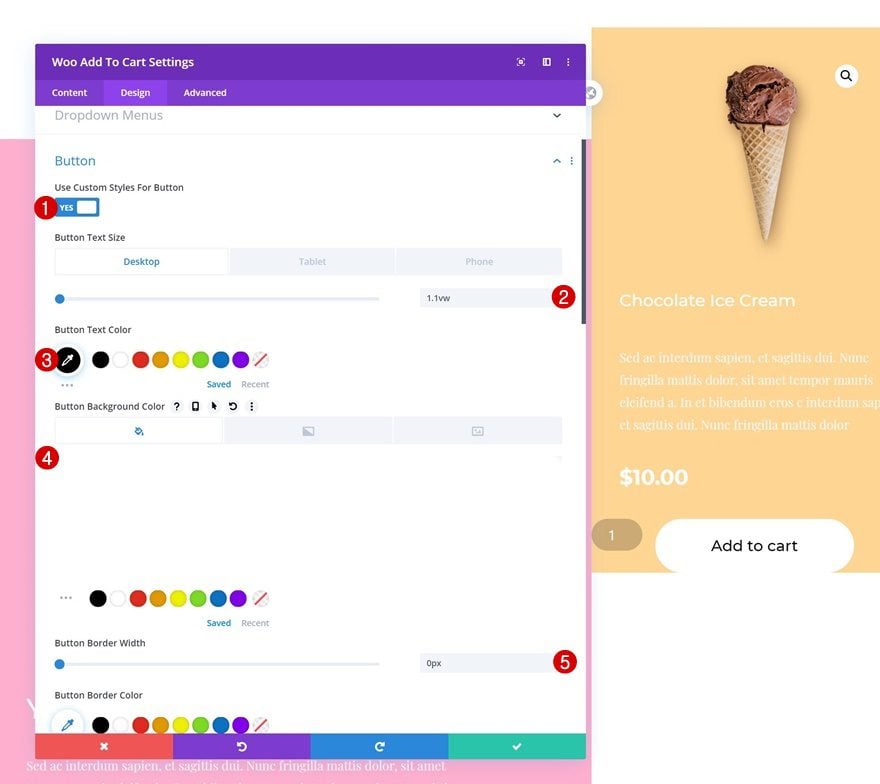
Button Settings
Then, style the button.
- Use Custom Styles For Button: Yes
- Button Text Size: 1.1vw (Desktop), 2vw (Tablet), 3vw (Phone)
- Button Text Color: #000000
- Button Background Color: #ffffff
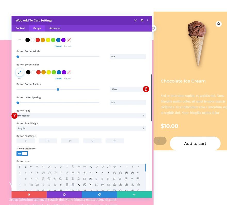
- Button Border Width: 0px
- Button Border Radius: 50vw
- Button Font: Montserrat
- Top Padding: 1vw (Desktop), 3vw (Tablet), 5vw (Phone)
- Bottom Padding: 1vw (Desktop), 3vw (Tablet), 5vw (Phone)
- Left Padding: 4vw (Desktop), 15vw (Tablet), 18vw (Phone)
- Right Padding: 4vw (Desktop), 15vw (Tablet), 18vw (Phone)
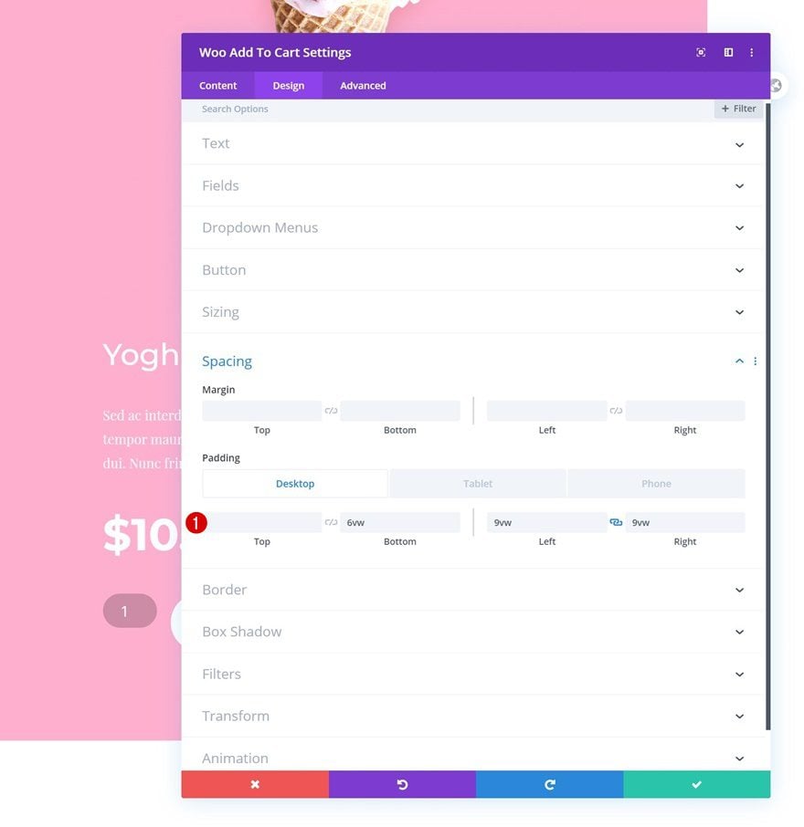
Spacing
Complete the module’s settings by adding some custom padding values across different screen sizes.
- Bottom Padding: 3vw (Desktop), 10vw (Tablet), 15vw (Phone)
- Left Padding: 2vw (Desktop), 9vw (Tablet & Phone)
- Right Padding: 2vw (Desktop), 9vw (Tablet & Phone)
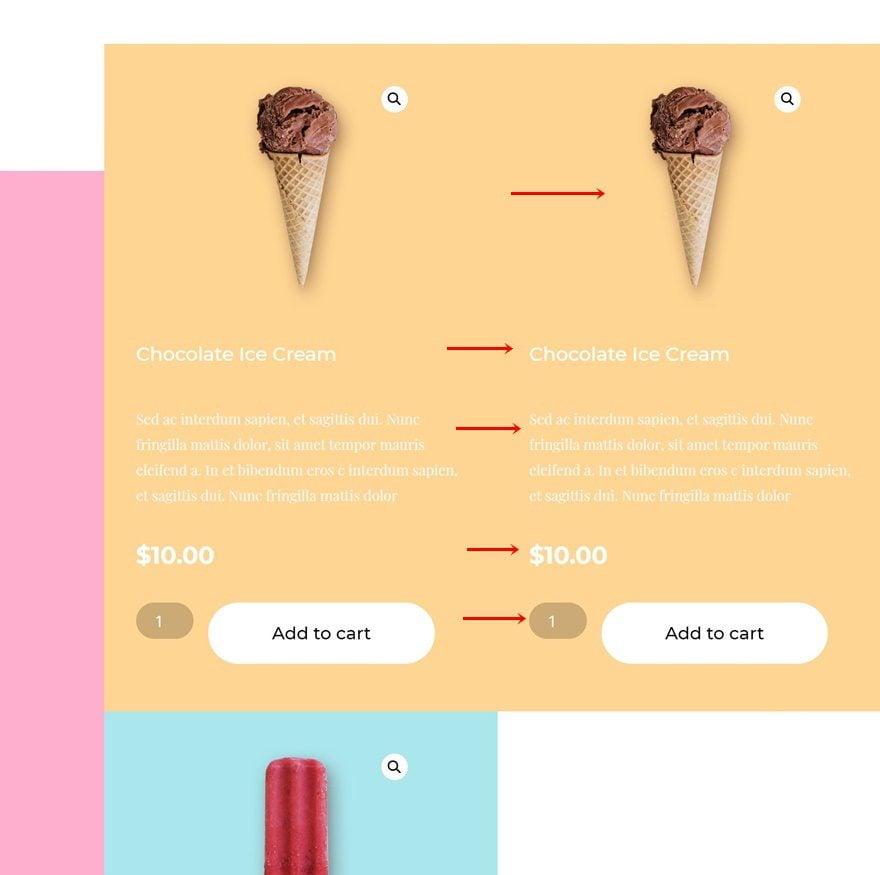
Clone Woo Modules in Column 2 & Place in Right Order
Once you’ve completed all modules in column 2, you can clone each one of them and place the duplicates in the same order.
Change Dynamic Content of All Duplicates
Change the product for each duplicate module.
- Product: Find in list
Change Background Color of All Duplicates
Along with the background color.
- Background Color: #aae7ed
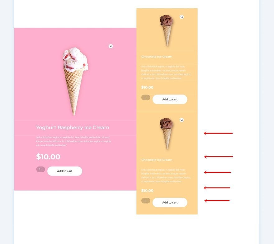
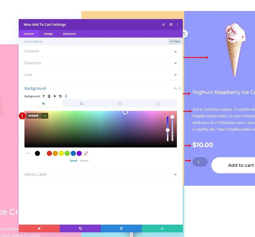
Clone Woo Modules in Column 2 & Place Duplicates in Column 3
Clone all the product modules once again and place the duplicates in column 3.
Change Dynamic Content of All Duplicates
Change the dynamic content of each module in column 3.
- Product: Find in list
Change Background Color of All Duplicates
Along with the background color.
- Background Color: #939bff
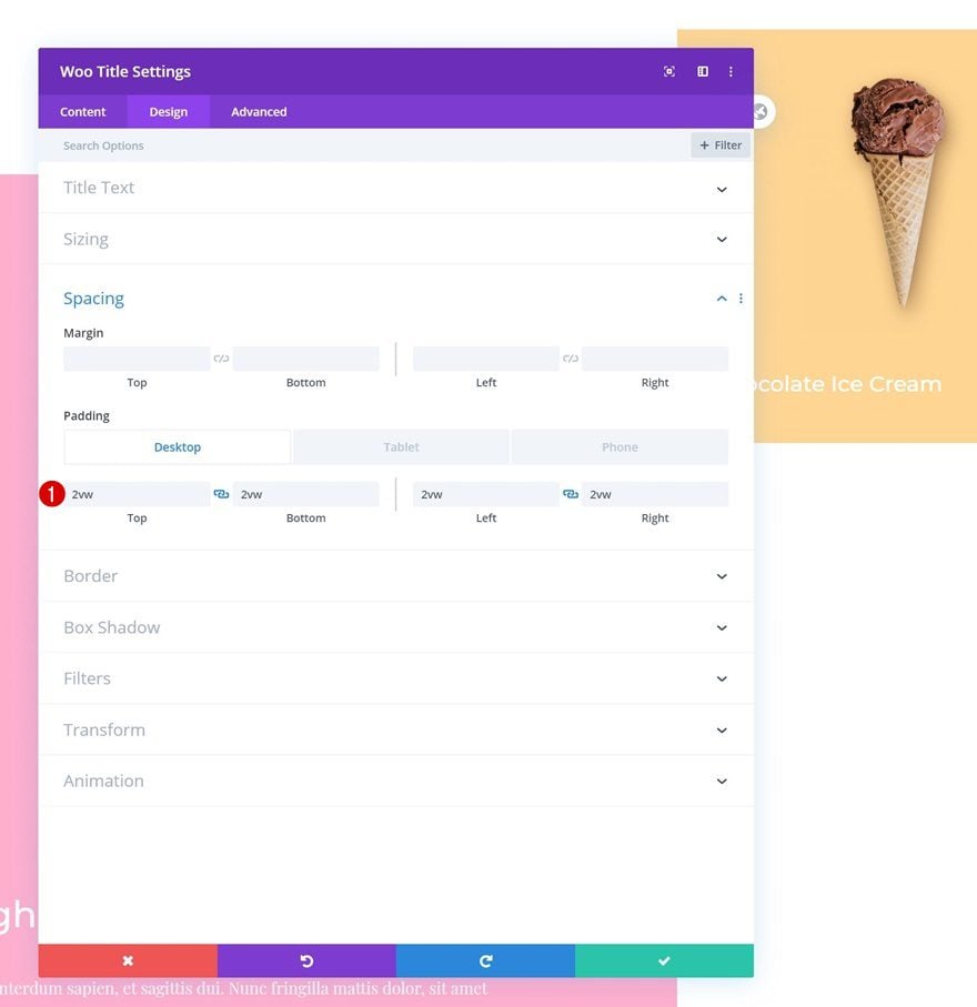
Add Top Margin to Woo Image Module
And to create some space at the top of column 3, we’ll open the Woo Image Module and add some top margin.
- Top Margin: 18vw (Desktop), 0vw (Tablet & Phone)
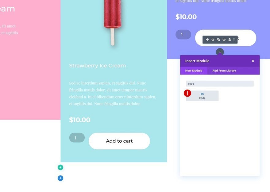
Add Code Module Below Woo Modules in Column 3
The last part of this tutorial is allowing the items to show below each (instead of next to each other) on tablet. To do that, we’ll add a Code Module.
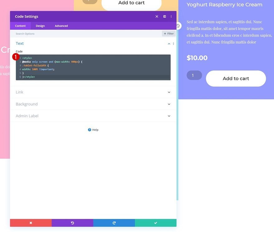
Insert Page CSS Code
And we’ll insert a few lines of CSS code. Once you’ve completed this step, you’re done!
@media only screen and (max-width: 980px) {
.tablet-fullwidth {
width: 100% !important;
}
}
Preview
Now that we’ve gone through all the steps, let’s take a final look at the outcome across different screen sizes.
Final Thoughts
In this post, we’ve shown you how to recreate a vibrant product grid with add to cart buttons. This is a great way to showcase multiple products on your landing page. This tutorial goes to show how versatile Divi’s new WooCommerce modules are when combined with Divi’s built-in element options. You were able to download the JSON file for free as well! If you have any questions or suggestions, make sure you leave a comment in the comment section below.
If you’re eager to learn more about Divi and get more Divi freebies, make sure you subscribe to our email newsletter and YouTube channel so you’ll always be one of the first people to know and get benefits from this free content.
The post How to Create a Dynamic & Vibrant Product Grid for Your Divi Landing Page appeared first on Elegant Themes Blog.