
There are a ton of approaches that you can apply on your homepage, but if you want to add that little extra touch to your website, opting for a navigation page as your homepage might be the way to go. You won’t see it around that often and it gives your visitors a clear view of what they can expect from your website. Besides, it’ll also help your visitors navigate visually through the different pages full of the awesome content that you provide.
To show you how you can get it done with Divi, in a stylish and elegant manner, we’ve created a design that we’ll show you how to recreate in this post. There will be two versions; the desktop version and the one that’s suitable for tablet and phone. Before we dive into the tutorial, let’s take a look at the final result.
Result on Desktop
The result we’re going to recreate looks like this on desktop:

Result on Mobile
The result on mobile is slightly different and looks like this:

How to Create a Navigation Homepage with Divi
Subscribe To Our Youtube Channel
Recreate Desktop Version
We’re going to create two versions of the navigation page; a desktop version and a version for tablet and phone. That way, we’ll be sure that the navigation page looks good on all devices. As usual, we’re going to start off by creating the desktop version.
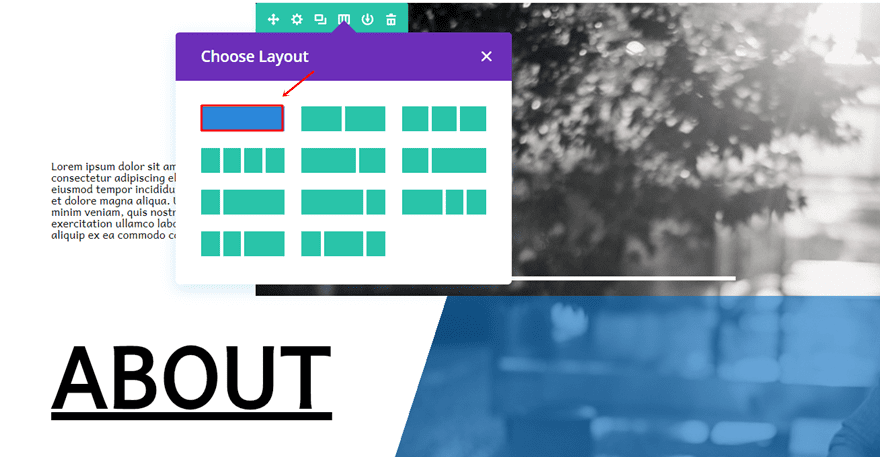
Add New Section
Start by creating a new page and adding a regular section to it. For this tutorial, we’re only going to use one section that’ll include all of the rows with content we’ll be needing (both for the desktop and mobile version). However, you can also choose to separate the desktop and mobile version into two sections.
Recreate First Navigation Row
As you can notice in the result preview above, each one of the navigation items has more or less the same design with some different details. Most of the settings for each one of the navigation items you want to create are the same. That’s why we’ll show you how you can create the first row in detail, and then show you how you can make the modifications for the other navigation items you want to add to the page as well.
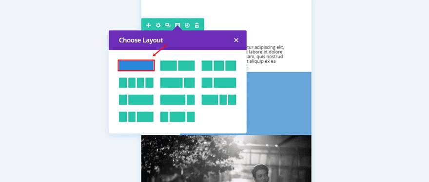
Column Structure
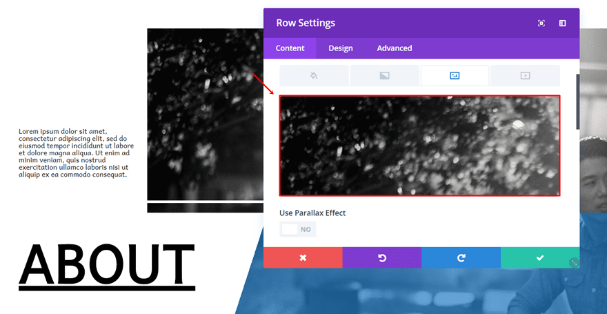
First of all, choose a fullwidth column for the row you’ve just added. Before we add any modules to it, we’re going to make sure the row settings are in place so go ahead and open the row settings.
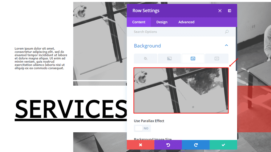
Background Image
While being on the Content tab, the first thing we’re going to do is add a background image to your row. We recommend using an image that has a width of ‘1400px’ and a height of ‘934px’ as it will lead to the best result. Also, make sure you put the image on ‘no repeat’.
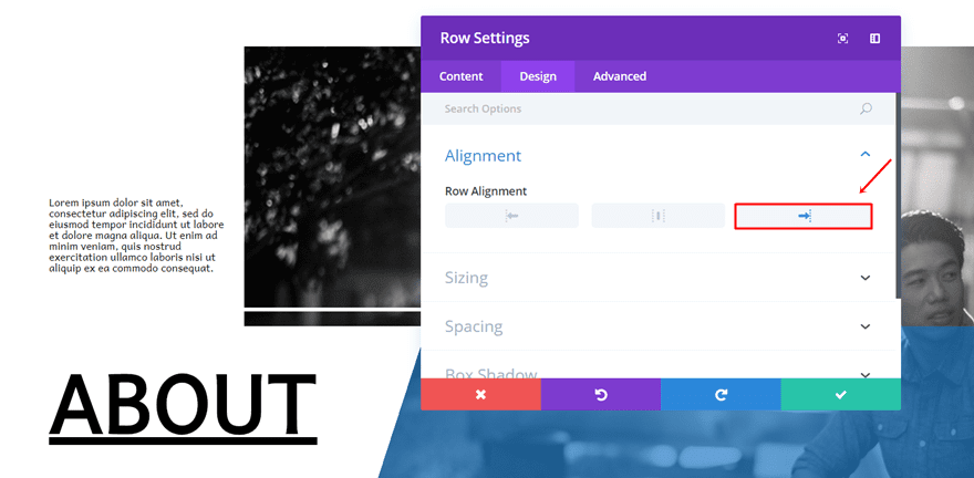
Alignment
Then, move on to the Design tab and add a right alignment to your row. By doing this, you will create enough space on the left side of your screen to add the description and the link.
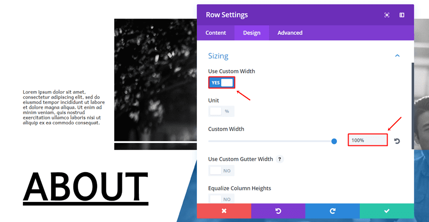
Sizing
Next, open the Sizing subcategory, enable the ‘Use Custom Width’ option and use a percentage width of ‘100%’.
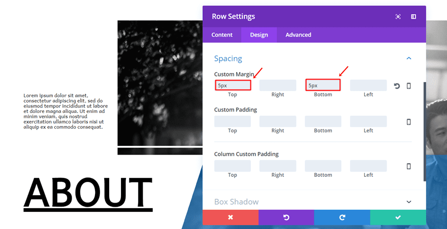
Spacing
Moving on, we want to add a bit of white space between each navigation item, that’s why we’re going to add a top and bottom margin of ‘5px’ to the row.
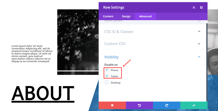
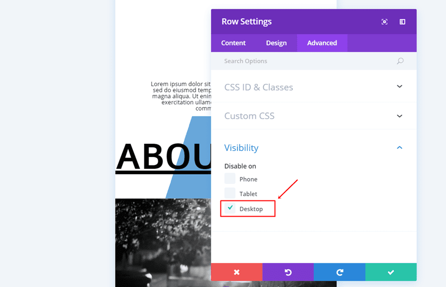
Visibility
Last but not least, we want to disable this row on phone and tablet since we’re going to create another row that will match tablet and phone later on this post.
Text Module for Page Description
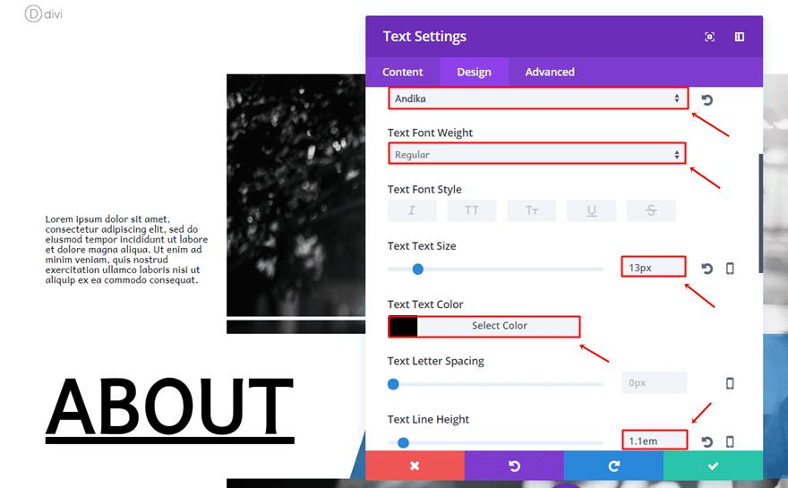
Text Settings
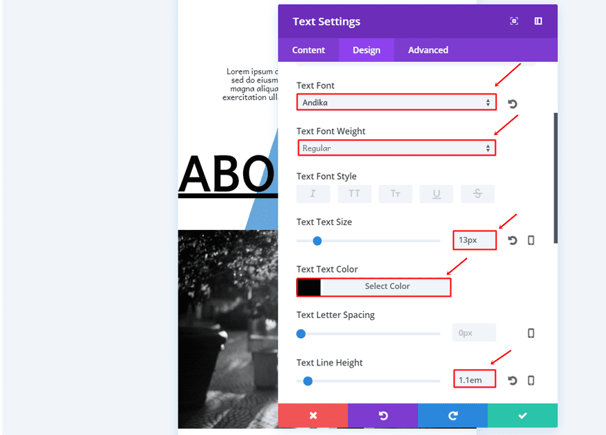
Once the row settings are done, you can add a first Text Module to the column of the row and use the following settings for the Text subcategory in the Design tab:
- Text Font: Andika
- Text Font Weight: Regular
- Text Size: 13px
- Text Color: #000000
- Text Line Height: 1.1em
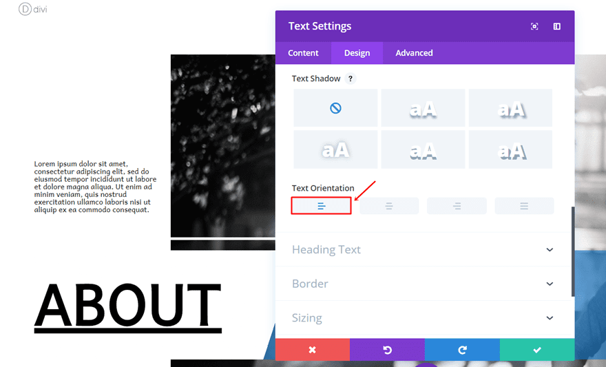
- Text Orientation: Left
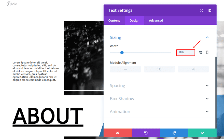
Sizing
Scroll down, open the Sizing subcategory and add a width of ‘18%’. This width will make sure that our Text Module will not cross the background image of our row once we add the negative left margin to it.
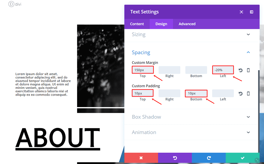
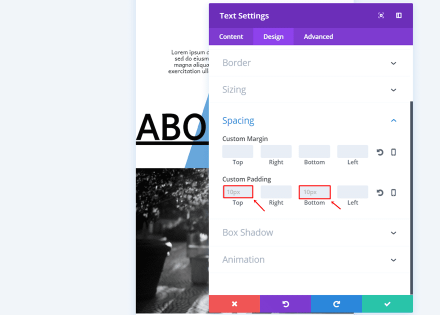
Spacing
As mentioned in the previous step, we want the Text Module to come on the left side of our row without overlapping the row background. We also want to have some space between the top of the row image and the start of the Text Module, that’s why we’re using some top margin as well.
- Top Margin: 150px
- Left Margin: -20px
- Top Padding: 10px
- Bottom Padding: 10px
Divider Module
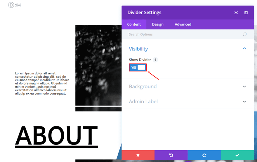
Visibility
Next, go ahead and add a Divider module right below the Text Module. Within the Visibility subcategory, enable the ‘Show Divider’ option.
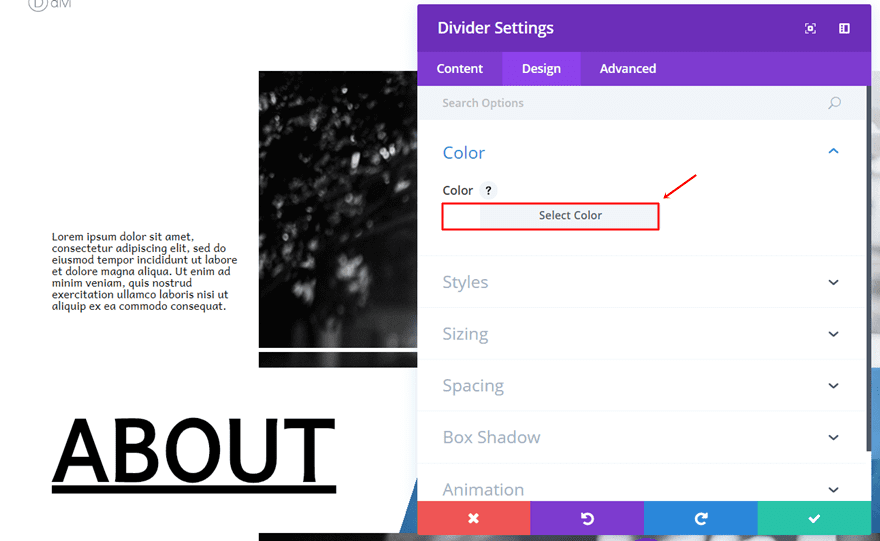
Color
Then, move on to the Design tab and add ‘#FFFFFF’ as the divider color.
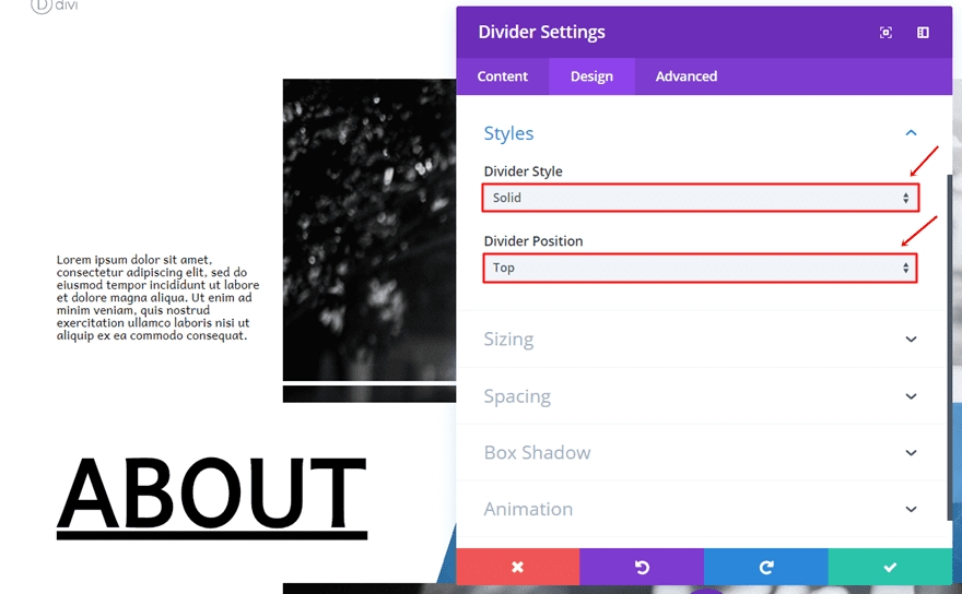
Styles
Moving on, choose ‘Solid’ as the Divider Style and ‘Top’ as the Divider Position.
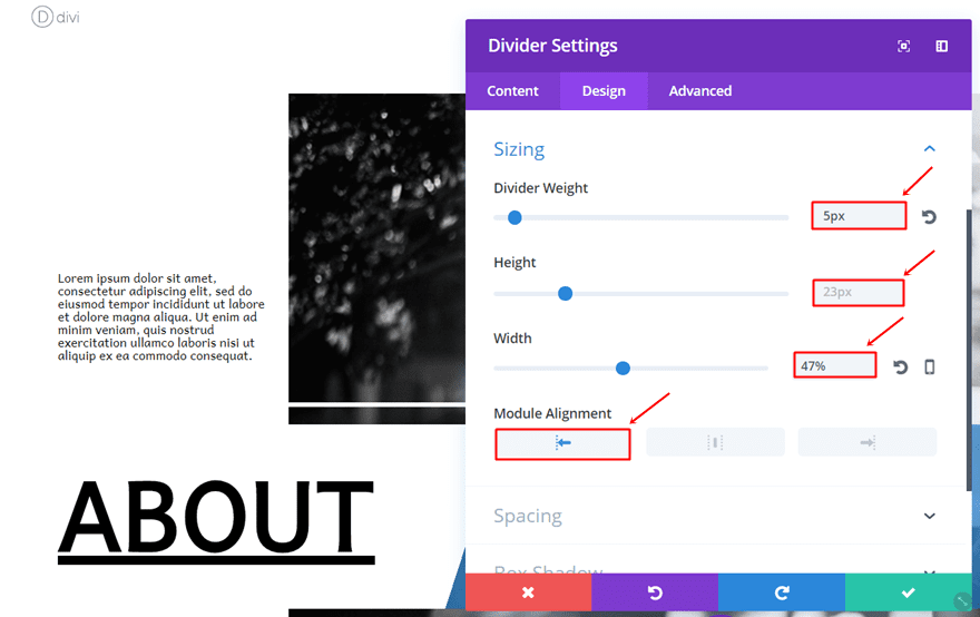
Sizing
Lastly, make the following settings apply to the Sizing subcategory:
- Divider Weight: 5px
- Height: 23px
- Width: 47%
- Module Alignment: Left
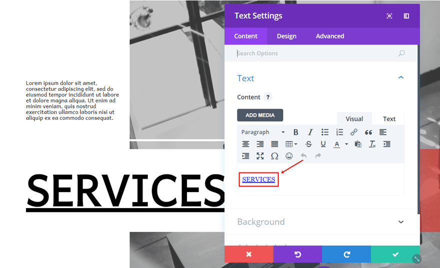
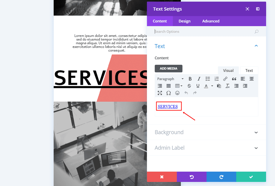
Text Module for Menu Item
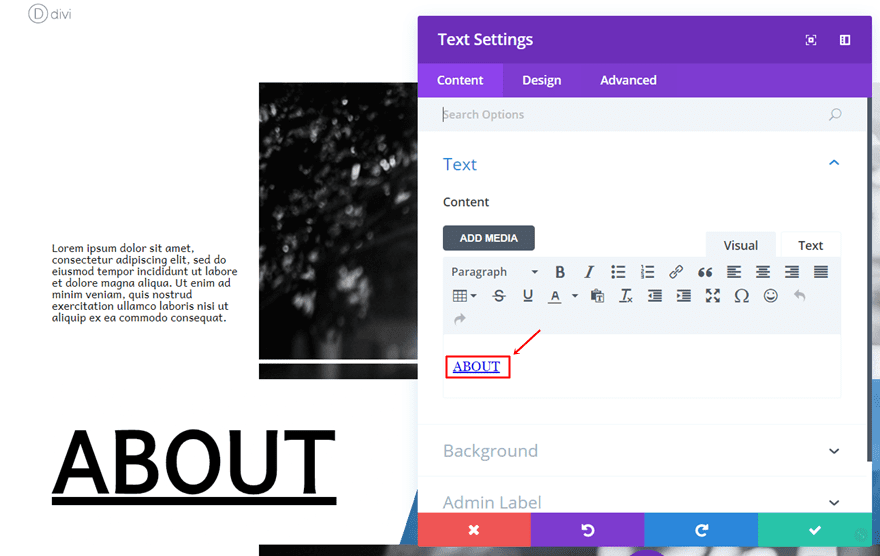
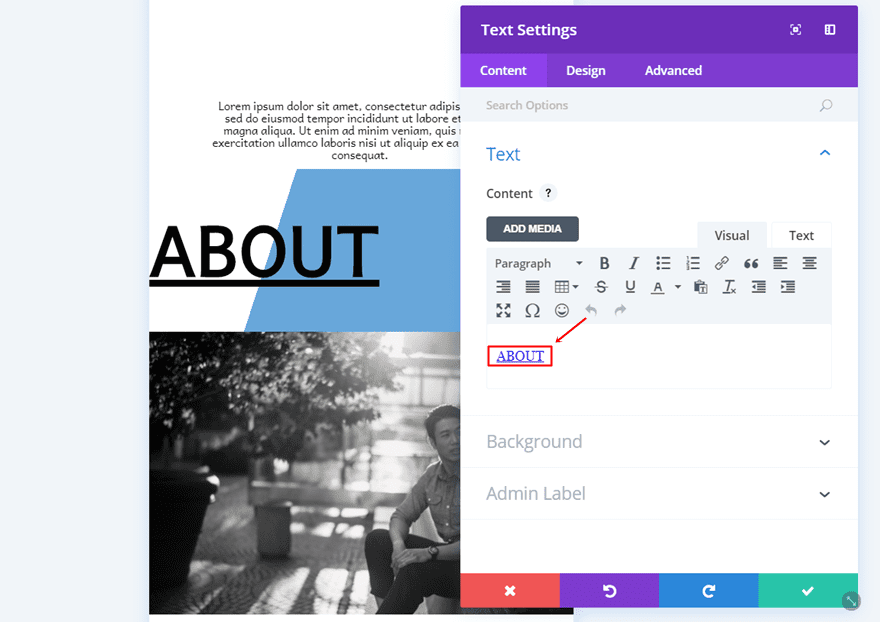
Link Text in Content Box
Once you’re done with the Divider Module, go ahead and add another Text Module right below it. This Text Module will be our navigation item. Open the settings, enter the text and add a link to it.
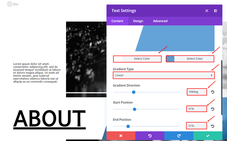
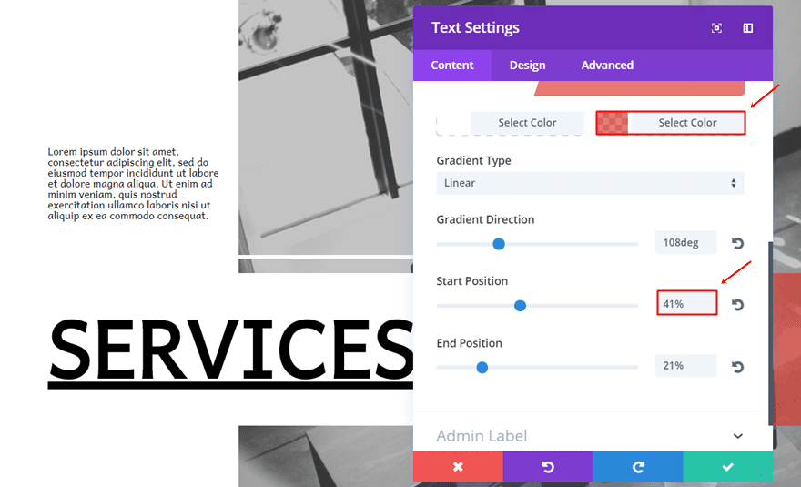
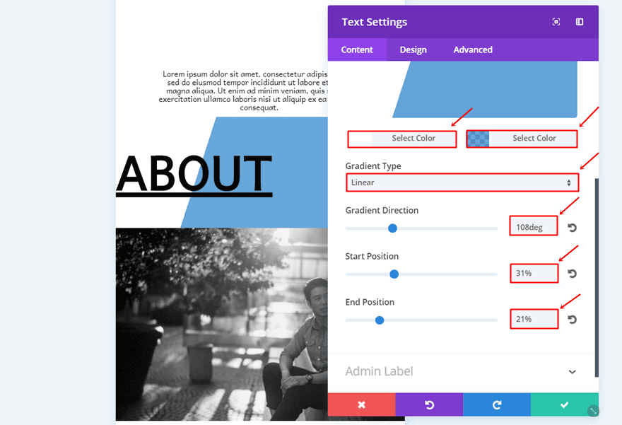
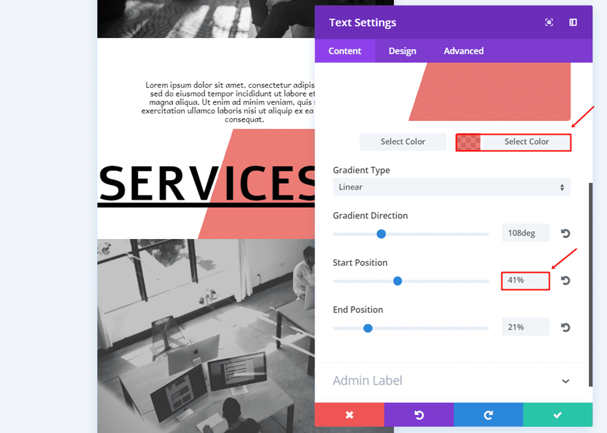
Gradient Background Color
While still being on the Content tab, use the following gradient background settings:
- First Color: #FFFFFF
- Second Color: rgba(12,113,195,0.62)
- Gradient Type: Linear
- Gradient Direction: 108deg
- Start Position: 31%
- End Position: 21%
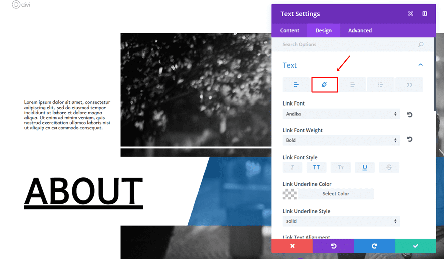
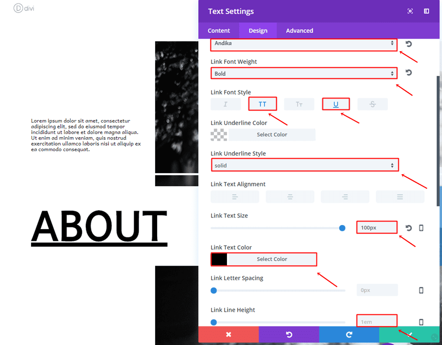
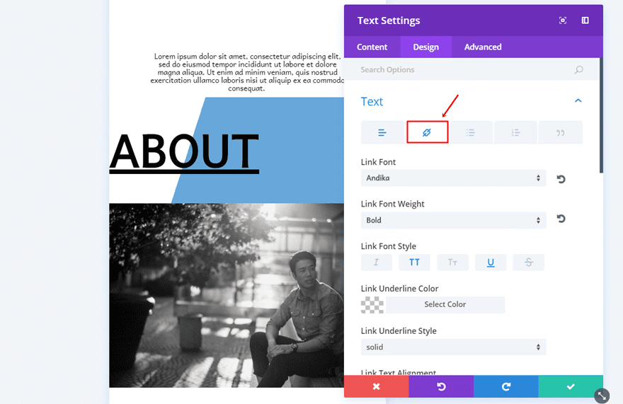
Link Text Settings
Then, go to the Design tab and make the following settings apply to the link tab of the Text Subcategory:
- Link Font: Andika
- Link Font Weight: Bold
- Link Font Style: Uppercase & Underline
- Link Underline Style: Solid
- Link Text Size: 100px
- Link Text Color: #000000
- Link Line Height: 1em
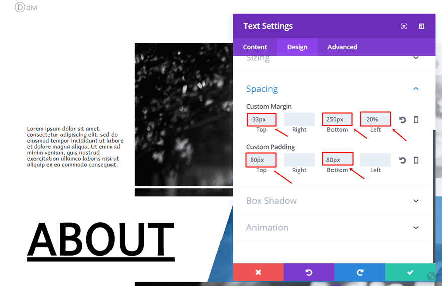
Spacing
This Text Module will need to appear on the left side of the screen as well, that’s why we’re adding the left margin. We also want the space between the Divider Module and this Text Module to be smaller, that’s where the negative top margin enters. To create that central horizontal alignment, we’re also going to add a bottom margin. And lastly, we want the gradient background to be larger, that’s why we’re using the top and bottom padding.
- Top Margin: -33px
- Bottom Margin: 250px
- Left Margin: -20px
- Top Padding: 80px
- Bottom Padding: 80px
Clone First Navigation Row as Many Times as Needed
The different navigation items on your navigation page are going to have, more or less, the same settings. That’s why we recommend cloning the row as many time as you need and making the detail modifications afterwards. There are three things you’ll need to change, let’s take a look.
Change Row Background
The first thing you’ll need to do is change the background images of the duplicates of your row. Again, make sure you use an image with a width of ‘1400px’ and a height of ‘943px’ to obtain the best result.
Change Text Module for Menu Item
Change Link
Then, open the navigation item Text Module and change the text along with the link.
Change Gradient Background According to Text Length
Lastly, you’ll also need to change the gradient background of this Text Module. Change the second gradient color into ‘rgba(224,43,32,0.62)’ and change the Start Position value according to the length of your new navigation item. If you have a navigation item that is quite long, you’ll want to change the Start Position percentage to a higher value until you see it fall into place.
Recreate Mobile Version
Now that we have created the Desktop version, we’re going to create the tablet and mobile version as well. The style of the different Modules is pretty much the same as the desktop version but behind the scenes, the structure of our rows is completely different. Because of the many modifications you’d have to make to each module if you were to clone them, I’m simply going to show you how to create it from scratch without cloning any module from the Desktop version.
Recreate First Navigation Row
Start by adding another row to the section that we’ve created in the beginning of this post.
Column Structure
This column will, like the desktop version, also need only one column.
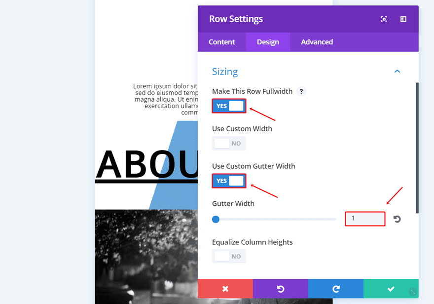
Sizing
The sizing of this row is the following:
- Make This Row Fullwidth: Yes
- Use Custom Gutter Width: Yes
- Gutter Width: 1
These settings will make sure our row takes up the whole width of the screen.
Visibility
And lastly, disable this row on desktop because we have other rows that will be displayed on desktop instead.
Text Module for Page Description
Text Settings
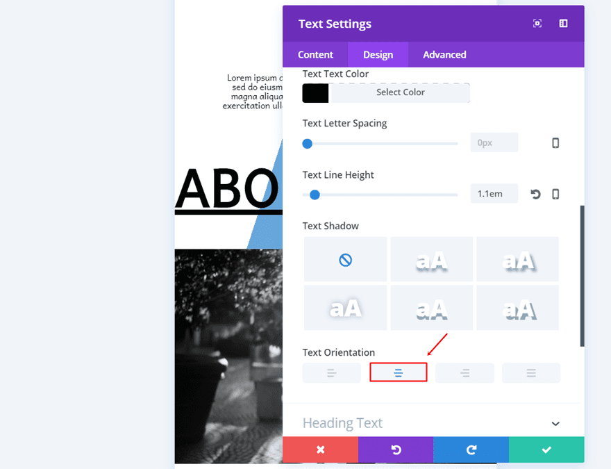
Go ahead and add the first Text Module to the row. Make the following settings apply to the Text subcategory:
- Text Font: Andika
- Text Font Weight: Regular
- Text Size: 13px
- Text Color: #000000
- Text Line Height: 1.1em
- Text Orientation: Center
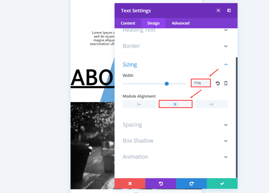
Sizing
Then, open the Sizing subcategory and, use a width of ‘71%’ and a center Module Alignment.
Spacing
Lastly, this Text Module will need a top and bottom padding of ’10px’. As you can notice, there is no need for margin values in the tablet and mobile version because we’re opting for a center alignment instead.
Text Module for Menu Item
Link Text in Content Box
For the Mobile version, we don’t need a Divider Module so we’re going to skip that step. Instead, we’re immediately going to add the navigation item Text Module right below the previous Text Module we’ve created. Once you do that, add the text with the link to the Content Box in the Content tab.
Gradient Background Color
The gradient background we’re going to use for this Text Module is the same as the Desktop version one:
- First Color: #FFFFFF
- Second Color: rgba(12,113,195,0.62)
- Gradient Type: Linear
- Gradient Direction: 108deg
- Start Position: 31%
- End Position: 21%
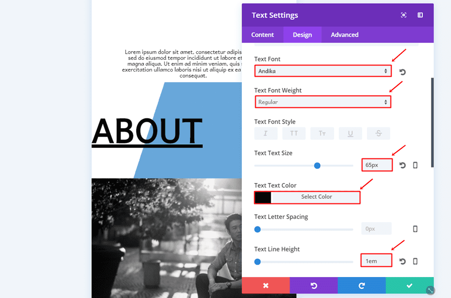
Link Text Settings
Make use of the following settings for the Text Subcategory:
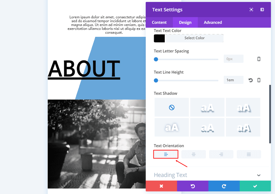
- Link Font: Andika
- Link Font Weight: Bold
- Text Size: 65px
- Text Color: #000000
- Text Line Height: 1em
- Text Orientation: Left
Spacing
Like the desktop version, this navigation item Text Module will need a top and bottom padding of ’80px’ to make the gradient background larger.
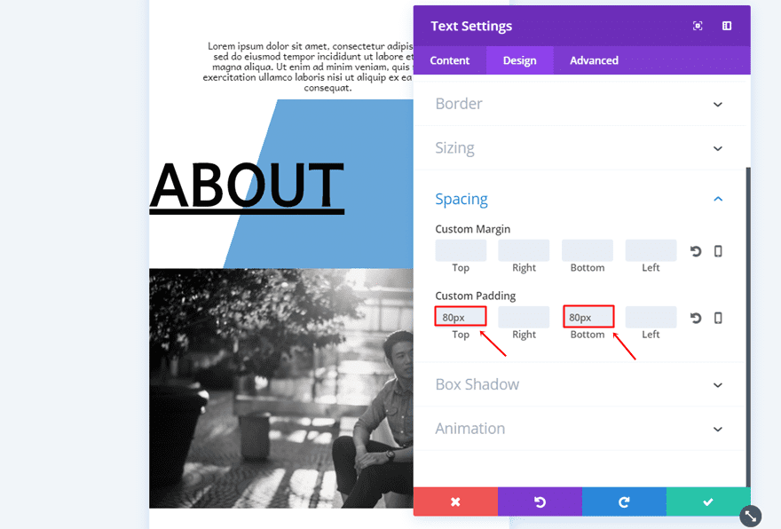
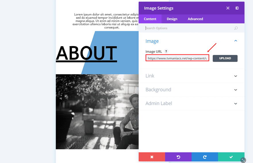
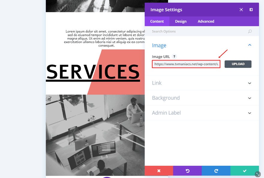
Image Module
Upload Image
Lastly, add an Image Module as the last module in your row and upload an image of choice.
Clone First Navigation Row as Many Times as Needed
Same thing counts for the mobile version; you can clone the row you’ve just created as many times as needed to add the other navigation items as well. There are three things you’ll need to modify each time you add a new navigation item, let’s take a look.
Change Text Module for Menu Item
Change Link
The first thing you’ll need to change is the text and link within the Content Box of the Content tab of your navigation item Text Module.
Change Gradient Background According to Text Length
Then, you can also change the second gradient color into ‘rgba(224,43,32,0.62)’ and change the start position value according to the length of your text.
Change Image Module
Lastly, you can also change the image of the Image Module within that row.
Result
Once you’ve created both the desktop and mobile version, you’ll have a stunning navigation page that looks good on desktop, tablet and phone. Let’s take a final look at the result.
Result on Desktop
Result on Mobile
Final Thoughts
Creating a navigation page as your homepage will definitely leave a mark on your visitors. Not only does it help your visitors navigate more visually, but it also allows them to see a more elaborated sneak peek on what your website has to offer. If you have any questions or suggestions, make sure you leave a comment in the comment section below!
Be sure to subscribe to our email newsletter and YouTube channel so that you never miss a big announcement, useful tip, or Divi freebie!
Featured Image by LanKogal / shutterstock.com
The post How to Create a Navigation Homepage with Divi appeared first on Elegant Themes Blog.