
Creating an animated promo bar for your page template in Divi can be a great way to advertise products and deals in style without having to rely on a plugin. Using Divi’s powerful design features, you can build the promo bar visually when editing a template in Divi’s Theme Builder. Then once you the template is ready, the promo bar will popup on any page that has been assigned to that template. Easy!
Let’s jump in and get started!
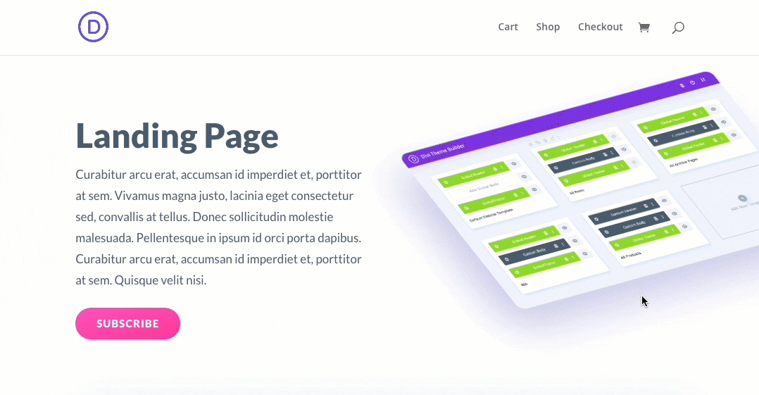
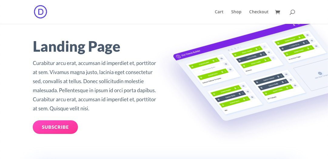
Sneak Peek
Here is a quick look at the promo bar we will create in this tutorial.
We’ll also show you how to make the promo bar fixed (or sticky) as well.
Download the Promo Bar Page Template for FREE
To lay your hands on the promo bar page template from this tutorial, you will first need to download it using the button below. To gain access to the download you will need to subscribe to our Divi Daily email list by using the form below. As a new subscriber, you will receive even more Divi goodness and a free Divi Layout pack every Monday! If youíre already on the list, simply enter your email address below and click download. You will not be “resubscribed” or receive extra emails.
Download For Free
Join the Divi Newlsetter and we will email you a copy of the ultimate Divi Landing Page Layout Pack, plus tons of other amazing and free Divi resources, tips and tricks. Follow along and you will be a Divi master in no time. If you are already subscribed simply type in your email address below and click download to access the layout pack.
You have successfully subscribed. Please check your email address to confirm your subscription and get access to free weekly Divi layout packs!
To import the layout to your page, simply extract the zip file and add one of the json files into the Divi Theme Builder using the Theme Builder Portability option.
Let’s get to the tutorial shall we?
What You Need to Get Started
To get started, you will need to install and activate the Divi Theme. Make sure you have the latest version of Divi.
You will also need at least one page created with the Divi Builder for testing purposes in order to assign the promo bar template to that page to show the result.
After that, you are ready to go.
Creating an Animated Promo Bar at the Top of a Page Template
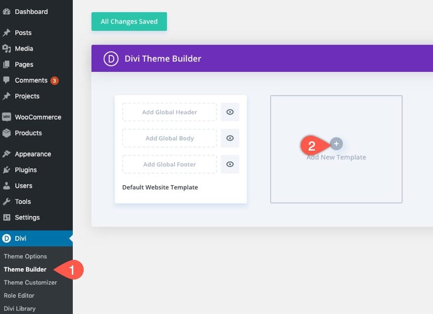
Creating a New Template
From the WordPress Dashboard, navigate to Divi > Theme Builder. Then click the “Add New Template” box to create a new template.
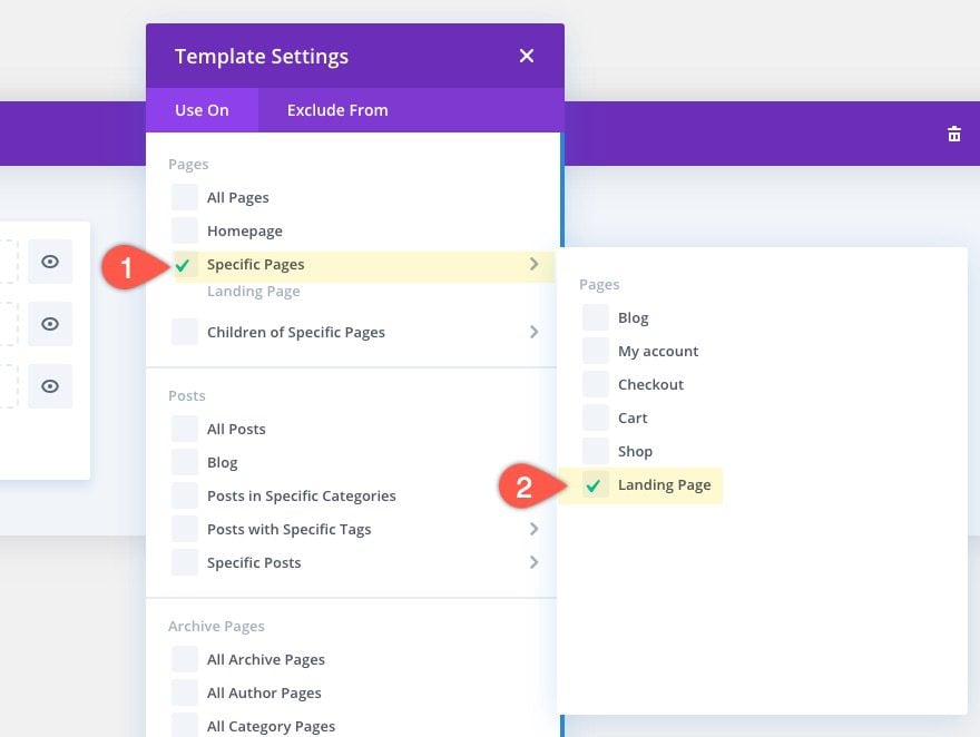
Assign the template to the page(s) you want the promo bar to be displayed.
On the new template, click the “Add Custom Body” area then select “Build Custom Body”.
NOTE: We are adding the promo bar to the body area of the template (not the header) so that it can work with Divi’s default header as well as any custom headers you may add in the future.
Then select the option “Build From Scratch”.
Adding the Promo Bar to the Template
Inside the Template Layout Editor, we can start building the promo bar using the Divi Builder.
Start with adding a one-column row to the regular section.
Row Settings
Before adding a module, update the Row settings as follows:
- Background Gradient Left Color: #4a42ec
- Background Gradient Right Color: #521d91
- Gradient Direction: 90deg
- Use Custom Gutter Width: YES
- Gutter Width: 1
- Width: 100%
- Max Width: 100%
- Padding: 0px top, 0px bottom
That takes care of the background color and width of the promo bar we are creating.
Column Settings
Before leaving the row settings, click to open the settings of the column. Then add the following custom CSS to Column Main Element:
display: flex;
align-items: center;
justify-content: center;
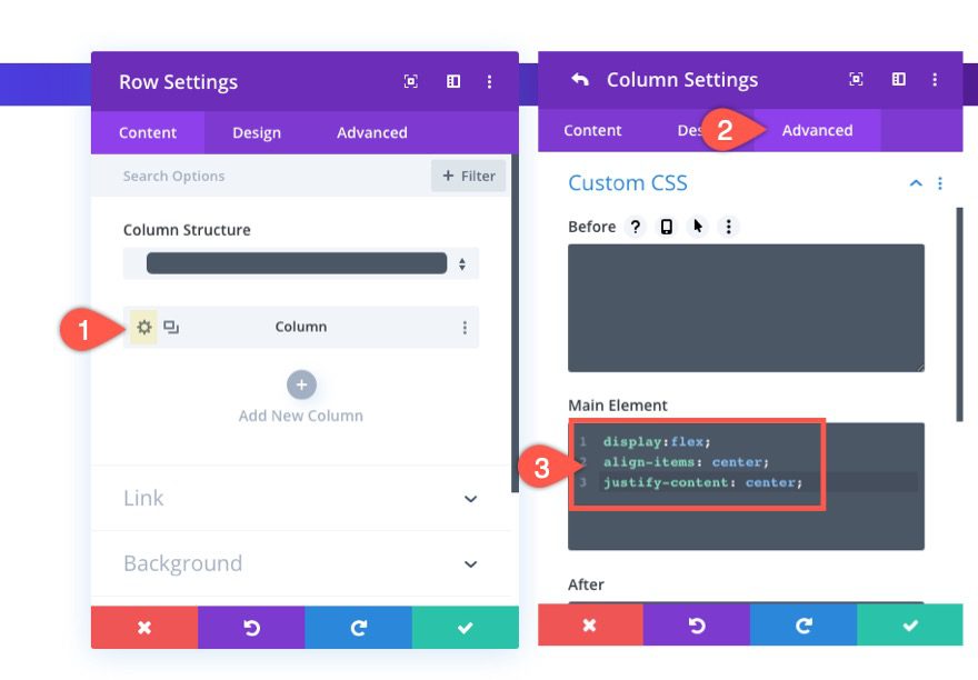
This CSS uses the flex property to align the content (or modules) within the column to stack horizontally (side by side). It also centers the modules within the column both vertically and horizontally. The reason we are doing it this way is to avoid having to use multiple column rows structures that will stack on top of each other on mobile. With this setup, the content will stay in a horizontal alignment on all browser widths.
Now we are ready to add some content to the promo bar.
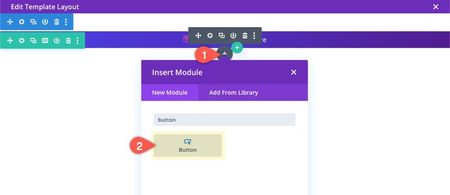
Adding the Blurb Module
For the content of this example promo, we will include a blurb module with a small icon and a blog of text with a button on the right (much like the promo bar on Elegantthemes.com).
Click the gray circle plus icon inside the row and add a blurb module.
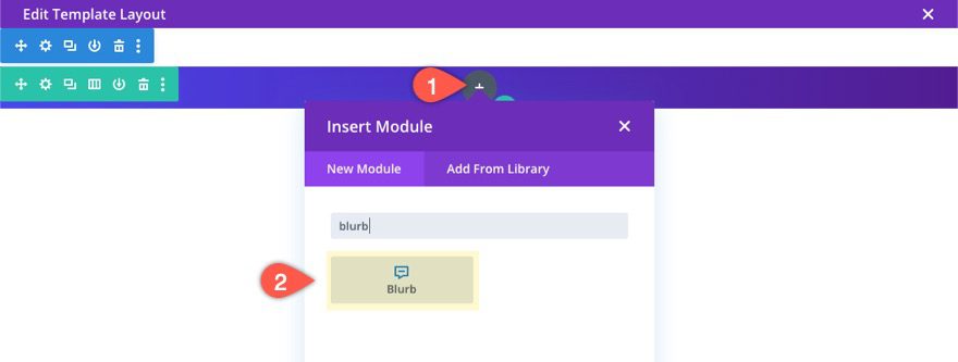
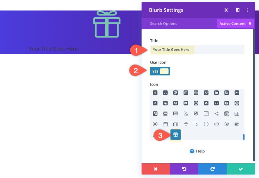
For the content of the blurb, enter the following:
- Title: [enter the promo text]
- Use Icon: YES
- Icon: gift icon (see screenshot)
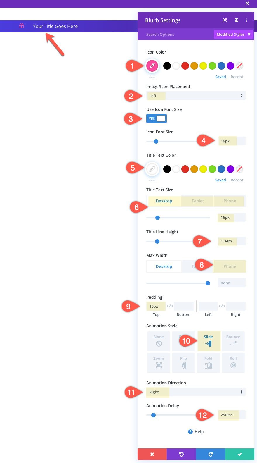
Update the blurb design settings as follows:
- Icon Color: #ff4a9e
- Image/Icon Placement: Left
- Use Icon Font Size: YES
- Icon Font Size: 16px
- Title Text Size: 16px (desktop), 14px (phone)
- Title Line Hewight: 1.3em
- Max Width: 230px (phone only)
- Padding: 10px top
- Animation Style: Slide
- Animation Direction: Right
- Animation Delay: 250ms
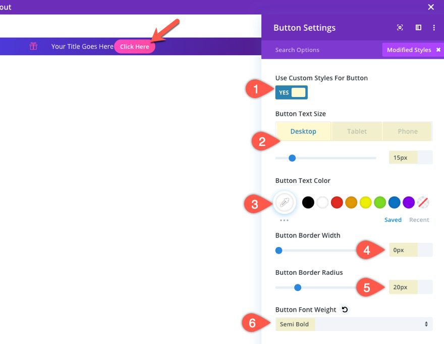
Adding the Button Module
Next add a button module under the blurb module. Because of the flex property, the module will appear to the right of the blurb instead of under it.
Update the button design settings as follows:
- Use Custom Styles for Button: YES
- Button Text Size: 15px (desktop), 13px (phone)
- Button Text Color: #ffffff
- Button Border Width: 0px
- Button Border Radius: 20px
- Button Font Weight: Semi Bold
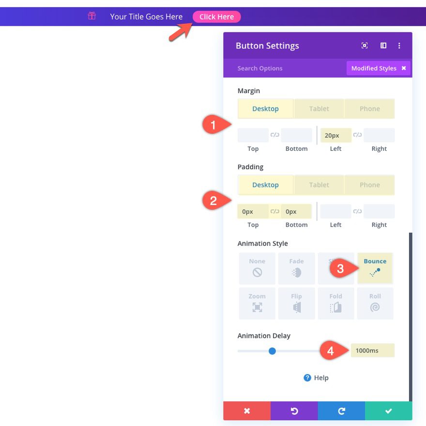
- Margin (desktop): 20px left
- Margin (phone): 10px left
- Padding (desktop): 0px top, 0px bottom
- Padding (phone): 2px top, 2px bottom, 8px left, 8px right
- Animation Style: Bounce
- Animation Delay: 1000ms
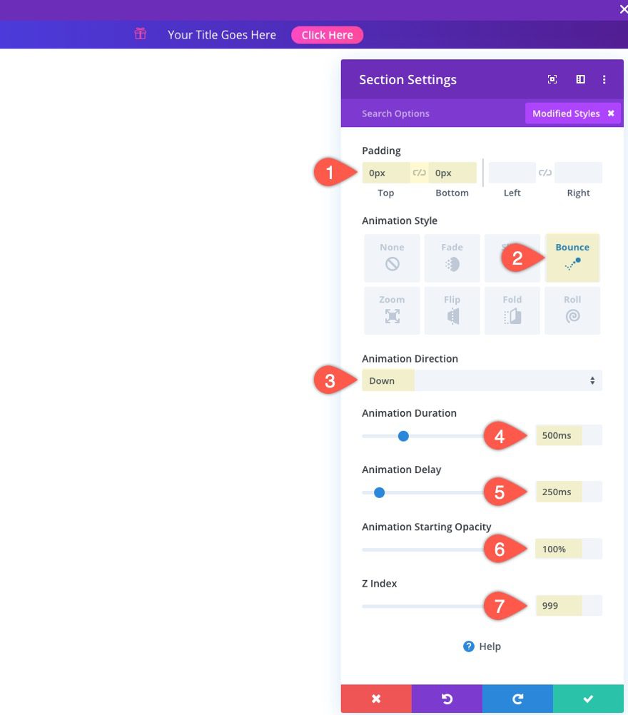
Section Settings
To complete the promo bar design, update the section containing the promo bar as follows:
- Padding: 0px top, 0px bottom
- Animation Style: Bounce
- Animation Direction: Down
- Animation Duration: 500ms
- Animation Delay: 250ms
- Animation Starting Opacity: 100%
- Z-Index: 999
Adding the Fullwidth Post Content Module
At this point the promo bar is ready to go. But since this is a template, we need to make sure and add the post content module to display the content of the page(s) using this template.
For pages that are (or will be) built using the Divi Builder, you will want to use a fullwidth post content module in order to maximize the content area.
(NOTE: For pages that use the default editor, you will want to use a regular post content module inside a regular section so that you have a similar max width of 1080px by default.)
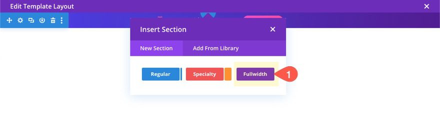
Add Fullwidth Section
Under the section containing your promo bar, add a fullwidth section.
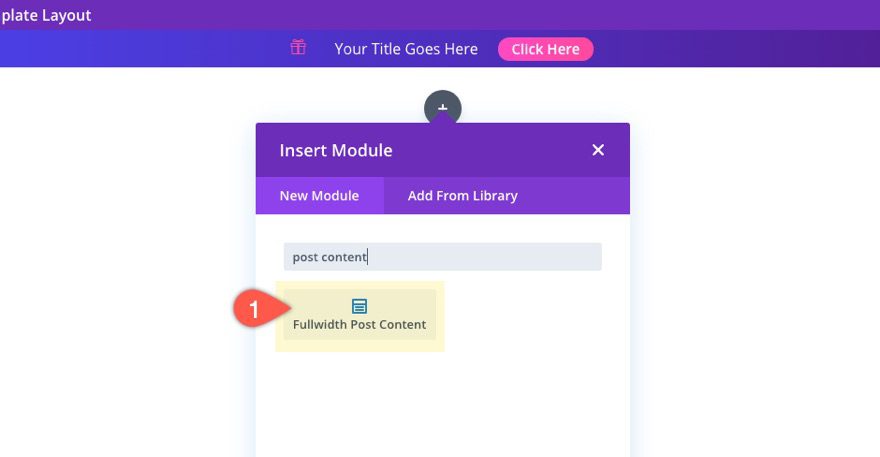
Add Fullwidth Post Content Module
Then select the Fullwidth Post Content Module.
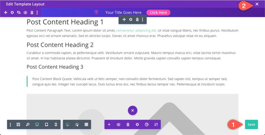
That about does it. Now make sure and save the layout before exiting the editor.
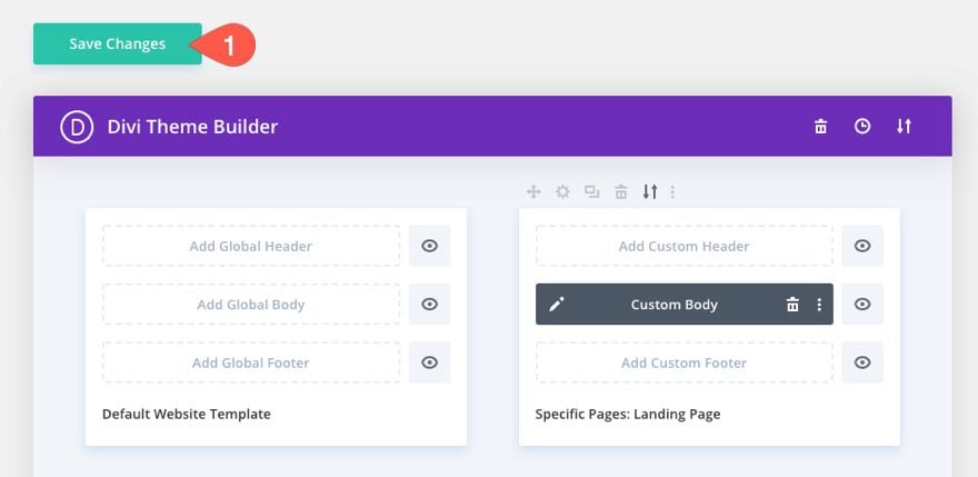
Then save the changes for the theme builder too.
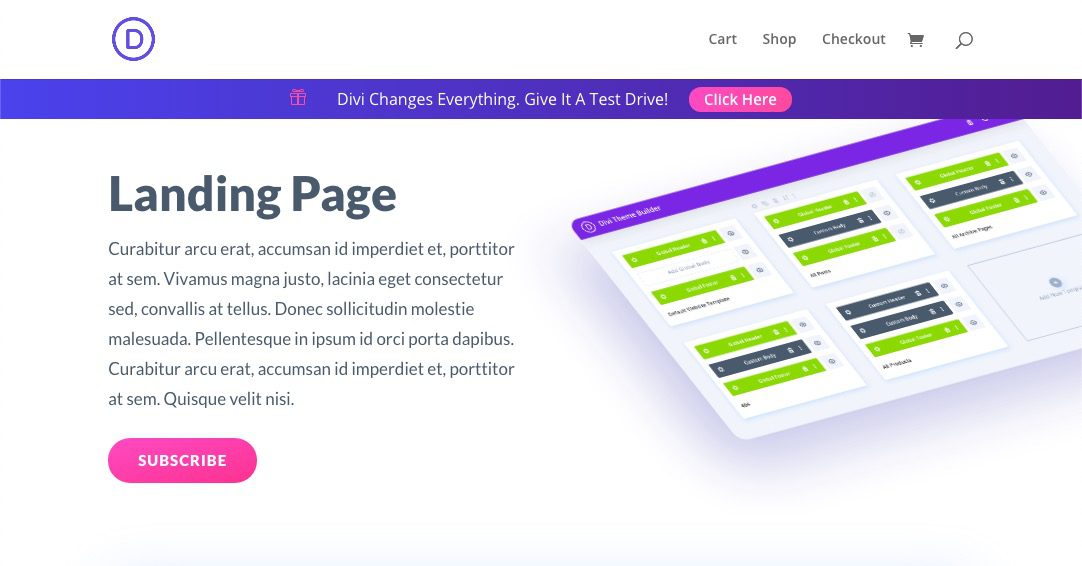
Final Result
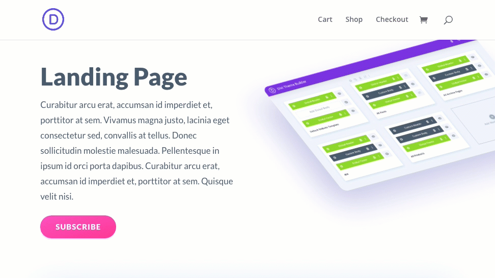
Before
Now here is the page before assigning the template with the promo bar.
After
And here is the same page with the new template with the promo bar.
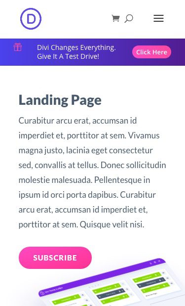
Here it is on mobile.
Here is the promo bar animation on page load.

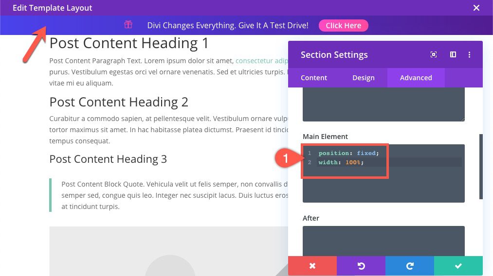
Making the Promo Bar Sticky
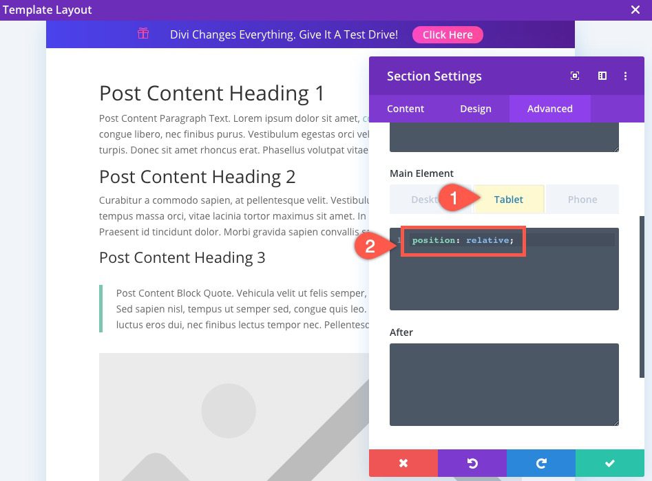
To make the promo bar stick under the default Divi header, we can add a simple CSS snippet to the section containing the promo bar.
Open the section settings and add the following CSS to the Main Element on Desktop:
position: fixed;
width: 100%;
Then add the following CSS to the Main Element on Tablet:
position: relative;
Now check out the result.
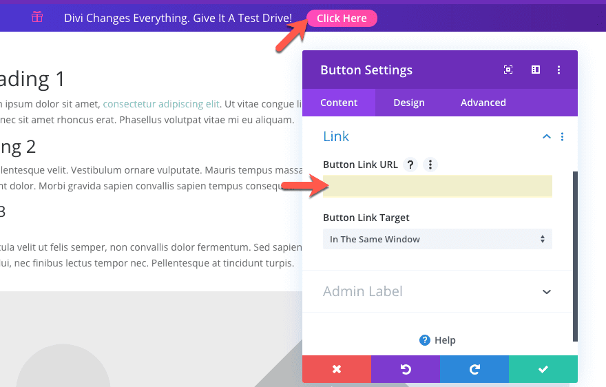
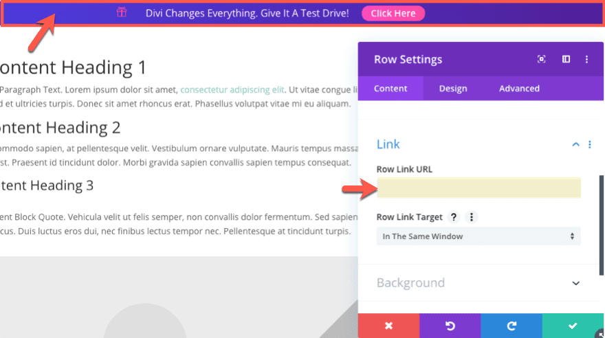
Don’t Forget the Links
Once you do have the promo bar built, you will want to add the link URL to the promotional offer or page. You can add the button link URL in the button settings content tab.
For even been conversions, you might as well add the link url to the entire row, under the row settings link option.
Final Thoughts
In this tutorial, we showed you how to design a promo bar (from scratch) using the Divi Theme Builder. The promo bar is complete with multiple animations and designs to make it really stand out to visitors. You can even make the promo bar fixed when scrolling down the page for even more visibility. And with the ability to control where the promo bar appears throughout your site, the application is extremely practical.
Hopefully this will inspire you to create a few promo bars of your own.
I look forward to hearing from you in the comments.
Cheers!
.inline-code{padding: 0px 4px; color: crimson; font-family: Monaco,consolas,bitstream vera sans mono,courier new,Courier,monospace!important}
The post How to Create an Animated Promo Bar to Page Templates in Divi appeared first on Elegant Themes Blog.