
Every week, we provide you with new and free Divi layout packs which you can use for your next project. For one of the layout packs, we also share a use case that’ll help you take your website to the next level.
This week, as part of our ongoing Divi design initiative, we’re going to show you how to how to create an automatic carousel with Divi, Slick.js and the Ice Cream Shop Layout Pack. We’ll start by including the slick JS library in our website and continue by making it work inside the Divi Builder. This is a great way to create an automatic carousel for any kind of module you want to showcase. You’ll be able to download the JSON file for free as well!
Let’s get to it.
Preview
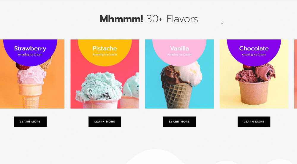
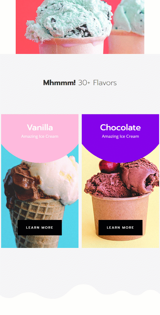
Before we dive into the tutorial, let’s take a quick look at the outcome across different screen sizes.
Desktop
Mobile
Download The Automatic Carousel Layout for FREE
To lay your hands on the free automatic carousel layout, you will first need to download it using the button below. To gain access to the download you will need to subscribe to our Divi Daily email list by using the form below. As a new subscriber, you will receive even more Divi goodness and a free Divi Layout pack every Monday! If you’re already on the list, simply enter your email address below and click download. You will not be “resubscribed” or receive extra emails.
@media only screen and ( max-width: 767px ) {.et_bloom .et_bloom_optin_1 .carrot_edge.et_bloom_form_right .et_bloom_form_content:before, .et_bloom .et_bloom_optin_1 .carrot_edge.et_bloom_form_left .et_bloom_form_content:before { border-top-color: #ffffff !important; border-left-color: transparent !important; }
}.et_bloom .et_bloom_optin_1 .et_bloom_form_content button { background-color: #f92c8b !important; } .et_bloom .et_bloom_optin_1 .et_bloom_form_content .et_bloom_fields i { color: #f92c8b !important; } .et_bloom .et_bloom_optin_1 .et_bloom_form_content .et_bloom_custom_field_radio i:before { background: #f92c8b !important; } .et_bloom .et_bloom_optin_1 .et_bloom_border_solid { border-color: #f7f9fb !important } .et_bloom .et_bloom_optin_1 .et_bloom_form_content button { background-color: #f92c8b !important; } .et_bloom .et_bloom_optin_1 .et_bloom_form_container h2, .et_bloom .et_bloom_optin_1 .et_bloom_form_container h2 span, .et_bloom .et_bloom_optin_1 .et_bloom_form_container h2 strong { font-family: “Open Sans”, Helvetica, Arial, Lucida, sans-serif; }.et_bloom .et_bloom_optin_1 .et_bloom_form_container p, .et_bloom .et_bloom_optin_1 .et_bloom_form_container p span, .et_bloom .et_bloom_optin_1 .et_bloom_form_container p strong, .et_bloom .et_bloom_optin_1 .et_bloom_form_container form input, .et_bloom .et_bloom_optin_1 .et_bloom_form_container form button span { font-family: “Open Sans”, Helvetica, Arial, Lucida, sans-serif; } p.et_bloom_popup_input { padding-bottom: 0 !important;}

Download For Free
Join the Divi Newlsetter and we will email you a copy of the ultimate Divi Landing Page Layout Pack, plus tons of other amazing and free Divi resources, tips and tricks. Follow along and you will be a Divi master in no time. If you are already subscribed simply type in your email address below and click download to access the layout pack.
You have successfully subscribed. Please check your email address to confirm your subscription and get access to free weekly Divi layout packs!
Make sure you include the Slick.js file in your head tags! Without it, it won’t work. See the first step below.
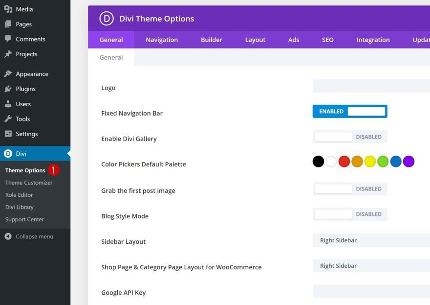
1. Add Slick JS to Your Divi Theme Integration
Go to Divi Theme Options
The first part of this tutorial is a very important one; adding Slick.js to your website. To do that, go to your Divi Theme Options.
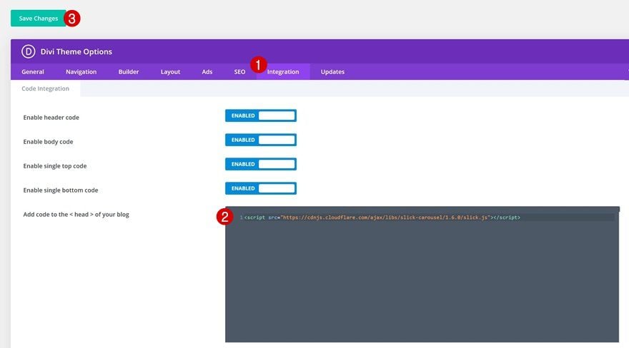
Add Slick.js to Head Tags
Navigate to the integration tab and add the Slick.js file to the head tags of your website.
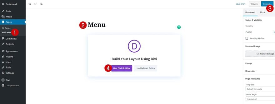
2. Create New Page Using Ice Cream Shop Menu Layout
Add New Page
Continue by adding a new page to your website. Give your page a title, publish the page and switch over to Divi Builder.
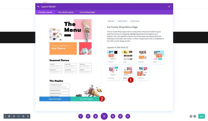
Upload Ice Cream Shop Menu Layout
For this tutorial, we’re using the Ice Cream Shop Layout Pack’s menu layout, but feel free to use any other page/layout of your choice.
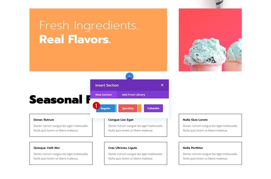
2. Add New Section to Page
Add New Section
The next step in creating the automatic carousel is adding a new section to your page.
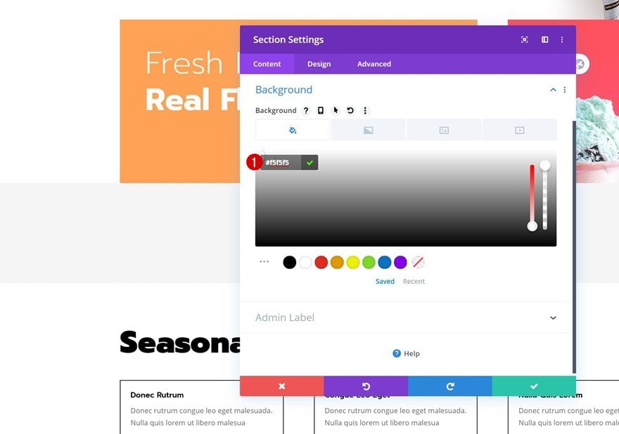
Background Color
Open the section settings and change the background color.
- Background Color: #f5f5f5
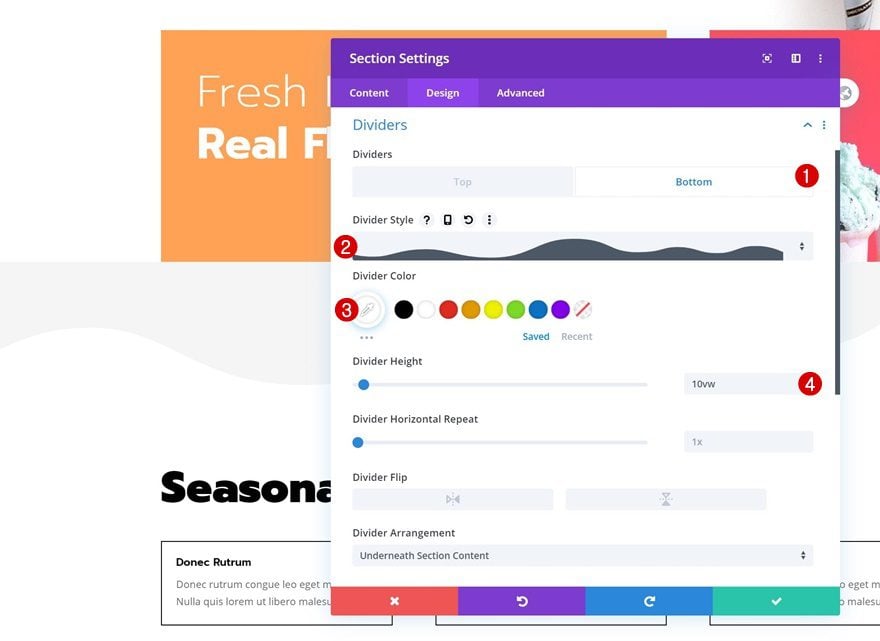
Bottom Divider
Add a bottom divider to the section as well.
- Divider Style: Find in List
- Divider Color: #ffffff
- Divider Weight: 10vw
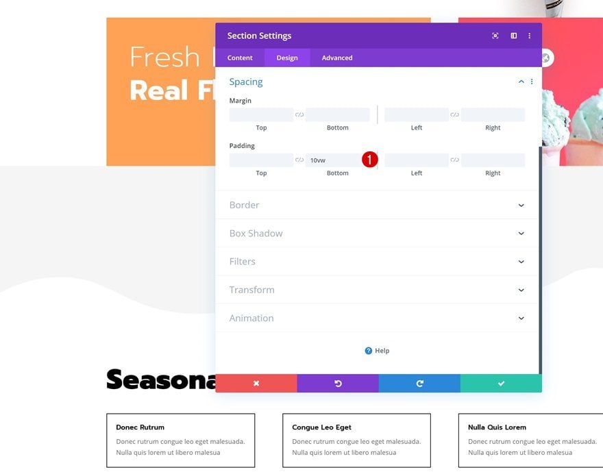
Spacing
Along with some bottom padding.
- Bottom Padding: 10vw
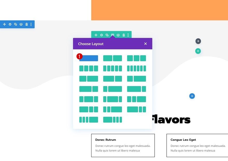
Add New Row
Column Structure
Continue by adding the first row using the following column structure:
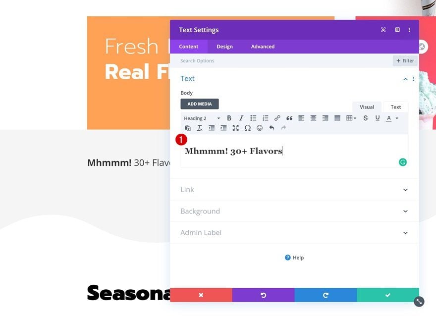
Add Title Text Module to Column
Add H2 Content
Add a Text Module to the row’s column and insert some H2 content of your choice.
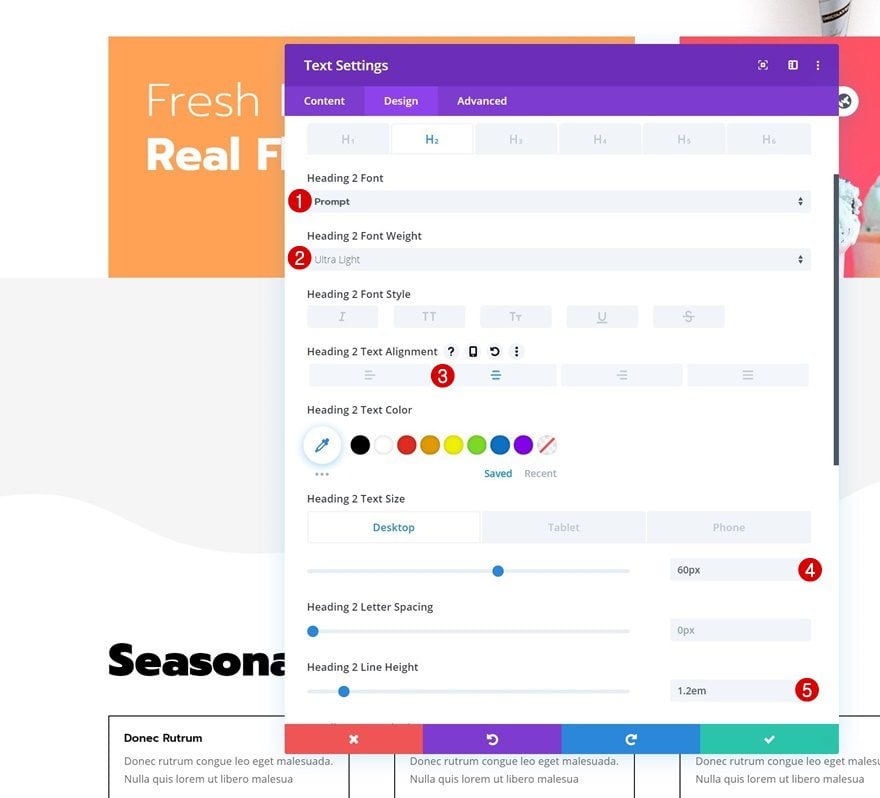
H2 Text Settings
Move on to the design tab and change the H2 text settings accordingly:
- Heading 2 Font: Prompt
- Heading 2 Font Weight: Ultra Light
- Heading 2 Text Alignment: Center
- Heading 2 Text Size: 60px (Desktop), 40px (Tablet), 25px (Phone)
- Heading 2 Line Height: 1.2em
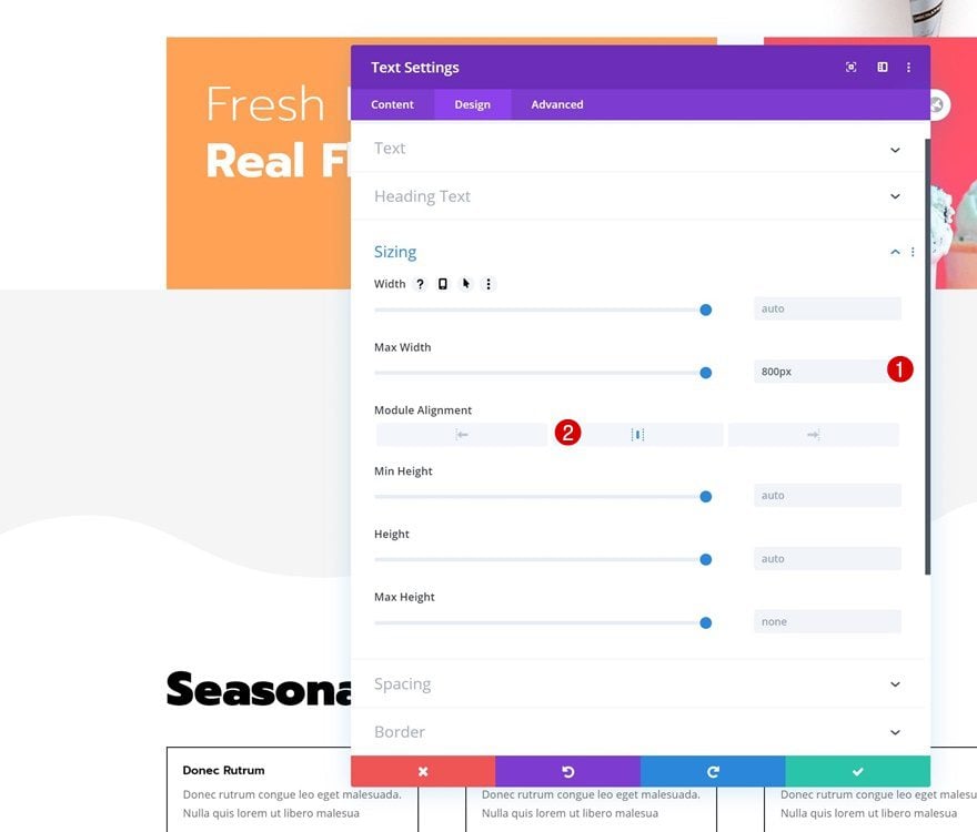
Sizing
Modify the module’s sizing settings too.
- Max Width: 800px
- Module Alignment: Center
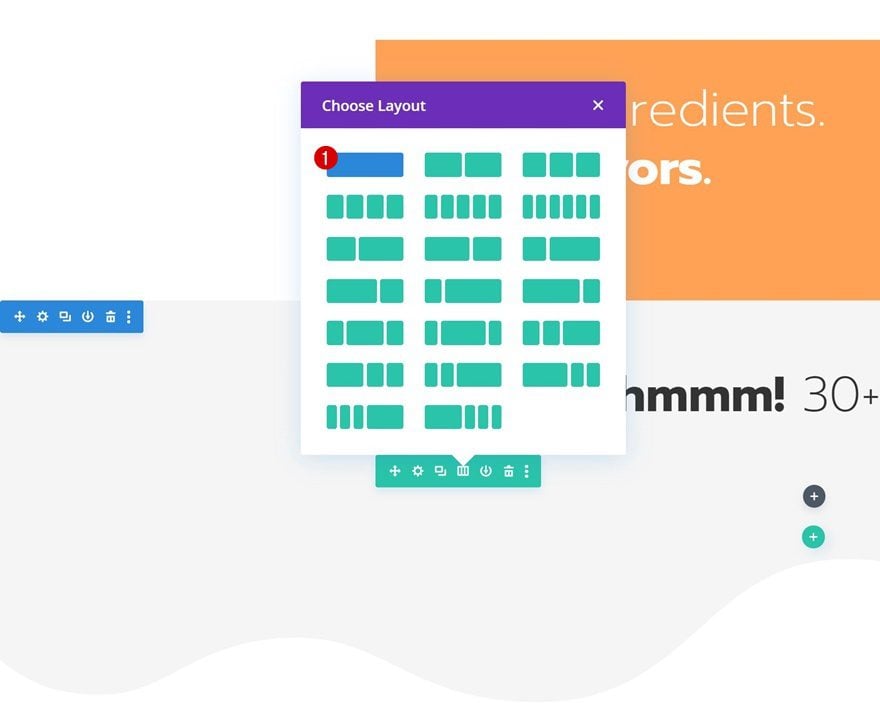
3. Dedicate New One-Column Row to Automatic Slider
Add New Row
Column Structure
To create the automatic carousel, we’ll need to dedicate a new row to the items we want to place inside the carousel. Make sure you choose a row with one column only. In the upcoming steps, we’ll transform this column into an automatic carousel.
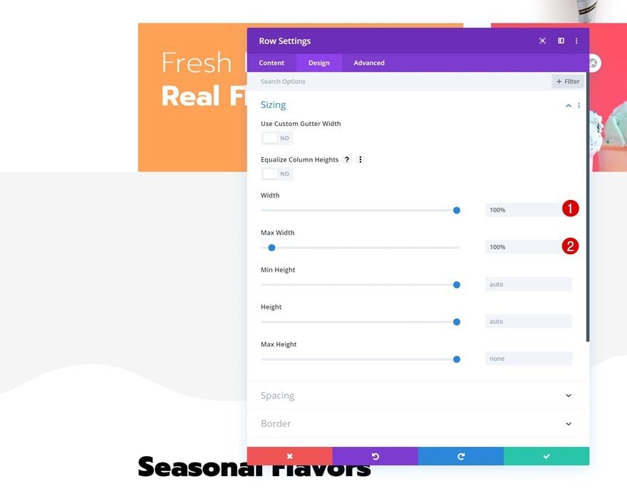
Sizing
Without adding any modules yet, open the row settings and allow the row to take up the entire width of the screen in the sizing settings.
- Width: 100%
- Max Width: 100%
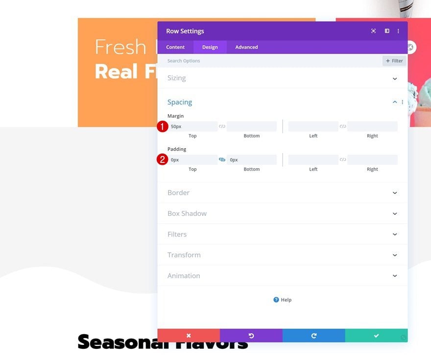
Spacing
Add some top margin and remove all default top and bottom padding next.
- Top Margin: 50px
- Top Padding: 0px
- Bottom Padding: 0px
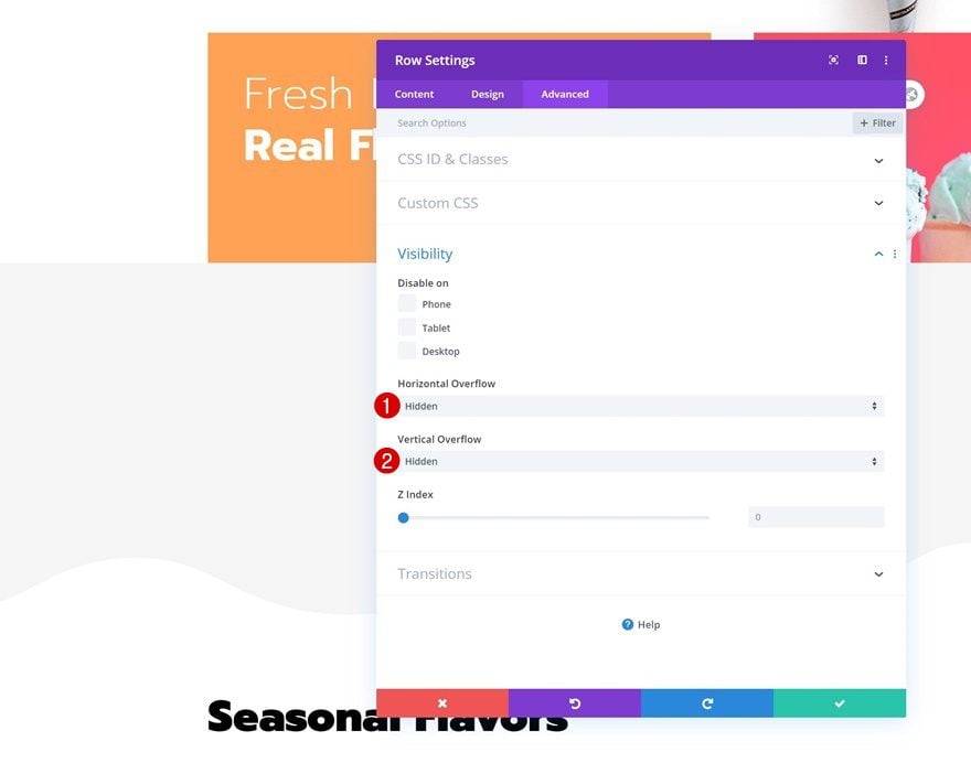
Overflows
We’re also making sure nothing surpasses the row container by hiding the overflows.
- Horizontal Overflow: Hidden
- Vertical Overflow: Hidden
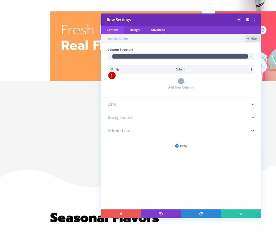
Column Settings
Continue by opening the column settings.
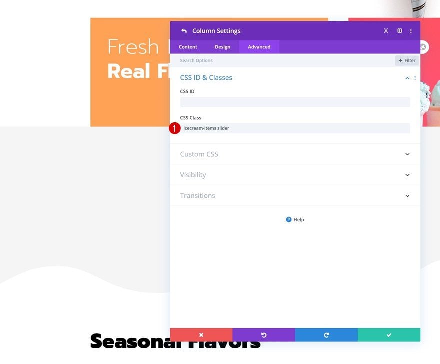
CSS Classes
Add two different CSS classes to the column. Make sure you leave a space in between them. Later on this tutorial, we’ll use these classes to create the automatic carousel.
- CSS Class: icecream-items slider
Add First Slider Item to Column (Call to Action Module)
Default Content
Time to start adding the first carousel item! We’ll use a Call to Action Module but feel free to use any other module of your choice. Enter some content of your choice.
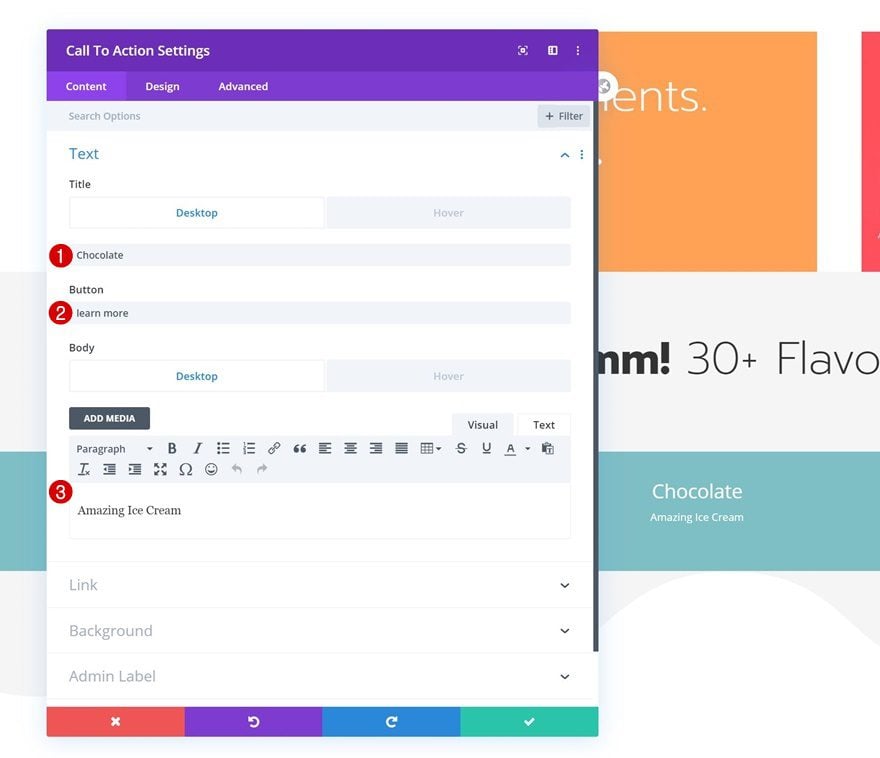
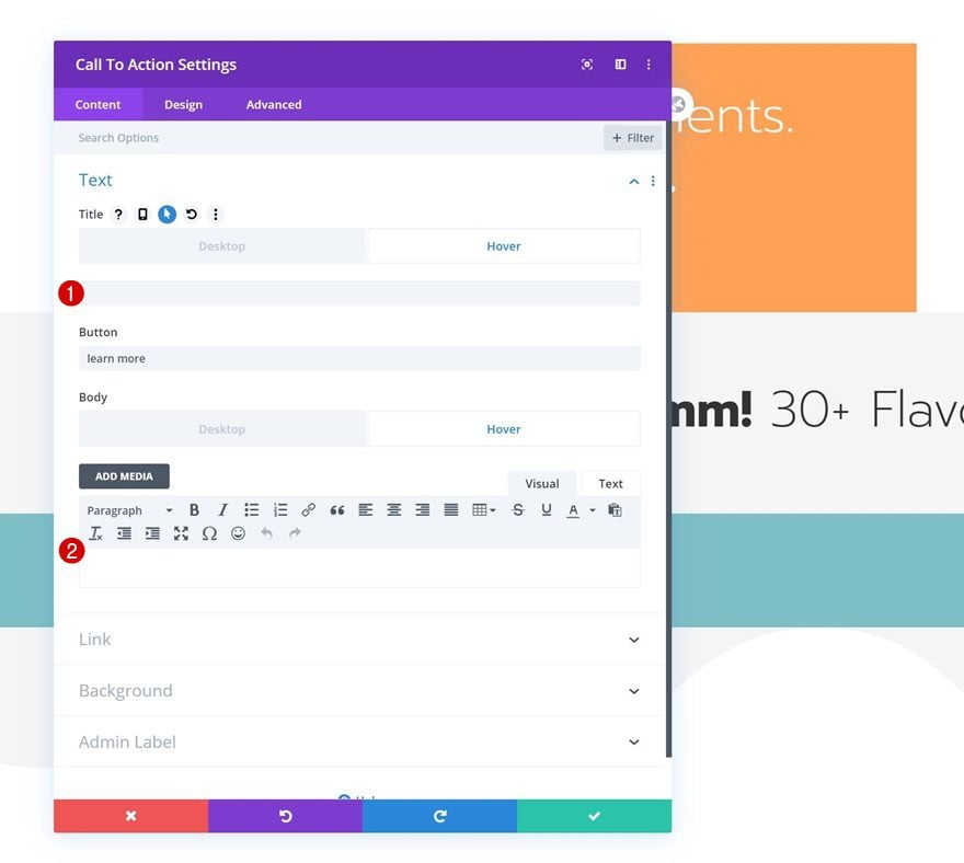
Hover Content
Replace the title and body content with an empty character (such as this one: ‘ ’) to remove the content on hover.
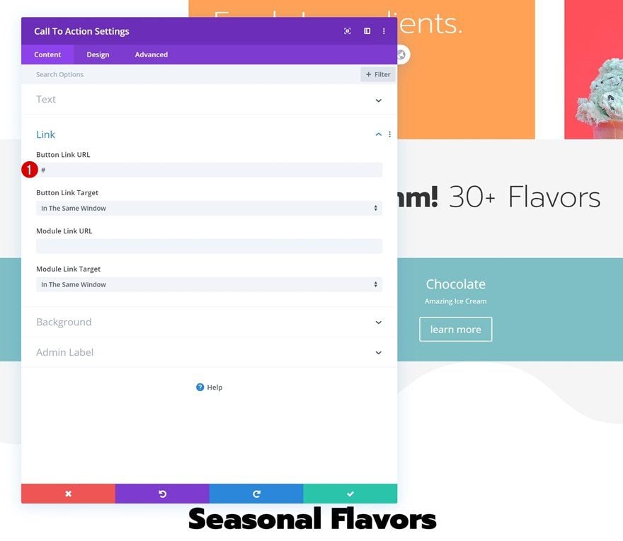
Link
Make sure you add a link to the module as well so the button shows up.
- Button Link URL: #
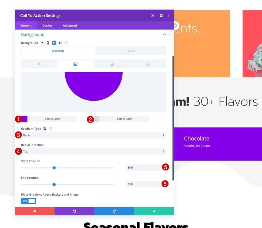
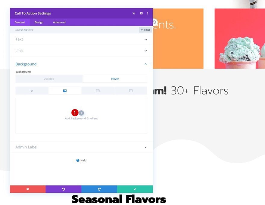
Default Gradient Background
Then, go to the background settings and add a gradient background.
- Color 1: #8300e9
- Color 2: rgba(41,196,169,0)
- Gradient Type: Radial
- Radial Direction: Top
- Start Position: 35%
- End Position: 35%
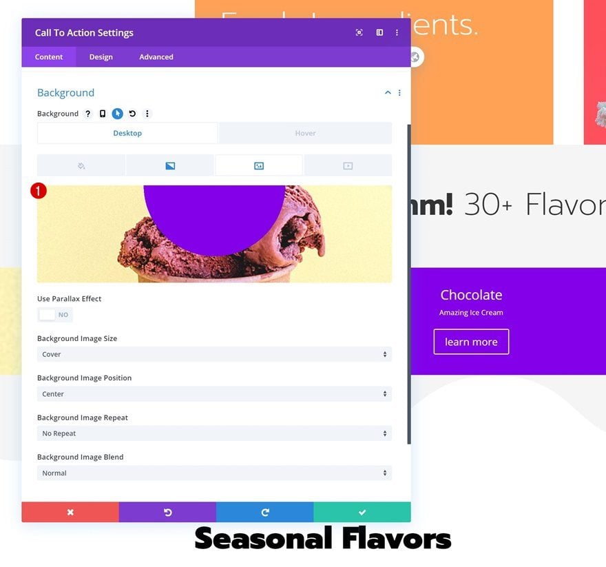
Remove Hover Gradient Background
Remove the gradient background on hover.
Background Image
Upload a relevant background image as well.
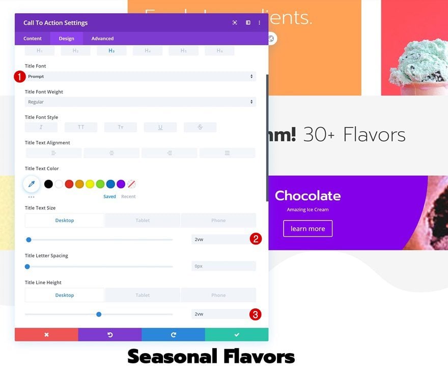
Title Text Settings
Move on to the design tab and change the title text settings accordingly:
- Title Font: Prompt
- Title Text Size: 2vw (Desktop), 4vw (Tablet), 5vw (Phone)
- Title Line Height: 2vw (Desktop), 3vw (Tablet), 4vw (Phone)
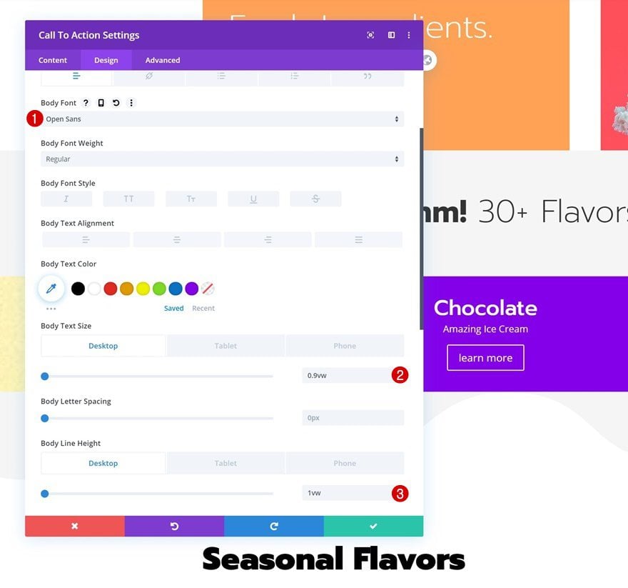
Body Text Settings
Modify the body text settings as well.
- Body Font: Open Sans
- Body Text Size: 0.9vw (Desktop), 2vw (Tablet), 2.5vw (Phone)
- Body Line Height: 1vw (Desktop), 2vw (Tablet), 3vw (Phone)
Button Settings
Then, go to the button settings and style the button as follows:
- Use Custom Styles For Button: Yes
- Button Text Size: 0.9vw (Desktop), 1.5vw (Tablet), 2vw (Phone)
- Button Text Color: #ffffff
- Button Background Color: #000000 (Default), #ff6f7e (Hover)
- Button Border Width: 0px
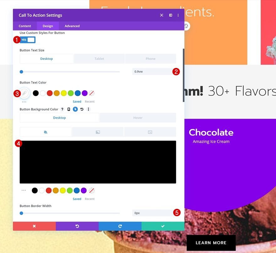
- Button Border Radius: 0px
- Button Letter Spacing: 2px
- Button Font: Prompt
- Button Font Weight: Regular
- Button Font Style: Uppercase
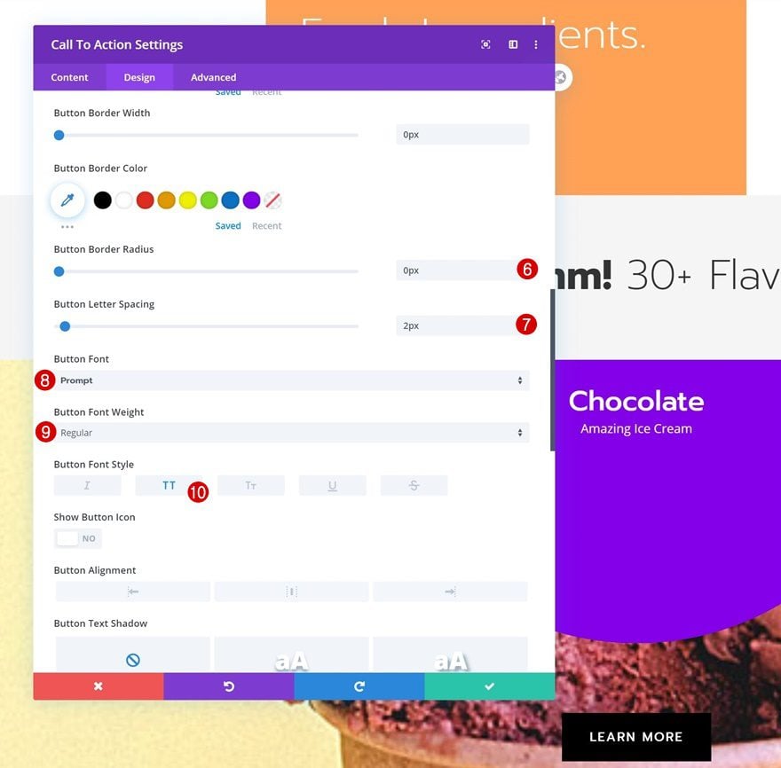
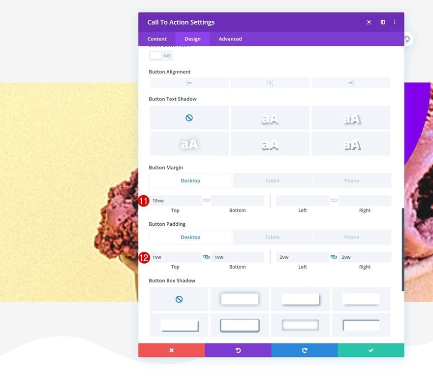
- Top Margin: 19vw (Desktop), 30vw (Tablet), 45vw (Phone)
- Top Padding: 1vw (Desktop), 2vw (Tablet), 3vw (Phone)
- Bottom Padding: 1vw (Desktop), 2vw (Tablet), 3vw (Phone)
- Left Padding: 2vw (Desktop), 4vw (Tablet), 5vw (Phone)
- Right Padding: 2vw (Desktop), 4vw (Tablet), 5vw (Phone)
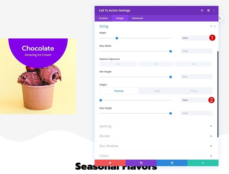
Sizing
We’re also modifying the module’s width and height.
- Width: 23vw
- Height: 23vw (Desktop), 50vw (Tablet), 80vw (Phone)
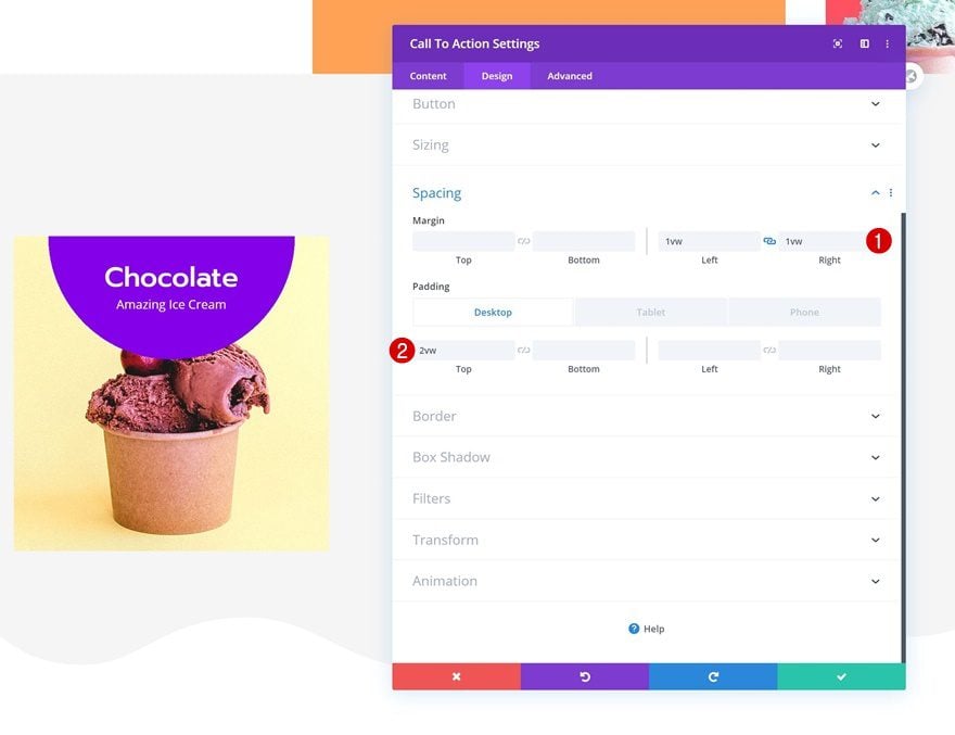
Spacing
Last but not least, go to the spacing settings and add some custom margin and padding values.
- Left Margin: 1vw
- Right Margin: 1vw
- Top Padding: 2vw (Desktop), 4vw (Tablet), 6vw (Phone)
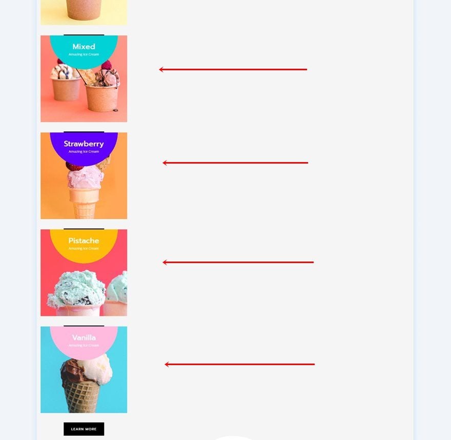
4. Clone Slider Item as Many Times as Wanted
Clone CTA Module Four Times
Once you’ve completed the first CTA Module, you can go ahead and clone it up to as many times as you want. Every module in this column will be part of the automatic carousel.
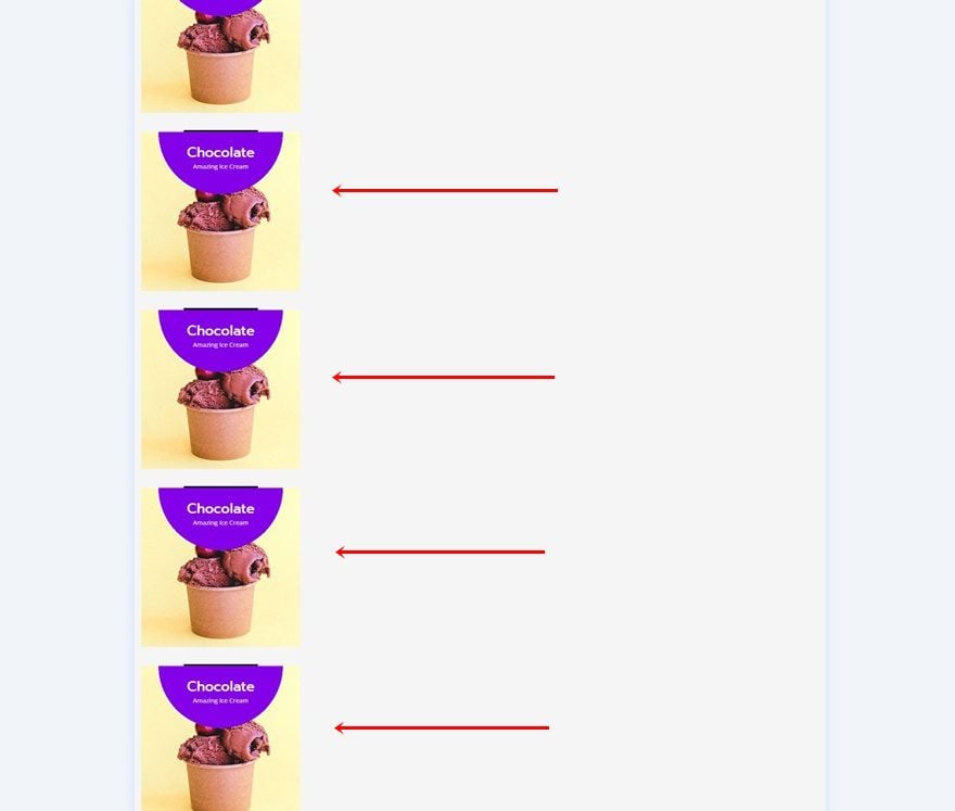
Change Content, Gradient Background & Background Image for Each Duplicate
Make sure you change the content, gradient background and background image of each duplicate to make each CTA Module unique.
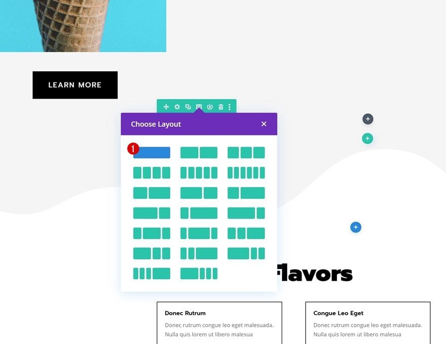
5. Add New Row Below Previous One
Add the next and last row to the section using the following column structure:
Insert First Code Module with jQuery Code
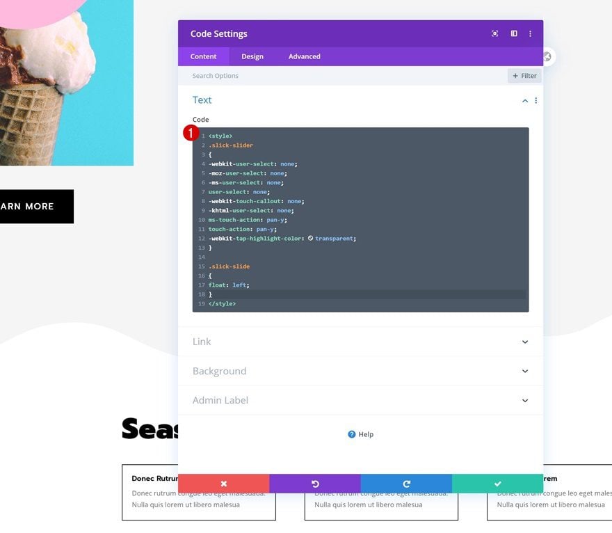
Add New Code Module to Column
Add a first Code Module to the column.
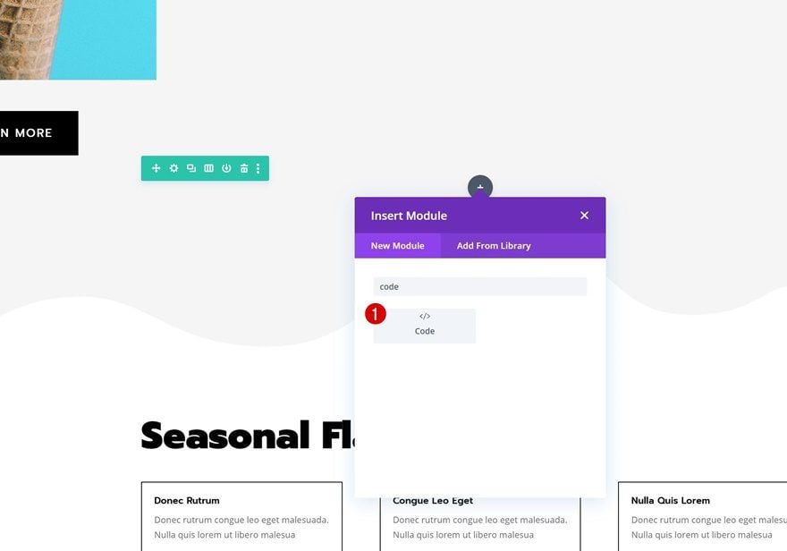
Insert CSS Code
And insert the following lines of CSS Code:
.slick-slider
{
-webkit-user-select: none;
-moz-user-select: none;
-ms-user-select: none;
user-select: none;
-webkit-touch-callout: none;
-khtml-user-select: none;
ms-touch-action: pan-y;
touch-action: pan-y;
-webkit-tap-highlight-color: transparent;
}

.slick-slide
{
float: left;
}
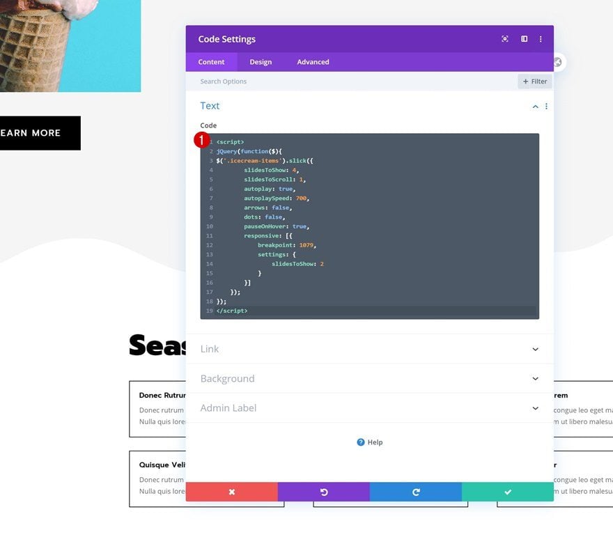
Insert Second Code Module with CSS Code
Add New Code Module to Column
Add another Code Module right below the previous one.
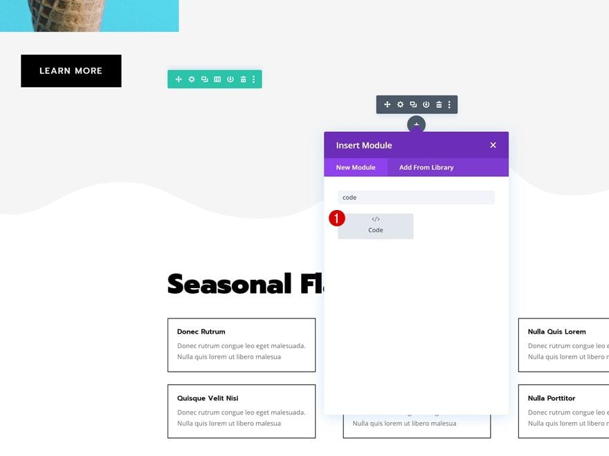
Insert jQuery Code
And insert the following lines of jQuery code:
jQuery(function($){
$('.icecream-items').slick({
slidesToShow: 4,
slidesToScroll: 1,
autoplay: true,
autoplaySpeed: 700,
arrows: false,
dots: false,
pauseOnHover: true,
responsive: [{
breakpoint: 1079,
settings: {
slidesToShow: 2
}
}]
});
});
Once you’ve added the CSS and jQuery code, you can exit the Visual Builder to view the result!
Preview
Now that we’ve gone through all the steps, let’s take a final look at the outcome across different screen sizes.
Desktop
Mobile
Final Thoughts
In this post, we’ve shown you how to create an automatic carousel using Divi, slick.js and the Ice Cream Shop Layout Pack. This is a great way to add interaction to your website. You can make this technique work with any kind of module you want to display! If you have any questions or suggestions, make sure you leave a comment in the comment section below.
If you’re eager to learn more about Divi and get more Divi freebies, make sure you subscribe to our email newsletter and YouTube channel so you’ll always be one of the first people to know and get benefits from this free content.
The post How to Create an Automatic Carousel with Divi & Slick.js appeared first on Elegant Themes Blog.