
Every time a new update comes out, the design possibilities you have increase. Combining dynamic content and hover options, for instance, can bring stunning results. To demonstrate that, we’ll show you how to create 3 stunning dynamic blog post hero sections using Divi’s built-in options only. We’ll guide you step by step through each one of the examples that will inspire you to create your own variations as well.
Let’s get to it!
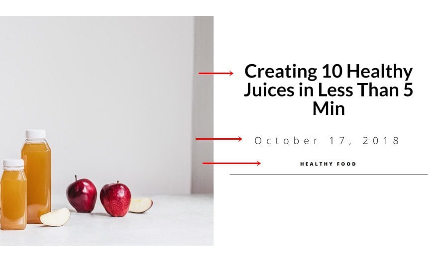
Preview
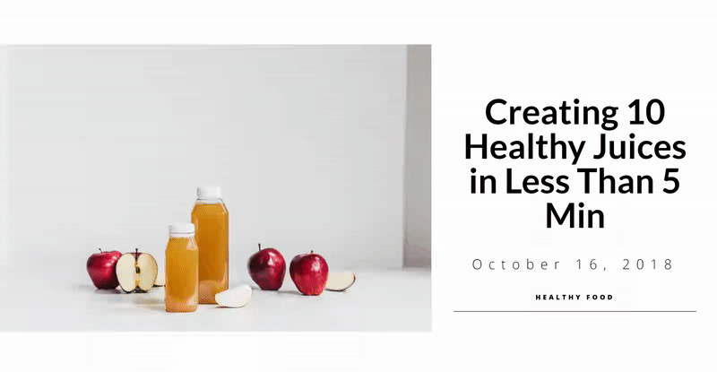
Before we dive into the tutorial, let’s take a look at the end result of all three examples we’ll be creating.
Example #1
Example #2

Example #3

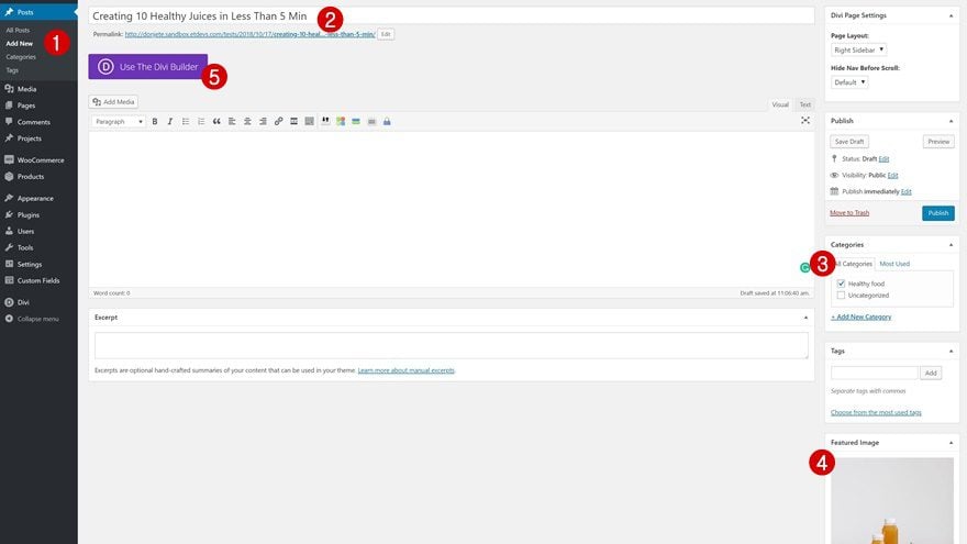
Add a New Blog Post
Post Details
First things first, start by creating a new blog post. Add the title, the category of choice and the featured image. Once that’s done, enable the Divi Builder.
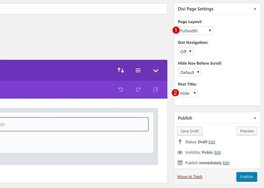
Divi Page Settings
Before switching over to the Visual Builder, change the Divi Page Settings in the top right corner of the new blog post.
- Page Layout: Fullwidth
- Post Title: Hide
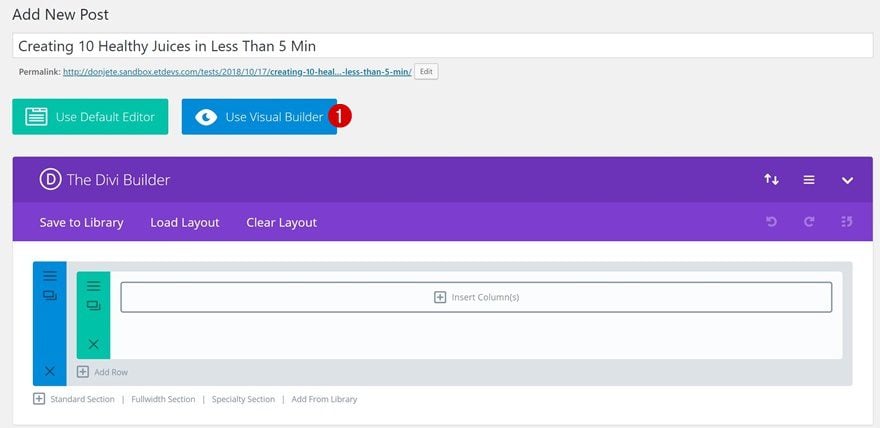
Switch over to Visual Builder
Time to switch over to the Visual Builder to start creating the different examples!
Creating the Modules
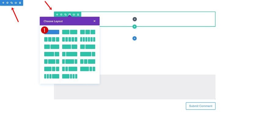
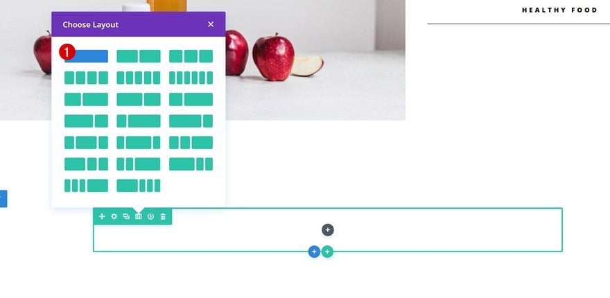
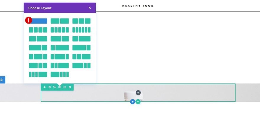
Add a New Section + One-Column Row
Before we dive into each one of the examples separately, we’ll start by creating the Text Modules containing dynamic content. Throughout all three examples, we will use these premade modules to finish the design. Once you’ve added a new section, add a new row to it using the following column structure:
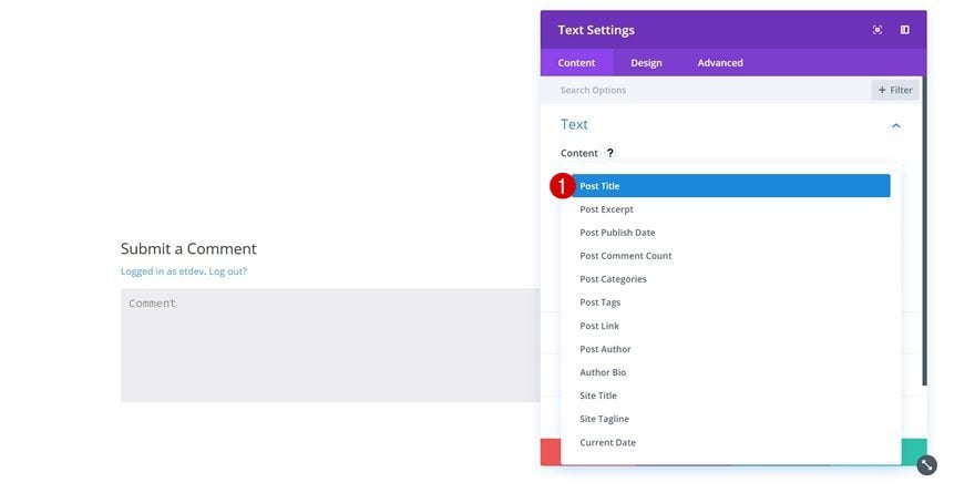
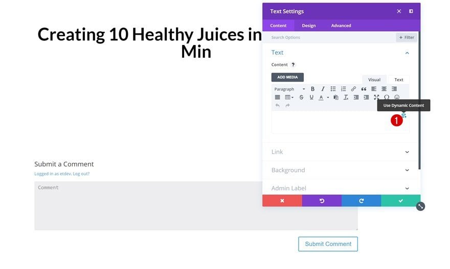
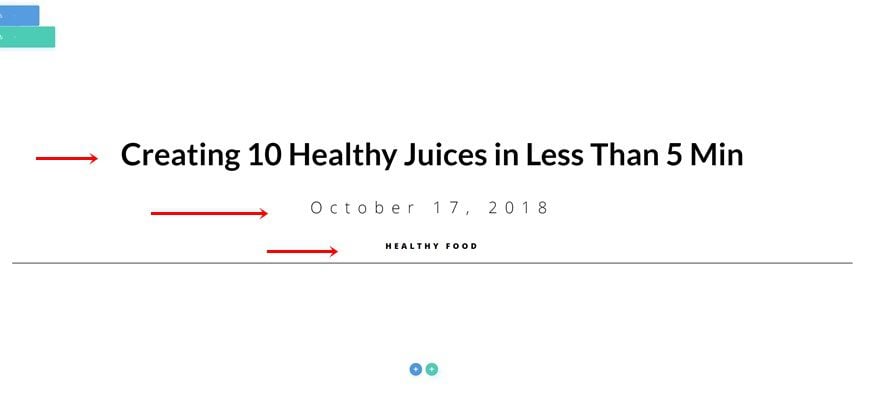
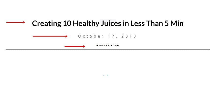
Post Title Text Module
Select Post Title Dynamic Content
The first dynamic module we need will contain the Post Title. Add a new Text Module and select Post Title in the list of dynamic content.
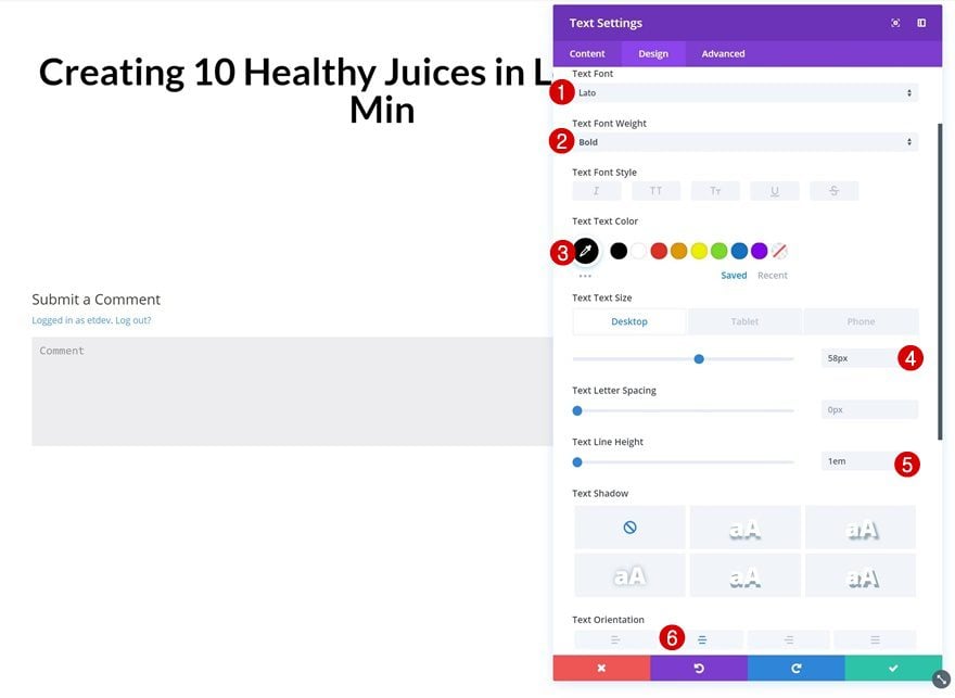
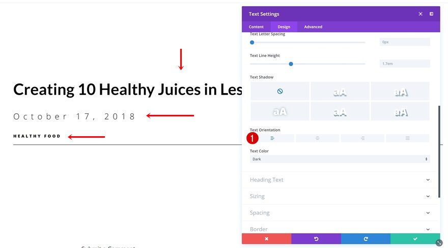
Text Settings
Then, go to the text settings and make some changes.
- Text Font: Lato
- Text Font Weight: Bold
- Text Color: #000000
- Text Size: 58px (Desktop), 45px (Tablet), 35px (Phone)
- Text Line Height: 1em
- Text Orientation: Center
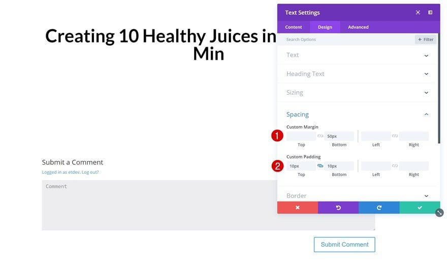
Spacing
Change the spacing values as well.
- Bottom Margin: 50px
- Top Padding: 10px
- Bottom Padding: 10px
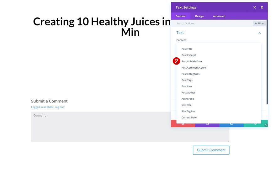
Post Publish Date Text Module
Select Post Publish Date Dynamic Content
The second module we’ll need is a Text Module containing the Post Publish Date. Go ahead and add one and select Post Publish Date in the dynamic content list.
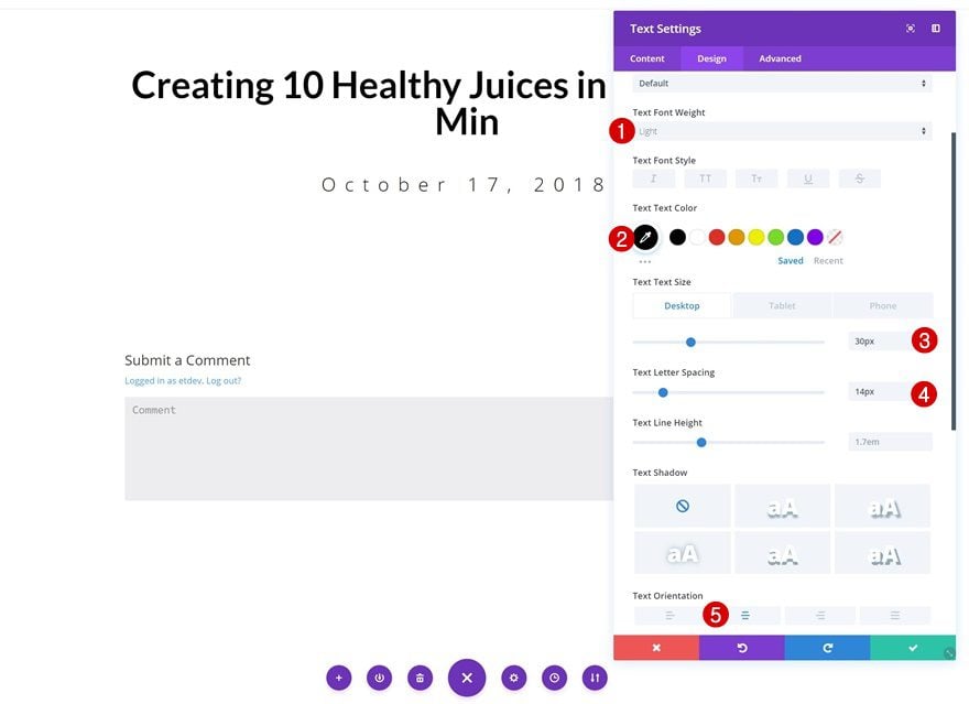
Text Settings
Change the text settings of this module next.
- Text Font Weight: Light
- Text Color: #000000
- Text Size: 30px (Desktop), 20px (Tablet), 16px (Phone)
- Text Letter Spacing: 14px
- Text Orientation: Center
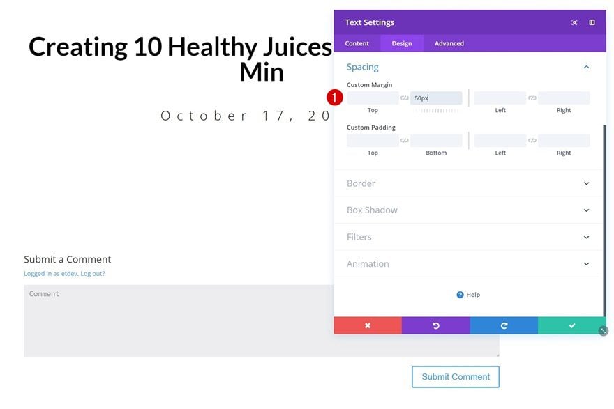
Spacing
Add some bottom margin as well.
- Bottom Margin: 50px
Post Categories Text Module
Select Categories Dynamic Content
The last module we’ll add is a Text Module containing Post Categories dynamic content.
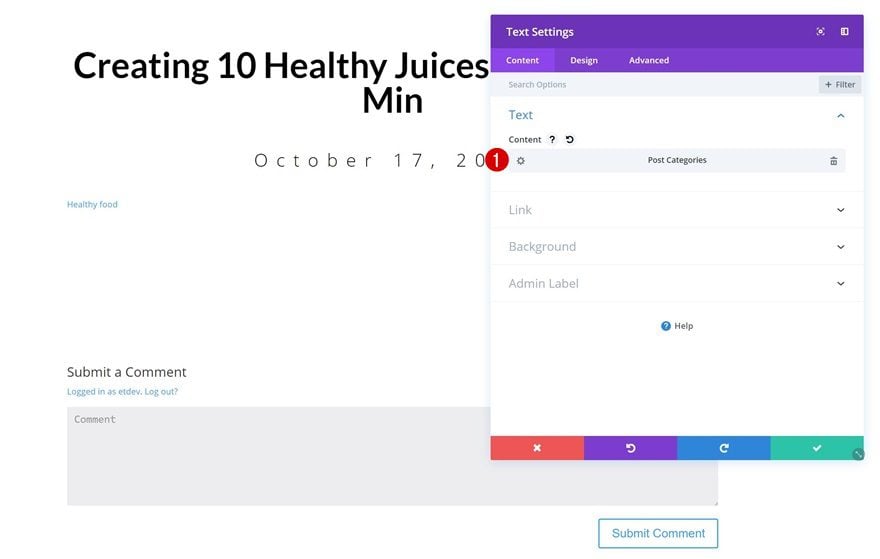
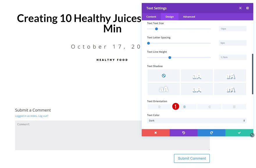
Text Settings
Go to the text settings and change the text orientation.
- Text Orientation: Center
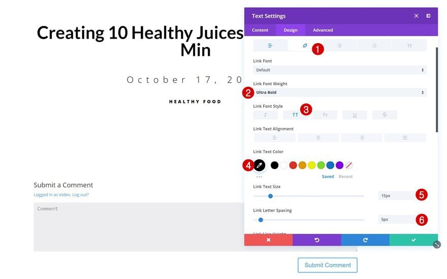
Link Text Settings
Then, apply some modifications to the link text settings.
- Link Font Weight: Ultra Bold
- Link Font Style: Uppercase
- Link Text Color: #000000
- Link Text Size: 15px
- Link Letter Spacing: 5px
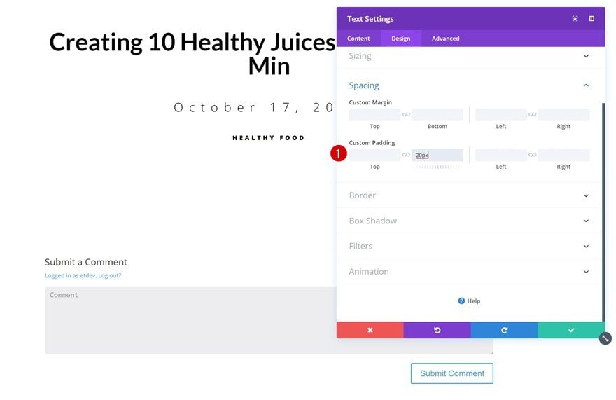
Spacing
Add bottom padding next.
- Bottom Padding: 20px
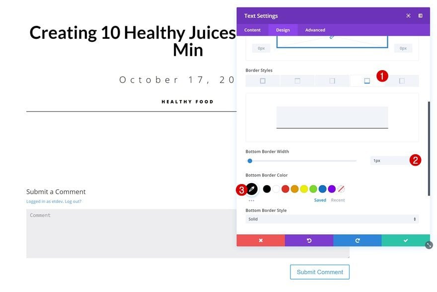
Border
And finish off with a subtle bottom border.
- Bottom Border Width: 1px
- Bottom Border Color: #000000
Creating Example #1
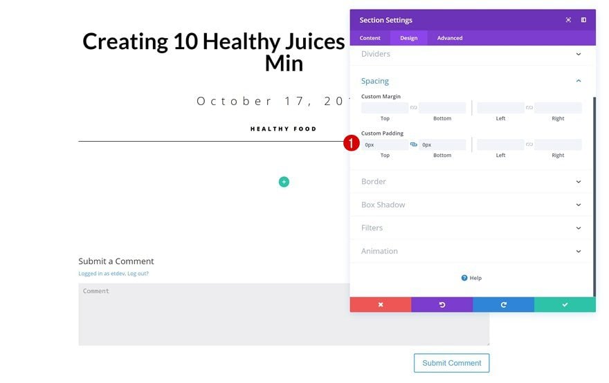
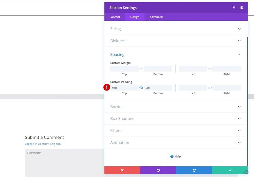
Add New Section
Spacing
Let’s start creating the first example! Right below the previous section you’ve created, go ahead and add a new one. Open its settings and remove all the default custom padding.
- Top Padding: 0px
- Bottom Padding: 0px
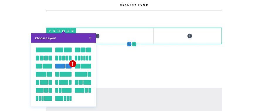
Add New Row
Column Structure
Continue by adding a new row with the following column structure:
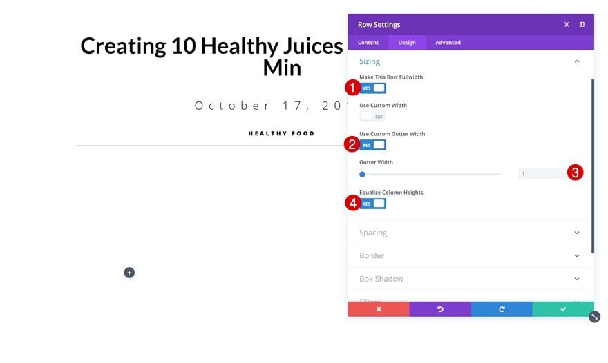
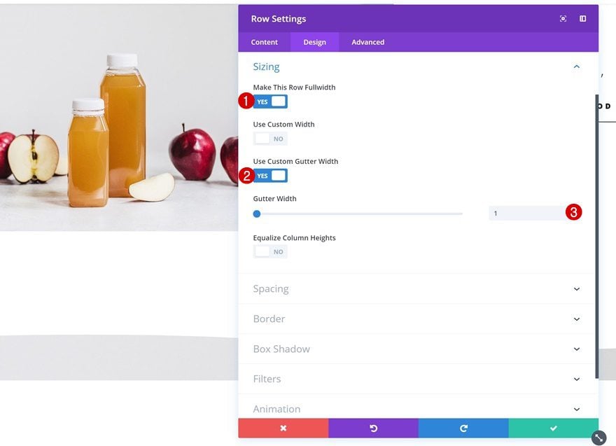
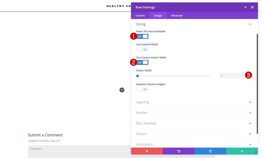
Sizing
Open the sizing settings of this row and change things around.
- Make This Row Fullwidth: Yes
- Use Custom Gutter Width: Yes
- Gutter Width: 1
- Equalize Column Heights: Yes
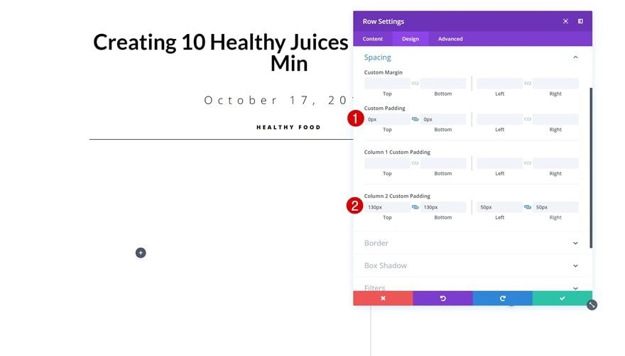
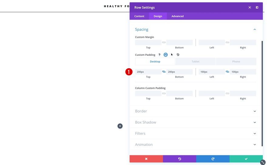
Spacing
Add some custom spacing values next.
- Top Padding: 0px
- Bottom Padding: 0px
- Column 2 Top Padding: 130px
- Column 2 Bottom Padding: 130px
- Column 2 Left Padding: 50px
- Column 2 Right Padding: 50px
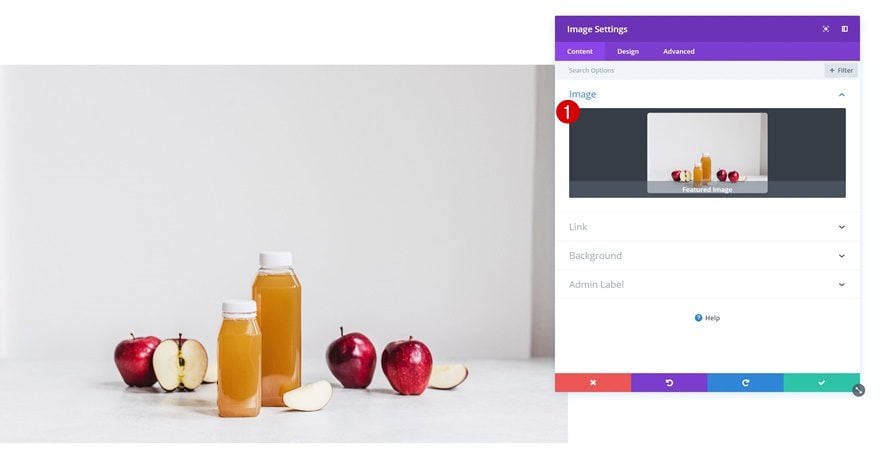
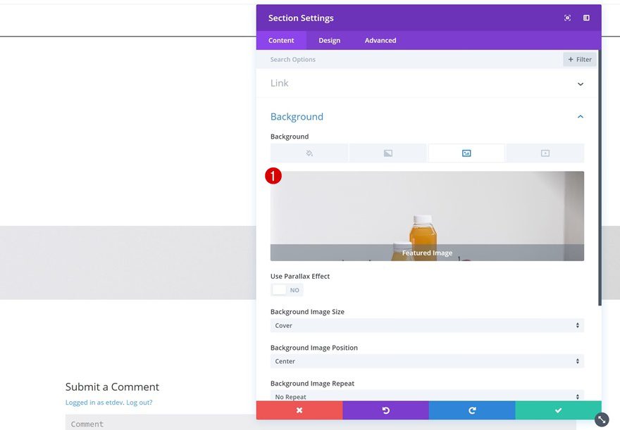
Add Image Module to Column 1
Select Featured Image Dynamic Content
Proceed by adding an Image Module to the first column. Instead of uploading an image, link the module to the dynamic Featured Image.
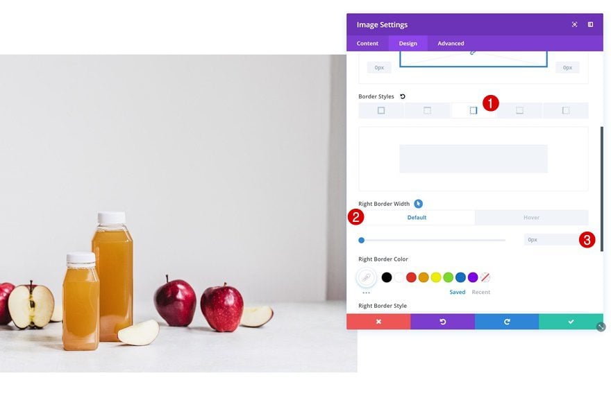
Border Default
We’re also adding a right border on hover. To do that, choose the following default border width first:
- Right Border Width: 0px
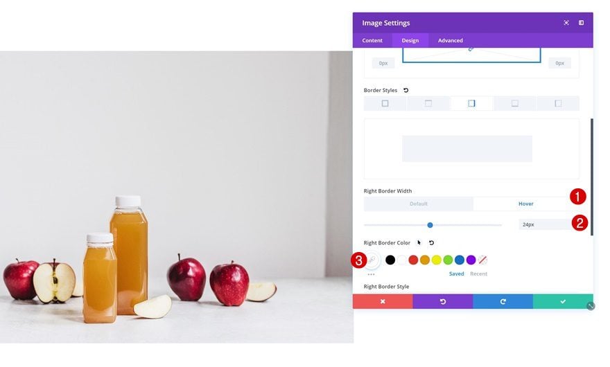
Border Hover
And add the following settings on hover:
- Right Border Width: 24px
- Right Border Color: #FFFFFF
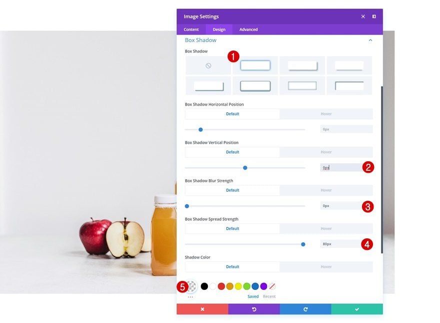
Box Shadow Default
Same goes for the box shadow, apply the following default box shadow settings:
- Box Shadow Vertical Position: 0px
- Box Shadow Blur Strength: 0px
- Box Shadow Spread Strength: 80px
- Shadow Color: rgba(255,255,255,0)
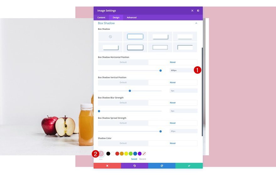
Box Shadow Hover
And change things around on hover:
- Box Shadow Horizontal Position: 600px
- Box Shadow Vertical Position: 0px
- Box Shadow Blur Strength: 0px
- Box Shadow Spread Strength: 80px
- Shadow Color: #E4BAC7
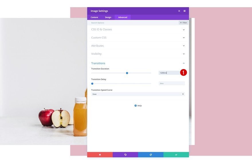
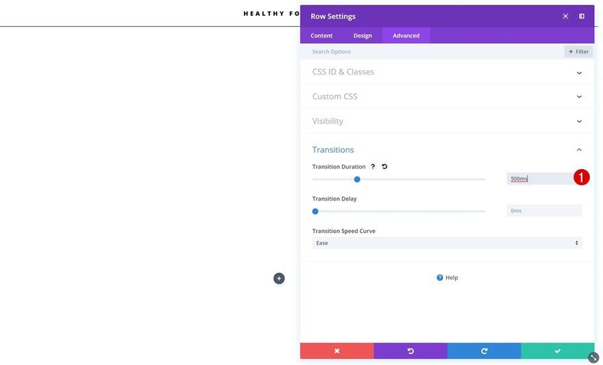
Transitions
To create a smooth transition, change the transition duration in the advanced tab.
- Transition Duration: 1200ms
Place Dynamic Modules in Column 2
The only thing left to do to complete this example is placing the modules we’ve created in the first part of this tutorial in the second column.
Creating Example #2
Add New Section
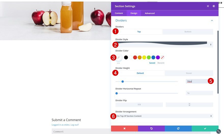
Top Divider Default
On to the next one! Add a new section with the following top divider:
- Divider Style: Find in List
- Divider Color: #FFFFFF
- Divider Height: 50px
- Divider Arrangement: On Top Of Section Content
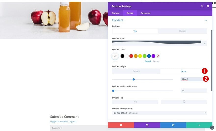
Top Divider Hover
Change the divider height on hover.
- Divider Height: 174px
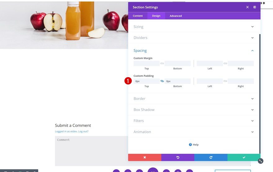
Spacing
Remove all the custom padding of the section next. This will allow the row and section to collide in one of the next steps.
- Top Padding: 0px
- Bottom Padding: 0px
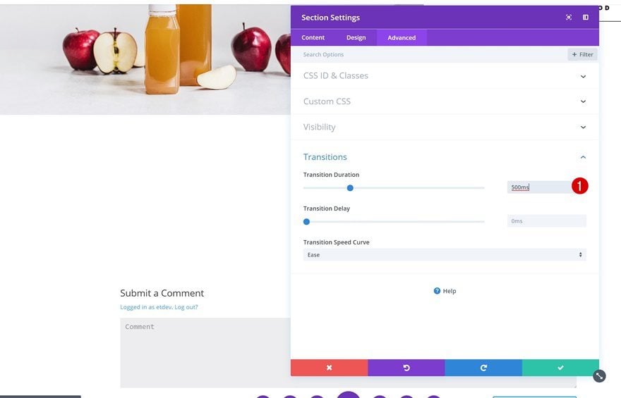
Transitions
To create a smooth divider transition, change the transition duration in the advanced tab.
- Transition Duration: 500ms
Add New Row
Column Structure
Now, go ahead and add a row to your section using the following column structure:
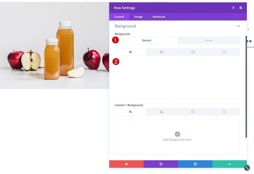
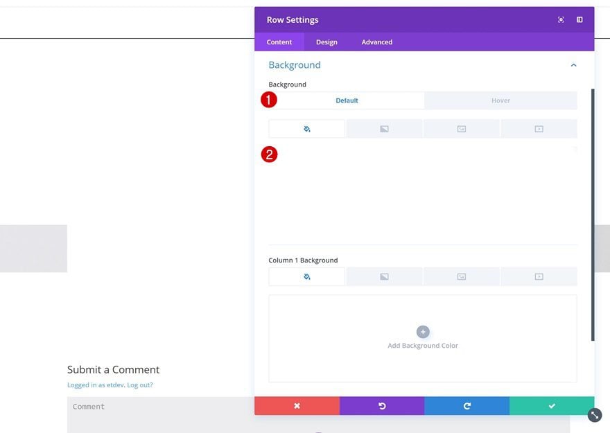
Background Color Default
Add the following background color to it:
- Background Color: #FFFFFF
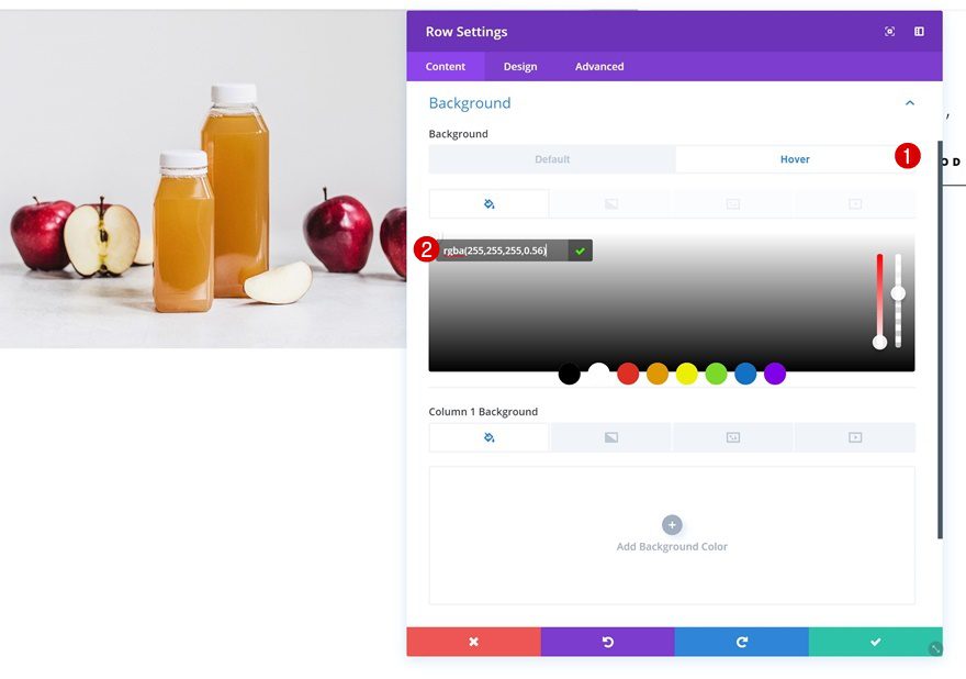
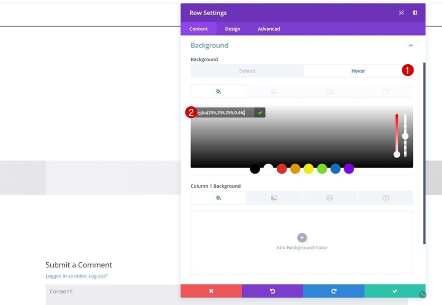
Background Color Hover
Change the background color on hover.
- Background Color: rgba(255,255,255,0.56)
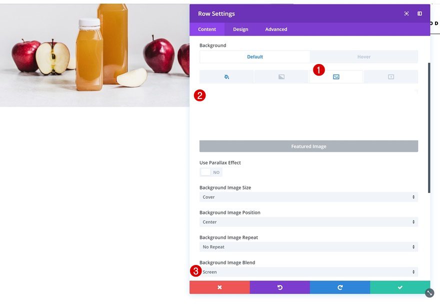
Featured Image Dynamic Background Image
Upload the Featured Image as a dynamic row background image as well. After you do so, change the background image blend.
- Background Image Blend: Screen
Sizing
Allow the row to take up the entire width of the screen by changing the sizing settings.
- Make This Row Fullwidth: Yes
- Use Custom gutter Width: Yes
- Gutter Width: 1
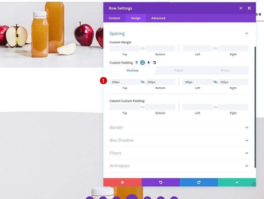
Spacing
And add some custom padding spacing values.
- Top Padding: 200px
- Bottom Padding: 200px
- Left Padding: 100px (Desktop), 50px (Tablet), 20px (Phone)
- Right Padding: 100px (Desktop), 50px (Tablet), 20px (Phone)
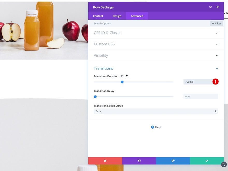
Transitions
Last but not least, create a smooth transition by changing the transition duration.
- Transition Duration: 700ms
Place Dynamic Modules in Column
You can now place all the dynamic modules in the row’s column and you’re done with the second example!
Creating Example #3
Add New Section
Featured Image Dynamic Background Image
On to the last example! Add a new section and select the Featured Image as the section background image.
Spacing Default
Then, remove all the default custom padding of the section.
- Top Padding: 0px
- Bottom Padding: 0px
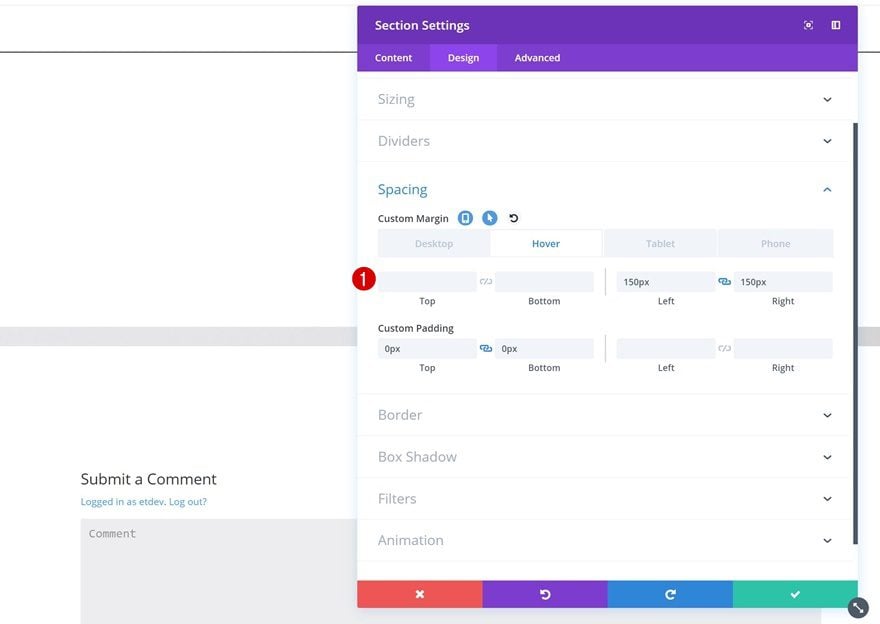
Spacing Hover
Add some custom margin on hover to create a shrinking effect.
- Left Padding: 150px (Desktop), 50px (Tablet), 30px (Phone)
- Right Padding: 150px (Desktop), 50px (Tablet), 30px (Phone)
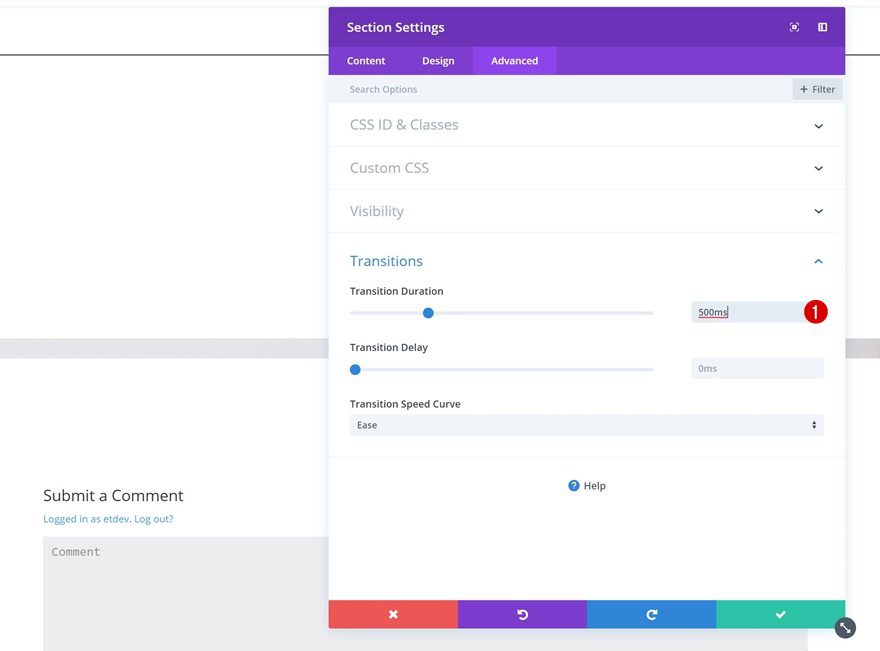
Transitions
Change the transition duration as well.
- Transition Duration: 500ms
Add New Row
Column Structure
Once you’re done modifying the section settings, continue by adding a new row with the following column structure:
Background Color Default
Add the following background color:
- Background Color: #ffffff
Background Color Hover
Change the background color on hover.
- Background Color: rgba(255,255,255,0.46)
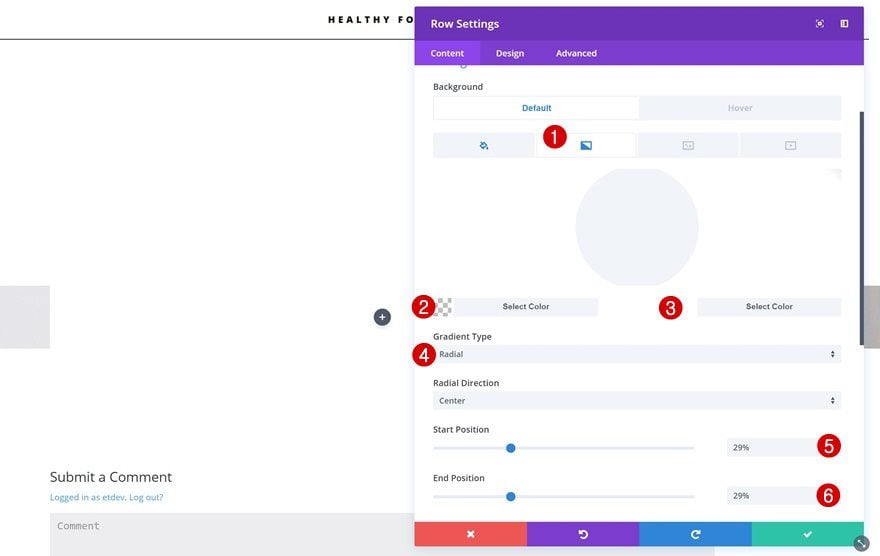
Gradient Background
Add a radial gradient background as well.
- Color 1: rgba(41,196,169,0)
- Color 2: #ffffff
- Gradient Type: Radial
- Start Position: 29%
- End Position: 29%
Sizing
Change the sizing settings of the row next.
- Make This Row Fullwidth: Yes
- Use Custom Gutter Width: Yes
- Gutter Width: 1
Spacing
And add some custom padding values.
- Top Padding: 200px
- Bottom Padding: 200px
- Left Padding: 100px (Desktop), 50px (Tablet), 20px (Phone)
- Right Padding: 100px (Desktop), 50px (Tablet), 20px (Phone)
Transitions
Last but not least, change the transition duration for a smooth transition.
- Transition Duration: 500ms
Place Dynamic Modules in Column
Go ahead and place all of the premade modules in the row’s column.
Change Text Orientation of All Modules
The only thing you’ll need to change about these modules is the text orientation and you’re done!
- Text Orientation: Left
Preview
Now that we’ve gone through all the steps, let’s take a final look at all three examples we’ve created.
Example #1
Example #2
Example #3
Final Thoughts
In this post, we’ve shown you how to combine dynamic content with Divi’s hover options to create stunning blog post hero sections. These examples will undeniably inspire you to create your own variations and personalize the blog post you put out there. If you have any questions or suggestions, make sure you leave a comment in the comment section below!
The post How to Create Beautiful & Engaging Dynamic Blog Post Hero Sections with Divi appeared first on Elegant Themes Blog.