
We know how important it is to make sure everything is customized to fit the mobile experience. To help you bring the mobile experience to another level, we’ll show you how to create fixed mobile footer bars with Divi in this step-by-step post.
This tutorial is part of our ongoing Divi design initiative where we try to put something extra in your design toolbox each and every week. This time around, we’ll use the Health Clinic Layout Pack and make the fixed mobile footer bars match the layout pack’s style. However, you’ll be able to use this approach for any kind of design you’re working on and create your own fixed mobile footer bar alternatives.
Let’s get to it!
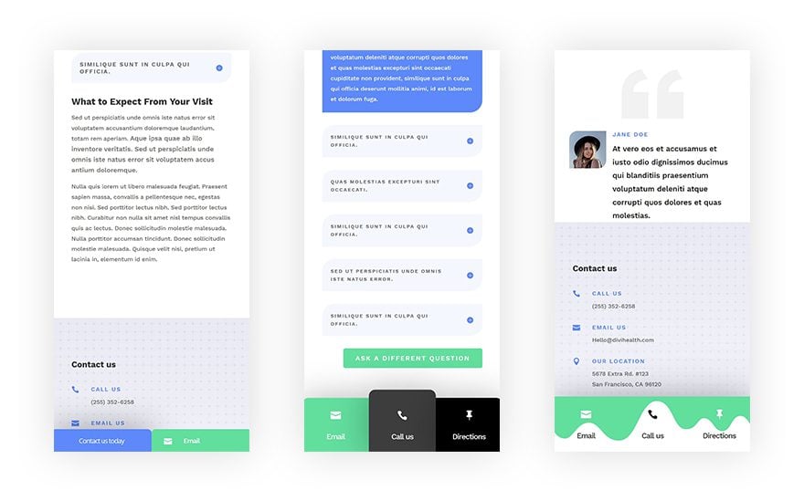
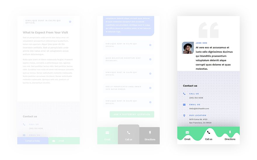
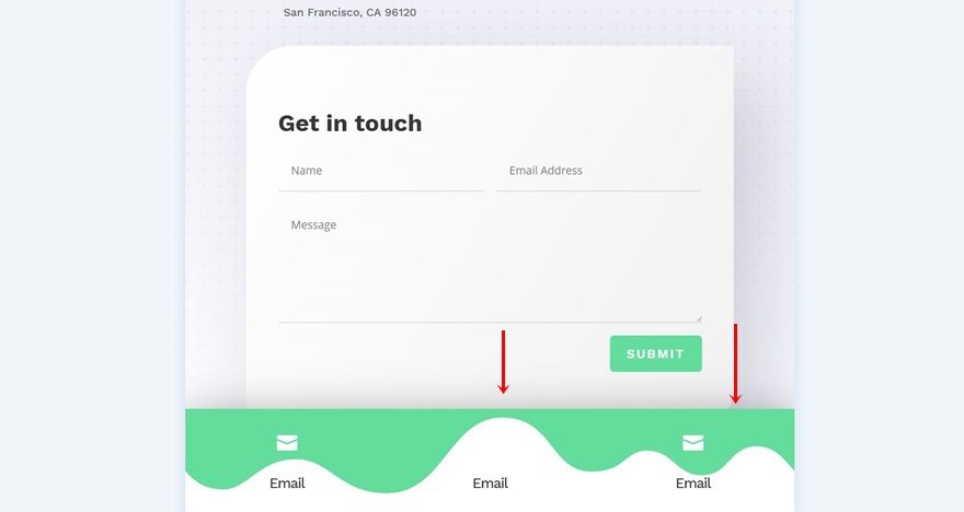
Preview
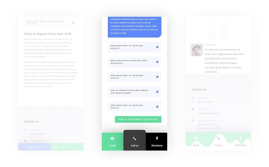
Before we dive into the tutorial, let’s take a quick look at the three examples we’ll recreate step by step. These examples will only show up on mobile (and tablet if you prefer so).
Recreate Example #1
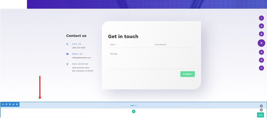
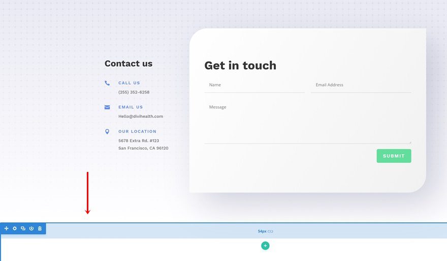
Add New Section to Bottom of Page
Let’s start recreating the first fixed mobile footer bar! We recommend creating a page for three of the layouts that are included in the Health Clinic Layout Pack. One for each example. Open whichever page you want to add the first footer bar to. Scroll down to the end of the page and add a new section right after the last one.
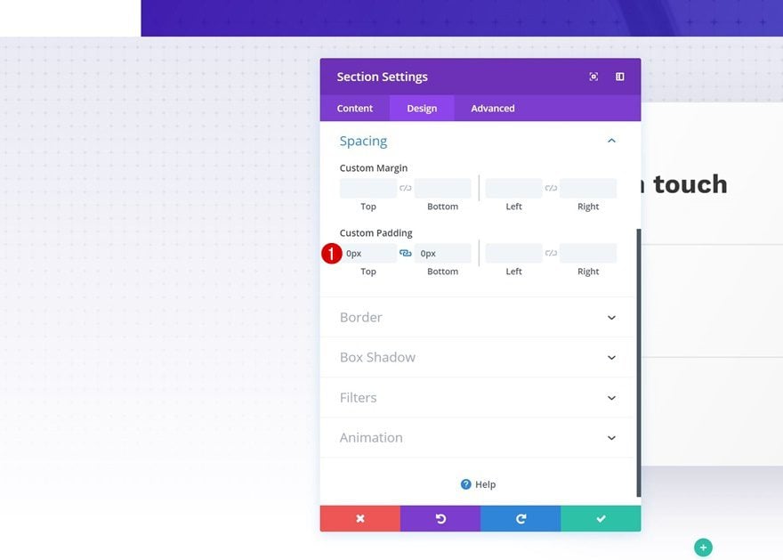
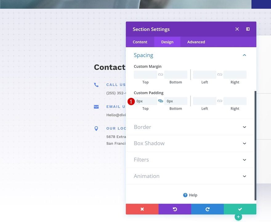
Spacing
Open the row settings and remove all custom top and bottom padding in the spacing settings.
- Top Padding: 0px
- Bottom Padding: 0px
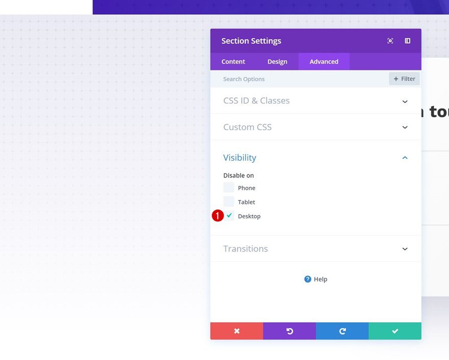
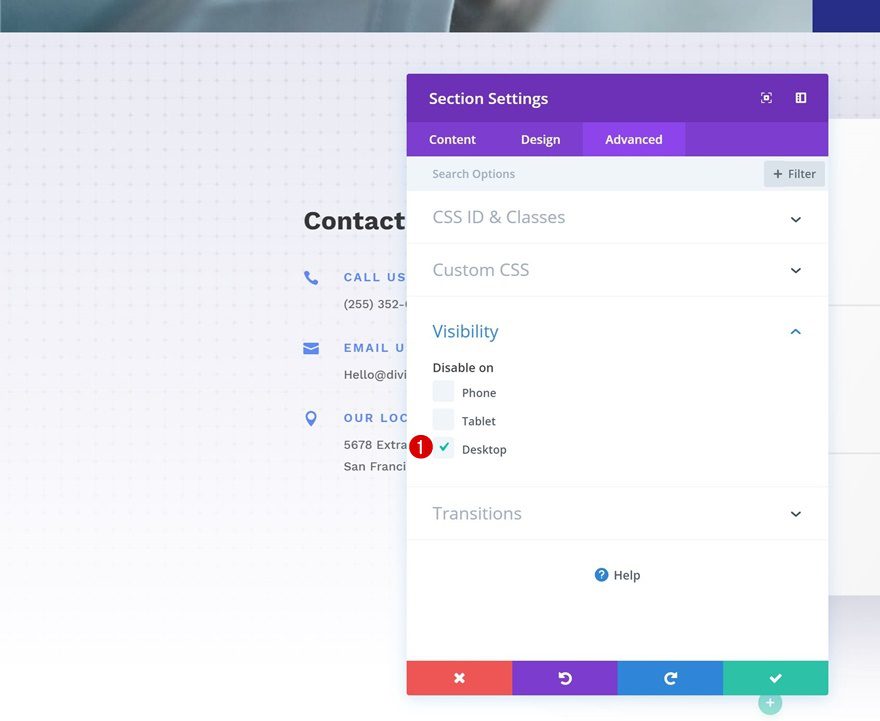
Visibility
We’re hiding this section on desktop as well. If you want the mobile footer bar to appear on mobile only, go ahead and hide the section on tablet as well.
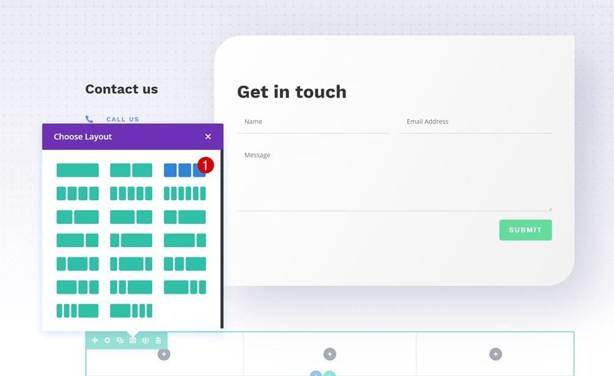
Add New Row
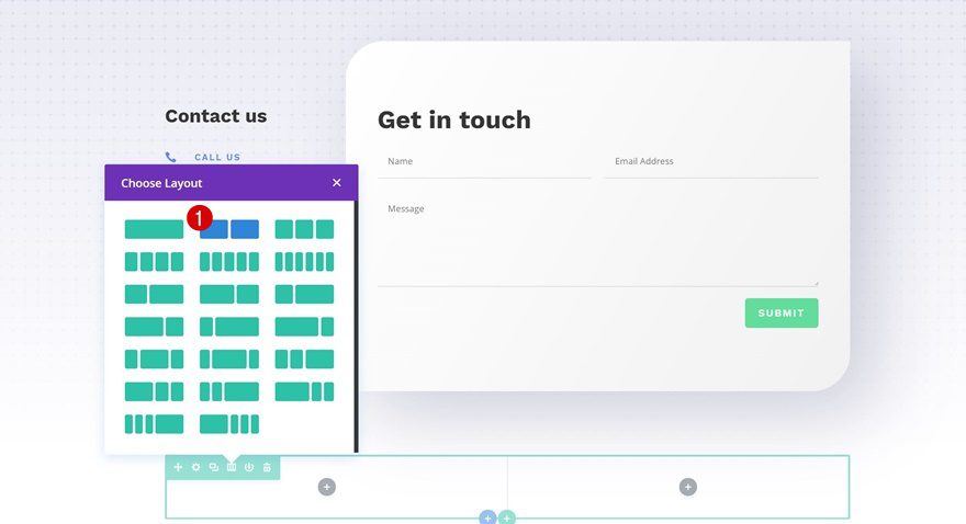
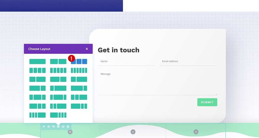
Column Structure
Continue by adding a new row to the section using the following column structure:
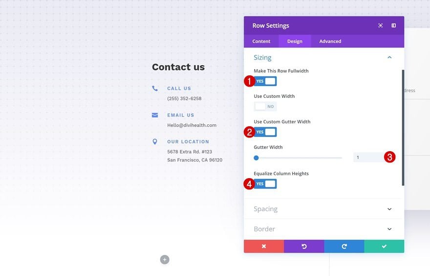
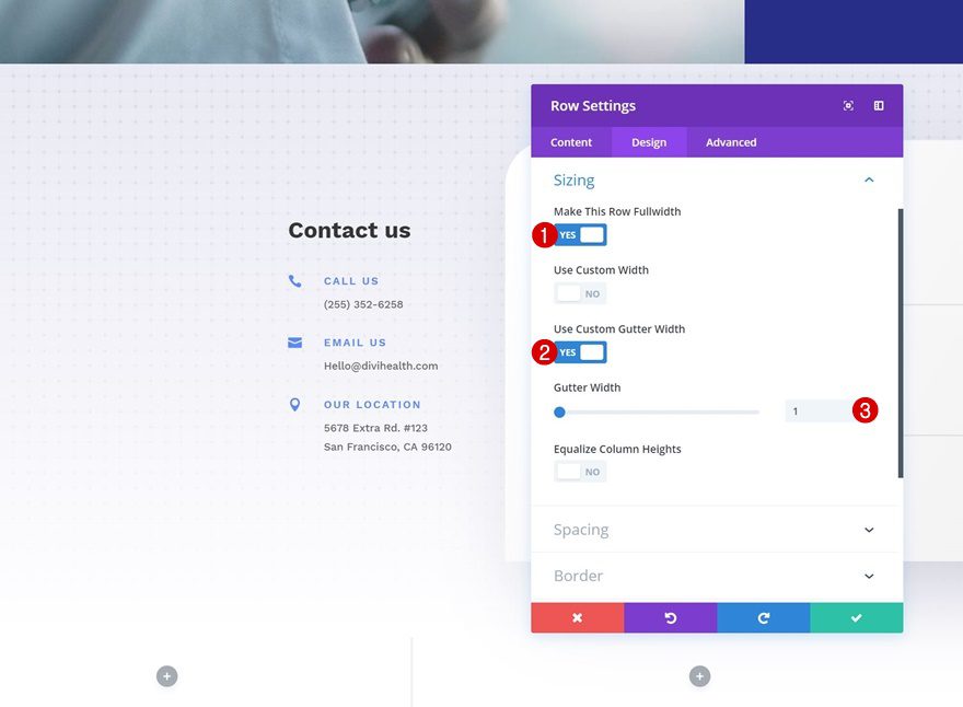
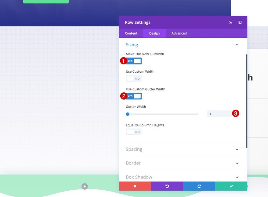
Sizing
Without adding any modules yet, open the row settings and modify the sizing settings.
- Make This Row Fullwidth: Yes
- Use Custom Gutter Width: Yes
- Gutter Width: 1
- Equalize Column Heights: Yes
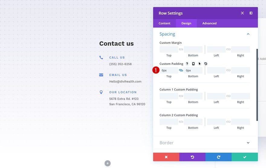
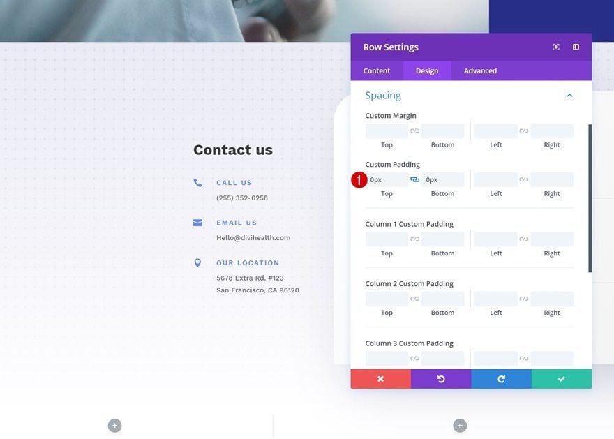
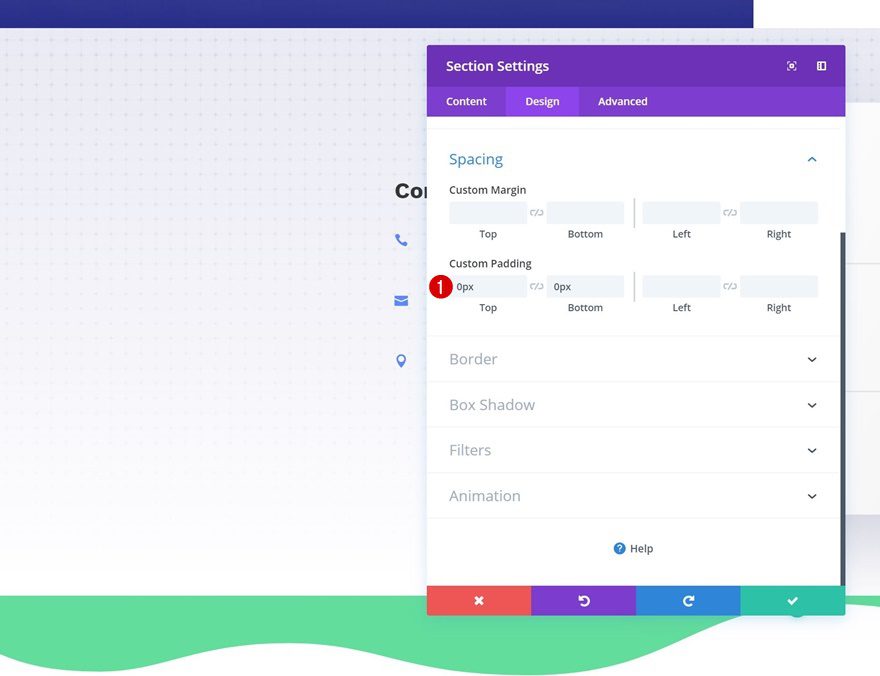
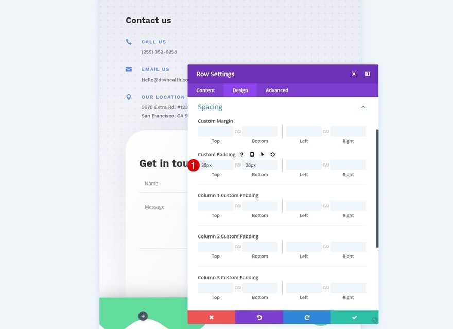
Spacing
Remove all default top and bottom padding of the row next.
- Top Padding: 0px
- Bottom Padding: 0px
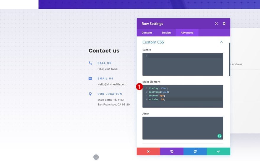
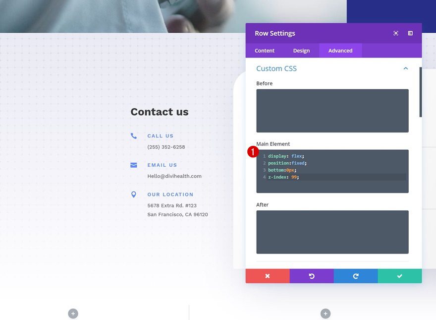
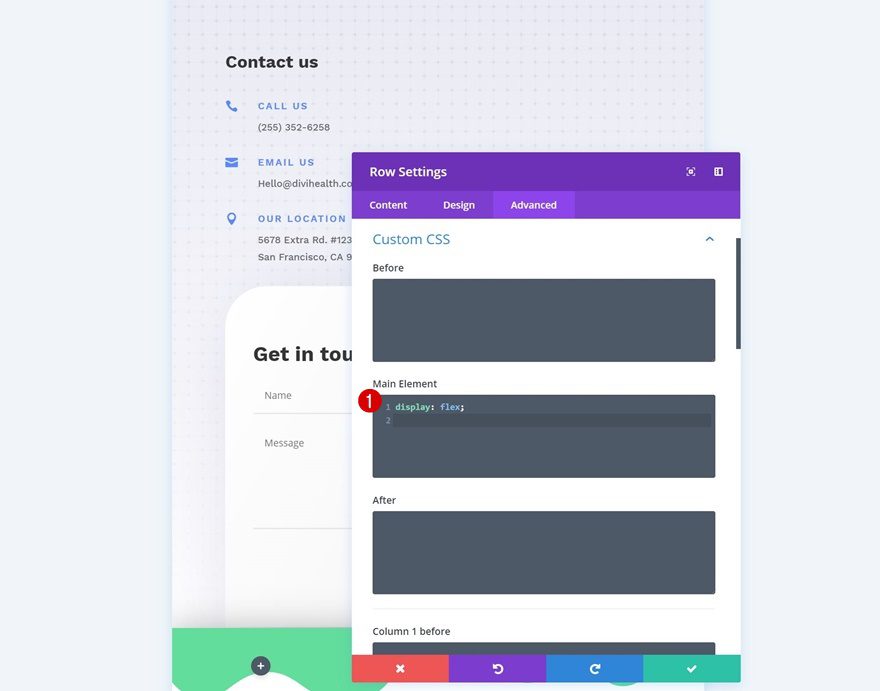
Custom CSS
Lastly, we’re adding some custom CSS lines to the row. These lines will help turn the row into a fixed footer bar.
display: flex;
position:fixed;
bottom: 0px;
z-index: 99;
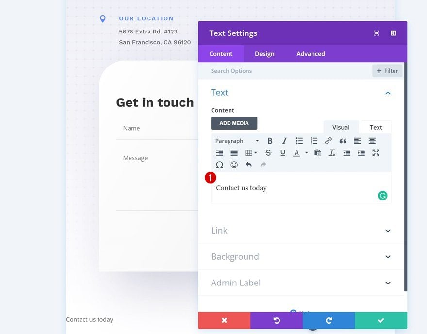
Add Text Module to Column 1
Add Content
Time to start adding modules! The first module we need is a Text Module in column 1. Add some content of choice.
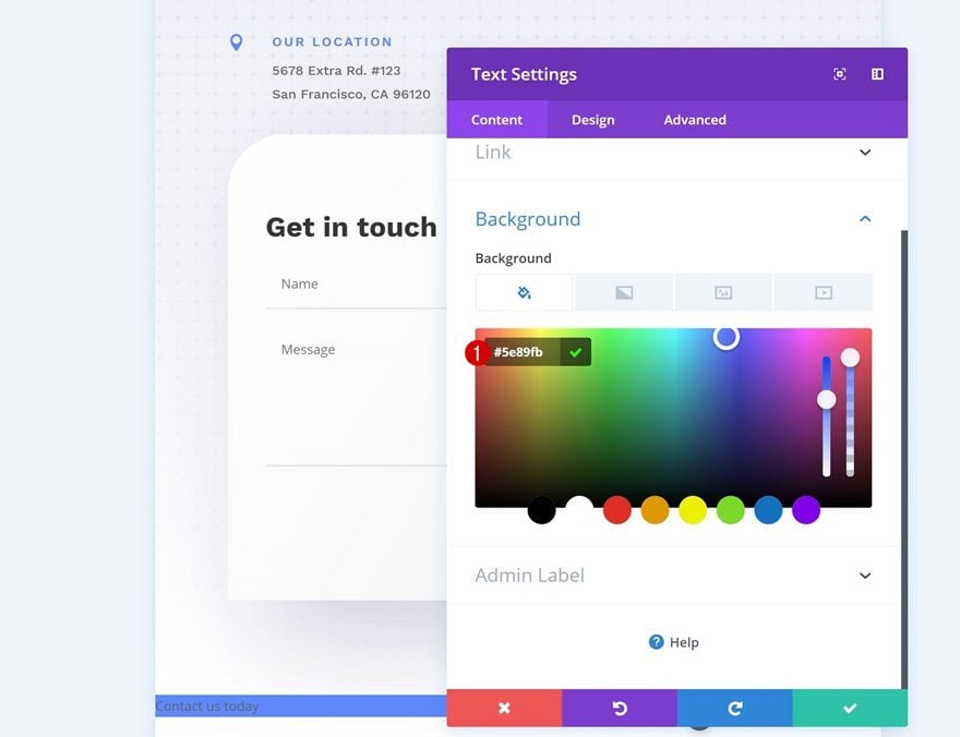
Background Color
Go to the background settings of the module and change the background color.
- Background Color: #5e89fb
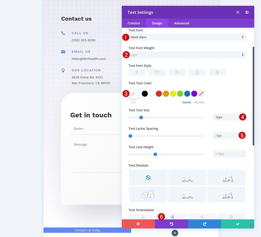
Text Settings
Modify the text settings as well.
- Text Font: Work Sans
- Text Font Weight: Light
- Text Color: #ffffff
- Text Size: 16px
- Text Letter Spacing: -1px
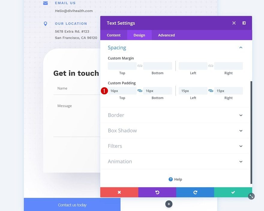
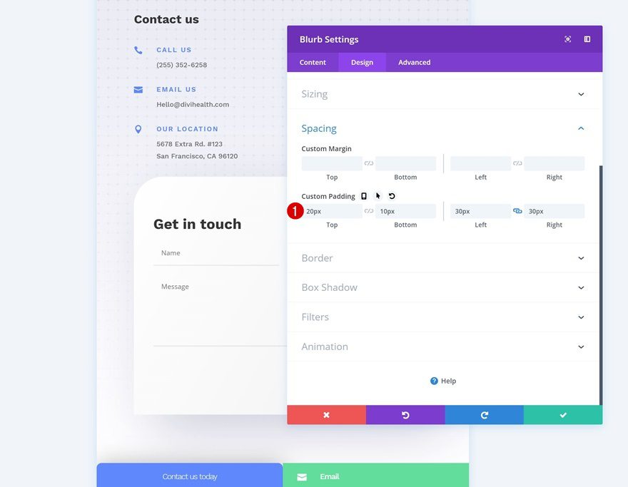
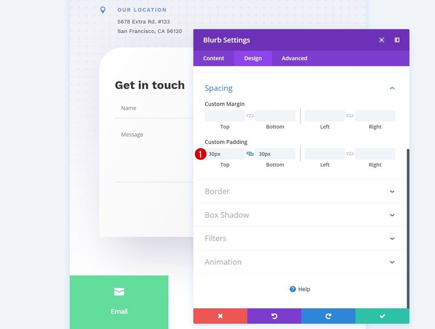
Spacing
Add some custom padding values next.
- Top Padding: 16px
- Bottom Padding: 16px
- Left Padding: 15px
- Right Padding: 15px
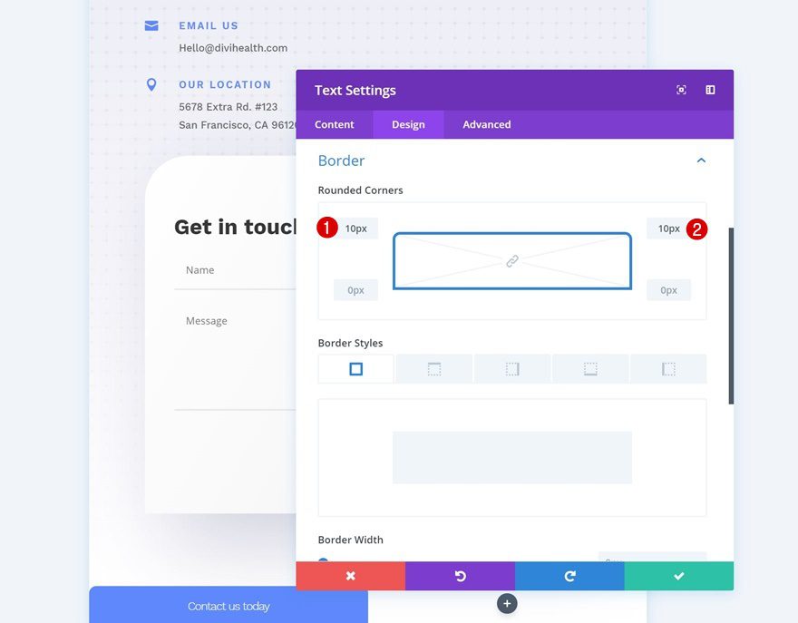
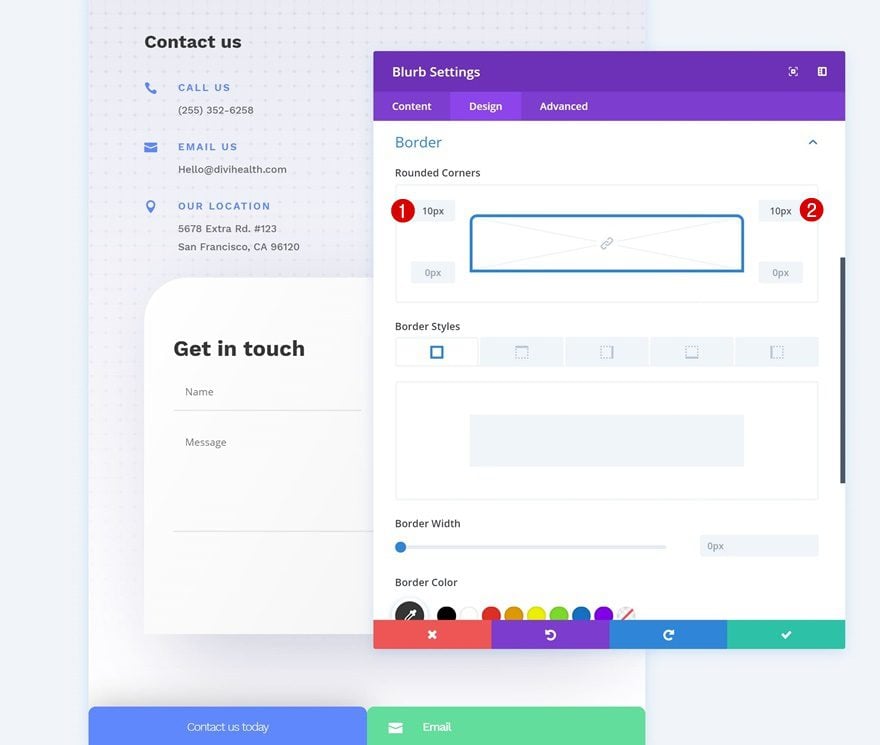
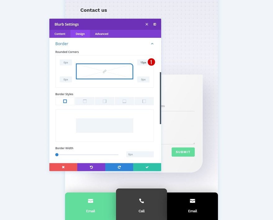
Border
And some rounded corners too.
- Top Left: 10px
- Top Right: 10px
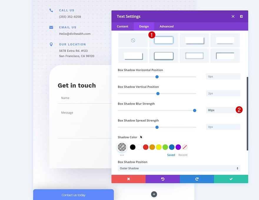
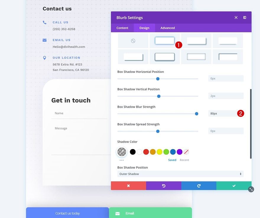
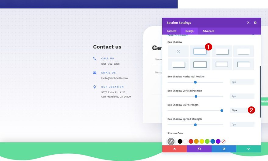
Box Shadow
Complete the module’s settings by adding a subtle box shadow.
- Box Shadow Blur Strength: 80px
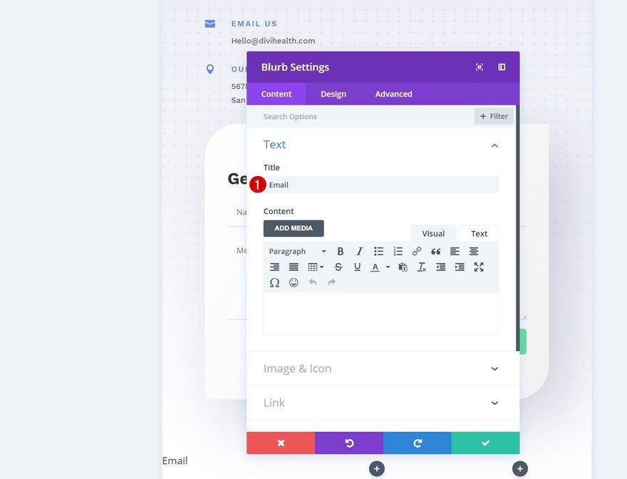
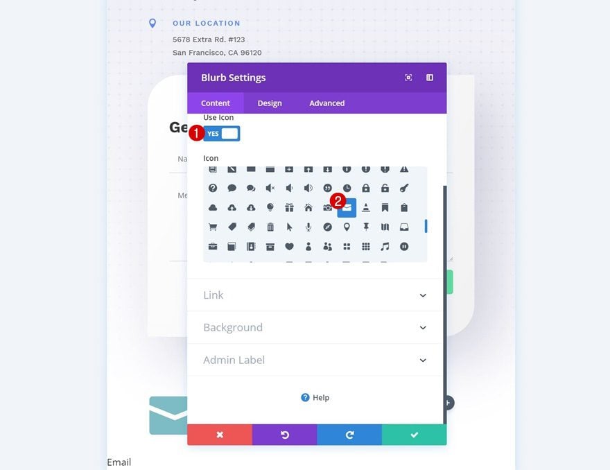
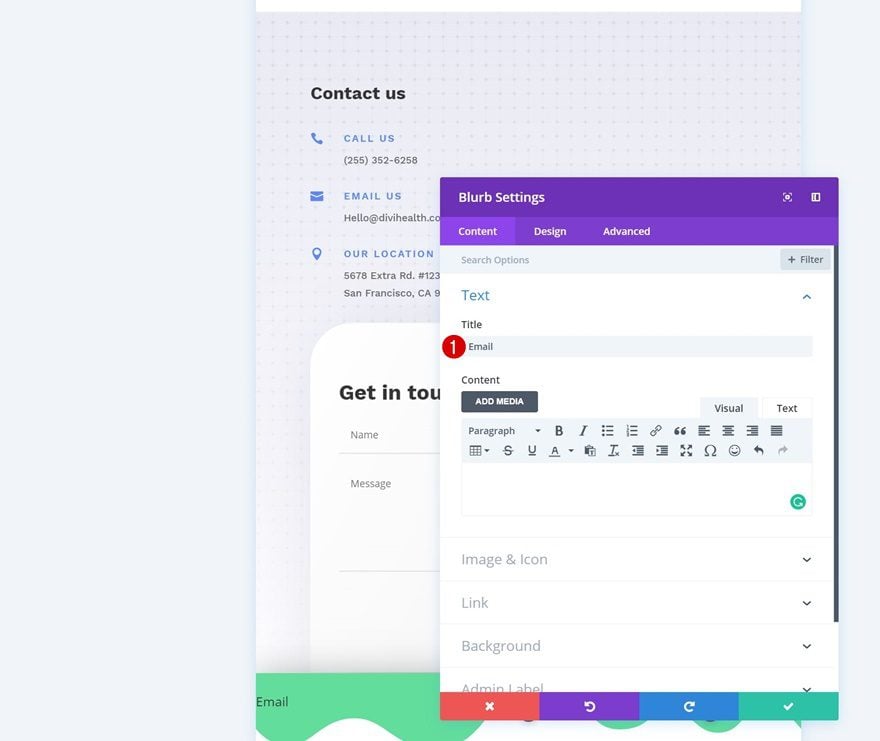
Add Blurb Module to Column 2
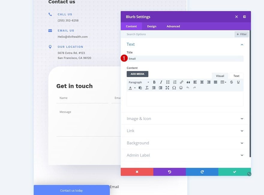
Add Content
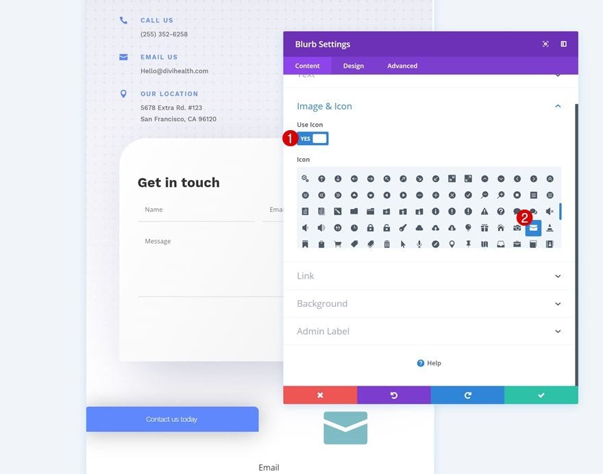
Add a Blurb Module to the second column and add a title of choice.
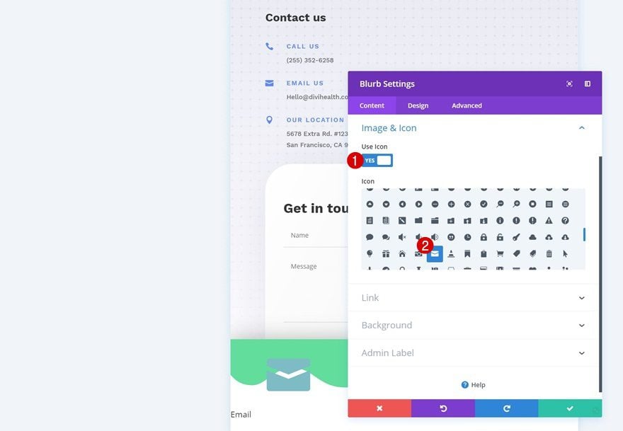
Select Icon
Continue by selecting an icon for the Blurb Module.
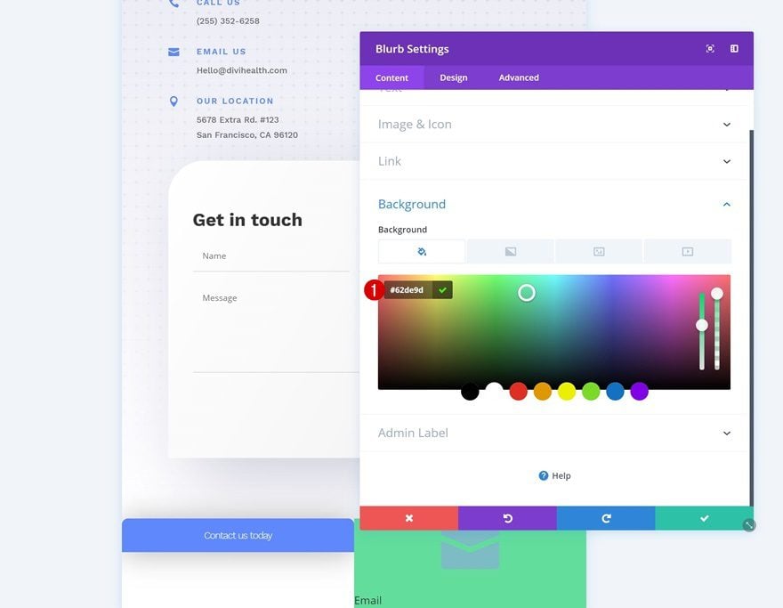
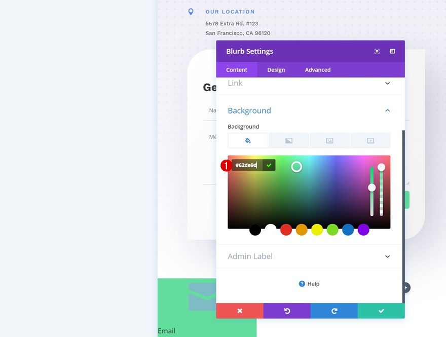
Background Color
Add a background color to the module as well.
- Background Color: #62de9d
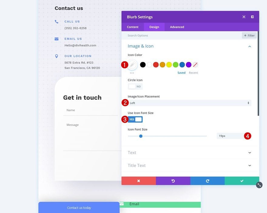
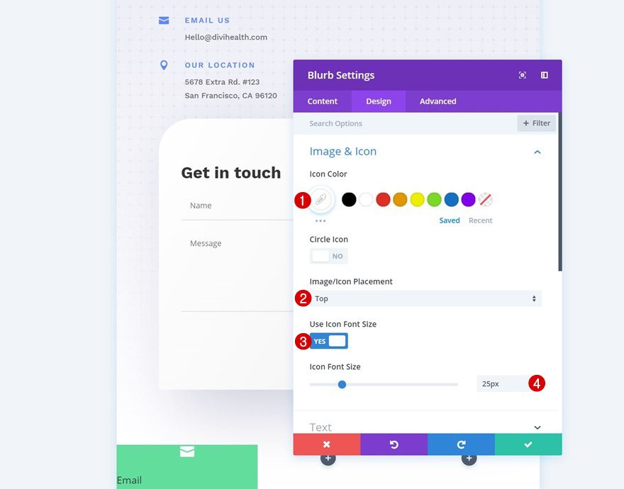
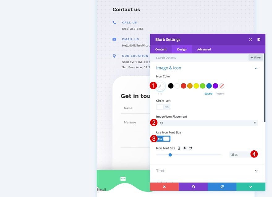
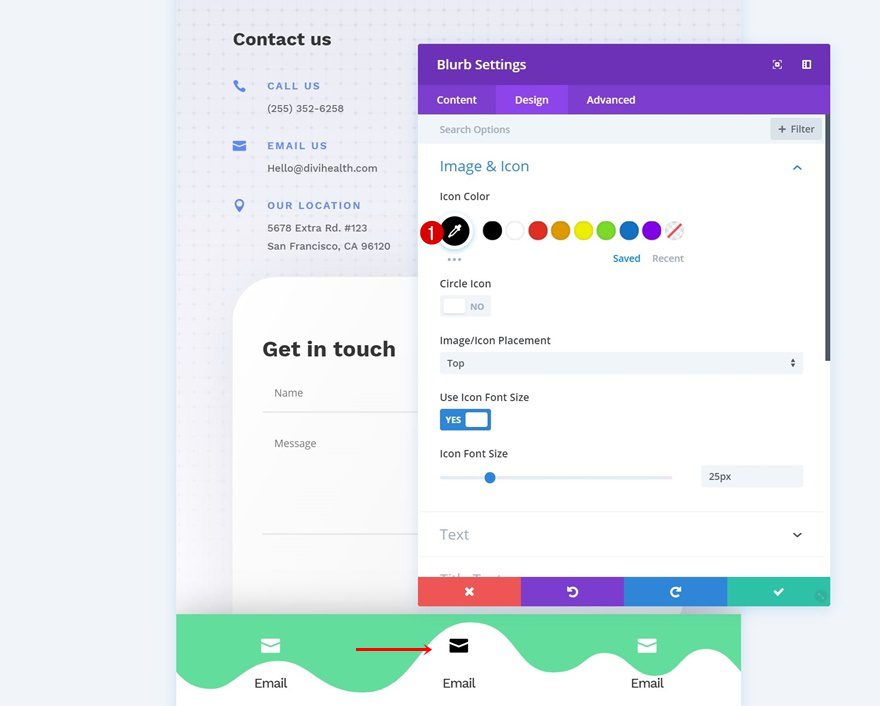
Icon Settings
Move on to the design tab and change the icon settings.
- Icon Color: #ffffff
- Icon Placement: Left
- Use Icon Font Size: Yes
- Icon Font Size: 19px
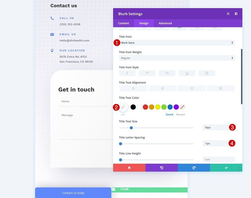
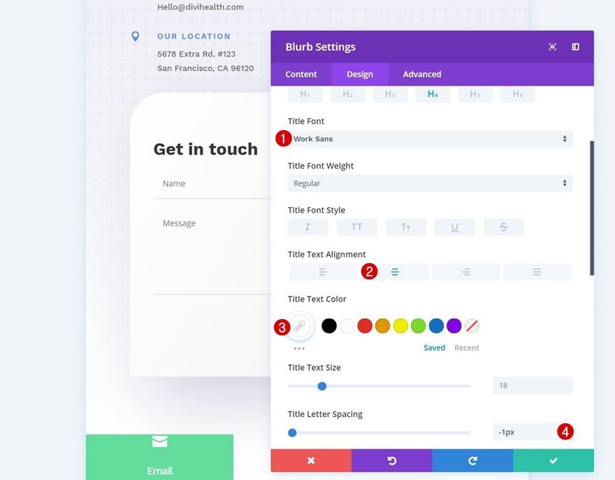
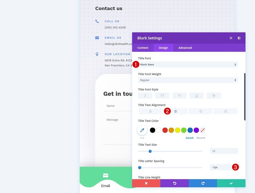
Title Text Settings
Continue by modifying the title text settings.
- Title Font: Work Sans
- Title Text Color: #ffffff
- Title Text Size: 16px
- Title Letter Spacing: -1px
Spacing
Add some custom padding to the module as well.
- Top Padding: 20px
- Bottom Padding: 10px
- Left Padding: 30px
- Right Padding: 30px
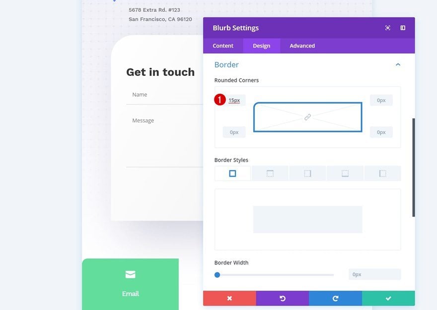
Border
And add ’10px’ to the top left and top right corners.
- Top Left: 10px
- Top Right: 10px
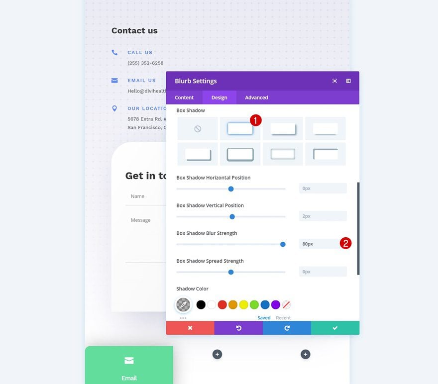
Box Shadow
Last but not least, add a subtle box shadow to the module.
- Box Shadow Blur Strength: 80px
Recreate Example #2
Add New Section to Bottom of Page
On to the second example! Again, open a page of your choice, scroll down to the end of the page and add a new section.
Spacing
Open the section settings and remove the default top and bottom padding.
- Top Padding: 0px
- Bottom Padding: 0px
Visibility
Hide the section on desktop (and tablet if you prefer so).
Add New Row
Column Structure
Continue by adding a new row to the section using the following column structure:
Sizing
Without adding any modules, open the row settings and change the sizing settings.
- Make This Row Fullwidth: Yes
- Use Custom Gutter Width: Yes
- Gutter Width: 1
Spacing
Remove the default top and bottom padding of the row as well.
- Top Padding: 0px
- Bottom Padding: 0px
Custom CSS
Add some custom css lines to the row next. These lines of CSS code will help create the fixed mobile footer bar.
display: flex;
position:fixed;
bottom: 0px;
z-index: 99;
Add Blurb Module to Column 1
Add Content
Continue by adding a Blurb Module to the first column. Add a title of choice.
Select Icon
Then, select an icon.
Background Color
Add a background color to the module next.
- Background Color: #62de9d
Icon Settings
Move on to the design tab and change the icon settings of the module.
- Icon Color: #ffffff
- Icon Placement: Top
- Use Icon Font Size: Yes
- Icon Font Size: 25px
Title Text Settings
Change around the title text settings as well.
- Title Font: Work Sans
- Title Text Alignment: Center
- Title Text Color: #ffffff
- Title Letter Spacing: -1px
Spacing
And add some top and bottom padding to give the module some space to breathe.
- Top Padding: 30px
- Bottom Padding: 30px
Border
We’re also adding ’15px’ to the top left border of the module.
- Top Left: 15px
Box Shadow
And we’ll complete the module with a subtle box shadow.
- Box Shadow Blur Strength: 80px
Clone Blurb Module Twice & Place Duplicates in Remaining Columns
Once you’re done modifying the first Blurb Module, you can go ahead and clone the module twice and place the duplicates in the two remaining columns.
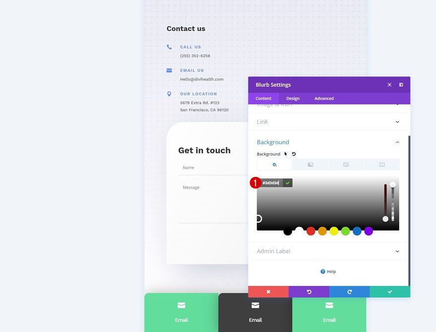
Change Background Color of Duplicate #1
Change the background color of the first duplicate.
- Background Color: #3d3d3d
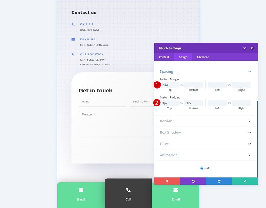
Change Spacing Settings of Duplicate #1
Along with the spacing settings.
- Top Margin: -20px
- Top Padding: 50px
- Bottom Padding: 30px
Change Border of Duplicate #1
And the rounded corners as well.
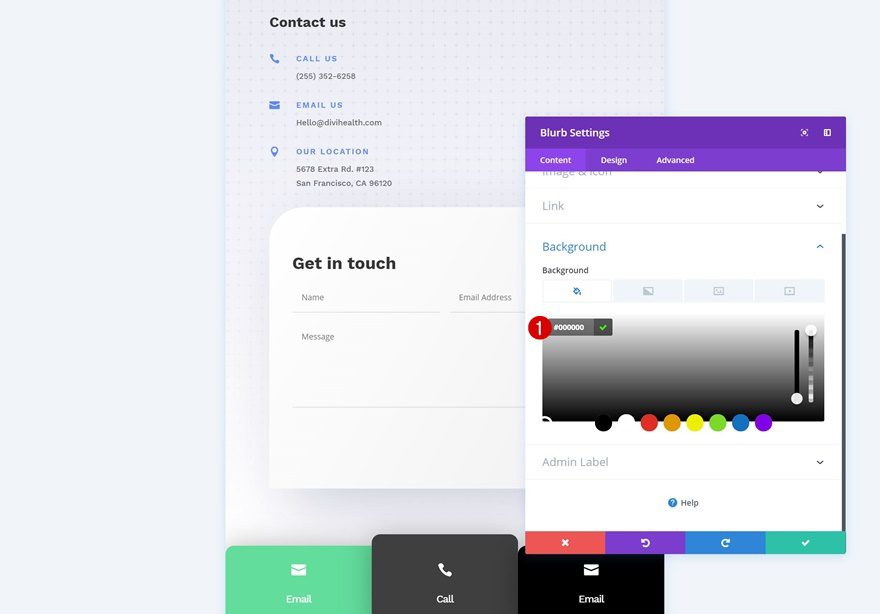
Change Background Color of Duplicate #2
Change the background color of the second duplicate in the third column too.
- Background Color: #000000
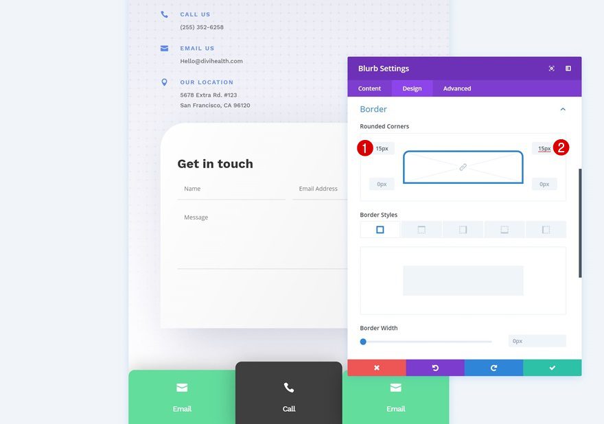
Change Border of Duplicate #2
Along with the rounded corners.
- Top Right: 15px
Recreate Example #3
Add New Section to Bottom of Page
On to the next and last example! Open one of the pages, scroll down the page and add a new section.
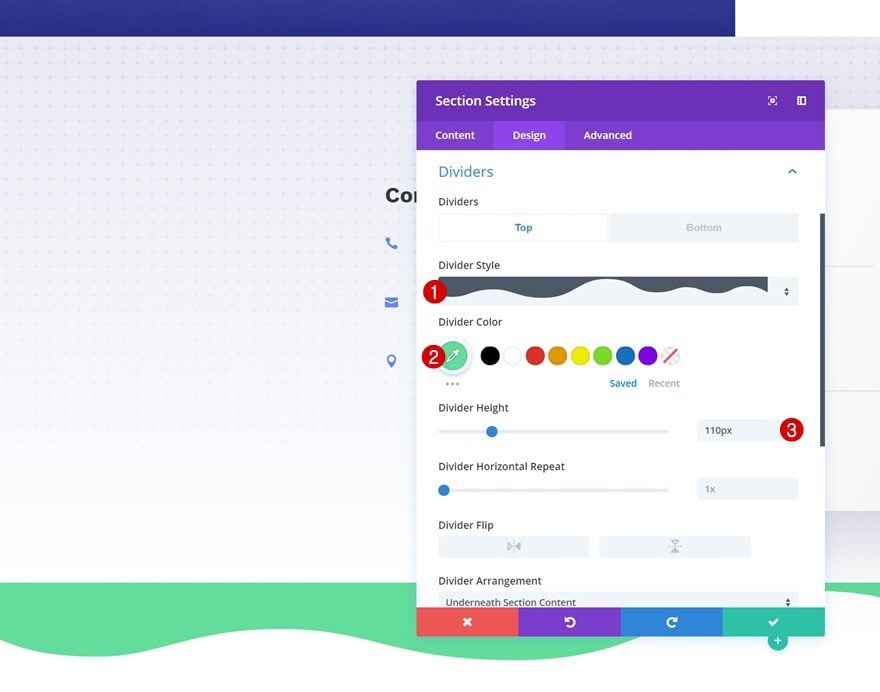
Top Divider
Open the section settings and add a top divider.
- Divider Color: #62de9d
- Divider Height: 110px
Spacing
Remove all default top and bottom padding of the section as well.
- Top Padding: 0px
- Bottom Padding: 0px
Box Shadow
Add a subtle box shadow to the section next.
- Box Shadow Blur Strength: 80px
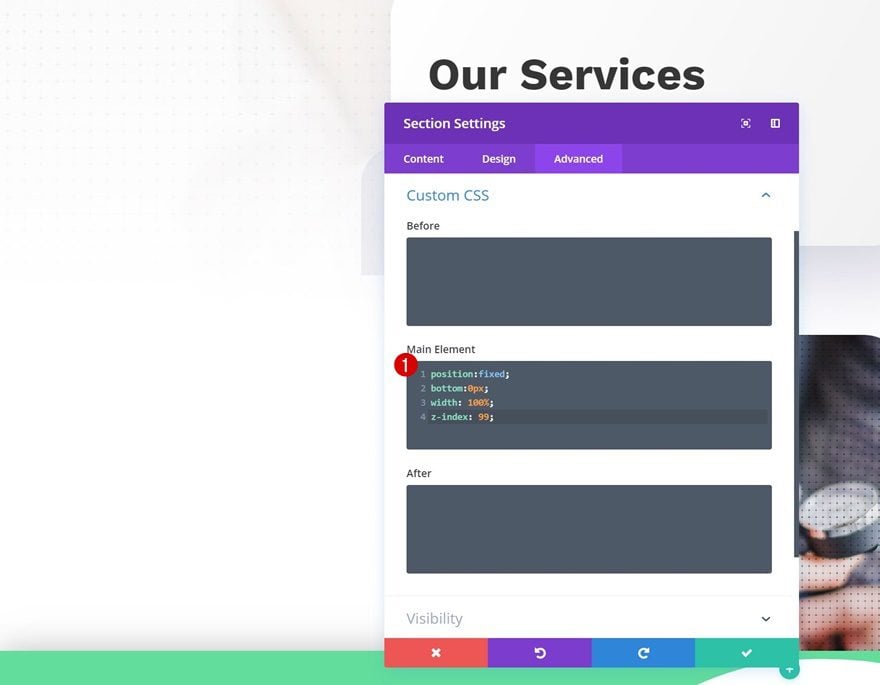
Custom CSS
And include some custom CSS lines in the advanced tab. This will help turn the section into a fixed mobile footer bar.
position:fixed;
bottom:0px;
width: 100%;
z-index: 99;
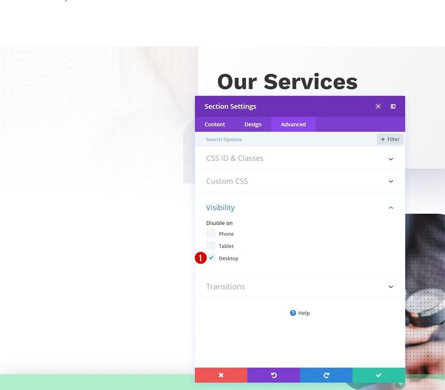
Visibility
Lastly, disable the section on desktop (and tablet if you prefer so).
Add New Row
Column Structure
Continue by adding a new row to the section using the following column structure:
Sizing
Without adding any modules yet, open the row settings and change the sizing settings.
- Make This Row Fullwidth: Yes
- Use Custom Gutter Width: Yes
- Gutter Width: 1
Spacing
Add some custom top and bottom padding next.
- Top Padding: 30px
- Bottom Padding: 20px
Custom CSS
To make sure all three columns remain on the same height, we’re going to add a line of CSS code to the advanced tab of the row as well.
display: flex;
Add Blurb Module to Column 1
Add Content
Now we can start adding modules! Add a Blurb Module to the first column and give it a title.
Select Icon
Select an icon next.
Icon Settings
Move on to the design tab and change the icon settings.
- Icon Color: #ffffff
- Icon Placement: Top
- Use Icon Font Size: Yes
- Icon Font Size: 25px
Title Text Settings
Modify the title text settings as well.
- Title Font: Work Sans
- Title Text Orientation: Center
- Title Letter Spacing: -1px
Clone Blurb Module Twice & Place
Once you’re done modifying the Blurb Module in column 1, you can go ahead and clone the module twice. Place the duplicates in the two remaining columns.
Change Icon Color of Duplicate #1
Don’t forget to change the icon color of the duplicate located in the second column.
- Icon Color: #000000
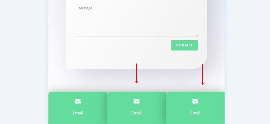
Preview
Now that we’ve gone through all the different steps, let’s take a final look at the outcome of all three examples we’ve handled above.
Final Thoughts
In this post, we’ve handled three different fixed mobile footer bar designs that you can recreate step by step by following the tutorial. The mobile footer bars will follow visitors throughout their scrolling experience on the page. This tutorial is part of the ongoing Divi design initiative, where we try to put something extra into your design toolbox each and every week. If you have any questions or suggestions, make sure you leave a comment in the comment section below!
The post How to Create Fixed Mobile Footer Bars with Divi appeared first on Elegant Themes Blog.