
The way you design your pages is a direct reflection of your brand. That’s why at some point in your design brainstorm, you might want to find and add unique design elements to your website that’ll help generate a pattern throughout all pages. One unique way to highlight your website’s identity is by using sticky section titles. These sticky section titles will follow your visitors’ navigation behavior by sticking to the top of their browser. In this tutorial, we’ll show you how to create sticky section titles using Divi’s sticky options. The sticky section titles will be less emphasized once your visitors are scrolling, but will be visible enough for them to recognize the section they’re at. You’ll be able to download the JSON file for free as well!
Let’s get to it.
Preview
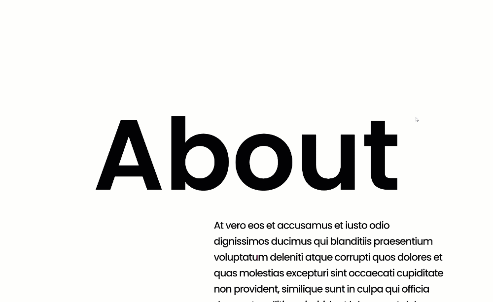
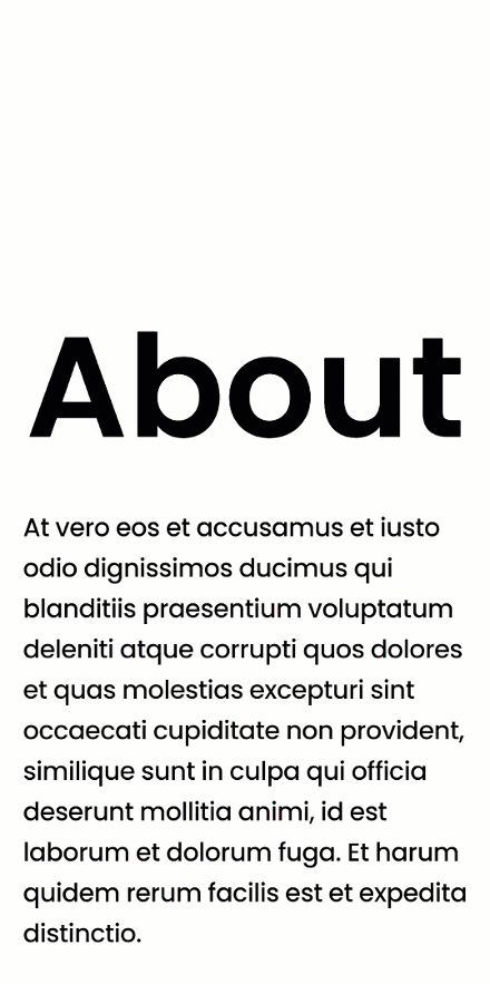
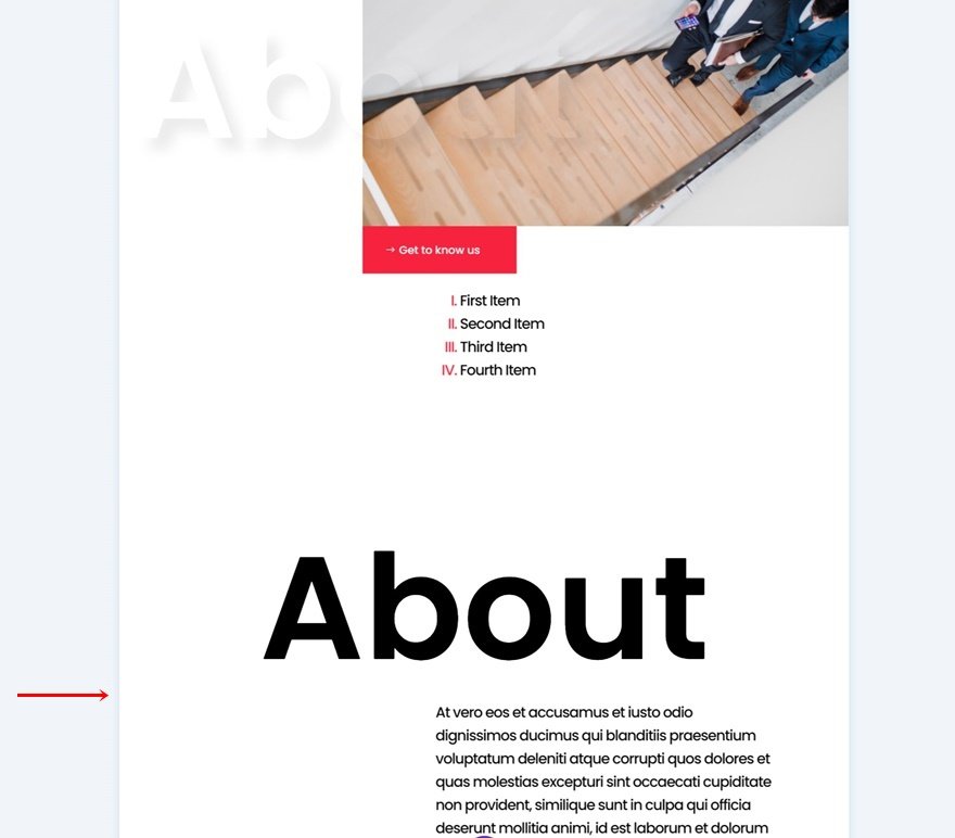
Before we dive into the tutorial, let’s take a quick look at the outcome across different screen sizes.
Desktop
Mobile
Download The Layout for FREE
To lay your hands on the free layout, you will first need to download them using the button below. To gain access to the download you will need to subscribe to our Divi Daily email list by using the form below. As a new subscriber, you will receive even more Divi goodness and a free Divi Layout pack every Monday! If you’re already on the list, simply enter your email address below and click download. You will not be “resubscribed” or receive extra emails.
@media only screen and ( max-width: 767px ) {.et_bloom .et_bloom_optin_1 .carrot_edge.et_bloom_form_right .et_bloom_form_content:before, .et_bloom .et_bloom_optin_1 .carrot_edge.et_bloom_form_left .et_bloom_form_content:before { border-top-color: #ffffff !important; border-left-color: transparent !important; }
}.et_bloom .et_bloom_optin_1 .et_bloom_form_content button { background-color: #f92c8b !important; } .et_bloom .et_bloom_optin_1 .et_bloom_form_content .et_bloom_fields i { color: #f92c8b !important; } .et_bloom .et_bloom_optin_1 .et_bloom_form_content .et_bloom_custom_field_radio i:before { background: #f92c8b !important; } .et_bloom .et_bloom_optin_1 .et_bloom_border_solid { border-color: #f7f9fb !important } .et_bloom .et_bloom_optin_1 .et_bloom_form_content button { background-color: #f92c8b !important; } .et_bloom .et_bloom_optin_1 .et_bloom_form_container h2, .et_bloom .et_bloom_optin_1 .et_bloom_form_container h2 span, .et_bloom .et_bloom_optin_1 .et_bloom_form_container h2 strong { font-family: “Open Sans”, Helvetica, Arial, Lucida, sans-serif; }.et_bloom .et_bloom_optin_1 .et_bloom_form_container p, .et_bloom .et_bloom_optin_1 .et_bloom_form_container p span, .et_bloom .et_bloom_optin_1 .et_bloom_form_container p strong, .et_bloom .et_bloom_optin_1 .et_bloom_form_container form input, .et_bloom .et_bloom_optin_1 .et_bloom_form_container form button span { font-family: “Open Sans”, Helvetica, Arial, Lucida, sans-serif; } p.et_bloom_popup_input { padding-bottom: 0 !important;}

Download For Free
Join the Divi Newsletter and we will email you a copy of the ultimate Divi Landing Page Layout Pack, plus tons of other amazing and free Divi resources, tips and tricks. Follow along and you will be a Divi master in no time. If you are already subscribed simply type in your email address below and click download to access the layout pack.
You have successfully subscribed. Please check your email address to confirm your subscription and get access to free weekly Divi layout packs!
1. Create Section Design
Add New Section
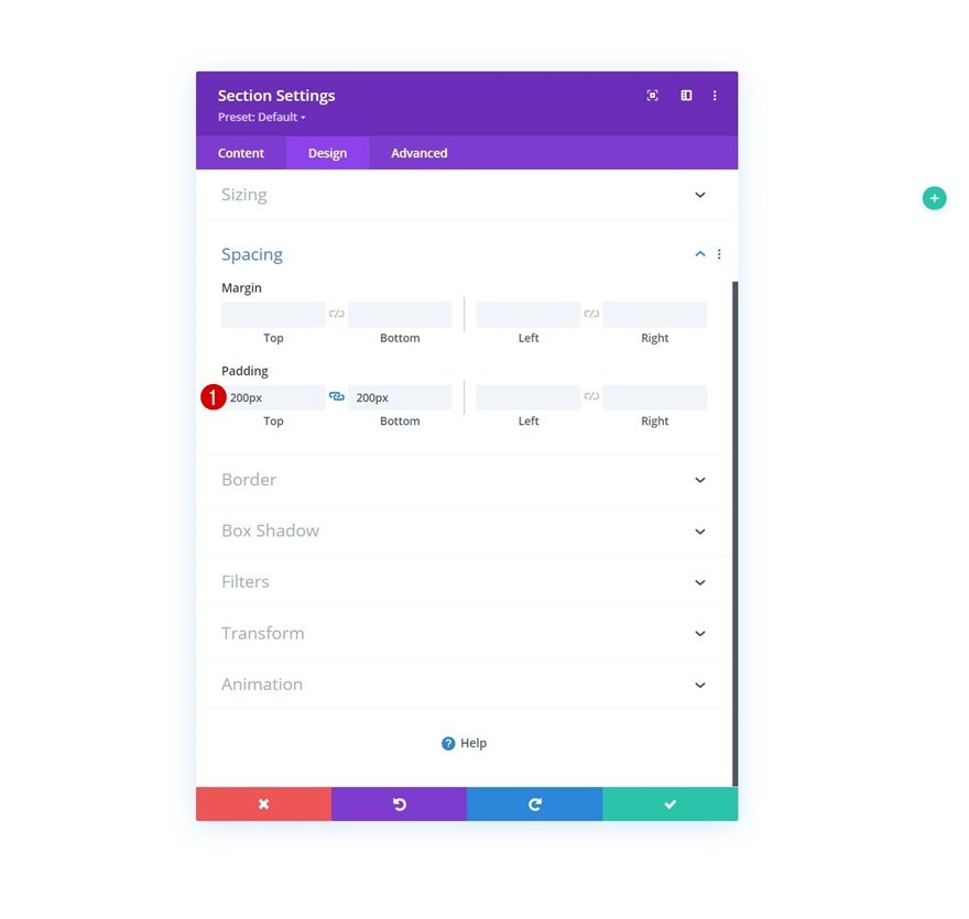
Spacing
Start by adding a new section to the page you’re working on. Open the section settings and apply some top and bottom padding.
- Top Padding: 200px
- Bottom Padding: 200px
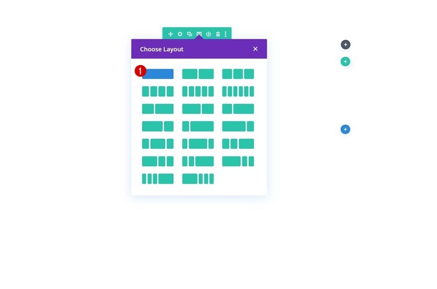
Add Row #1
Column Structure
Continue by adding a new row using the following column structure:
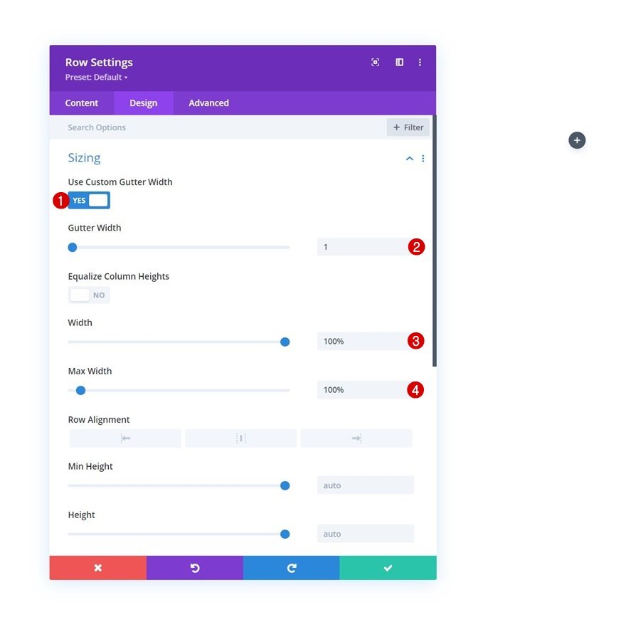
Sizing
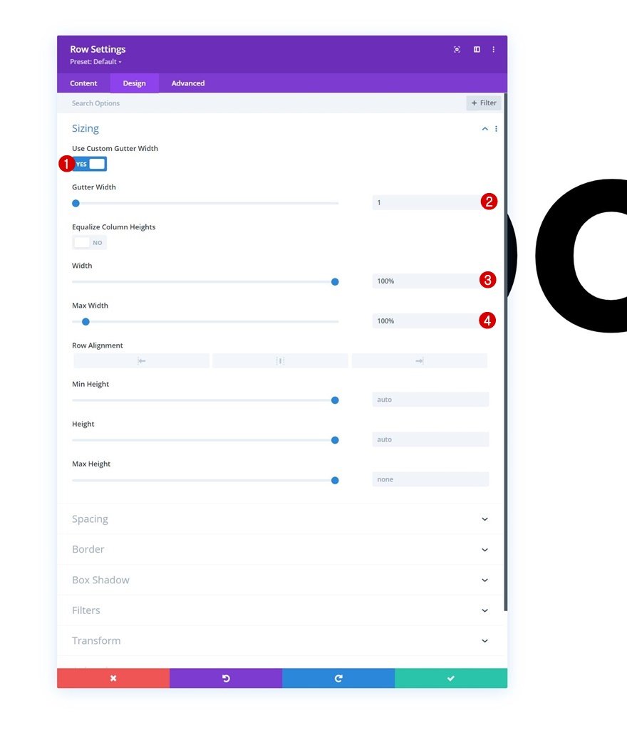
Without adding any modules yet, open the row settings and modify the sizing settings as follows:
- Use Custom Gutter Width: Yes
- Gutter Width: 1
- Width: 100%
- Max Width: 100%
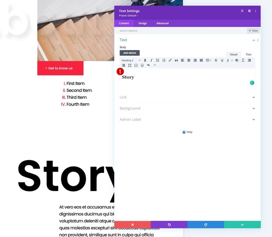
Add Text Module to Column
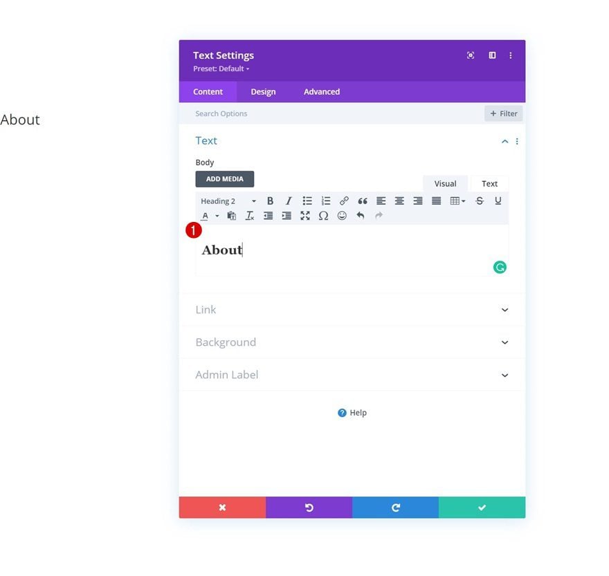
Add H2 Content
Now, add a Text Module to the row’s column and insert some H2 content of your choice.
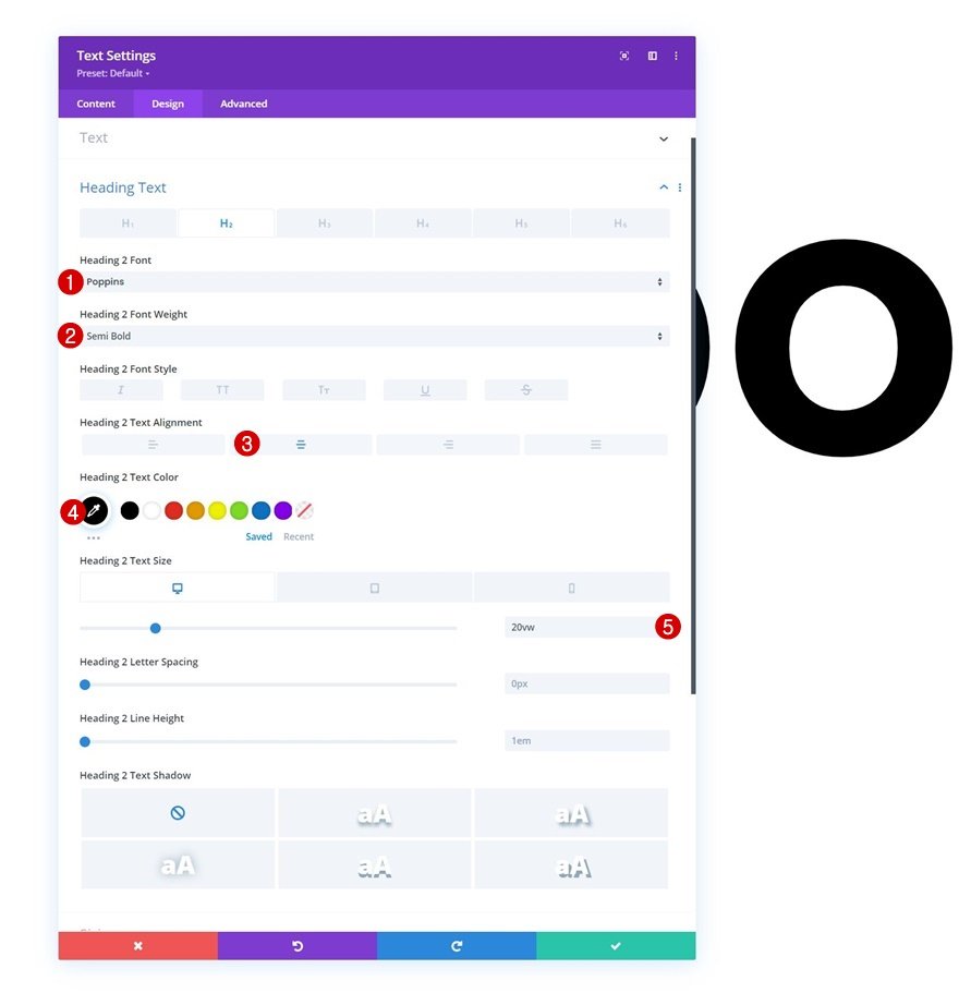
H2 Text Settings
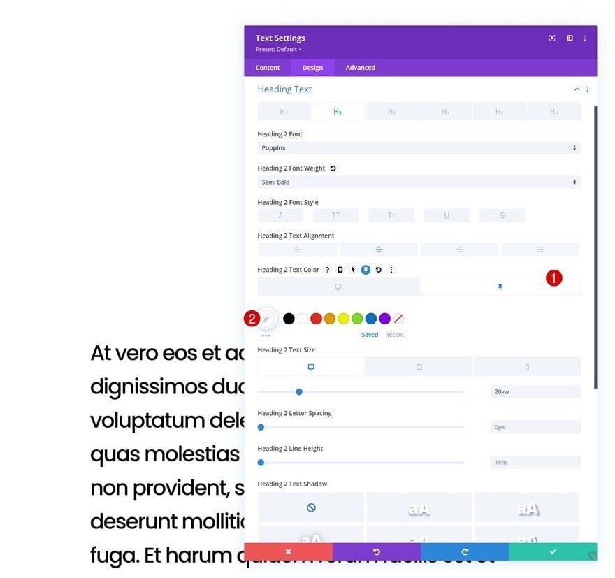
Move on to the module’s design tab and modify the H2 text settings as follows:
- Heading 2 Font: Poppins
- Heading 2 Font Weight: Semi Bold
- Heading 2 Text Alignment: Center
- Heading 2 Text Color: #000000
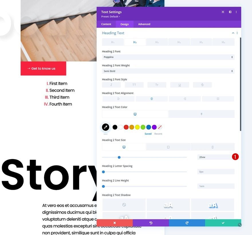
- Heading 2 Text Size:
- Desktop: 20vw
- Tablet & Phone: 28vw
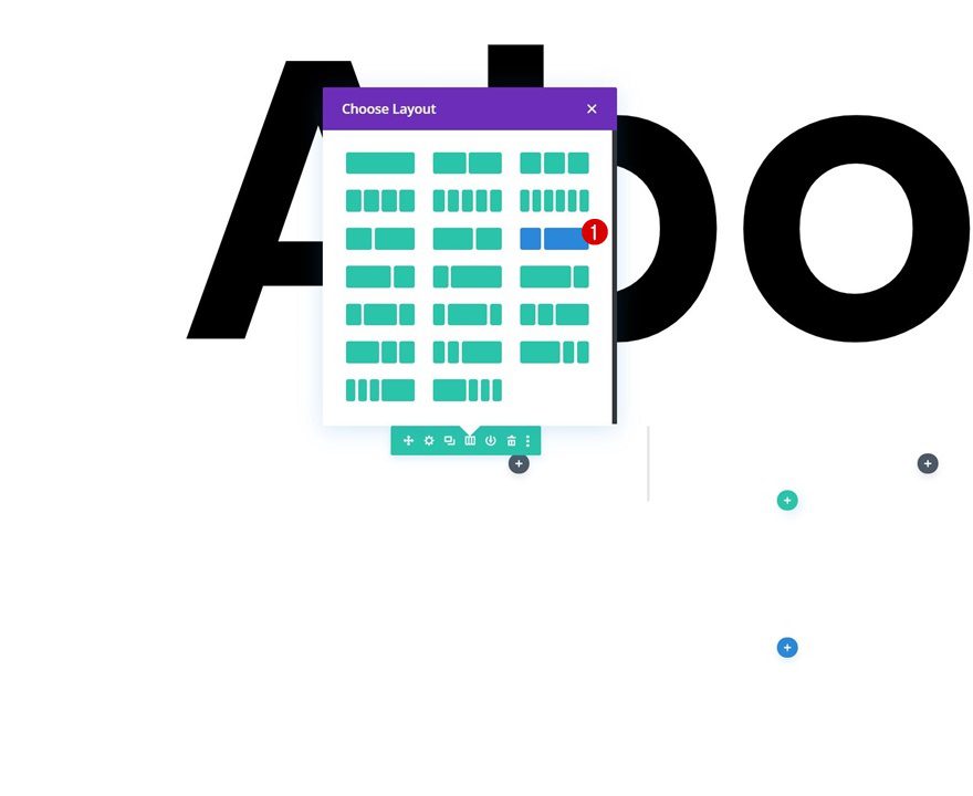
Add Row #2
Column Structure
Add another row right below the previous one using the following column structure:
Sizing
Open the row settings and change the sizing settings accordingly:
- Use Custom Gutter Width: Yes
- Gutter Width: 1
- Width: 100%
- Max Width: 100%
Add Text Module to Column 2
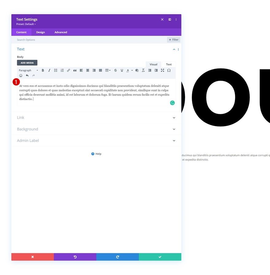
Add Content
Then, add a first Text Module to column 2 with some descriptive content of your choice.
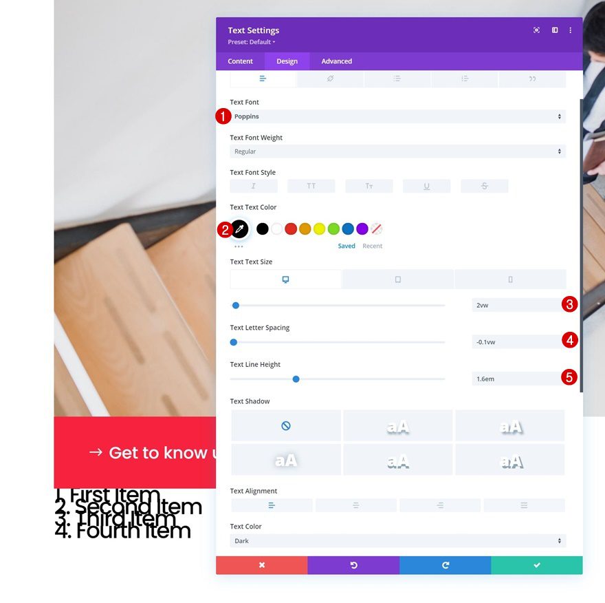
Text Settings
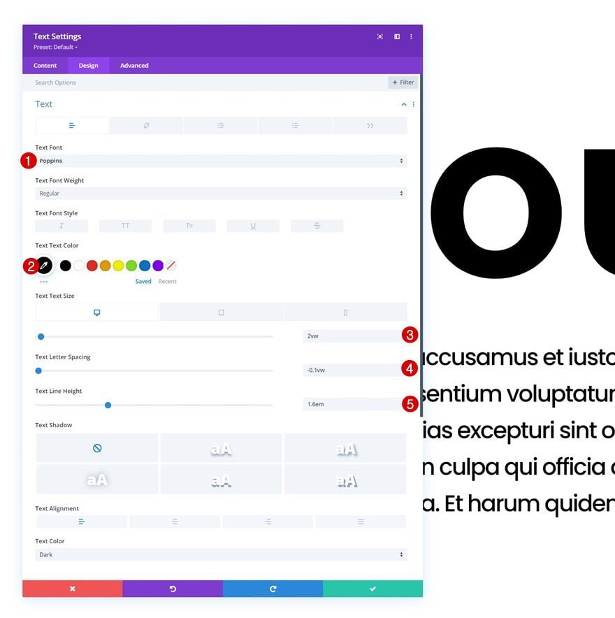
Move on to the module’s design tab and change the text settings accordingly:
- Text Font: Poppins
- Text Color: #000000
- Text Size:
- Desktop: 2vw
- Tablet: 4vw
- Phone: 5vw
- Text Letter Spacing: -0.1vw
- Text Line Height: 1.6em
Sizing
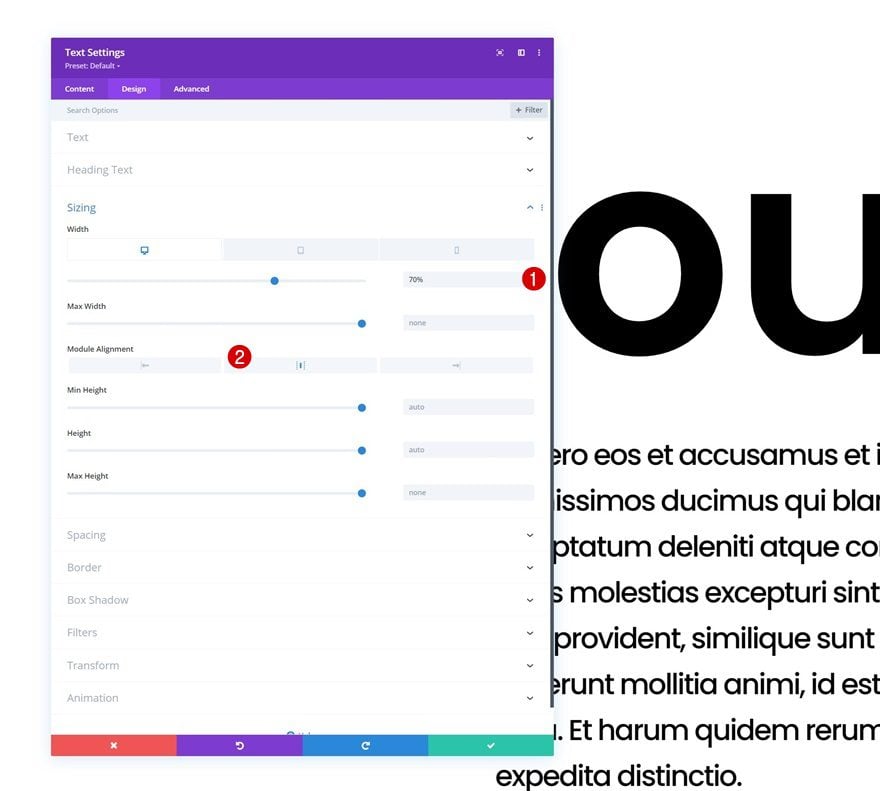
Modify the sizing settings across different screen sizes too.
- Width:
- Desktop: 70%
- Tablet & Phone: 90%
- Module Alignment: Center
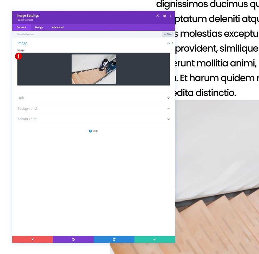
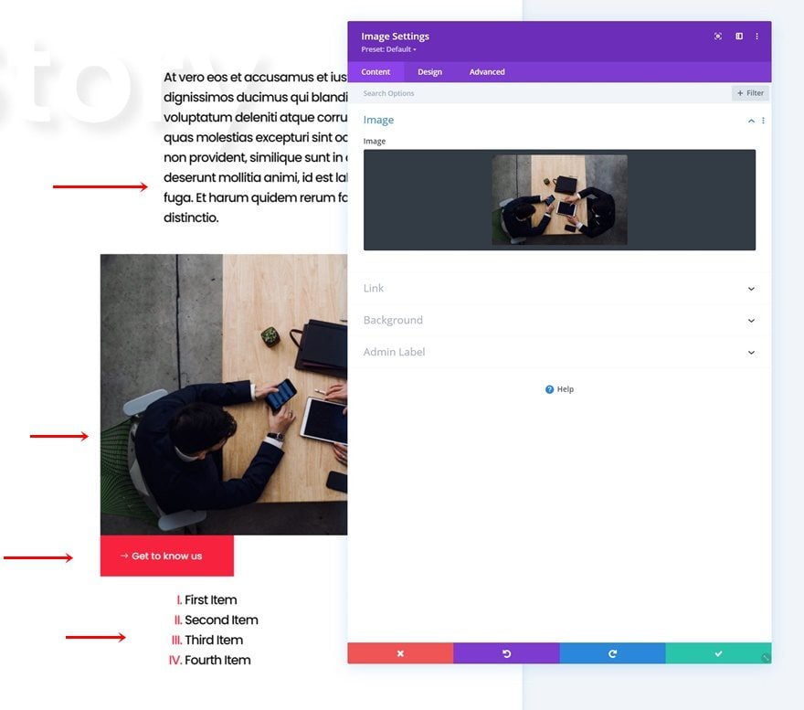
Add Image Module to Column 2
Upload Image
On to the next module, which is an Image Module. Upload an image of your choice.
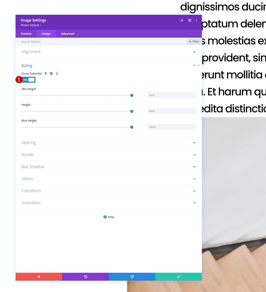
Sizing
Move on to the module’s design tab and force fullwidth on the image.
- Force Fullwidth: Yes
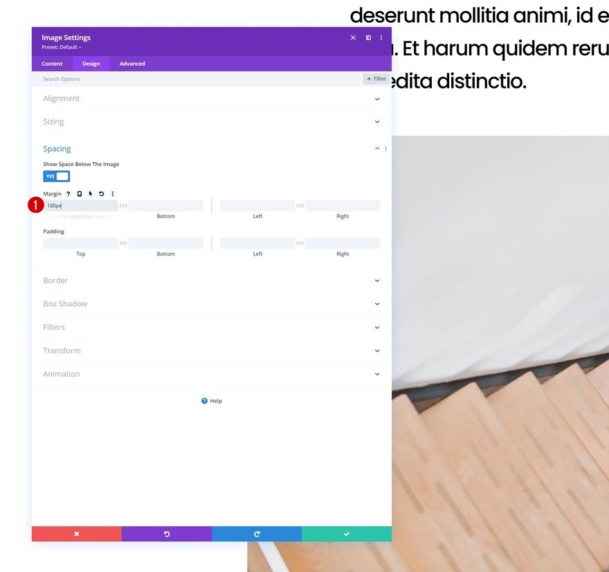
Spacing
Add some top margin too.
- Top Margin: 100px
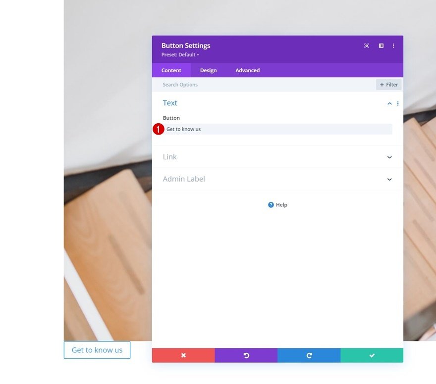
Add Button Module to Column 2
Add Copy
Next up, we have a Button Module. Add some copy of your choice.
Button Settings
Change the module’s button settings accordingly:
- Use Custom Styles For Button: Yes
- Button Text Size:
- Desktop: 1.5vw
- Tablet: 2.5vw
- Phone: 3.5vw
- Button Text Color: #ffffff
- Button Background Color: #f6223e
- Button Border Width: 0px
- Button Border Radius: 0px
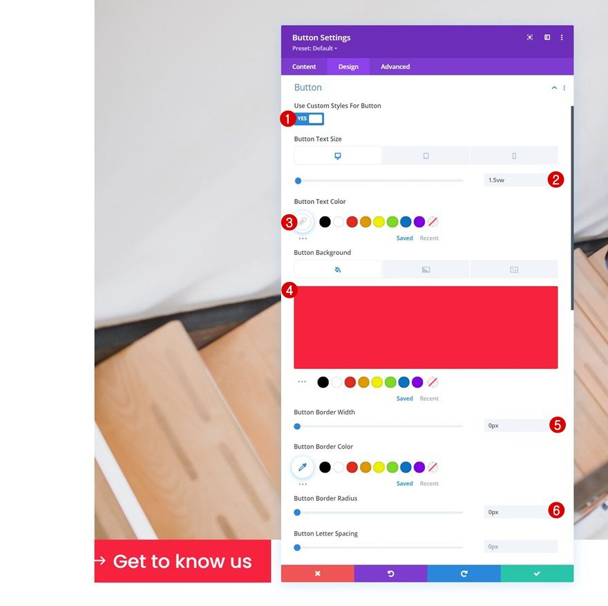
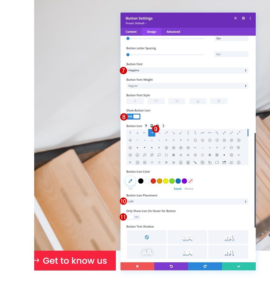
- Button Font: Poppins
- Show Button Icon: Yes
- Button Icon Placement: Left
- Only Show Icon On Hover for Button: No
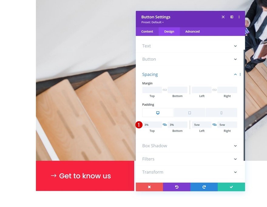
Spacing
And complete the module settings by adding some custom padding values across different screen sizes.
- Top Padding:
- Desktop & Tablet: 3%
- Phone: 5%
- Bottom Padding:
- Desktop & Tablet: 3%
- Phone: 5%
- Left Padding:
- Desktop: 5vw
- Tablet: 8vw
- Phone: 12vw
- Right Padding:
- Desktop: 5vw
- Tablet: 8vw
- Phone: 12vw
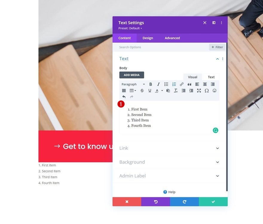
Add Text Module to Column 2
Add Bullet List Content
The next and last module we’ll add to this column is another Text Module. Add the list items of your choice to the content box.
Text Settings
Move on to the module’s design tab and change the text settings accordingly:
- Text Font: Poppins
- Text Color: #000000
- Text Size:
- Desktop: 2vw
- Tablet: 4vw
- Phone: 5vw
- Text Letter Spacing: -0.1vw
- Text Line Height: 1.6em
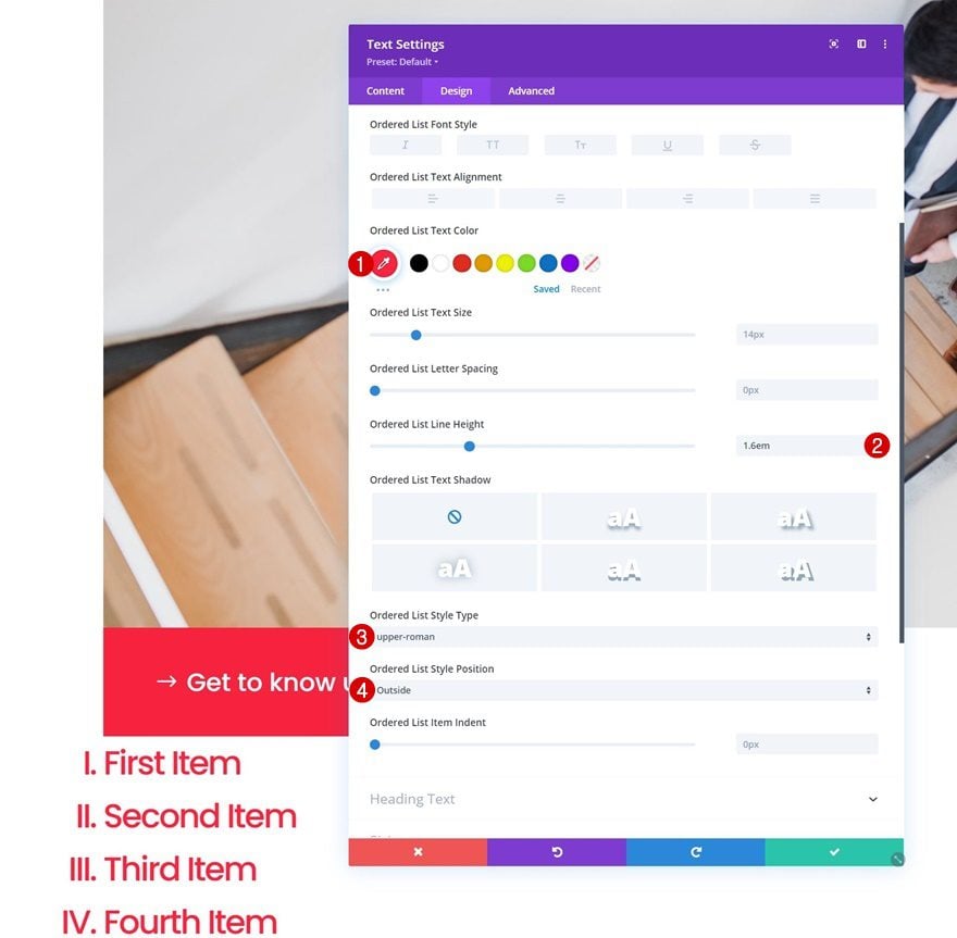
Ordered List Text Settings
Make some changes to the ordered list text settings too.
- Ordered List Text Color: #ff2340
- Ordered List Line Height: 1.6em
- Ordered List Style Type: upper-roman
- Ordered List Style Position: Outside
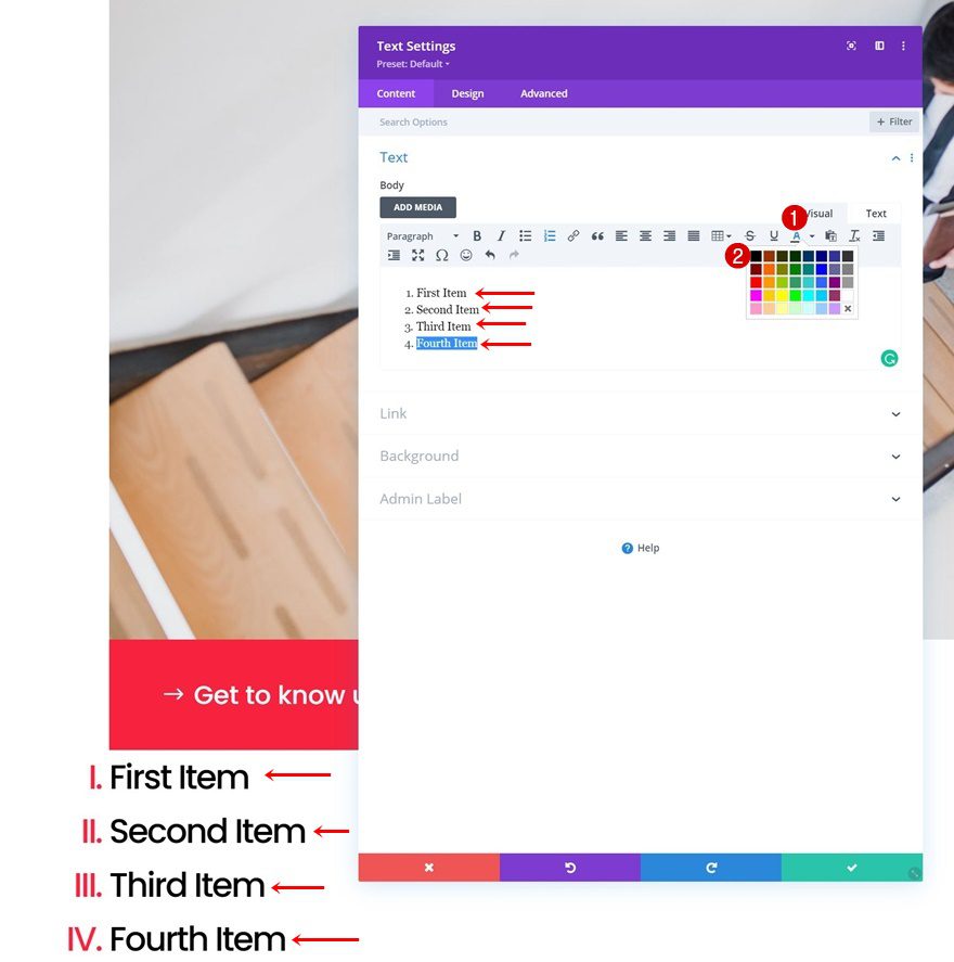
Add Black Text Color to List Items Individually in Content Box
Then, we’ll turn the items back to black by navigating to the content box and manually adding a black text color to each one of the list items.
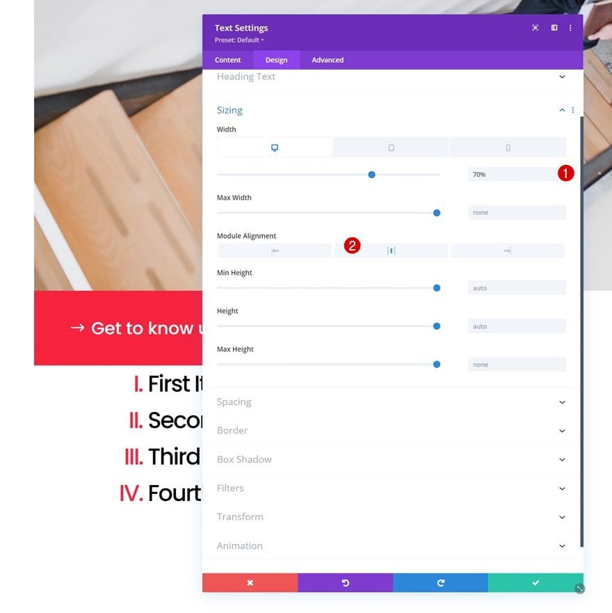
Sizing
Next, we’ll change the sizing settings across different screen sizes.
- Width:
- Desktop: 70%
- Tablet & Phone: 90%
- Module Alignment: Center
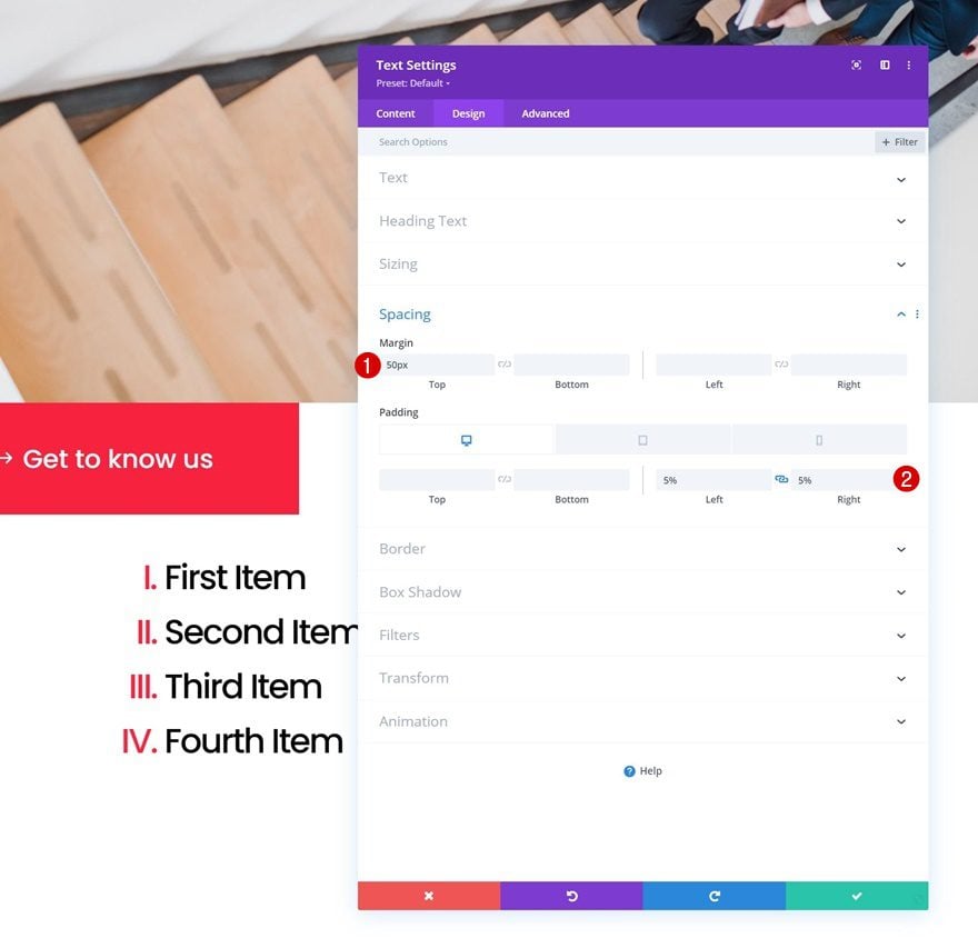
Spacing
We’ll apply some custom margin and padding values to the module’s spacing settings too.
- Top Margin: 50px
- Left Padding: 5%
- Right Padding: 5%
2. Apply Sticky Effect to Section Title
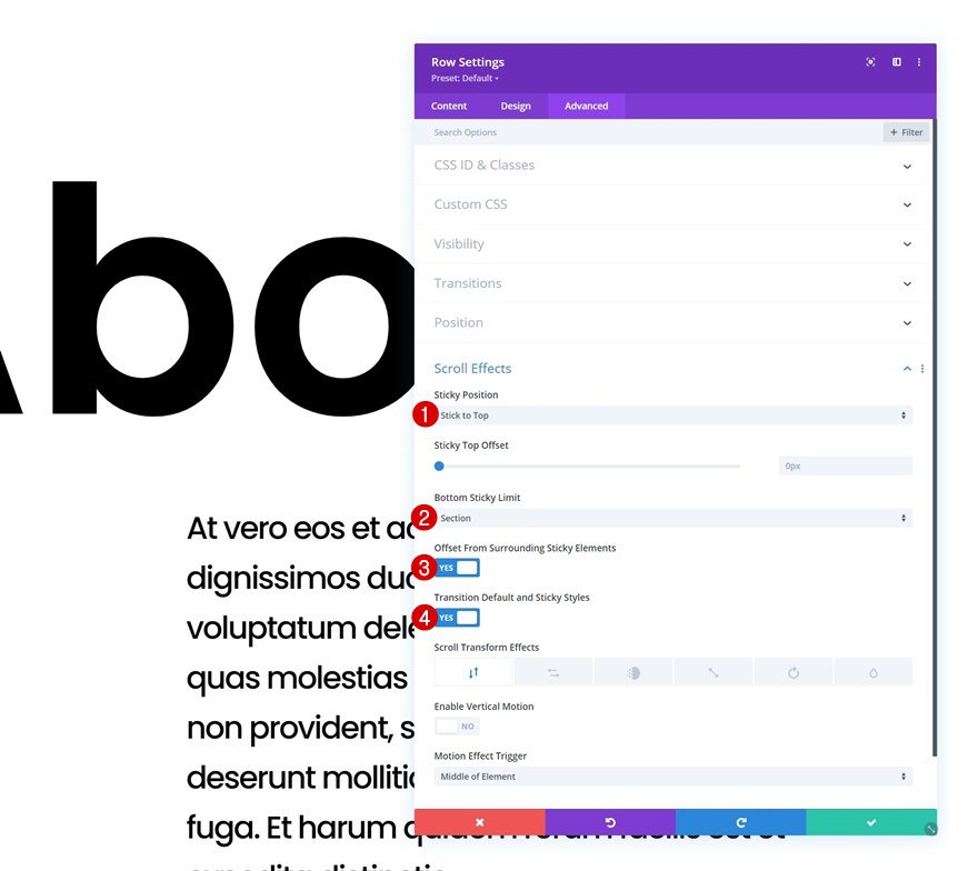
Add Sticky Effect to Row
Now that we’ve set up the foundation of our design, it’s time to make the effect happen that you were able to see in the preview of this post. To do that, we’ll turn our entire first row sticky by opening the row settings, going to the advanced tab and applying the following settings:
- Sticky Position: Stick to Top
- Bottom Sticky Limit: Section
- Offset From Surrounding Sticky Elements: Yes
- Transition Default and Sticky Styles
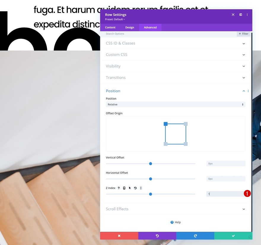
Modify Row Z Index
To make sure the sticky row remains below the second row in our design, we’ll assign a z index of “1” to our sticky row. When scrolling, you’ll see the sticky row and its Text Module go below the second row’s modules.
- Z Index: 1
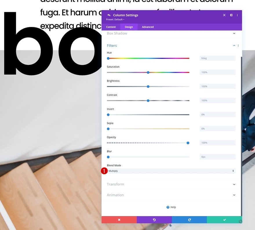
Add Column 2 Blend Mode (Row #2)
However, as you could notice in the preview of this post, the sticky section title is visible at all times. To achieve that effect, we’ll add a blend module to the second column of our second row. This will help blend the sticky row and the modules in the second row, while still maintaining a low z index for the sticky row.
- Blend Mode: Multiply
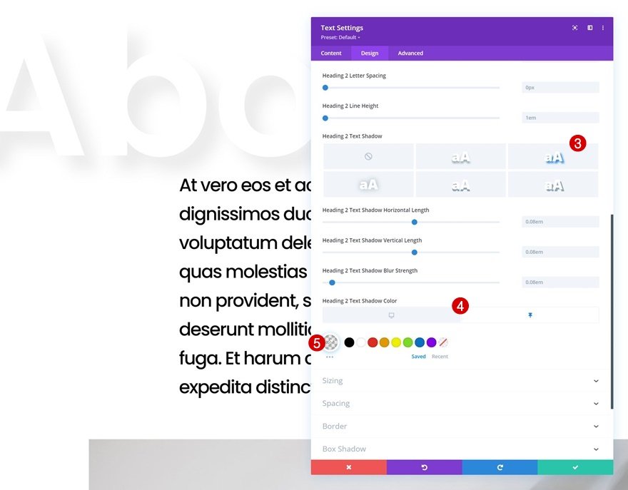
Change Sticky H2 Text Settings
We’ll apply some sticky styles to our Text Module in row #1 too. Start by changing the H2 text color in a sticky state and apply a custom text shadow as well.
- Sticky H2 Text Color: #ffffff
- Heading 2 Text Shadow: Second Option (See Print Sreen Below)
- Heading 2 Text Shadow Color:
- Default: rgba(0,0,0,0)
- Sticky: rgba(0,0,0,0.08)
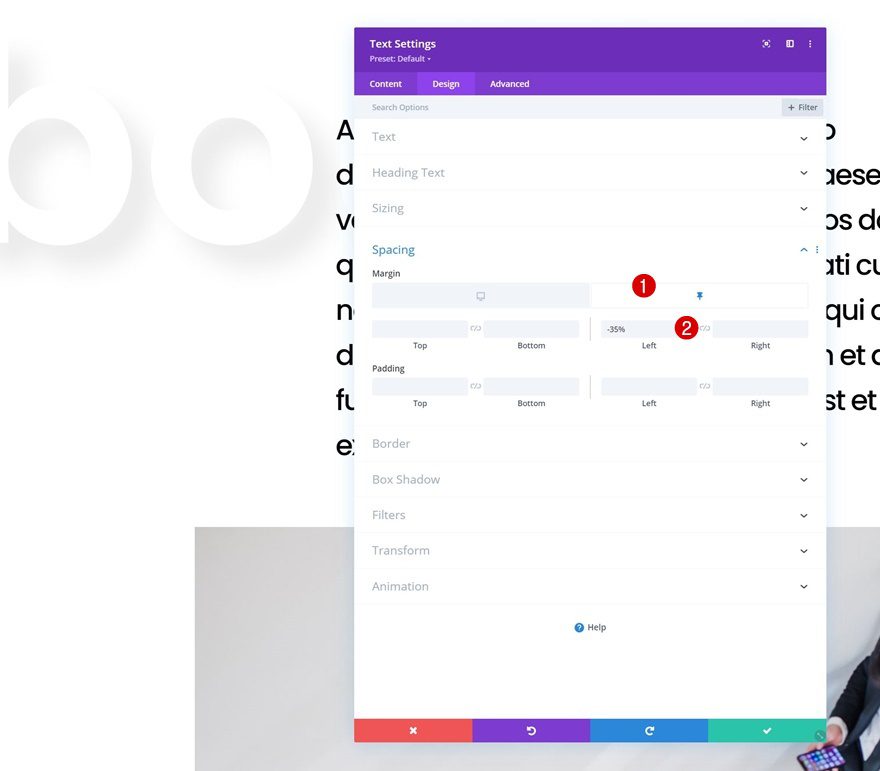
Change Sticky Text Module Spacing
We’ll change the module’s position as well using some negative sticky left margin in the spacing settings
- Sticky Left Margin: -35%
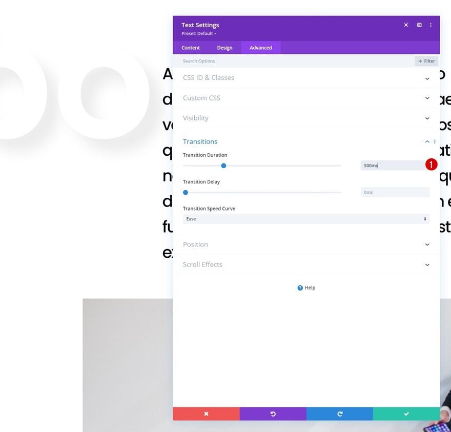
Increase Text Module Transition Duration
And to assure a smooth transition, we’ll increase the transition duration in the advanced tab.
- Transition Duration: 500ms
3. Reuse Section
Clone Section
Now that we have one completed section, including sticky section title, we can reuse the entire section up to as many times as we want by cloning it.
Change Title Content
Make sure you change the title content in the first row.
Match Text Size to Character Length
Depending on how many characters your new H2 title has, you might want to adjust the heading 2 text size.
Change All Other Content & Images
And of course, you’ll need to change all other content in the duplicate section as well. That’s it!
Preview
Now that we’ve gone through all the steps, let’s take a final look at the outcome across different screen sizes.
Desktop
Mobile
Final Thoughts
In this post, we’ve shown you how to get creative with Divi’s sticky options. More specifically, we’ve shown you how to create sticky section titles that follow your visitors throughout the design you’re creating. This effect gives your design an extra dimension and a seamless transition. You were able to download the JSON file for free as well! If you have any questions or suggestions, feel free to leave a comment in the comment section below.
If you’re eager to learn more about Divi and get more Divi freebies, make sure you subscribe to our email newsletter and YouTube channel so you’ll always be one of the first people to know and get benefits from this free content.
The post How to Create Sticky Section Titles with Divi appeared first on Elegant Themes Blog.