
Your page’s hero section usually sets the bar for the rest of the page. It also plays a major role in your visitors’ first impression. With Divi, you can create amazing hero sections using the built-in options only. Now, if you’re looking for a way to make your next hero section stand out, you’ll love this post. We’re going to show you how to create an effective and beautiful hero section design while playing around with Divi’s row borders. You’ll be able to download the design JSON file for free as well!
Let’s get to it.
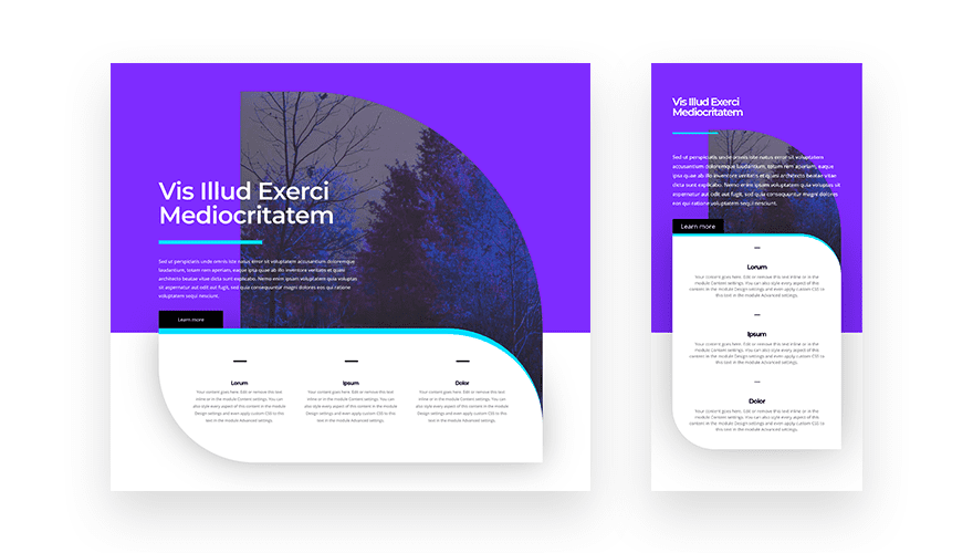
Preview
Before we dive into the tutorial, let’s take a quick look at the outcome across different screen sizes.
Download The Hero Section Layout for FREE
To lay your hands on the FREE hero section layout, you will first need to download it using the button below. To gain access to the download you will need to subscribe to our Divi Daily email list by using the form below. As a new subscriber, you will receive even more Divi goodness and a free Divi Layout pack every Monday! If you’re already on the list, simply enter your email address below and click download. You will not be “resubscribed” or receive extra emails.
@media only screen and ( max-width: 767px ) {.et_bloom .et_bloom_optin_1 .carrot_edge.et_bloom_form_right .et_bloom_form_content:before, .et_bloom .et_bloom_optin_1 .carrot_edge.et_bloom_form_left .et_bloom_form_content:before { border-top-color: #ffffff !important; border-left-color: transparent !important; }
}.et_bloom .et_bloom_optin_1 .et_bloom_form_content button { background-color: #f92c8b !important; } .et_bloom .et_bloom_optin_1 .et_bloom_form_content .et_bloom_fields i { color: #f92c8b !important; } .et_bloom .et_bloom_optin_1 .et_bloom_form_content .et_bloom_custom_field_radio i:before { background: #f92c8b !important; } .et_bloom .et_bloom_optin_1 .et_bloom_border_solid { border-color: #f7f9fb !important } .et_bloom .et_bloom_optin_1 .et_bloom_form_content button { background-color: #f92c8b !important; } .et_bloom .et_bloom_optin_1 .et_bloom_form_container h2, .et_bloom .et_bloom_optin_1 .et_bloom_form_container h2 span, .et_bloom .et_bloom_optin_1 .et_bloom_form_container h2 strong { font-family: “Open Sans”, Helvetica, Arial, Lucida, sans-serif; }.et_bloom .et_bloom_optin_1 .et_bloom_form_container p, .et_bloom .et_bloom_optin_1 .et_bloom_form_container p span, .et_bloom .et_bloom_optin_1 .et_bloom_form_container p strong, .et_bloom .et_bloom_optin_1 .et_bloom_form_container form input, .et_bloom .et_bloom_optin_1 .et_bloom_form_container form button span { font-family: “Open Sans”, Helvetica, Arial, Lucida, sans-serif; } p.et_bloom_popup_input { padding-bottom: 0 !important;}

Download For Free
Join the Divi Newlsetter and we will email you a copy of the ultimate Divi Landing Page Layout Pack, plus tons of other amazing and free Divi resources, tips and tricks. Follow along and you will be a Divi master in no time. If you are already subscribed simply type in your email address below and click download to access the layout pack.
You have successfully subscribed. Please check your email address to confirm your subscription and get access to free weekly Divi layout packs!
Let’s Start Recreating!
Add New Section
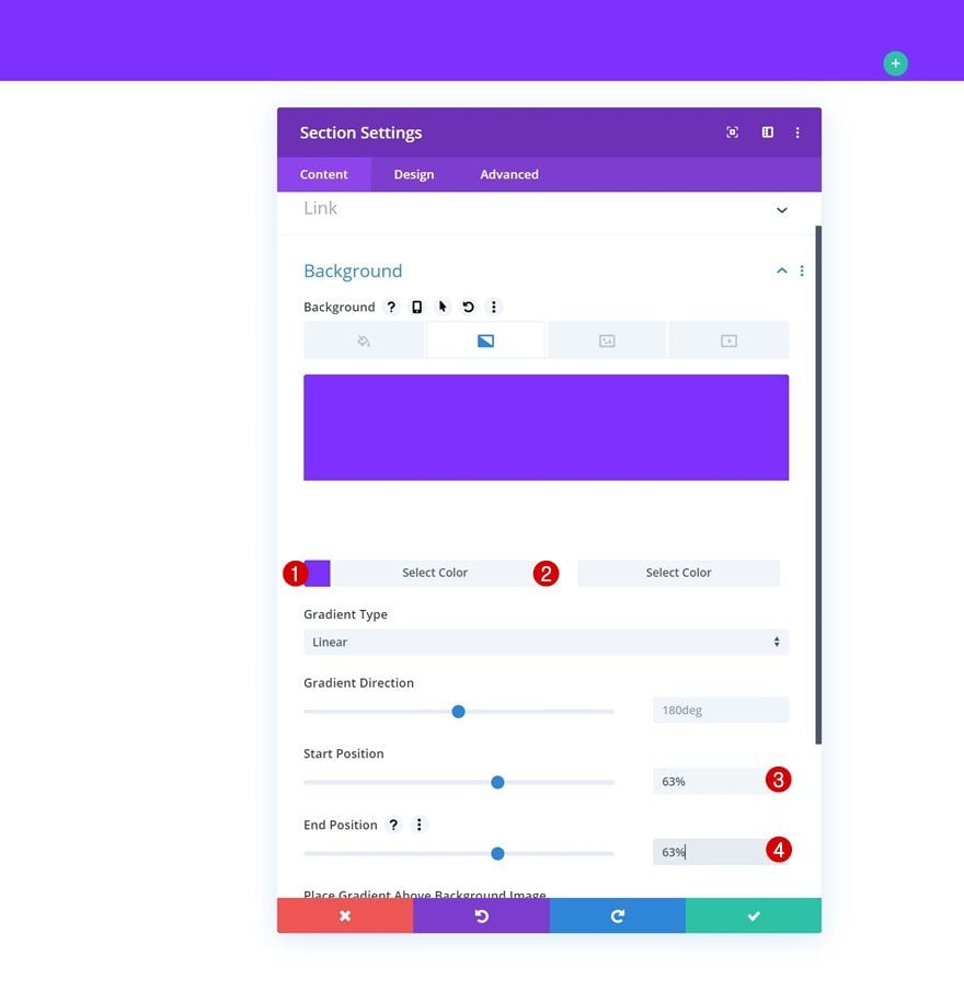
Gradient Background
Go ahead and create a new page or open an existing one. Add a new regular section, open the section settings and add the following gradient background:
- Color 1: #7e2dff
- Color 2: #ffffff
- Start Position: 63%
- End Position: 63%
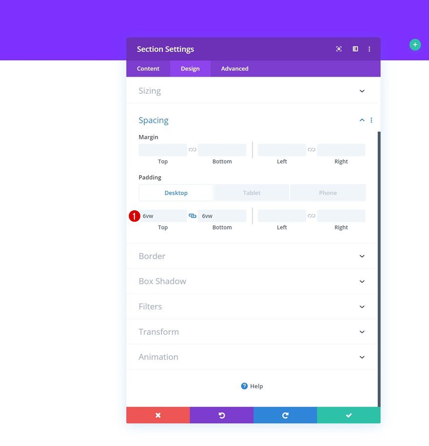
Spacing
Move on to the design tab and add some custom top and bottom padding across different screen sizes.
- Top Padding: 6vw (Desktop), 13vw (Tablet), 32vw (Phone)
- Bottom Padding: 6vw (Desktop), 10vw (Tablet), 20vw (Phone)
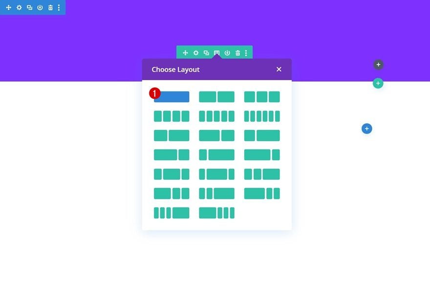
Add Row #1
Column Structure
Continue by adding a new row using the following column structure:
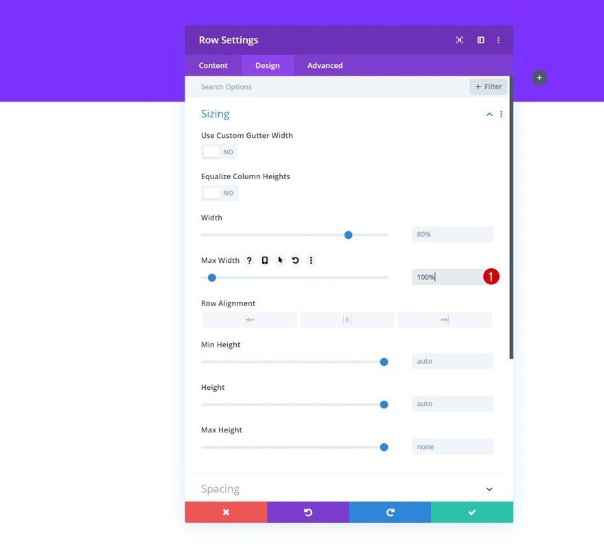
Sizing
Without adding any modules yet, open the row settings and modify the max width.
- Max Width: 100%
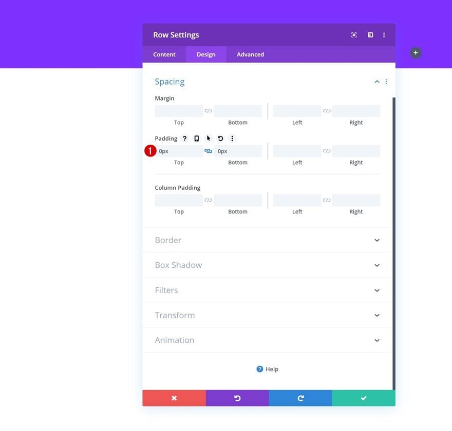
Spacing
Remove the default top and bottom padding of the row as well.
- Top Padding: 0px
- Bottom Padding: 0px
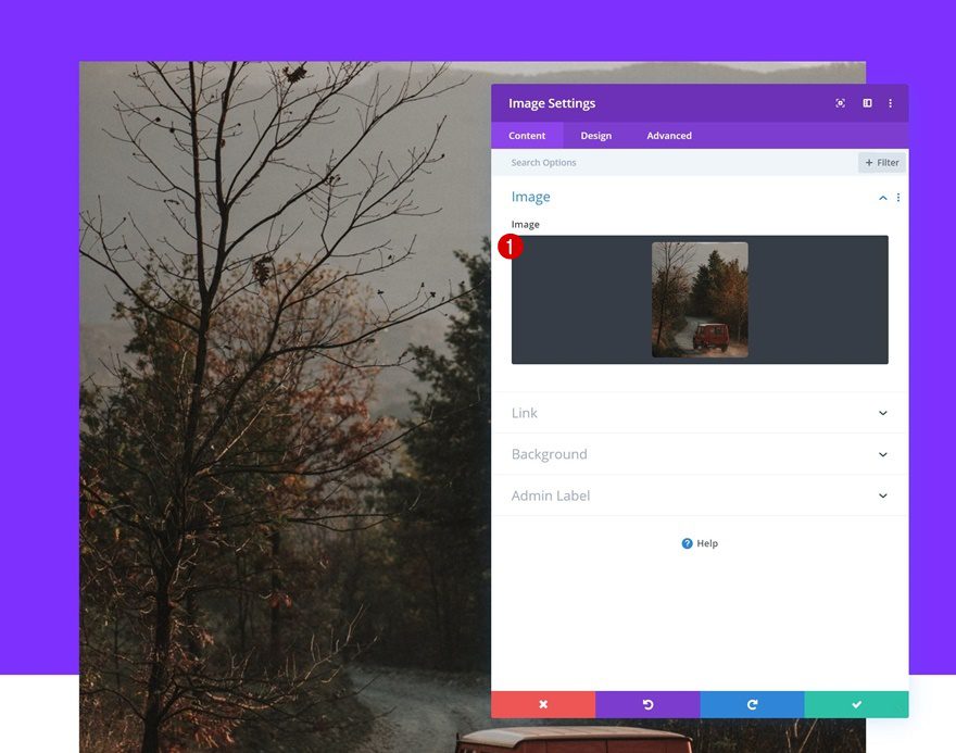
Add Image Module to Column
Upload Image
Time to start adding modules! The first module we need is an Image Module. Upload the image which you can find in the zipped folder you were able to download at the beginning of this tutorial. If you prefer using another image, make sure you’re using a width of 1160px and a height of 1385px.
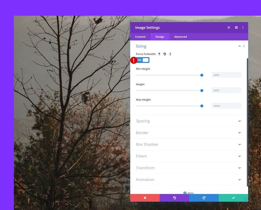
Sizing
Move on to the design tab of the Image Module and enable the ‘Force Fullwidth’ option.
- Force Fullwidth: Yes
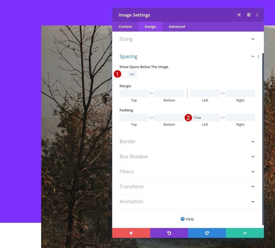
Spacing
Modify the spacing settings next.
- Show Space Below The Image: No
- Left Padding: 17vw
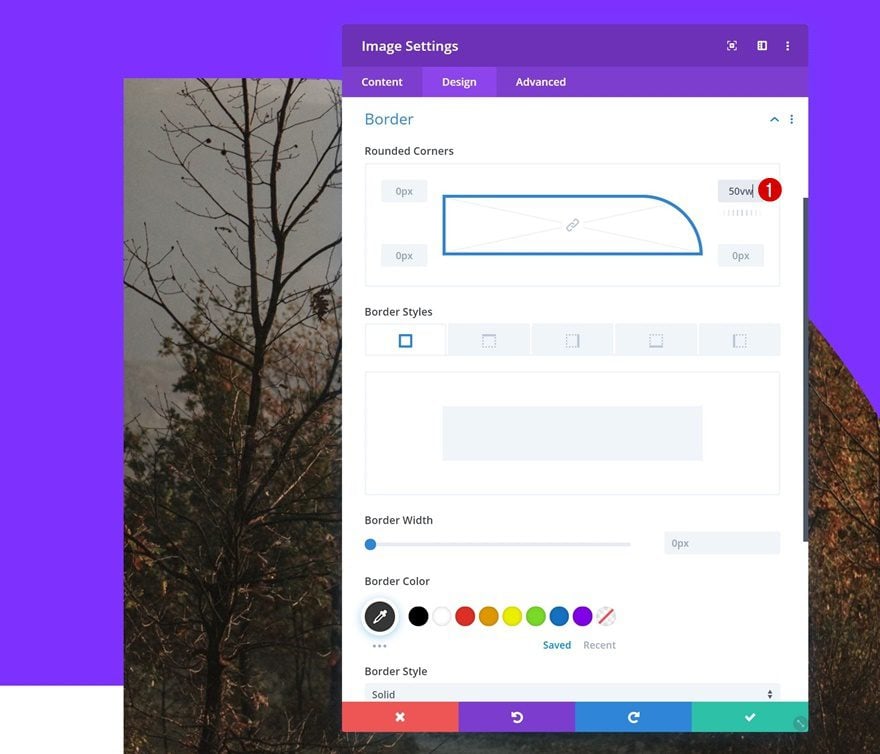
Border
And add ’50vw’ to the top right corner of the Image Module.
Filters
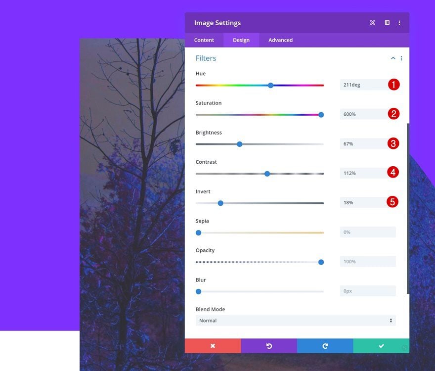
We’re also changing the colors of our image to match our color palette. Open the filters settings and apply the following settings:
- Hue: 211deg
- Saturation: 600%
- Brightness: 67%
- Contrast: 112%
- Invert: 18%
Add Text Module #1 to Column
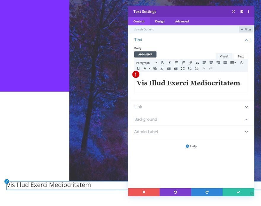
Add H1 Content
The second module we need in this row is a Text Module with some H1 content.
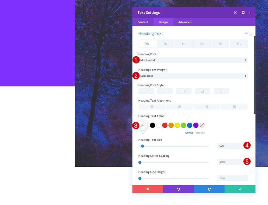
H1 Text Settings
Move on to the design tab and change the H1 text settings accordingly:
- Heading Font: Montserrat
- Heading Font Weight: Semi Bold
- Heading Text Color: #ffffff
- Heading Text Size: 5vw
- Heading Letter Spacing: -2px
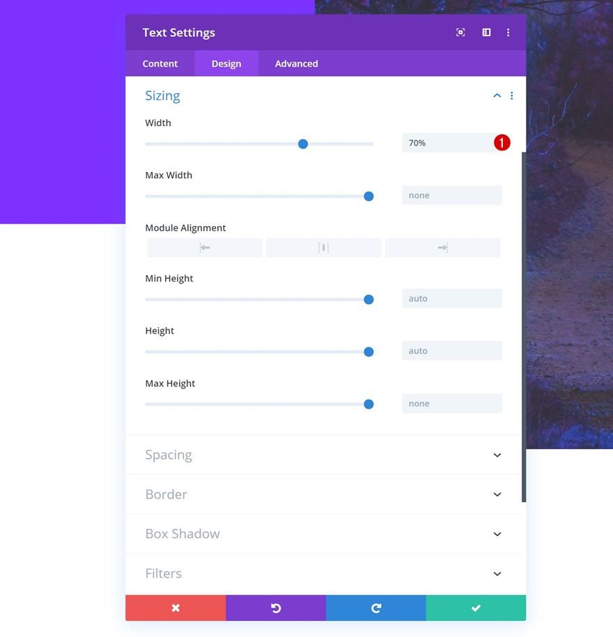
Sizing
Modify the width of the module next.
- Width: 70%
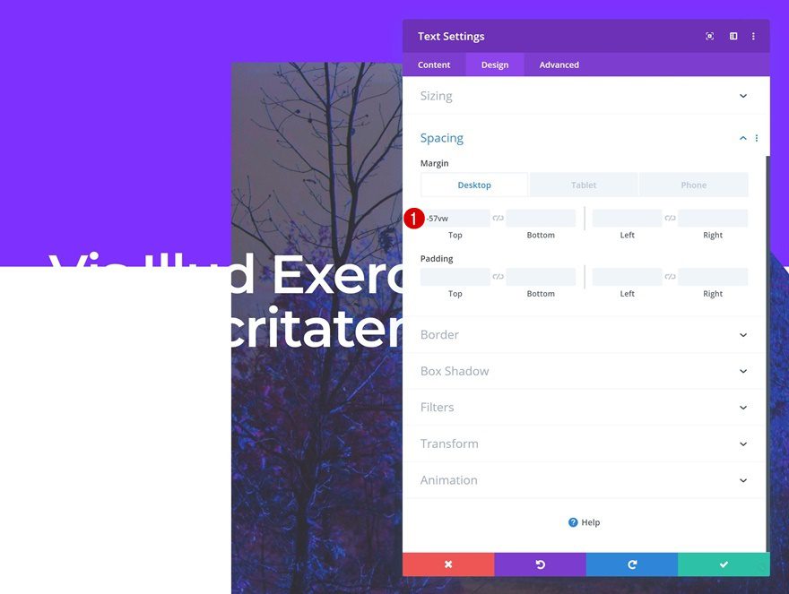
Spacing
And create an overlap between this and the previous module using some negative top margin.
- Top Margin: -57vw (Desktop), -75vw (Tablet), -91vw (Phone)
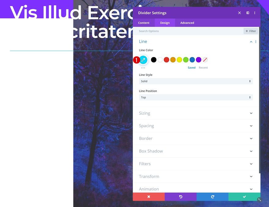
Add Divider Module to Column
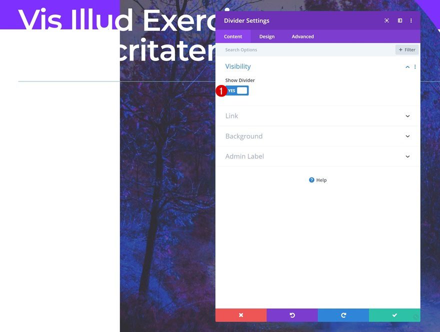
Visibility
The next module we need is a Divider Module. Make sure the ‘Show Divider’ option is enabled.
- Show Divider: Yes
Line
Change the line color next.
- Line Color: #00dcff
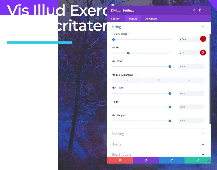
Sizing
Modify the sizing settings as well.
- Divider Weight: 0.8vw
- Width: 27%
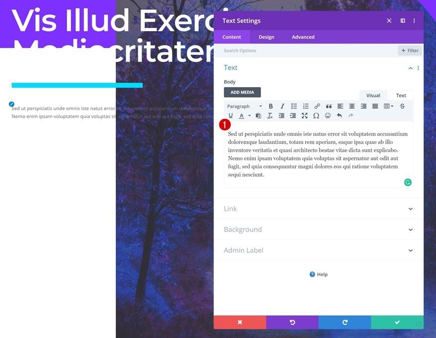
Add Text Module #2 to Column
Add Paragraph Content
Continue by adding a new Text Module with some paragraph content of your choice.
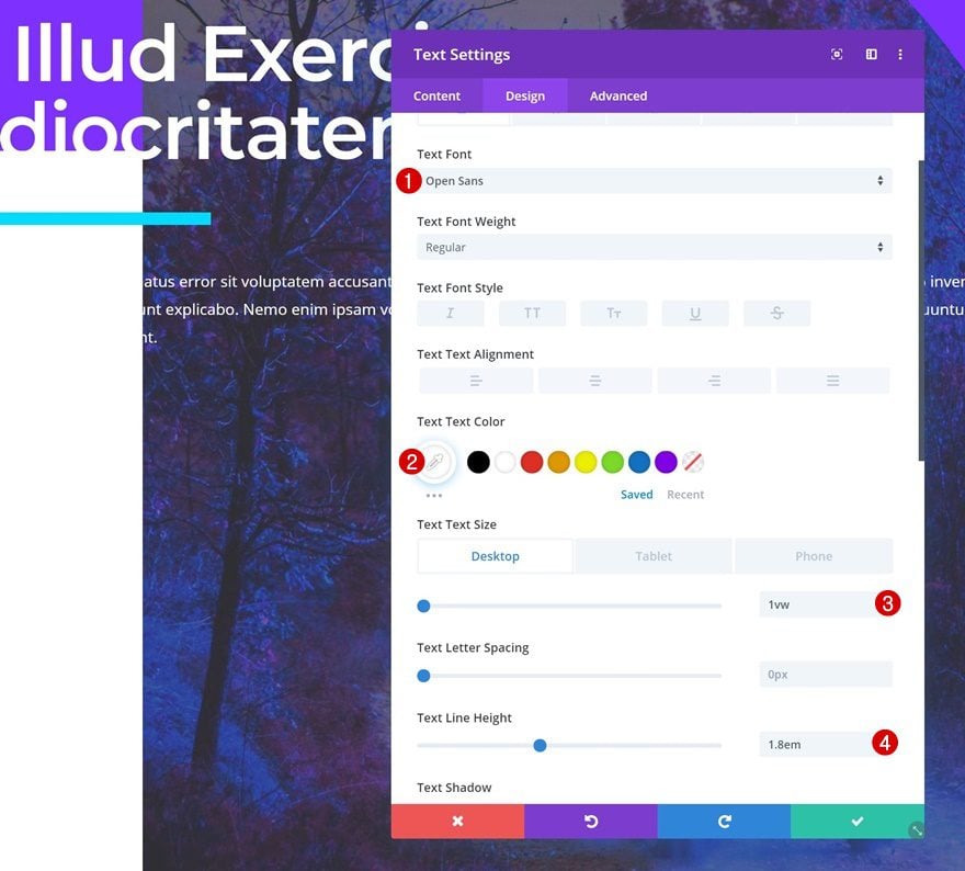
Text Settings
Move on to the design tab and change the text settings accordingly:
- Text Font: Open Sans
- Text Color: #ffffff
- Text Size: 1vw (Desktop), 2vw (Tablet), 2.5vw (Phone)
- Text Line Height: 1.8em
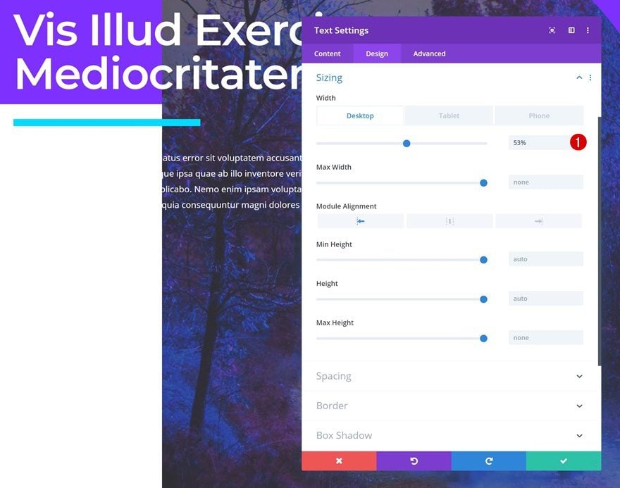
Sizing
Modify the width of the module as well.
- Width: 53% (Desktop), 65% (Tablet), 100% (Phone)
Add Button Module to Column
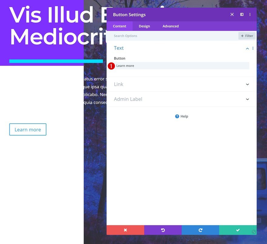
Add Copy
The next and last module we need in this row is a Button Module. Add some copy of your choice.
Button Settings
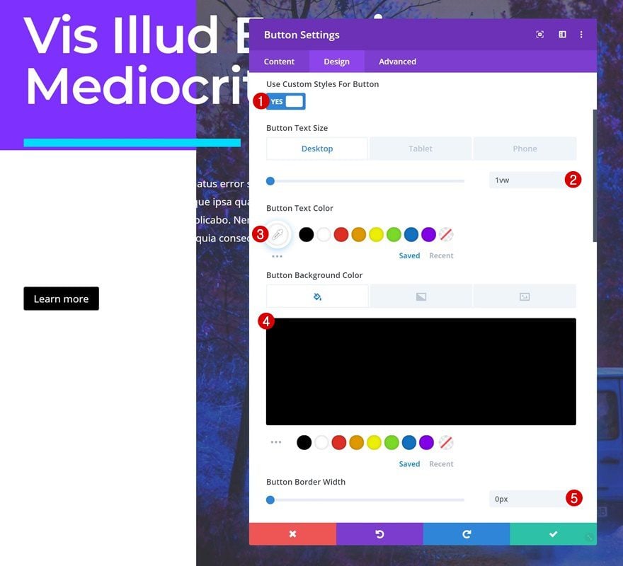
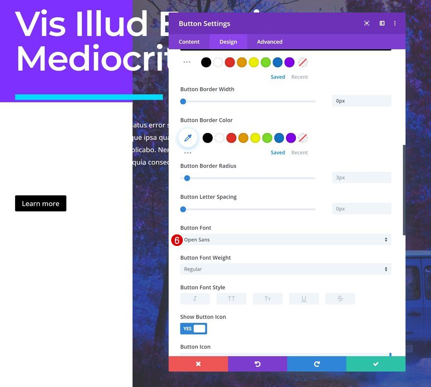
Go to the button settings next and change the style of your button accordingly:
- Use Custom Styles For Button: Yes
- Button Text Size: 1vw (Desktop), 2vw (Tablet), 3vw (Phone)
- Button Text Color: #ffffff
- Button Background Color: #000000
- Button Border Width: 0px
- Button Font: Open Sans
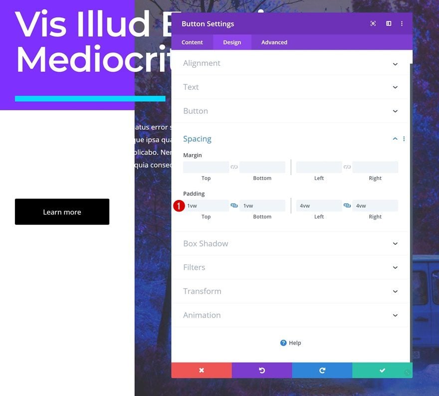
Spacing
Add some custom padding values as well.
- Top Padding: 1vw
- Bottom Padding: 1vw
- Left Padding: 4vw
- Right Padding: 4vw
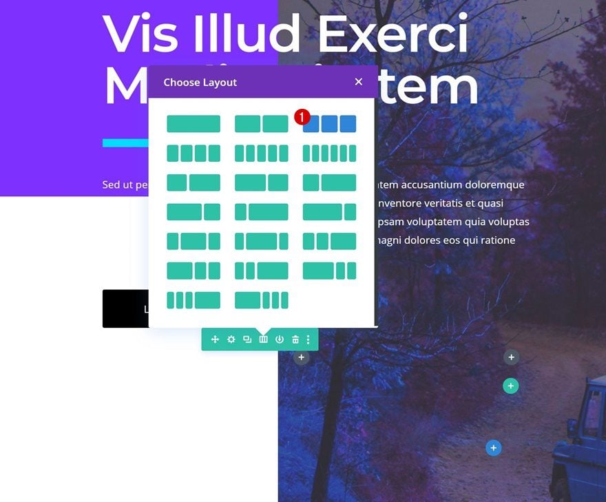
Add Row #2
Column Structure
On to the next row! Choose the following column structure:
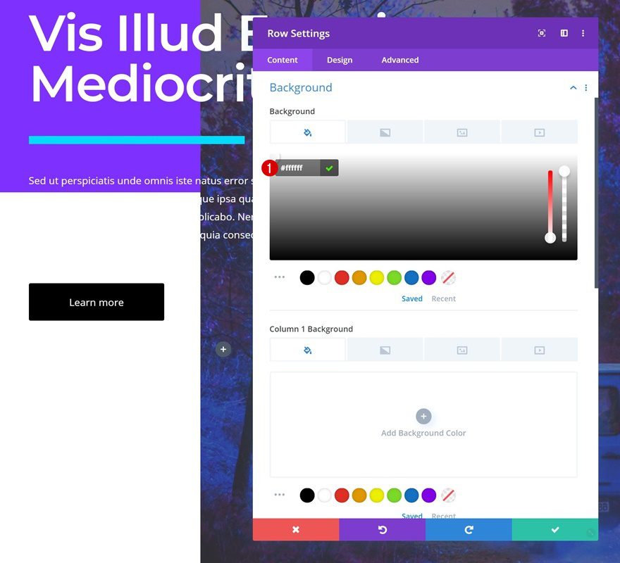
Background Color
Without adding any modules yet, open the row settings. Change the background color into white.
- Background Color: #ffffff
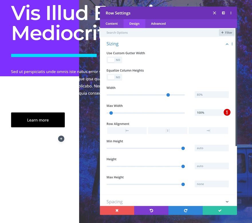
Sizing
Move on to the design tab and increase the max width.
- Max Width: 100%
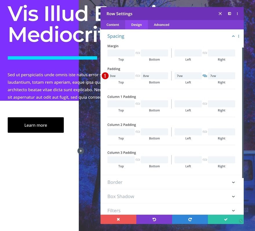
Spacing
Add some custom padding values next.
- Top Padding: 3vw
- Bottom Padding: 8vw
- Left Padding: 7vw
- Right Padding: 7vw
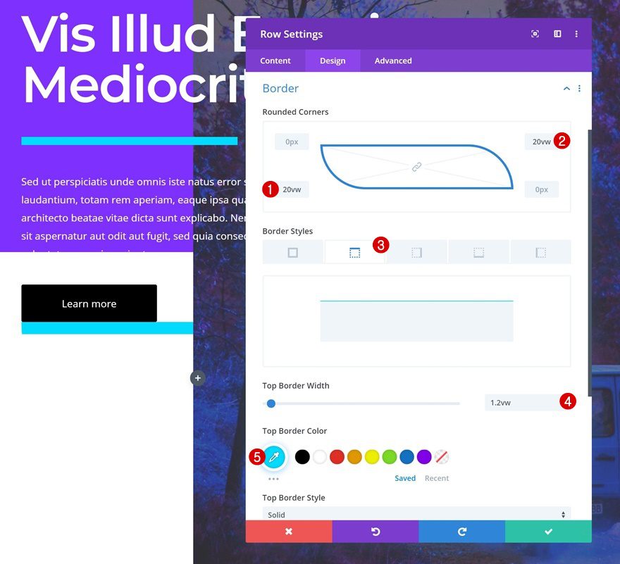
Border
We’ll continue by adding ’20vw’ to the bottom left and top right corners of the row. We’ll add a top border using the following settings as well:
- Top Border Width: 1.2vw
- Top Border Color: #00dcff
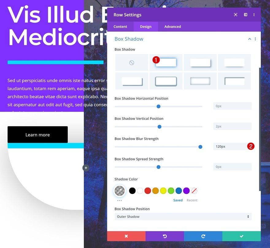
Box Shadow
We’re also adding a subtle box shadow to create depth on the page.
- Box Shadow Blur Strength: 120px
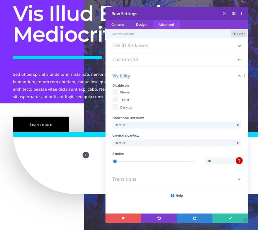
Z Index
To make sure the row appears on top of the Image Module, we’re going to increase the row Z Index in the visibility settings.
- Z Index: 10
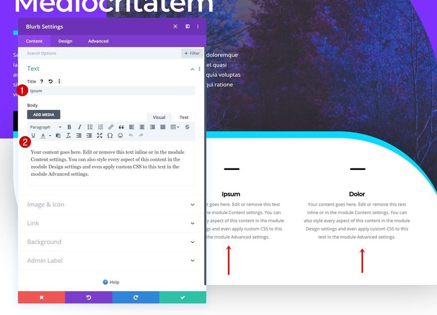
Add Blurb Module to Column 1
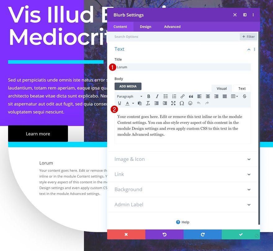
Add Content
Once you’ve completed the row settings, you can add a Blurb Module to the row’s first column. Enter some content of your choice.
Select Icon
Select an icon of your choice next.
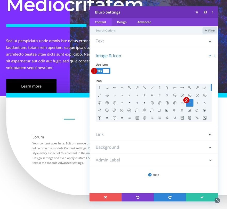
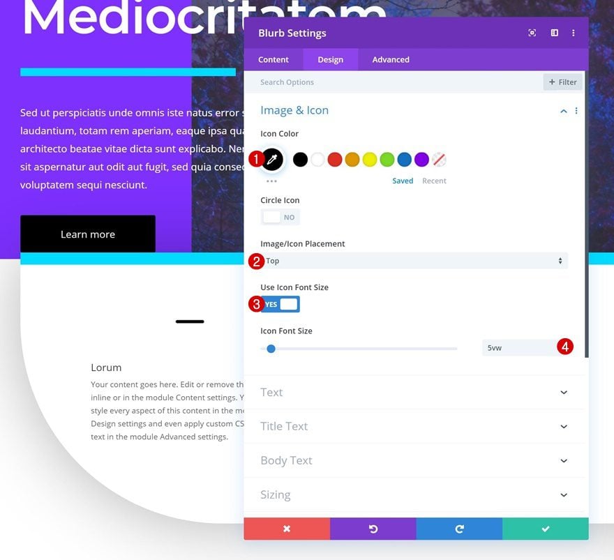
Icon Settings
Move on to the design tab and change the icon settings.
- Icon Color: #000000
- Icon Placement: Top
- Use Icon Font Size: Yes
- Icon Font Size: 5vw
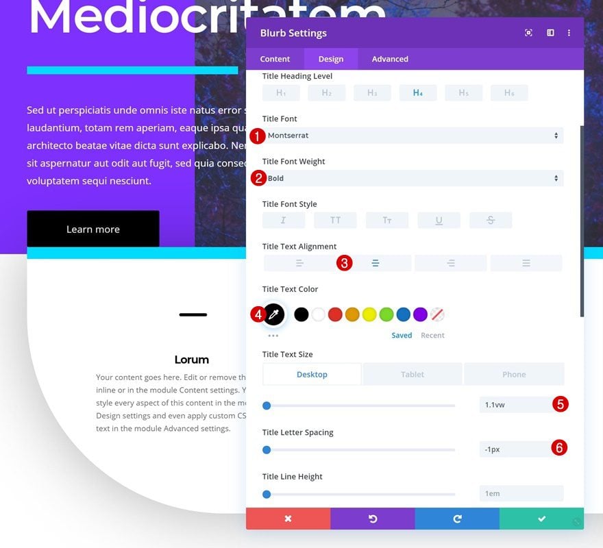
Title Text Settings
Modify the title settings too.
- Title Font: Montserrat
- Title Font Weight: Bold
- Title Text Alignment: Center
- Title Text Color: #000000
- Title Text Size: 1.1vw (Desktop), 2.5vw (Tablet), 3vw (Phone)
- Title Letter Spacing: -1px
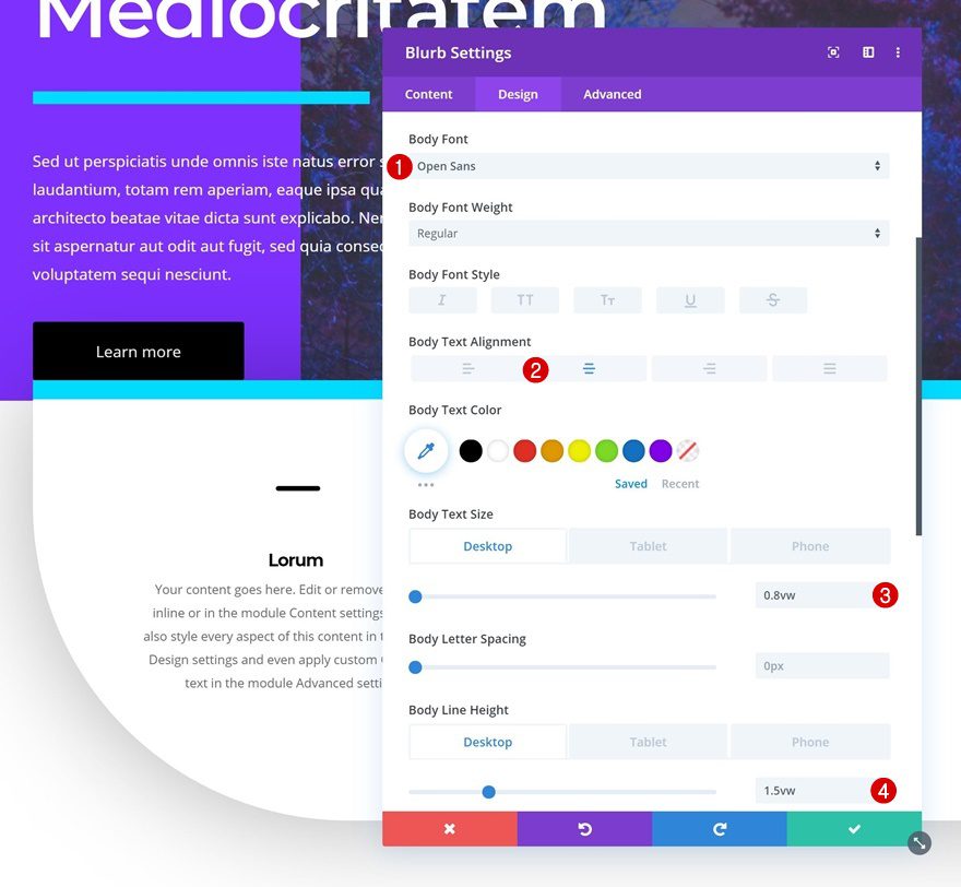
Body Text Settings
Along with the body text settings.
- Body Font: Open Sans
- Body Text Alignment: Center
- Body Text Size: 0.8vw (Desktop), 1.6vw (Tablet), 2vw (Phone)
- Body Line Height: 1.5vw (Desktop), 3vw (Tablet & Phone)
Clone Blurb Module Twice & Place Duplicates in Remaining Columns
Once you’ve completed the Blurb Module in column 1, you can clone it twice and place the duplicates in the two remaining columns of the row.
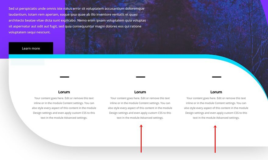
Change Content
Make sure you change the content of both duplicates and you’re done!
Preview
Now that we’ve gone through all the steps, let’s take a final look at the outcome across different screen sizes.
Final Thoughts
In this post, we’ve shown you how to get creative with Divi’s built-in row borders to create a stunning hero section that you can use for your next Divi project. We’ve recreated a beautiful example from scratch and you were also able to download the JSON file for free. If you have any questions or suggestions, make sure you leave a comment in the comment section below!
If you’re eager to learn more about Divi and get more Divi freebies, make sure you subscribe to our email newsletter and YouTube channel so you’ll always be one of the first people to know and get benefits from this free content.
The post How to Creatively Use Divi’s Row Borders to Create a Stunning Hero Section Design appeared first on Elegant Themes Blog.