A product comparison chart can be an extremely effective way to promote new products along with their upgraded features. The visual aspect of a chart is more appealing to users than simple text. And the structure of a side-by-side comparison allows users to see the difference between each product feature with ease.
In this tutorial, I’m going to show you how to design a creative product comparison chart with Divi. And this design layout can be used for comparing just about anything. For example, I can see this being a perfect layout for case studies as well.
Let’s get started.
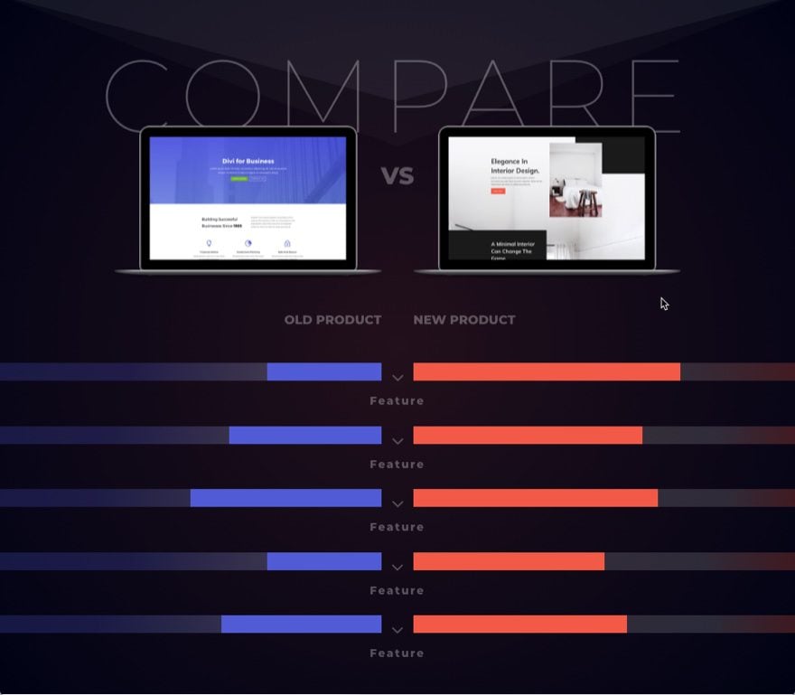
Sneak Peek
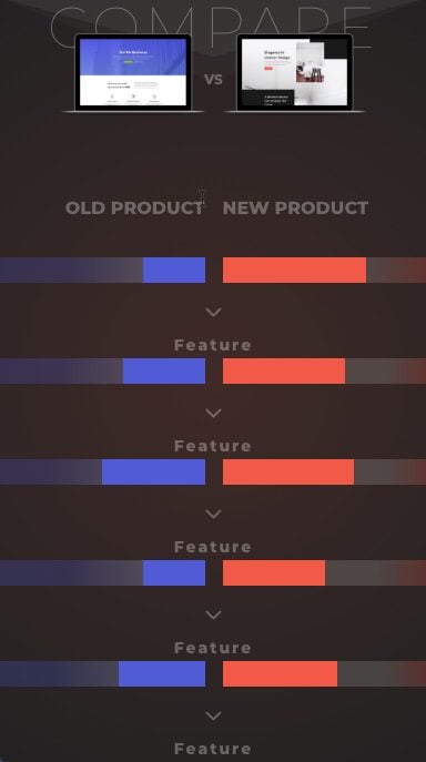
Here is a sneak peek of the comparison chart I will build in this tutorial.

What You Need for This Tutorial
For this tutorial, you need the following:
- Divi Theme (Installed and Active)
- Two Images (about 800px by 450px) to serve as your product images in the comparison chart.
Creating your Heading and Product Images
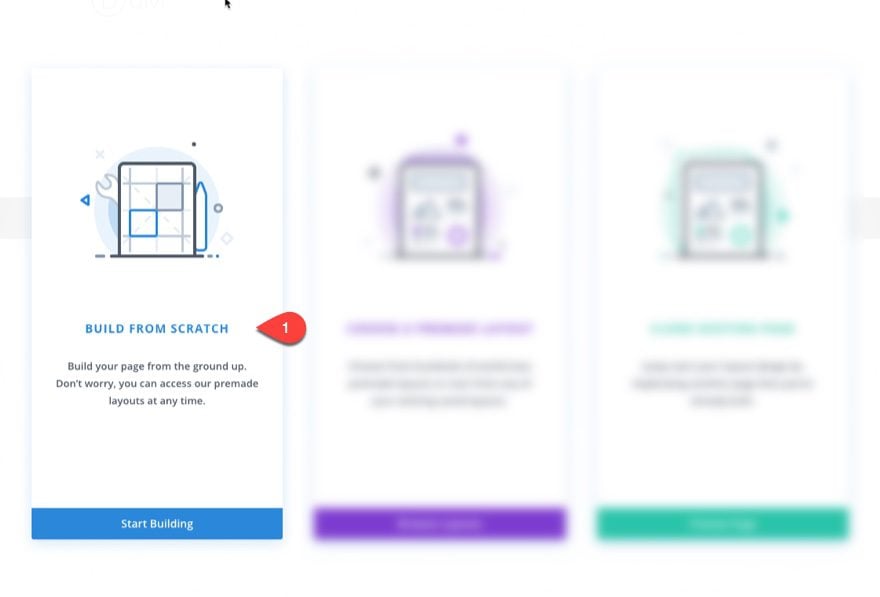
For starters, create a new page, deploy the Visual Builder, then choose to build your page from scratch.
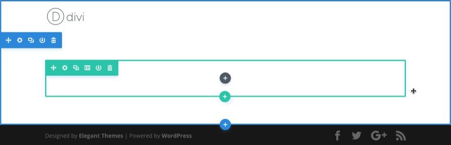
Next add a one column layout to your row of your section.
Before we add a module, let’s go to the section setting and update the following:
Background Color: #222222
Background Gradient Color Left: rgba(242,90,71,0.14)
Background Gradient Color Right: rgba(255,255,255,0)
Gradient Type: Radial
Place Gradient Above Background Image: YES
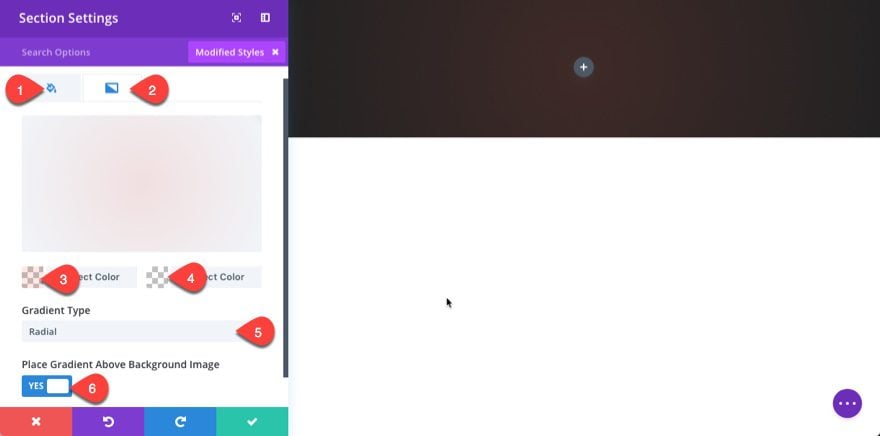
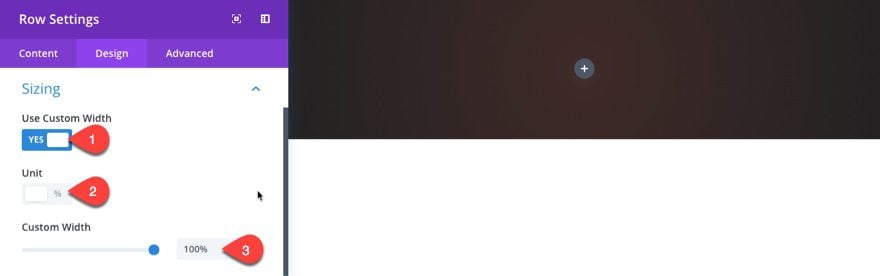
Save settings. Now open up your row settings and give your row a custom width of 100%.
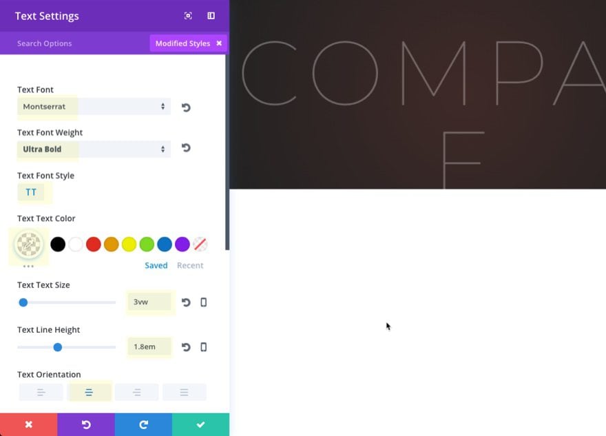
Then add a text module to your one column row with the following settings:
For the content, enter this html:
<h2>Compare</h2>
VS
Text Font: Montserrat
Text Font Weight: Ultra Bold
Text Font Style: TT (Uppercase)
Text Text Color: rgba(255,255,255,0.3)
Text Text Size: 3vw
Text Line Height: 1.8em
Text Orientation: Center
Next update the h2 heading design options and give your module a custom bottom margin to create the overlapping effect.
Heading 2 Font: Montserrat
Heading 2 Text Color: rgba(255,255,255,0.3)
Heading 2 Text Size: 13vw
Heading 2 Letter Spacing: 1vw
Custom Margin: -13vw Bottom
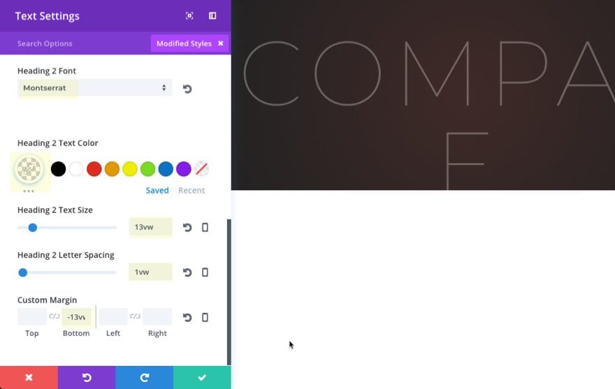
Part of your text will be hidden for now, but it will show up once we add the other content.
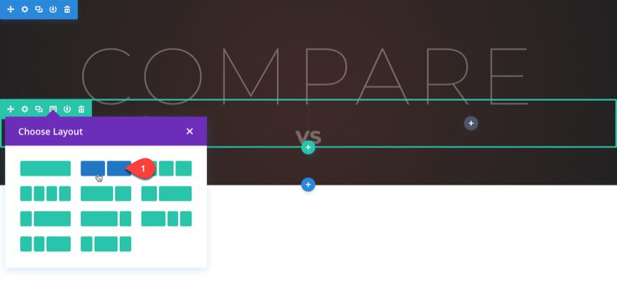
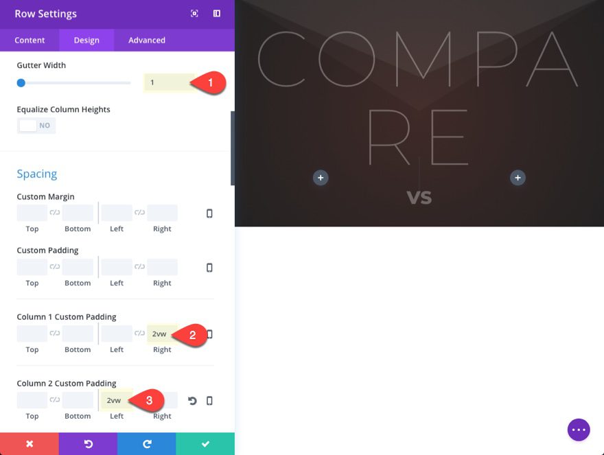
Two create our second row duplicate the first row and then delete the text module inside the duplicated row. Then update the column structure to a two-column row.
Go ahead and update your row settings as follows:
Custom Gutter Width: 1
Column 1 Custom Padding: 2vw Right
Column 2 Custom Padding: 2vw Left
This is where we are going to put the images of our two products we wish to compare. In the left column of our row, add your image using the image module. For this example, I’m using an png image that is 800px by 459px. Then update the image module settings as follows:
Width: 70%
Module Alignment: Right
Custom Padding: 40px Bottom
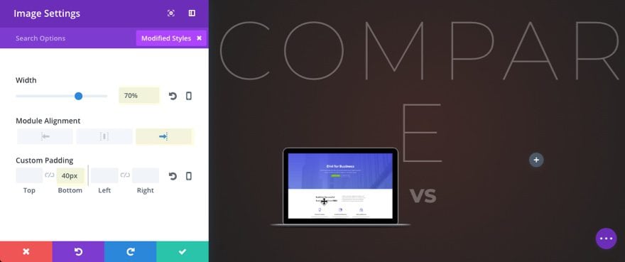
Then copy the module and paste it into the right column. Change the image and then adjust the module alignment to left.

Under the image module in the left column, add a text module with the following text content: “Old Product”.
Then go into the text module in the first row above and copy the text styles.
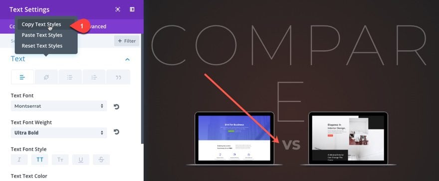
Then hover over the new text module with the text “Old Product” and paste the text styles to the module using right click.
This will match the text styles we need a lot quicker. Now all we need to do is
update the text size and alignment:
Text Text Size: 16px
Text Orientation: Right
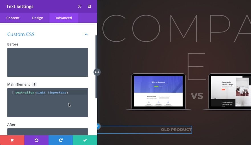
Now go to the advanced tab and put the following custom CSS into the Main Element input box:
text-align:right !important;
This is necessary because Divi will adjust the text alignment to left on smartphones by default. This CSS snippet will override this and make sure it stays right aligned on smartphone as well.
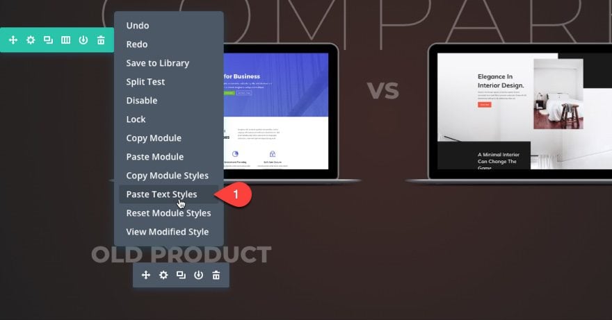
Save settings. Then copy the text module and paste it under the image in the right column. Change the text content to “New Product” and update the text orientation to “Left”.
Here is what we have so far.

Creating the Product Comparison Chart
To create our comparison chart we are going to use a sequence of two column rows each separated by a one column row. The two column rows will hold our colored bars. And the one column row will display the name of the feature associated with the bar values.
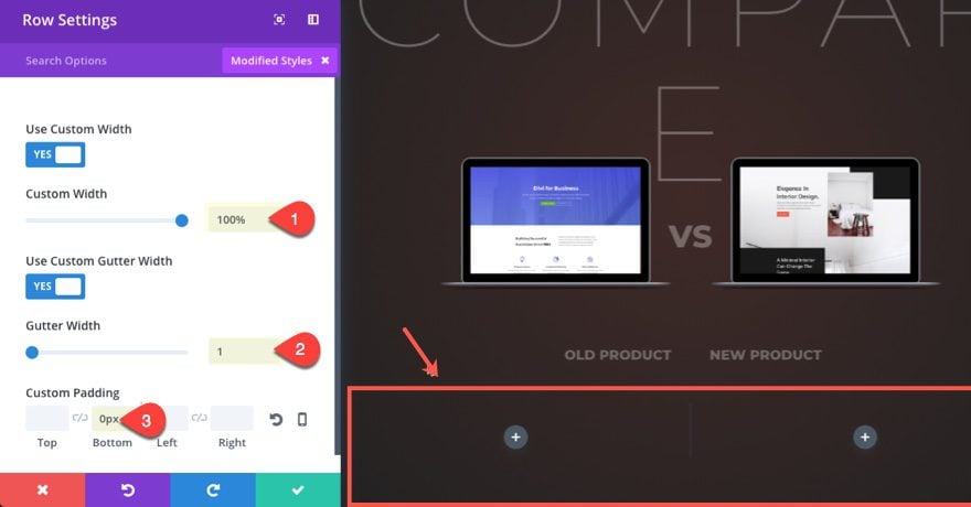
Create a new two column row and update the row settings as follows:
Custom Width: 100%
Gutter Width: 1
Custom Padding: 0px Bottom
Column 1 Custom Padding: 2vw Right
Column 2 Custom Padding: 2vw Left
The column 1 and 2 custom padding creates the space we need in the middle of our bar charts we will be adding.
In the left column add a divider module and update the settings as follows:
Background Gradient Color Left: rgba(81,91,214,0.25)
Background Gradient Color Right: rgba(255,255,255,0.15)
Gradient Direction: 90deg
Start Position: 35%
Color: #515bd6
Divider Weight: 23px (this value should equal the Divider Height value which is 23px by default so that the divider is the same width as the background of the module)
Custom Padding: 70% Left (This pushes the divider to the right 75% resulting in a bar graph value of 25% from the right)
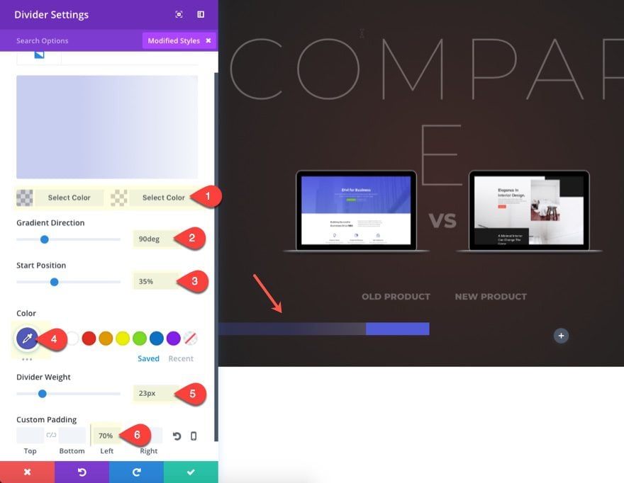
Save Settings.
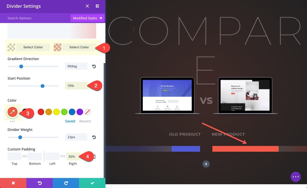
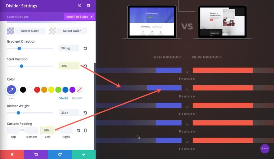
Now copy the Divider Module over to the right column of the same row. Then update the following settings:
Background Gradient Color Left: rgba(255,255,255,0.15)
Background Gradient Color Right: rgba(242,90,71,0.25)
Start Position: 70%
Color: #f25a47
Custom Padding: 30% Right (This pushes the divider to the left 30% resulting in a bar graph value of 70% from the left.)
Now that your first row of bars are in place, we need to add a one column row below it to put our product feature label.
Create a one column row with a custom padding of 0px on the top. Then add a new blurb module and update the blurb module settings as follows:
Content: “feature”
Use Icon: YES
Icon: see screenshot
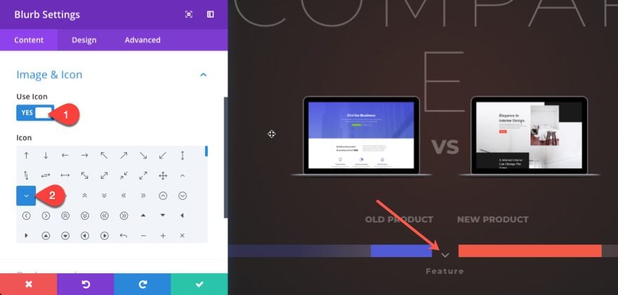
Icon Color: rgba(255,255,255,0.3)
Use Icon Font Size: YES
Icon Font Size: 30px
Text Orientation: center
Body Font: Montserrat
Body Font Weight: Ultra Bold
Body Text Color: rgba(255,255,255,0.3)
Body Letter Spacing: 2px
Custom Margin: -20px
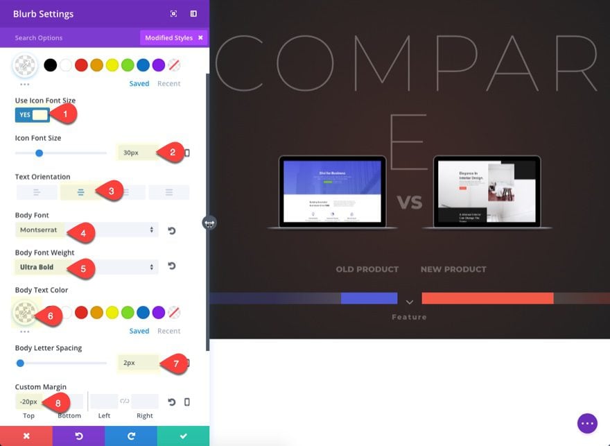
Under the advanced tab, you can take out the default margin beneath the blurb icon by adding the following custom CSS in the Blurb Image CSS box:
margin-bottom: 0px;

Now that you have your first working example of product comparison feature, all you need to do is duplicate the two rows that make up the comparison feature (the row with the two bars/dividers and the row with the blurb module). I find that it is easiest to use ctrl + c (or command + c) to copy each row and then ctrl + v (or command + v) to paste them below one another. Then just update the custom padding for the duplicated dividers to show different bar chart values.
You can also adjust the start and end position of the gradient depending on the custom padding value you choose. For example, if you give you left column divider a padding of 60% Left, you can adjust the starting position of your gradient to 30% (exactly half the distance of the padding).
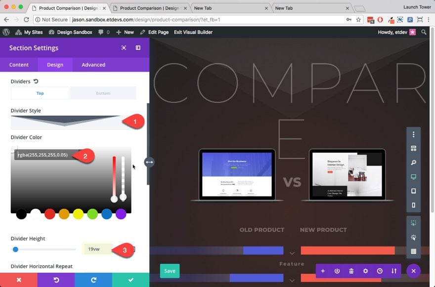
For a final touch, you may want to add a divider background to your section. For this example, I’m going to add the following:
Top Divider: See screenshot
Divider Color: rgba(255,255,255,0.05)
Divider Height: 19vw
Here is the final result.
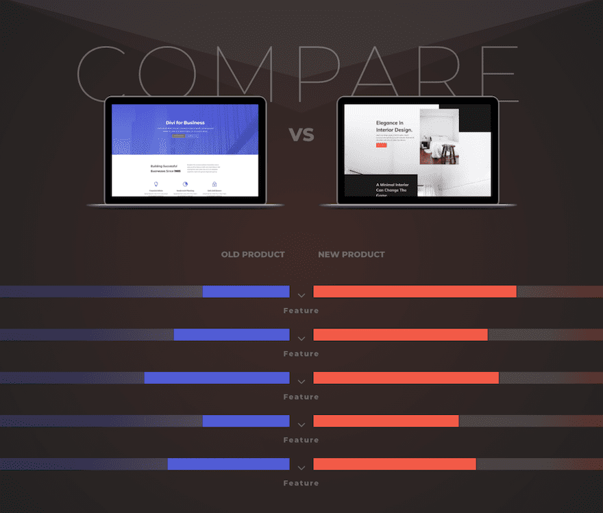
I also like the look of the design when I change the section background color to #000314.

Making the Design Responsive
In Divi, any two-column row will automatically stack on top of each other on mobile devices. This will of course break the design on mobile. To fix this we will need to do two things. First, we need to add a small snippet of custom CSS within the theme customizer.
@media (max-width: 980px){
.disable-break .et_pb_column {
    width: 50%!important;
    margin-bottom: 30px;
}
}
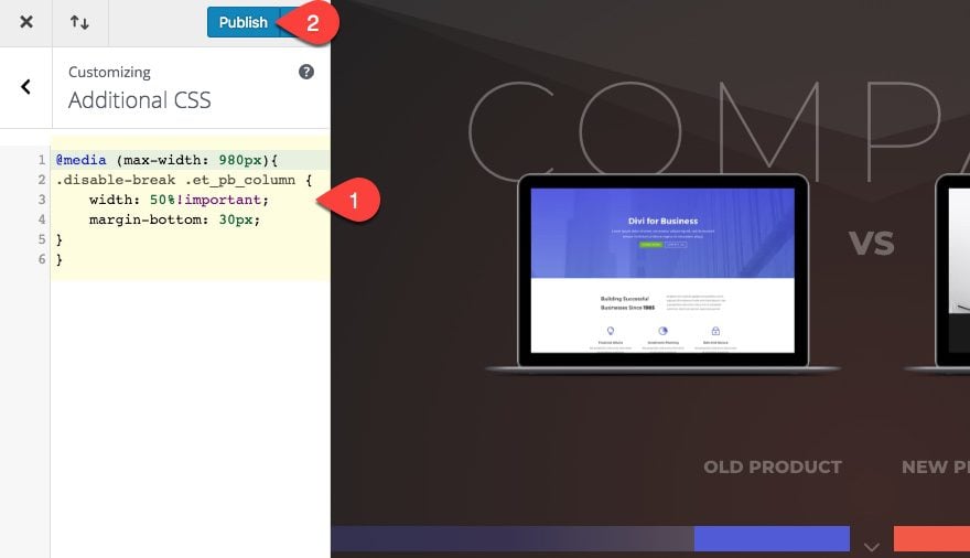
This code will adjust the column width of any row with the CSS class “disable-break” to 50%. This will make sure we keep our two column structure on mobile devices so that the design will not break. Don’t forget to publish your changes.
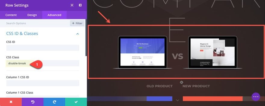
Once the CSS is in place, we need to add the CSS class to any row that has a two column structure.
For starters, let’s add the CSS class to the two column row holding our two product images. Open the row settings and go to the advanced tab. Then enter “disable-break” into the CSS Class input box.
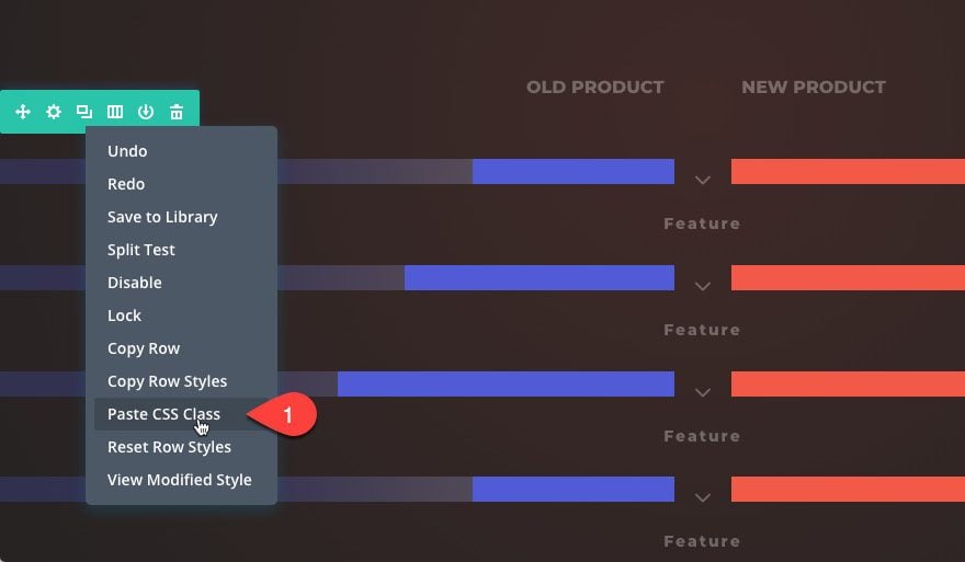
Then right-click on the CSS Class option and click “Copy CSS Class”.
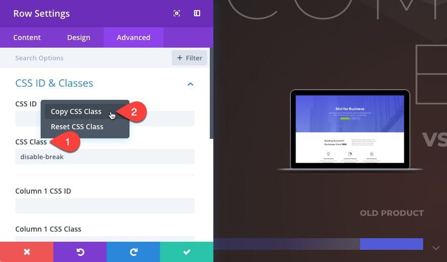
Now all you need to do is right click on each row that has a two column structure (all the rows with the dividers/bars) and click “Paste CSS Class”.
Now your columns will keep the two column structure on mobile devices and keep the design consistent..
Final Thoughts
Creating a product comparison chart in Divi is simple once you learn a few design techniques. The trick is to set up your two-column rows with a 100% width and gutter width of 1. After that, you can use the divider module to build some unique bar chart designs. And if you want to keep your two-column layout on mobile, all you need is a small snippet of custom CSS. I would expect that this comparison chart layout can be used in many different ways. Feel free to share some ideas with the Divi Nation.
I look forward to hearing from you in the comments.
Cheers!
The post How to Design a Creative Product Comparison Chart with Divi appeared first on Elegant Themes Blog.