
Creating a diagonal layout for your page content can be a little tricky to pull off, especially in responsive web design. But, with the Divi Builder, I’ve found that it can actually be fun. With the right combination of section dividers, column spacing, and vw length units, you can add a diagonal layout to any Divi section. And surprisingly, this design technique will scale nicely on different browser sizes.
In this tutorial, I’m going to show you how to create a layout with diagonal rows of content (modules) that look great and scale nicely with your browser window size.
Let’s get started.
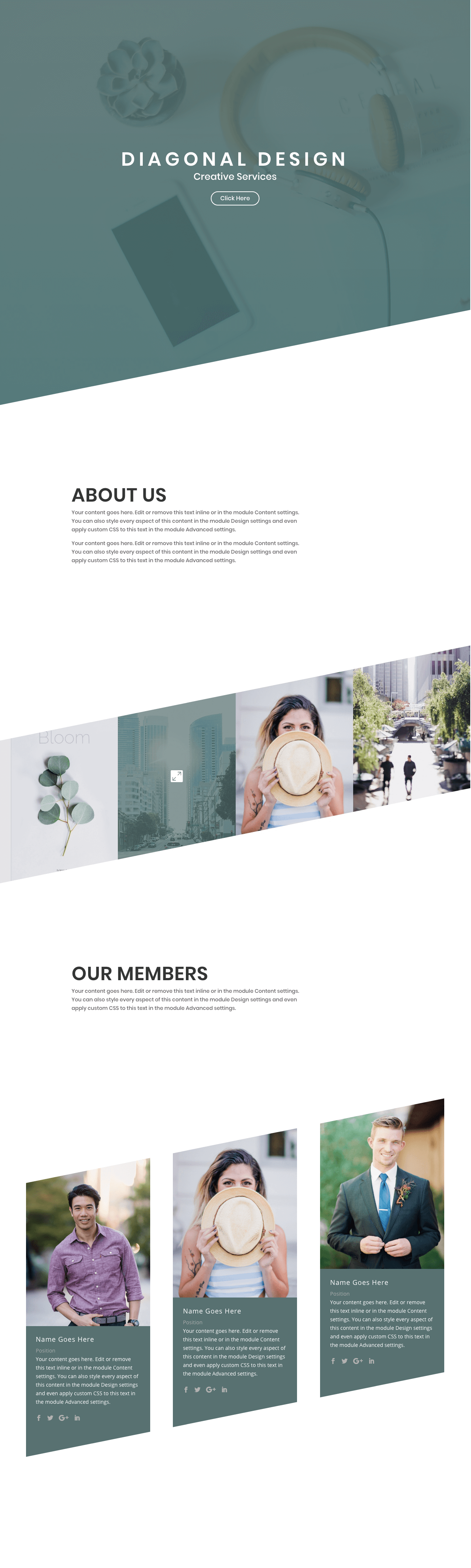
Sneak Peak
The Plan of Attack
Each section you create in Divi has the option of adding those wonderful section dividers to add beautiful transitional design elements between sections. This would allow you to easily create diagnonal dividers to separate your sections. Simple enough. The challenge comes when you want to use those section dividers to add a diagonal frame to your content. You have to make sure the diagnonal design remains consistent without breaking symmetry or content visibility.
The key to this design is the consistent use of the vw length unit to size our dividers and space our modules within each column. The vw length unit is relative to the width of your browser viewport/window. If you need, feel free to learn more about using length units with Divi when you get a chance.
Once we settle on the size and angle of the section dividers, we need to incrementally apply padding to each column so that our modules match the diagonal progression of the dividers. Any images or content you add to each column should to the same size/amount in order to keep things lined up and visible.
Creating the Header Section
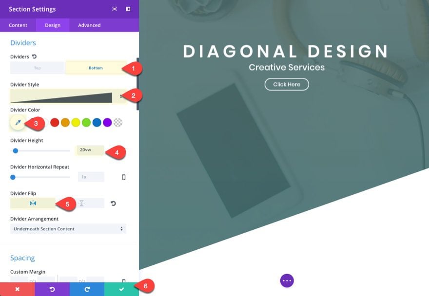
This first section is pretty straight forward. The main design element I want to highlight is the bottom section divider height of 20vw. This height will serve as the standard size for all of our section dividers throughout the design of the layout. It is important to keep this size the same to keep the diagonal design symmetrical and parallel throughout.
To create the first section, add a new page, give it a title, and deploy the visual builder. Add a regular section with a one-column row (or just use the one that shows by default).
Before you add a module, update the section settings to have a background image and gradient overlay.
Background Image: [enter 1920 x 1080 image]
Background gradient left color: rgba(87,113,113,0.89)
Background gradient Right color: rgba(68,112,112,0.9)
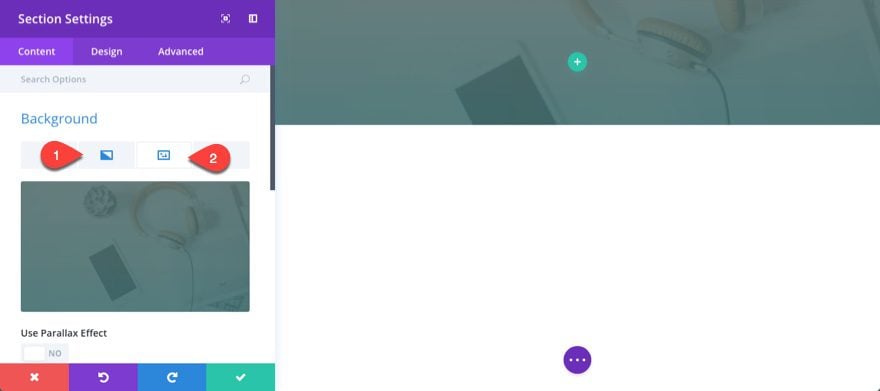
Then add some custom padding using the vw length unit:
Custom Padding: 30vw Top, 40vw Bottom
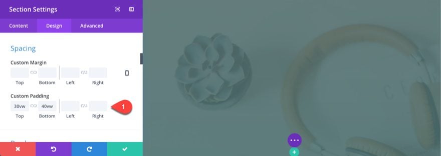
Save settings.
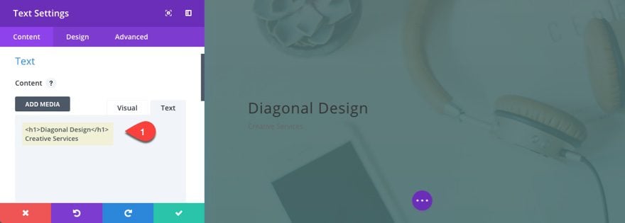
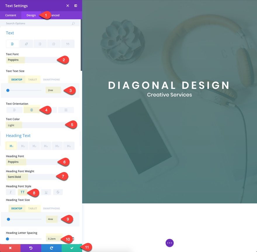
Now add a text module to your one-column row with the following content:
<h1>Diagonal Design</h1>
Creative Services
Update the design settings as follows:
Text Font: Poppins
Text Text Size: 2vw (desktop), 20px (tablet)
Text Orientation: center
Text Color: Light
Heading Font: Poppins
Heading Font Weight: Semi Bold
Heading Font Style: TT
Heading Text Size: 4vw (desktop), 30px (tablet)
Heading Letter Spacing: 0.2em
The em length value for the letter spacing will scale nicely with the font size vw value.
Save Settings
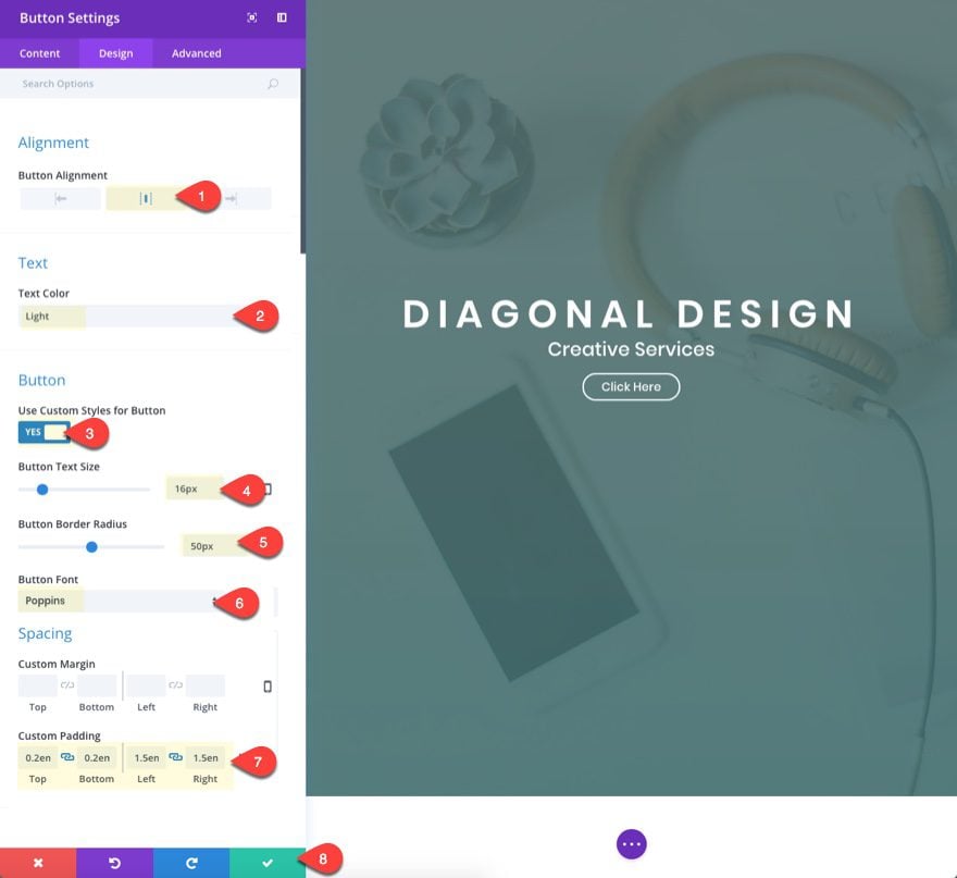
Under the text module, add a button module with the following settings:
Button Alignment: center
Text color: Light
Use Custom Styles for Button: YES
Button Text Size: 16px
Button Border Radius: 50px
Button Font: Poppins
Custom Padding: 0.2em Top, 0.2em Bottom, 1.5em Left, 1.5em Right
Save settings.
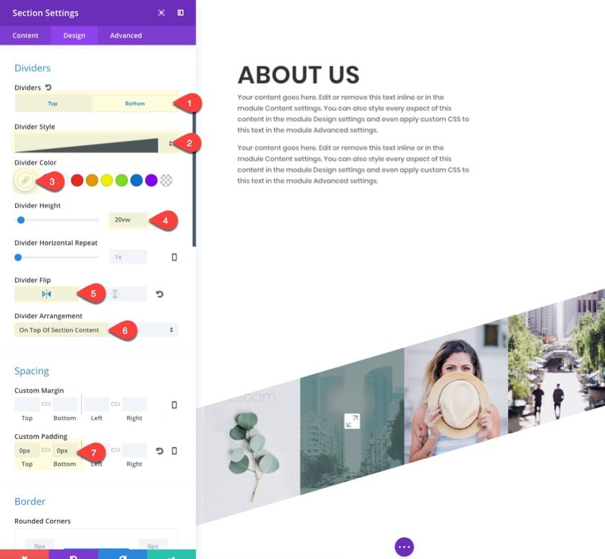
Now that we have all our header section elements in place, go back to the section settings and add the bottom divider that will kick off our diagonal design.
Dividers: Bottom
Divider STyle: see screenshot
Divider Color: #ffffff
Divider Height: 20vw
Divider Flip: vertical
Save settings.
Creating the Second Section
For the next section, this is nothing fancy or complicated. Just add a new regular section with a one-column row.
Make sure the section has the following custom padding:
Custom Padding: 15vw Top, 15vw Bottom
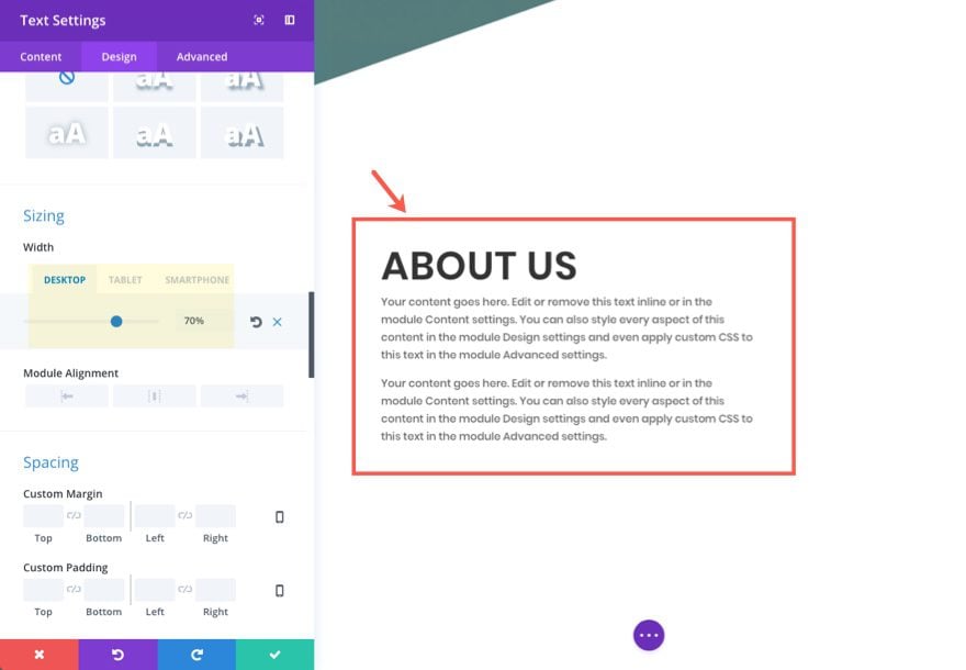
Then add a text module to the row with the following mock content:
<h2>About US</h2>
<p>Your content goes here. Edit or remove this text inline or in the module Content settings. You can also style every aspect of this content in the module Design settings and even apply custom CSS to this text in the module Advanced settings.</p>
<p>Your content goes here. Edit or remove this text inline or in the module Content settings. You can also style every aspect of this content in the module Design settings and even apply custom CSS to this text in the module Advanced settings.</p>
Update the design settings as follows:
Text Font: Poppins
Heading 2 Font: Poppins
Heading 2 Font Weight: Semi Bold
Heading 2 Font Style: TT
Heading 2 Text Size: 4vw
Width: 70% (desktop), 80% (tablet), 100% (smartphone)
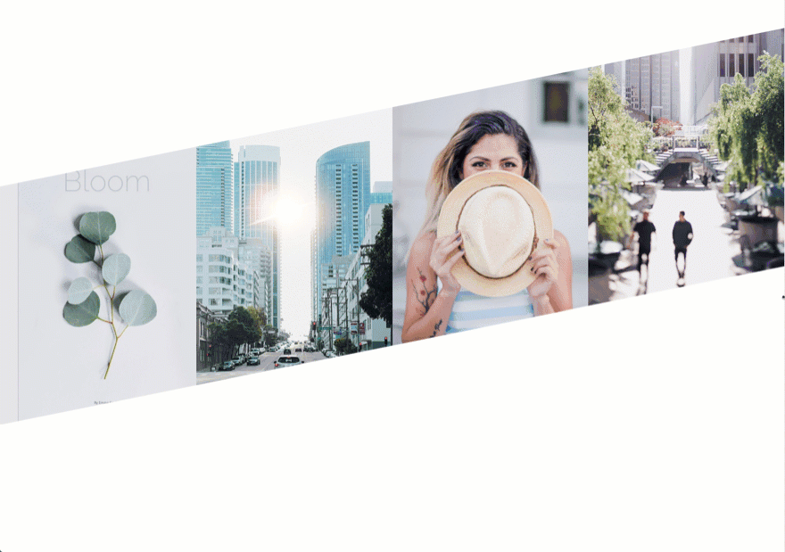
Creating Section Two: A Diagonal Layout for Images
For this next section, we are going to create a diagonal section with 4 images. Keep in mind that in order for this design to work properly, you must be purposeful with your vw length unit values and use the same size images throughout.
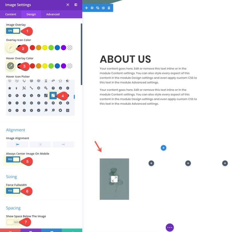
Add a new regular section with a four-column row structure. Then add an image module to the left column. Update the module with the following settings:
Update in Lightbox: YES
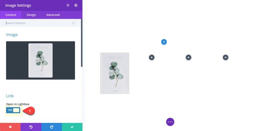
Image Overlay: ON
Overlay Icon Color: #ffffff
Hover Overlay Color: rgba(87,113,113,0.69)
Force Fullwidth: YES
Show Space Below Image: NO
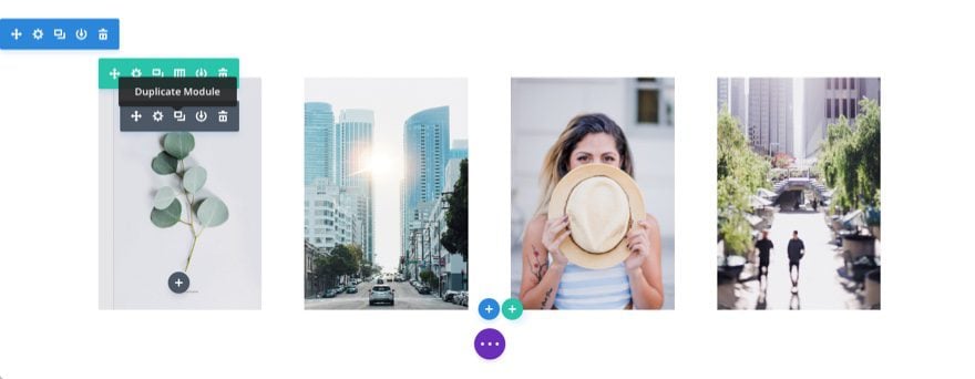
Once you have one image added with the settings in place, duplicate the image module to create the other three images and put them in each column. That way you don’t have to update the settings for each one.
Then upload new images for each. Make sure your images are the exact same dimensions (600px by 850px).
Now we are going to update the row settings to create a fullwidth layout and stagger the images with custom padding.
Update the row settings as follows:
Make This Row Fullwidth: YES
Use Custom Gutter Width: YES
Gutter Width: 1
Custom Padding: 0px Top, 0px Bottom, 0px Left, 0px Right
Column 1 Custom Padding: 15vw Top (desktop), 0px Top (tablet)
Column 2 Custom Padding: 10vw Top (desktop), 0px Top (tablet)
Column 3 Custom Padding: 5vw Top (desktop), 0px Top (tablet)
Notice how the first three columns have a custom top padding that decreases incrementally in order to create the diagonal image layout.
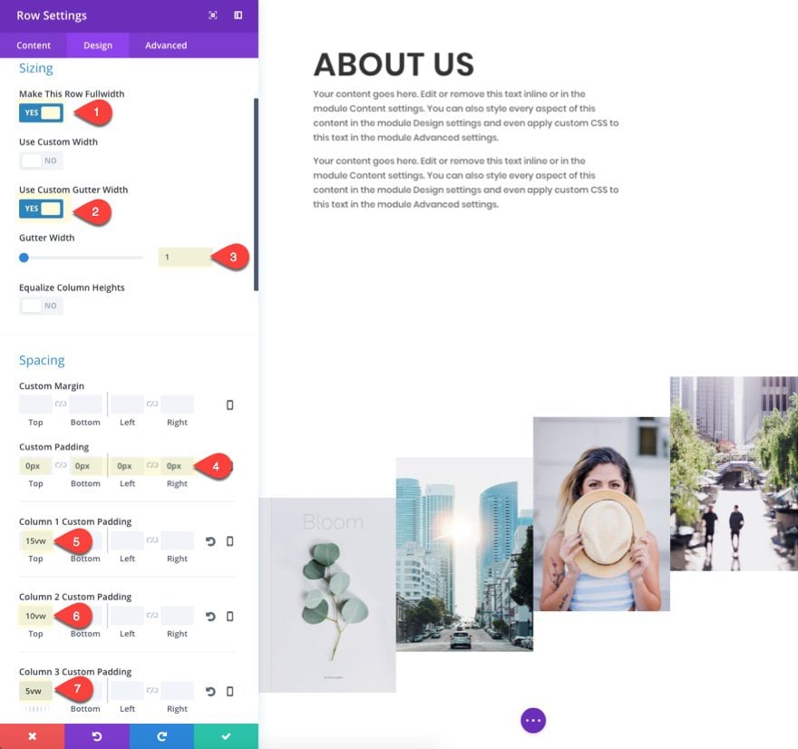
Save settings.
With our images in place, let’s add our section dividers to complete the design. Go to the section settings and update the following:
Dividers: Top
Divider Style: see screenshot
Divider Color: #ffffff
Divider Height: 20vw (desktop), 0px (tablet), 0px (smartphone)
Divider Flip: horizontal
Divider: Bottom
Divider Style: see screenshot
Divider Color: #ffffff
Divider Height: 20vw (desktop), 0px (tablet), 0px (smartphone)
Divider Flip: horizontal
Custom Padding: 0px Top, 0px Bottom
NOTE: If your images have a dimension other than 600×850, you will have to adjust the row padding in order to get the dividers to overlap the images correctly.
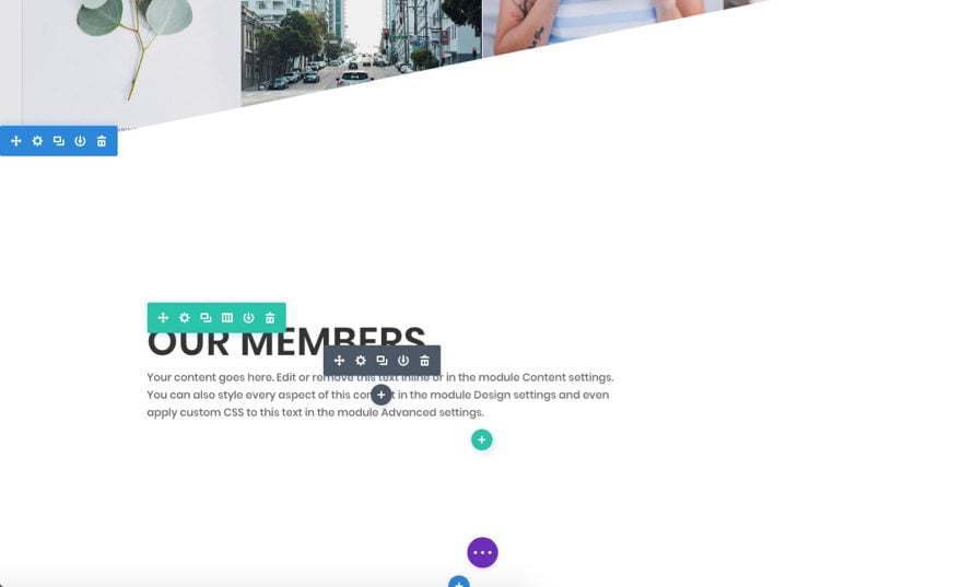
Creating Section Four
To create section four, simply copy section two and paste it under section three.
Then update the content with the following:
<h2>Our Members</h2>
Your content goes here. Edit or remove this text inline or in the module Content settings. You can also style every aspect of this content in the module Design settings and even apply custom CSS to this text in the module Advanced settings.
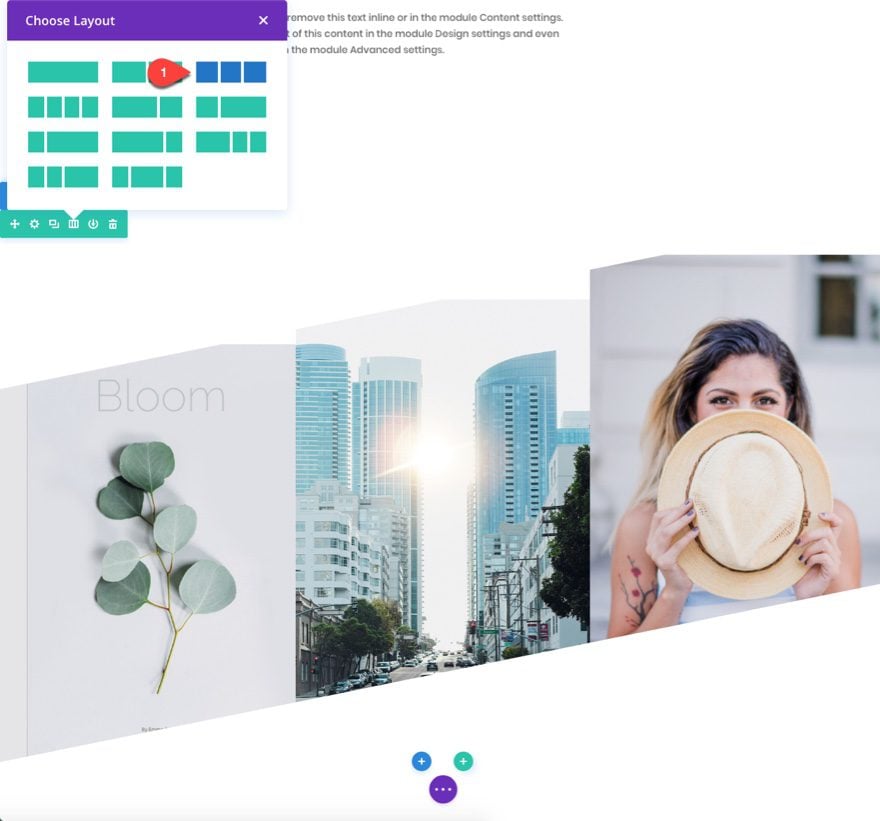
Creating Section Five: A Diagonal Layout for Team Members
For this next section, we are going to create a section for showcasing members on your page. To speed up the design process, go ahead and copy section three (the one with your images) and paste it at the bottom of the page.
Delete the image module in the fourth column and change the row column structure to three columns instead of four.
Under the image module in the first column, add a person module.
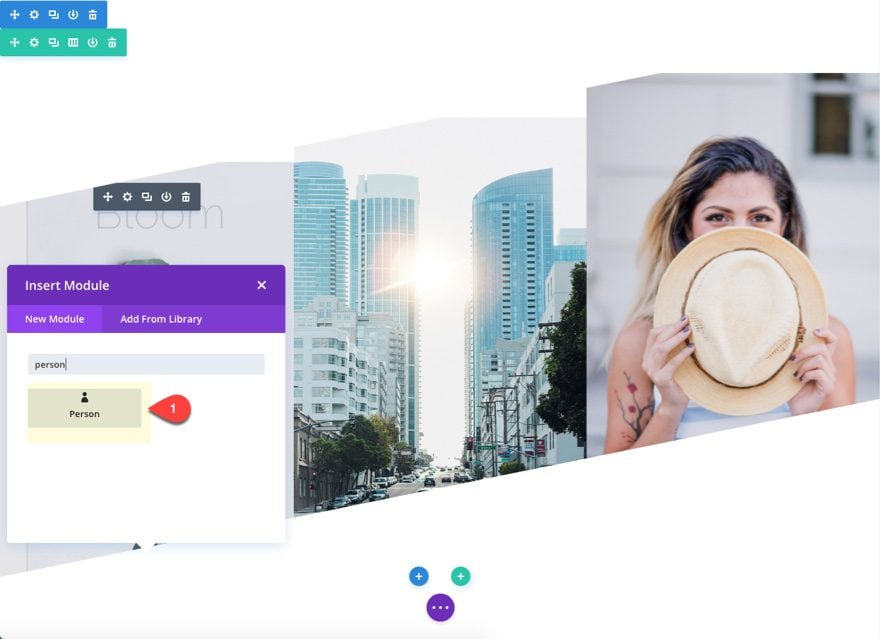
We are going to keep the default text content. But go ahead and add social profile URLs so that they show up in the module. Then delete the image since we are going to use the image module above for our person image.
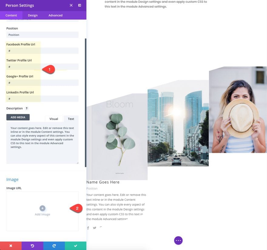
Under the design tab, update the following:
Text Color: Light
Custom Padding: 8% Top, 8% Bottom, 8% Left, 8% Right
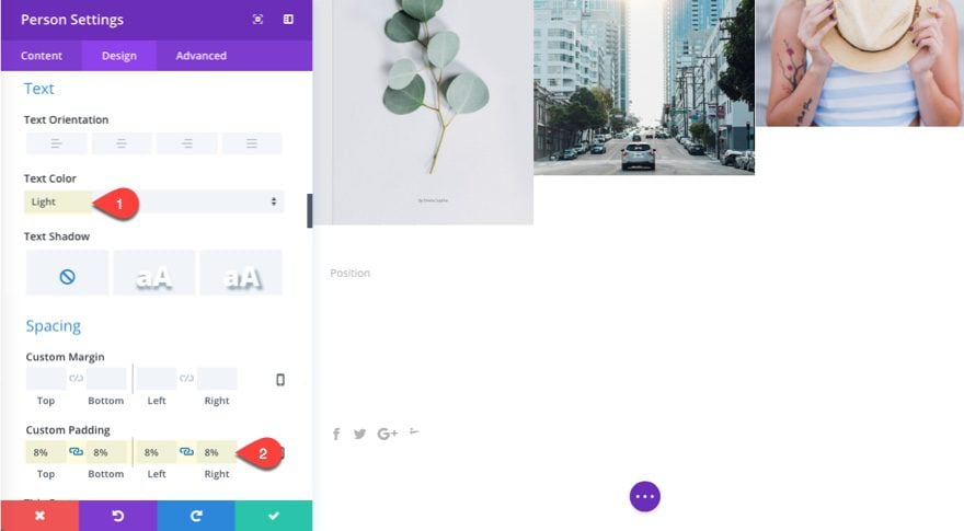
You won’t be able to see the text yet, but it will become visible once we add the background color to each of the three columns.
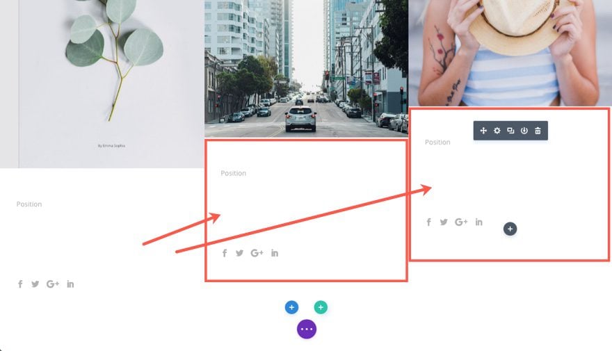
Now copy the person module and add it under the other two image modules in other two columns
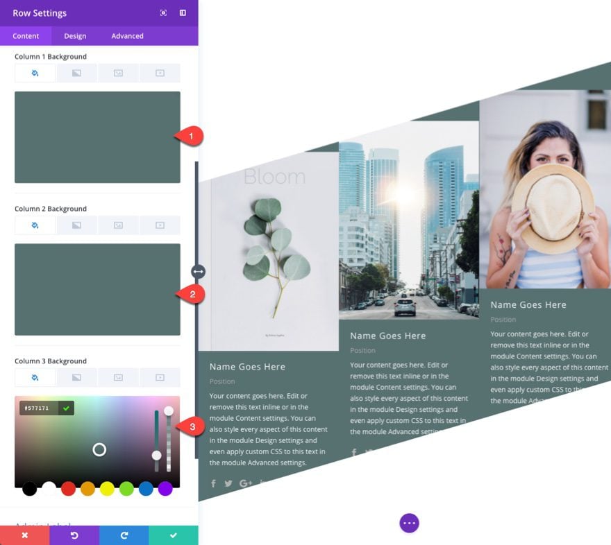
Go to the row settings and update the following:
Column 1 Background Color: #577171
Column 2 Background Color: #577171
Column 3 Background Color: #577171
Under the design tab, update the size and spacing as follows:
Gutter Width: 3
Equalize Column Heights: YES
Custom Padding: 0px bottom
Column 1 Custom Padding (desktop): 12vw Top, 6vw Bottom
Column 1 Custom Padding (tablet): 0vw Top, 0vw Bottom
Column 2 Custom Padding (desktop): 6vw Top
Column 2 Custom Padding (tablet): 0vw Top
Column 3 Custom Padding: 0px Top
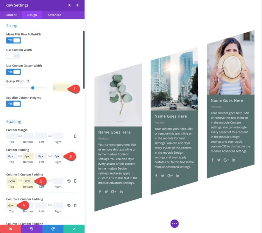
Save settings.
Don’t forget to update your images with new ones.
Now check out the final result…
A Responsive Diagonal Layout
This design highlights the power of the vw length unit. Because we used vw throughout the design to space and size elements, the result will scale perfectly on all browser sizes for desktop.
And on tablet and smartphone, the layout will adjust to a normal clean design without the diagonal elements.
Final Thoughts
Designing a diagonal layout with Divi can produce strikingly unique results. The secret is using the right combination of divider height, image size, and spacing using the vw length unit to scale the design to your browser width.
This is simply the tip of the iceberg of possible designs you can create with different modules, dividers, and colors. I hope this will inspire you to create your own geometric masterpiece.
I look forward to hearing from you in the comments below.
Cheers!
The post How to Design a Unique Diagonal Layout with Divi appeared first on Elegant Themes Blog.