
In this post, we’re going to show you how to combine the standard and vertical navigation. More specifically; how to make the secondary menu and footer overlap the vertical navigation on your website. That means you won’t have to choose between having a top navigation or vertical navigation; you can do both! You can style the primary menu and secondary menu however you want within your Theme Customizer, that’s not what we’re going to help you achieve in this post explicitly. We’re rather going to show you the following things that help in the process of doing the following things:
- how to make your secondary menu overlap your vertical navigation
- how to make your secondary menu fixed when scrolling
- how to make your footer overlap your vertical navigation
These are all the things that’ll help you create a nice balance between the standard and vertical navigation on your website. By making the standard and vertical navigation overlap, your website won’t feel like it’s being dominated by the vertical navigation. The main content on your website will adjust itself to the vertical navigation but the secondary menu and footer will behave in the same way it behaves when vertical navigation isn’t enabled.
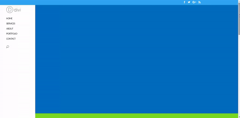
Result
By the end of this tutorial, you’ll be able to achieve the following result on a website that used vertical navigation:
The Inspiration for Overlapping Standard and Vertical Navigation
In a previous post, we’ve shared some examples of websites that use the vertical navigation. All of the examples showed us how creative you can get with a Divi option that is not that often used. A thought-through vertical navigation on your website can give that extra interaction you were trying to achieve with your visitors.
While showing the examples, there were some comments that inspired us to show you how to achieve certain results. This post is one of those inspiration-based tutorials that will show you how to make some tweaks to your website without having to search for solutions yourself.
We’ve been inspired by the Alex Brands website that uses the secondary menu at the top and the vertical navigation on the left side of the page.
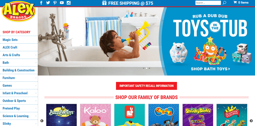
While scrolling, the secondary menu scrolls along. It gives that nice extra little touch to the website and it helps to keep the focus on the content within the secondary menu. Alex Brands is an e-commerce website and the fixed secondary menu helps to remind people what’s in their shopping basket and the deal that they’re offering.
This kind of vertical navigation is especially interesting for e-commerce websites. The vertical navigation makes it easy for visitors to navigate through the different categories of items that are offered on the website. It’s easier to follow the menu items when they’re located in a vertical navigation since it’s easier interpreted as a list people have to go through.
General Steps
Before we dive into the part where we show you how to make your standard navigation overlap your vertical navigation, we’re going to go through the general steps first. These general steps are the foundation you’ll need to go through before you apply the overlap.
Without any further due; let’s get started.
Create Your Menu & Add Menu Items
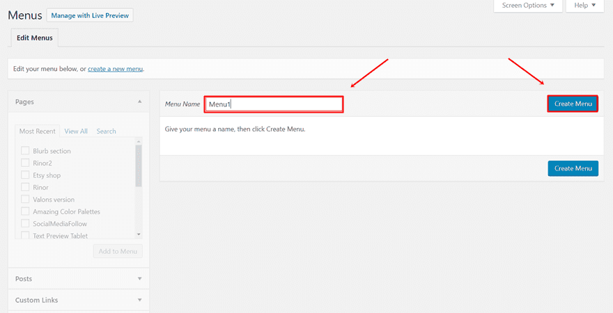
The first thing you’ll need to do (if you haven’t done that already) is add a menu and the menu items to your website. These are the menu items that will appear within your vertical navigation. To add a new menu to your website, go to your WordPress Dashboard > Appearance > Menus. Once you’re on that page, give your new menu a title and create the menu.
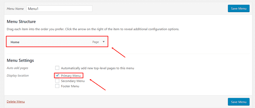
Continue by adding menu items and making this your primary menu.
Add Social Icons to Secondary Menu
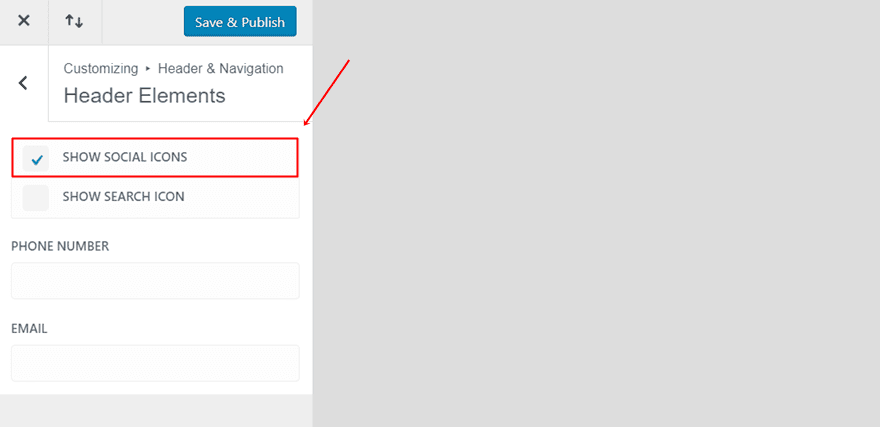
The next thing you’ll need to do is activate your secondary menu. To make sure the secondary menu appears on your website, your secondary menu must have an element that is activated. In this post, we’ll only add the social media icons, but you can, of course, add whatever you like.
To activate the secondary menu and make the social icons show up, start by going to your WordPress Dashboard > Customize > Header & Navigation >Header Elements > Enable the ‘Show Social Icons’ option.
Activate Vertical Navigation
The next step you’ll need to take is enabling the vertical navigation within your Divi builder. To do that, go to your WordPress Dashboard > Appearance > Customize > Header & Navigation > Header Format > Enable the vertical navigation.
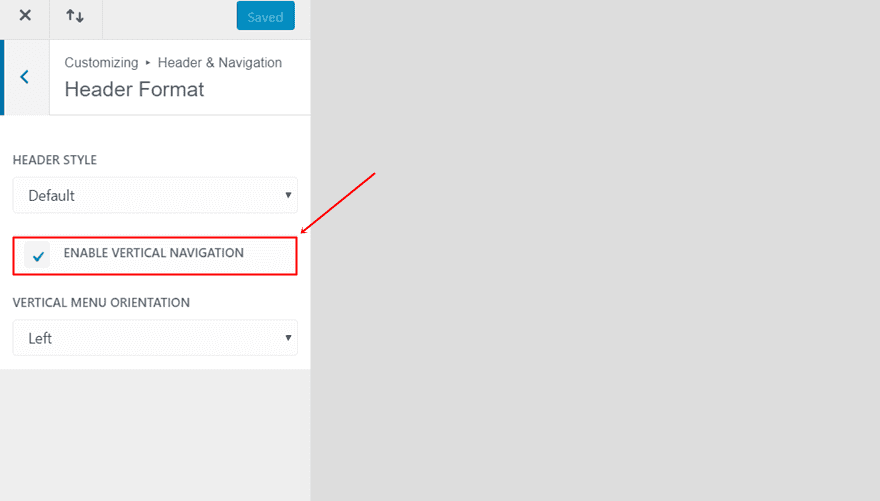
Besides that, you can also choose where you want your vertical navigation to appear; on the left or right side of your website.
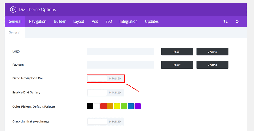
Disable Fixed Navigation For Your Primary Menu
Before we go over to the advanced modifications, there’s one last thing left to do: disabling the fixed navigation for your primary menu. If you’ve already disabled primary menu, skip this step. If, however, your primary menu is currently fixed, go to your WordPress Dashboard > Divi > Theme Options > And disable the fixed navigation.
Combine Standard & Vertical Navigation
In the next part of this post, we’re going to show you how to make your standard and vertical navigation into something different than usual. When it comes to vertical navigation, we’re used to seeing a part of the screen being covered up by it. The secondary menu and the footer will, by default, not pass the vertical navigation.
But in some cases, we want to make sure the secondary navigation and footer are on top of the vertical navigation. That way, the only thing that’ll depend on the vertical navigation is the main content. Your website won’t feel like it’s completely divided in two places; the vertical navigation and the rest of the website.
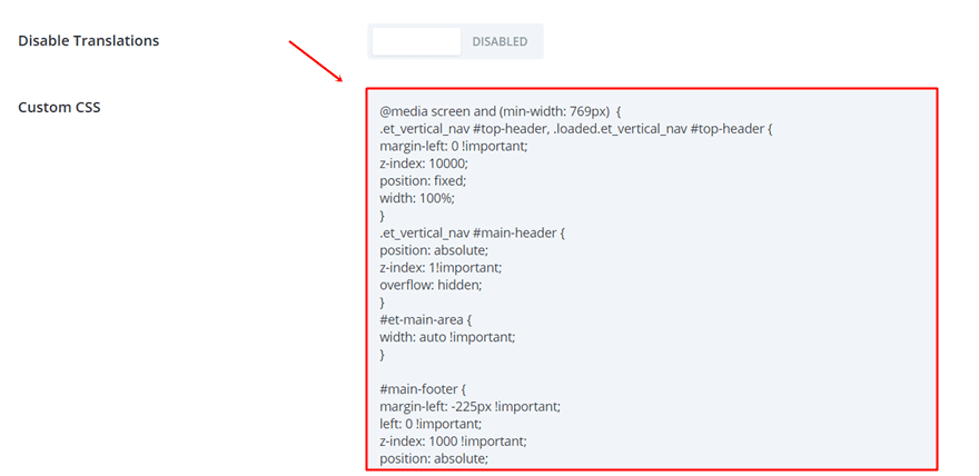
Add CSS Code to Theme Options
You can add the CSS code in two ways: through Divi’s Theme Options or through the Theme Customizer. To add the code to the Theme Options, go to your WordPress Dashboard > Divi > Theme Options > General > Scroll down the tab and paste the following lines of CSS code into the Custom CSS box:
@media screen and (min-width: 769px) {.et_vertical_nav #top-header, .loaded.et_vertical_nav #top-header {
margin-left: 0 !important;
z-index: 10000;
position: fixed;
width: 100%;
}
.et_vertical_nav #main-header {
position: absolute;
z-index: 1!important;
overflow: hidden;
}
#et-main-area {
width: auto !important;
}
#main-footer {
margin-left: -225px !important;
left: 0 !important;
z-index: 1000 !important;
position: absolute;
width: 117.4%;
height: auto;
}} 
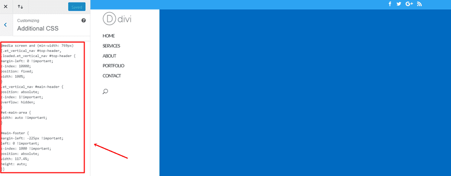
Add CSS Code to Theme Customizer
The other possibility you have is adding the CSS code lines to the Theme Customizer. To do that, go to your WordPress Dashboard > Appearance > Customize > Additional CSS > And paste the CSS lines in the Custom CSS field:
@media screen and (min-width: 769px) {.et_vertical_nav #top-header, .loaded.et_vertical_nav #top-header {
margin-left: 0 !important;
z-index: 10000;
position: fixed;
width: 100%;
}
.et_vertical_nav #main-header {
position: absolute;
z-index: 1!important;
overflow: hidden;
}
#et-main-area {
width: auto !important;
}
#main-footer {
margin-left: -225px !important;
left: 0 !important;
z-index: 1000 !important;
position: absolute;
width: 117.4%;
height: auto;
}} 
Final Thoughts
In this post, we’ve shown you how to combine standard and vertical navigation on your website. More precisely; we’ve shown you how to make the secondary menu and footer overlap your vertical navigation and how to make your secondary menu fixed. If you have any questions or suggestions; feel free to leave a comment in the comment section below!
Be sure to subscribe to our email newsletter and YouTube channel so that you never miss a big announcement, useful tip, or Divi freebie!
Featured Image by Line design / shutterstock.com
The post How to Make The Standard and Vertical Navigation Overlap on Your Divi Website appeared first on Elegant Themes Blog.