
In today’s Divi tutorial we’ll show you, step by step, how to make a fixed navigation on your website when scrolling and after you’ve passed the height of your fullscreen. If you follow the steps in this post and recreate the fixed navigation, you’ll see that the navigation will bring a nice interacting effect to your primary menu and to your website in general.
We’re going to start off by creating a normal vertical navigation on the screen. Instead of being at the top of the page, this navigation will be pushed to the bottom of the screen. After scrolling and once you’ve passed the menu height of the screen, you’ll see that the menu will change its position and will get placed on the top of the page. Once the navigation becomes fixed, it will remain fixed throughout the rest of the page. But once you scroll back to the hero section, the navigation will behave normally again and will get placed at the bottom of the hero section.
You could say that the page will ‘pick up’ the menu at the bottom of the screen and give that advanced effect that you are looking for. To help you visualize the result we’re trying to achieve, let’s take a look at the final result:
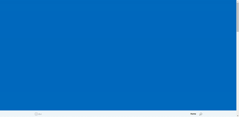
Hero Section: Fullwidth Header Module with Fullscreen Mode
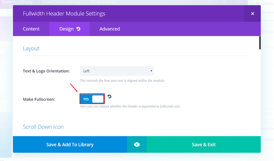
There’s one thing to take into consideration when you’re going to use this effect for your website; you need a fullscreen mode Header Module. Theoretically, you can apply this to other modules and sections as well, but you’ll have to make some modifications to make sure the menu appears at the bottom of that section. The fullscreen option Divi offers makes sure the hero section fills the screen (whatever the measures of the screen might be), that’s why we recommend using it if you want to apply this effect to your menu.
Start by opening or creating the page where you want to add this effect. Next, open the Fullwidth Header or create it and go to the Design tab. The first thing you’ll come across in the design tab is the Layout subcategory. Go ahead and enable the Fullscreen mode in that subcategory.
Creating the Fixed Navigation When Scrolling
To add the effect to our website, we’ll need to make use of both some CSS code lines and some jQuery code lines. The CSS code we’ll be using will put the navigation at the bottom of the screen and will make it behave like a normal footer before the jQuery code is activated. After that, the jQuery code lines will take over from the custom CSS code and will let the navigation behave according to your position on the website.
Add The Required CSS Code
We’ll start by adding the required CSS code to our website. Generally, there are three ways to do this. The first two ways make the code apply to the whole website. The third method makes it work for one page only.
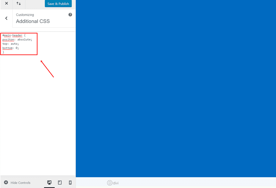
Add CSS Code Through Theme Customizer
The first method we’ll show you lets you add the code through the Theme Customizer. This is a way of adding code is not that often used but it has some perks. One of them is that as soon as you’ve added the code, you’ll notice the changes happen in real time.
To add the CSS code, open your WordPress dashboard > go to Appearance > Customize > Scroll down the tab and open the Additional CSS tab > Add the following CSS code lines:
#main-header {
position: absolute;
top: auto;
bottom: 0;
} 
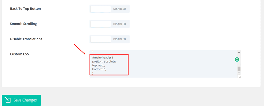
Add CSS Code Through Theme Options
Another option you have, which is also the most common one used, is adding the CSS code to the Theme Options of your Divi website. Once you’ve added the code, it’ll apply to the whole website. If you’re rather looking for a possibility that adds the effect to one page only, move on to the next possibility where you can add the code to one page in particular.
To add the code to your Theme Options; go to your WordPress dashboard > Divi > Theme Options > Scroll down the General tab and paste the following code into the Custom CSS field:
#main-header {
position: absolute;
top: auto;
bottom: 0;
} 
Add CSS Code to One Page Only
This possibility might be interesting if you want to apply this fixed navigation to one page only but not the rest of the website. If you’re using the fullwidth header on the homepage only, for instance, you might want to use this method.
Open the page where you want to add the fixed navigation when scrolling. Next, you’ll see the following symbol in the right corner of the builder:
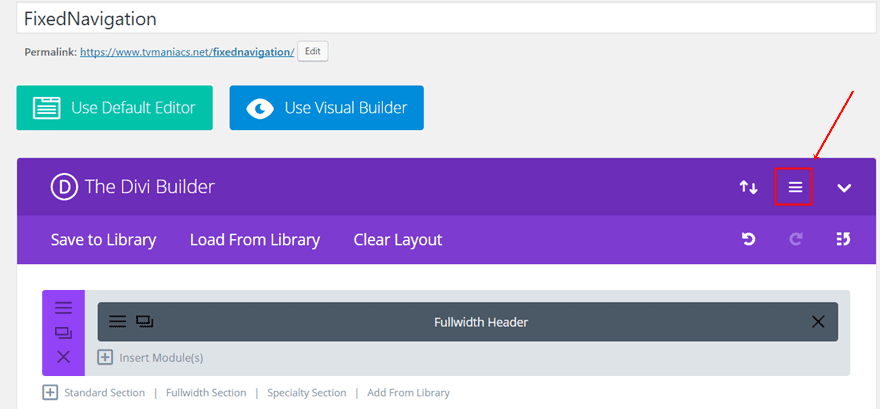
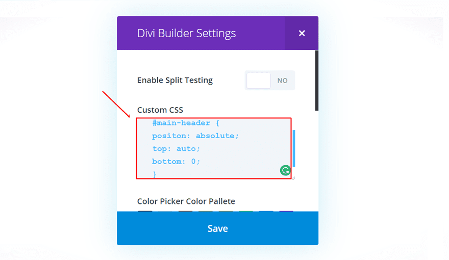
Click on it and you’ll see a screen appear where you can make modifications to the whole page. Add the following code in the Custom CSS box to make it apply to that page in particular:
#main-header {
position: absolute;
top: auto;
bottom: 0;
} 
Add The Required jQuery Code
The next step we want to take is adding the jQuery code to our WordPress website. This code will start to work from the moment you scroll. We can add the jQuery code in two ways; through the Theme Options or through the Code Module. If you want to add the code to one page only, you can use the Code Module in combination with the third possibility we mentioned for the CSS code in this post.
Add jQuery Code Through Theme Options
To apply the code to all the pages on your website, you can add the code to the Theme Options. Go to your WordPress dashboard > Go to Divi > Continue to Theme Options > Open the Integration tab > And paste the following code in the ‘<head> of your blog’ field:
<script text="text/javascript">
jQuery(function($){
$(window).bind('scroll', function() {
var windowHeight = $(window).height();
if ($(window).scrollTop() < windowHeight) {
$("#main-header").css("position","absolute").css("top","auto").css("bottom",0);
}
else {
$("#main-header").css("position","fixed").css("bottom","auto").css("top",0);
}
});
});
</script> 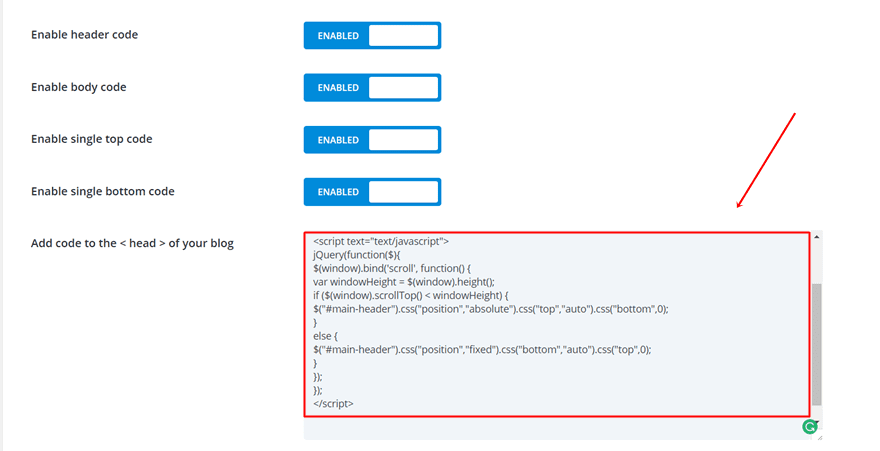
Add jQuery Code Through Code Module
If you want to add the code to one page in particular, you can do that through the Code Module. In the previous part, where we’ve added the CSS code, you must’ve chosen the last option.
Go back to that page and add a Standard Section to the top of your page. Within that Standard Section, add a Code Module. You can actually place this section wherever you like, but if you want to find it quickly, we recommend you put it at the top of your page. Next, copy and paste the following code into the Content Box of your Code Module:
<script text="text/javascript">
jQuery(function($){
$(window).bind('scroll', function() {
var windowHeight = $(window).height();
if ($(window).scrollTop() < windowHeight) {
$("#main-header").css("position","absolute").css("top","auto").css("bottom",0);
}
else {
$("#main-header").css("position","fixed").css("bottom","auto").css("top",0);
}
});
});
</script> 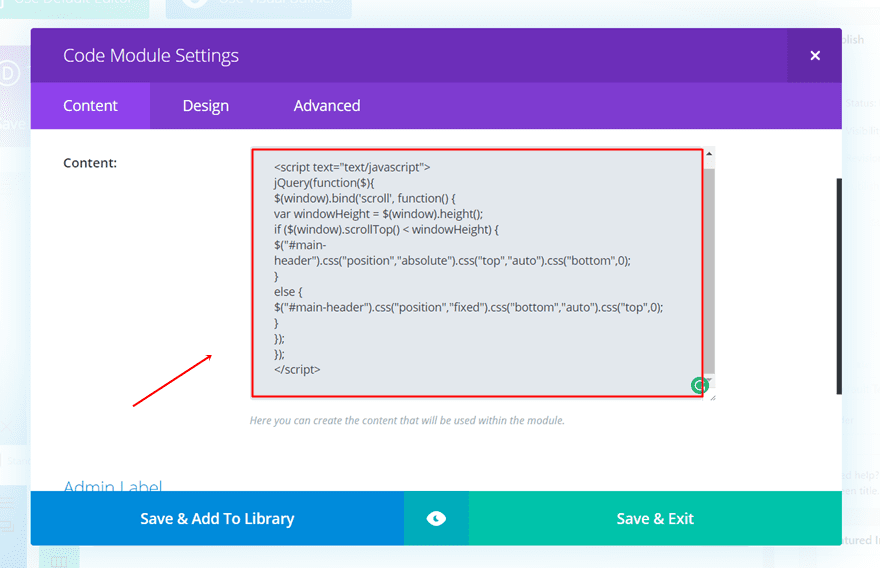
And that’s it! The code should now work, transform your menu and make your website a bit more interactive.
Final Thoughts
In this post, we showed you how to create a fixed navigation when scrolling. We provided you with some CSS code lines and some jQuery code lines that should do the trick. If you’ve followed this post step by step, you should be able to get the final result. If you have any questions or suggestions for upcoming posts; feel free to leave a comment in the comment section below!
Be sure to subscribe to our email newsletter and YouTube channel so that you never miss a big announcement, useful tip, or Divi freebie!
Featured Image by DenisXize / shutterstock.com
The post How to Make Your Divi Navigation Start at the Bottom, Then Stay Fixed at Top When Scrolling appeared first on Elegant Themes Blog.