How to Stack Rows on Scroll with Divi’s Sticky Options
Ever since Divi’s sticky options have come out, we’ve shown you ways on how to use the different features throughout your website builds, particularly inside headers. But there are a ton of ways you can use the sticky options to enhance the user experience people have on your website and make your website shine. In today’s tutorial, for example, we’ll show you how to stack rows on scroll with Divi’s sticky options. As soon as a row touches the top of your viewport, it’ll start going below the next row, which gives a stacking effect that looks beautiful. We’ll recreate the design from scratch and you’ll be able to download the section’s JSON file for free as well!
Let’s get to it.
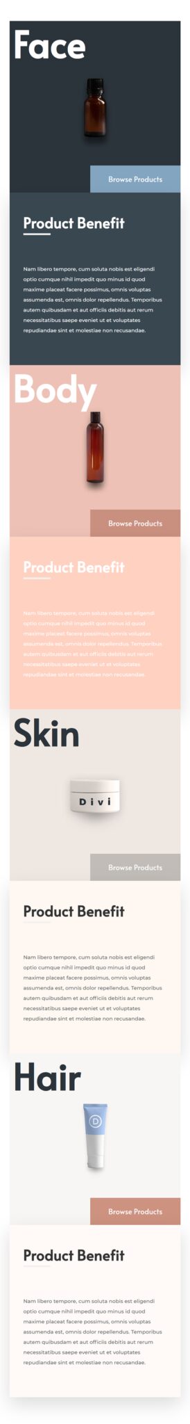
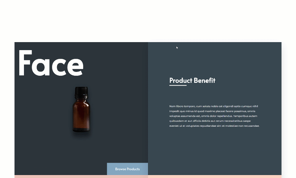
Preview
Before we dive into the tutorial, let’s take a quick look at the outcome across different screen sizes.
Desktop
Mobile

Download The Row Stacking Layout for FREE
To lay your hands on the free row stacking layout, you will first need to download it using the button below. To gain access to the download you will need to subscribe to our Divi Daily email list by using the form below. As a new subscriber, you will receive even more Divi goodness and a free Divi Layout pack every Monday! If you’re already on the list, simply enter your email address below and click download. You will not be “resubscribed” or receive extra emails.
.et_bloom .et_bloom_optin_1 .et_bloom_form_content { background-color: #4843d2 !important; } .et_bloom .et_bloom_optin_1 .et_bloom_form_container .et_bloom_form_header { background-color: #ffffff !important; } .et_bloom .et_bloom_optin_1 .carrot_edge .et_bloom_form_content:before { border-top-color: #ffffff !important; } .et_bloom .et_bloom_optin_1 .carrot_edge.et_bloom_form_right .et_bloom_form_content:before, .et_bloom .et_bloom_optin_1 .carrot_edge.et_bloom_form_left .et_bloom_form_content:before { border-top-color: transparent !important; border-left-color: #ffffff !important; }
@media only screen and ( max-width: 767px ) {.et_bloom .et_bloom_optin_1 .carrot_edge.et_bloom_form_right .et_bloom_form_content:before, .et_bloom .et_bloom_optin_1 .carrot_edge.et_bloom_form_left .et_bloom_form_content:before { border-top-color: #ffffff !important; border-left-color: transparent !important; }
}.et_bloom .et_bloom_optin_1 .et_bloom_form_content button { background-color: #f92c8b !important; } .et_bloom .et_bloom_optin_1 .et_bloom_form_content .et_bloom_fields i { color: #f92c8b !important; } .et_bloom .et_bloom_optin_1 .et_bloom_form_content .et_bloom_custom_field_radio i:before { background: #f92c8b !important; } .et_bloom .et_bloom_optin_1 .et_bloom_border_solid { border-color: #f7f9fb !important } .et_bloom .et_bloom_optin_1 .et_bloom_form_content button { background-color: #f92c8b !important; } .et_bloom .et_bloom_optin_1 .et_bloom_form_container h2, .et_bloom .et_bloom_optin_1 .et_bloom_form_container h2 span, .et_bloom .et_bloom_optin_1 .et_bloom_form_container h2 strong { font-family: “Open Sans”, Helvetica, Arial, Lucida, sans-serif; }.et_bloom .et_bloom_optin_1 .et_bloom_form_container p, .et_bloom .et_bloom_optin_1 .et_bloom_form_container p span, .et_bloom .et_bloom_optin_1 .et_bloom_form_container p strong, .et_bloom .et_bloom_optin_1 .et_bloom_form_container form input, .et_bloom .et_bloom_optin_1 .et_bloom_form_container form button span { font-family: “Open Sans”, Helvetica, Arial, Lucida, sans-serif; } p.et_bloom_popup_input { padding-bottom: 0 !important;}
Download For Free
Join the Divi Newsletter and we will email you a copy of the ultimate Divi Landing Page Layout Pack, plus tons of other amazing and free Divi resources, tips and tricks. Follow along and you will be a Divi master in no time. If you are already subscribed simply type in your email address below and click download to access the layout pack.
You have successfully subscribed. Please check your email address to confirm your subscription and get access to free weekly Divi layout packs!
1. Create First Row Concept
Add New Section
Spacing
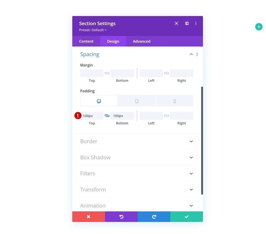
In the first part of this tutorial, we’ll start laying down the foundation of our first row. Once we’re done styling the elements in the first row, we can reuse it entirely to create the row stacking effect. Add a new section to the page you’re working on. Open the section settings and apply some custom padding values across different screen sizes.
- Top Padding:
- Desktop: 100px
- Tablet: 40px
- Phone: 25px
- Bottom Padding:
- Desktop: 100px
- Tablet: 40px
- Phone: 25px
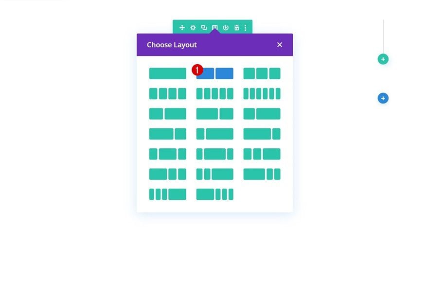
Add New Row
Column Structure
Continue by adding a new row using the following column structure:
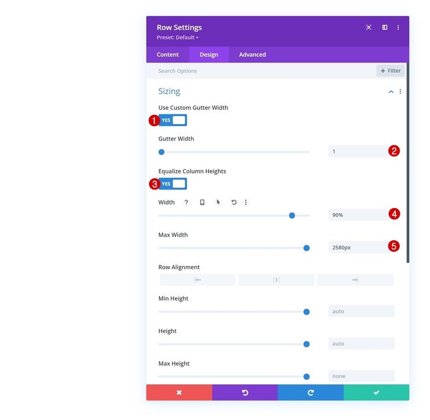
Sizing
Without adding any modules yet, open the row settings and apply the following sizing settings:
- Use Custom Gutter Width: Yes
- Gutter Width: 1
- Equalize Column Heights: Yes
- Width: 90%
- Max Width: 2580px
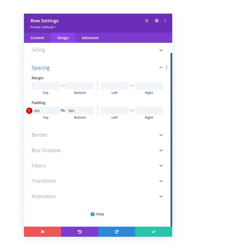
Spacing
Next, remove all default top and bottom padding.
- Top Padding: 0px
- Bottom Padding: 0px
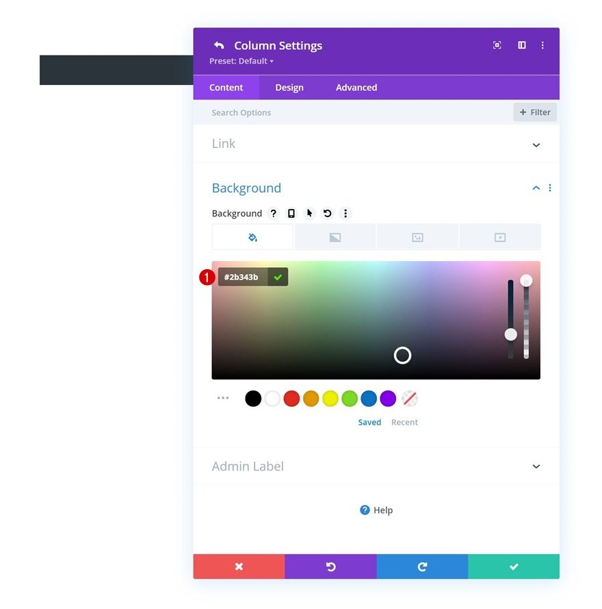
Column 1 Settings
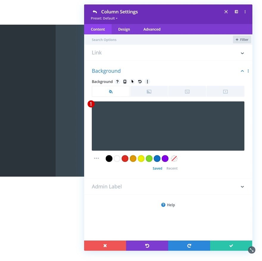
Background Color
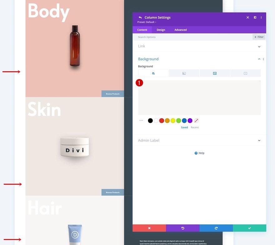
Then, open the column 1 settings and apply a background color of your choice.
- Background Color: #2b343b
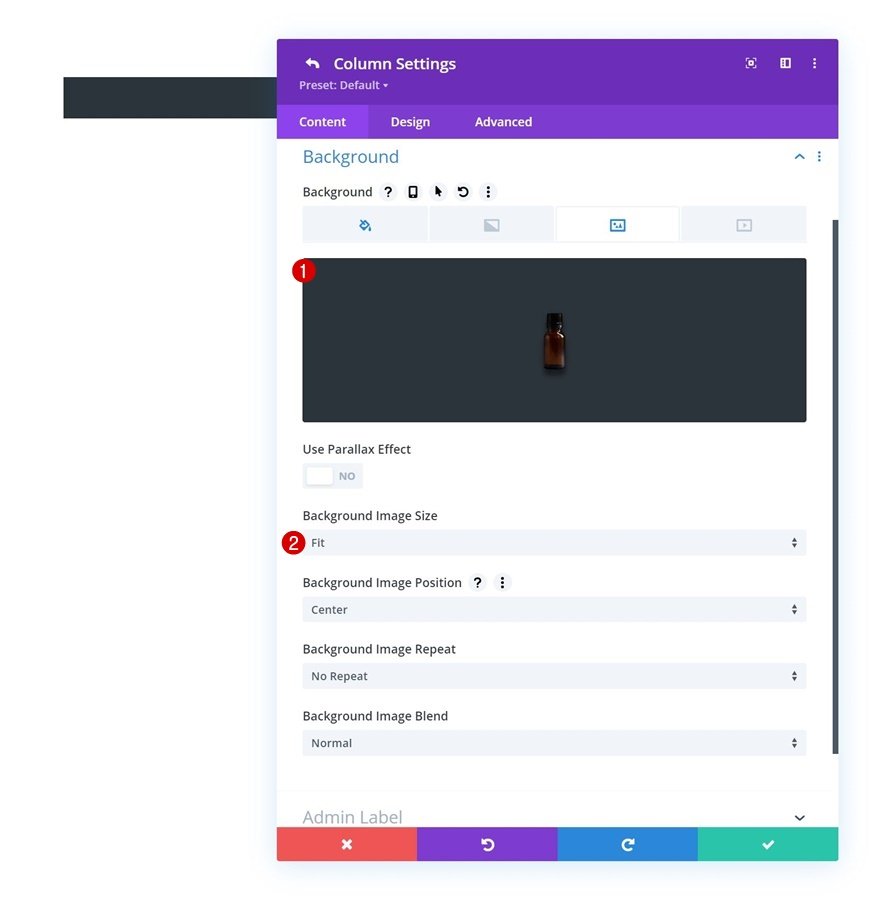
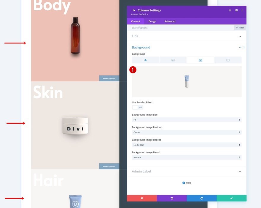
Background Image
Use a background image as well. If you want to use the ones that are displayed throughout this tutorial, download the zipped folder at the beginning of the tutorial and upload the background images to your media library.
- Background Image Size: Fit
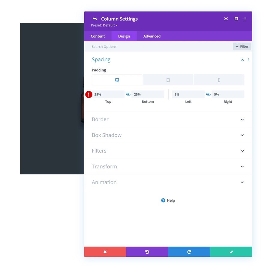
Spacing
Move on to the column’s design tab and apply the following padding values across different screen sizes next:
- Top Padding:
- Desktop: 25%
- Tablet: 40%
- Phone: 50%
- Bottom Padding:
- Desktop: 25%
- Tablet: 40%
- Phone: 50%
- Left Padding: 5%
- Right Padding: 5%
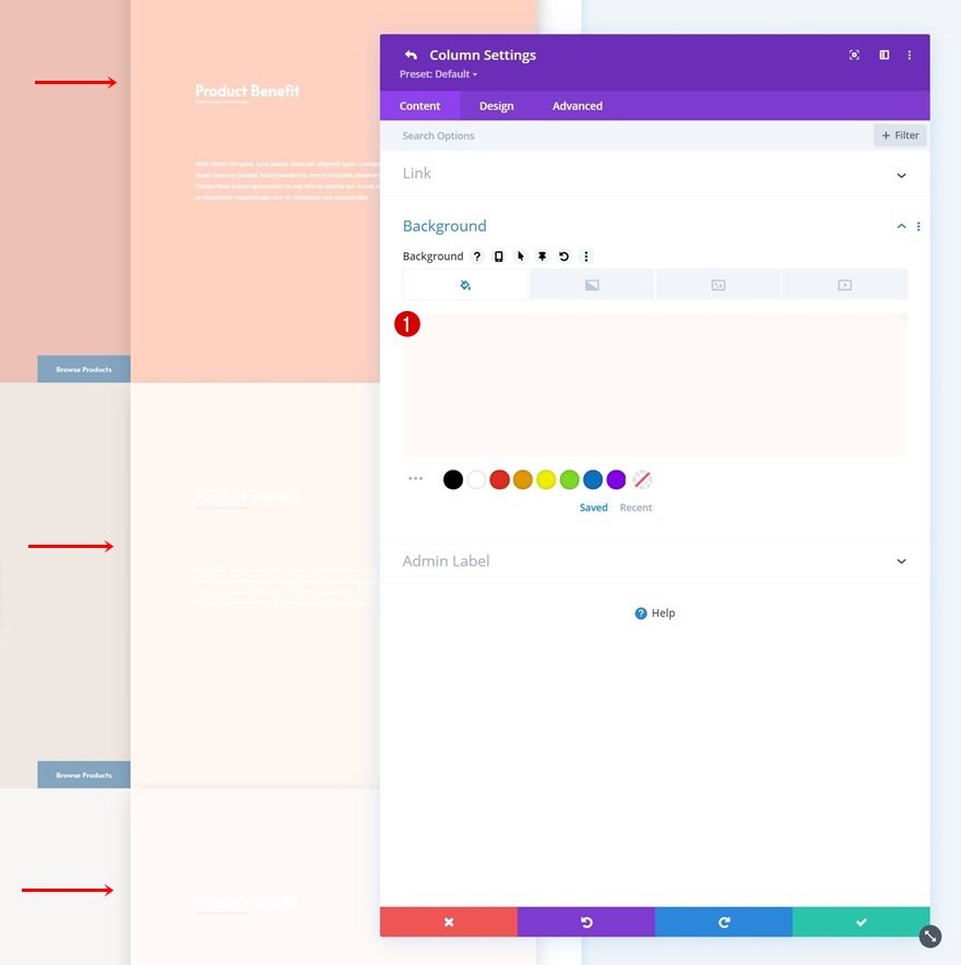
Column 2 Settings
Background Color
Then, open the second column and use a background color there too.
- Background Color: #394751
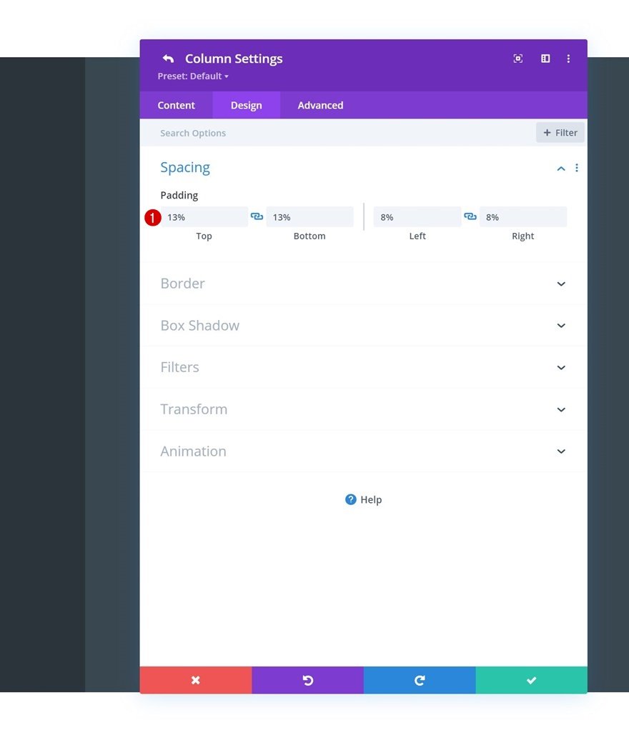
Spacing
Along with some custom padding values.
- Top Padding: 13%
- Bottom Padding: 13%
- Left Padding: 8%
- Right Padding: 8%
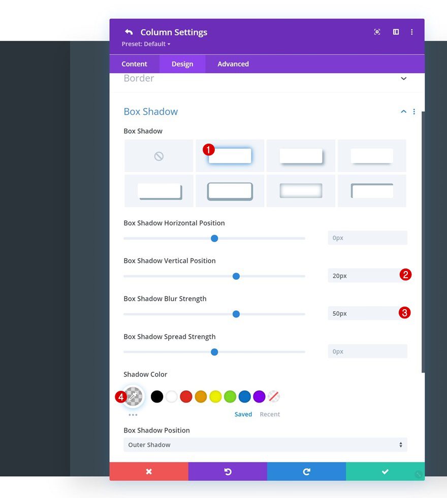
Box Shadow
And a box shadow.
- Box Shadow Vertical Position: 20px
- Box Shadow Blur Strength: 50px
- Shadow Color: rgba(0,0,0,0.14)
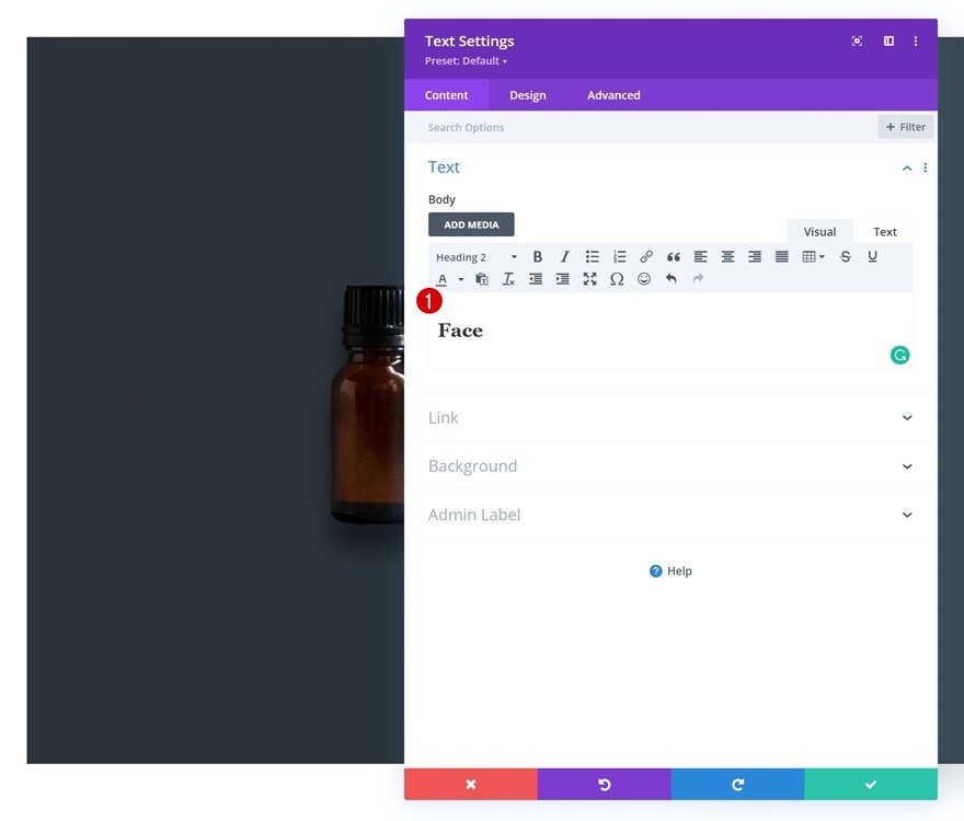
Add Text Module to Column 1
Add H2 Content
Time to add modules, starting with a Text Module in column 1. Place some H2 content of your choice inside the content box.
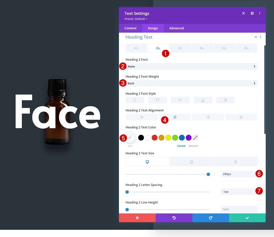
H2 Text Settings
Move on to the module’s design tab and style the H2 text settings accordingly:
- Heading 2 Font: Alata
- Heading 2 Font Weight: Bold
- Heading 2 Text Alignment: Center
- Heading 2 Text Color: #ffffff
- Heading 2 Text Size:
- Desktop: 200px
- Tablet: 150px
- Phone: 100px
- Heading 2 Letter Spacing: -1px
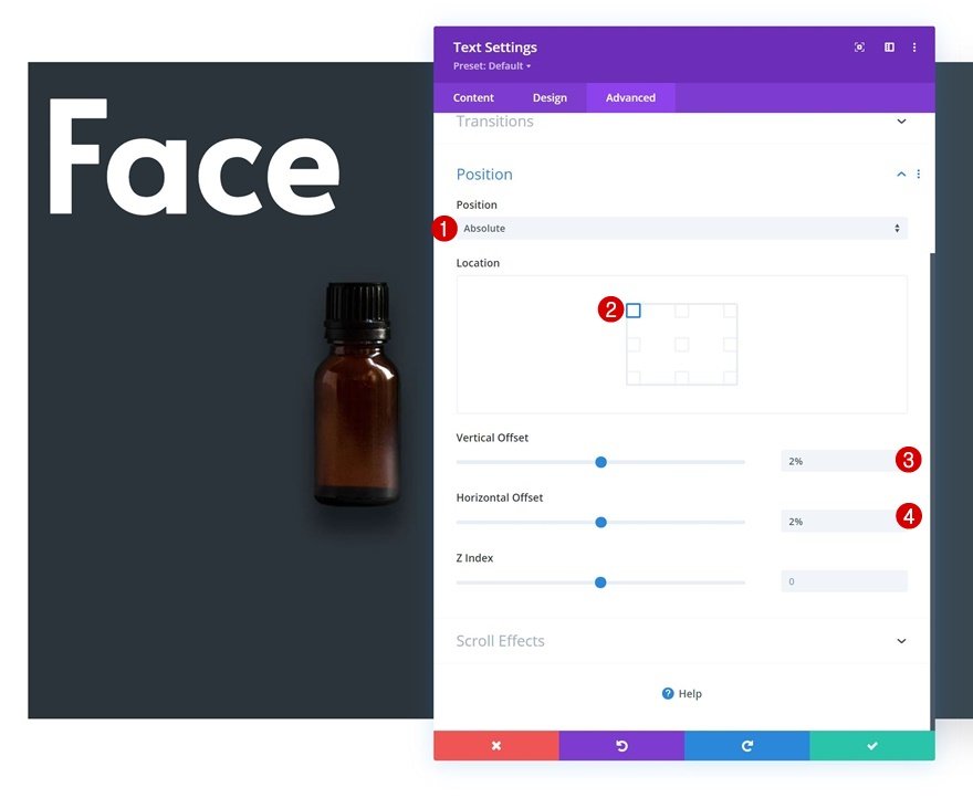
Position
Reposition the module in the advanced tab as well.
- Position: Absolute
- Location: Top Left
- Vertical Offset: 2%
- Horizontal Offset: 2%
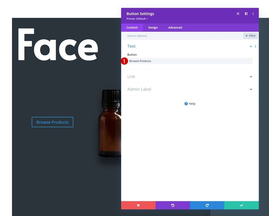
Add Button Module to Column 1
Add Copy
The next and last module we need in column 1 is a Button Module. Add some copy of your choice.
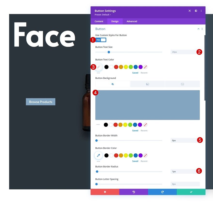
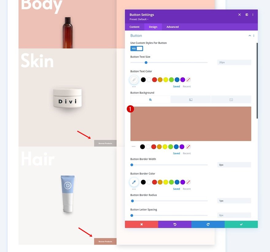
Button Settings
Move on to the module’s design tab and style the button accordingly:
- Use Custom Styles For Button: Yes
- Button Text Size: 20px
- Button Text Color: #ffffff
- Button Background Color: #83a5bf
- Button Border Width: 0px
- Button Border Radius: 1px
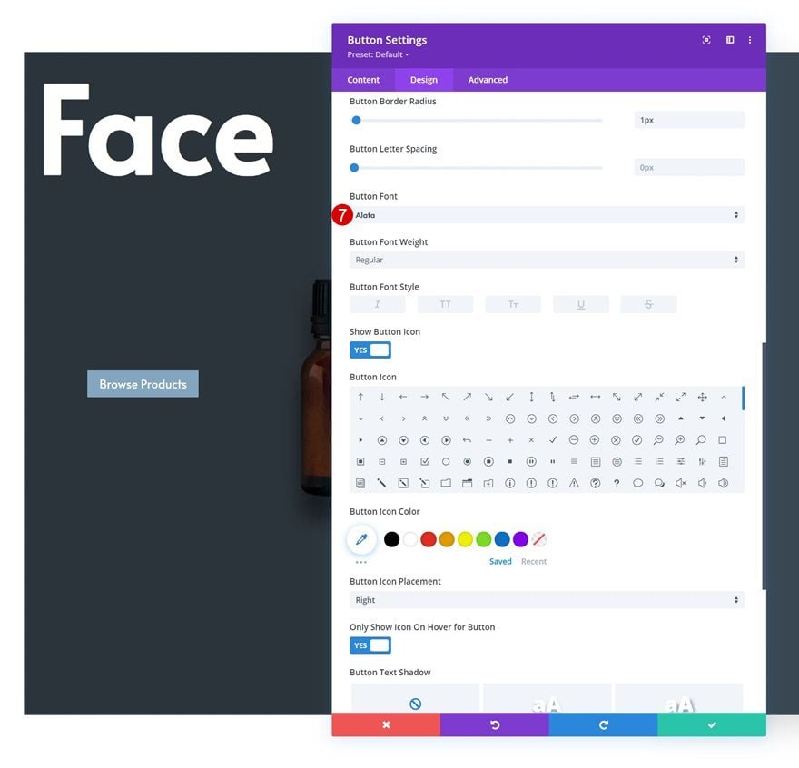
- Button Font: Alata
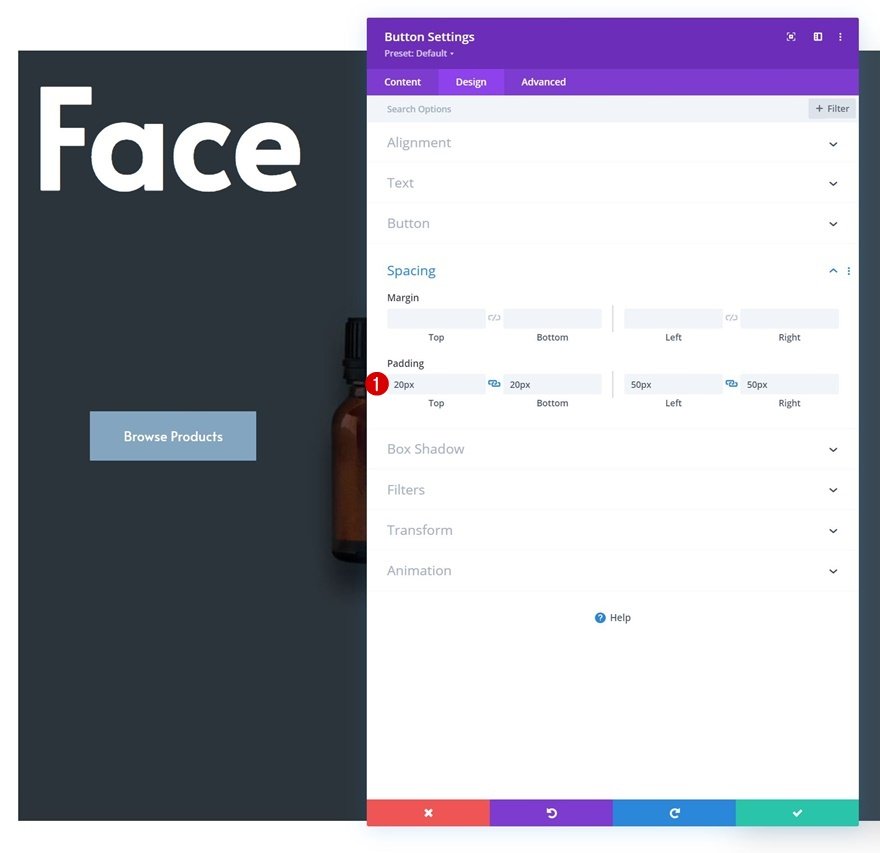
Spacing
Add some custom padding values next.
- Top Padding: 20px
- Bottom Padding: 20px
- Left Padding: 50px
- Right Padding: 50px
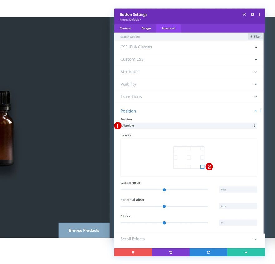
Position
And reposition the module in the advanced tab.
- Position: Absolute
- Location: Bottom Right
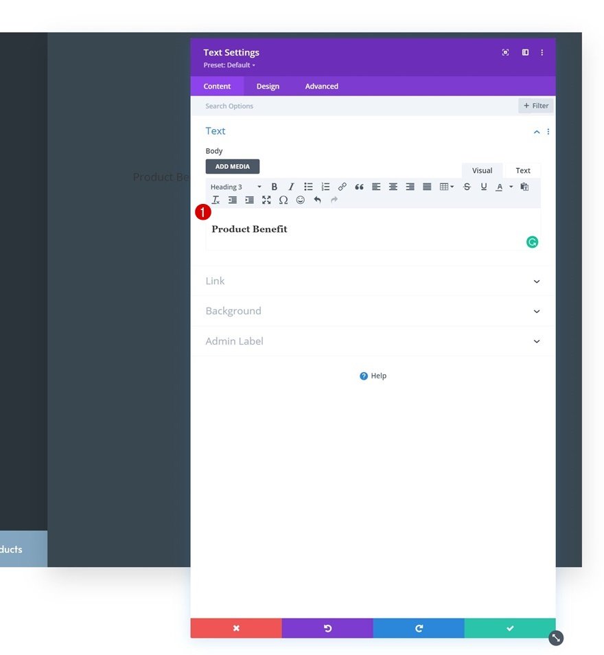
Add Text Module #1 to Column 2
Add H3 Content
On to the second column. Add a first Text Module with some H3 content of your choice.
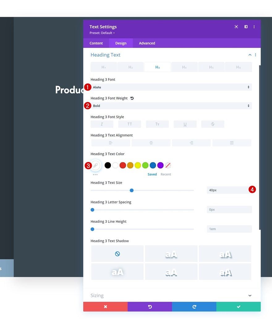
H3 Text Settings
Move on to the module’s design tab and apply the following H3 text styles:
- Heading 3 Font: Alata
- Heading 3 Font Weight: Bold
- Heading 3 Text Color: #ffffff
- Heading 3 Text Size: 40px
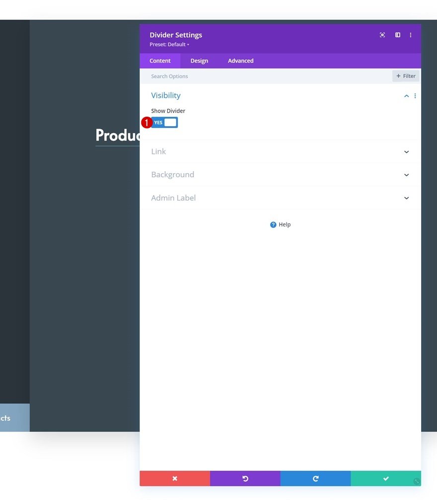
Add Divider Module to Column 2
Visibility
Below the first Text Module, we’ll add a Divider Module. Make sure the “Show Divider” option is enabled.
- Show Divider: Yes
Line Settings
Move on to the module’s design tab and change the line color.
- Line Color: #f3f0ee
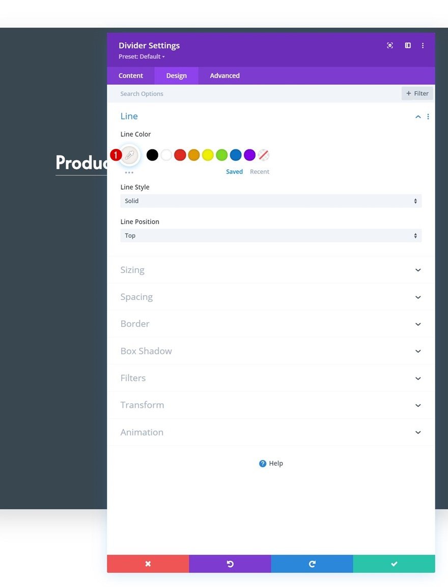
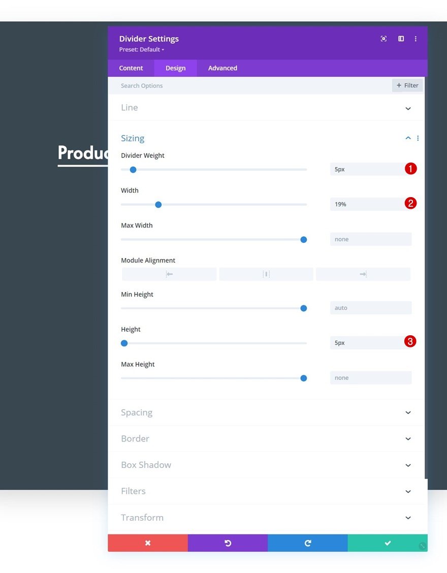
Sizing
Modify the sizing settings too.
- Divider Weight: 5px
- Width: 19%
- Height: 5px
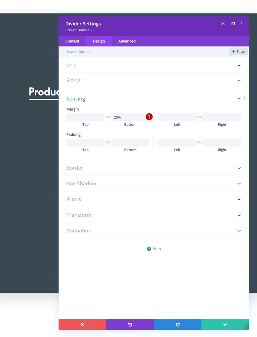
Spacing
And complete the module settings by adding some bottom margin to the spacing settings.
- Bottom Margin: 20%
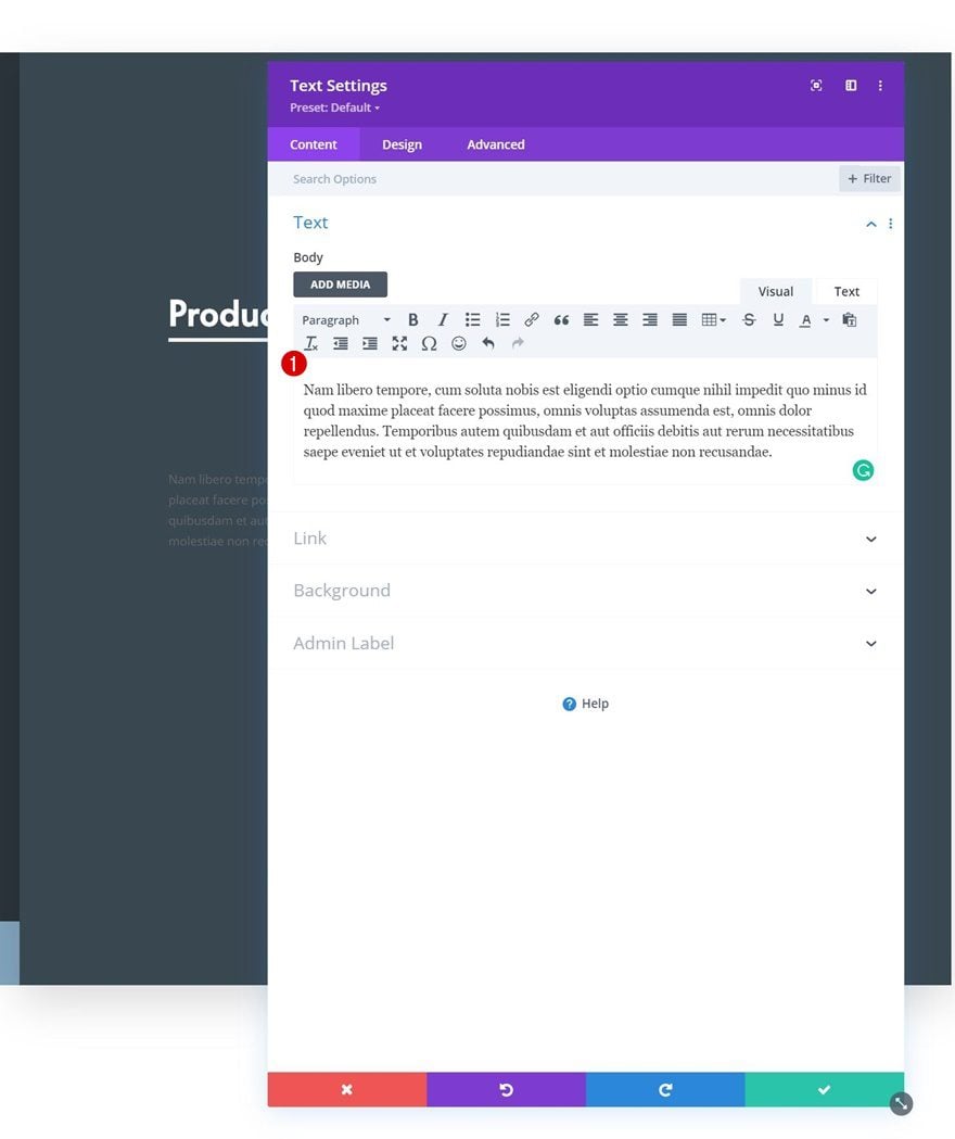
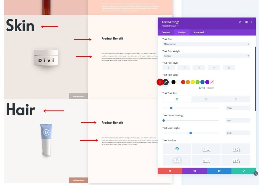
Add Text Module #2 to Column 2
Add Content
Add another Text Module right below the Divider Module. Enter some description content of your choice.
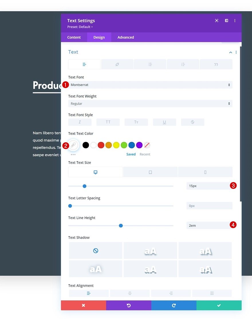
Text Settings
Style the module’s text accordingly:
- Text Font: Montserrat
- Text Color: #ffffff
- Text Size:
- Desktop: 15px
- Tablet & Phone: 14px
- Text Line Height: 2em
2. Turn Row into Stacking Element
Row Settings
Z Index
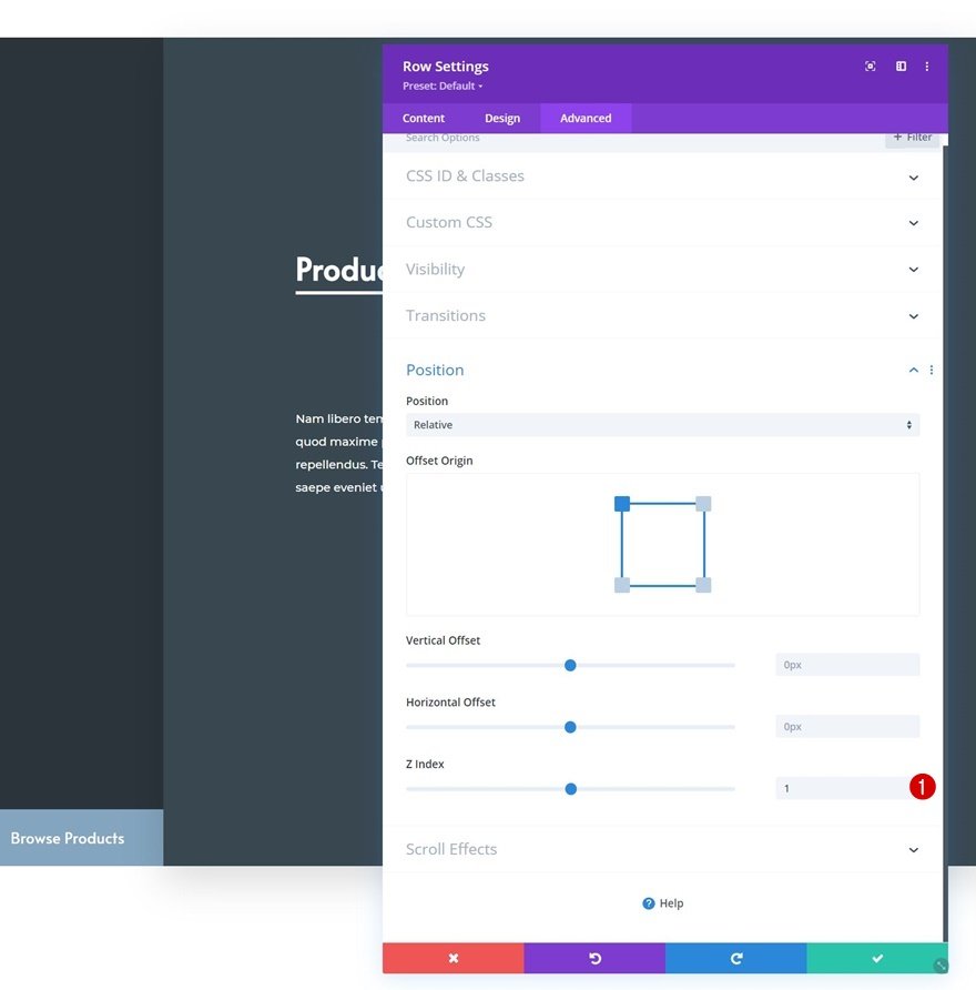
Now that we have our first row in place, it’s time to apply the sticky row stacking settings. We’ll apply these settings before cloning our row for reuse so the stacking effect takes place automatically. Open the row settings, go to the advanced tab and apply a z index of 1. This z index will help us ensure that each next row is placed on top of the previous one.
- Z Index: 1
Sticky Settings
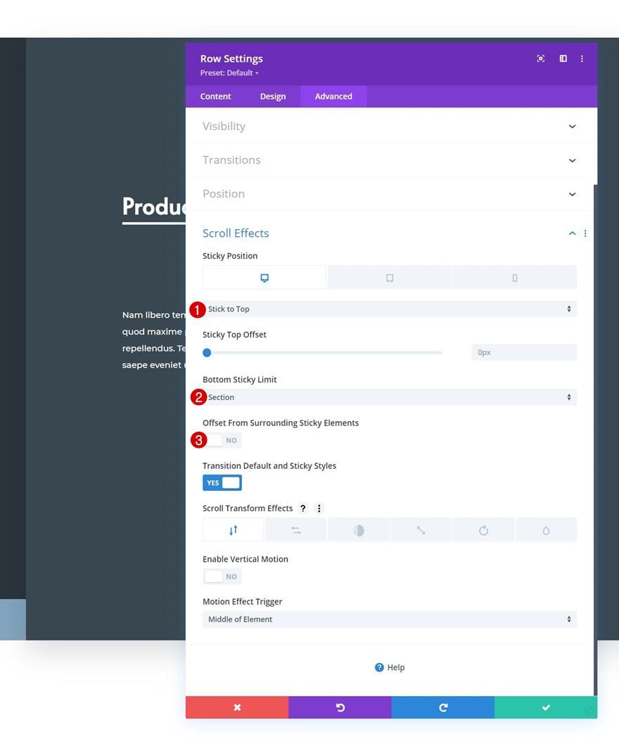
Then, we’ll go to the scroll effects settings and apply the following sticky settings:
- Sticky Position:
- Desktop: Stick to Top
- Tablet & Phone: Do Not Stick
- Bottom Sticky Limit: Section
- Offset From Surrounding Sticky Elements: No
3. Reuse Stacking Row in Same Section
Clone Row x3
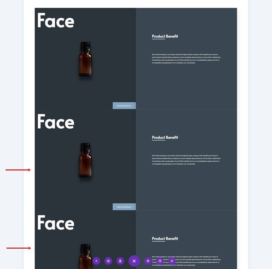
Now that our sticky options have been applied, we can reuse the entire row up to as many times as we want.
General Changes
Change All Copy
Make sure you change the copy in each duplicate
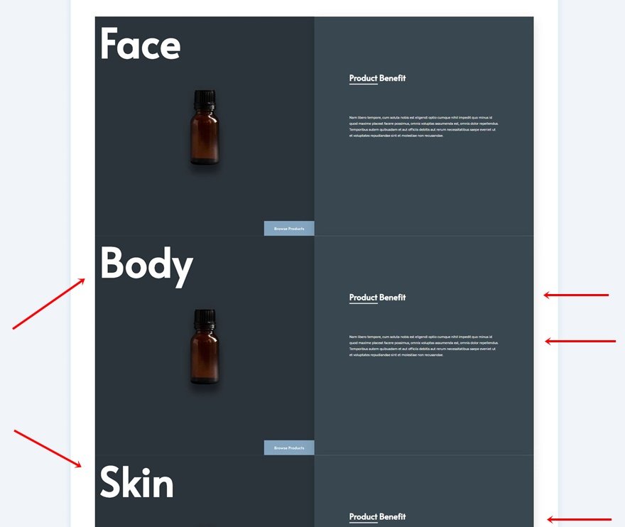
Change Column 1 Background Colors & Images
Along with the column 1 background colors and images.
- Duplicate 1: #edc1b6
- Duplicate 2: #efe7e2
- Duplicate 3: #f7f6f4
Change Column 2 Background Colors
We’re using different colors for the second column of each duplicate row as well.
- Duplicate 1: #ffd1c1
- Duplicate 2: #fff8f2
- Duplicate 3: #fffaf7
Change Button Background Colors
Next, we’ll change the button background colors in each duplicate row.
- Duplicate 1: #c18a7a
- Duplicate 2: #bab5b2
- Duplicate 3: #c98f7d
Changes to Rows with Light Background Colors
Change Text Colors
And last but not least, we’ll change the text color for each Text Module in the rows with a lighter background color. That’s it!
- Text Color: #2b343b
Preview
Now that we’ve gone through all the steps, let’s take a final look at the outcome across different screen sizes.
Desktop
Mobile
Final Thoughts
In this post, we’ve shown you how to get creative with Divi’s sticky options inside your page design. More specifically, we’ve shown you how to stack rows to create an appealing design and user experience. We’ve recreated a beautiful design example from scratch and you were able to download the JSON file for free as well! If you have any questions or suggestions, feel free to leave a comment in the comment section below.
If you’re eager to learn more about Divi and get more Divi freebies, make sure you subscribe to our email newsletter and YouTube channel so you’ll always be one of the first people to know and get benefits from this free content.
The post How to Stack Rows on Scroll with Divi’s Sticky Options appeared first on Elegant Themes Blog.