
Images are a key aspect of web design. And modern web design seems to call for new and abstract ways to display images on your website. Divi’s transform options make it easy to style and position images on your page just about anywhere you want. This opens the door for creating unique layouts that will take your website to the next level.
In this tutorial, I’ll be showing you a couple of ways you can style and position images in abstract places on your website. This will allow you to create countless design variations for images that you may have thought only possible in a photo editor like Photoshop or Sketch.
Let’s get started!
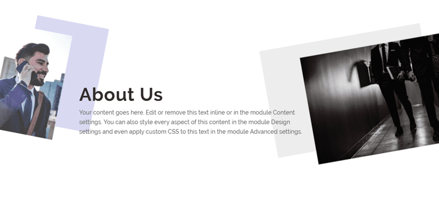
Sneak Peek
Here is a sneak peek of the designs we will build in this tutorial.
Download the Design Examples from This Tutorial for FREE
To lay your hands on these example designs, you will first need to download it using the button below. To gain access to the download you will need to subscribe to our Divi Daily email list by using the form below. As a new subscriber, you will receive even more Divi goodness and a free Divi Layout pack every Monday! If you’re already on the list, simply enter your email address below and click download. You will not be “resubscribed” or receive extra emails.
@media only screen and ( max-width: 767px ) {.et_bloom .et_bloom_optin_1 .carrot_edge.et_bloom_form_right .et_bloom_form_content:before, .et_bloom .et_bloom_optin_1 .carrot_edge.et_bloom_form_left .et_bloom_form_content:before { border-top-color: #ffffff !important; border-left-color: transparent !important; }
}.et_bloom .et_bloom_optin_1 .et_bloom_form_content button { background-color: #f92c8b !important; } .et_bloom .et_bloom_optin_1 .et_bloom_form_content .et_bloom_fields i { color: #f92c8b !important; } .et_bloom .et_bloom_optin_1 .et_bloom_form_content .et_bloom_custom_field_radio i:before { background: #f92c8b !important; } .et_bloom .et_bloom_optin_1 .et_bloom_border_solid { border-color: #f7f9fb !important } .et_bloom .et_bloom_optin_1 .et_bloom_form_content button { background-color: #f92c8b !important; } .et_bloom .et_bloom_optin_1 .et_bloom_form_container h2, .et_bloom .et_bloom_optin_1 .et_bloom_form_container h2 span, .et_bloom .et_bloom_optin_1 .et_bloom_form_container h2 strong { font-family: “Open Sans”, Helvetica, Arial, Lucida, sans-serif; }.et_bloom .et_bloom_optin_1 .et_bloom_form_container p, .et_bloom .et_bloom_optin_1 .et_bloom_form_container p span, .et_bloom .et_bloom_optin_1 .et_bloom_form_container p strong, .et_bloom .et_bloom_optin_1 .et_bloom_form_container form input, .et_bloom .et_bloom_optin_1 .et_bloom_form_container form button span { font-family: “Open Sans”, Helvetica, Arial, Lucida, sans-serif; } p.et_bloom_popup_input { padding-bottom: 0 !important;}

Download For Free
Join the Divi Newlsetter and we will email you a copy of the ultimate Divi Landing Page Layout Pack, plus tons of other amazing and free Divi resources, tips and tricks. Follow along and you will be a Divi master in no time. If you are already subscribed simply type in your email address below and click download to access the layout pack.
You have successfully subscribed. Please check your email address to confirm your subscription and get access to free weekly Divi layout packs!
To import the layout to your page, simply extract the zip file and drag the json file into the Divi Builder.
Now let’s get to the tutorial shall we?
Gettings Started
To get started, make sure you have the Divi Theme installed and active. Then create a new page and deploy the Divi Builder on the front end. Choose the option “Build from Scratch”.
Now you are ready to design!
Positioning Images Partially Outside of the Viewport (to the right or left)
In this first example, I’m going to show you how to position images partially outside of the viewport. This a nice way to add more of an abstract display for your images which will work much like a custom background image for your content. Then you can style the image for even more unique designs.
Here’s how to do it.
Create and Style the Text Module
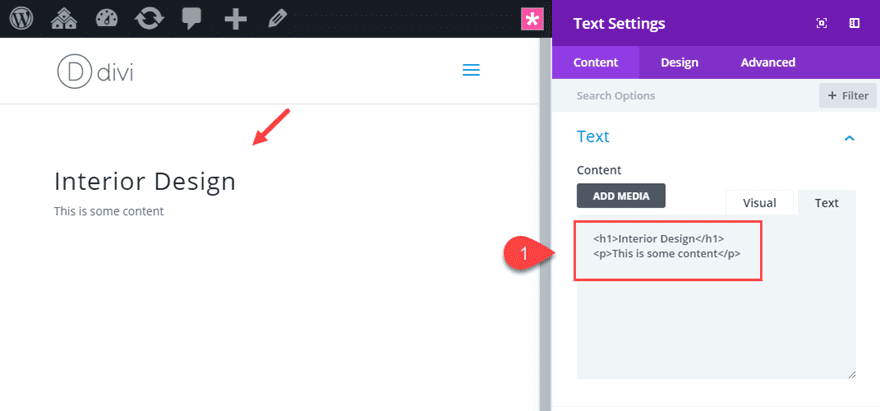
First we are going to create a text module which will serve as the main content for our section.
If you haven’t already, create a regular section with a one-column row. Then add the text module to the row.
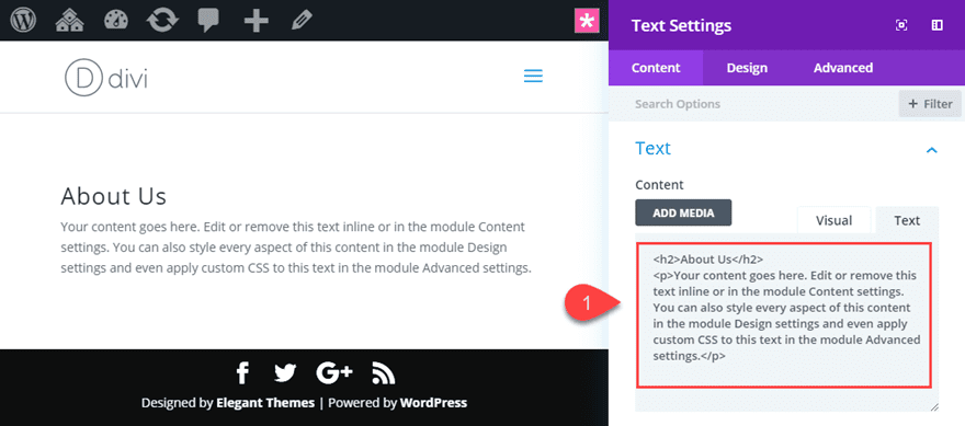
Update the content to include the following:
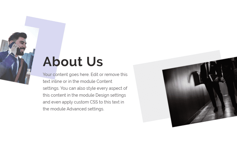
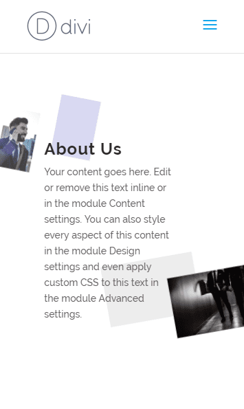
About Us
Your content goes here. Edit or remove this text inline or in the module Content settings. You can also style every aspect of this content in the module Design settings and even apply custom CSS to this text in the module Advanced settings.
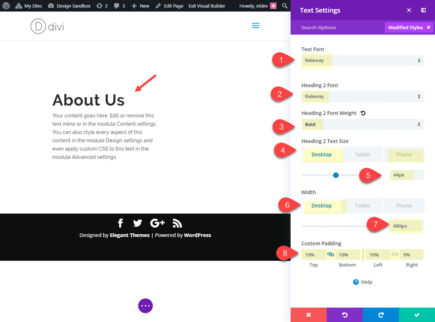
Then update the design settings as follows:
Text Font: Raleway
Heading 2 Font: Raleway
heading 2 Font Weight: Bold
Heading 2 Text Size: 44px (desktop), 24px (phone)
Width: 680px (desktop), 60% (tablet), 80% (phone)
Custom Padding: 10% top, 10% bottom, 10% left, 5% right
Add Image #1
Now we are ready to add the first image. Go ahead and add an image module directly above the text module.
Then upload your image to the image module. Make sure the image is large enough so that it doesn’t lose quality when we enlarge the image using the transform property. I’m using an image that is 400 by 580 pixels.
Next bring the width of the image module down and align it to the left as follows:
Width: 5%
Module Alignment: left
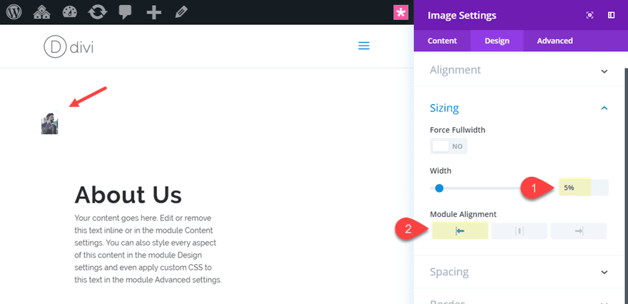
Shrinking the image module like this initially allows us to cut down on the negative space of the layout. This way we don’t have to adjust the spacing using negative margins.
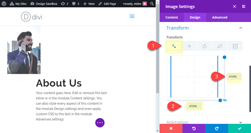
Now we can enlarge the image using transform options as follows:
Transform Scale X-axis: 416%
Transform Scale Y-axis: 416%
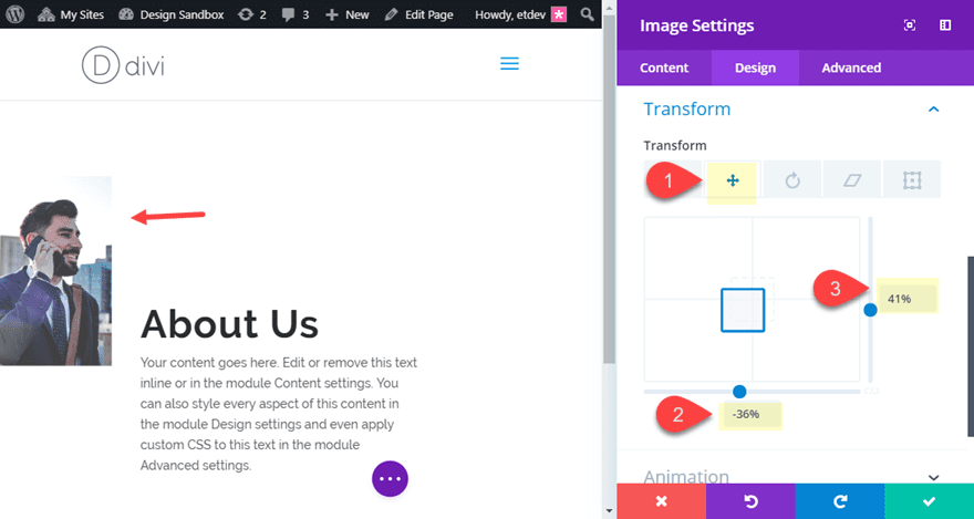
Then we can position the image using the transform translate as follows:
Transform Translate X-axis: -36%
Transform Translate Y-axis: 41%
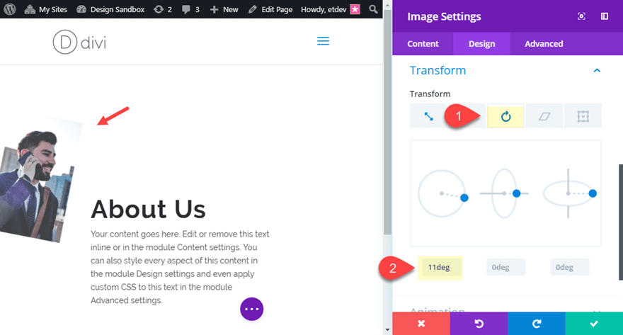
Lastly, you can rotate the image using transform rotate:
Transform Rotate Z-axis: 11deg
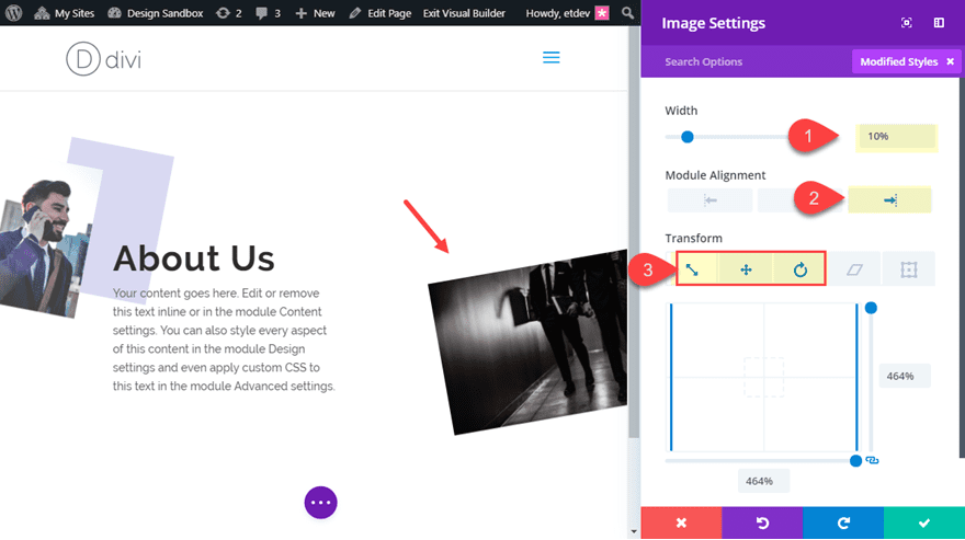
Now we are ready to add the second image. Go ahead and add an image module directly under the text module.
Then upload a new image to the image module.
Next bring the width of the image module down and align it to the left as follows:
Width: 10%
Module Alignment: left
The Width doesn’t have to be exactly 10%. All you want to do is shrink the module enough so that it doesn’t take up too much vertical space on the layout.
Then update the transform options as follows:
Transform Scale X-axis: 464%
Transform Scale Y-axis: 464%
Transform Translate X-axis: 7%
Transform Translate Y-axis: -80%
Transform Rotate Z-axis: -10deg
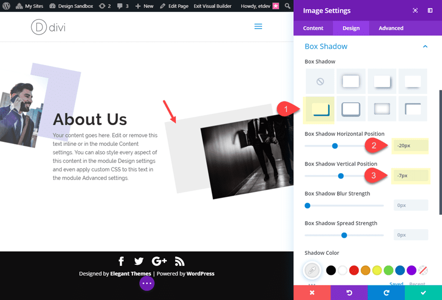
Then add a box shadow for an additional design element.
Box Shadow: see screenshot
Box Shadow Horizontal Position: -20px
Box Shadow Vertical Position: -7px
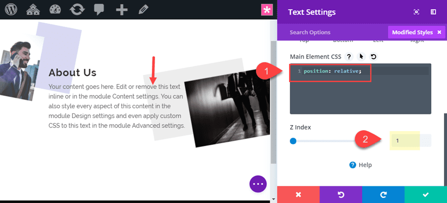
Making Sure the Text Module Stays on Top
We want to make sure the Text Module stays on top of the images whenever they start to overlap on mobile. This makes sure the images continue to serve as background images in the design.
To do this, open the text module and add the following Custom CSS to the Main Element:
Main Element CSS:
position: relative;
Then set the Z-index to 1.
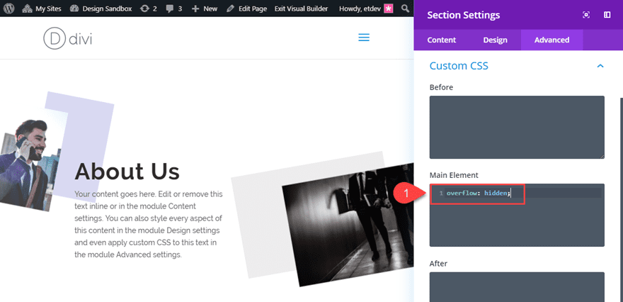
Hiding the Section Overflow
Since we will have images that are extending outside of the section of the page, the browser viewport width will increase to accommodate the extra space. This will engage the horizontal scroll bar at the bottom of the browser. To disable this, you will need to add a snippet of CSS to the section.
Open the section settings and add the following custom CSS to the Main Element:
overflow: hidden;
Now Check out the final result.
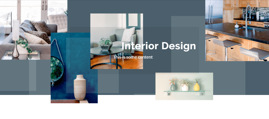
Creating an Abstract Image Collage Background for Your Header
For this next design, I’m going to show you how to build an abstract collage of images that will serve as a background for a header. To do this, we will use the display flex property to create a row of images that we can scale and move around in creative ways.
Here’s how to do it.
Designing the Header Text Module
First, create a new regular section with a one-column row. Then add a text module to the row and update the following content:
Interior Design
This is some content
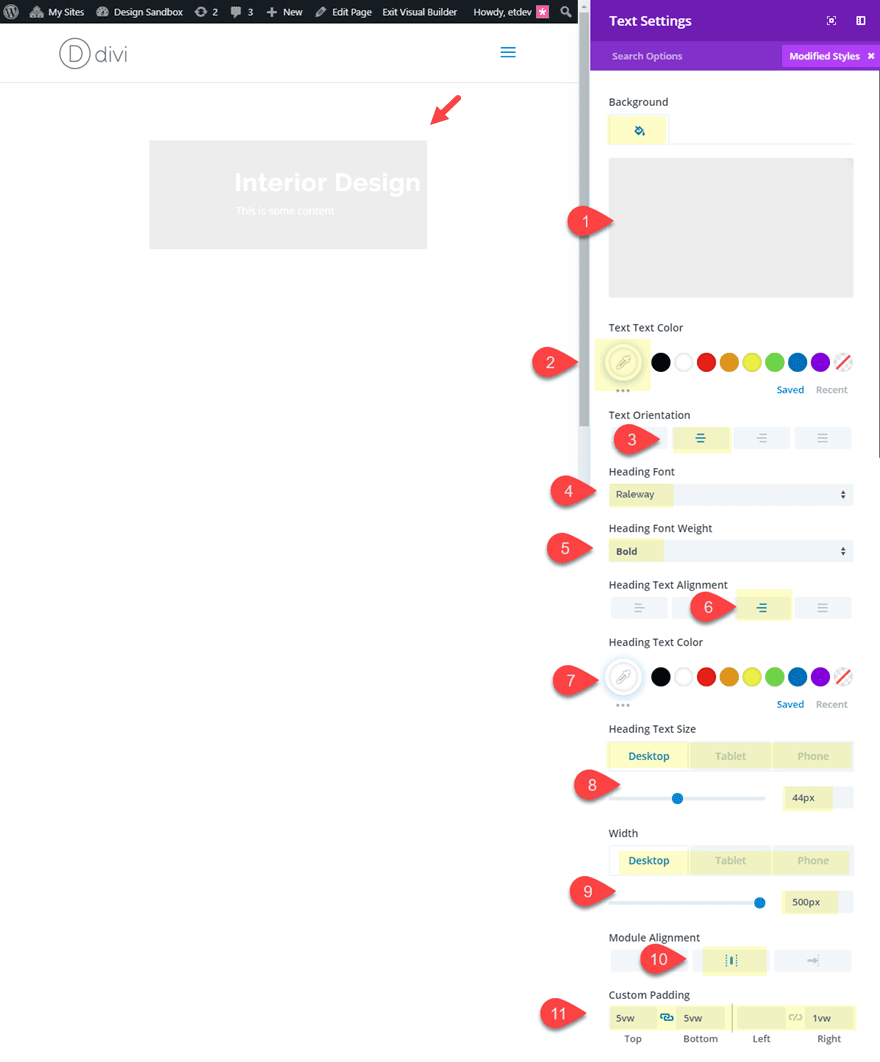
Then update the design as follows:
Background Color: rgba(0,0,0,0.07)
Text Text Color: #ffffff
Text Orientation: Center
Heading Font: Raleway
Heading Font Weight: Bold
Heading Text Alignment: Right
Heading Text Color: #ffffff
Heading Text Size: 44px (desktop), 34px (tablet), 24px (phone)
Width: 500px (desktop), 60% (tablet), 80% (phone)
Module Alignment: Center
Custom Padding: 5vw top, 5vw bottom, 1vw right
Section Settings
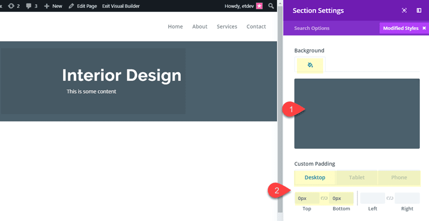
Before adding our images and building the collage background, let’s customize our section. This will provide our canvas for completing the rest of the design.
Open the section settings and update the following:
Background Color: #4c606d
Custom Padding (desktop): 0px top, 0px bottom
Custom Padding (tablet): 20px bottom
Custom Padding (phone): 40px bottom
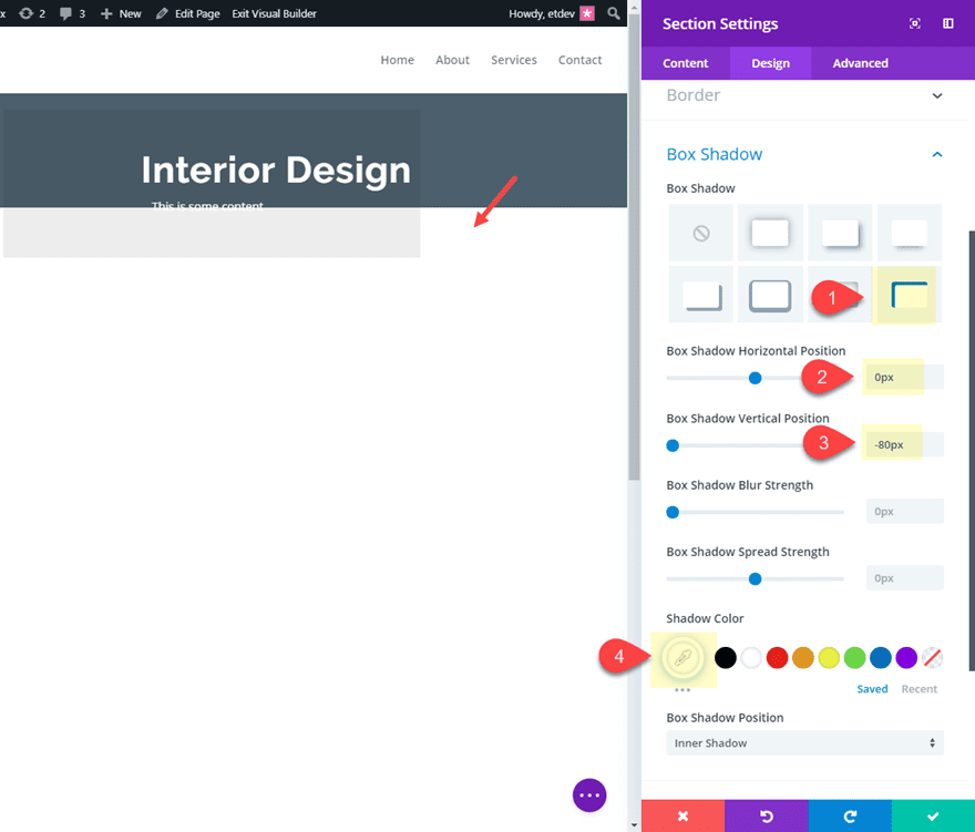
Next, add an inner box shadow to the bottom of the section with a color that matches the background of the next section on the page (in this case it will be white). This will allow us to create the effect of our images overlapping the bottom of the header into the next section (you’ll see what I mean later on).
Box Shadow: see screenshot
Box Shadow Horizontal Position: 0px
Box Shadow Vertical Position: -80px
Shadow Color: #ffffff
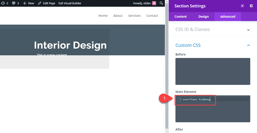
And since we will be moving images outside of the section viewport for our collage, we will need to add the following CSS to the Main Element.
overflow: hidden;
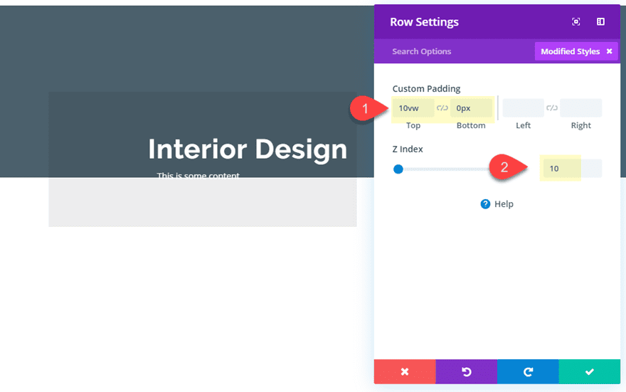
Row 1 Settings
Now we need to add some padding to the row containing our text module. We also need to add a z-index to keep the section on top of the images we will be adding to our section. By default, every section has a z-index value of 9. So all we need to do is add a z-index of 10 to the row we want to stay on top.
Open the row settings and update the following:
Custom Padding: 10vw top
Z Index: 10
Creating the Abstract Image Collage
At this point the section is ready to start adding our images.
To create the abstract image collage we are going to add 5 images to a one column row and then use “display: flex” to align all of those images horizontally on the page. This is necessary to keep the images in place (horizontally) on all browser sizes. If we were to use a traditional 5 column layout, the images what break into different column layouts on different devices and break the design.
After that we will be able to style and position our images one by one with transform options.
Adding The Row of Images
Go ahead and create a new one-column row directly under the row containing the text module.
Then open the row settings and update the following:
Custom Width: 50%
Gutter Width: 1
And to align all modules in this row horizontally, add the following CSS to the Column Main Element:
display: flex;
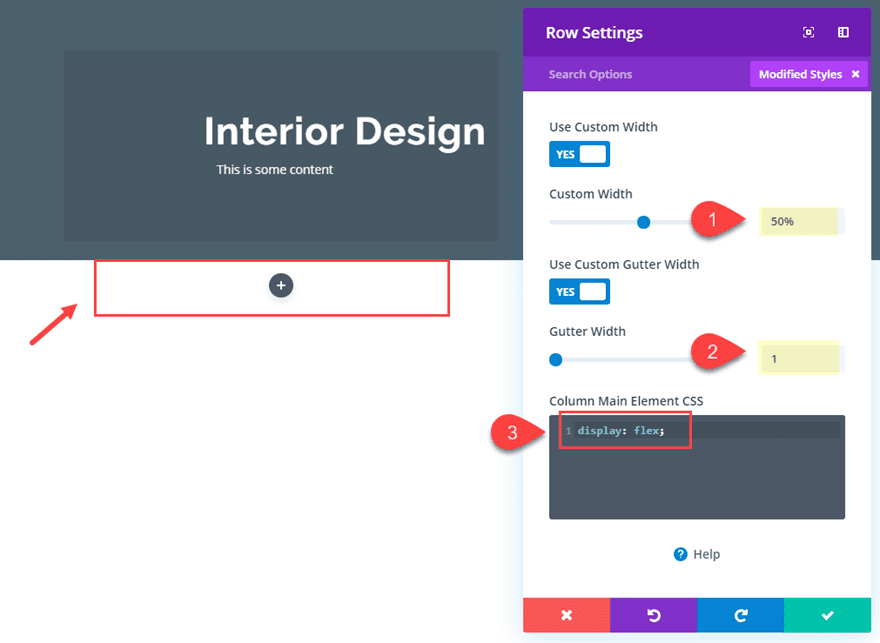
Now when you add image modules to the row, they will align horizontally.
Look at what happens as I duplicate an image module in the row with display:flex add to the column.
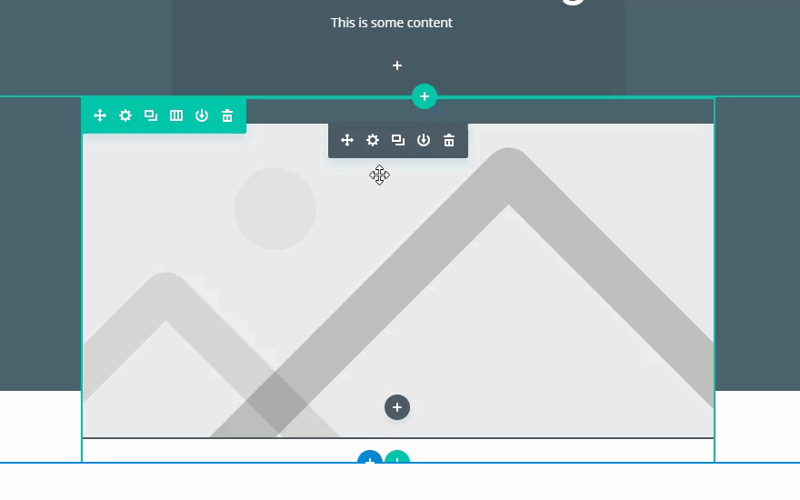
Go ahead and add 5 images to the row making sure they are large enough in size to accommodate for the size increase when scaling the image for the collage. I’m using images featured in our Home Improvement Layout Pack which are all about 800px in width and vary in height. Images with different dimensions tend to make a better looking abstract collage.
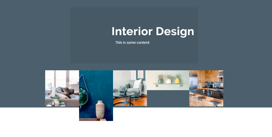
Positioning the Images with Transform Translate
It’s time to start positioning our images to create our collage.
Image #1
Open the settings for the first image module (far left) and update the transform options as follows:
Transform Scale X-axis: 266%
Transform Scale Y-axis: 266%
Transform Translate: X-axis: -68%
Transform Translate: Y-axis: -54%
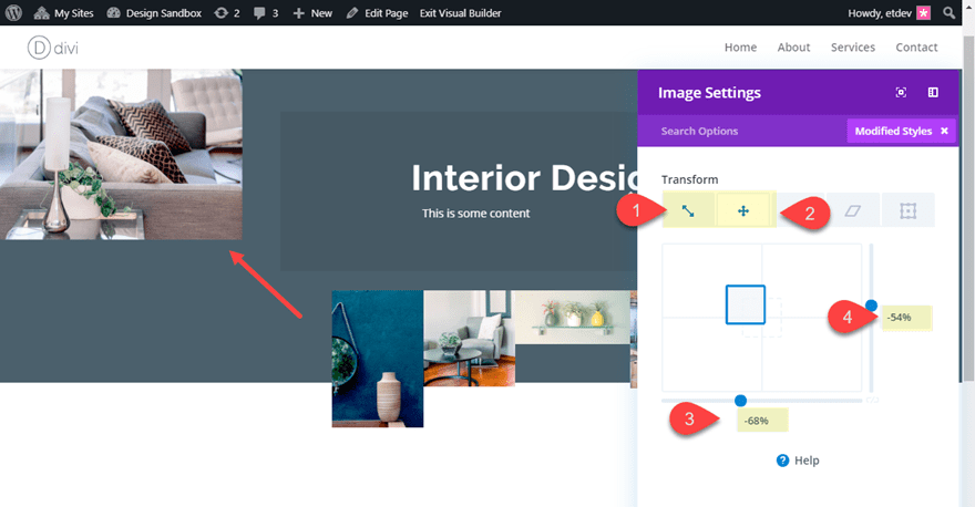
Image #2
Open the settings for the second image module and update the transform options as follows:
Transform Scale X-axis: 184%
Transform Scale Y-axis: 184%
Transform Translate: X-axis: -36%
Transform Translate: Y-axis: -66%
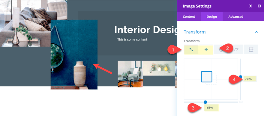
Image #3
Open the settings for the third image module and update the transform options as follows:
Transform Scale X-axis: 206%
Transform Scale Y-axis: 206%
Transform Translate: X-axis: -51%
Transform Translate: Y-axis: -27%
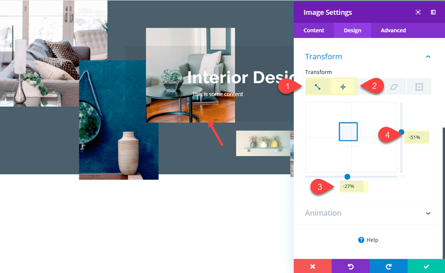
Image #4
Open the settings for the fourth image module and update the transform options as follows:
Transform Scale X-axis: 180%
Transform Scale Y-axis: 180%
Transform Translate: X-axis: 20%
Transform Translate: Y-axis: 42%
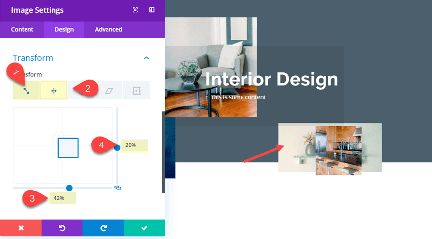
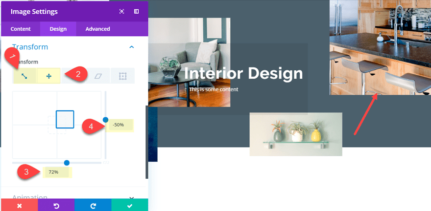
Image #5
Open the settings for the fifth image module and update the transform options as follows:
Transform Scale X-axis: 290%
Transform Scale Y-axis: 290%
Transform Translate: X-axis: -50%
Transform Translate: Y-axis: 72%
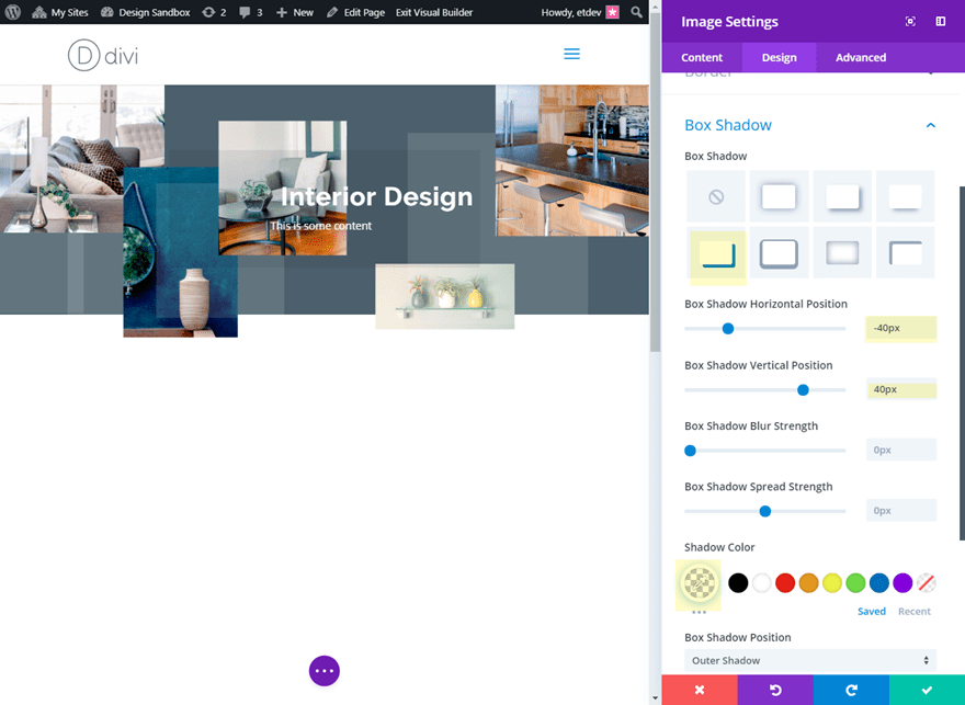
Adding a Box Shadow to the Images
To create an additional design element, we can add a box shadow to our images. To do this, activate grid mode and use the multiselect feature to select all of the image modules. Then open the settings of one of the image modules to deploy the element settings modal.
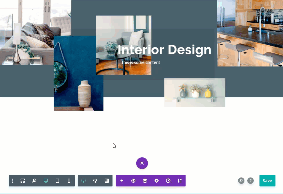
Then update the following:
Box Shadow: see screenshot
Box Shadow Horizontal Position: -40px
Box Shadow Vertical Position: 40px
Shadow Color: rgba(255,255,255,0.13)
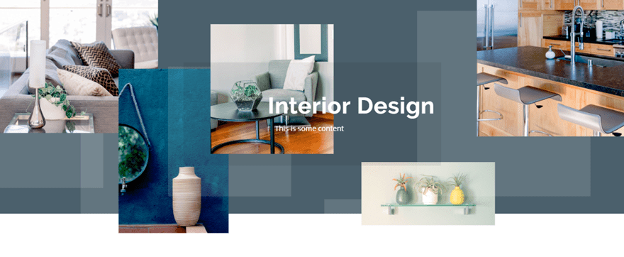
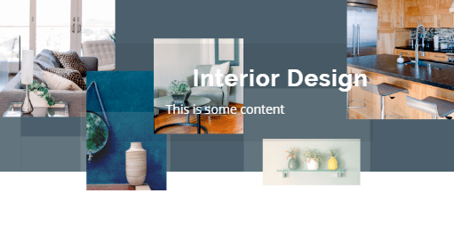
Final Result
Here is the final result of the design.
Desktop
Tablet
Phone
Final Thoughts
These example designs should provide you will some inspiration for how to style and position images on your website in ways you may have never thought possible outside of a photo editing software. Once you learn how to properly customize your layout, Divi’s transform options can position images in unique and abstract places. Hopefully, this will come in handy for your next project.
I look forward to hearing from you in the comments.
Cheers!
The post How to Style and Position Images in Abstract Places in Divi appeared first on Elegant Themes Blog.