
Most companies will need to showcase services on their website to their visitors. And one way to showcase services above the fold is to use a slider. This allows you to highlight each service one by one, but the downside is that the user will have to navigate back and forth to find the service they need. A better user experience may be to keep those services visible to the user at all times.
In this tutorial, I’m going to show you how to showcase services using a slider while at the same time keeping each service content visible to the user at all times. To do this we will be using multiple sliders and automatic animation so that each service is highlighted one by one with a specific slide design. And we will do this using Divi’s built-in design options.
Let’s get started.
Sneak Peek
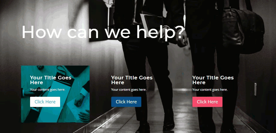
Here is a quick look at the design using multiple sliders to showcase services one by one.
Download the Showcase Services with Multiple Sliders Layout for FREE
To lay your hands on the designs from this tutorial, you will first need to download it using the button below. To gain access to the download you will need to subscribe to our Divi Daily email list by using the form below. As a new subscriber, you will receive even more Divi goodness and a free Divi Layout pack every Monday! If you’re already on the list, simply enter your email address below and click download. You will not be “resubscribed” or receive extra emails.
@media only screen and ( max-width: 767px ) {.et_bloom .et_bloom_optin_1 .carrot_edge.et_bloom_form_right .et_bloom_form_content:before, .et_bloom .et_bloom_optin_1 .carrot_edge.et_bloom_form_left .et_bloom_form_content:before { border-top-color: #ffffff !important; border-left-color: transparent !important; }
}.et_bloom .et_bloom_optin_1 .et_bloom_form_content button { background-color: #f92c8b !important; } .et_bloom .et_bloom_optin_1 .et_bloom_form_content .et_bloom_fields i { color: #f92c8b !important; } .et_bloom .et_bloom_optin_1 .et_bloom_form_content .et_bloom_custom_field_radio i:before { background: #f92c8b !important; } .et_bloom .et_bloom_optin_1 .et_bloom_border_solid { border-color: #f7f9fb !important } .et_bloom .et_bloom_optin_1 .et_bloom_form_content button { background-color: #f92c8b !important; } .et_bloom .et_bloom_optin_1 .et_bloom_form_container h2, .et_bloom .et_bloom_optin_1 .et_bloom_form_container h2 span, .et_bloom .et_bloom_optin_1 .et_bloom_form_container h2 strong { font-family: “Open Sans”, Helvetica, Arial, Lucida, sans-serif; }.et_bloom .et_bloom_optin_1 .et_bloom_form_container p, .et_bloom .et_bloom_optin_1 .et_bloom_form_container p span, .et_bloom .et_bloom_optin_1 .et_bloom_form_container p strong, .et_bloom .et_bloom_optin_1 .et_bloom_form_container form input, .et_bloom .et_bloom_optin_1 .et_bloom_form_container form button span { font-family: “Open Sans”, Helvetica, Arial, Lucida, sans-serif; } p.et_bloom_popup_input { padding-bottom: 0 !important;}

Download For Free
Join the Divi Newlsetter and we will email you a copy of the ultimate Divi Landing Page Layout Pack, plus tons of other amazing and free Divi resources, tips and tricks. Follow along and you will be a Divi master in no time. If you are already subscribed simply type in your email address below and click download to access the layout pack.
You have successfully subscribed. Please check your email address to confirm your subscription and get access to free weekly Divi layout packs!
To import the layout to your page, simply extract the zip file and drag the json file into the Divi Builder.
Let’s get to the tutorial shall we?
What You Need to Get Started
To get started, you will need to have the following:
- The Divi Theme installed and active
- A new page created to build from scratch on the front end (visual builder)
- Images to be used for mock content
After that, you will have a blank canvas to start designing in Divi.
Creating the Showcase Services with Multiple Sliders Design in Divi
Create the section and row 1
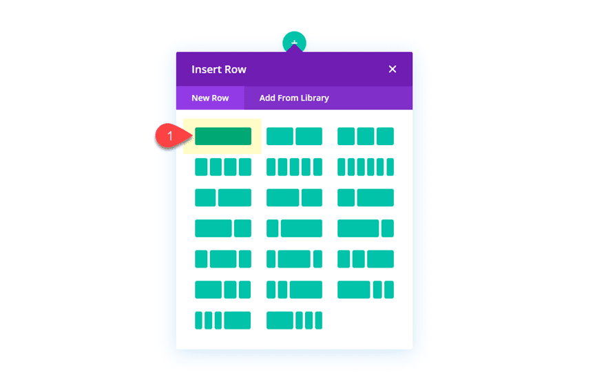
To get started, create a regular section with a one column row.
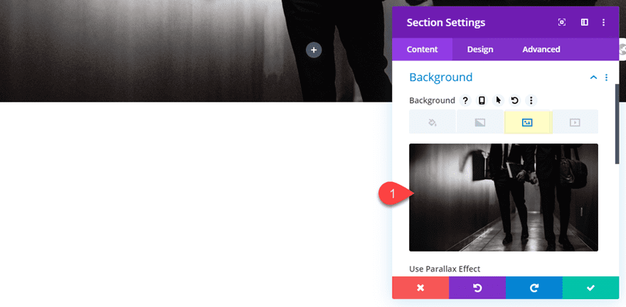
Then before you add any modules, open the section settings and add a dark background image (or background color).
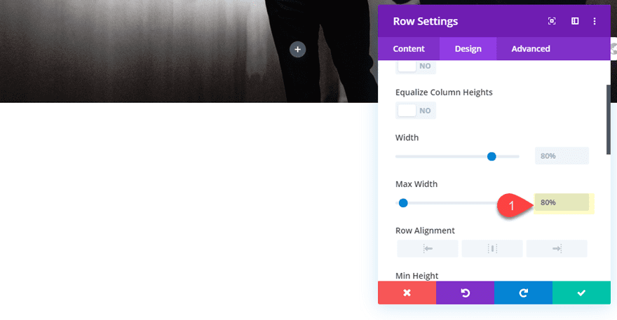
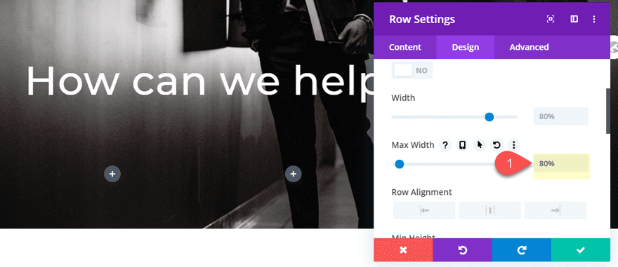
Then open the row settings and update the following:
Max Width: 80%
Add the Header Text with a Text Module
To add the header text for the design, let’s use a text module. Go ahead and add a text module to the row.
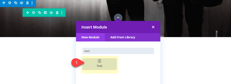
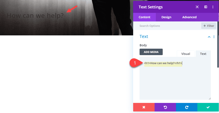
Then update the text module body content with the following HTML:
How can we help?
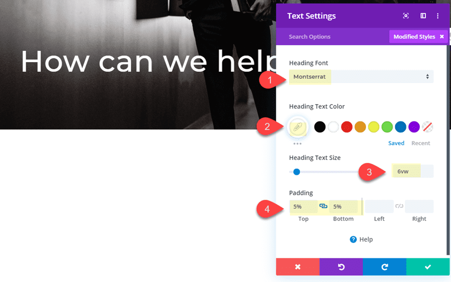
Then update the design settings as follows:
Heading Font: Montserrat
Heading Text Color: #ffffff
Heading Text Size: 6vw
Padding: 5% top, 5% bottom
Add the second Row
Next, add another row with a three column layout.
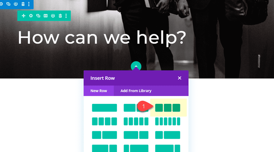
Then update the row settings with a max width of 80%.
Max Width: 80%
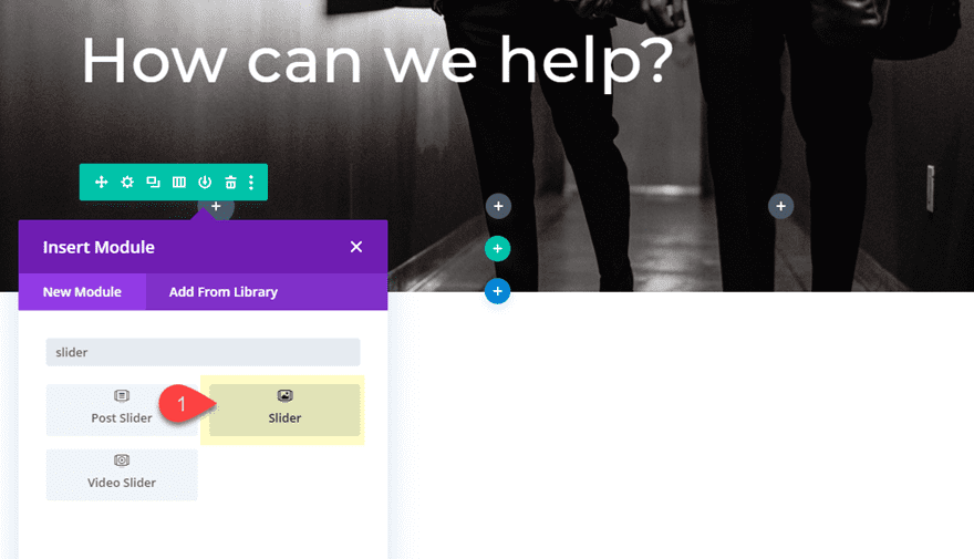
Add a Slider to Column 1
Now we are ready to start adding our sliders to each of out columns. Start with adding a slider module to column 1.
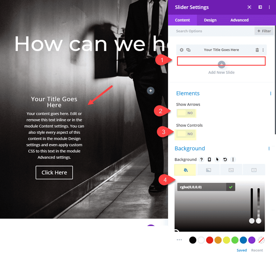
Delete the second default slide so that only one slide remains.
Then update the following:
Show Arrows: NO
Show Controls: NO
Background Color: rgba(0,0,0,0)
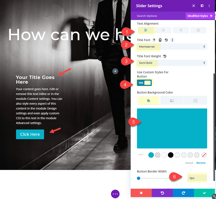
Text Alignment: Left
Title Font: Montserrat
Title Font Weight: Semi Bold
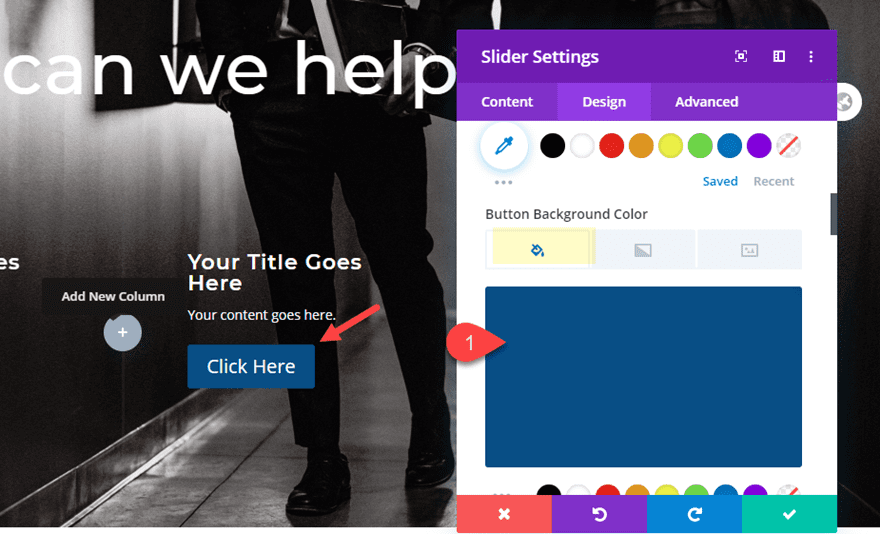
Button Background Color: #38b3cb
Button Border width: 0px
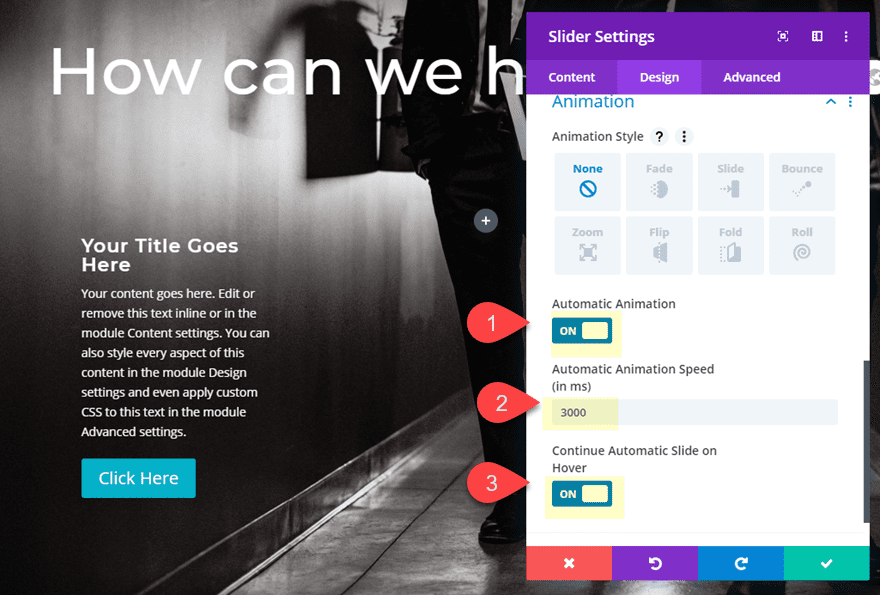
Then set the automatic animation options as follows:
Automatic Animation: ON
Automatic Animation Speed: 3000
Continue Automatic Slide on Hover: ON
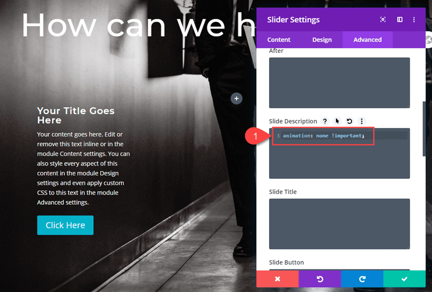
By default, Divi will add a subtle fade animation between slides. We want to disable this so that there is no noticeable change between slides. To do this, add the following custom CSS to the Slide Description:
animation: none !important;
That takes care of the slider settings. Now we need to update our individual slides.
Creating the Slides for Slider 1
We are going to be using three sliders with one slider in each of the three columns. And in order to get the timing of the slides to highlight each service one by one, we need to have three slides for each slider. Then we can choose one of the slides to be designed for showcasing or highlighting the service.
Let’s start by creating the three slides for Slider 1.
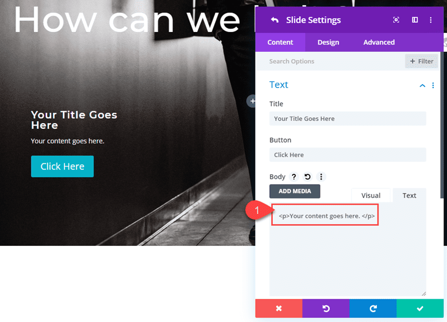
Open the settings for the individual slide. Then adjust the body text content to contain only a short sentence.
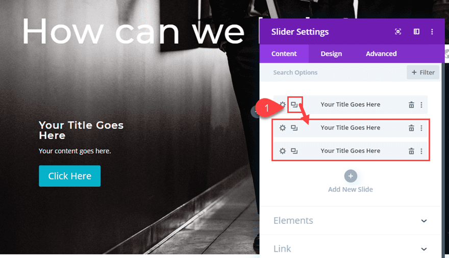
Now save the individual slide settings and duplicate the slide 2 times so that you have a total of three slides. Remember, for this design, you need to have the same number of slides as you do sliders/columns.
Copying and Pasting the Slider into Each Remaining Column
With our three slides in place on Slider 1, we can copy the slider module and paste it into column 2 and column 3.
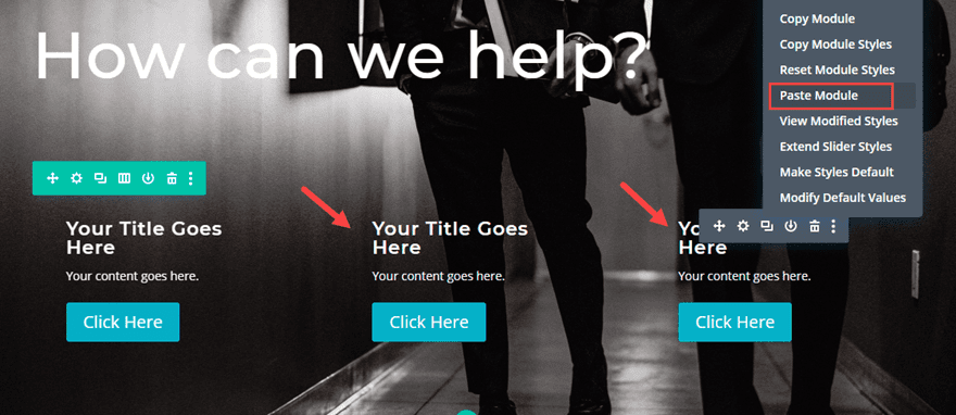
Now you should have the same slider in each column. And each slider has three identical slides that are set to automatically transition every 3000ms. And since we disabled the fade animation, you can’t see the transitions between slides. However, if we change the design of one of the slides, we will be able to see the difference when the slider goes to that slide. This allows us to change the design of one slide in each slider in order to showcase (or highlight) the service with automatic animation.
Updating each slider with a Showcase Slide
To do this, we will change the design of the first slide in slider 1, the second slide in slider 2, and the third slide in slider 3. This will highlight each service automatically (every 3000ms) starting from the left column and ending with the third column on the right. Then it will continue to repeat this automatic animation.
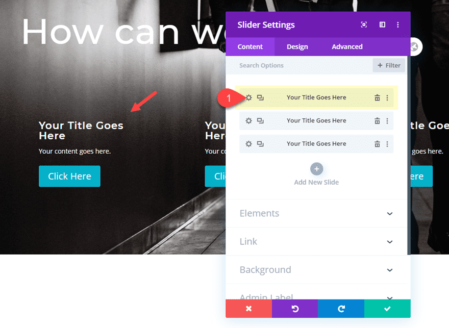
Update Slider 1 Showcase Slide
Start by opening the settings for slider 1 and then opening the settings for the first individual slide.
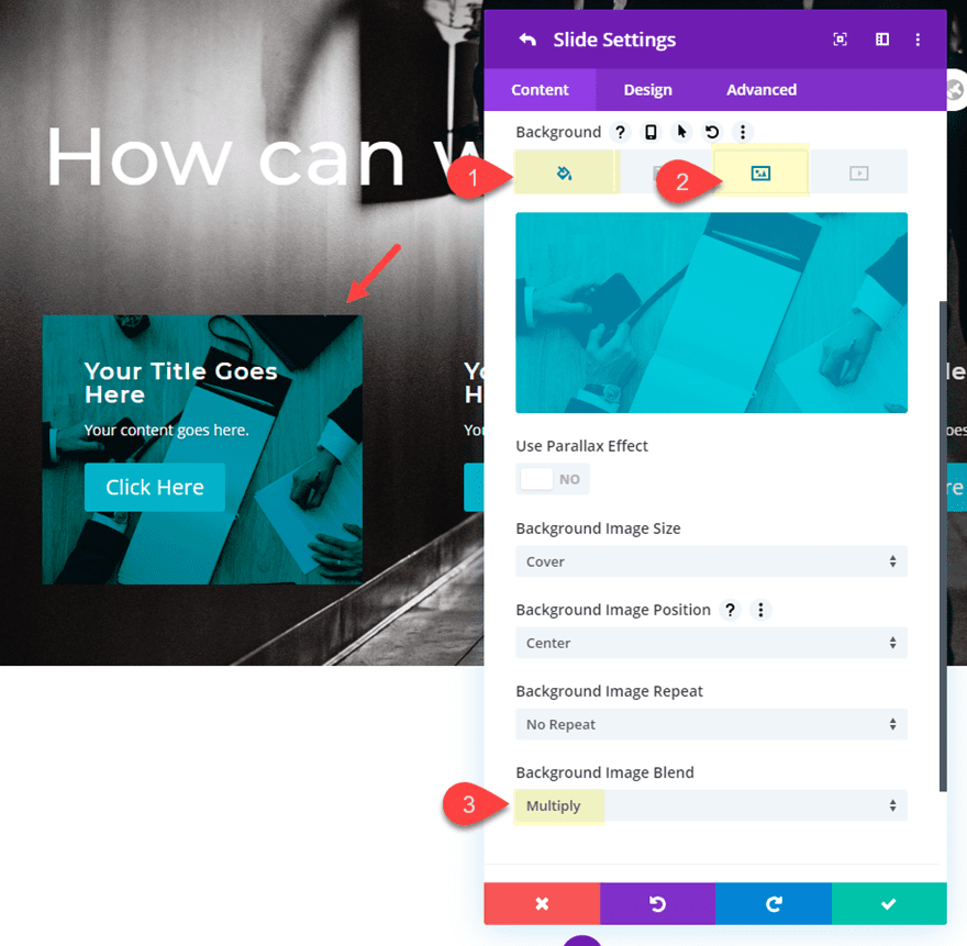
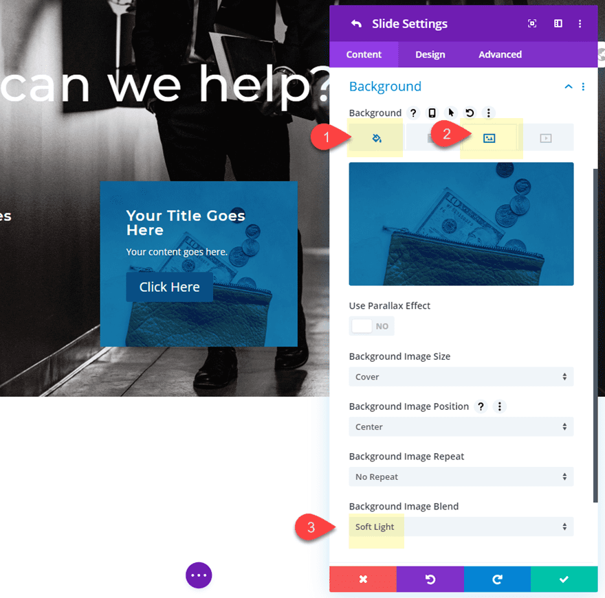
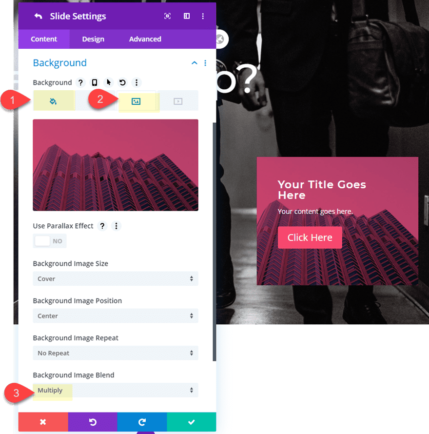
To highlight the service, we will update the slide with a background color (that matches the button) and a background image that is blended together with the background color using the multiply blend mode.
To do this add update the following:
Background Color: #00b2ca
Background Image: [upload image of your choice]
Background Image Blend: Multiply
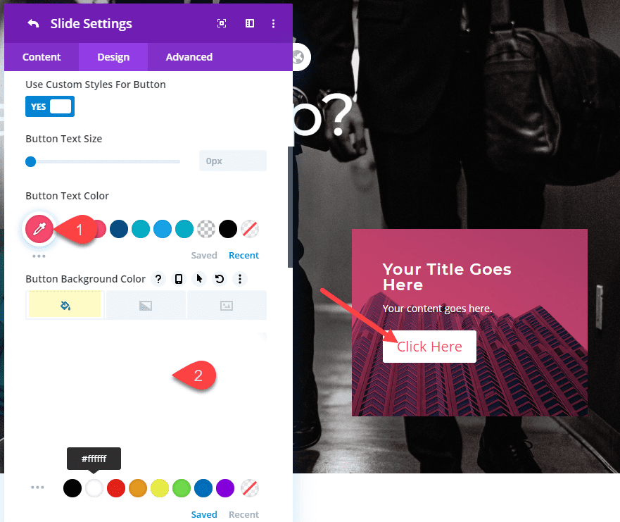
Then update the button style for this slide as follows:
Button Text Color: #00b2ca
Button Background Color: #ffffff
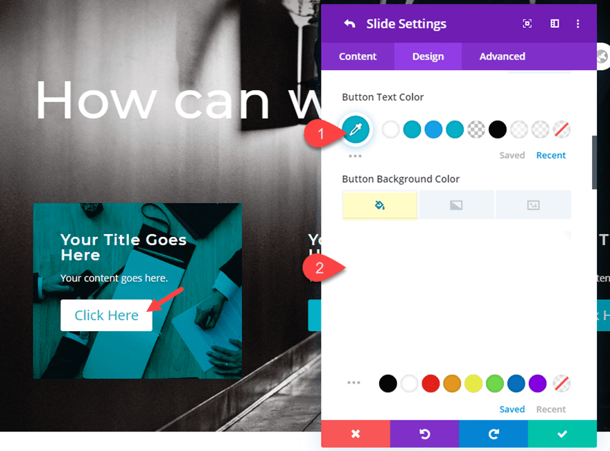
Save settings.
Now with the new design added to the first slide you will see the first slide highlight the service whenever the slider reaches the first slide.
Update Slider 2 Showcase Slide
For Slider 2, we want the second slide to be our showcase slide so that it appears immediately after the showcase slide in slider 1.
Open the slider module settings for the slider in column 2 and change the button background color.
Button Background Color: #1d4e89
Then open the individual slide settings for the second slide and update the following:
Background Color: #1d4e89
Background Image: [upload image of choice]
Background Image Blend: Soft Light (or multiply for a darker effect)
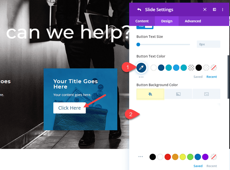
Then update the button style for the slide.
Button Text Color: #1d4e89
Button Background Color: #ffffff
Update Slider 3 Showcase Slide
For Slider 3 (in column 3), we will need to update the third slide as our showcase slide so that it appears immediately after the second slider showcase slide.
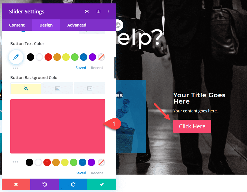
First, change the button color of slider 3 as follows:
Button Background Color: #ef476f
Then open the settings for the third slide and update the following:
Background Color: #ef476f
Background Image [insert image of choice]
Background Image Blend: Multiply
Then update the button style for the slide as follows:
Button Text Color: #ef476f
Button Background color: #ffffff
Final Result
Let’s check out the final result.
And here is how the design stacks on tablet and phone.

Final Thoughts
Showcasing services using multiple sliders with automatic animation seems a bit tricky. But it’s actually pretty easy once you understand the concept.
Since each slider represents one service, you will want to keep the content the same and make sure your button url is the same for each slide.
There are also many other ways you can use this setup. For example, you could set the automatic animation duration to different speeds in order to make the services highlight sporadically. And you can even add different services within each slide of the sliders for more services to popup.
I personally like the current setup because it shows progression and can be used to show visitors a process. But I would love to hear your thoughts and ideas.
I look forward to hearing from you in the comments.
Cheers!
The post How to Use Multiple Sliders to Showcase Services with Automatic Animation appeared first on Elegant Themes Blog.