The ability to vertically align content when building a site with Divi can be a convenient addition to your design tool belt. Sometimes a certain layout calls for content to be vertically aligned in different ways (centered, bottom, top). The most common need is to have your content vertically centered. It provides a delightful touch of symmetrical spacing that really comes in handy when using multiple column layouts for your content. Plus, vertically centered content stays centered on different browser widths, which takes the grunt work out of applying custom padding or margins to get similar responsiveness.
In this tutorial, I’m going to show you how you can add a few small snippets of CSS to any column to vertically align the content. I’ll be using some of Divi’s premade layouts for examples of how to do this. If you don’t know much about CSS, you don’t have to worry. This will be easy enough to apply to your own layouts in seconds.
Understanding Flex and Divi
The Flex (or Flexbox) css property is simply a way for positioning elements in horizontal and/or vertical stacks (kind of like a table). Except, unlike traditional tables, the flex property allows you to create boxes that adjust or “flex” to the size of the content it holds.
Divi does use the flex property whenever you select “Equalize Column Heights” as your row setting. This simply makes sure the size of your columns will all adjust to the size of the column with the most content. And since “Equalize Column Heights” activates the flex for the row container, you can easily take advantage of that by adding css to your columns to adjust the contents of each column (or box).
For example, if you add “margin: auto” to any column in a row, the content of that column (whether it be one or more modules) will become vertically centered.
Also, if you add “align-items:center;” to your row, all of your columns (and their content) will be vertically centered.
Of course, there are many more uses for the flex property in web design along with more advanced CSS that you can apply to your theme. But for this tutorial, I wanted to keep things simple.
Is This Really Necessary?
Technically, no. You can vertically align your content/modules within a column using custom spacing (padding and margin). For example, you can use Divi’s spacing options to give a column equal top and bottom padding to center the module(s) vertically within the column. Or, you can add only top padding to a column to make the content bottom aligned. However, you may have to adjust the spacing when updating your page with more content. Plus, it may be difficult to keep this alignment on different browser widths.
So, if you are looking for a solution to vertically aligning content without having to think about custom spacing, I think you will find this useful.
Let’s get started!
Load the Premade Layout to Your Page
To kick things off, I’m going to use the Interior Design Company Portfolio Page Layout. To get this layout on your page, create a new page. Then give your page a title. Click “Use Divi Builder” and then “Use Visual Builder”. Then select the option “Choose a Premade Layout”. Then select the Interior Design Company Layout Pack from the Load From Library popup. Finally, select the Portfolio page from the list of layouts and click “Use this Layout”.
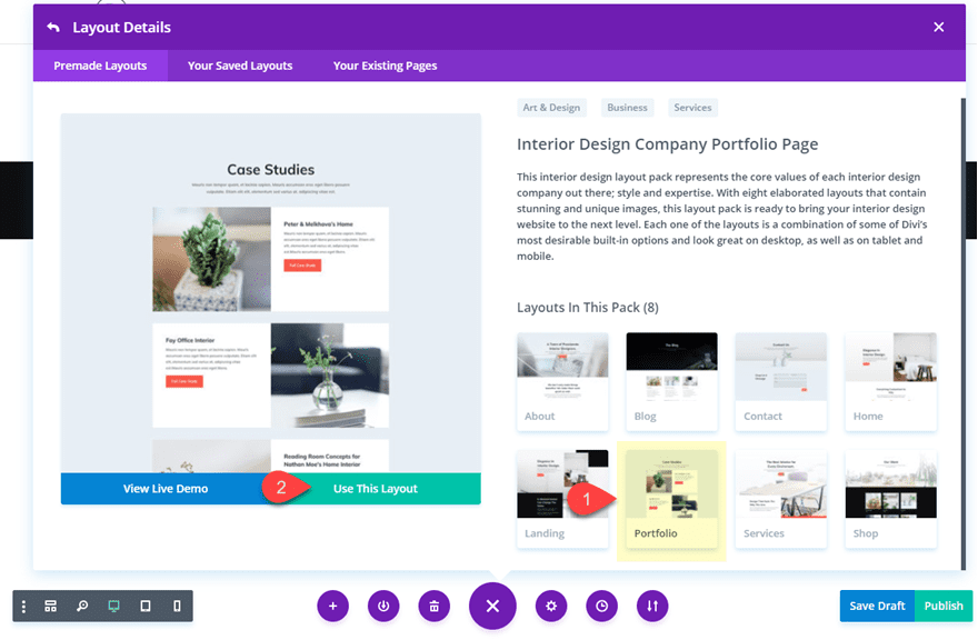
Once the layout has loaded to your page, you are ready to go.
Method 1: How to Vertically Align Content using Flex and Auto Margin
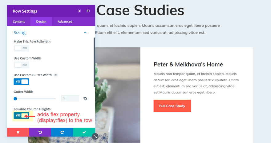
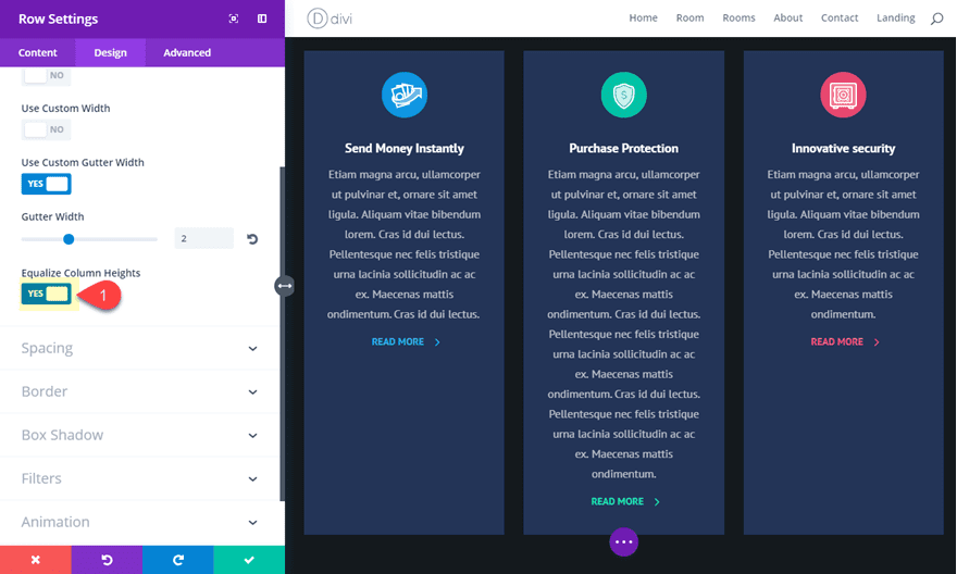
Open the row settings of the second row on the page (the one directly under the row with the page title). Under the design settings toggle open the Sizing option group and notice that “Equalize Column Heights” is already active. This means that the row now has the flex property (“display: flex;”) added to it.
Now go to the Advanced tab settings for the same row and add the following css snippet under the Column 2 Main Element input box.
margin: auto;
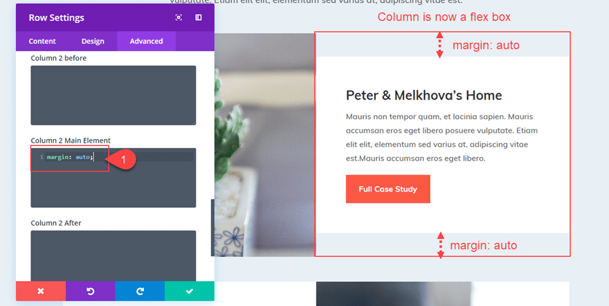
Now the second column content has shifted to become vertically centered.
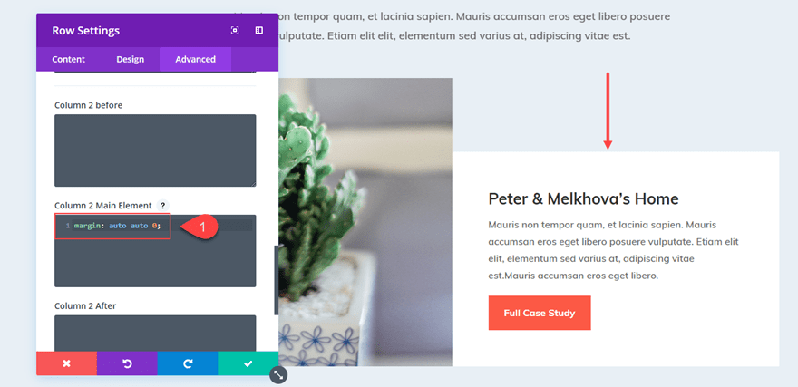
Making the Content Bottom Aligned
If you want to make your content bottom aligned so that all modules will stack on the bottom of your column, you can adjust the margin value as follows:
margin: auto auto 0;
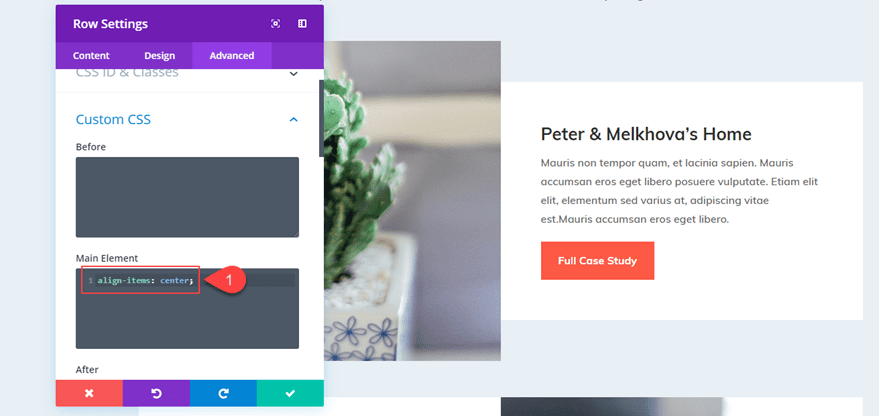
Aligning Content Vertically for All Columns in Your Row
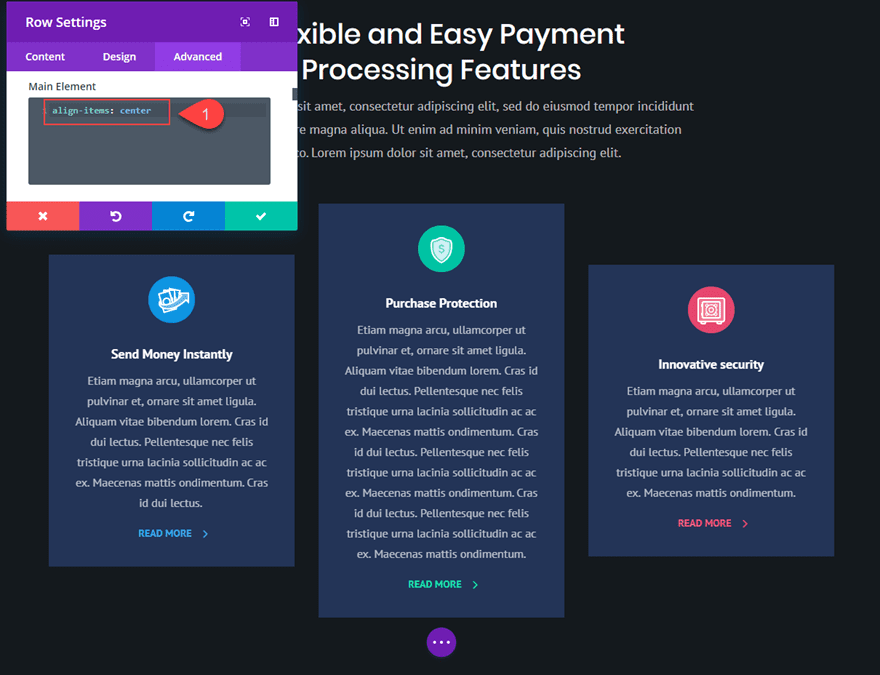
Instead of adding “margin:auto” to each column individually, You can also vertically center the content of all columns in your row by adding the following snippet to the main element of your Row settings.
align-items: center;
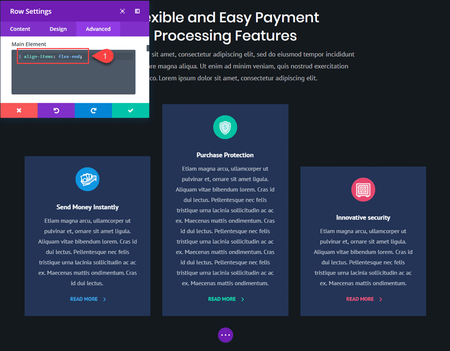
Or if you want all the content of your columns to be bottom aligned, you can add this snippet:
align-items: flex-end;
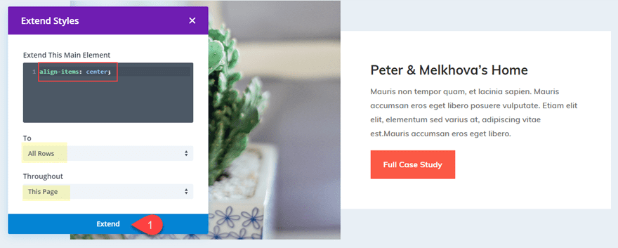
And, don’t forget that you could take advantage of Divi’s Extend Styles feature by right clicking on the main element with your css snippet and clicking “Extend Main Element”.
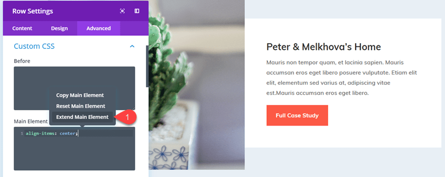
Then extend that main element css to all rows throughout the page (or section) to vertically center all the content of every column on the page.
Now everything is vertically centered.
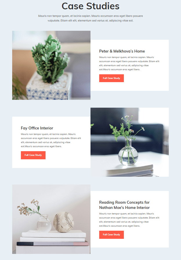
But, you may have noticed the white column background color no longer spans the full height of the row. This is because we added “margin: auto” to the column. To fix this, you could change the row background color to white and get rid of the row padding. But instead, I’m going to show you a way for you to center the content of your column without changing the margin.
Method 2: Vertically Aligning Content using Column Flex Direction
In the first method, we took advantage of the flex property being added to the row. This made each of our columns a “flex box” that can be vertically aligned simply by adjusting the margin.
But there is also a way for use to flex-direction to align the content of our column without losing the “Equalize Column Height” effect that keeps our columns (and column backgrounds) the same size. To do this we are simple going to add a few lines of CSS to our column so that all the modules within the column will be stacked vertically and then centered.
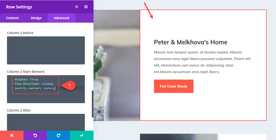
Let’s go back to our row in the previous example. Open up the Row Settings and take out any custom css you may have in there by right clicking on Custom CSS and clicking “Reset Custom CSS Styles”
Then add the following CSS under Column 2 Main Element:
display: flex;
flex-direction: column;
justify-content: center;
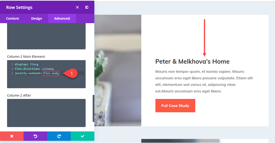
Or if I wanted to bottom align the content, simply change “justify-content: center” to “justify-content: flex-end”.
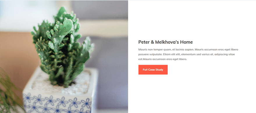
What is great about this setup is that if I have my content vertically centered and I make the row full width, the content stays centered.
Making Blurbs with Various Amounts of Text Vertically Aligned
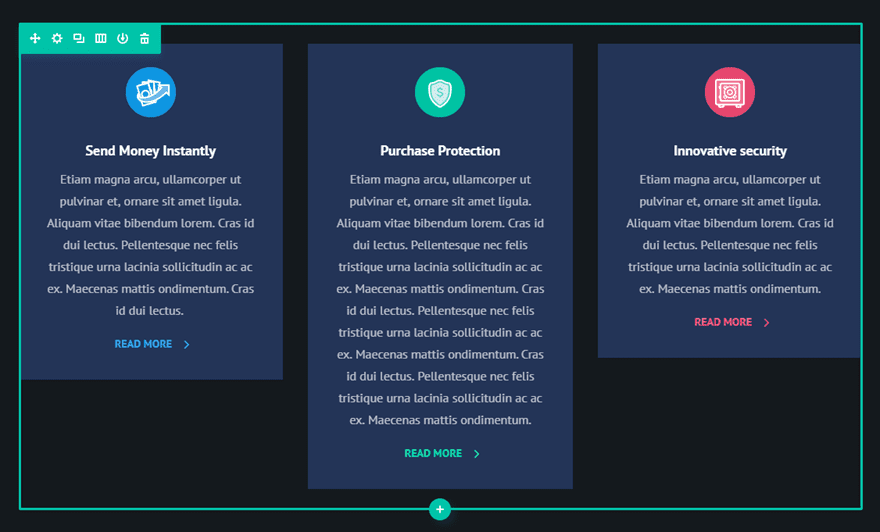
Making your column content vertically centered can also come in handy for blurbs. As you know, not every blurb will have the exact amount of text used to describe the feature or service. Making these blurbs vertically centered can create a nice design for your layout.
For this example, I’m going to vertically align the blurbs on the Digital Payments Home Page Layout.
I’m going to first add some differing amounts of body text to the blurbs to give a more realistic representation of what a site might look like.
Now, I need to go to the row settings and “Equalize Column Heights”.
Now I can add my CSS snippets to align my content and change the design.
Under the Advanced tab of your Row Settings, we can vertically center the content of our columns by adding the following under Main Element:
align-items: center;
Or change it to the following to make them bottom aligned.
align-items: flex-end;
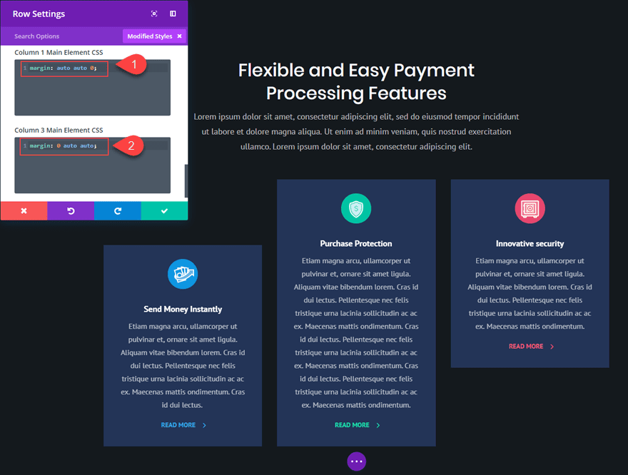
Or you can reset your custom css styles and add the following custom margins to make the first column bottom aligned and the third column top aligned.
Column 1 Main Element CSS:
margin: auto auto 0;
Column 3 Main Element CSS:
margin: 0 auto auto;
What About One Column Layouts?
Technically, you don’t need a css snippet or flex to get your one column content vertically centered. All you need to do is make sure you have equal spacing above and below your content (or modules). Most of the time, people need vertical centered content on layouts with multiple columns because they want the adjacent content to line up perfectly.
Lots of Applications
There are a lot of useful applications vertically aligning your content in Divi. This would come in handy for headers with a two column layout with the heading text in one column and you want to make sure a CTA (button) in the other column is vertically centered. It would also be helpful for vertically centering logos in a six column layout (especially if the logos have slightly different dimensions).
Final Thoughts
Even though this method does rely on a few small snippets of custom CSS, I believe the application can be extremely useful for those looking for a quick fix to a sometimes cumbersome process. I would love to hear of other examples where this might come in handy.
Feel free to share your ideas and comments below.
Cheers!
The post How to Vertically Align Content in Divi appeared first on Elegant Themes Blog.