
We all love social media. We may get frustrated at times, and we all probably disconnect and take breaks, but in the end, we return to our chosen networks like puppies who wandered too far into the woods and got lost for a bit.
What we don’t love, however, are the annoying pop-ups, overlays, and general unpleasantness that many websites force on us with their social media buttons. I don’t know about y’all, but between email pop-ups and absurdly placed social sharing buttons, I’ve got a ton of blacklisted sites I never visit.
The annoyance just isn’t worth it. And you don’t want to have the kind of site that loses visitors like that.
However, if you do social media buttons right, your presence grows, your content gets spread far and wide, and your users will come back because they see you as a human being and not a RT/Like junkie.
How to Be Annoying
No, that isn’t the name of my memoir, it’s our look at the most annoying practices that drive visitors away due to bad design and even-worse UX.
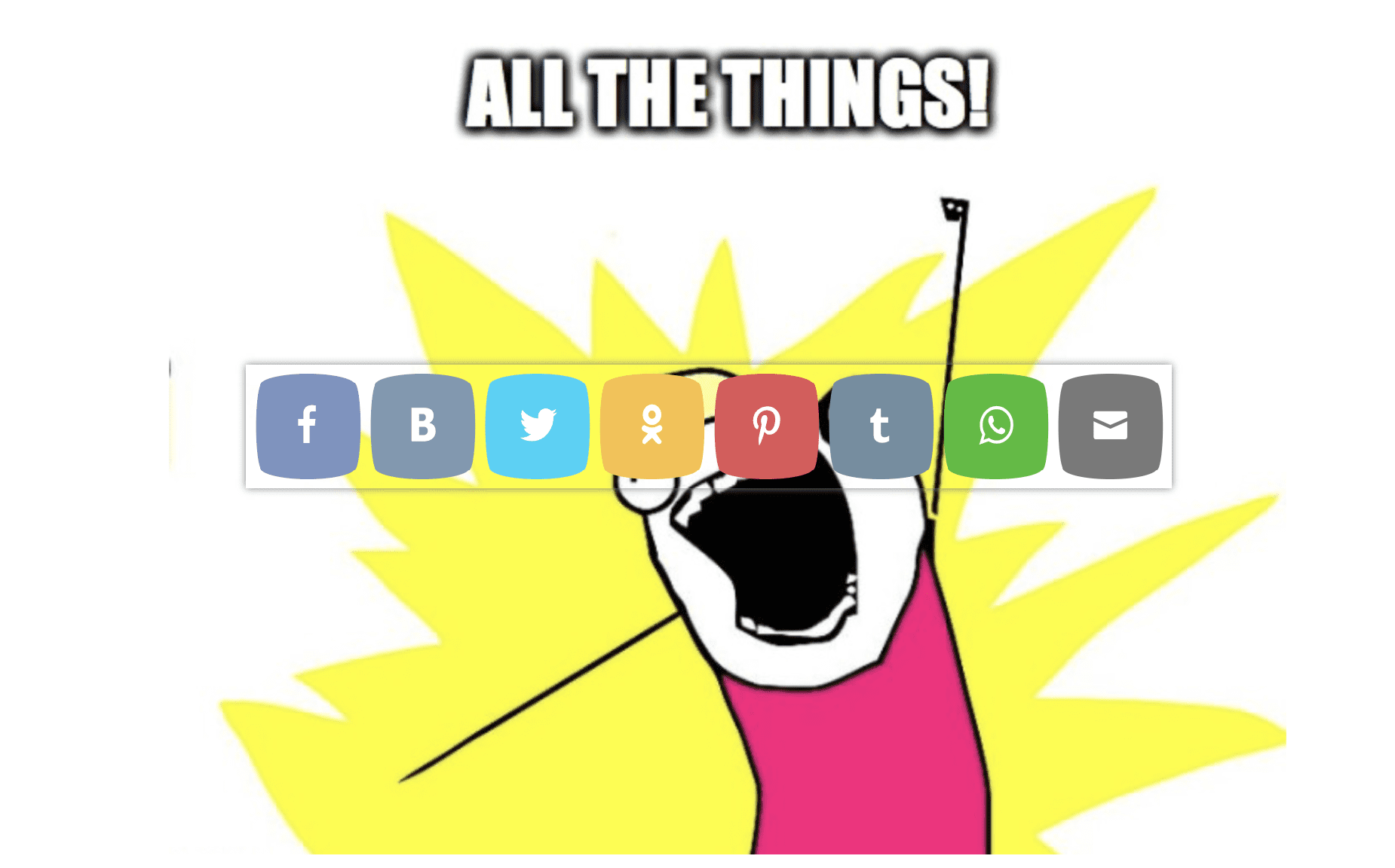
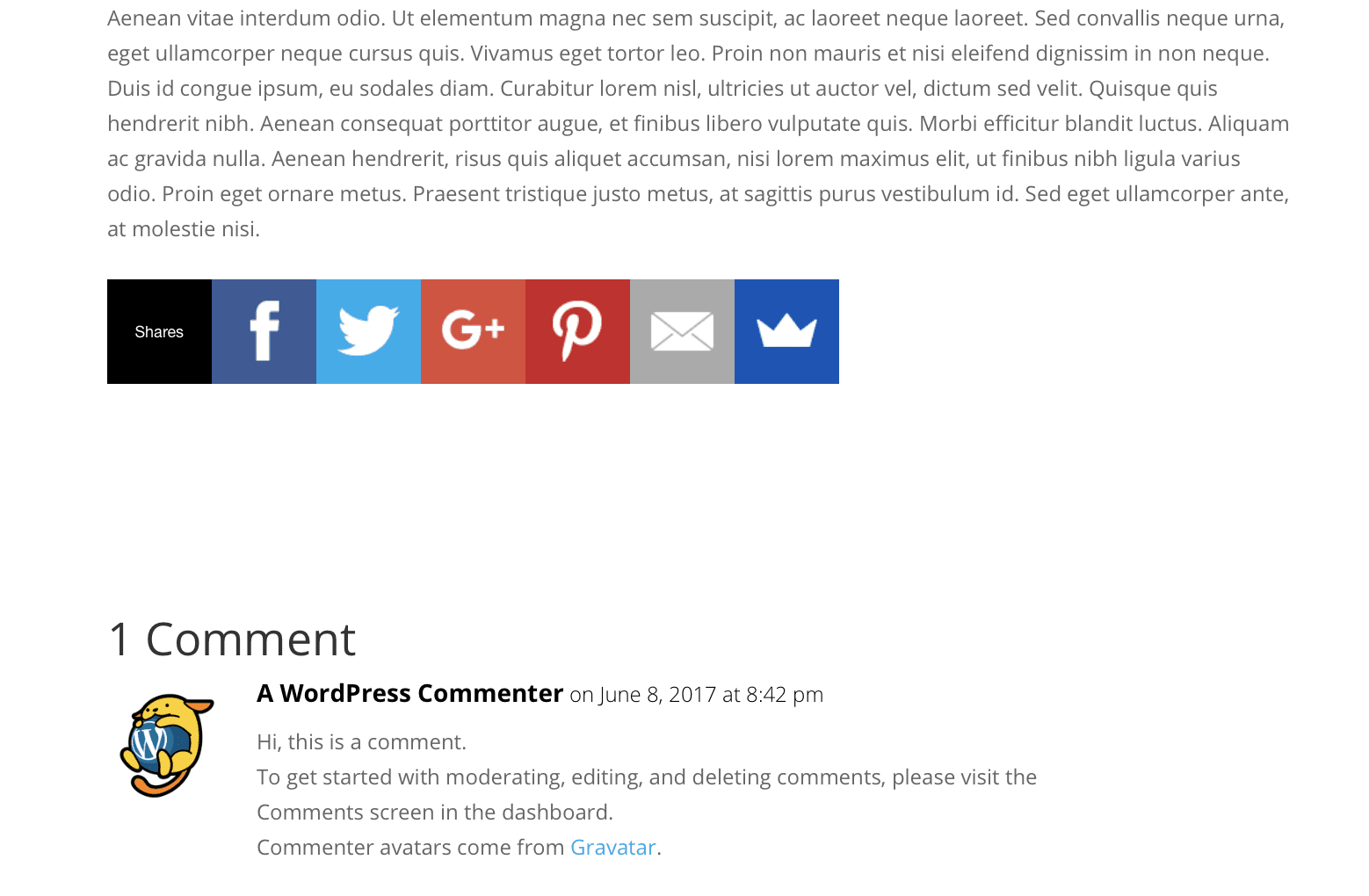
Too. Many. Buttons.
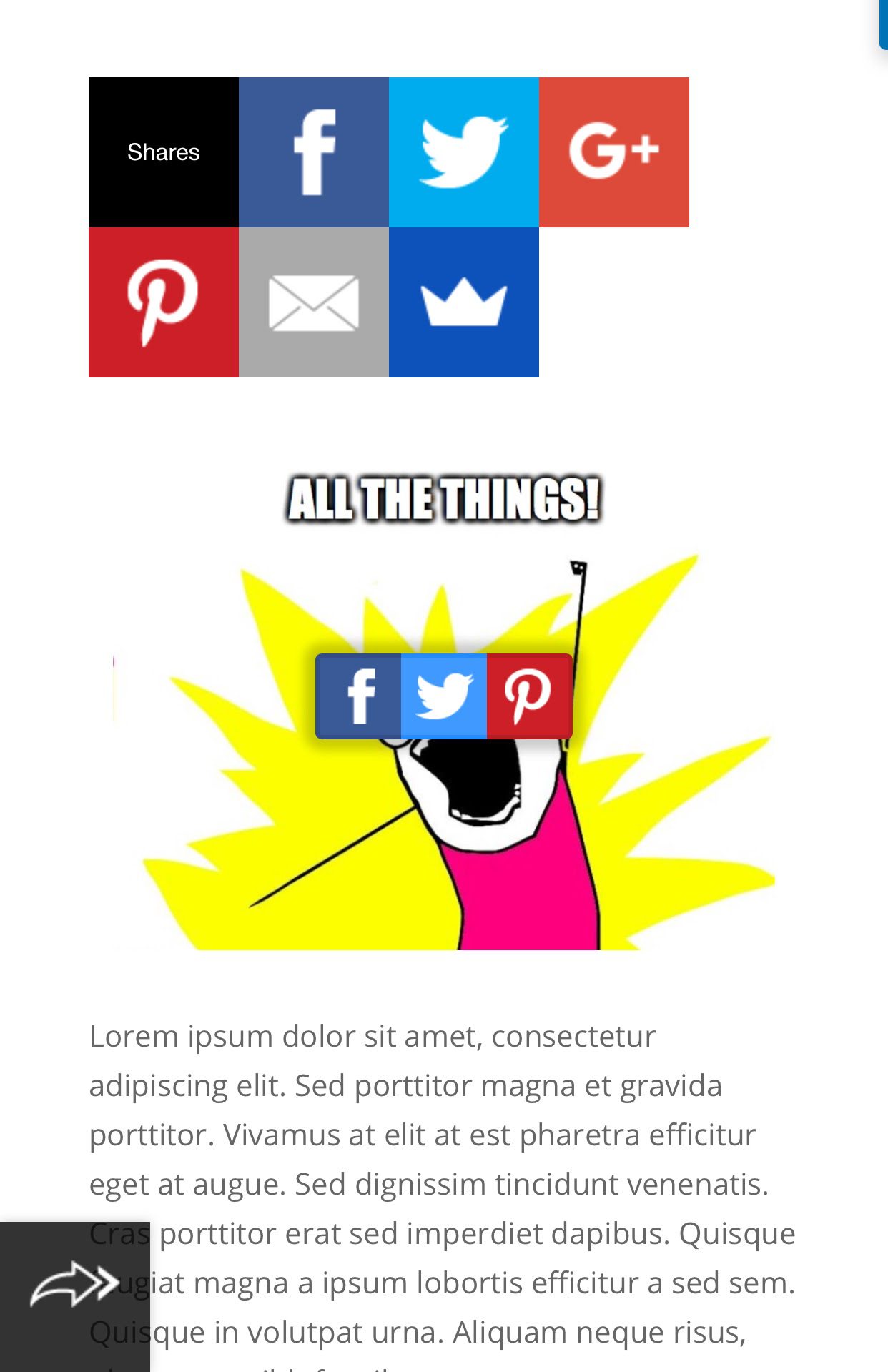
It’s easy to go overboard by accident. After all, you just want people to share your content with their friends and family, putting you on the front-page of Reddit. In your desire to make such sharing more convenient, you place buttons everywhere.
I think it’s pretty obvious why this is annoying.
Social Pop-ups

Yes. We know you’re on Facebook. I am aware you have a Twitter account. Please don’t interrupt the user’s experience to let them know where they can contact you via social media.
Why would they want to connect on social media with you if they don’t even know who you are and what you have to say? Sure, you have buttons for them to do it with one click, but the only button they’re going to push is that big ole X in the corner.
Blocking Content
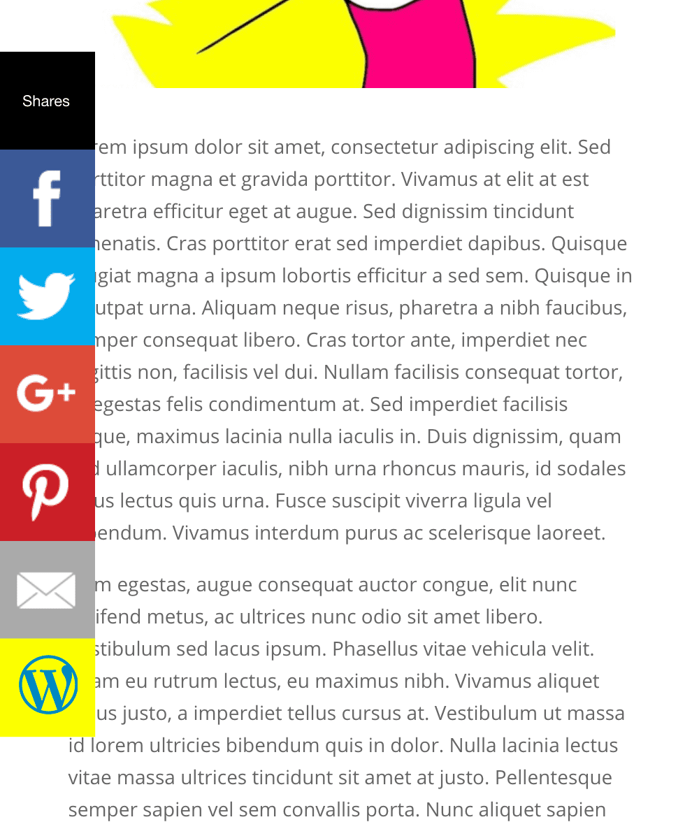
I know that those buttons are important. I get it. And the floating bar beside your content is so cool because it follows the page as your visitors scroll through your stuff.
But these bars can suck. Many of them block content because of poorly designed plugins or themes, and it’s hard to get it right because of the sheer number of viewport sizes your visitors will have. Admittedly, this is an issue that comes up on mobile devices a lot more than desktop, but I’ve seen poorly coded floating buttons that stay right in the middle of the screen or somewhere over the text.
When in doubt, leave it out (which is also what I’ve always told my composition students about commas, btw. #grammarlesson).
Obfuscating Your Own Images
In the same vein as above, don’t use strange overlays for content and images. Social media buttons are one thing, but when you darken an image or push a social share over what your visitors are reading, it will annoy them.
Why? Because they came to your site for the content, and you’re restricting them from it.
How Not to Be Annoying
I am really tempted to just put an arrow pointing up with a label that says “don’t do that stuff,” but what’s the fun in that?
Really, though, not being annoying to your site’s visitors is honestly simpler than being truly obnoxious.
Pick One Spot and Be Consistent
Whether it’s before the content or after or on the side, pick a single area that you have your share buttons. Your visitors aren’t stupid (impulsive, maybe, but not stupid), and they know where to find the buttons if they really want to share the content.
All of the icons on your social media buttons will be recognizable, and people will know exactly how to get to them. So if you use a floating vertical bar, great. Just make sure it doesn’t overlap text and that it’s the primary way your users can share.
Generally, the end of the article (when your readers are blown away by your awesomeness and have that “OMG I have to share this!” feeling) or a left-floating sidebar will be your best spot for sharing buttons (because like Co-Schedule says, the upper-left portion of the viewing area is the reader’s focus hotspot).
I will note, however, if you write really long-form content, you may consider multiple button placements (at the top and bottom of the article, perhaps) so that as your readers scroll up and down to read your content thoroughly, they’re able to share no matter where they are (because long-form content is really shareable).
Less is More (or Really, Fewer is More)

There’s a good chance that our visitors aren’t going to be sharing your content on WhatsApp. They might be sharing it on Reddit, and if they are, they probably aren’t using your button. And email? That one’s gonna probably be used less than poison ivy toilet paper.
So when choosing which networks to highlight, less is more. Facebook is obvious. So is Twitter. I try to only keep 3 up, so if your users love Pinterest, use that one. If you write about something businessy, choose LinkedIn as your third (btw, good LinkedIn shares can rack up a ton of new visitors and leads, holy cow).
By limiting the user choice, you make it easier on your visitors. When they have fewer options, they won’t be annoyed at having to scan past your WhatsApp and Digg icons.
Bonus points if you don’t put the icons in the middle of an image.
That’s It, and That’s All!
Okay, so there’s a lot of data science and analytics research that goes into why those two simple are the best ways not to annoy your visitors because internet users today know how to share. They love to share. Heck, you and I love to share. We all love it. But we don’t want to be told that we have to.
We all know where the social media buttons are (and they do get used pretty often), but users are also savvy enough that they probably use the iOS or Android native share feature as much or more than what you have on your site.
So go take down all the pop-ups, declutter your sidebars, and make your site readable and inviting again. Despite the old cliche of this now being the social web, your site doesn’t have to be the epitome of that.
Bonus: Monarch Plugin Shout-out
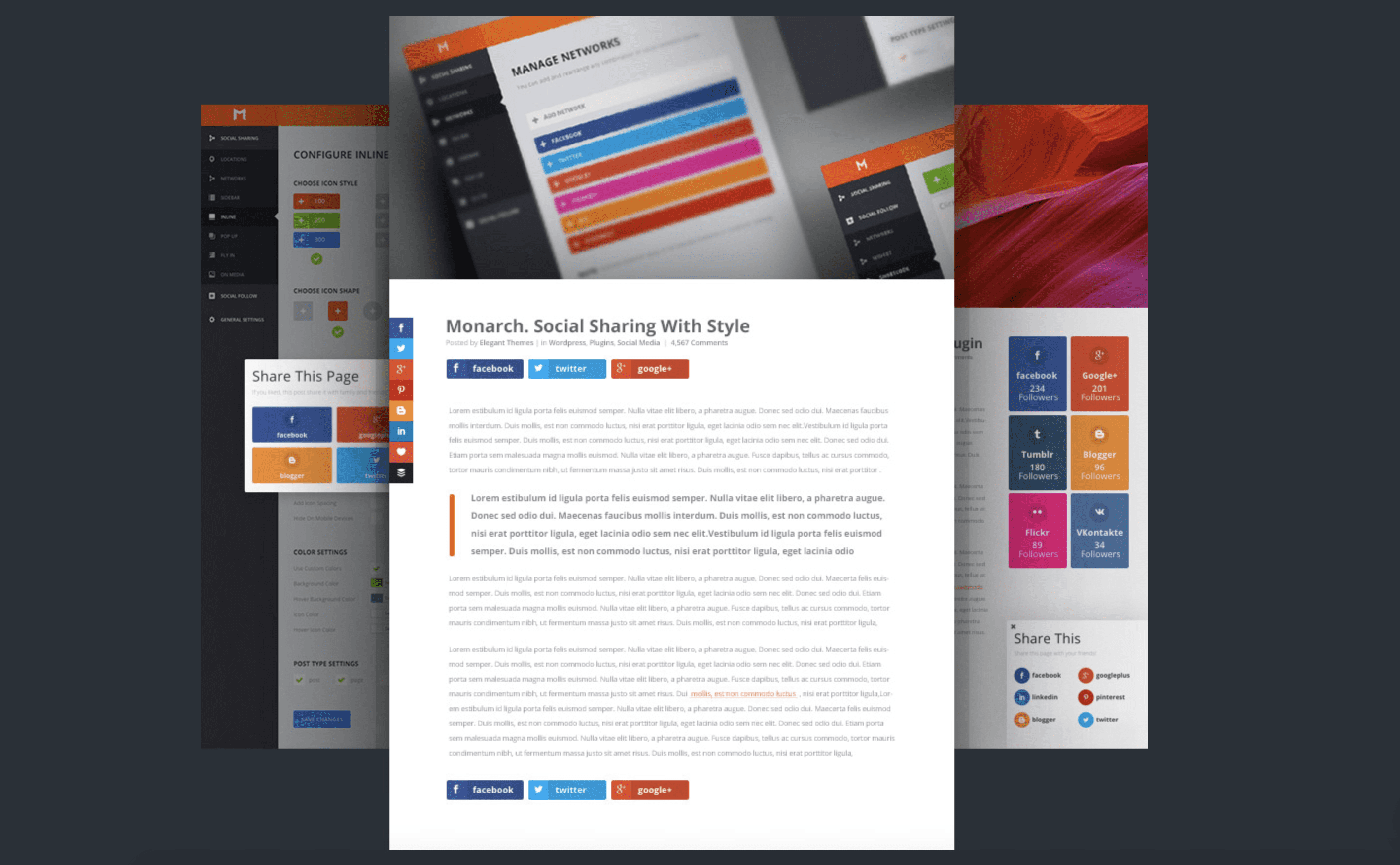
Elegant Themes members also have access to Monarch, a super awesome social media experience. Yes, it’s an experience, not just a plugin. So you absolutely want to become a member and get access to it so that you’re not annoying your visitors and driving them away from your site. Just something to keep in mind! See, we want to help you be as non-annoying as possible. Because we love you.
Article Thumbnail by Snopek Nadia / shutterstock.com
The post Social Media Buttons: How to Not Annoy Your Site’s Visitors with Them appeared first on Elegant Themes Blog.