
Trying to find the right size image for parallax can be a little frustrating. The image may look great as a standard background image, but then as soon as you select “Use Parallax Effect”, the image gets blown up and nothing looks right. To avoid this aggravation in the future, you need to understand what parallax is and what is happening to the image when it is put in parallax mode.
Today, I’m going to dive deep into the ways parallax works with Divi. I’ll explain exactly what happens when you use the two different parallax methods, what size image is best, and I’ll even throw in some custom css hacks to position your images just how you want them.
Let’s get going.
What is Parallax?
In regards to web design, parallax is a term used to describe an effect that gives the perception of life-like distance and motion using a kind of two-dimensional animation. This is accomplished by changing the scrolling speeds of different elements on a webpage to create the illusion of distance while viewing a fixed point. The technique has been around for a while in places other than the web. Remember Super Mario Brothers? If you have ever played video games in the 80’s (Nintendo NES), most of the games used this technique to give the impression of movement using only 2d imagery. The items in the forefront moved quicker than the trees/mountains/clouds in the background. Thus creating a more life-like motion.
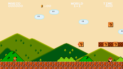
This effect is much like the True Parallax method in Divi. Except the movement is vertical instead of horizontal.
Understanding How Parallax Works with Divi
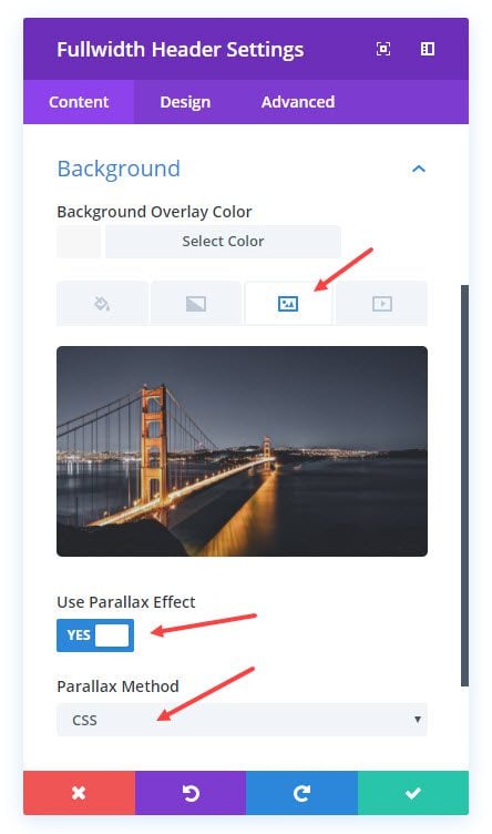
With Divi, Parallax is really easy to deploy on any background image within any section, row, column or module. All you have to do is set the Parallax Effect option to “YES” and then select your Parallax Method (CSS or True Parallax).
The CSS Method
The CSS Method is one of two methods you can choose for your parallax effect. You can probably guess what is happening just by testing this method out on your site. It is referred to as the CSS Method because it only uses CSS to create the effect. This method uses CSS to fix the background image in place while the other elements on the page scroll normally. This gives the impression that the content is moving in front of the background image.

The True Parallax Method
The second method is called True Parallax. It is called “True” probably because it exemplifies the conventional idea of the parallax effect. This method uses CSS and JavaScript to create a slightly slower scrolling movement than the other elements on the page. This is a more life-like representation of movement because of the perception of distance it creates between the slow moving image in the background and the faster moving elements in the forefront.

What Happens When Parallax is Enabled in Divi?
This can be frustrating if you don’ t understand what is going on behind the scenes. Therefore it is helpful to know exactly what is happening to the image when parallax is activated.
What Happens When CSS Method is Selected?
When CSS Parallax is selected, the image is wrapped in a new div with an absolute position that spans the full size of the browser window. Here are the CSS Classes and snippets of code that do this in Divi:
.et_parallax_bg {
    position: absolute;
    bottom: 0;
    left: 0;
    width: 100%;
    height: 100%;
    background-repeat: no-repeat;
    background-position: top center;
    background-size: cover;
}
/*** This sets the image to fixed when using the CSS method ***/
.et_pb_section_parallax .et_pb_parallax_css, .et_pb_slides .et_parallax_bg.et_pb_parallax_css {
    background-attachment: fixed;
}
Since the background-size is set to “cover” with a height and width of 100%, the image will always “cover” every part of its container. In this case, the container is the browser window. This means that parts of the image will become hidden behind other content sections since the background image will always keep expanding and contracting along with the browser window size.
Imagine this is a regular background image added to a header module at the top of a page.
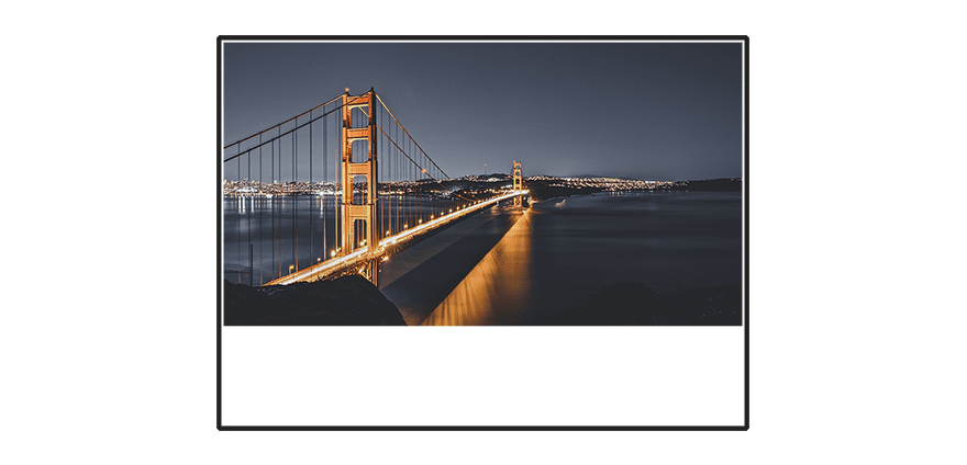
The aspect ratio of the image is correct (1920×1080) and the size of the image covers and fits in the section nicely without any overlap when viewed on a 1366×766 screen size. The white area below the image is the rest of the content on the page.
Now this is what happens when you select parallax for your image.
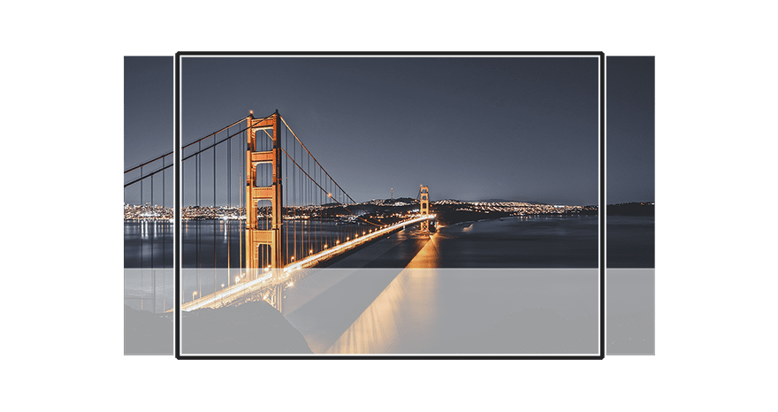
As you can see, the image expands both vertically (to reach the bottom of the browser window) and horizontally (to keep the aspect ratio of the image). The black square represents your monitor so everything inside the black square is what the viewer sees. I made the white content section at the bottom semi-transparent so that you can see where the background image sits hidden behind it. There the image stays fixed while you scroll and other elements move up and down in front of the image.
What Happens When True Parallax Method is Selected?
If you have True Parallax set, the image is wrapped in a new div with the same CSS class:
.et_parallax_bg {
    position: absolute;
    bottom: 0;
    left: 0;
    width: 100%;
    height: 100%;
    background-repeat: no-repeat;
    background-position: top center;
    background-size: cover;
}
However, through the use of a little JavaScript, the height and position of the image is dynamically set based on the size of the browser window and when scrolling down the page. The two values that are dynamically added to the background image are the px value for height property and the translate value for transform property. The height property value determines the height of the image while the transform property translate value determines the exact positioning of the image on the page according to the x and y axis.
Here is the code that gets inserted to the image tag of my parallax background image with my browser window being 1366×766:
    height: 960.8px;
    transform: translate(0px, 220.5px);
Notice the two numbers in the transform property. These two numbers control the positioning of the background image. The first number (0px) positions the image along the x axis (horizontally). Since it is set to 0px, the image won’t be moved. The second number positions the image along the y axis (vertically). Since it is currently 220.5px, that means the image is being pushed down the page 220.5px.
Also notice the height value (960.8px) is greater than the height of my browser window (766px) by about 200px. This is to accommodate for the image being pushed 220.5px passed the bottom of the browser window.
When the True Parallax Method is selected, you may have noticed that your image gets blown up even more than the CSS Method. This is because the position of the image is stretched an additional 30% of the browser height.
Remember our regular background illustration?
Here is what happens to the image after True Parallax is selected (before you start scrolling of course):
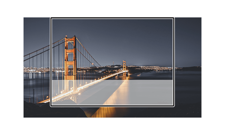
As you can see, the image is pulled a bit more passed the bottom of the browser window. This browser window is about 1080×700 so it is fairly small, but I wanted to show you what is happening on a smaller desktop window.
Why Does True Parallax Stretch the Image So Far?
Well, my best guess is to accommodate for larger screen sizes. Once the browser window reaches a 1920×1080 screen size, the background image no longer extends passed the bottom of the window anymore and fits nicely.
Why Does True Parallax Use JavaScript?
The main reason True Parallax requires JavaScript is because the background image needs to move at a different speed than the other elements when scrolling. Remember Mario Brothers?
With True Parallax, if I increase the size of my browser, the height value also dynamically increases through JavaScript making sure my image is always big enough for the browser.
If I scroll down the page, the translate position value (the 220.5px in the above example) increases, moving the vertical (y-axis) position of the image down the page.
If I scroll up, the translate position value decreases, pulling the image back up the page. But because the image is being pushed down and pulled up at a different speed than the other elements when scrolling, you get the True parallax effect.
What Kind of Image Should I Use?
If you are looking to use the parallax effect on your site, choosing the right background image is crucial. You don’t want the background to be too cluttered or distracting. But on the other hand you don’t want it to be a boring side note either.
Here Are 5 General Tips for Picking the Right Kind of Image for Parallax
- Avoid Distracting Photos. Images that have too much going on with create confusion and distract from the content.
- Make sure your photo matches the theme of your site. Your site should be telling a story. This parallax image (like the rest of your images) should fit in with the theme.
- Keep it big and simple. Remember, your parallax image will be viewed on smaller screen sizes as well. Make sure the details of the photo aren’t so small that they can’t be recognized on smaller devices.
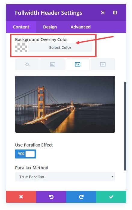
- Add an overlay color when necessary. Sometimes a good parallax image will have both dark and light aspects which may end up hiding your text when scrolling. Adding a dark or light overlay will guarantee your text can be read anywhere on the image
- Make It Interesting. There are way to may photos out there to settle for something boring. Take the time to find one that engages your audience and grabs their attention.
What Size Parallax Background Image Should You Use?
This one is a little tricky to answer. There are no one size fits all parallax images. In fact there is no one size fits all anything in web design, at least not since responsive design came around. But, even though I may not be able to give you a firm rule, I can offer some general guidelines for picking the right size parallax background images with Divi.
Since the most popular screen size is about 1366×766, I would definitely make sure all background parallax images be at least this size. But because of the popularity of larger monitors, I would go with a bigger size like 1920×1080. This will make sure users see a high quality image on larger desktops.
The problem with having an image with the dimensions 1920×1080 is that rarely will you ever have a visible section that is 1080px in height. So you can bank on the bottom of those images staying hidden.
Helpful Tips for Getting Your Parallax Background Image To Look Right
For Headers and Top Sections
The easiest way to make sure your image is fully visible and looking great is to use the Fullwidth Header Module. That way your background image will always look great no matter what screen size. But, If you are using a parallax background image using the Fullwidth Header Module, you may need to add some padding to top and bottom of the module to show more of the image. You can do this by using the Visual Builder. Go to the Header Module Settings. Under the Advanced Tab, enter the following in the Main Element text box:
Padding: 250px 0 250px;
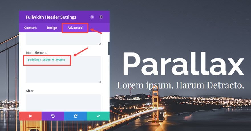
That should get you going in the right direction.
If you still don’t have enough of the image showing, I would suggest cropping the top part of your image and then upload it again. This may help.
Also, try to select photos that have insignificant content at the bottom of the image and the more important content at the top. For headers, you should only expect to see the top 700px of the parallax image.
For Regular/Middle Sections
Make sure you leave enough space around your content to expose the background enough so that you can get a full picture when the section reaches the center viewpoint of the user. Use the padding to your advantage. If you are going to use parallax, don’t let your users get confused and have to scroll up and down just to see what the image is. Better to show them the first time around.
For Bottom Sections/Footers
If you are using the CSS Method, you can expect to see more of the bottom of your background image (depending on how much space you have). I would try cropping the bottom of the photo to show more of the top in these sections.
If you are using the True Parallax method, you are going to see mostly the top of your images, so I would treat them like your headers.
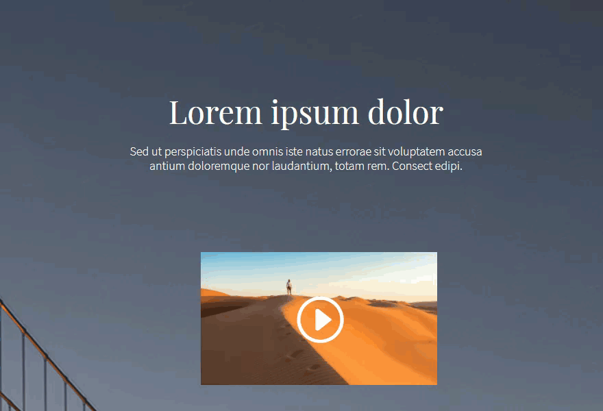
Here is an example of True Parallax background images at the top, middle, and bottom of the page.
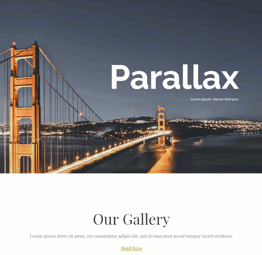
This type of image of a bridge works well because it has a nice focal point off to the side and the bottom of the image isn’t as significant as the top, so the message is never lost on the user.
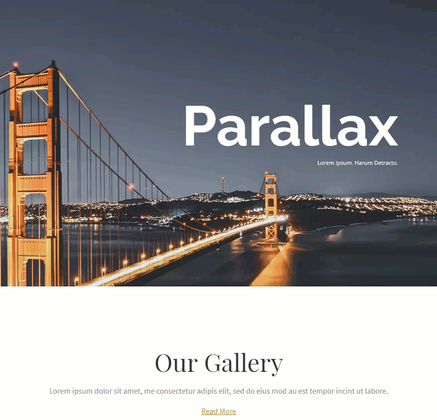
Here is the same page using the CSS method. You can really see the fact that the background image is fixed and expands to the browser window. It even looks like it is the same image fixed in the background the whole time.
If you still aren’t satisfied after you have searched for the perfect image, added necessary padding, and cropped it, you can always resort to some hacking.
Parallax Image Hacks: Changing the Position of the Image with Custom CSS
If you want to change the position of the parallax background, you can use the css selector “.et_parallax_bg”. Here is the default css that positions the image for the parallax effect.
.et_parallax_bg {
    position: absolute;
    bottom: 0;
    left: 0;
    width: 100%;
    height: 100%;
    background-repeat: no-repeat;
    background-position: top center;
    background-size: cover;
}
If you notice, by default, the background position property for the css parallax method is as follows is set to “top center”. But if I wanted to change the original position of the background image, you can adjust the background-position property values.
If you want to keep your Custom CSS condensed to a certain image and not have it effect all your parallax background you will need to add a class to your section so we can identify in the css which background we need to customize.
Go to the section settings, under the Advance tab, and enter a CSS Class called “parahacks”.
Now go to Page Settings and select the Advanced tab.
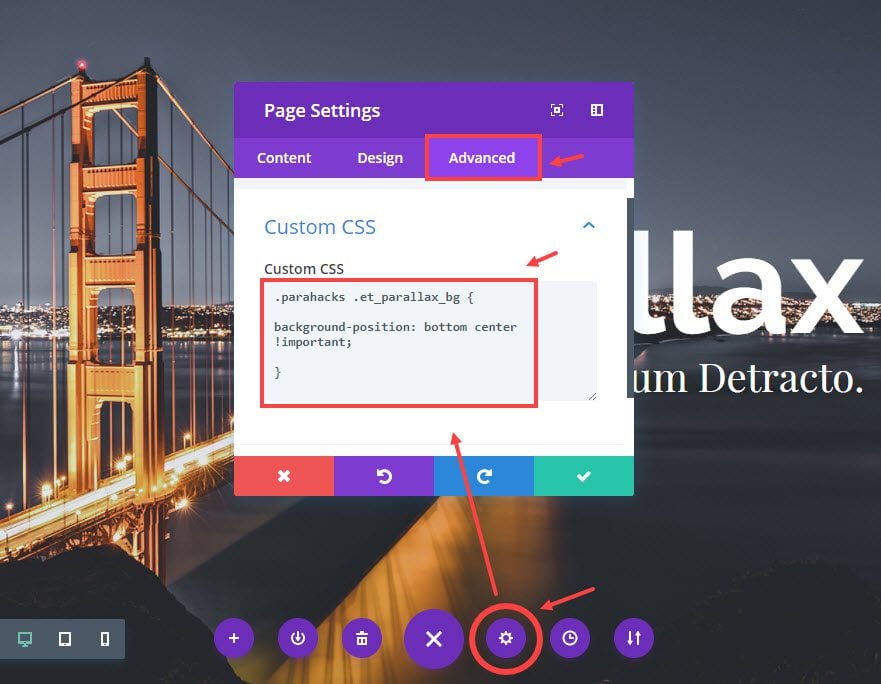
Then use the Custom CSS box to enter any of the following examples of Custom CSS:
If using The CSS Method, you can make the background image vertically centered by adding the following custom css:
.parahacks .et_parallax_bg {
    Background-position: center center !important;
}
To make the background image bottom aligned, add the following custom css:
.parahacks .et_parallax_bg {
    background-position: bottom center !important;
}
To make the background image move up a certain number of pixels, add the following custom css:
.parahacks .et_parallax_bg {
    background-position: center -150px !important;
}
If using True Parallax method, you have to account for the extra 220px (more or less depending on your browser height) of image that is hidden at the bottom. To make the background image more vertically centered, you need to adjust the background-position property using a negative pixel value like so:
.parahacks .et_parallax_bg {
    background-position: center -100px !important;
}
To make the background image more bottom aligned, add the following custom css:
.parahacks .et_parallax_bg {
    background-position: center -220px !important;
}
In Closing
I sincerely hope this guide was helpful in gaining a deep understanding of how parallax works with Divi. Thankfully Divi does almost all of the heavy lifting in providing us with parallax functionality. The CSS method and the True Parallax method both create great life-like effects out of the box. However, it is up to us to find the right images and tweak them just right to make them work for our site. Go for it! I bet you will create something amazing.
Look forward to hearing from you in the comments.
Cheers!
The post Ultimate Guide to Using Parallax With Divi appeared first on Elegant Themes Blog.