
At the exact moment I’m typing this, my office has 17 Disney something-or-others on the walls and shelves. Seventeen. Even I’m surprised. As much as I love all-things-Disney, the magic created through the 12 principles of animation escapes even me as I watch one of their movies.
And that’s the point. The 12 principles of animation are subtle. They make impressions on viewers without the viewers realizing it. They make us laugh, cry, sympathize and dream, sometimes within the same scene. And they create characters and objects that look and move so realistically you want to reach out and touch them. (Have you ever seen Coco? I rest my case.)
Those 12 principles of animation now provide the basis for all motion work, Disney and otherwise. They’re also relevant to fields outside of animation, such as web design.
A Brief History of the 12 Principles of Animation
The 12 principles of animation were introduced by Ollie Johnston and Frank Thomas, two of Disney’s Nine Old Men, the core group of animators who joined in the 1920s and 30s. Johnston and Thomas wrote The Illusion of Life: Disney Animation in 1981, and it’s remained the “bible” of animation. The book takes a close look at the approaches of Disney’s top animators to extract the 12 principles. While these principles were originally intended for hand-drawn animation, they’ve survived through technological changes and are now used by computer animators (like Pixar) and web designers.
The 12 Principles of Animation and How They Inform Web Design
There’s a reason why these principles have stood the test of time. Sometimes the basics are still the best.
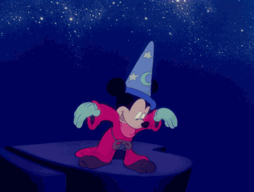
1. Squash and Stretch
Source: Chris Gannon via Giphy
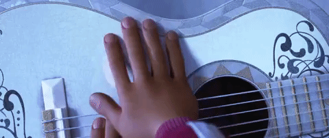
“Squash and Stretch” is the most important of the animation principles. It gives animations flexibility, gravity, weight and mass. When an object is in motion, it doesn’t remain the same shape.
The volume has to stay consistent, though. Stretching requires making the object thinner and longer; squishing makes it shorter and wider. If you just made it thinner or shorter, it wouldn’t retain the same volume.
In web design, “Squash and Stretch” is used when objects need to be eye-catching. If there’s an object that needs to look like it has physical mass, this principle can do the trick.
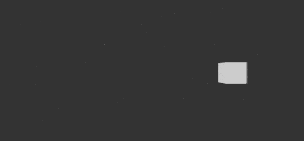
2. Anticipation

Source: CentoLodigiani via Giphy
Anticipation preps the viewer for what’s about to take place, and it can make the resulting action more realistic. You wouldn’t sit down without first bending your knees, or catch something without sticking your arm out, right? Anticipation puts the character or object through one or two realistic motions to cue the viewer as to what’s about to happen.

In web design, anticipation is used in transitions. For example, if a visitor is filling out an information box and leaves out required information, the box could bounce a bit to get their attention and communicate, “Hey, something’s wrong.” Another way to use anticipation is to shrink items slightly and then make them get bigger on hover.
3. Staging
Staging leads the viewer’s eye so that they’ll look where you want them to look (“leading lines” in photography). Downplay the rest of the scene so the viewer focuses on just what you want them to. Another component of staging is that every action a character makes has an intention behind it. If you isolated each frame of the animation, you would be able to tell the intention behind the pose.
Staging is one of the easier principles to apply to web design and visuals used on websites. This is what happens when a pop-up comes up on a web page – the motion of the pop-up makes you focus on it, and the rest of the page is blurred, dimmed or covered. You’re figuratively lighting the most important part of the “stage” and keeping everything else in the background. Light and shadow can be used for this, too, or web designers can apply this principle simply by getting rid of unnecessary detail.
4. Straight Ahead and Pose to Pose
“Straight ahead” and “pose to pose” are two different ways to create animations. With “straight ahead,” frames are created in order from beginning to end. This gives the animation dynamic, fluid motion. With “pose to pose,” the first and last frames are created, then the necessary in-between poses are added.
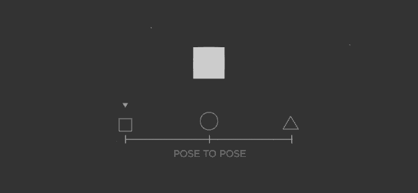
Source: Vincenzo Lodigiani, Motion Artist
Today, computer animation uses “pose to pose” because the computer can fill in the missing frames automatically. Check out the animations on Chekhov – you can tell they’re not realistically fluid (and they’re not supposed to be). If you want to create a “straight ahead” animation on your website, you can use the steps( ) timing function, which lets you define multiple frames and display them in a sequence.
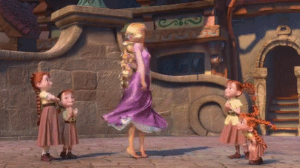
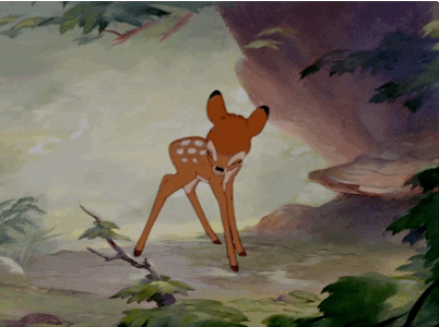
5. Follow Through and Overlapping Action
The “follow through and overlapping action” principle says that when a character or object is in motion and then stops, parts of the subject will move and stop at different rates. This mimics real-life laws of physics.
- Overlapping Action: Different parts of the subject move at different rates.
- Follow Through: Loosely-connected parts of the object continue moving for a few seconds after the main object has stopped moving. Those parts will move beyond the stopping point and then pull back toward the object.
In the example below, Rapunzel’s arms and legs move at a different rate from her head – that’s overlapping action. When she stops twirling, her hair continues to swing for a second – that’s follow through.
“Drag” is a related technique where the opposite happens – parts of the object move and then the rest catches up. All of these techniques show realistic movement or can exaggerate movement for comical effect.
“Moving hold” is related to this, too. Characters who are remaining still have slight movement so that the animation doesn’t become stagnant.
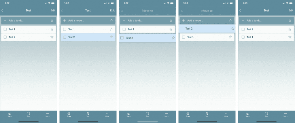
In mobile and web design, “follow through” and “overlapping action” show the viewer that an action is purposely stopping. Otherwise, you may think that it’s simply stopped working. For example, look how the Wunderlist app on my iPhone shows that I’m moving a list item. The item becomes a different color and gets larger as I move it, then goes back to the original color and size once I’m done. This is how I know the action is complete.
You can also see this principle in action on your iPhone. As you transition between views or move icons around on the home screen, the elements move at slightly different rates. This is how your iPhone communicates, “Things are changing.”
6. Slow In and Slow Out
The “slow in and slow out” principle states that an object starts moving slowly, gains momentum and speeds up, then slows down again as it comes to a stop. Basically, movements have to accelerate and slow down in order to be natural. To achieve this effect, there are additional frames at the start and end of an action to emphasize the gradual increase and decrease of motion.
Source: The Illusion of Life on Tumblr
For web design, CSS has two timing functions related to this principle: ease-in and ease-out. You can see an example if it on the Your Plan, Your Planet website (click “Let’s get started” first).
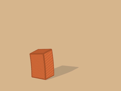
7. Arc
Like many of the other 12 principles of animation, “arc” is based on physics. Objects usually follow some type of arc as they move because of gravity. If they were to remain straight, the movement would be mechanical, not realistic.

This applies to all types of movement, too, not just low-to-high-to-low arcs:
In web design, the “arc” principle can be used by creating animations that arc, of course, but also by having an element rotate, like during loading times.
8. Secondary Action
A secondary action emphasizes the main action without distracting from it. It also gives characters and objects more dimension and breathes life into a scene. The principle of staging plays a role because the main action still has to be the focus.
A secondary action doesn’t have to fall outside of the main object. It can be a character whistling as they walk or expressing emotion by raising their eyebrows.

In mobile and web design, the “secondary action” principle is seen when elements move out of the way to make room for a new element, like when you rearrange apps on your iPhone. This may go hand-in-hand with “follow through and overlapping action,” which emphasizes those actions.
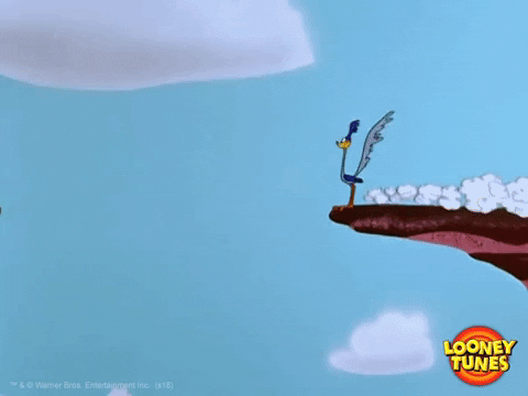
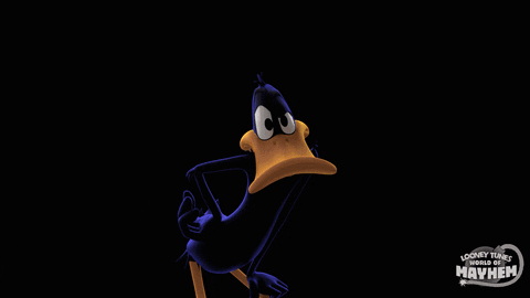
9. Timing
Timing is pretty straightforward, and it’s related to “slow in and slow out.” The principle says that elements should consistently move in a natural way, as they would in the real world. For emphasis, they can be purposely sped up or slowed down. The number of frames used will establish timing – more frames create a slower action, fewer frames create a faster one.
In this example, Daffy Duck’s first actions have natural timing, and then the last action, when he comes in close to the viewer, is purposely fast for emphasis.
Timing also helps the viewer understand the weight of the objects in relation to one another. In this example, the character lifts the weights slowly and drops them quickly, showing they’re heavy for him:
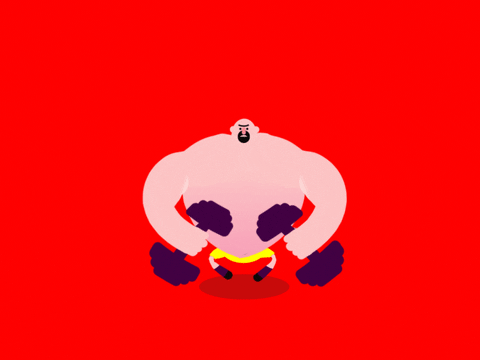
Source: @scottthigpen on Giphy
In web design, timing is used to make elements either stick around a bit longer or go away quickly, particularly when responding to user interaction. For example, if a user wants to dismiss a menu, you can set the timing so it sticks around for 300ms. If they tap an element in the navigation bar, you’ll want the action to happen quickly (100 ms).
10. Exaggeration
Even though many of the 12 principles of animation are reality-focused, the beauty of animation is that it’s not real. The “exaggeration” principle says that too much realism can detract from what animation’s best at: entertaining. Exaggeration is used to make characters and objects more interesting. It takes reality and turns it up a notch, just enough so the scene is still believable. Exaggeration requires restraint so the scene doesn’t become abstract or surreal.

In web design, objects are scaled up or down to draw or detract attention. When a user is active on a certain part of the website, like a form, it can grow while other elements shrink. This is similar to the “staging” principle, especially when you think of pop-up forms.
11. Solid Drawing

Source: The Illusion of Life on Tumblr
Even though animation is technically 2D, it has to present realistically in 3D. The “solid drawing” principle could also be called “perspective” because it’s about having the ability to draw and understanding basics like:
- Anatomy
- Balance
- Consistency
- Light and shadow
- Volume
- Weight
For web designers, adding depth to an element shows users that they can interact with it. You can see this in action on our website. Watch how the “Join to Download” button turns pink as I scroll down:

12. Appeal
Possibly the trickiest of the 12 principles of animation to master, “appeal” says that your characters, objects and their world have to appeal to the audience. They should be attractive and charming in some way, physically or otherwise. There’s no recipe for getting this right, but solid character development and storytelling are key ingredients.

In animation, every single character isn’t going to be appealing – the villain is a cornerstone of Disney movies. However, the way they’re presented should still have charisma and interest the audience.

In web design, “appeal” means that the website as a whole is engaging, enjoyable and easy to use.

Wrapping Up
Disney’s 12 principles can help with straightforward animations, like if you’re creating an interactive game on your website, but they can also help with design for all sorts of web pages. Most consumers are like me when it comes to Disney movies: I know that I like something and my brain processes the cues, but I can’t put my finger on why I have those reactions. The web designer’s job is to anticipate what a visitor will think and do, and then subtly guide them to take the right actions.
Looking for even more ways to connect with your audience? Read our blog post about using color emotion.
The post Using Disney’s 12 Principles of Animation in Your Next Web Design Project appeared first on Elegant Themes Blog.