Text Modules are a vital part of any page design you create with Divi, I’m sure that’s something we can all agree upon. Normally, they’re used to display text in a straightforward way. But you can use Text Modules to create stunning design elements as well. In previous blog posts, we’ve already shown you how to use text to elevate your web design.
In this tutorial, we’ll continue adding options for you to choose from when designing a page and using Text Modules. As you may or may not know, there several different text types that you can combine within the same text module. Additionally, one module can contain several headings, paragraphs, links and more. In this post, we’re going to use all of these text types to our advantage to create stunning block elements in our page design.
Let’s get to it!
Preview
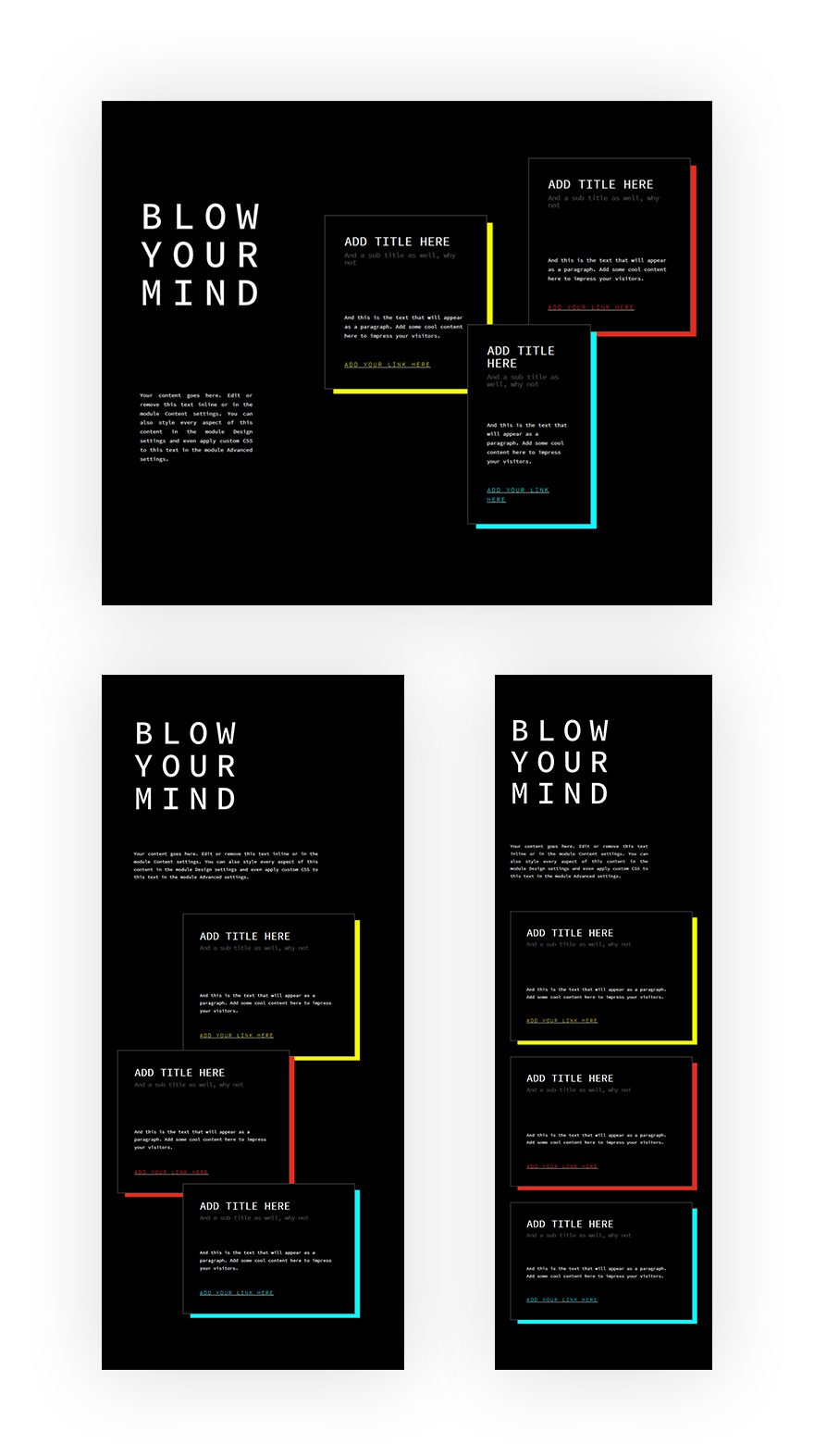
Before we dive into the tutorial, let’s take a look at the end result on different screen sizes.
Let’s Get Started!
Add New Regular Section
Background Color
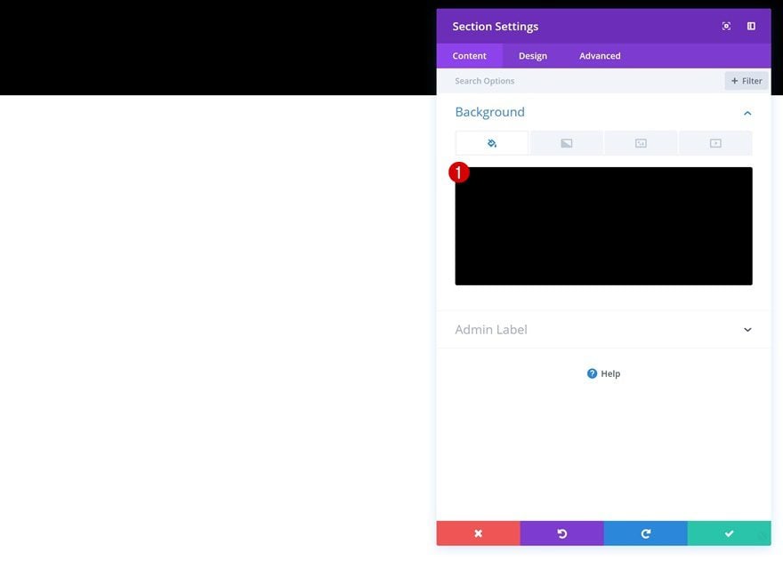
Start by adding a new regular section to the page you’re currently working on. Then, open the section settings and change the background color.
- Background Color: #000000
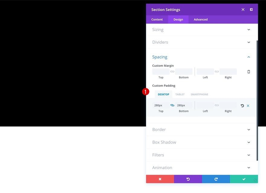
Spacing
Go to the Spacing settings of your section next and add some custom padding values.
- Top Padding: 280px (Desktop), 150px (Tablet & Phone)
- Bottom Padding: 280px (Desktop), 150px (Tablet & Phone)
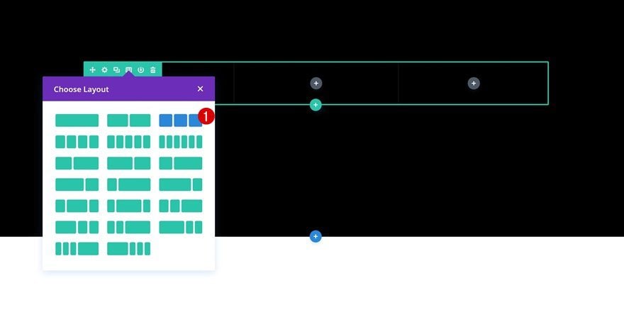
Add New Row
Column Structure
Once you’re done modifying the section settings, add a new row using the following column structure:
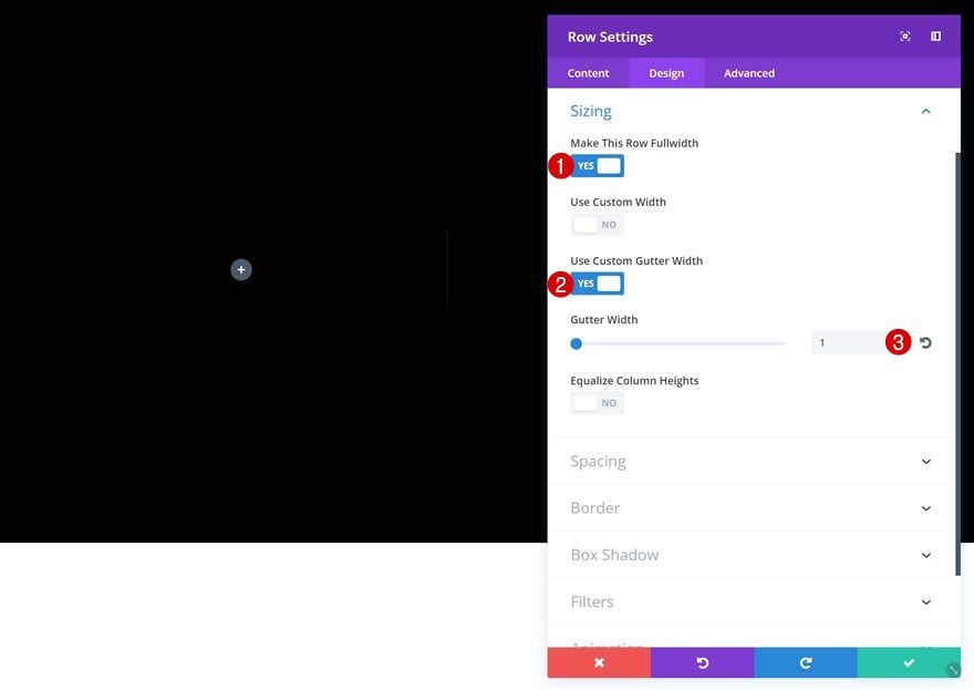
Sizing
Without adding any modules, open the row settings and make the row take up the entire width of the screen in the Sizing settings.
- Make This Row Fullwidth: Yes
- Use Custom Gutter Width: Yes
- Gutter Width: 1
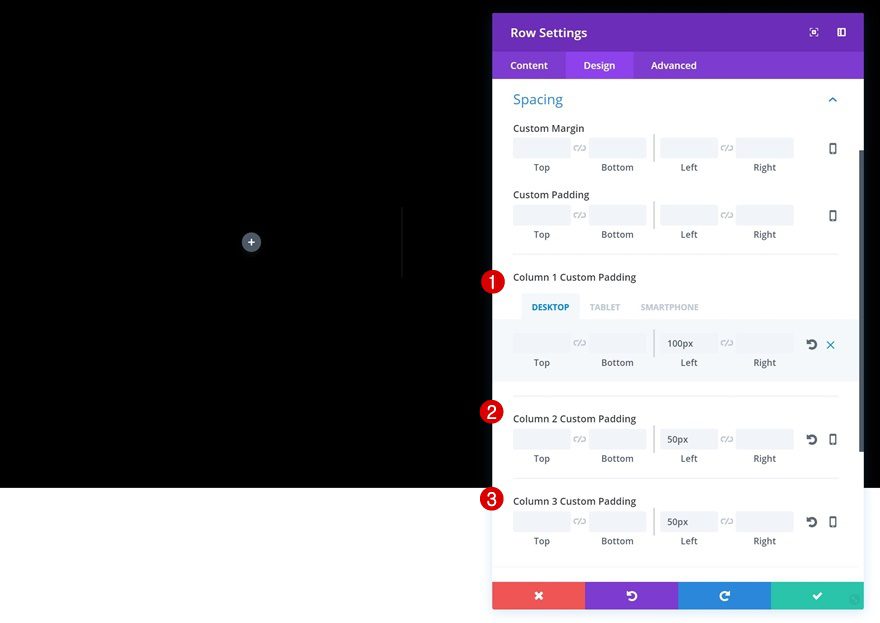
Spacing
Lastly, add some custom padding in the Spacing settings.
- Column 1 Left Padding: 100px (Desktop & Tablet), 50px (Phone)
- Column 2 Custom Padding: 50px
- Column 3 Custom Padding: 50px
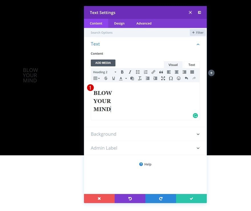
Add Title Text Module to Column 1
Content Box
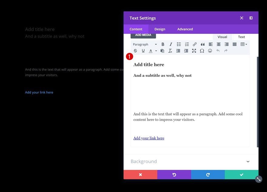
Time to start adding the different modules! The first module we’ll need in the first column is a Text Module. Add some H2 Content to the content box.
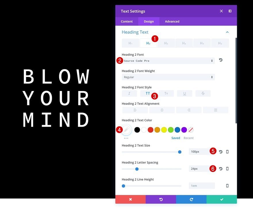
H2 Text Settings
Then, go to the H2 text settings and make some changes:
- Heading 2 Font: Source Code Pro
- Heading 2 Font Style: Uppercase
- Heading 2 Text Color: #ffffff
- Heading 2 Text Size: 100px
- Heading 2 Letter Spacing: 24px
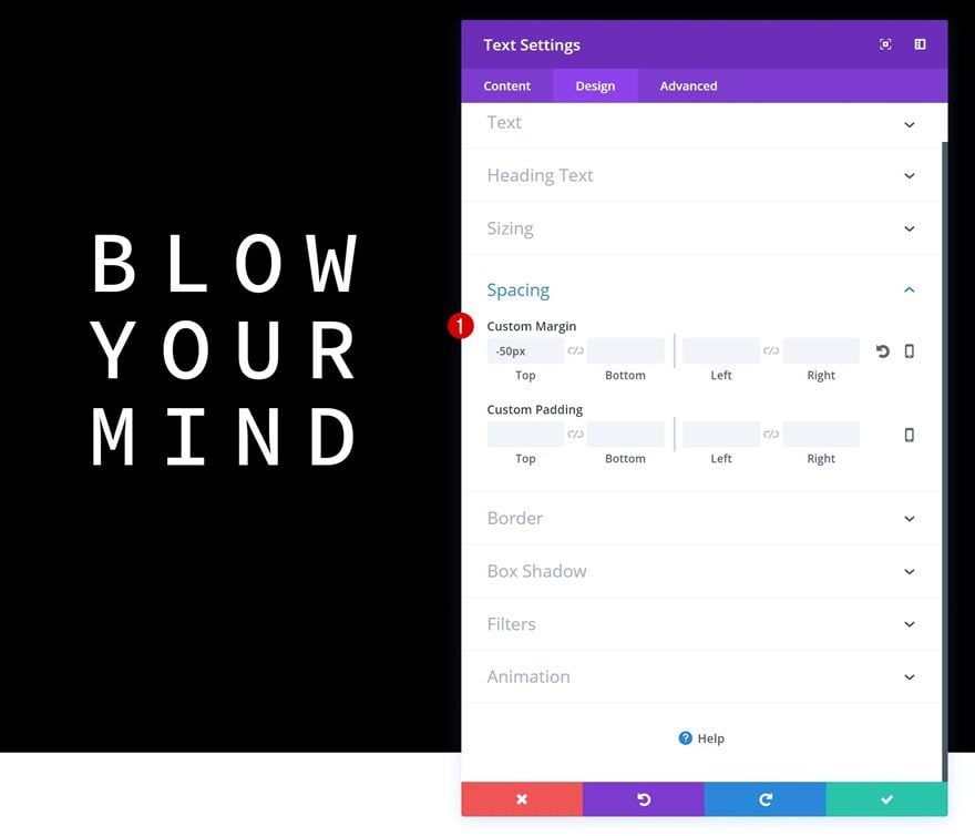
Spacing
Reduce the space at the top by using some negative top margin.
- Top Margin: -50px
Add Description Text Module to Column 1
Text Settings
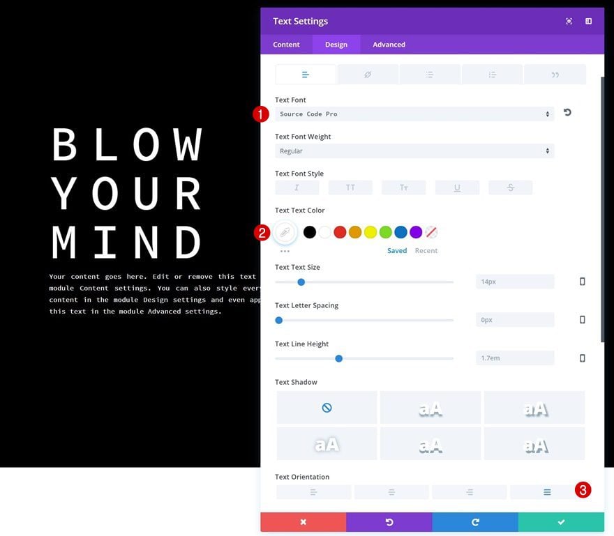
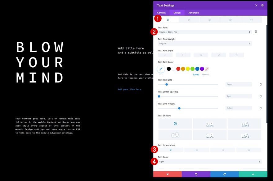
The second module needed in the first column is a description Text Module. After adding your content, go to the text settings and make some changes:
- Text Font: Source Code Pro
- Text Color: #ffffff
- Text Orientation: Justify
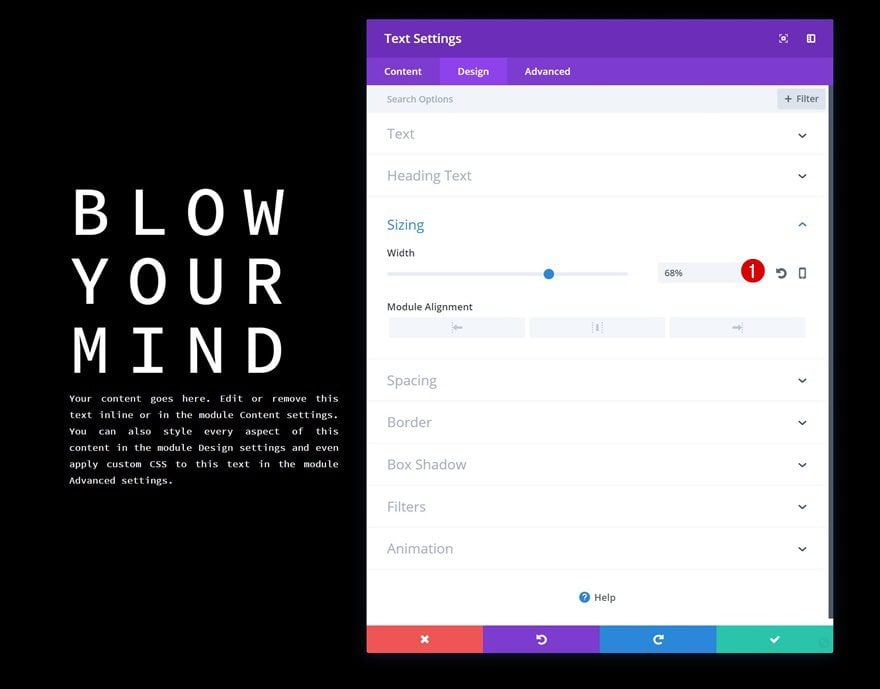
Sizing
Reduce the width of the Text Module as well.
- Width: 68%
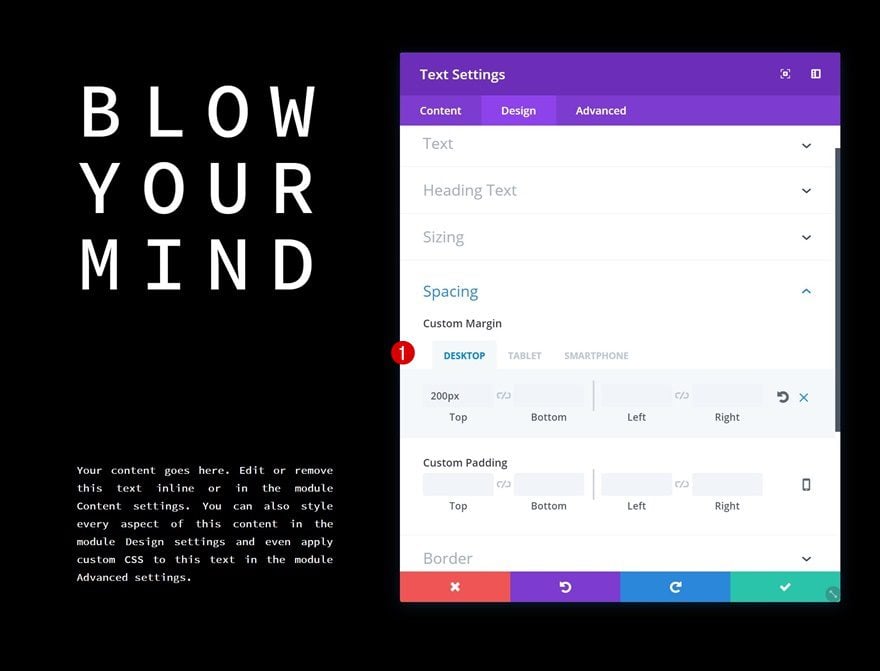
Spacing
And last but not least, create some space between this Text Module and the previous one in the Spacing settings.
- Top Margin: 200px (Desktop), 100px (Tablet & Phone)
- Bottom Margin: 100px (Tablet & Phone)
Add Block Text Module to Column 2
Content Box
Time to move on to the second column! Here, we’re going to use Text Modules to create block elements. A vital part of making this work is structuring the content box correctly. In the print screen below, you can see that we’re using an H3 title, an H4 title, a paragraph and a link. Between the H4 title and the paragraph, we’re making sure there’s some additional space left as well.
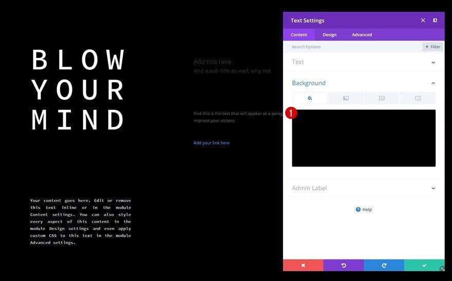
Background Color
Add a black background color to the Text Module.
- Background Color: #000000
Text Settings
We’re going to modify each one of the text types individually. Start by modifying the paragraph settings.
- Text Font: Source Code Pro
- Text Orientation: Left
- Text Color: Light
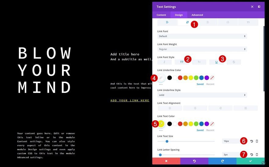
Link Text Settings
Then, make some additional changes to the link settings.
- Link Font Style: Uppercase & Underline
- Link Underline Color: #ffffff
- Link Text Color: #edf000
- Link Text Size: 16px
- Link Letter Spacing: 3px
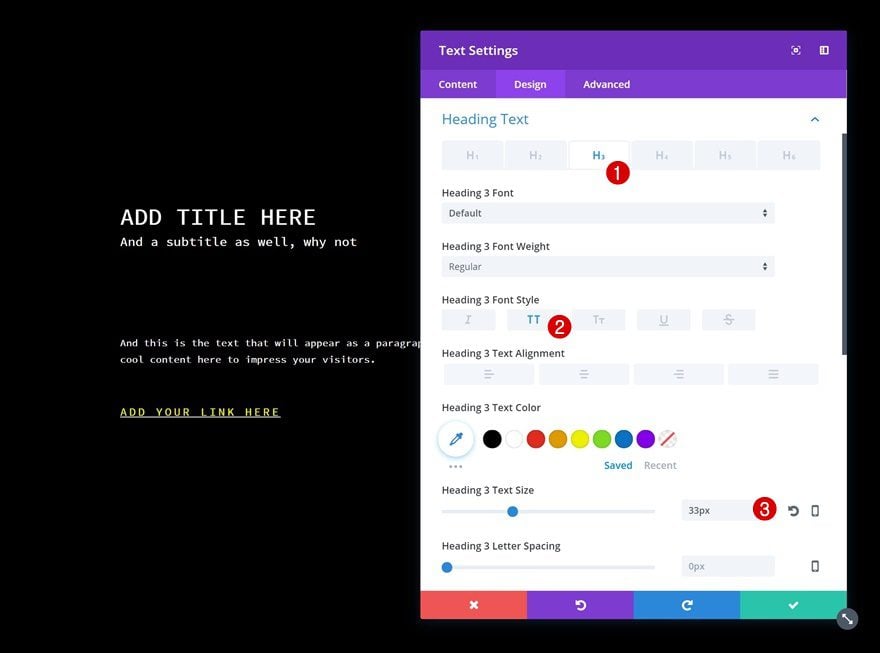
Heading 3 Text Settings
The H3 title in our content box needs the following settings:
- Heading 3 Font Style: Uppercase
- Heading 3 Text Size: 33px
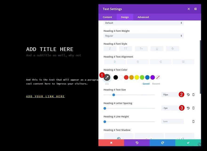
Heading 4 Text Settings
Continue by opening the H4 text settings and make some changes there as well.
- Heading 4 Text Color: #4f4f4f
- Heading 4 Text Size: 19px
- Heading 4 Letter Spacing: -1px
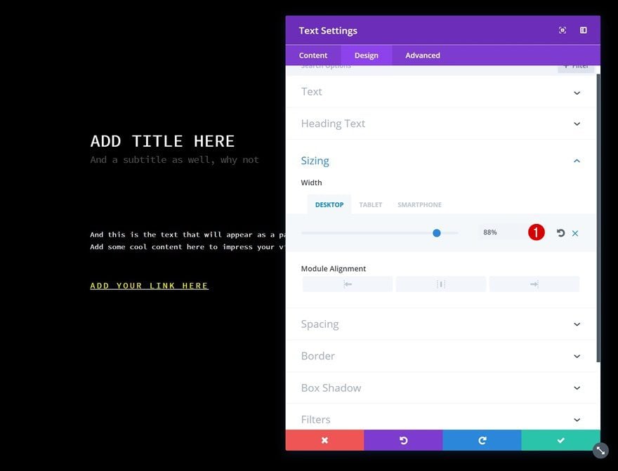
Sizing
To create the exact shape we want, we’re going to reduce the width of the Text Module next.
- Width: 88% (Desktop), 60% (Tablet), 90% (Phone)
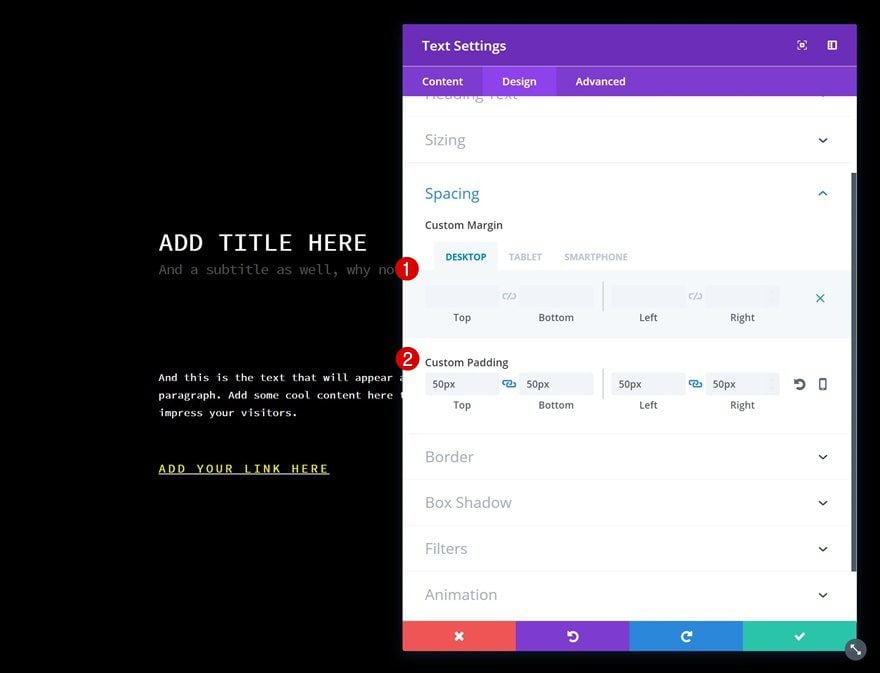
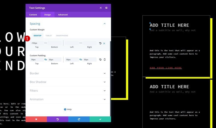
Spacing
We’ll need to change the Spacing settings as well.
- Left Margin: 200px (Tablet)
- Top Padding: 50px
- Bottom Padding: 50px
- Left Padding: 50px
- Right Padding: 50px
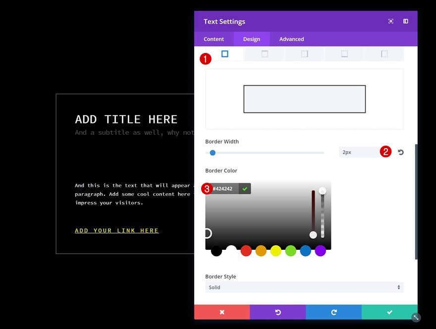
Border
Then, add a subtle border to the Text Module.
- Border Width: 2px
- Border Color: #424242
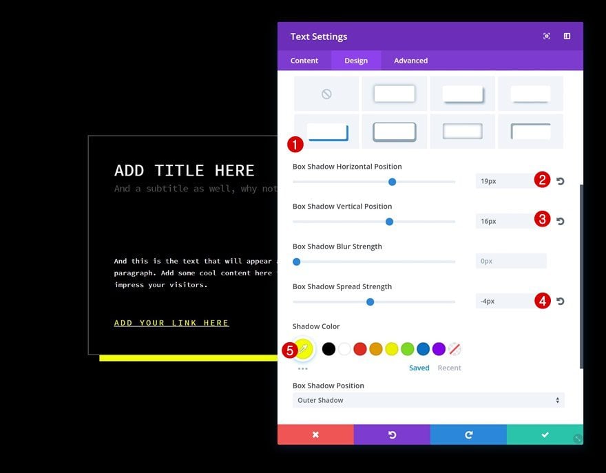
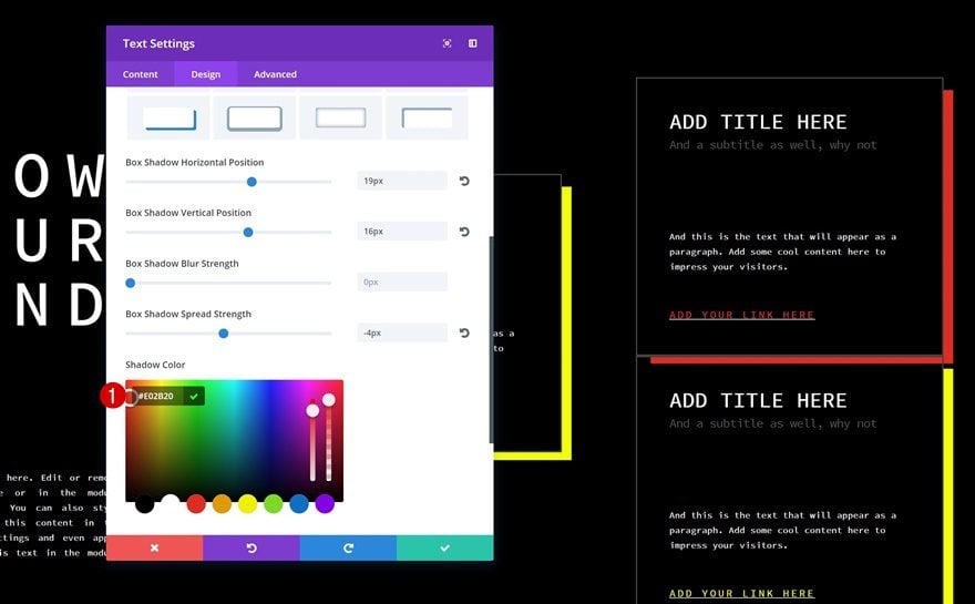
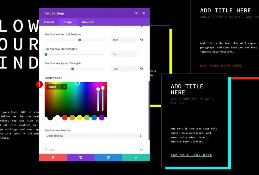
Box Shadow
And to finish off, add a colorful box shadow.
- Box Shadow Horizontal Position: 19px
- Box Shadow Vertical Position: 16px
- Box Shadow Spread Strength: -4px
- Shadow Color: #f2ff00
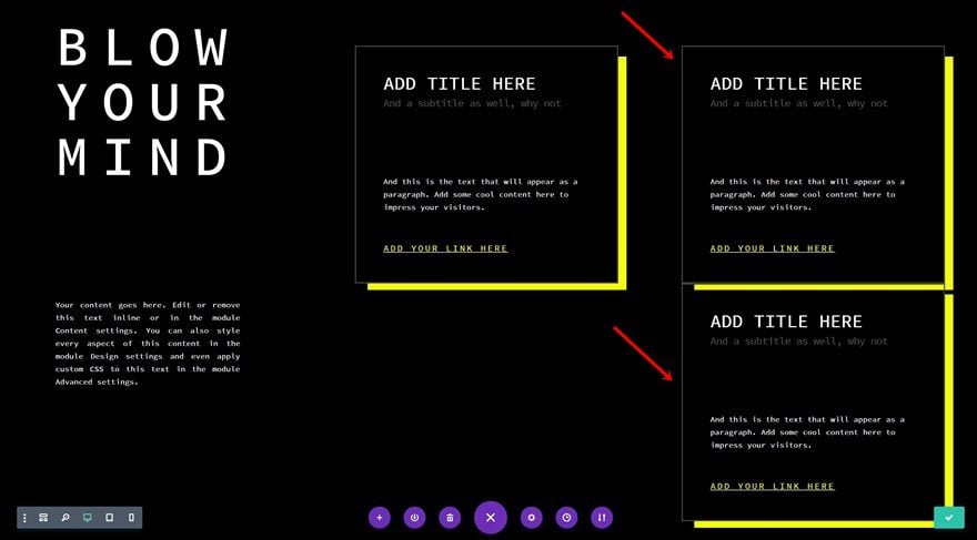
Clone Block Text Module Twice & Place in Column 3
To save time, we’re going to clone the block Text Module we’ve created twice and place both duplicates in the third column of the row.
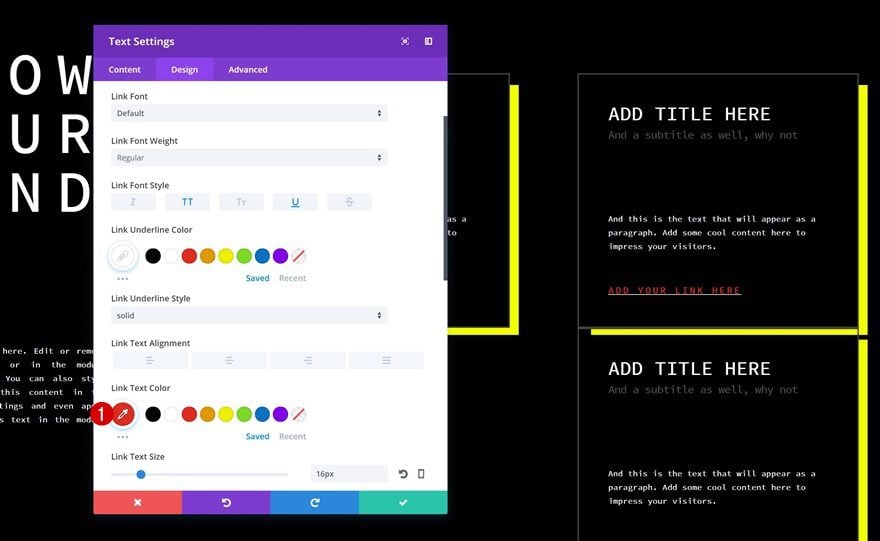
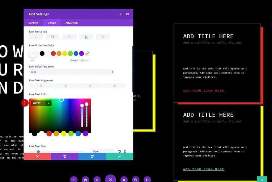
Red Text Module Modifications
Change Link Text Color
Open the first Text Module in the third column and change the link color.
- Link Text Color: #e02b20
Change Spacing
Then, go to the Spacing settings and add some top margin.
- Top Margin: -150px (Desktop), -20px (Tablet), 50px (Phone)
Change Box Shadow Color
Change the Box Shadow Color into the same color that is used for the link text.
- Shadow Color: #e02b20
Blue Text Module Modifications
Change Link Text Color
Change the link color of the second Text Module in the third column as well.
- Link Text Color: #0ff3ff
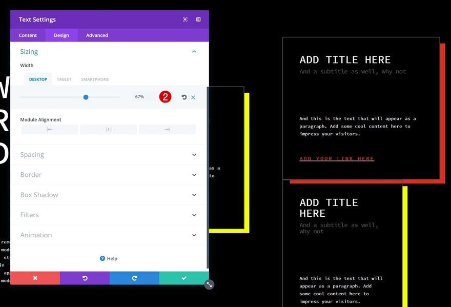
Change Sizing
Change the Sizing settings next.
- Sizing: 67% (Desktop), 60% (Tablet), 90% (Phone)
Change Spacing
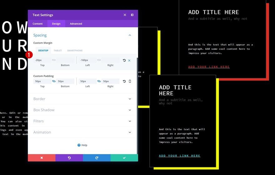
And to create some overlap between this module and the two other Text Modules, play around with the custom margin values.
- Top Margin: -20px (Desktop), -30px (Tablet), 50px (Phone)
- Left Margin: -160px (Desktop), 200px (Tablet), 0px (Phone)
Change Box Shadow Color
To finish off, change the box shadow color into the same blue color used for the link text and you’re done!
- Shadow Color: #0ff3ff
Preview
Now that we’ve gone through all the steps, let’s take a final look at the result on different screen sizes.
Final Thoughts
You’d be amazed at how many unique designs you can achieve using Text Modules in combination with Divi’s built-in options. No extra CSS code required. In this post, we’ve shown you how to use different text types to create stunning block elements on your Divi page design. If you have any questions or suggestions, make sure you leave a comment in the comment section below!
The post Using Divi’s Text Module to Create Block Elements in Your Divi Page Design appeared first on Elegant Themes Blog.