The Divi Builder includes lots of modules to help you add practically any design elements to your layouts, but what if you wanted to create your own modules? A third-party plugin called Divi Module Builder gives you this ability.
In this article I’ll take a look at the plugin and see what it can do and how easy it is to use. It requires Divi 3.0.50 or higher and works with both Divi and Extra. It’s available from the developer’s website: DiviPlugins.com.
Installing Divi Module Builder
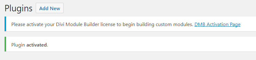
Once you’ve activated the plugin click DMB Activation Page. Alternately you can see this screen by going to Custom Modules in the dashboard and click License.
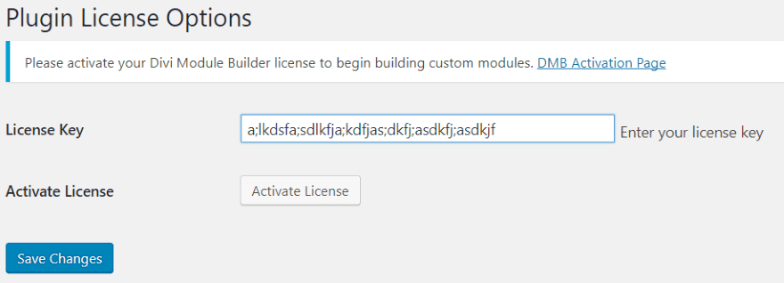
Enter your license key and click Activate License. A new menu is added to the dashboard called Custom Modules. Within this menu you’ll find everything you need to build your modules.
Add Module
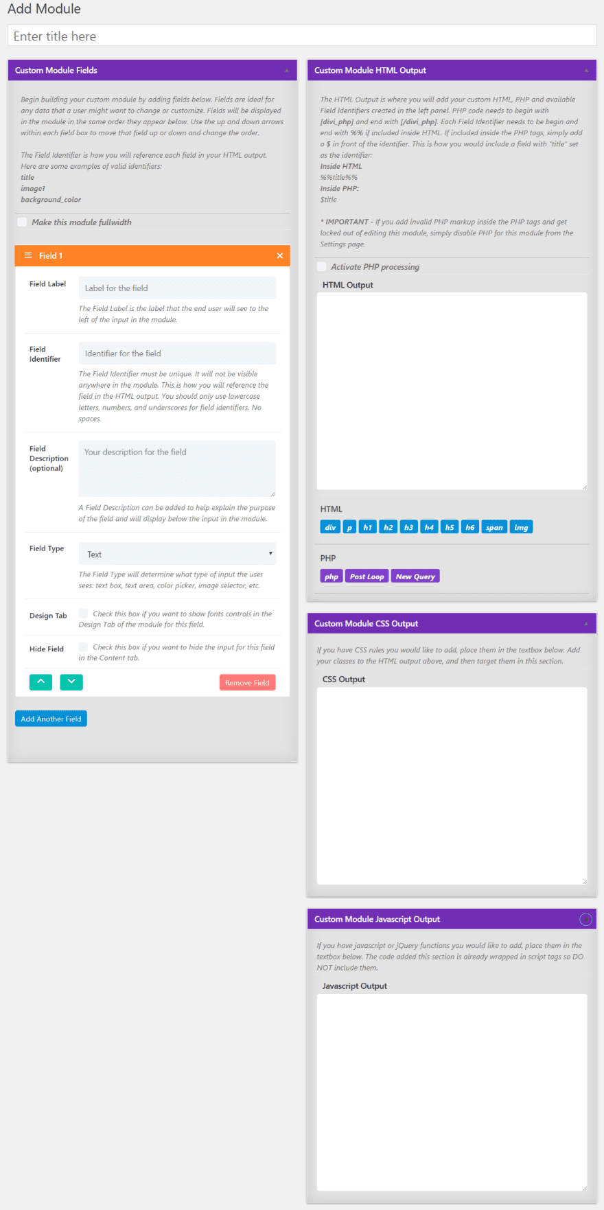
Modules are created in the dashboard menu under Custom Modules, Add Module. There are two areas that you’ll use to create the module. The area on the left is where you’ll create the fields. The area on the right is where you’ll add code that the fields will use. You can make the module standard or fullwidth. You can save draft or publish when you’re ready. Once the module is published it will appear in the Divi Builder.
Fields
Your module can have as many fields as you want. Each field has field properties within it. Here’s a closer look at each of the field’s properties:
Field Label – the label that will display as the field’s title in the module’s content tab.
Field Identifier – a unique value that you will use to reference the field in HTML. Use only lowercase letters, numbers, and underscores for field identifiers.
Field Description – add your own description to explain the purpose of the field. This will display below the input in the module’s content tab. This field is optional but I recommend adding information or examples to help users.
Field Type – determines the type of input the user sees. Choose several field types from the dropdown box including a text, text area, color, image, Yes/No toggle, and icon.
Design Tab – adds font controls for this field within the module’s Design. You’ll see this option if you select text or text area. You’ll have to identify which element to apply the font controls to by adding a class in the HTML.
Hide Field – give users control over an element’s font in the HTML Output without letting them control the content of this element. This option will only become available if a text or text area Field Type is selected.
Add your field label, identifier, description, choose the field type, enable the design tab, or select to hide the field. Rearrange fields by clicking the up/down arrows on each field. Each section and field provides a description and example.
Code
Add custom HTML, PHP, CSS, and JavaScript to control the output. The HTML fields can take custom queries and PHP. You’ll need to enable PHP before it will recognize the code. Otherwise it will print the code on screen. Both the HTML and PHP use field identifiers to reference the fields.
Code shortcuts are provided as buttons under the code fields. This includes tags and field identifiers. Add your field identifiers and then it’s available at the bottom of the code area where you can click to add them to your code. The HTML identifiers are seen as orange buttons and PHP is seen as green. You can use more than what is available as shortcuts, but these are here to help speed development time.
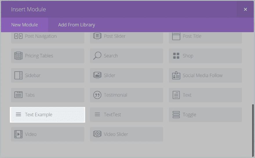
Creating a Module
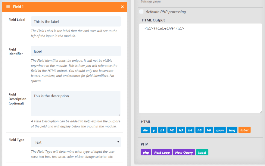
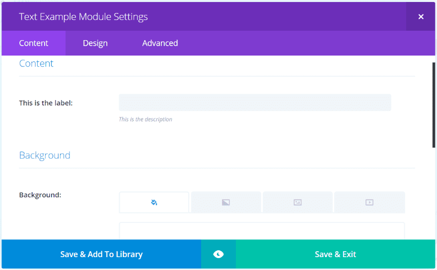
Here’s a quick example of creating a module. The title will be the name that appears on the module in the Divi Builder. I’ve added the field label, description, chose Text as the field type, and created a field identifier.
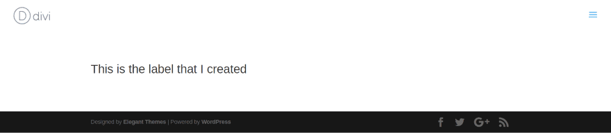
I saved as draft so the identifier would appear in the HTML shortcuts. Next, I selected the H1 tag from the shortcuts, placed my cursor between the tags, and selected label from the HTML shortcuts. Once I was finished I hit publish. The result should be a module with a field where users can enter text. The output will display the text as a header 1.
The module now appears in the Divi Builder. I can add to the page just like any Divi module.
The Content tab includes the fields that I added with my labels.
The module displays the text that I entered into the field. Since I added HTML to display it as an H1, the text automatically has an H1 property. I could add the Design tab to include more customization features. This will require some code to target the field correctly.
Modules
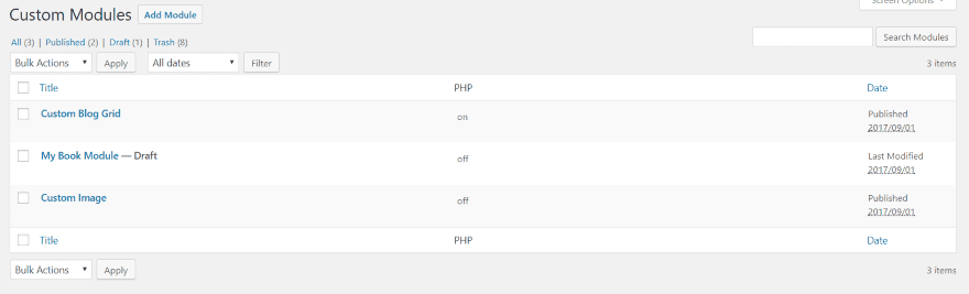
You can see the list of modules in the dashboard menu. Go to Custom Modules, Modules. Here you can edit or delete your modules. It shows if PHP is turned on or off for each module. If you want to clone a module you’ll have to view them in Settings.
Custom Module Settings
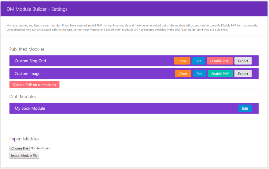
The Settings menu provides a location where you can manage your modules. You can view both published and draft modules.
You can clone them, which gives you a good place to start on a module that needs a lot of code that you’ve used in another module. You can also edit, disable or enable PHP (which is helpful if you’re locked out of the editor because of a code error – I did this and used this feature to edit the module), and import and export your modules.
Add Dependency
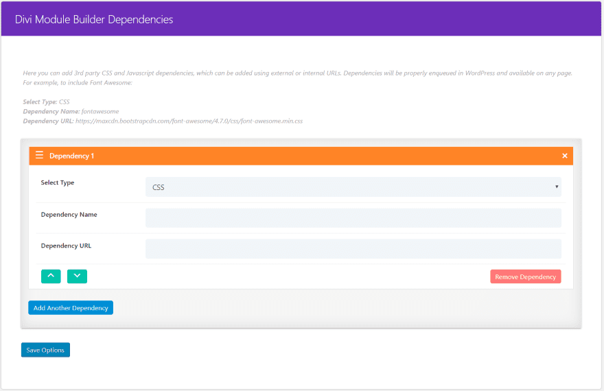
Here you can add third-party CSS and Javascript dependencies. Add them as external or internal URLs. Choose CSS or Javascript from the dropdown box, add the name, and add the URL. They can then be used on any page. It gives an example of using Font Awesome. This is an excellent way to create a dependency in one location and then use it anywhere.
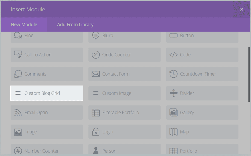
Divi Module Builder Example – Custom Blog Grid
Rather than creating an ‘okay’ module as an example, I’m showing the awesome example that the developer created – Custom Blog Grid (available for download at the developer’s website for free). It includes 3 fields, HTML, PHP, and CSS. Here’s a look at each one.
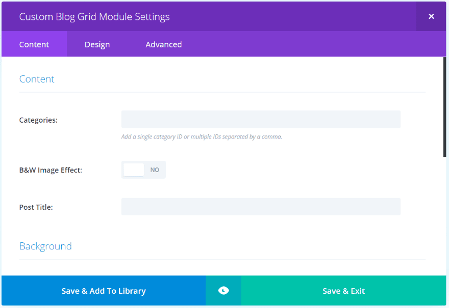
Custom Blog Grid Module
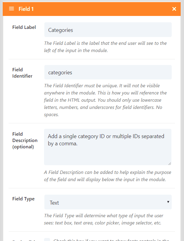
Field 1 is labeled Categories, uses categories as the indentifier, and the field type is set to Text.
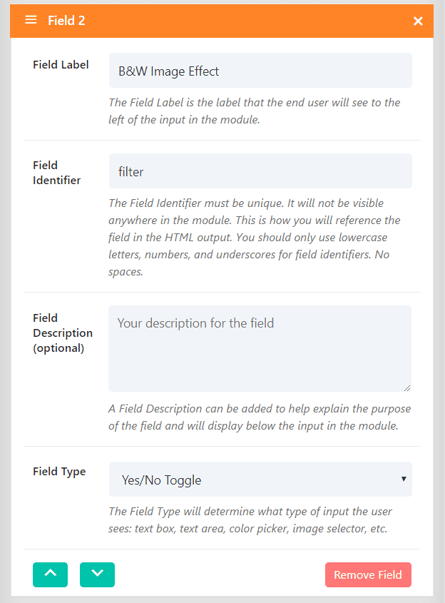
Field 2 is labeled B&W Image Effect. The identifier is filter and the filed type is Yes/No Toggle. The filter is created in CSS.
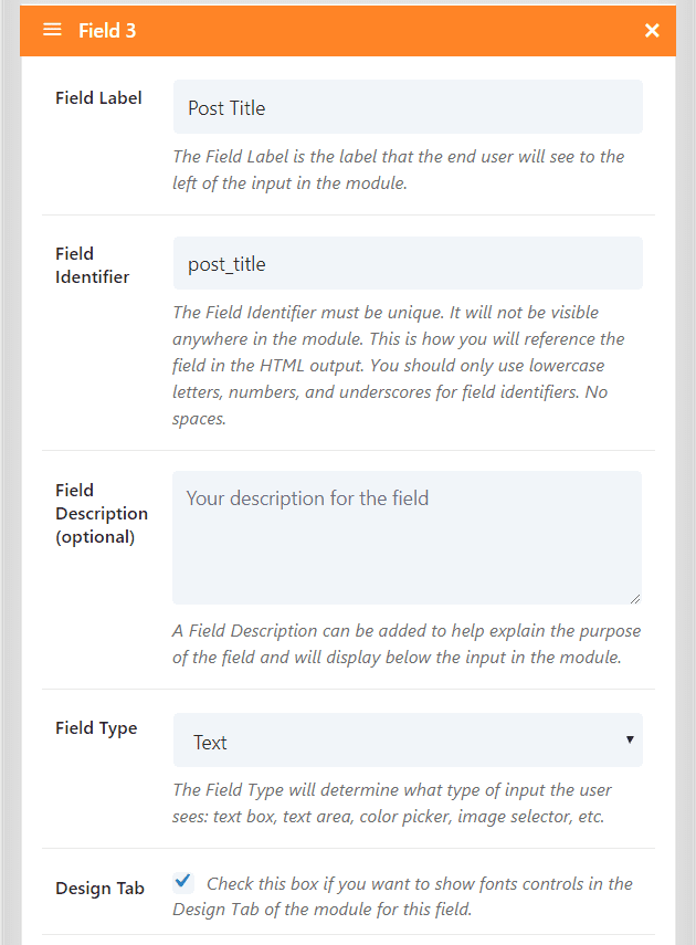
Field 3 is labeled Post Title and uses post_title as the identifier. The field type is set to Text and has the Design tab enabled. We’ll see customizations for this field in the module. This field is given an H2 class in HTML.
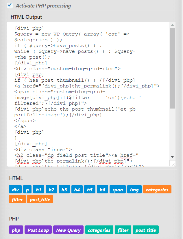
PHP is selected so it can be used in the HTML Output code box.
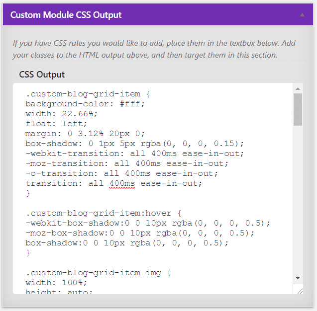
Custom CSS is added to the CSS output box.
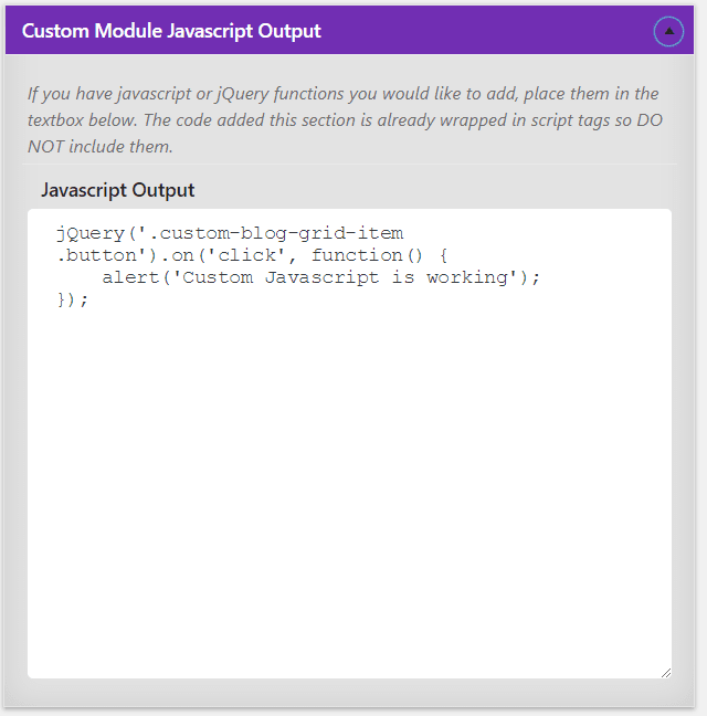
Here’s the Javascript. You’ll need to have a good understanding of HTML, PHP, CSS, and Javascript to get the most from this plugin. In other words, this is a plugin for developers.
The Custom Blog Grid Module in the Divi Builder
Once the module is published you’ll find it in the Divi Builder.
The settings that appear within the module and their labels will differ depending on selections you make. This module allows you to add categories, enable the black and white effect, and add a post title in the Content tab. It also include background settings (which is default for modules).
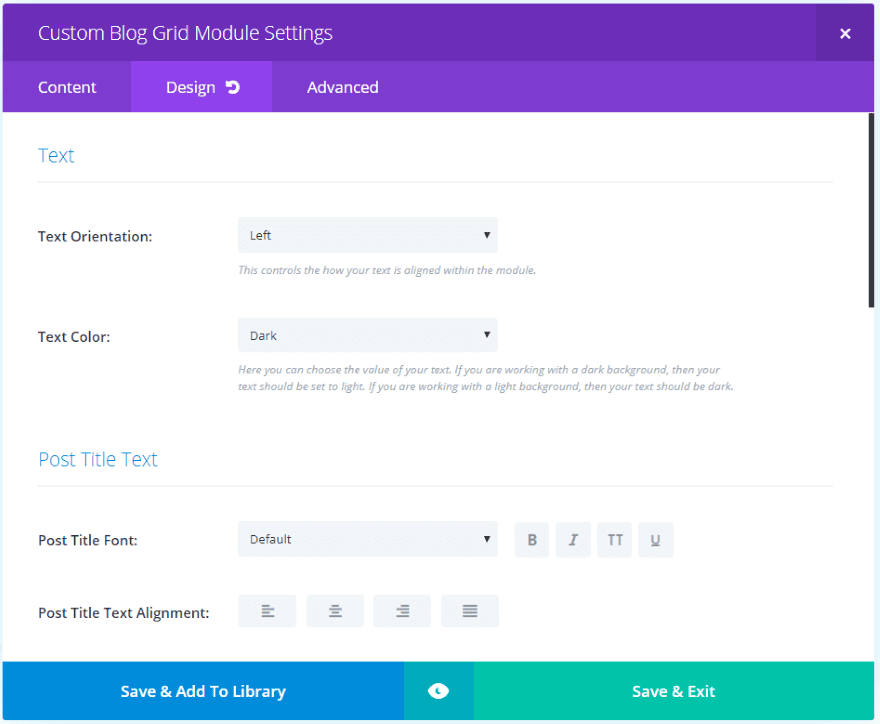
The Design tab is enabled for this module. It includes settings for the text, post title text, border, spacing, and animation.
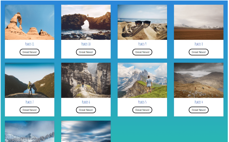
Custom Blog Grid Results
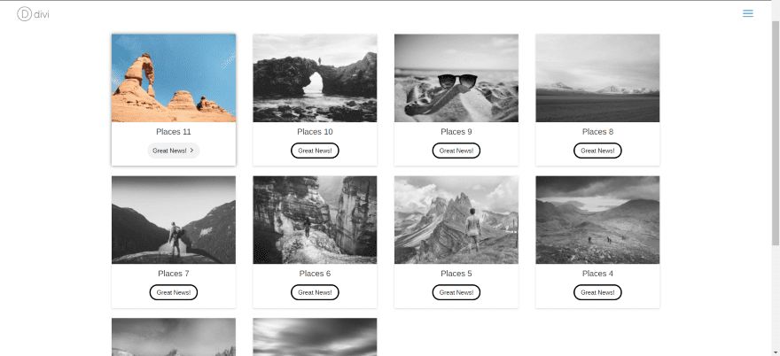
The result is a blog grid with hover animation. I’ve enabled black and white mode so the images display in black and white unless I’m hovering over them. I prefer this form of hover – to reveal the image on hover rather than obscure it.
In this one I’ve disabled the black and white mode, changed the title font, and added a background gradient. More adjustments can be added in code to change the button, add overlays, etc. If you can code it you can get it to do practically anything you can imagine.
License and Documentation
There are three licenses to choose from: single, unlimited, and lifetime. The Unlimited license covers unlimited websites and includes 1 year of updates and support. Lifetime Unlimited Sites license includes lifetime updates and support.
Documentation is provided on the developer’s website. Example code is included along with step-by-step instructions.
Final Thoughts
Divi Module Builder is powerful plugin with a lot of potential in the right hands. Since it does require a good knowledge of code it isn’t for everyone. This gives developers an excellent tool to create and share modules. I like that you can import and export from one site to another. Each site that uses the module will need the plugin installed. If you have a good knowledge of code and are interested in creating your own Divi modules, Divi Module Builder is worth a look.
We want to hear from you. Have you tried Divi Module Builder? Let us know what you think about it in the comments.
Featured Image via aliaksei kruhlenia / shutterstock.com
The post Divi Plugin Highlight: Divi Module Builder appeared first on Elegant Themes Blog.