
The way you display contact forms on your website can definitely help increase conversion rates. Besides creating beautiful and user-friendly contact forms, you can also approach it in a more targeted way. In this post, we’ll show you how to create one design with multiple contact forms that appear depending on which service your visitors are interested in. You’ll be able to download the JSON file for free as well!
Let’s get to it.
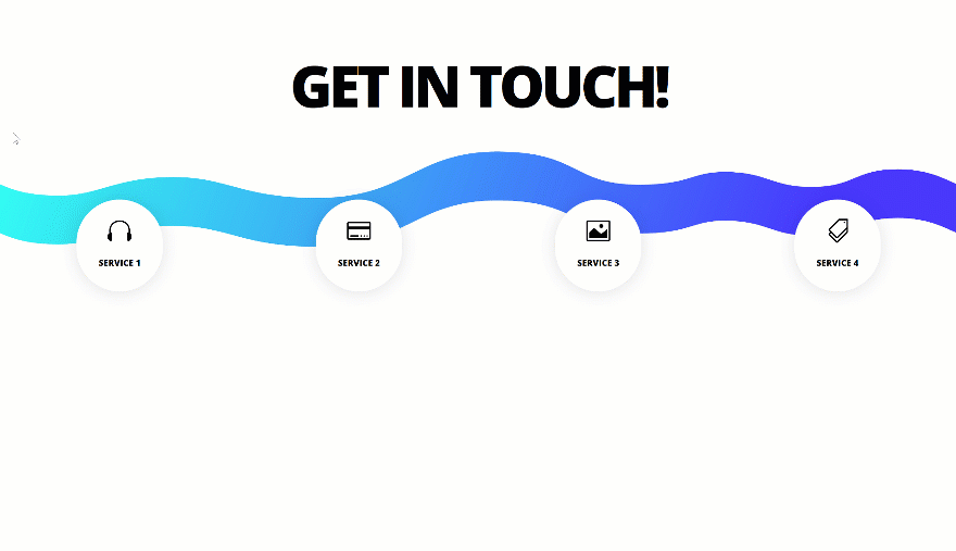
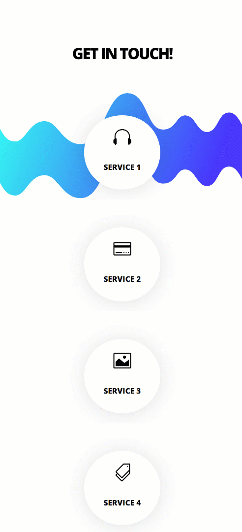
Preview
Before we dive into the tutorial, let’s take a quick look at the outcome across different screen sizes.
Desktop
Mobile
Download The Targeted Contact Forms Layout for FREE
To lay your hands on the free targeted contact forms layout, you will first need to download it using the button below. To gain access to the download you will need to subscribe to our Divi Daily email list by using the form below. As a new subscriber, you will receive even more Divi goodness and a free Divi Layout pack every Monday! If you’re already on the list, simply enter your email address below and click download. You will not be “resubscribed” or receive extra emails.
@media only screen and ( max-width: 767px ) {.et_bloom .et_bloom_optin_1 .carrot_edge.et_bloom_form_right .et_bloom_form_content:before, .et_bloom .et_bloom_optin_1 .carrot_edge.et_bloom_form_left .et_bloom_form_content:before { border-top-color: #ffffff !important; border-left-color: transparent !important; }
}.et_bloom .et_bloom_optin_1 .et_bloom_form_content button { background-color: #f92c8b !important; } .et_bloom .et_bloom_optin_1 .et_bloom_form_content .et_bloom_fields i { color: #f92c8b !important; } .et_bloom .et_bloom_optin_1 .et_bloom_form_content .et_bloom_custom_field_radio i:before { background: #f92c8b !important; } .et_bloom .et_bloom_optin_1 .et_bloom_border_solid { border-color: #f7f9fb !important } .et_bloom .et_bloom_optin_1 .et_bloom_form_content button { background-color: #f92c8b !important; } .et_bloom .et_bloom_optin_1 .et_bloom_form_container h2, .et_bloom .et_bloom_optin_1 .et_bloom_form_container h2 span, .et_bloom .et_bloom_optin_1 .et_bloom_form_container h2 strong { font-family: “Open Sans”, Helvetica, Arial, Lucida, sans-serif; }.et_bloom .et_bloom_optin_1 .et_bloom_form_container p, .et_bloom .et_bloom_optin_1 .et_bloom_form_container p span, .et_bloom .et_bloom_optin_1 .et_bloom_form_container p strong, .et_bloom .et_bloom_optin_1 .et_bloom_form_container form input, .et_bloom .et_bloom_optin_1 .et_bloom_form_container form button span { font-family: “Open Sans”, Helvetica, Arial, Lucida, sans-serif; } p.et_bloom_popup_input { padding-bottom: 0 !important;}

Download For Free
Join the Divi Newlsetter and we will email you a copy of the ultimate Divi Landing Page Layout Pack, plus tons of other amazing and free Divi resources, tips and tricks. Follow along and you will be a Divi master in no time. If you are already subscribed simply type in your email address below and click download to access the layout pack.
You have successfully subscribed. Please check your email address to confirm your subscription and get access to free weekly Divi layout packs!
Once you’ve uploaded the layout to your page, you’ll still have to add the CSS code to the page you’re working on. You can find the CSS code at the end of this tutorial.
Let’s Start Recreating!
Add Section #1
Open a new or existing page and add a new regular section.
Add New Row
Column Structure
Continue by adding a new row using the following column structure:
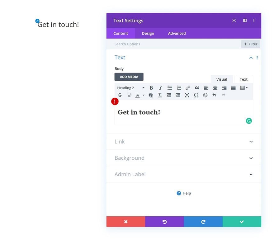
Add Text Module
Add H2 Content
Add a Text Module to the column with some H2 content of your choice.
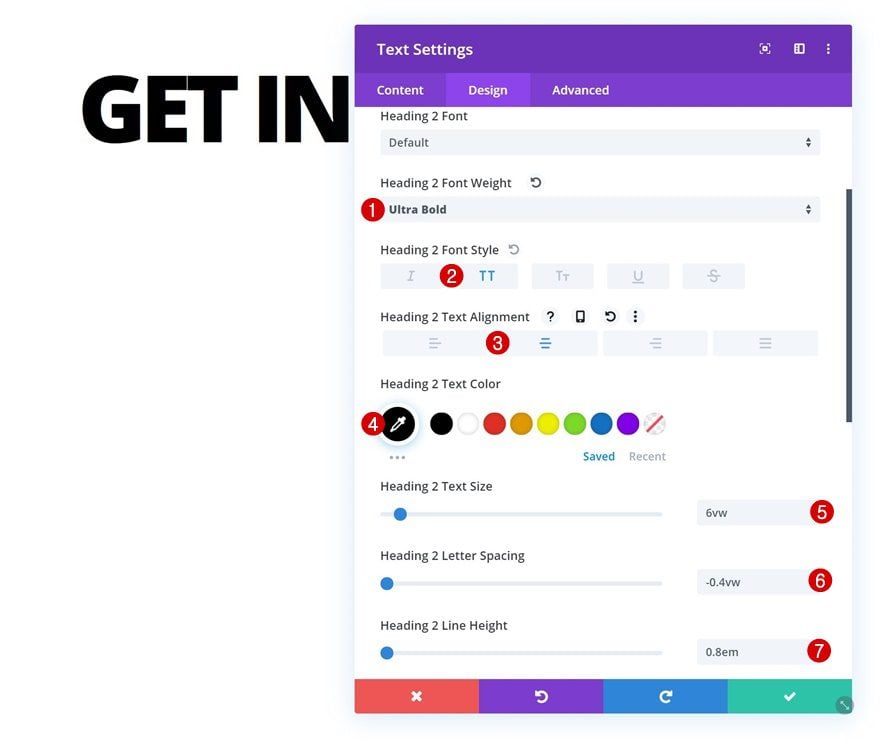
H2 Text Settings
Move on to the design tab and change the H2 text settings accordingly:
- Heading 2 Font Weight: Ultra Bold
- Heading 2 Font Style: Uppercase
- Heading 2 Text Alignment: Center
- Heading 2 Text Color: #000000
- Heading 2 Text Size: 6vw
- Heading 2 Letter Spacing: -0.4vw
- Heading 2 Line Height: 0.8em
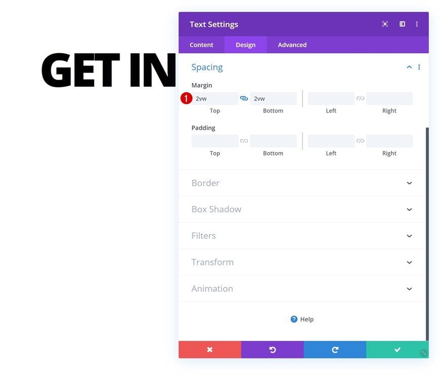
Spacing
Add some custom top and bottom margin as well.
- Top Margin: 2vw
- Bottom Margin: 2vw
Add Section #2
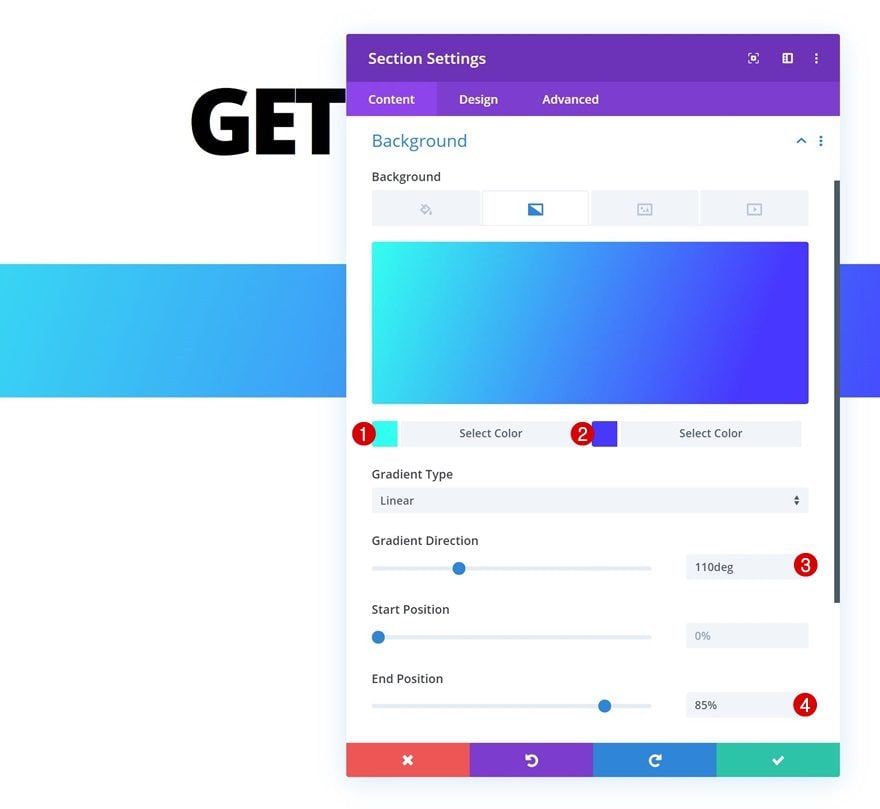
Gradient Background
Add another section right below the previous one and apply the following gradient background (or any gradient background of your choice):
- Color 1: #30fff1
- Color 2: #4635ff
- Gradient Direction: 110deg
- End Position: 85%
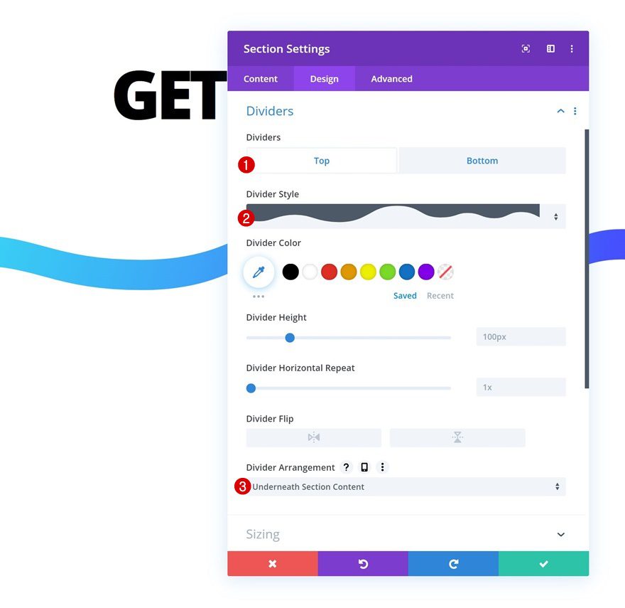
Top Divider
Move on to the design tab and add a top divider.
- Divider Style: Find in List
- Divider Arrangement: Underneath Section Content
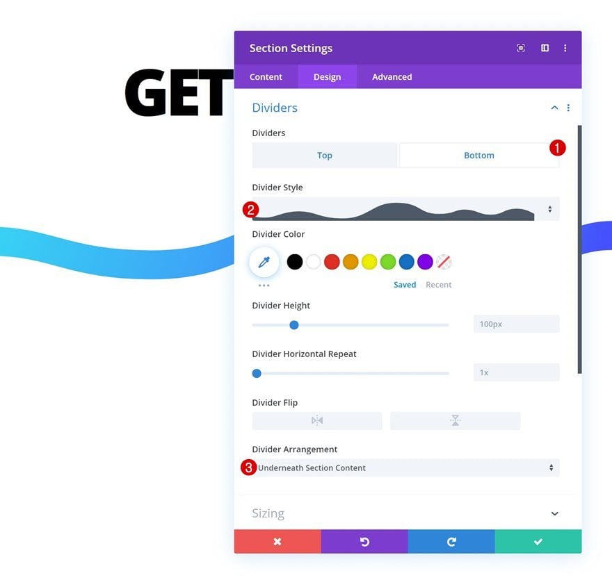
Bottom Divider
Add a bottom divider as well.
- Divider Style: Find in List
- Divider Arrangement: Underneath Section Content
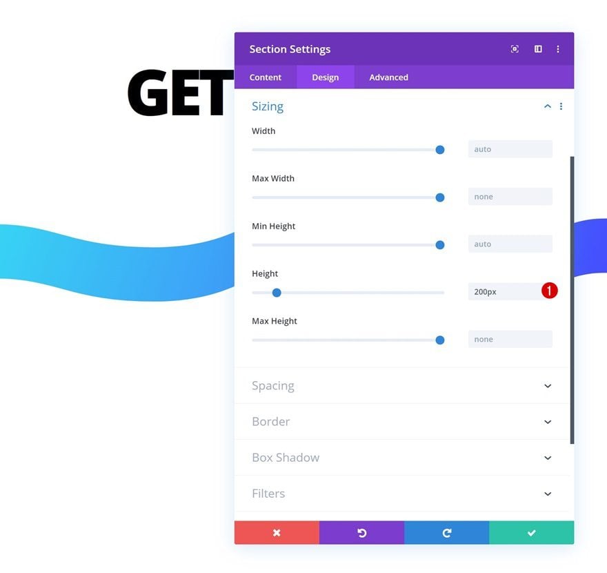
Sizing
Change the height in the sizing settings next.
- Height: 200px
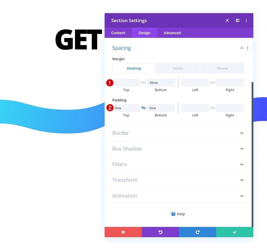
Spacing
Add some custom spacing settings next.
- Bottom Margin: 30vw (Desktop), 45vw (Tablet), 200vw (Phone)
- Top Padding: 0vw
- Bottom Padding: 0vw
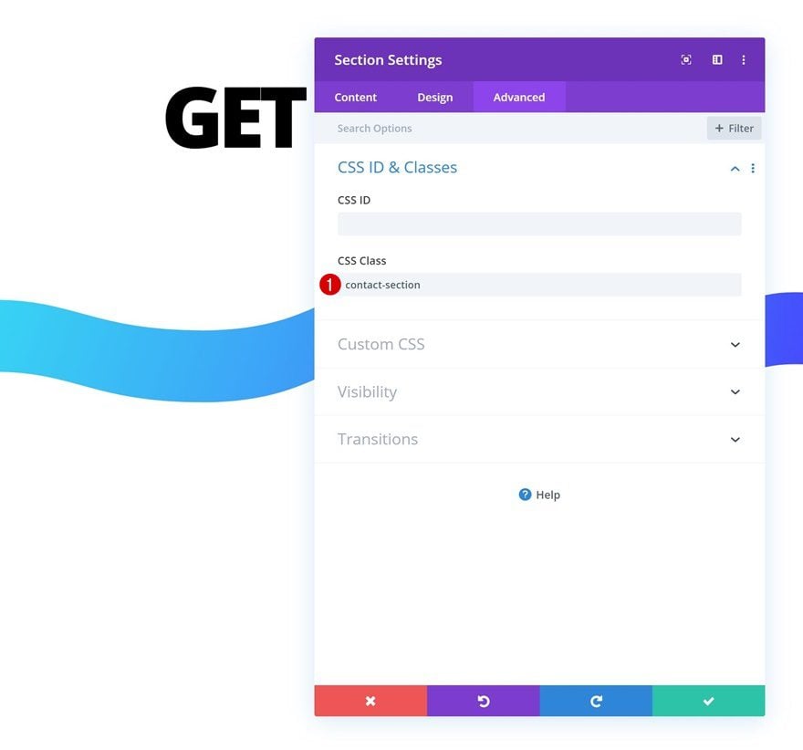
CSS Class
Later on the post, we’re going to add some CSS code to make the effect work. In preparation for that, we’ll add a CSS class to the section.
- CSS Class: contact-section
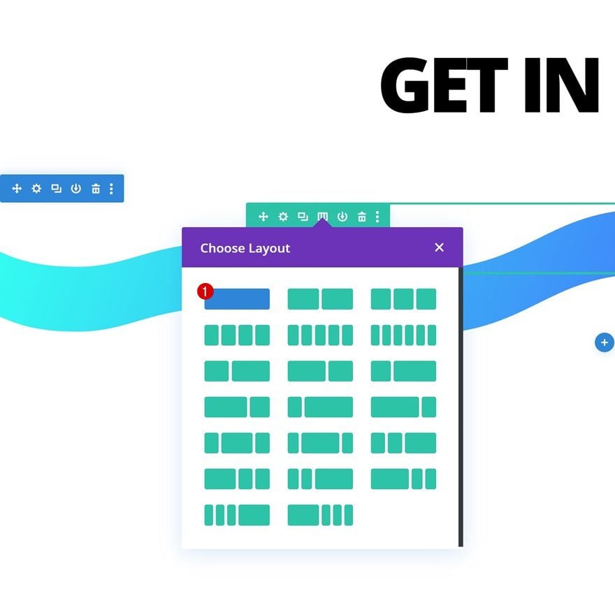
Add New Row
Column Structure
Continue by adding a new row using the following column structure:
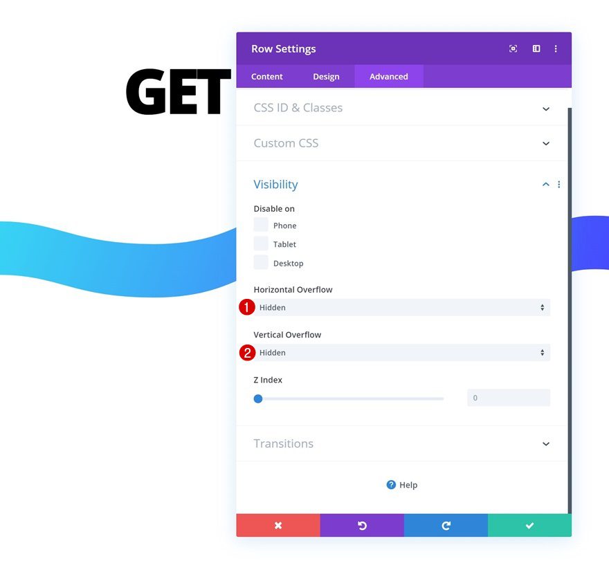
Overflow
Open the row settings and hide the overflows.
- Horizontal Overflow: Hidden
- Vertical Overflow: Hidden
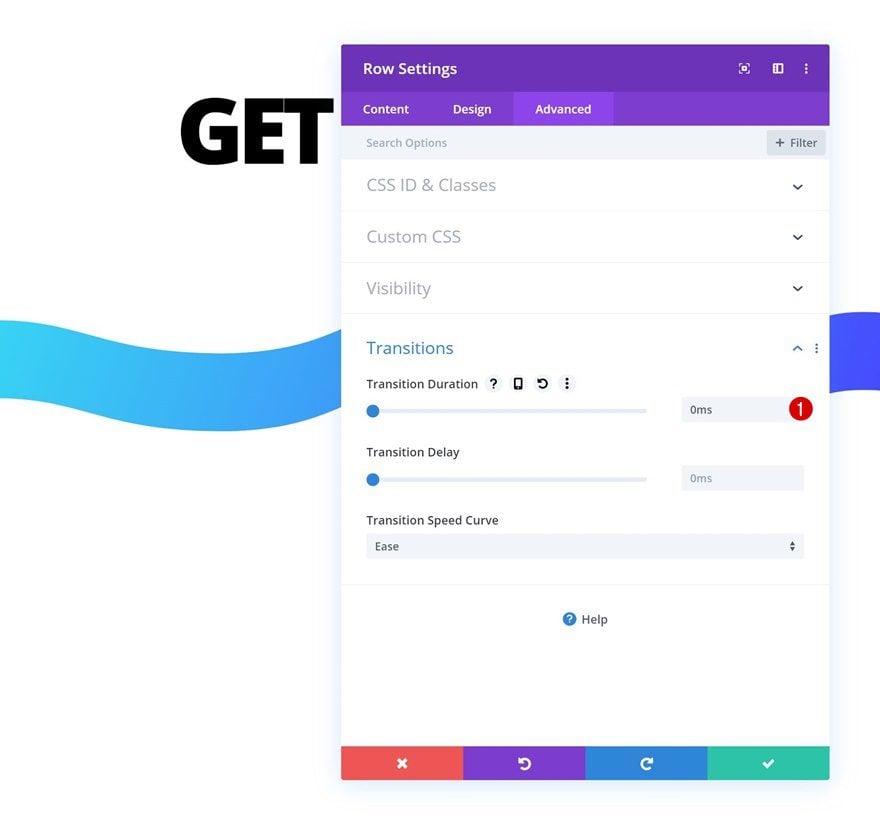
Transitions
Remove the transition duration as well.
- Transition Duration: 0ms
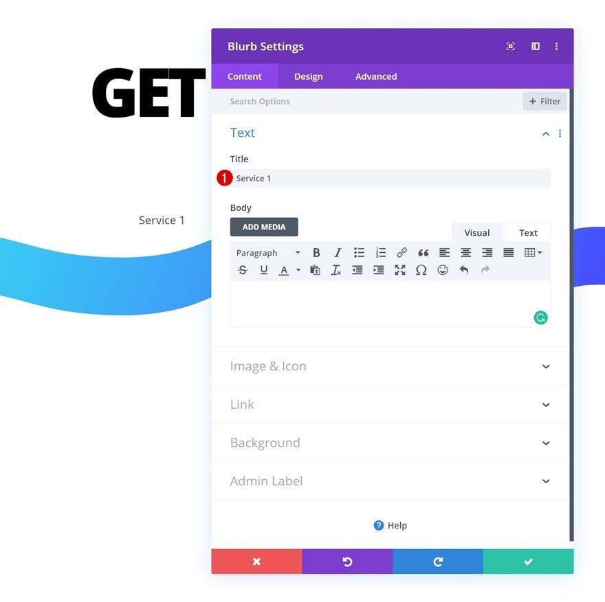
Add Blurb Module
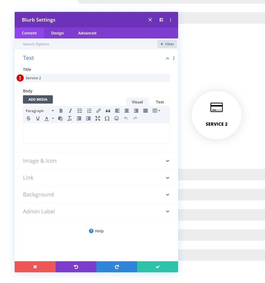
Add Title to Content Box
Time to start adding modules! Add a Blurb Module and enter a title of your choice that represents one of your services.
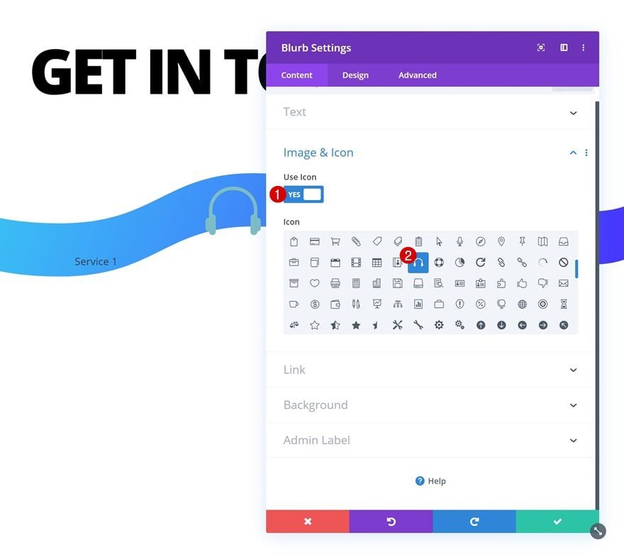
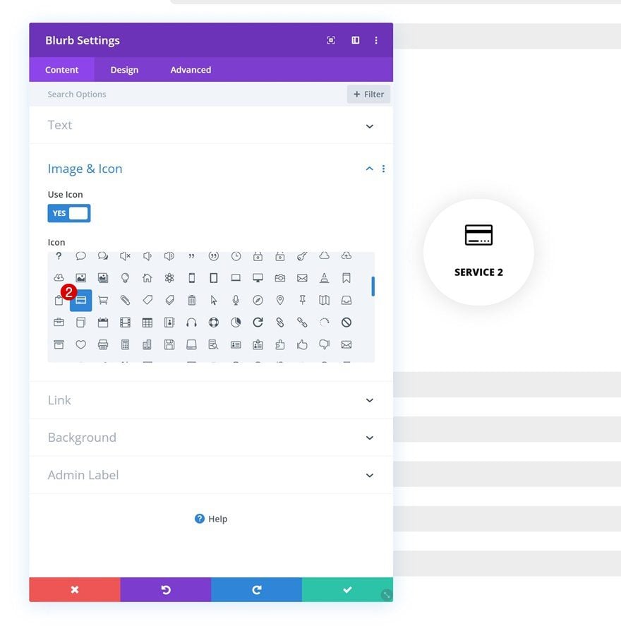
Select Icon
Select an icon next.
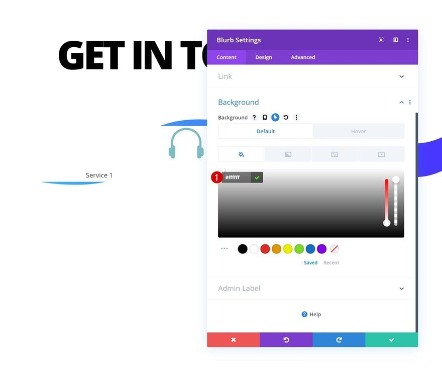
Default Background Color
Continue by adding a default background color.
- Background Color: #ffffff
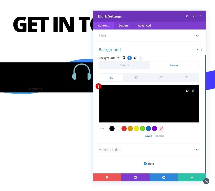
Hover Background Color
Change the background color on hover.
- Background Color: #000000
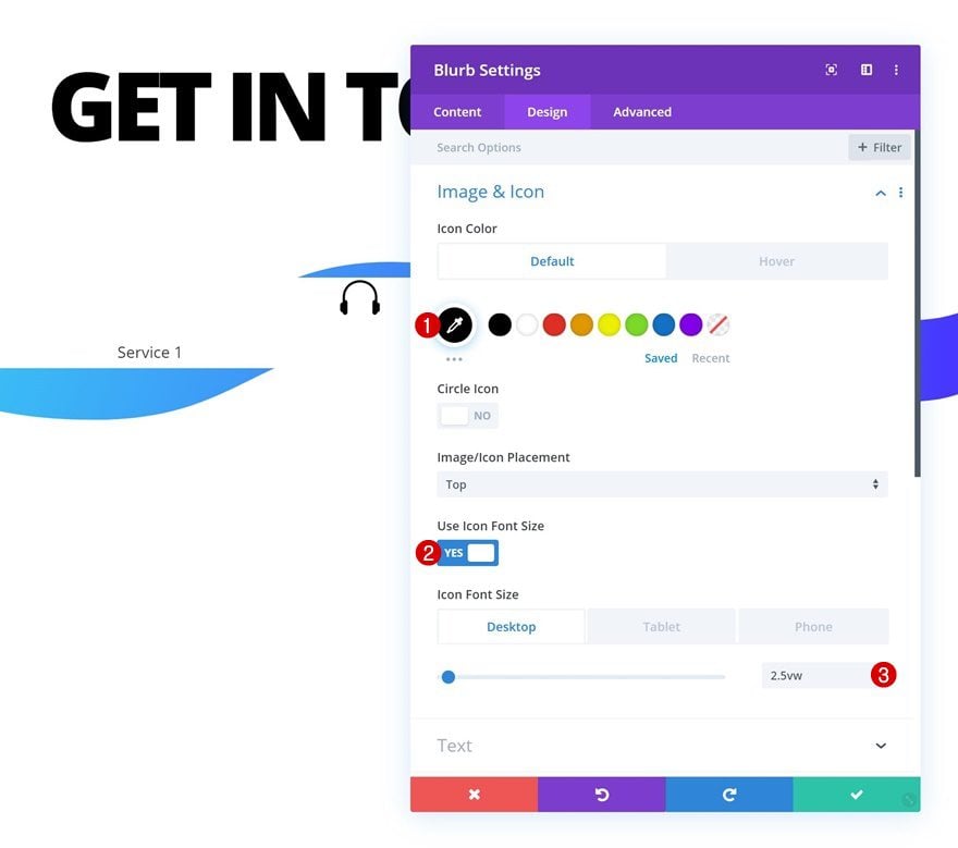
Default Icon Settings
Move on to the design tab and change the icon settings accordingly:
- Icon Color: #000000
- Use Icon Font Size: Yes
- Icon Font Size: 2.5vw (Desktop), 5vw (Tablet), 7vw (Phone)
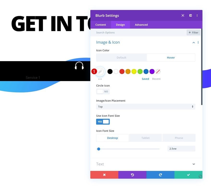
Hover Icon Settings
Modify the icon color on hover.
- Icon Color: #ffffff
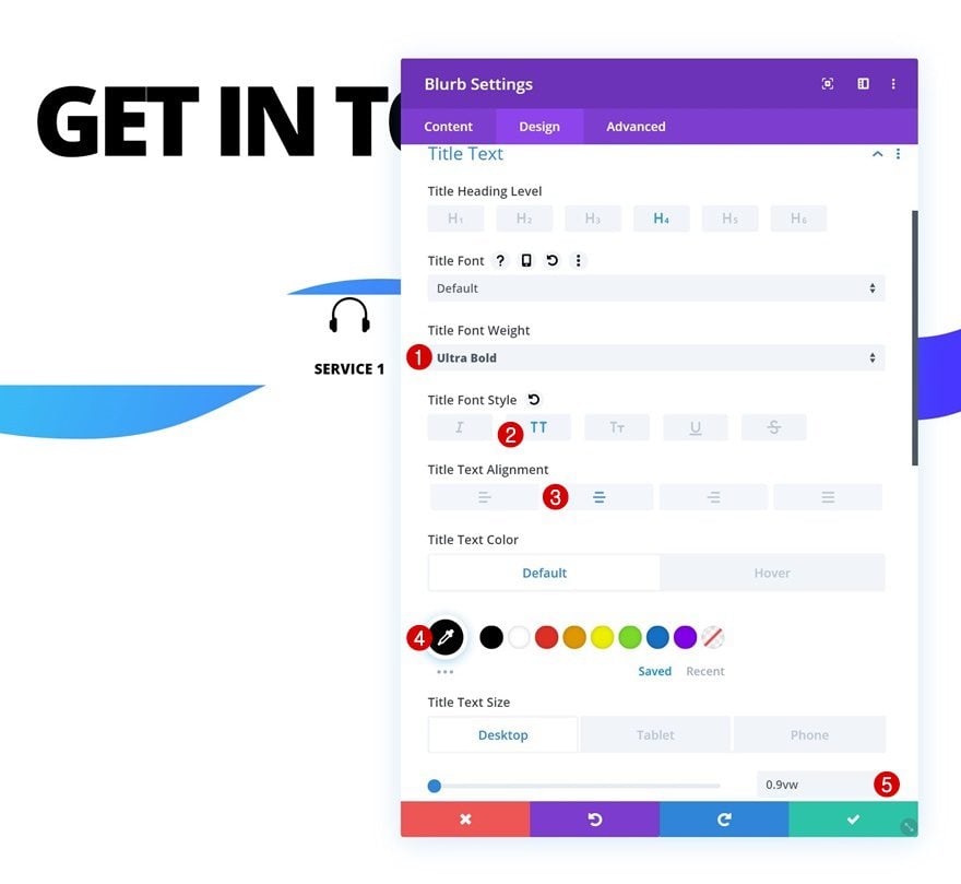
Default Title Text Settings
Open the title text settings next and apply the following changes:
- Title Font Weight: Ultra Bold
- Title Font Style: Uppercase
- Title Text Alignment: Center
- Title Text Color: #000000
- Title Text Size: 0.9vw (Desktop), 1.8vw (Tablet), 3vw (Phone)
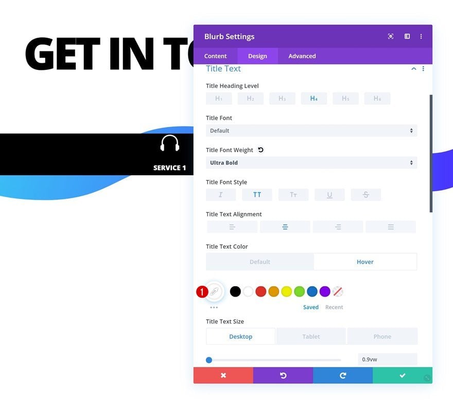
Hover Title Text Settings
Change the title text color on hover.
- Title Text Color: #ffffff
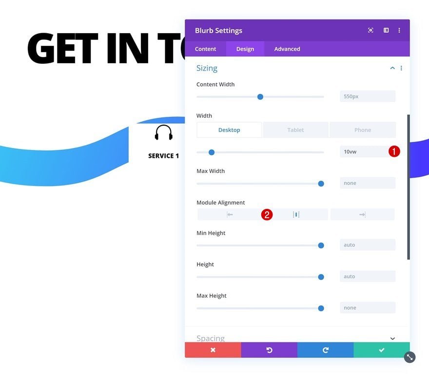
Sizing
Modify the width across different screen sizes next.
- Width: 10vw (Desktop), 17vw (Tablet), 30vw (Phone)
- Module Alignment: Center
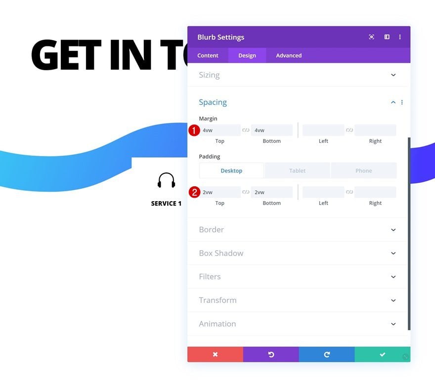
Spacing
And add some custom margin and padding values to the spacing settings.
- Top Margin: 4vw
- Bottom Margin: 4vw
- Top Padding: 2vw (Desktop), 3vw (Tablet), 6vw (Phone)
- Bottom Padding: 2vw (Desktop), 3vw (Tablet), 6vw (Phone)
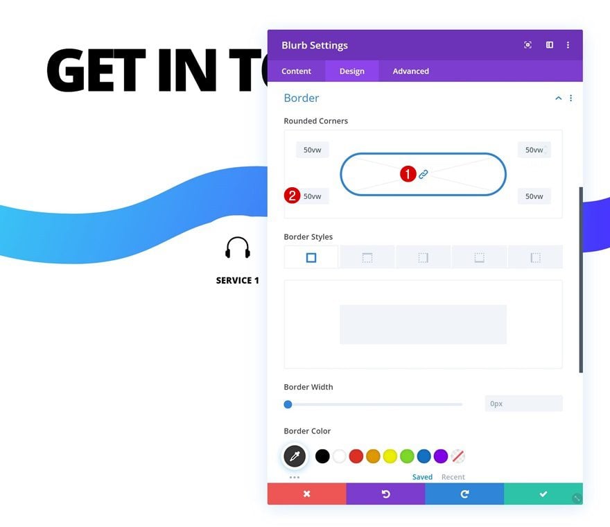
Border
We’re also turning the module into a circle by adding ’50vw’ to each one of the corners in the border settings.
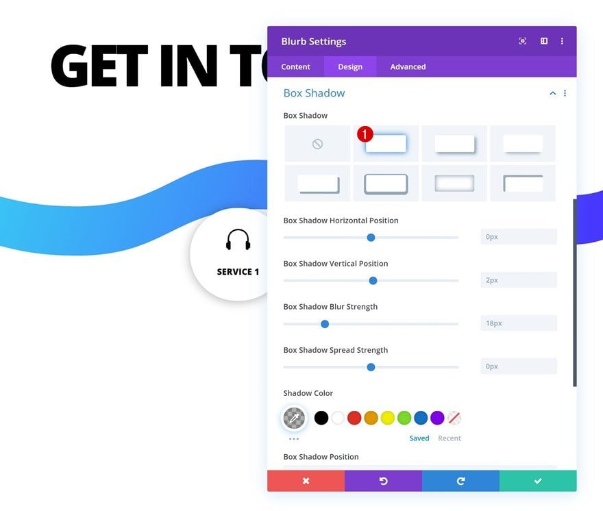
Box Shadow
Add a box shadow as well.
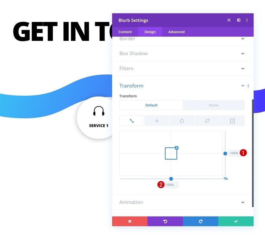
Default Transform Scale
Move on to the transform settings and make sure the default transform scale values remain ‘100%’.
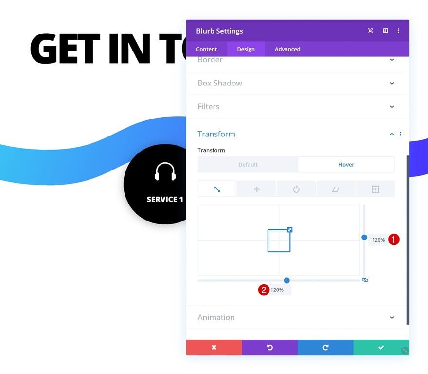
Hover Transform Scale
Change these values on hover.
- Bottom: 120%
- Right: 120%
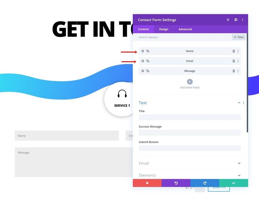
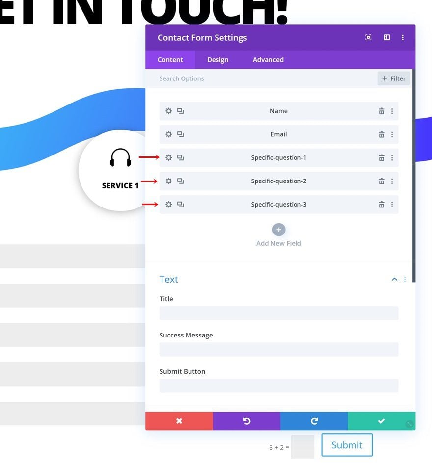
Add Contact Form
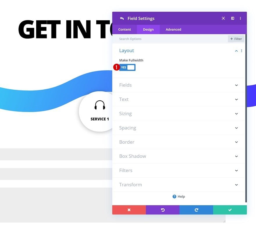
Make Name & Email Fields Fullwidth
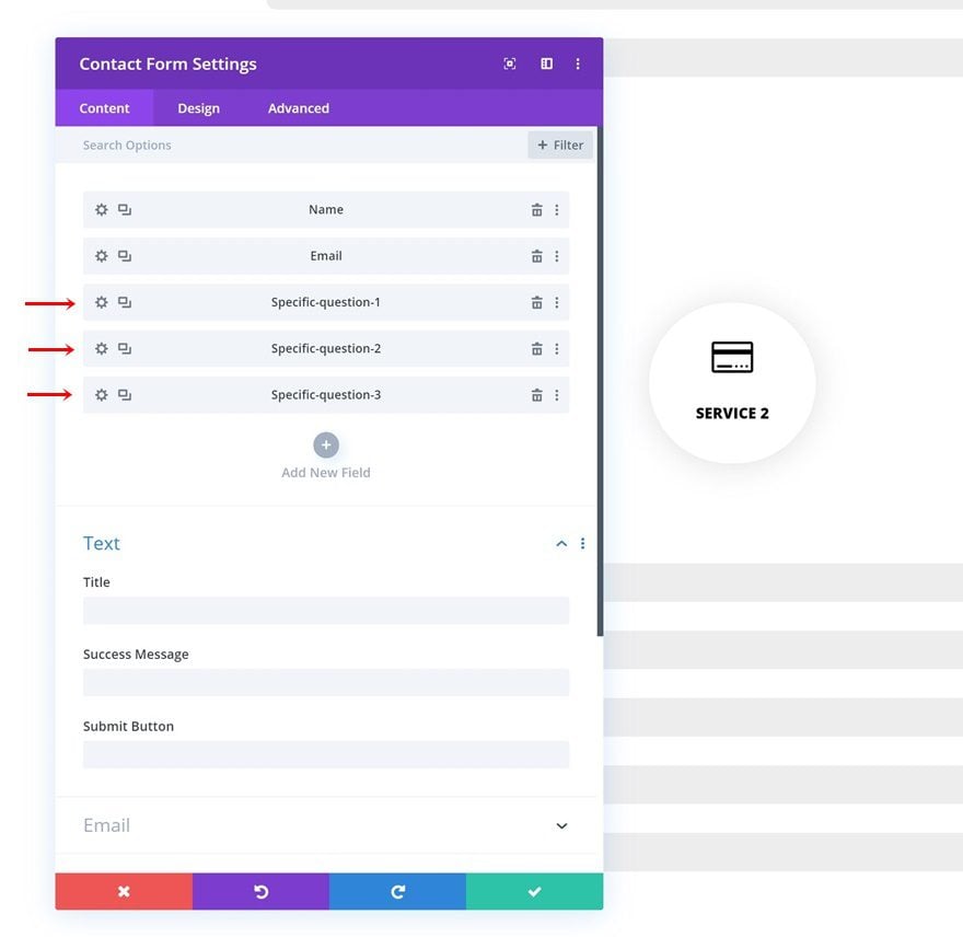
The second module we need in this row is a Contact Form Module. Once you’ve added the contact form, open the name and email fields and make them fullwidth.
- Make Fullwidth: Yes
Remove Message Field & Insert Three Input Fields for Service-Specific Questions
Add three questions that apply to that specific service next.
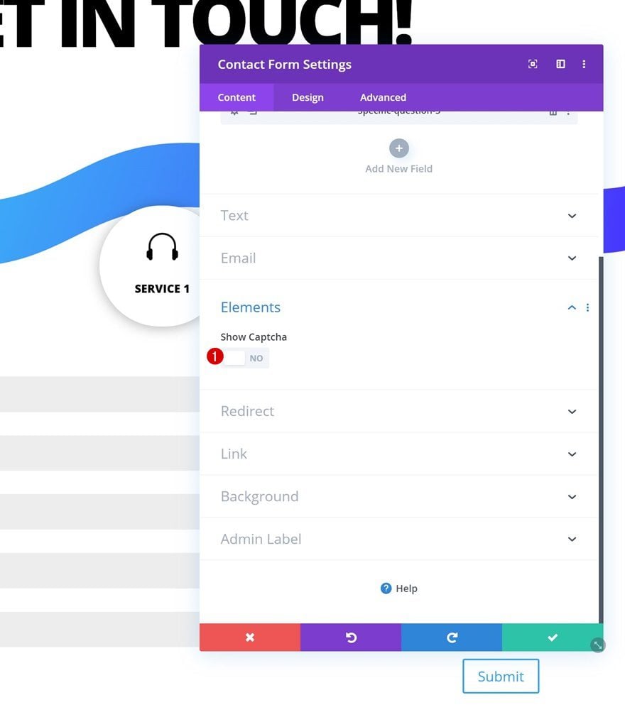
Disable Captcha
Disable the captcha option as well.
- Show Captcha: No
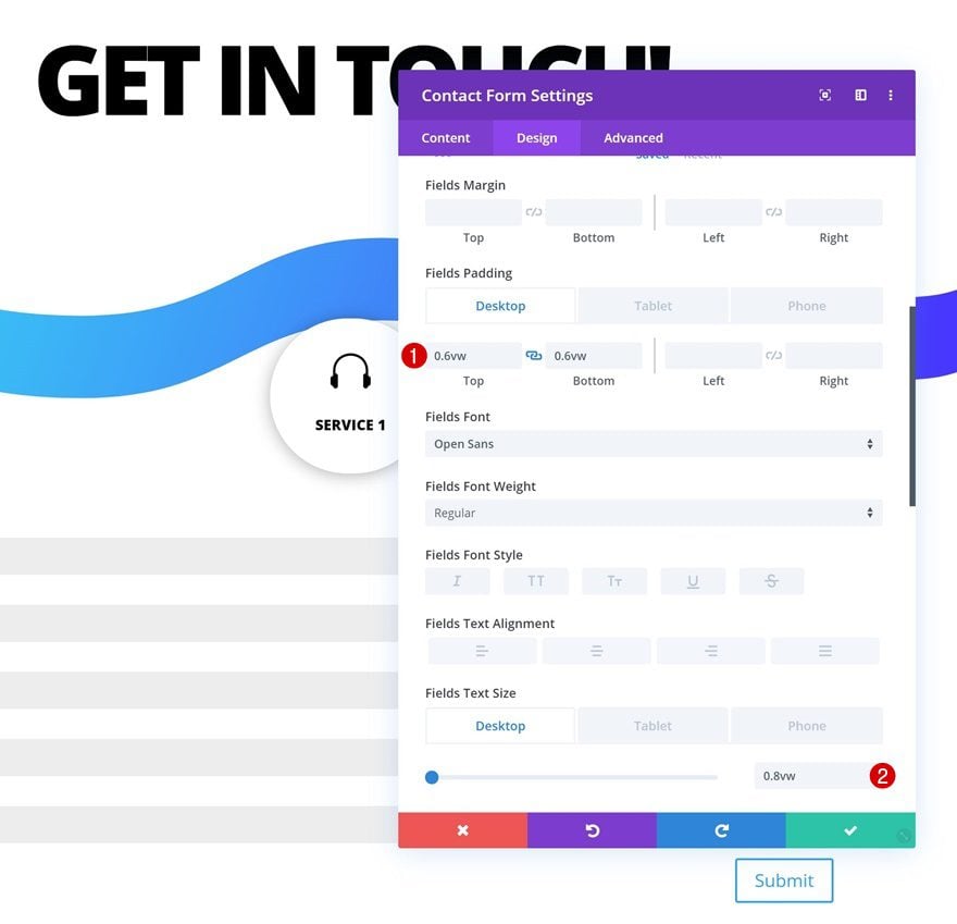
Fields Settings
Move on to the design tab and change the fields settings accordingly:
- Fields Top Padding: 0.6vw (Desktop), 0.9vw (Tablet), 1.5vw (Phone)
- Fields Bottom Padding: 0.6vw (Desktop), 0.9vw (Tablet), 1.5vw (Phone)
- Fields Text Size: 0.8vw (Desktop), 1.6vw (Tablet), 2.3vw (Phone)
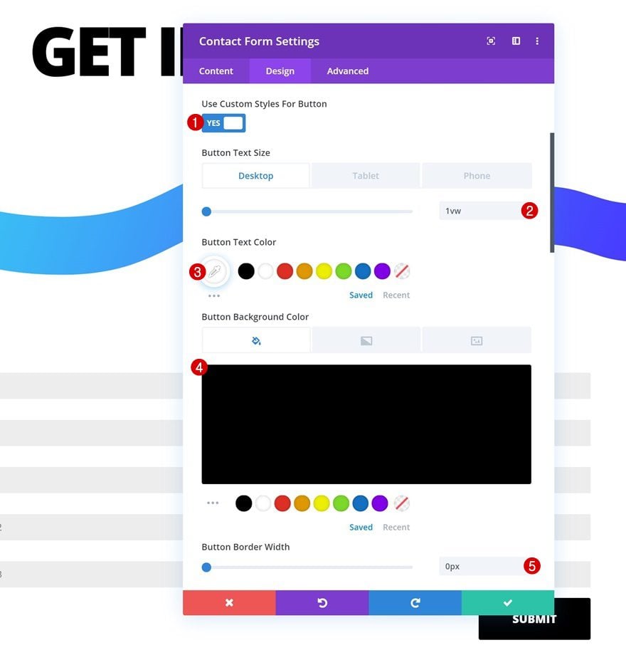
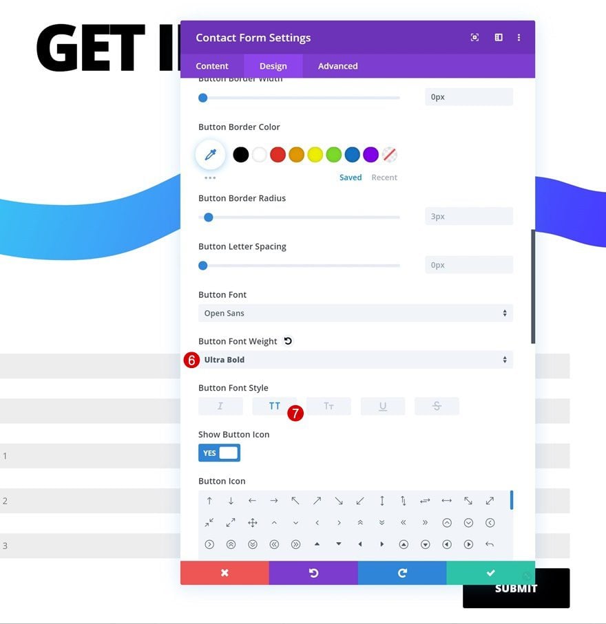
Button Settings
Change the appearance of the button next.
- Use Custom Styles for Button: Yes
- Button Text Size: 1vw (Desktop), 2vw (Tablet), 3vw (Phone)
- Button Text Color: #ffffff
- Button Background Color: #000000
- Button Border Width: 0px
- Button Font Weight: Ultra Bold
- Button Font Style: Uppercase
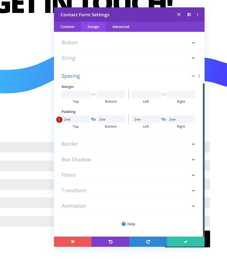
Spacing
Add some padding values too.
- Top Padding: 2vw
- Bottom Padding: 2vw
- Left Padding: 2vw
- Right Padding: 2vw
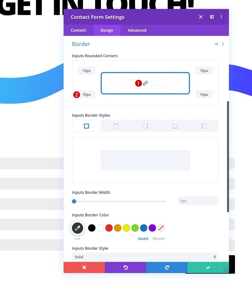
Border Settings
Last but not least, go to the border settings and add ’10px’ to each one of the corners.
Clone Row Three Times
Once you’ve completed the first row, you can go ahead and clone it three times.
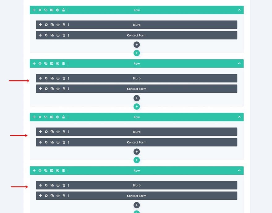
Change Blurb Content & Icon for Each Duplicate Row
Make sure you change the blurb title and icon for each duplicate.
Change Service-Specific Questions for Each Duplicate Row
Modify the contact form’s specific questions as well.
Additional Row Settings
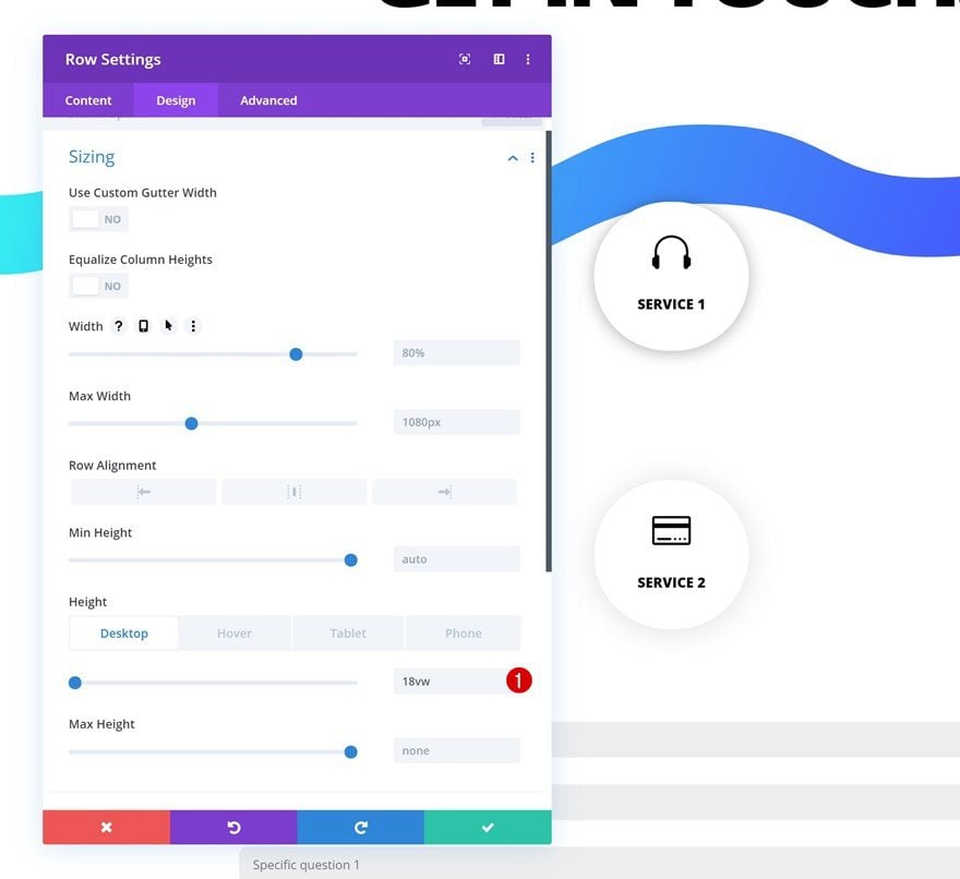
Default Height
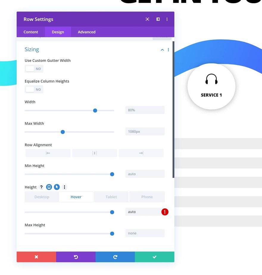
Open the first row’s settings once again, go to the sizing settings and change the height across different screen sizes.
- Height: 18vw (Desktop), 27vw (Tablet), 38vw (Phone)
Hover Height
Bring back the height to auto on hover.
- Height: auto
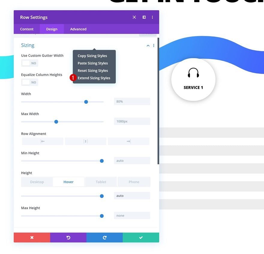
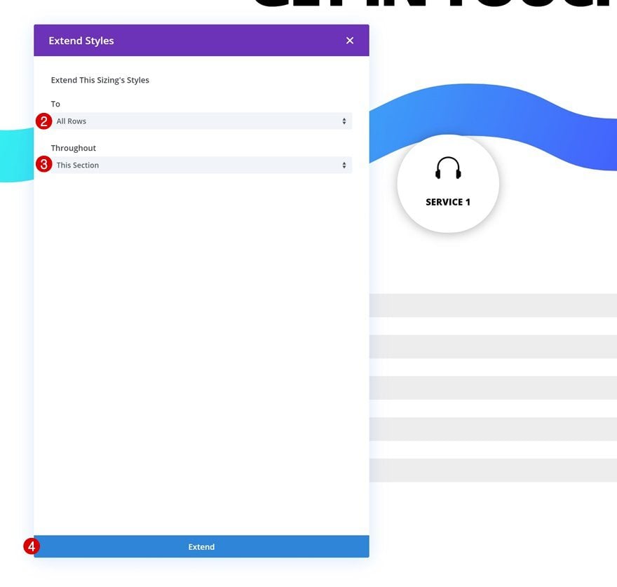
Extend Row Sizing Settings to All Rows in Section
Once you’ve modified the sizing settings for the first row, you can extend the settings to all the rows throughout the section.
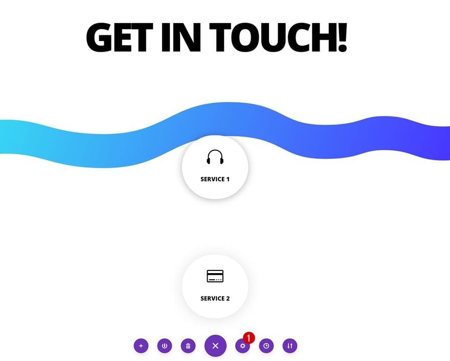
Place Rows Next to Each Other on Desktop & Tablet
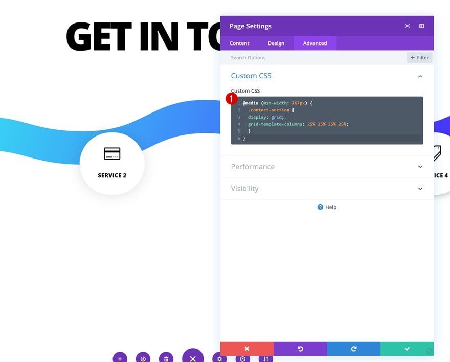
Open Page Settings
Last but not least, we’re going to place all four rows next to each other on tablet and desktop. To do that, open the page settings.
Insert Custom CSS
Move on to the custom CSS box and add the following lines of CSS Code:
@media (min-width: 767px) {
.contact-section {
display: grid;
grid-template-columns: 25% 25% 25% 25%;
}
} 
Preview
Now that we’ve gone through all the steps, let’s take a final look at the outcome across different screen sizes.
Desktop
Mobile
Final Thoughts
In this post, we’ve shown you how to create multiple targeted contact forms in one design. This is a great way to learn more about your visitors and what particular service they’re interested in. If you have any questions or suggestions, make sure you leave a comment in the comment section below!
If you’re eager to learn more about Divi and get more Divi freebies, make sure you subscribe to our email newsletter and YouTube channel so you’ll always be one of the first people to know and get benefits from this free content.
The post Creating Multiple Targeted Contact Forms on Hover in One Design with Divi appeared first on Elegant Themes Blog.