
Your page’s hero section deserves all the attention it can get. There are endless ways to style your hero section, depending on what your website is about and how your target audience behaves. For some websites, it can come in handy to place multiple column CTA cards without creating an overwhelming experience. A great way to approach it is by creating column swipe CTA cards. In today’s Divi tutorial, we’ll show you how to create a stunning design from scratch that tackles this technique. You’ll be able to download the JSON file for free as well!
Let’s get to it.
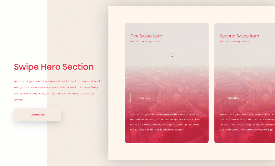
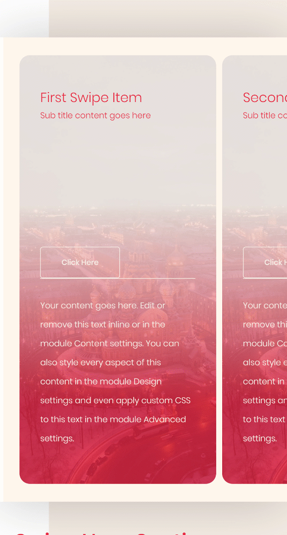
Preview
Before we dive into the tutorial, let’s take a quick look at the outcome across different screen sizes.
Desktop
Mobile
Download The Hero Sections for FREE
To lay your hands on the free hero sections, you will first need to download them using the button below. To gain access to the download you will need to subscribe to our Divi Daily email list by using the form below. As a new subscriber, you will receive even more Divi goodness and a free Divi Layout pack every Monday! If you’re already on the list, simply enter your email address below and click download. You will not be “resubscribed” or receive extra emails.
@media only screen and ( max-width: 767px ) {.et_bloom .et_bloom_optin_1 .carrot_edge.et_bloom_form_right .et_bloom_form_content:before, .et_bloom .et_bloom_optin_1 .carrot_edge.et_bloom_form_left .et_bloom_form_content:before { border-top-color: #ffffff !important; border-left-color: transparent !important; }
}.et_bloom .et_bloom_optin_1 .et_bloom_form_content button { background-color: #f92c8b !important; } .et_bloom .et_bloom_optin_1 .et_bloom_form_content .et_bloom_fields i { color: #f92c8b !important; } .et_bloom .et_bloom_optin_1 .et_bloom_form_content .et_bloom_custom_field_radio i:before { background: #f92c8b !important; } .et_bloom .et_bloom_optin_1 .et_bloom_border_solid { border-color: #f7f9fb !important } .et_bloom .et_bloom_optin_1 .et_bloom_form_content button { background-color: #f92c8b !important; } .et_bloom .et_bloom_optin_1 .et_bloom_form_container h2, .et_bloom .et_bloom_optin_1 .et_bloom_form_container h2 span, .et_bloom .et_bloom_optin_1 .et_bloom_form_container h2 strong { font-family: “Open Sans”, Helvetica, Arial, Lucida, sans-serif; }.et_bloom .et_bloom_optin_1 .et_bloom_form_container p, .et_bloom .et_bloom_optin_1 .et_bloom_form_container p span, .et_bloom .et_bloom_optin_1 .et_bloom_form_container p strong, .et_bloom .et_bloom_optin_1 .et_bloom_form_container form input, .et_bloom .et_bloom_optin_1 .et_bloom_form_container form button span { font-family: “Open Sans”, Helvetica, Arial, Lucida, sans-serif; } p.et_bloom_popup_input { padding-bottom: 0 !important;}

Download For Free
Join the Divi Newlsetter and we will email you a copy of the ultimate Divi Landing Page Layout Pack, plus tons of other amazing and free Divi resources, tips and tricks. Follow along and you will be a Divi master in no time. If you are already subscribed simply type in your email address below and click download to access the layout pack.
You have successfully subscribed. Please check your email address to confirm your subscription and get access to free weekly Divi layout packs!
Let’s Start Recreating!
Add New Section
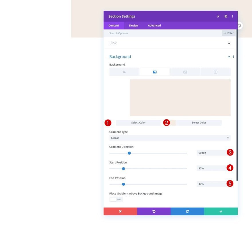
Gradient Background
Add a new section to the page you’re working on, open the section settings and insert a gradient background.
- Color 1: #ffffff
- Color 2: #f5ede5
- Gradient Direction: 90deg
- Start Position: 17%
- End Position: 17%
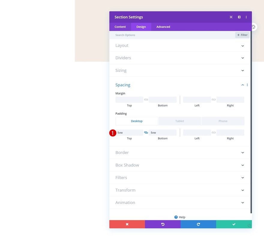
Spacing
Move on to the design tab and add some custom top and bottom padding across different screen sizes.
- Top Padding: 5vw (Desktop), 10vw (Tablet), 13vw (Phone)
- Bottom Padding: 5vw (Desktop), 10vw (Tablet), 13vw (Phone)
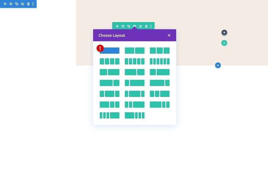
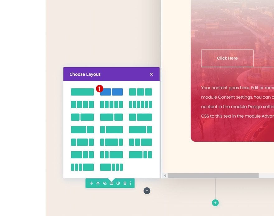
Add Row #1
Column Structure
Continue by adding a new row using the following column structure:
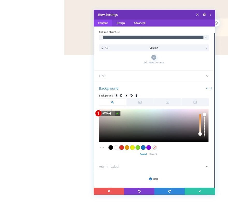
Background Color
Without adding any modules yet, open the row settings and change the background color.
- Background Color: #fff6ed
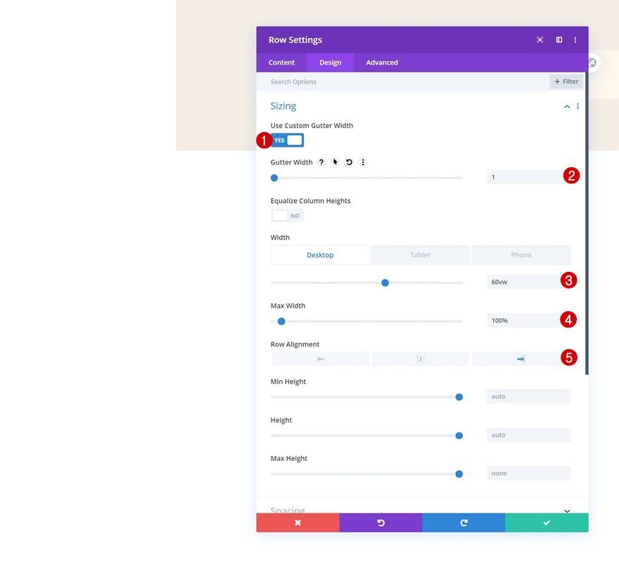
Sizing
Move on to the design tab and change the sizing settings of the row as well.
- Use Custom Gutter Width: Yes
- Gutter Width: 1
- Width: 60vw (Desktop), 100% (Tablet & Phone)
- Max Width: 100%
- Row Alignment: Right
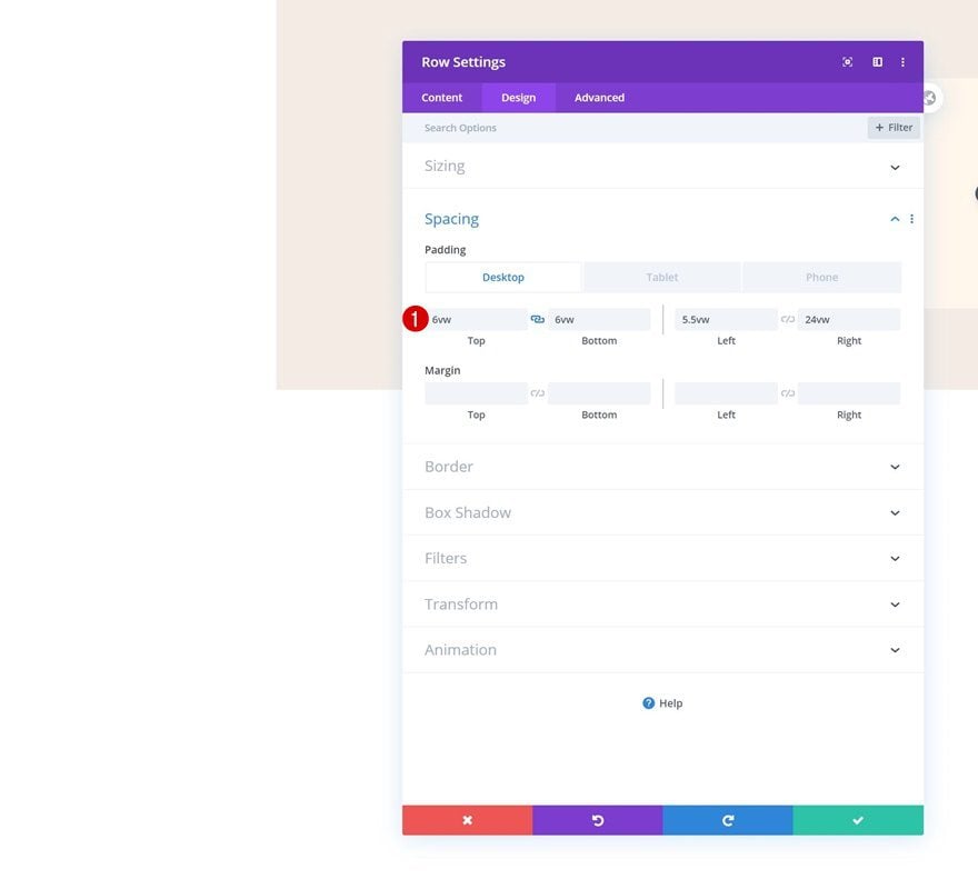
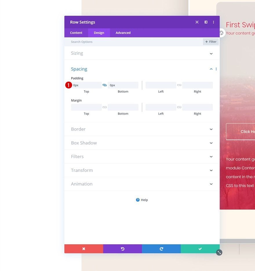
Spacing
We’re also adding some custom padding values to the spacing settings.
- Top Padding: 6vw
- Bottom Padding: 6vw
- Left Padding: 5.5vw
- Right Padding: 24vw
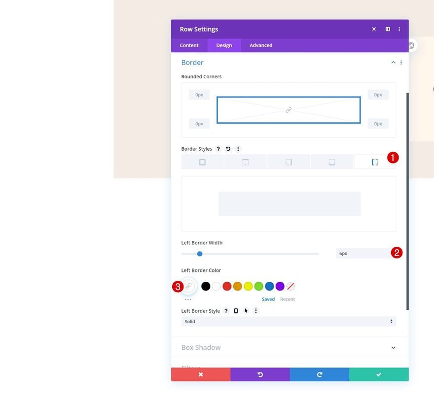
Border
Go to the border settings next and add a left border using the following settings:
- Left Border Width: 6px
- Left Border Color: #FFFFFF
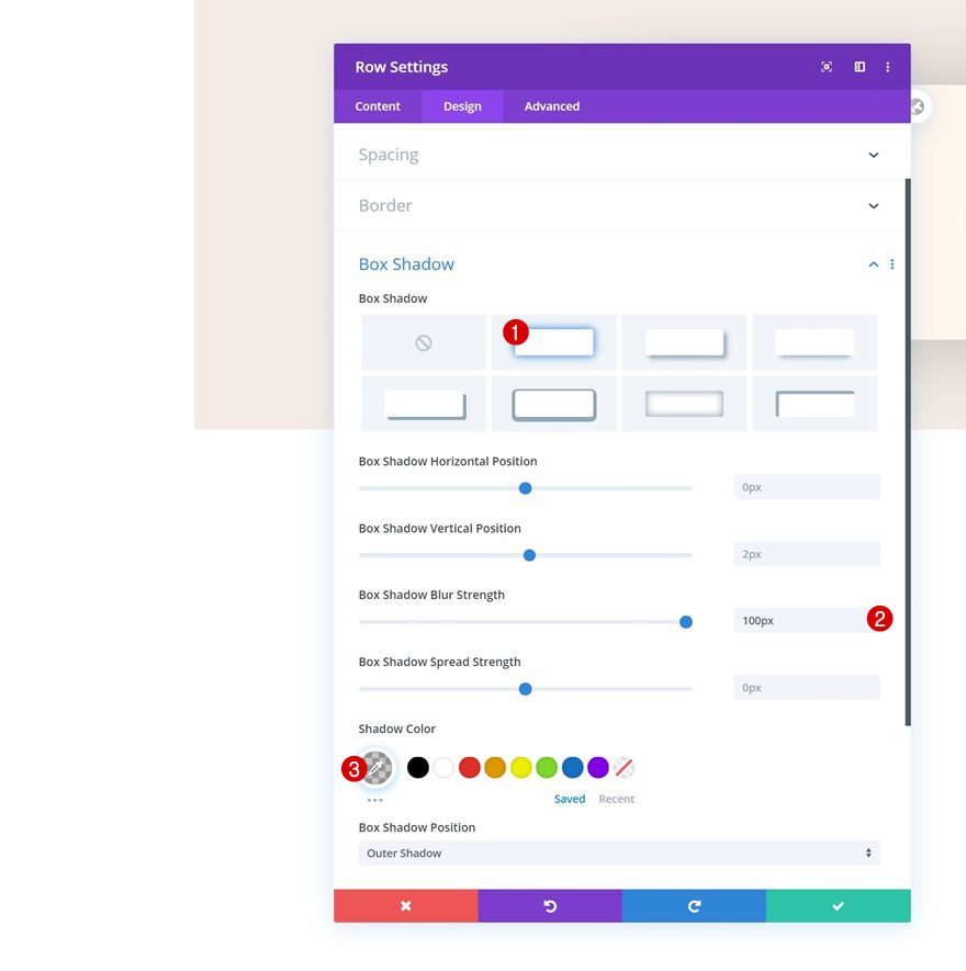
Box Shadow
Add a subtle box shadow to create depth in the hero section.
- Box Shadow Blur Strength: 100px
- Shadow Color: rgba(0,0,0,0.22)
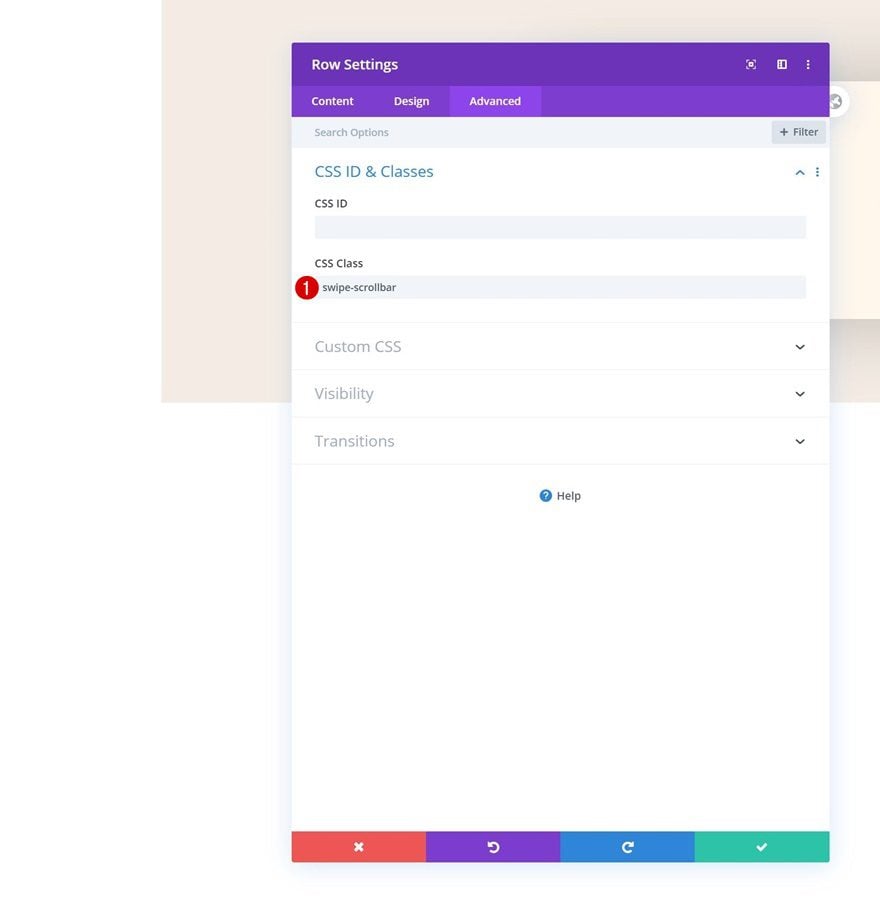
CSS Class
And use a CSS class in the advanced tab. Later on this post, we’ll use this CSS class to hide the scrollbar.
- CSS Class: swipe-scrollbar
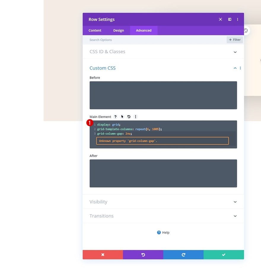
Main Element
To create a horizontal scroll/swipe, we’ll need to place the columns horizontally. We’ll do that by adding some custom CSS code in the main element of the row.
display: grid;
grid-template-columns: repeat(6, 100%);
grid-column-gap: 2vw;
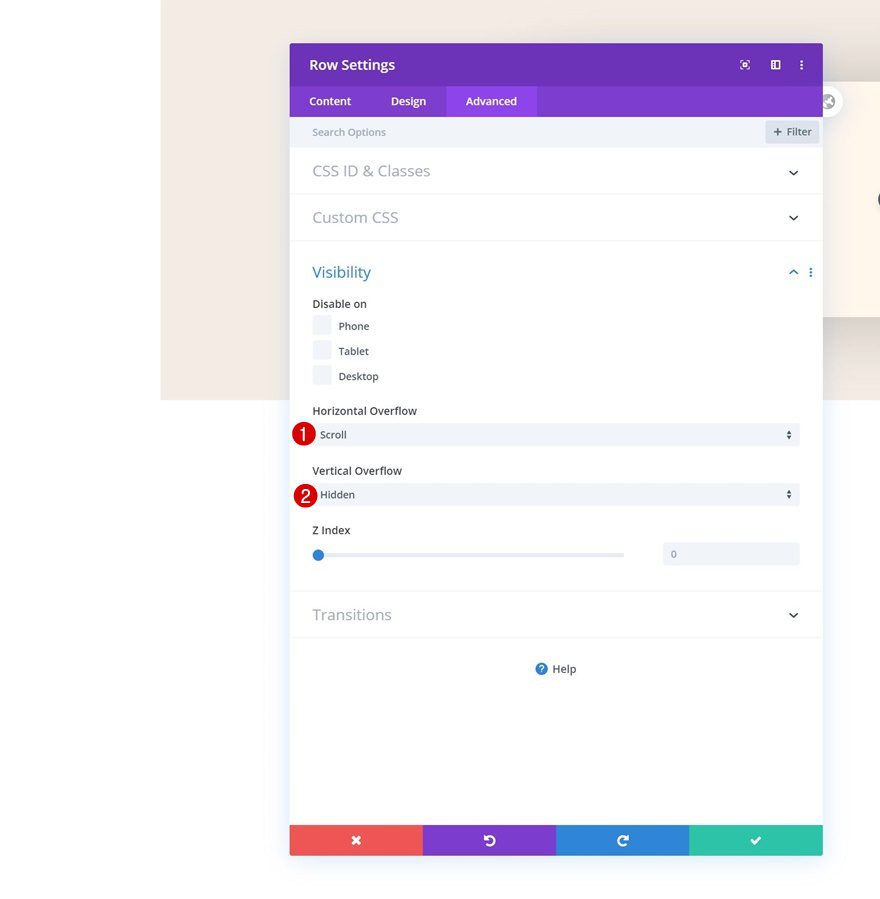
Overflows
Move on to the visibility settings and change the overflows of the row.
- Horizontal Overflow: Scroll
- Vertical Overflow: Hidden
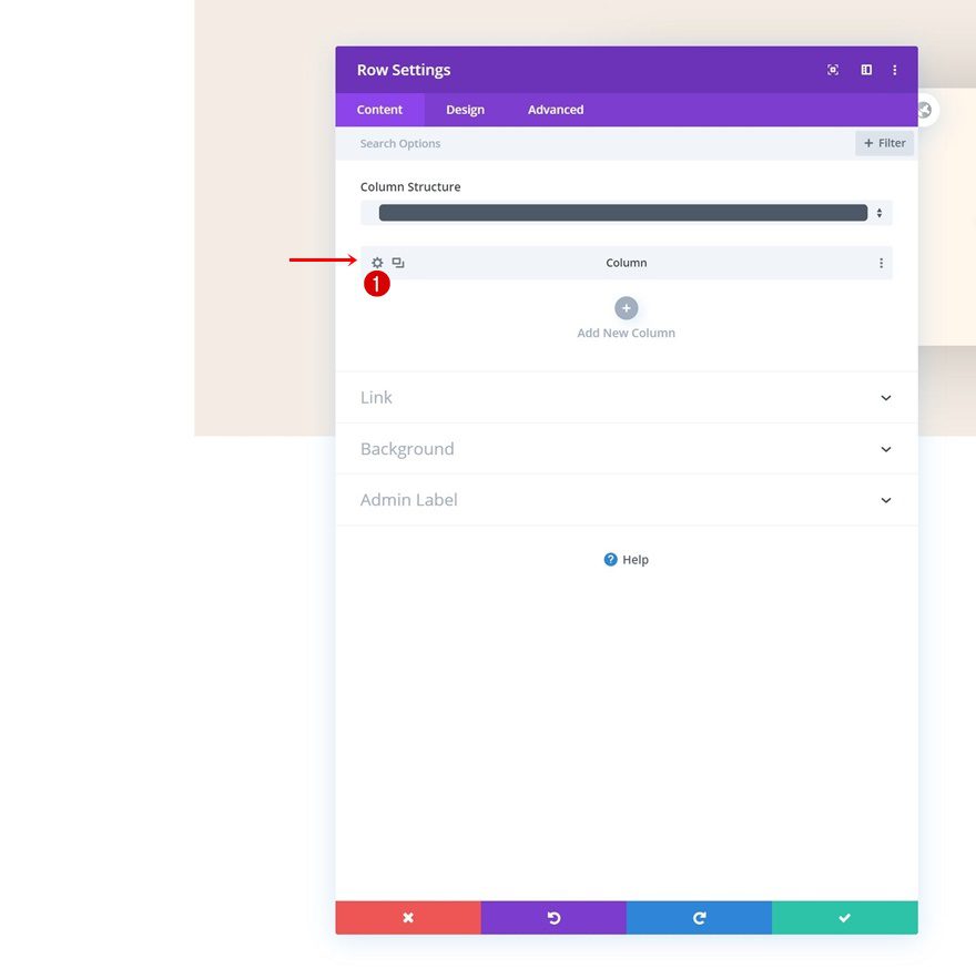
Column Settings
Once you’ve completed the row settings, you can open the first column’s settings.
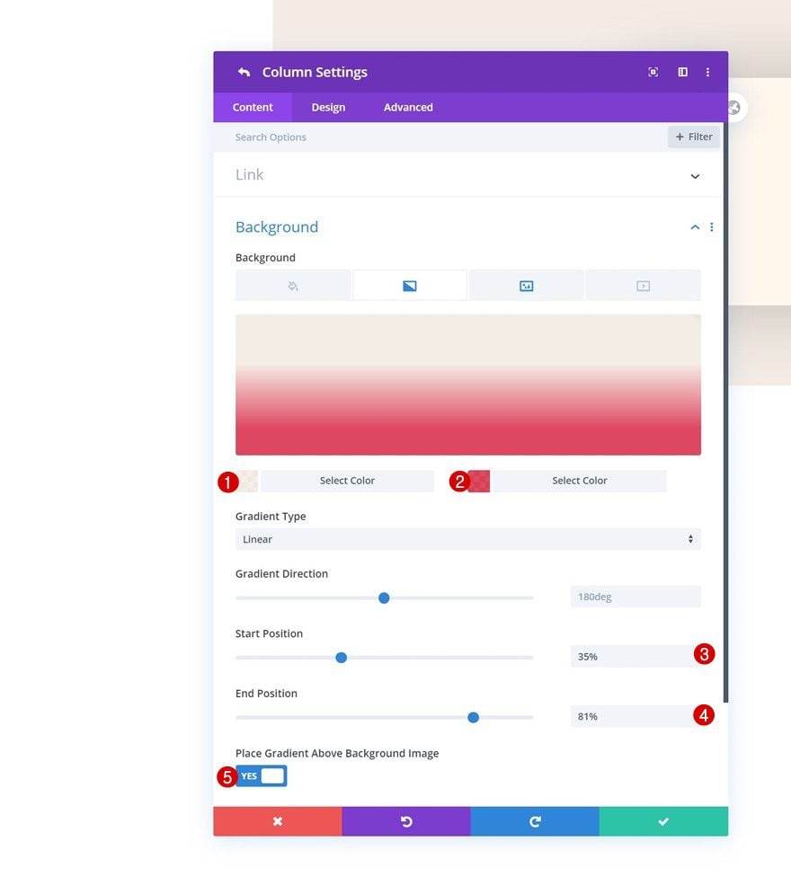
Gradient Background
Add a gradient background.
- Color 1: rgba(245,237,229,0.91)
- Color 2: rgba(219,34,65,0.84)
- Start Position: 35%
- End Position: 81%
- Place Gradient Above Background Image: Yes
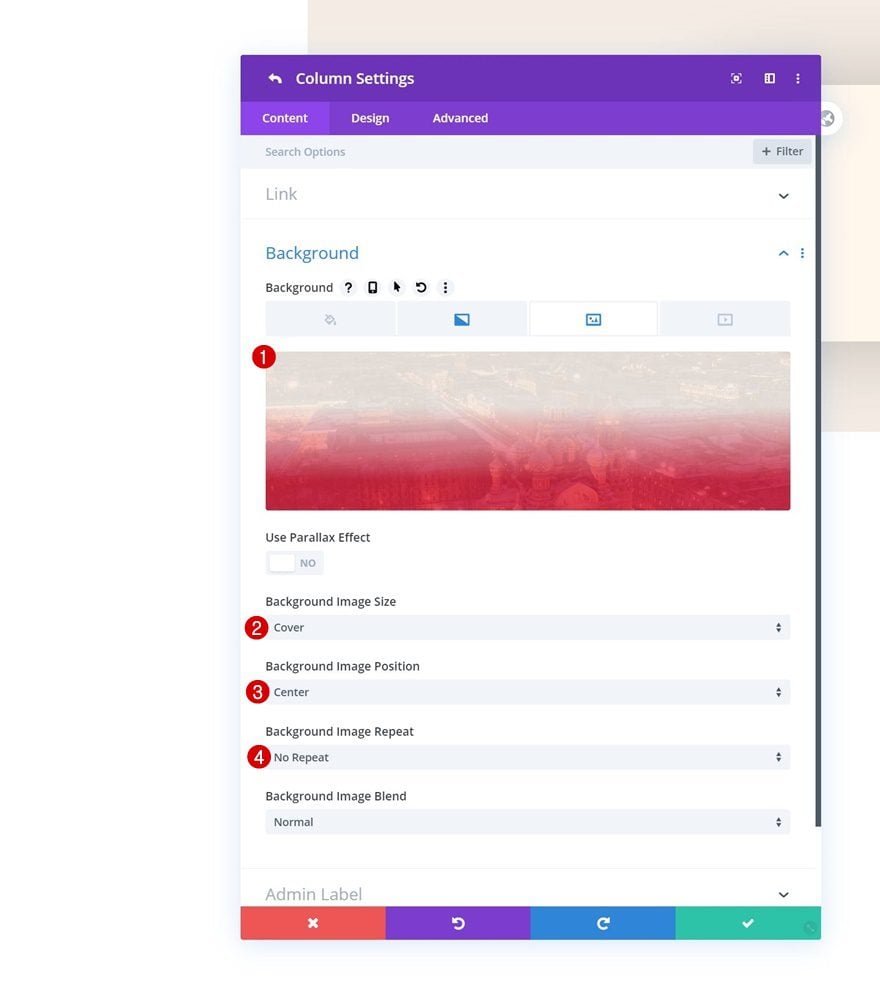
Background Image
Along with a background image.
- Background Image Size: Cover
- Background Image Position: Center
- Background Image Repeat: No Repeat
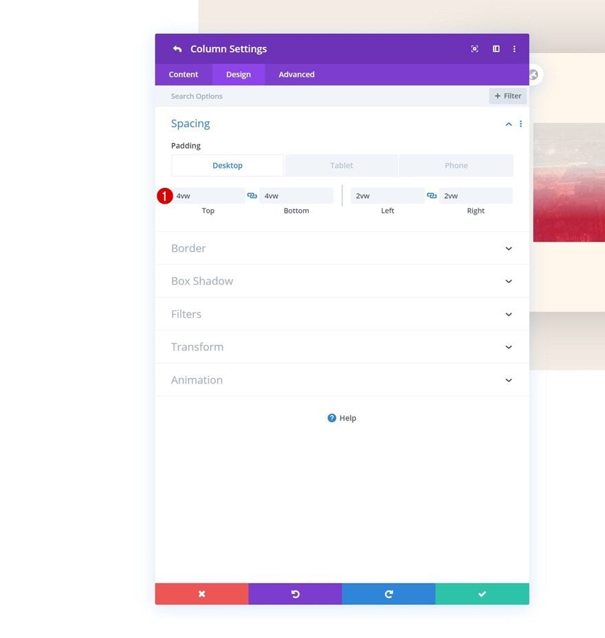
Spacing
Move on to the design tab and add some custom padding values across different screen sizes.
- Top Padding: 4vw (Desktop), 10vw (Tablet), 12vw (Phone)
- Bottom Padding: 4vw (Desktop), 10vw (Tablet), 12vw (Phone)
- Left Padding: 2vw (Desktop), 5vw (Tablet), 7vw (Phone)
- Right Padding: 2vw (Desktop), 5vw (Tablet), 7vw (Phone)
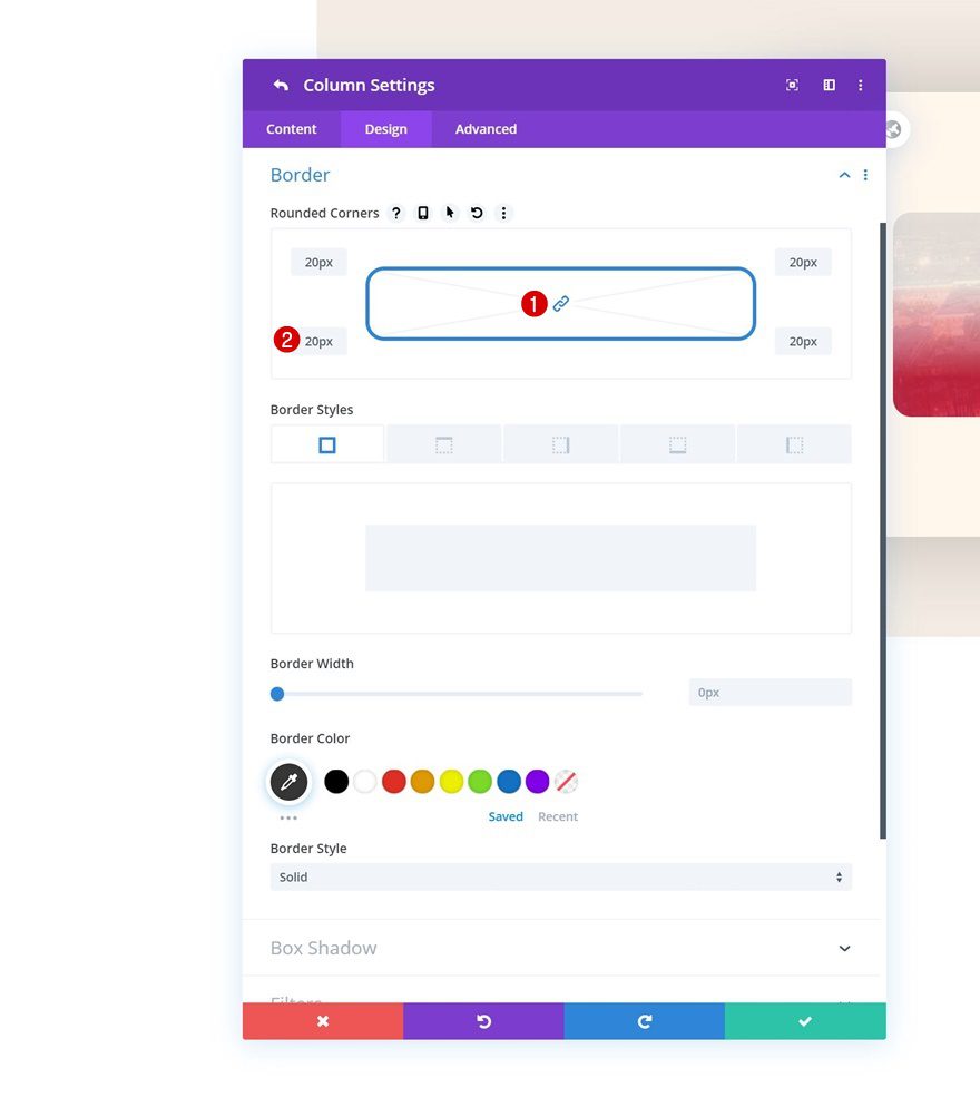
Border
Continue by adding ’20px’ border radius to each one of the corners in the border settings.
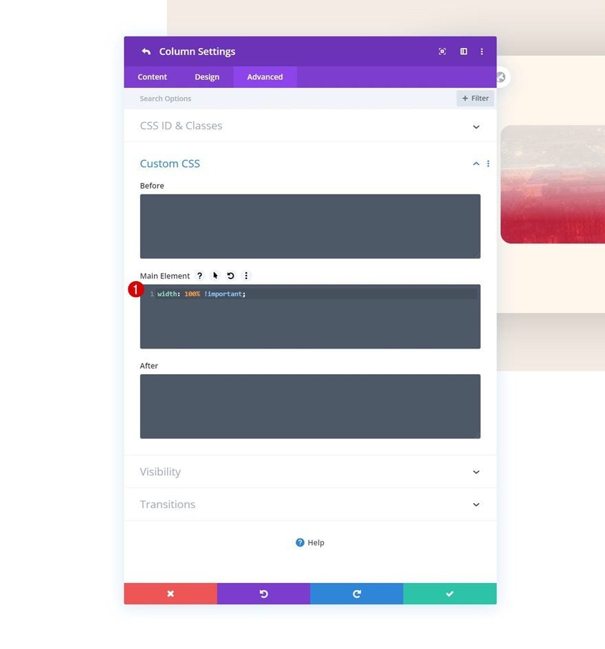
Main Element
Another important part in making this work is adding one single line of CSS code to the main element of the column.
width: 100% !important;
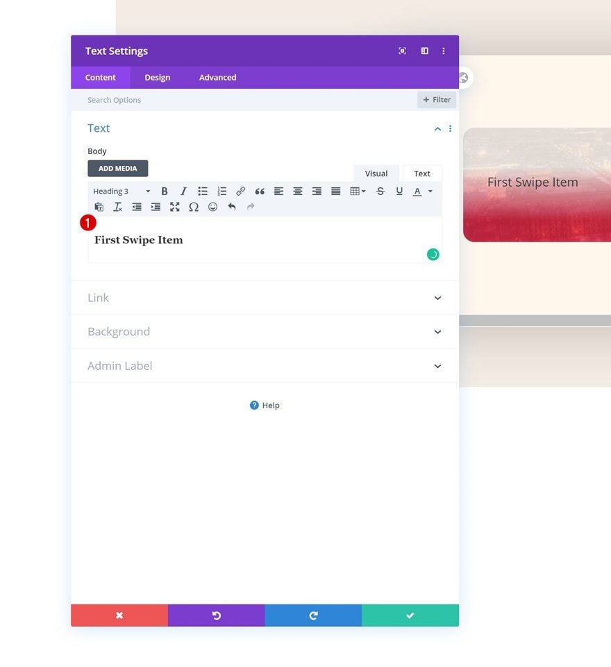
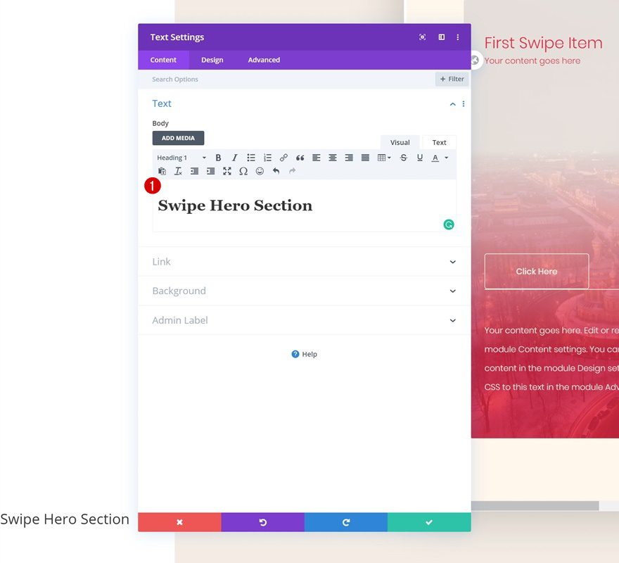
Add Text Module #1 to Column 1
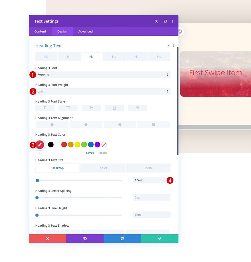
Add H3 Content
Time to start adding modules! You can add as many modules as you want and style them to your own preference. If you, however, want to recreate the exact same example that was shared in the preview of this post, start with a Text Module and insert some H3 content.
H3 Text Settings
Move on to the design tab and change the H3 text settings accordingly:
- Heading 3 Font: Poppins
- Heading 3 Font Weight: Light
- Heading 3 Text Color: #e92640
- Heading 3 Text Size: 1.5vw (Desktop), 3.5vw (Tablet), 4.5vw (Phone)
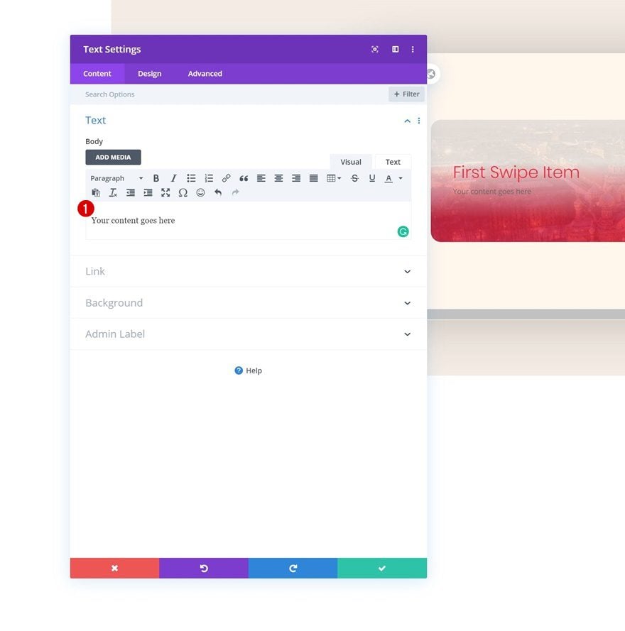
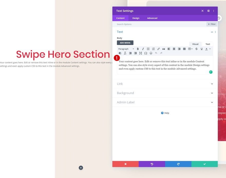
Add Text Module #2 to Column 1
Add Content
The next module we need is another Text Module. Enter some paragraph content of your choice.
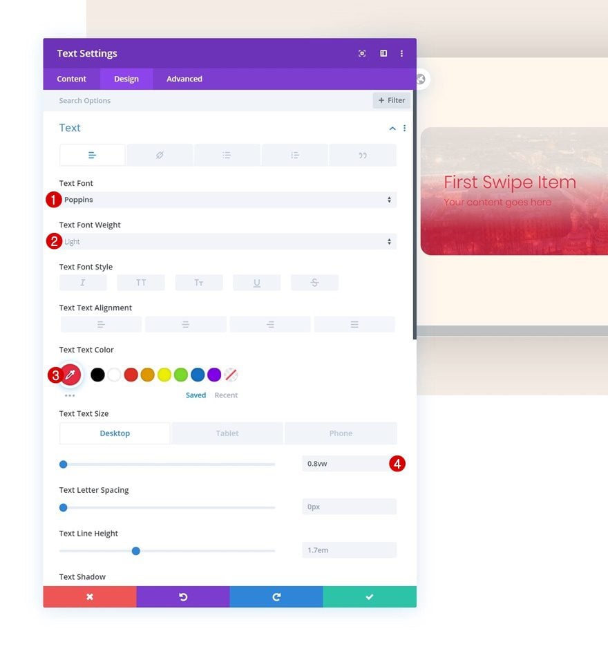
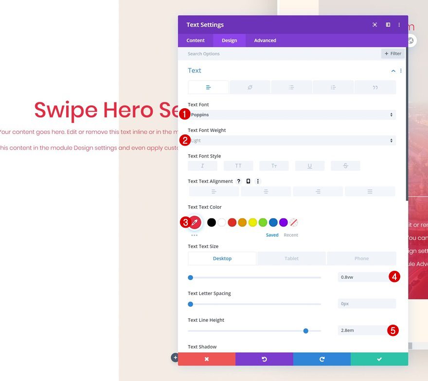
Text Settings
Go to the text settings next and make some changes.
- Text Font: Poppins
- Text Font Weight: Light
- Text Color: #e92640
- Text Size: 0.8vw (Desktop), 1.9vw (Tablet), 2.8vw (Phone)
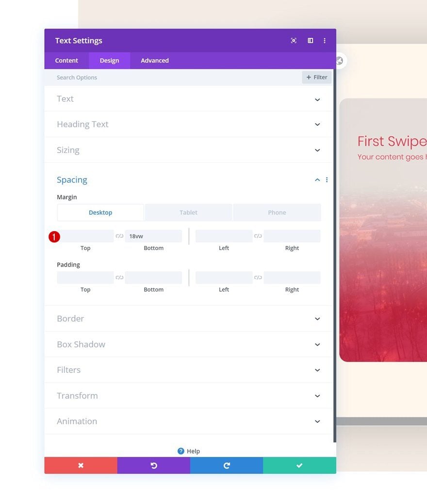
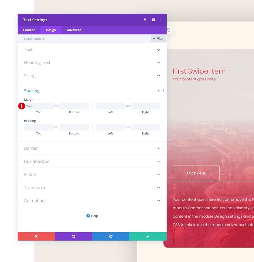
Spacing
We’re also adding some bottom margin to create space in our column swipe card.
- Bottom Margin: 18vw (Desktop), 30vw (Tablet), 42vw (Phone)
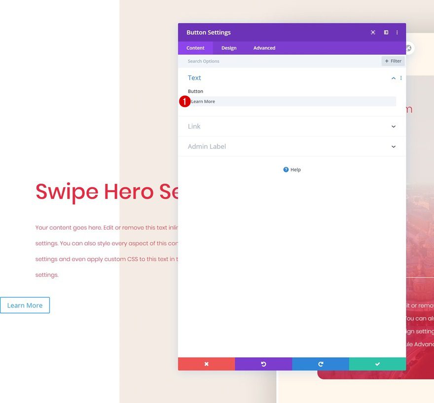
Add Button Module to Column 1
Add Copy
On to the next module, which is a Button Module. Enter some copy of your choice.
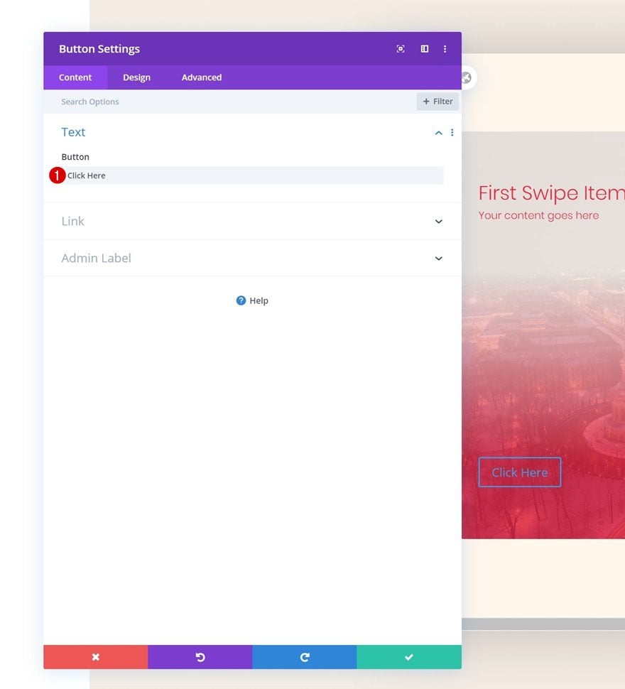
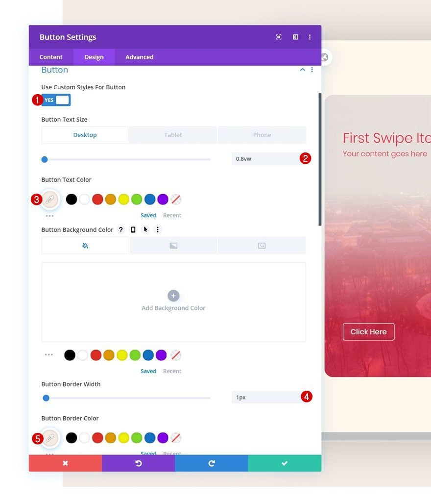
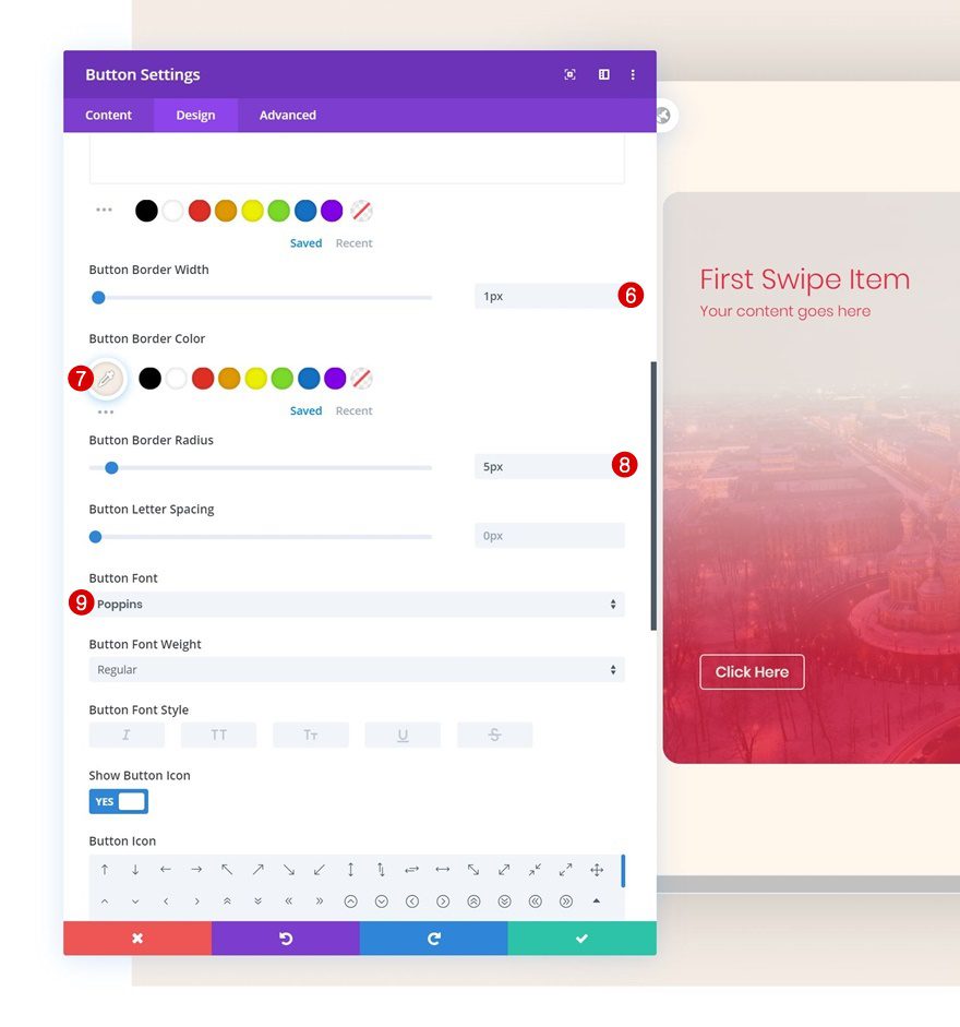
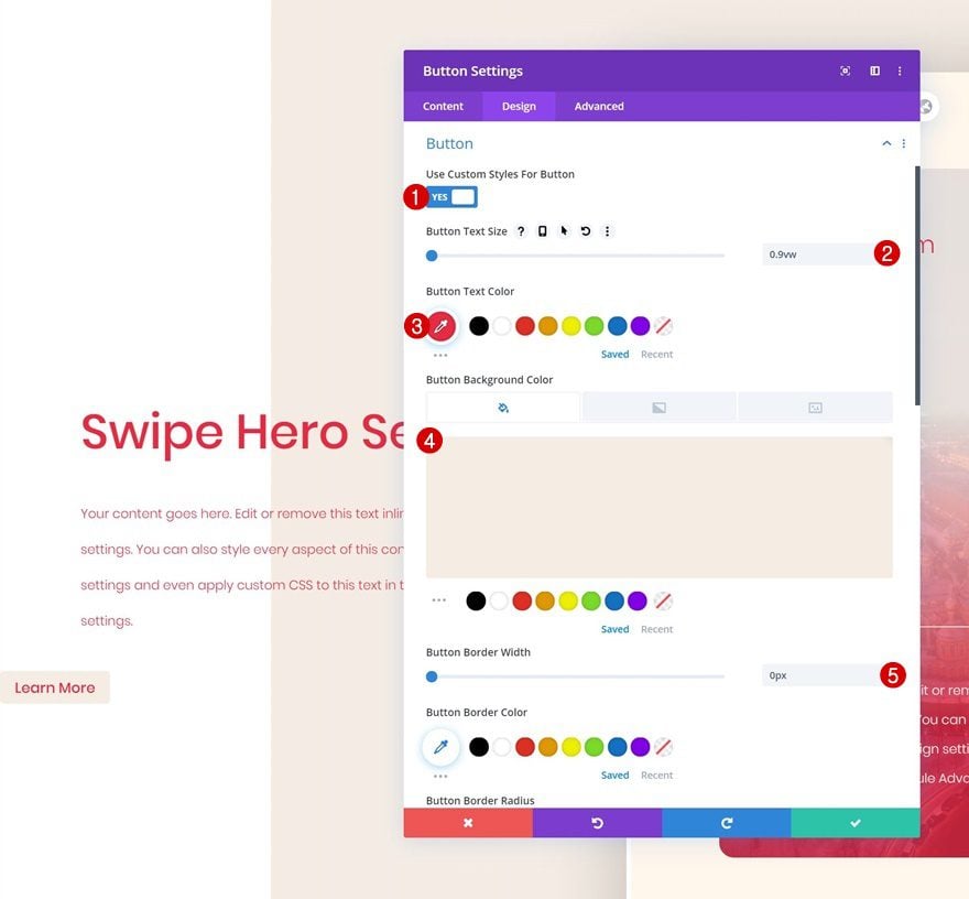
Button Settings
Move on to the design tab and change the button settings accordingly:
- Use Custom Styles For Button: Yes
- Button Text Size: 0.8vw (Desktop), 1.8vw (Tablet), 2.5vw (Phone)
- Button Text Color: #f5ede5
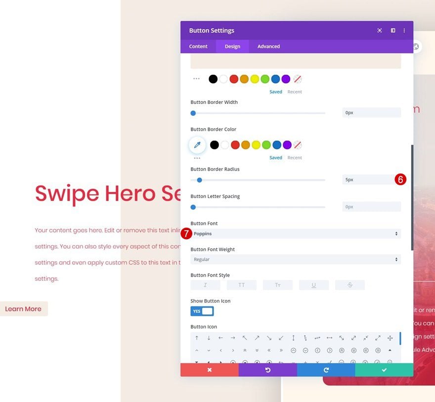
- Button Border Width: 1px
- Button Border Color: #f5ede5
- Button Border Radius: 5px
- Button Font: Poppins
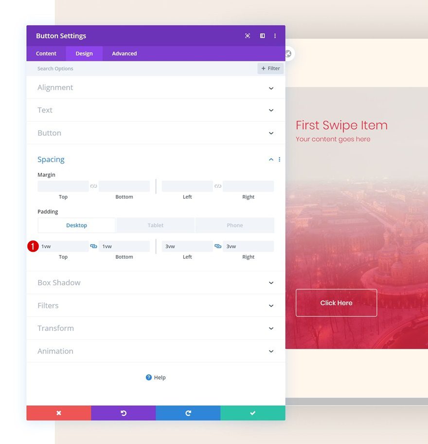
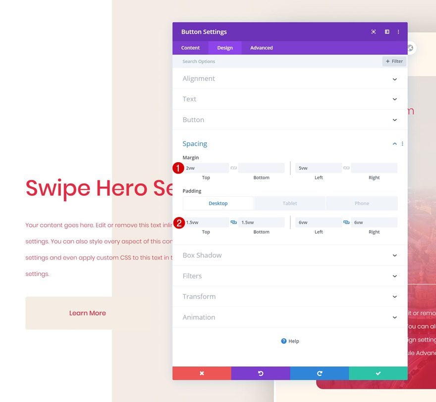
Spacing
Increase the size of the button by adding some custom padding values across different screen sizes.
- Top Padding: 1vw (Desktop), 2vw (Tablet), 3vw (Phone)
- Bottom Padding: 1vw (Desktop), 2vw (Tablet), 3vw (Phone)
- Left Padding: 3vw (Desktop), 5vw (Tablet), 7vw (Phone)
- Right Padding: 3vw (Desktop), 5vw (Tablet), 7vw (Phone)
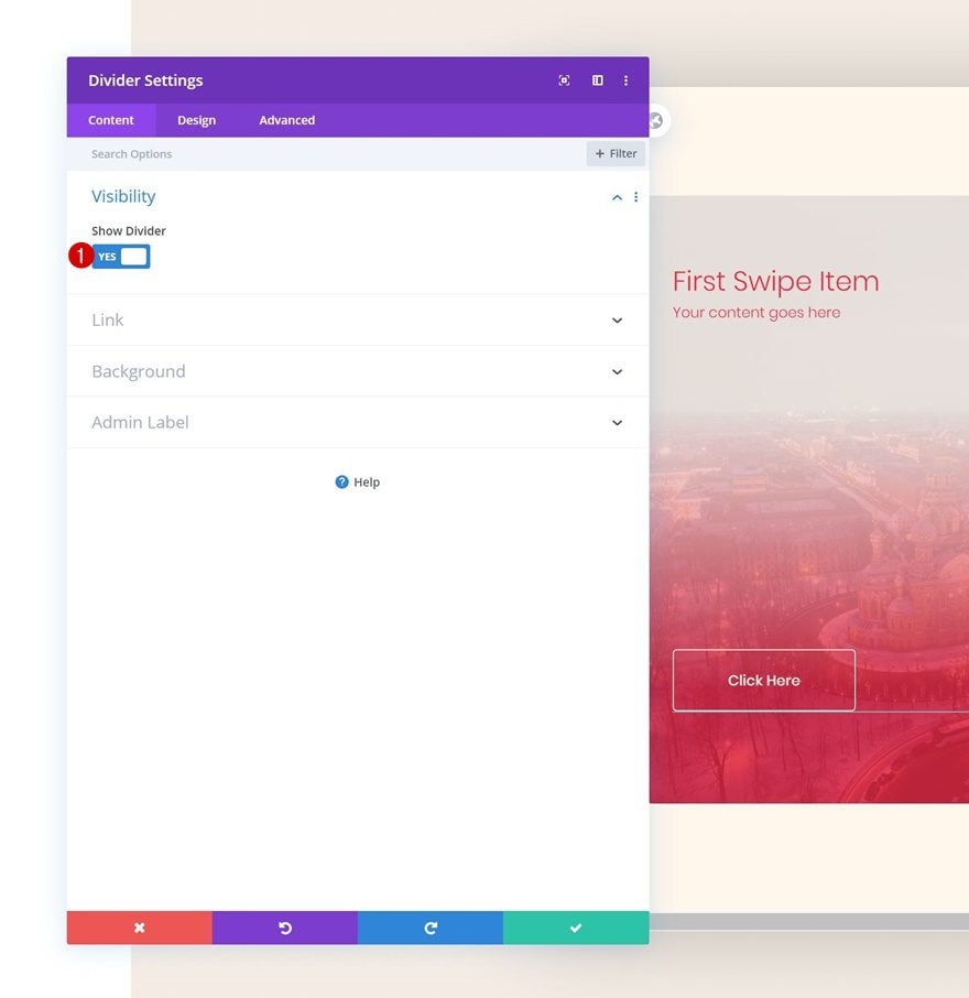
Add Divider Module to Column 1
Visibility
The next module we need is a Divider Module. Make sure the ‘Show Divider’ option is enabled.
- Show Divider: Yes
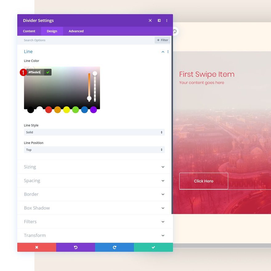
Line
Move on to the design tab and change the line color.
- Line Color: #f5ede5
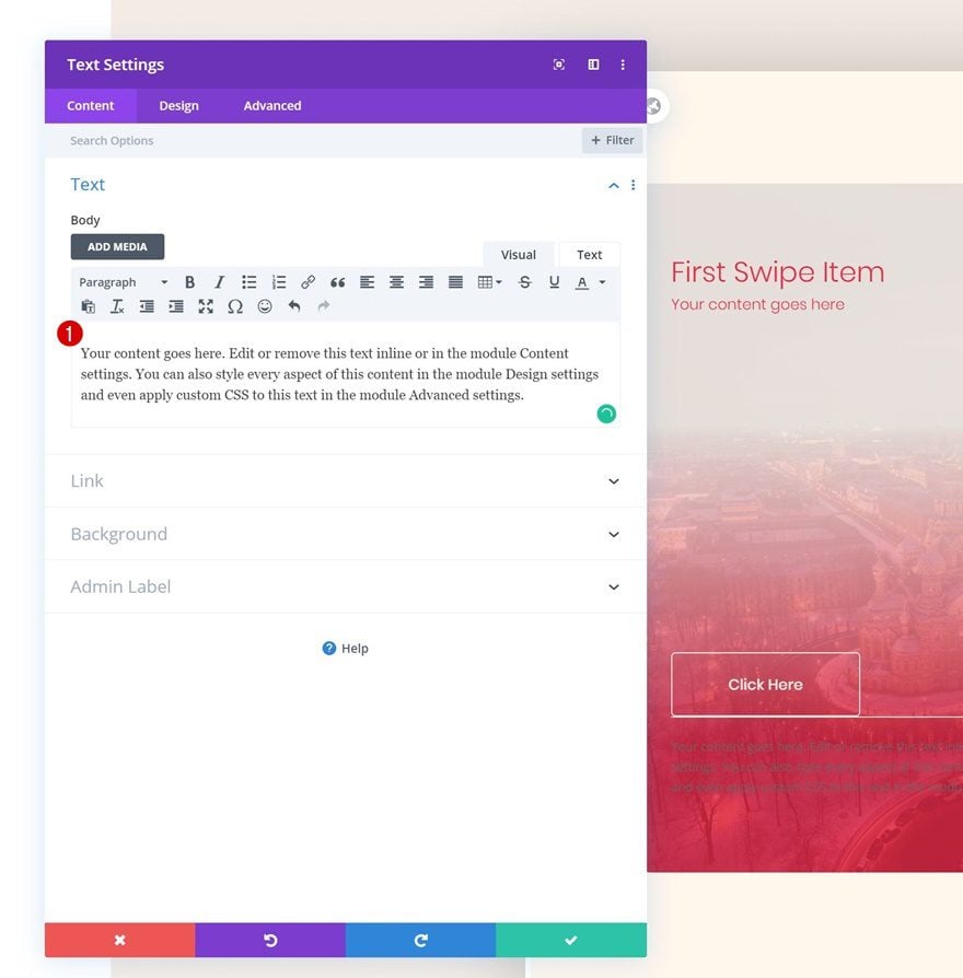
Add Text Module #3 to Column 1
Add Content
The next and last module we need in this column is another Text Module. Enter some paragraph content of your choice.
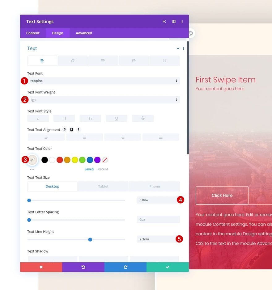
Text Settings
Move on to the design tab and change the text settings accordingly:
- Text Font: Poppins
- Text Font Weight: Light
- Text Color: #f5ede5
- Text Size: 0.8vw (Desktop), 1.9vw (Tablet), 2.8vw (Phone)
- Text Line Height: 2.3em
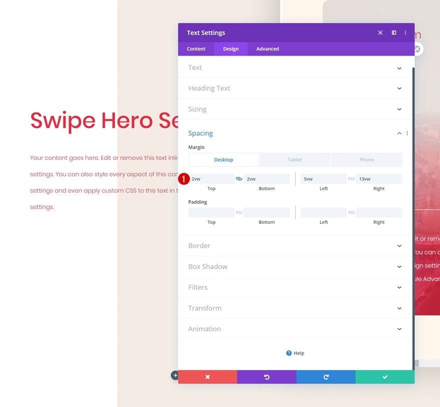
Spacing
Add some top margin as well.
- Top Margin: 2vw
Clone Column up to 5 Times & Reuse for Other CTAs
Once you’ve completed the first column and all the modules in it, you can clone the entire column up to 5 times, depending on how many column swipe CTA cards you want to display. Make sure you change all the copy for each column duplicate along with the button links.
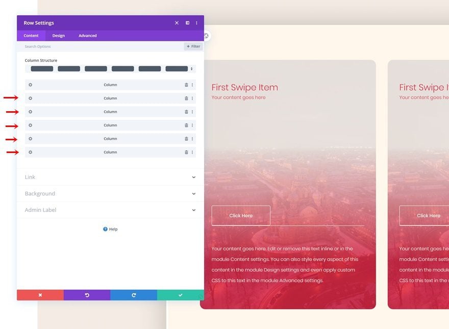
Add Row #2
Column Structure
On to the second row! We’ll use this row to create an overlap with the previous one. Choose the following column structure:
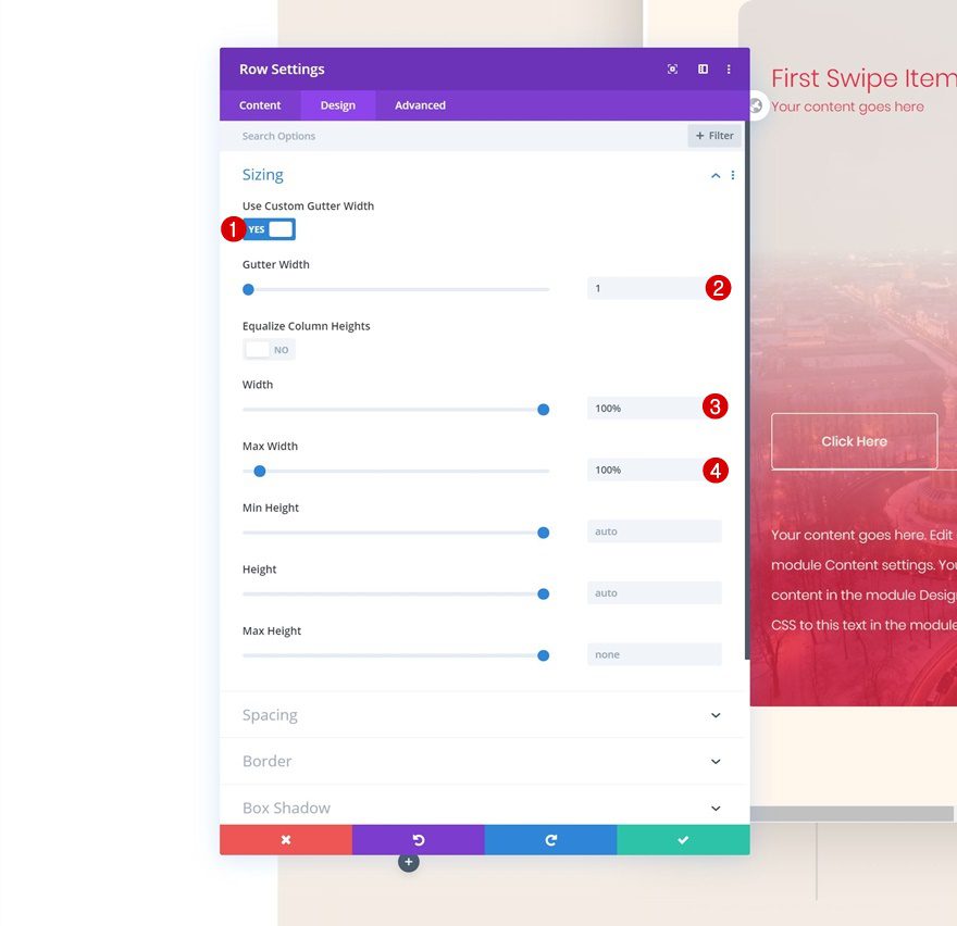
Sizing
Without adding any modules yet, open the row settings and adjust the sizing settings accordingly:
- Use Custom Gutter Width: Yes
- Gutter Width: 1
- Width: 100%
- Max Width: 100%
Spacing
Later on the post, we’ll add the modules we need and create a negative top overlap to make it seem like the modules are part of the first row. This means we don’t need the second row to take up any space in our design at all. That’s why we’re removing all default top and bottom row padding.
- Top Padding: 0px
- Bottom Padding: 0px
Add Text Module #1 to Column 1
Add H1 Content
Time to start adding modules! Start with a first Text Module and enter some H1 content of your choice.
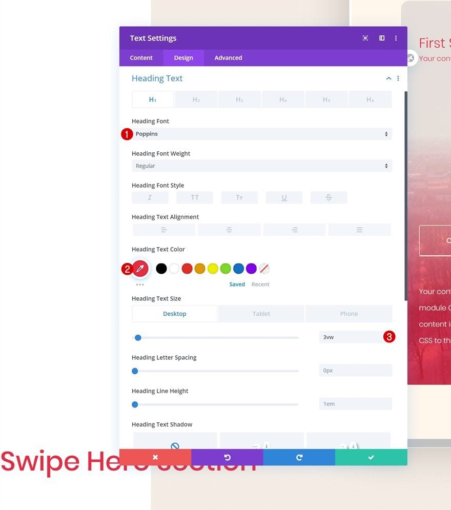
H1 Text Settings
Move on to the design tab and change the H1 text settings accordingly:
- Heading Font: Poppins
- Heading Text Color: #e92741
- Heading Text Size: 3vw (Desktop), 5vw (Tablet), 7vw (Phone)
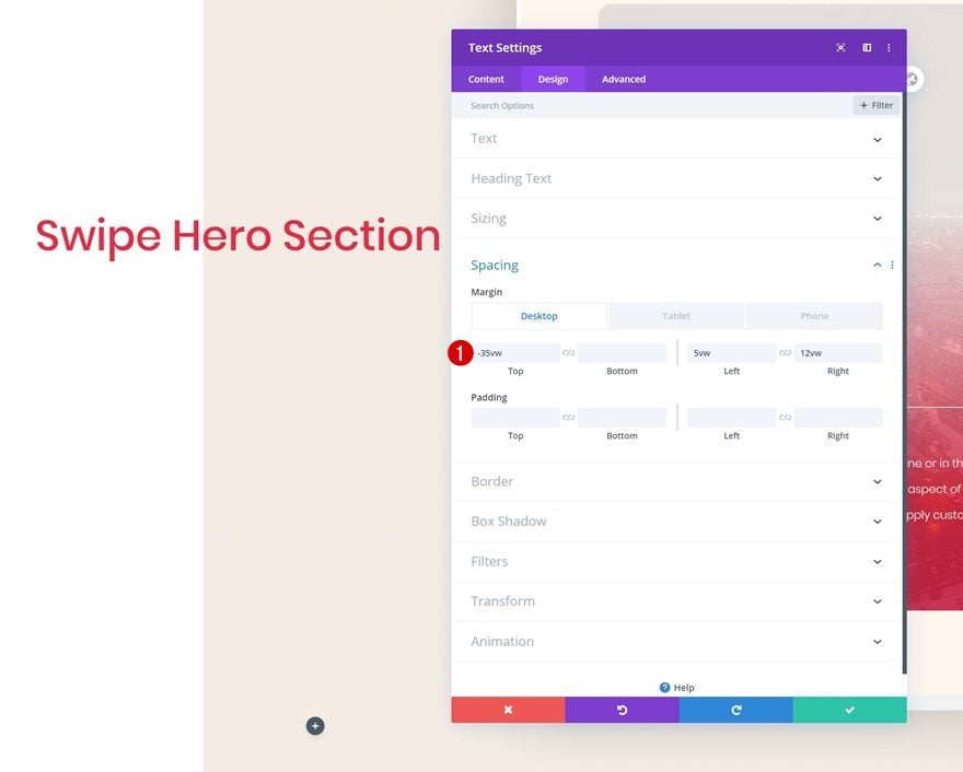
Spacing
Add some margin values next.
- Top Margin: -35vw (Desktop), 7vw (Tablet), 10vw (Phone)
- Left Margin: 5vw
- Right Margin: 12vw
Add Text Module #2 to Column 1
Add Content
The second module we need is another Text Module. Enter some paragraph content of your choice.
Text Settings
Go to the design tab and change the text settings accordingly:
- Text Font: Poppins
- Text Font Weight: Light
- Text Color: #e92741
- Text Size: 0.8vw (Desktop), 1.9vw (Tablet), 2.8vw (Phone)
- Text Line Height: 2.8em
Spacing
We’re adding some custom margin values to the Text Module as well.
- Top Margin: 2vw (Desktop), 7vw (Tablet), 10vw (Phone)
- Bottom Margin: 2vw (Desktop), 7vw (Tablet), 10vw (Phone)
- Left Margin: 5vw
- Right Margin: 13vw (Desktop), 5vw (Tablet & Phone)
Add Button Module to Column 1
Add Copy
The next module we need is a Button Module. Enter some copy of your choice.
Button Settings
Then, go to the design tab and style the button.
- Use Custom Styles For Button: Yes
- Button Text Size: 0.9vw
- Button Text Color: #e92741
- Button Background Color: #f5ede5
- Button Border Width: 0px
- Button Border Radius: 5px
- Button Font: Poppins
Spacing
We’re also increasing the size of the button by adding some custom spacing values.
- Top Margin: 2vw
- Left Margin: 5vw
- Top Padding: 1.5vw (Desktop), 2.5vw (Tablet), 3vw (Phone)
- Bottom Padding: 1.5vw (Desktop), 2.5vw (Tablet), 3vw (Phone)
- Left Padding: 6vw (Desktop), 9vw (Tablet), 15vw (Phone)
- Right Padding: 6vw (Desktop), 9vw (Tablet), 15vw (Phone)
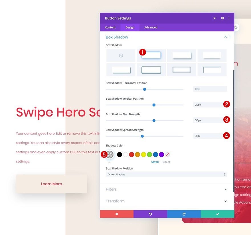
Box Shadow
Finish the Button Module design by adding a subtle box shadow.
- Box Shadow Vertical Position: 20px
- Box Shadow Blur Strength: 50px
- Box Shadow Spread Strength: -5px
- Shadow Color: rgba(0,0,0,0.19)
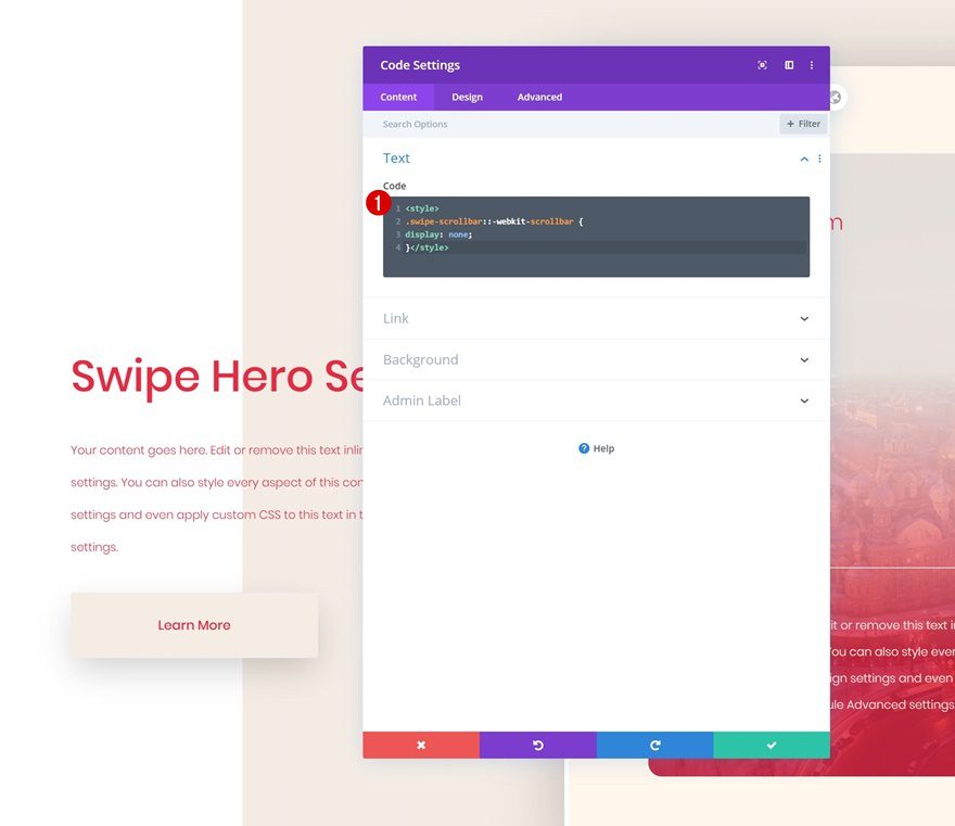
Add Code Module to Column 1
Insert Page CSS Code to Hide Scrollbar
The next and last module we need in column 1 is a Code Module. We’ll use this code module to insert our page CSS. The CSS we’ll add will hide the scroll bar of our first row. Once you’ve completed this step, you’re done!
.swipe-scrollbar::-webkit-scrollbar {
display: none;
}
Preview
Now that we’ve gone through all the steps, let’s take a final look at the outcome across different screen sizes.
Desktop
Mobile
Final Thoughts
In this post, we’ve shared a beautiful column swipe hero section for free and we’ve also shown you how to recreate it from scratch. This is a great way to showcase multiple CTA cards in your hero section without having a design that looks too overwhelming. We hope you’ve enjoyed this tutorial and if you have any questions or suggestions, make sure you leave them in the comment section below!
If you’re eager to learn more about Divi and get more Divi freebies, make sure you subscribe to our email newsletter and YouTube channel so you’ll always be one of the first people to know and get benefits from this free content.
The post Download a FREE CTA Column Swipe Hero Section Design for Divi appeared first on Elegant Themes Blog.