
It’s time again for our monthly Divi Showcase where we take a look at 10 amazing Divi websites made by our community members. Each month we showcase the best Divi websites that were submitted from our community and today we want to share with you the top ten websites for the month of February. Throughout the post, I’ll point out some of my favorite design features that draw me to each of the websites.
I hope you like them!
Divi Design Showcase: New Submissions from February 2019
1. New Sherpa
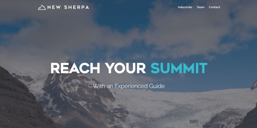
This site was submitted by Gregory Little. This is a one-page design. The full-screen header displays a background video that transitions to another video as you scroll. You can actually see both at the same time during the transition. The header uses large text with a dark blue/green branded color to create a tagline. An About section uses the same font family and styling to show the company’s focus. A contact CTA is placed over a full-width image followed by blurbs with icons styled with the branded colors. The Management Team section shows the founding members with information and links to read more, which reveals more lines of text, all in branded colors.
2. Sea Jets
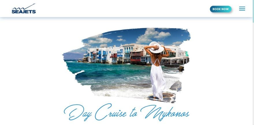
This site was submitted by George Paratsokis. The header includes a shadow effect and a styled CTA button that matches the site’s branded colors. Images are revealed through the screen as animated boxes wipe across the area as you scroll to the section, which also reveals the styled buttons. Titles are written with an elegant script font that stands out. The layout itself displays information and images in two columns in an alternating design. It uses a lot of white-space to showcase the design. A CTA includes a background image with overlay and elegant fonts, displayed with a box shadow. The footer is interesting. It has a background in a light gray silhouette with all of the contact info over it.
3. Breeze
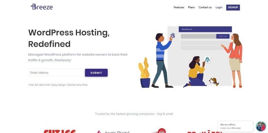
This site was submitted by Sakshi Behl. The site uses a simple layout with a few styled elements to make it stand out. The header displays the tagline with an email opt-in form next to a graphic to help define the site. Client logos are displayed in an offset layout. Blurbs show the benefits over a styled background pattern that sits at the side of the screen. The features section is interesting. It displays a screenshot next to descriptions. Each description has a title. Clicking on the title reveals the text for that description. A styled line next to the title becomes darker to show which title is selected. The pricing tables also look interesting against the blue background. The suggested plan is shown with a box shadow to stand out.
4. Dragonfly Ave
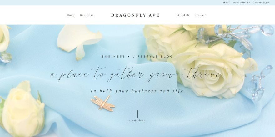
This site was submitted by Marci Angeles. This site uses soft colors and floral photography to attract the target audience. Several page links are displayed to one side in the top bar while the header shows the menu centered. The description and tagline are shown in several fonts over the full-screen background image. A full-width email opt-in is styled with a light blue background and uses a graphic of a key to show that the visitor can unlock information. The blog posts are shown in a single column with a sidebar- all with matched styling. The blog posts include the same sidebar. An embedded Instagram feed shows the latest photos.
5. Parris Mfg. Company
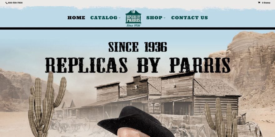
This site was submitted by Joseph Brown. This site makes fun use of photography to portray the old west. It displays a full-screen background with a graphic reminiscent of clouds above the menu and a title under the menu. An animated layer of dust moves across the screen in 3D. The clouds come down behind the menu on scroll, which then looks more like a painted section. The next section shows a fence background with wanted posters for the pages. The posters animate on hover as if you’ve touched them. The footer has a mountain range and cowboys in black with a dark green sky with the menu. The shop pages place items over a western background. The items are shown in sepia and are colorized on hover. The product pages place the images over the fence background. The site makes great use of images.
6. imparaqui
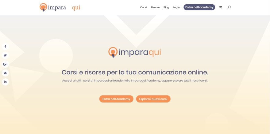
This site was submitted by Pascal Claro. The site uses orange to white gradients for the hero section and CTA, and orange highlights throughout the site for buttons, icons, and text. The hero section shows the logo with buttons to log in or see courses. Below these several cards show the most followed courses. The cards show information at the top, an image, title, excerpt, and button- all styled to match the site and include hover animation. They stand out over the background gradient. The courses page uses this same design. Reviews are shown in a testimonial slider. Resources are displayed with orange icons over a dark image with a touch of orange in an overlay.
7. Phoenix Building
This site was submitted by Andre Villanueva. It has a full-screen background with a styled pattern and a tagline in an interesting font and swirly graphics. Scrolling reveals the header which includes the same font for the menu items. The font and swirlies are also used in the logo, which appears in several locations throughout the site, including an About section that uses the logo in one side and multi-colored text in the other. It has several backgrounds in parallax with blue or red overlays. One of the most interesting sections shows slanted images with boxes behind them that slant in the opposite direction. Other pages use this section and a similar section with image and bold borders with padding. The site makes excellent use of bold color.
8. Marx Creative
This site was submitted by PK SON. The large logo is placed in the center of a black background. The logo is a cutout. Behind it displays an image in parallax. White text shows the tagline with the main point in bold. A section about the company provides links with arrows that change location on hover. A slider overlaps two sections and uses verticle dots for navigation. Projects are showcased in a multi-column layout with elegant photography. It has a neat call to action that shows a 3D version of the logo on one side over a light gray background and text on the other over a black background- tying the design back to the header. I like the menu. Clicking on the hamburger icon opens the menu in full-screen, showing navigation in one side and an image with information in the other.
9. Epic Tree
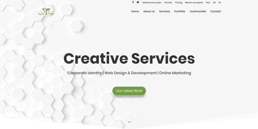
This site was submitted by Ľubomír Mičúch. This one-page website has a background pattern made of hexagons that display in parallax behind the tagline and CTA button. Several sections show the company’s services and information in two columns with graphics on one side and text with a CTA on the other. The graphics are made up of branded green elements that match the buttons and highlights throughout the website. The section of counters is interesting. It shows green numbers over a background image of mountains with an overlay in parallax and wavy section dividers. A similar section creates a CTA. A section that shows work numbers each of the projects in an alternating layout. Client icons have rounded backgrounds with box shadows. The site includes styled testimonials, toggles, social follow, contact form, and more.
10. Robert L. O’Neil
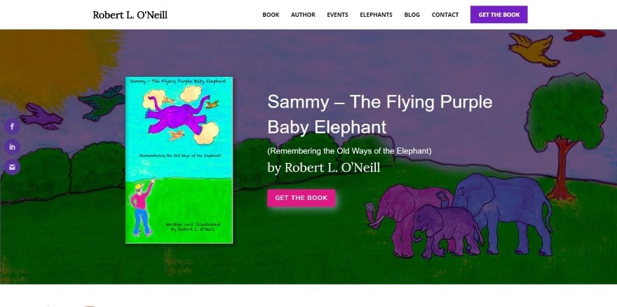
This site was submitted by Masha Goltsova-Lanoue. This author’s website uses color and artwork to attract the target audience. The hero section shows a CTA with the book cover, description, and button to purchase- all placed over a background that includes artwork from the book. An About section provides information with a button to see more next to an image of the target audience reading the book. All of the buttons use different colors from the book. A testimonial slider uses the branded purple as the background. Several CTAs invite the reader to purchase books, learn more, or read about the author. Backgrounds include artwork from the books, including the footer. The artwork is even used as the preload graphic. I like how the shop page shows testimonials. The layout is simple and makes great use of color.
In Closing
That’s our 10 best community Divi website submissions for the month of February. These sites look amazing and as always we want to thank everyone for your submissions!
If you’d like your own design considered please feel free to email our editor at nathan at elegant themes dot com. Be sure to make the subject of the email “DIVI SITE SUBMISSION”.
We’d also like to hear from you in the comments! Tell us what you like about these websites and if there is anything they’ve done you want us to teach on the blog.
Featured image via MJgraphics / shutterstock.com
The post Divi Design Showcase: New Submissions from February 2019 appeared first on Elegant Themes Blog.