
Creating a hero section that stands out is really important. And not only should it stand out, but it should also be split up into multiple elements that empower the call to action that is there. The easy-to-understand structure split-content hero sections have makes them really popular and frequently used among different kinds of websites.
And while making split-content hero sections for desktop is straightforward, making them for smaller screen sizes may not be. That’s where this tutorial will come in handy. We’re going to recreate a highly-interactive mobile-split hero section that will not only look good on mobile but across all different screen sizes. We’re also combining some great animations to make the design style match 2019 perfectly. We hope this tutorial inspires you to create your own mobile split-content hero sections.
Let’s get to it!
Preview
Before we dive into the tutorial, let’s take a look at the outcome across different screen sizes.
Mobile

Desktop

Let’s Start Recreating!
Add New Section
Spacing
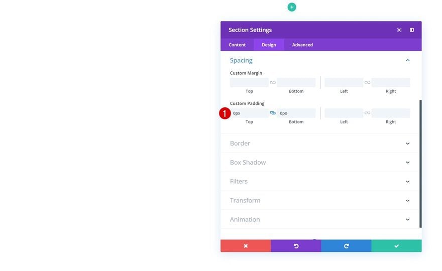
Start by creating a new page or opening an existing one. Add a new regular section to it, go to the spacing settings and remove all the default top and bottom padding.
- Top Padding: 0px
- Bottom Padding: 0px
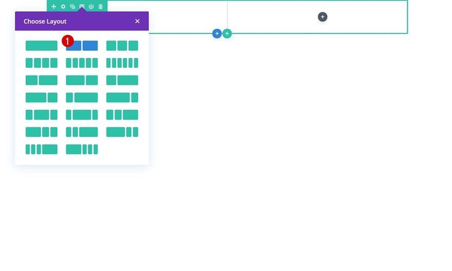
Add New Row
Column Structure
Continue by adding a new row using the following column structure:
Background Color
Without adding any modules yet, open the row settings and add an entirely black background color.
- Background Color: #000000
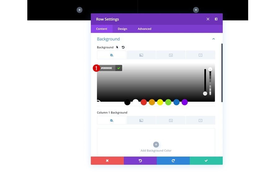
Column 1 Background Color
Add a black background color to the first column as well.
- Column 1 Background Color: #000000
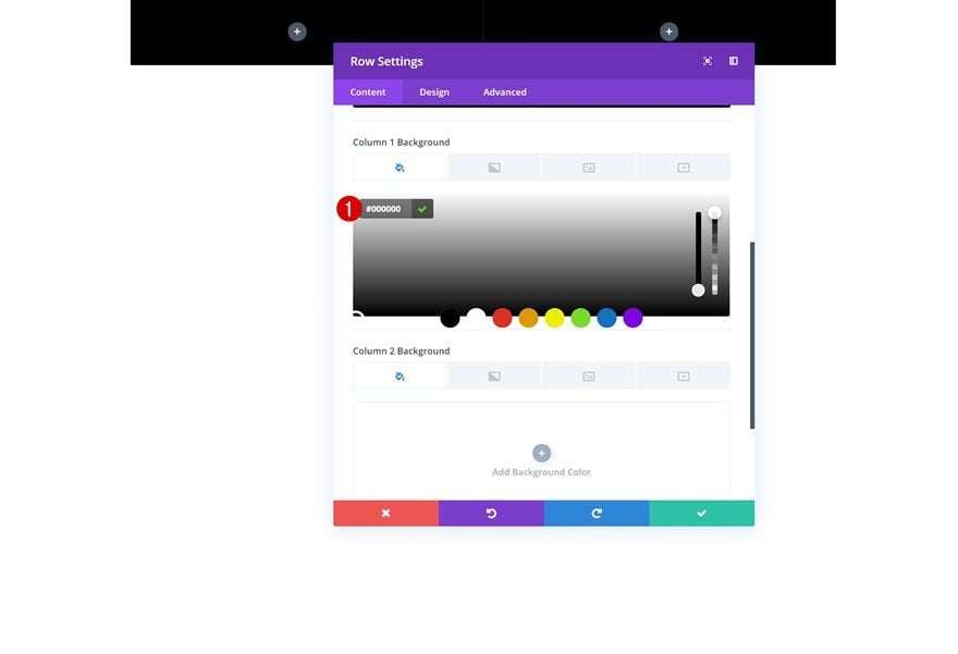
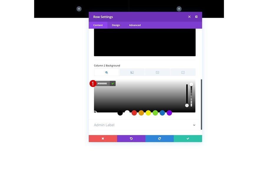
Column 2 Background Color
Same thing for the second column.
- Column 2 Background Color: #000000
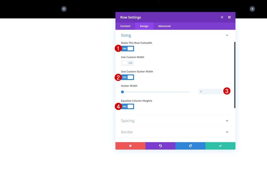
Sizing
Then, go to the sizing settings and allow the row and its columns to take up the entire width of the screen.
- Make This Row Fullwidth: Yes
- Use Custom Gutter Width: Yes
- Gutter Width: 1
- Equalize Column Heights: Yes
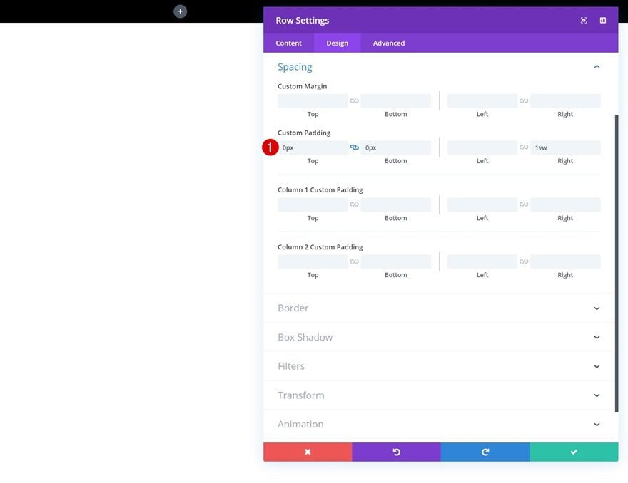
Spacing
We’re also removing all the default top and bottom padding of the row.
- Top Padding: 0px
- Bottom Padding: 0px
- Right Padding: 1vw
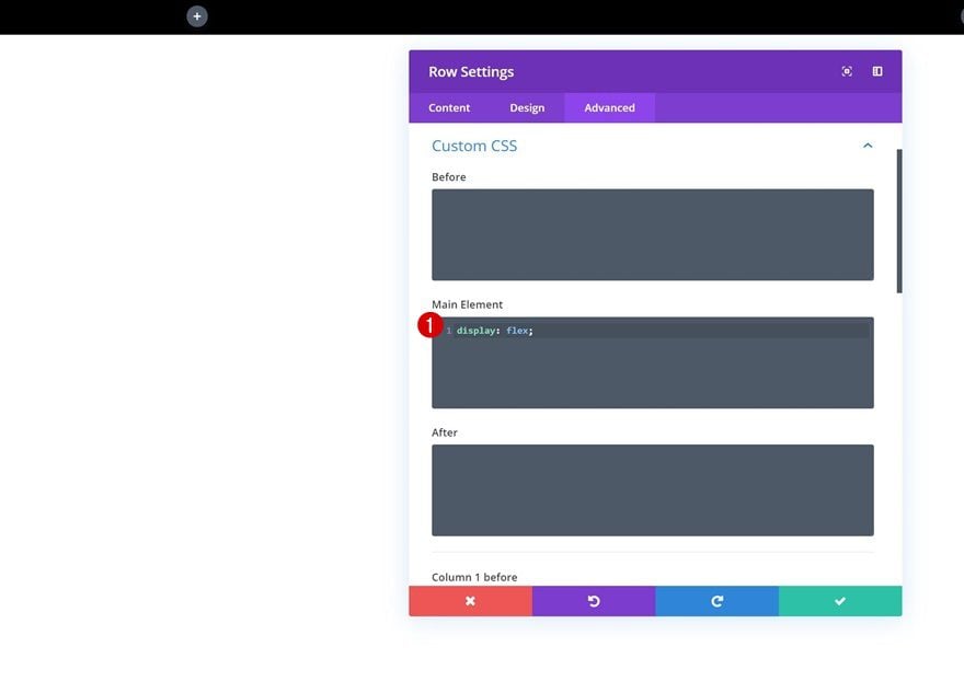
Display
Last but not least, we’ll make sure both columns appear next to each other on smaller screen sizes as well. To do that, we’ll need to add one single line of CSS code to the advanced tab of the row.
display: flex;
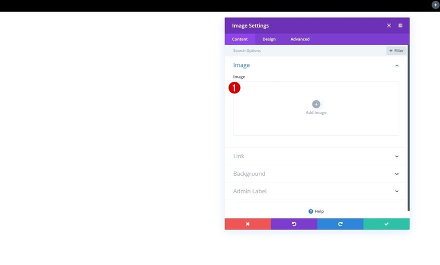
Add Image Module to Column 1
Leave Image Box Empty
Time to add all the different modules we need! Start with the Image Module in the first column. Instead of uploading an image to the image box, we’ll upload the image to the background settings in the upcoming steps. This will allow us to play around with how the image is positioned and how much space it takes up in our row.
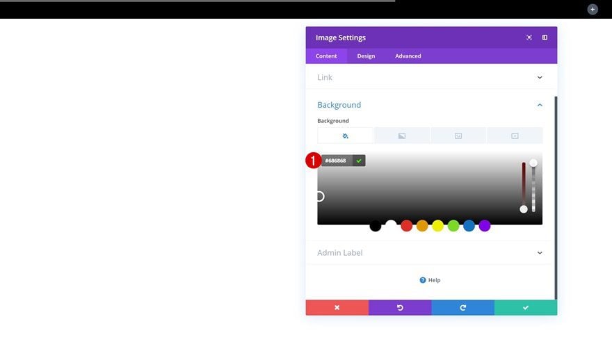
Add Background Color
Go to the background settings of the Image Module and add a background color. In the next step, we’ll combine this background color and a background image using a blend effect to darken the image.
- Background Color: #686868
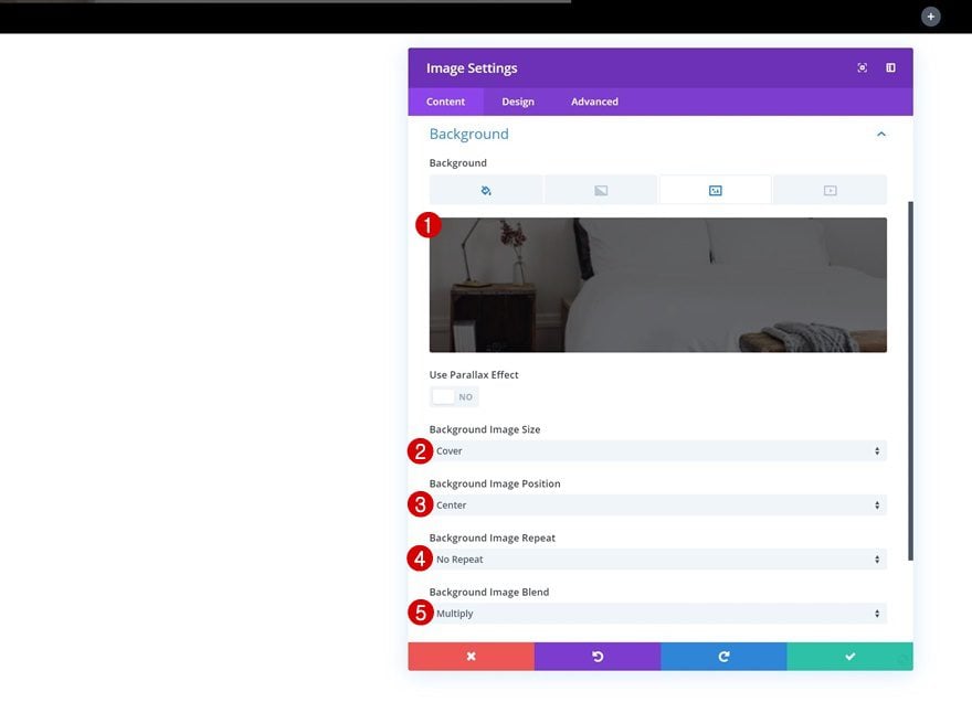
Add Background Image
Add a background image of your choice and modify the background settings accordingly:
- Background Image Size: Cover
- Background Image Position: Center
- Background Image Repeat: No Repeat
- Background Image Blend: Multiply
Sizing
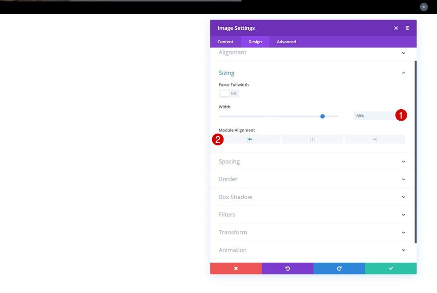
We’ve used two equally-sized columns for the row we’re working on, but the outcome doesn’t look that way. We’re going to manually change the size of each module we add to make it seem like we’re using a different column structure. The reason why we’re doing this (instead of just choosing another column structure) is to make everything look good and responsive on smaller screen sizes as well. Go to the sizing settings of the Image Module and modify the width.
- Width: 88%
- Module Alignment: Left
Spacing
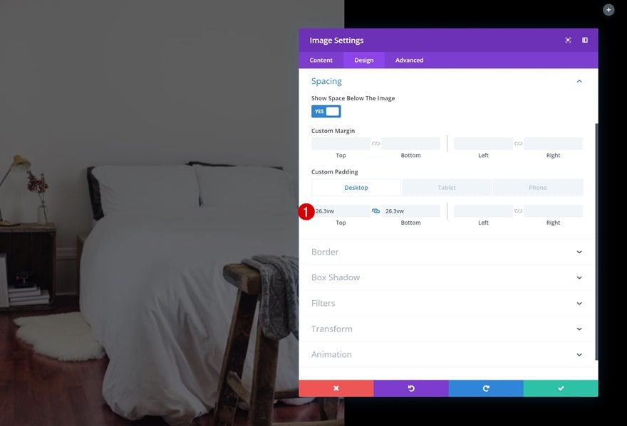
We now get to decide on the size of our image in the spacing settings. We’re also using a viewport unit for these values to make sure our design remains fully responsive across all screen sizes.
- Top Padding: 26.3vw (Desktop), 48vw (Tablet), 72vw (Phone)
- Bottom Padding: 26.3vw (Desktop), 48vw (Tablet), 72vw (Phone)
Animation
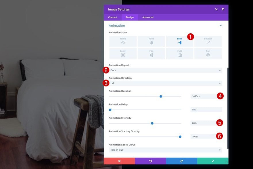
Last but not least, we’ll add a slide animation to our Image Module. Once you apply the animation, you’ll notice that the image will only start showing up from the moment it enters the first column. The second column’s background color stays on top of the Image Module while it’s sliding to the left.
- Animation Style: Slide
- Animation Repeat: Once
- Animation Direction: Left
- Animation Duration: 1450ms
- Animation Intensity: 60%
- Animation Starting Opacity: 100%
Add Button Module to Column 1
Add Copy
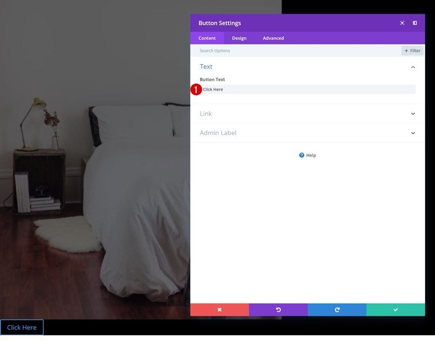
The next module we need in column 1 is a Button Module. Enter some copy of your choice.
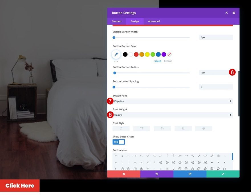
Button Settings
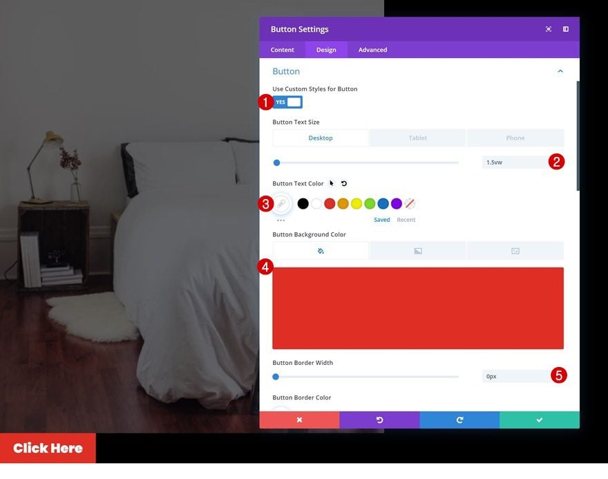
Then, go to the design tab and change the button settings.
- Use Custom Styles for Button: Yes
- Button Text Size: 1.5vw (Desktop), 2.5vw (Tablet), 4vw (Phone)
- Button Text Color: #ffffff
- Button Background Color: #e02b20
- Button Border Width: 0px
- Button Border Radius: 1px
- Button Font: Poppins
- Font Weight: Heavy
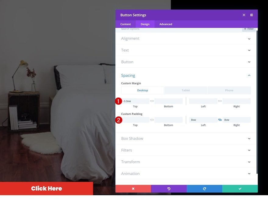
Spacing
Modify the spacing values as well.
- Top Margin: -3.3vw (Desktop), -6vw (Tablet), -9.1vw (Phone)
- Left Padding: 8vw
- Right Padding: 8vw
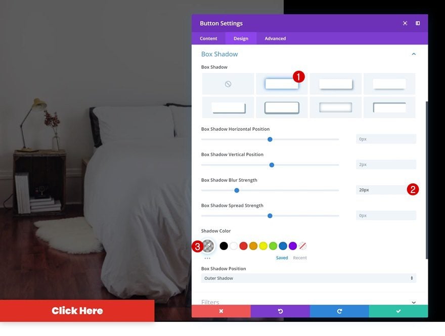
Box Shadow
And add a subtle box shadow to create some depth on the page.
- Box Shadow Blur Strength: 20px
- Shadow Color: rgba(0,0,0,0.27)
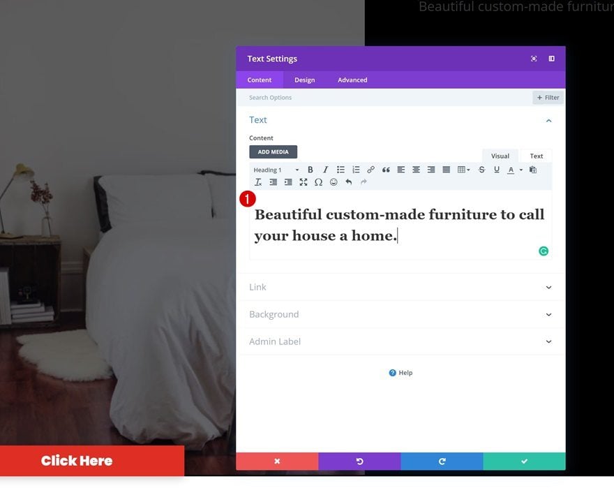
Add Text Module #1 to Column 2
Add H1 Content
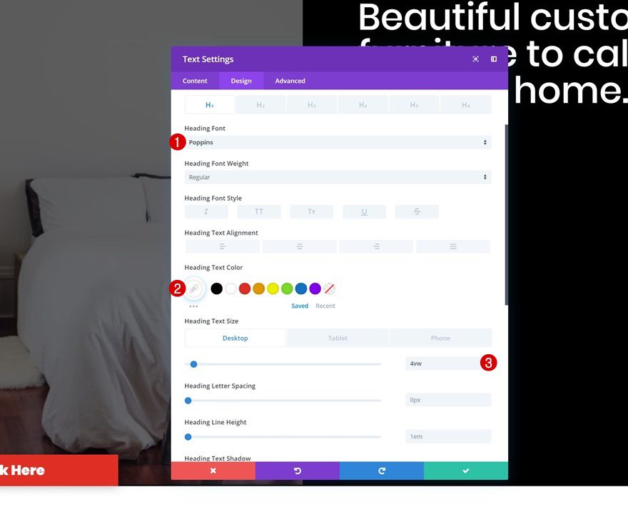
On to the second column! The first module we’ll need there is a Text Module. Add some H1 content of your choice.
H1 Text Settings
Then, go to the design tab and modify the H1 text settings.
- Heading Font: Poppins
- Heading Text Color: #ffffff
- Heading Text Size: 4vw (Desktop), 5vw (Tablet), 6vw (Phone)
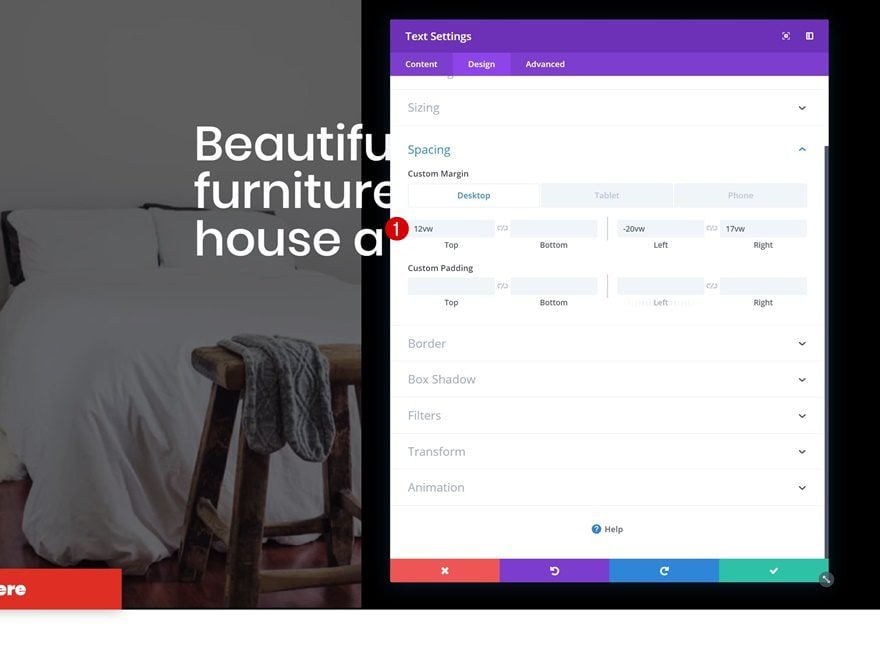
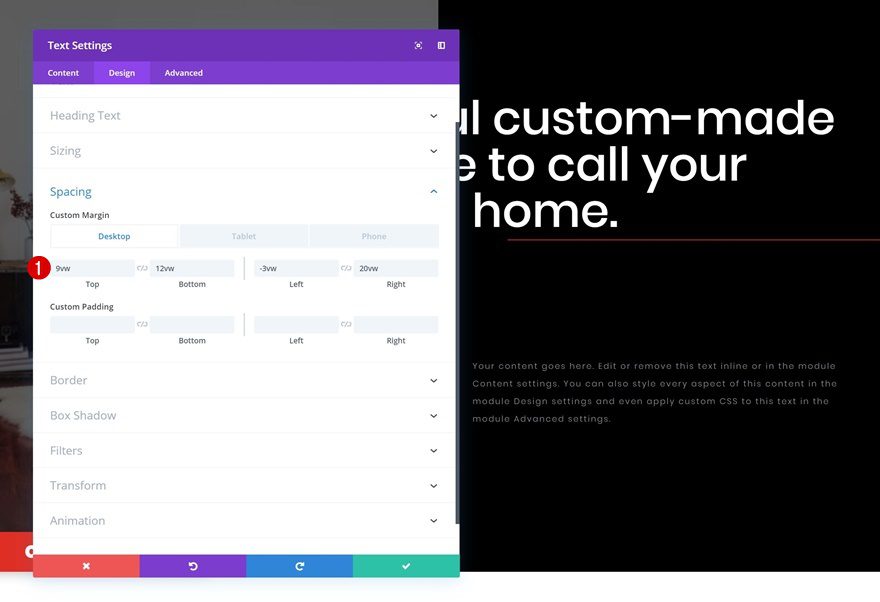
Spacing
Change around the spacing values too.
- Top Margin: 12vw
- Left Margin: -20vw
- Right Margin: 17vw (Desktop), 15vw (Tablet), 1vw (Phone)
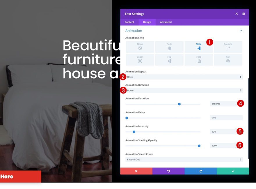
Animation
And add a subtle animation.
- Animation Style: Slide
- Animation Repeat: Once
- Animation Direction: Down
- Animation Duration: 1450ms
- Animation Intensity: 10%
- Animation Starting Opacity: 100%
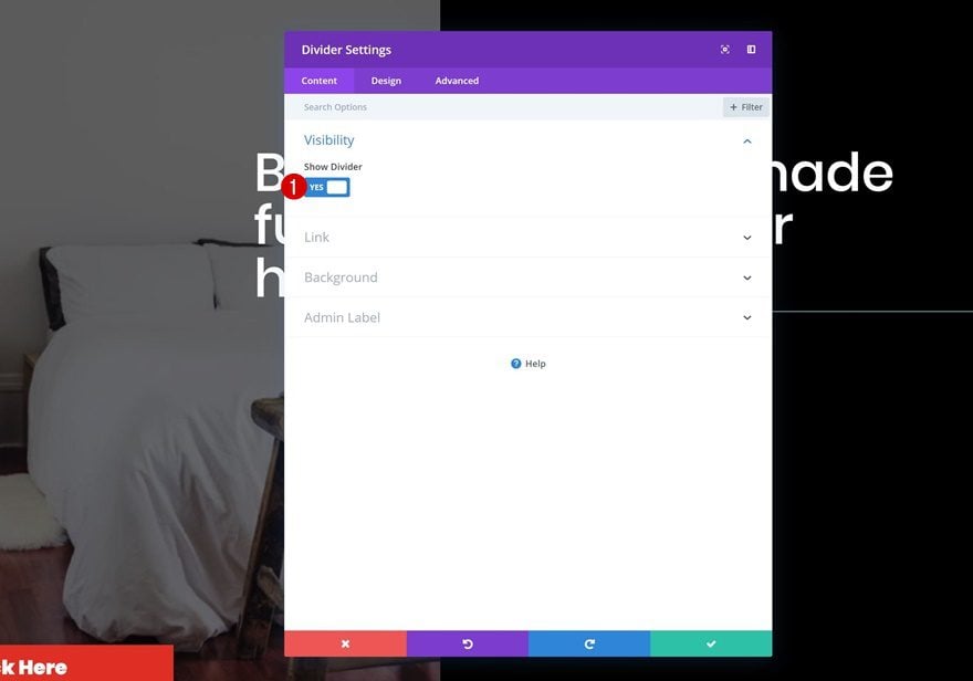
Add Divider Module to Column 2
Visibility
The next module we need in the second column is a Divider Module. Make sure the ‘Show Divider’ option is enabled.
- Show Divider: Yes
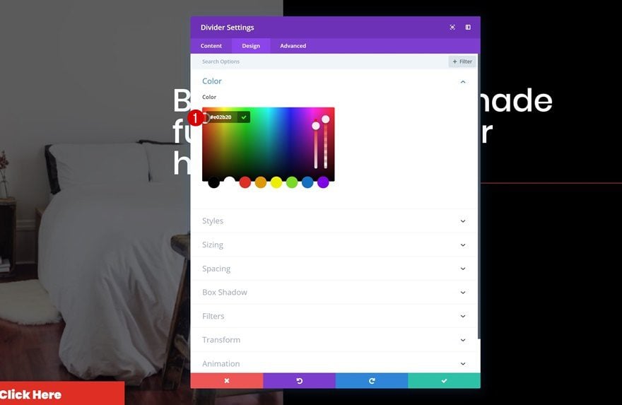
Color
Then, go to the design tab and change the divider color.
- Color: #e02b20
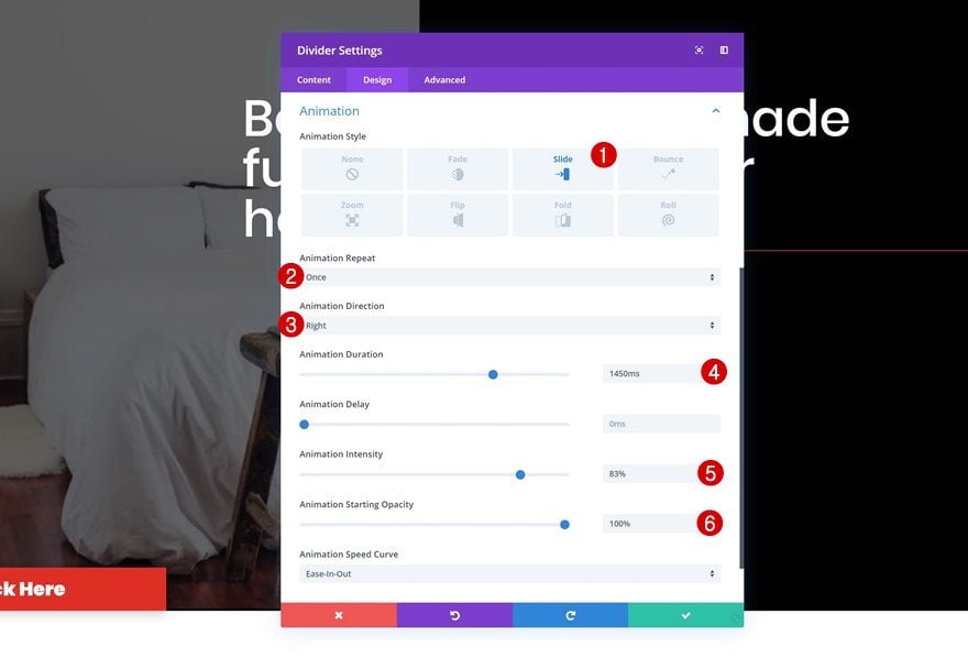
Animation
Add an animation to the Divider Module next.
- Animation Style: Slide
- Animation Repeat: Once
- Animation Direction: Right
- Animation Duration: 1450ms
- Animation Intensity: 83%
- Animation Starting Opacity: 100%
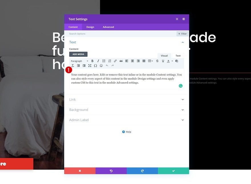
Add Text Module #2 to Column 2
Add Content
On to the next and last module we need in the second column! Add a description of your choice.
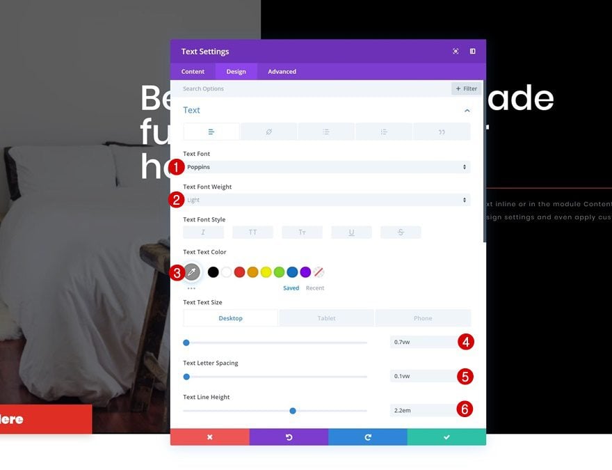
Text Settings
Then, go to the text settings in the design tab and make some changes accordingly:
- Text Font: Poppins
- Text Font Weight: Light
- Text Color: #919191
- Text Size: 0.7vw (Desktop), 1.8vw (Tablet), 2.2vw (Phone)
- Text Letter Spacing: 0.1vw
- Text Line Height: 2.2em
Spacing
Modify the spacing values as well.
- Top Margin: 9vw (Desktop), 19vw (Tablet), 23vw (Phone)
- Bottom Margin: 12vw (Desktop), 19vw (Tablet), 23vw (Phone)
- Left Margin: -3vw
- Right Margin: 20vw (Desktop), 6vw (Tablet), 3vw (Phone)
Animation
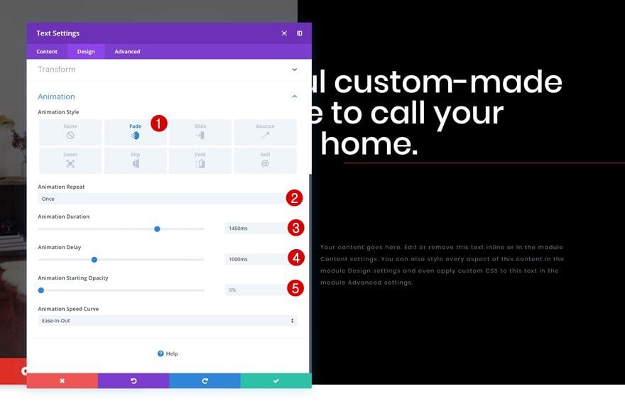
Last but not least, add a fade animation to the module and you’re done!
- Animation Style: Fade
- Animation Repeat: Once
- Animation Duration: 1450ms
- Animation Delay: 1000ms
- Animation Starting Opacity: 0%
Preview
Now that we’ve gone through all the steps, let’s take a final look at the outcome on different screen sizes.
Mobile
Desktop
Final Thoughts
In this post, we’ve shown you how to create stunning split-content hero sections using Divi. Split-content hero sections are really popular and frequently used on the web but it’s important to make sure they’re highly responsive as well. We hope this tutorial will help you create mobile split-content hero sections for the upcoming websites you build! If you have any questions or suggestions, make sure you leave a comment in the comment section below!
The post How to Create an Animated Mobile Split-Content Hero Section with Divi appeared first on Elegant Themes Blog.