
Making your website stand out from similar websites can be hard but once you manage to do it, it’s almost always worth the effort and thought that has been put into it. To help you get inspired, we’re going to show you how to create interactive content when building websites with Divi.
The example that we’ll recreate in this tutorial will work particularly well for any about page you’re working on. You’ll be able to share facts or company information on hover using Divi’s built-in text shadow options. We’re also making sure these hover effects don’t apply on smaller screen sizes so the information and mobile experience don’t get lost.
Let’s get to it!
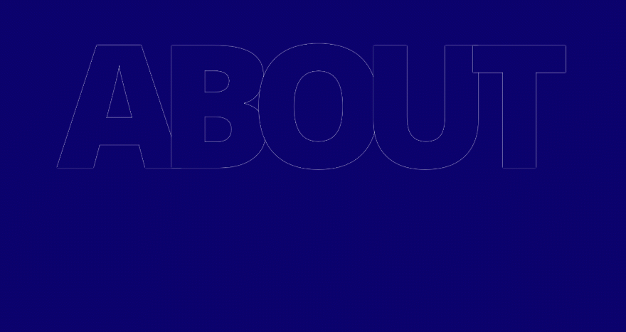
Preview
Before we dive into the tutorial, let’s take a quick look at the outcome you can expect.
Desktop
Mobile
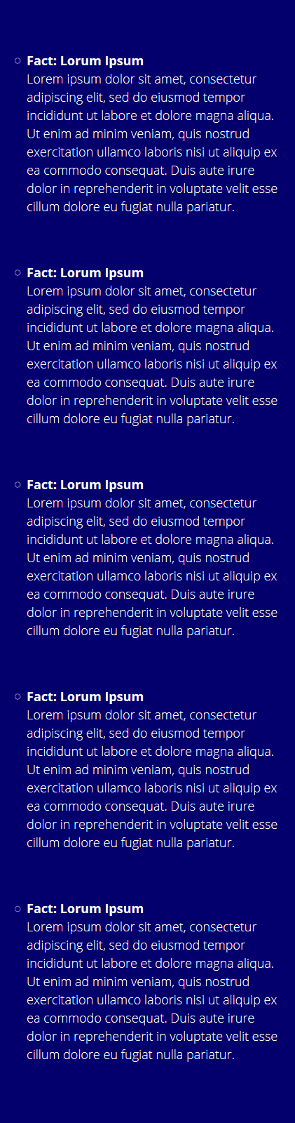
We’re making sure all of these hover interactions don’t apply on smaller screen sizes. While using the same section and modules, we’ll get the following simple outcome instead:
Approach
- The example we’ll recreate is great for about pages, but you can make it work with any 5-character or 6-character word (match it with the column structure)
- Each one of the characters will be dedicated to an individual Text Module
- We’re using a row with a sufficient number of columns to connect the different characters of the word and make them appear as if they were created in the same module
- By default, we’ll make the text color of the Text Module match the section background color
- To make sure the character remains readable, we’ll apply a white text shadow to the character as well
- Once you hover the character, the text shadow will disappear and the text color will change which gives you the feeling that the text is filling up
- While hovering a character, some additional information will show up as well
- On smaller screen sizes, the company facts and/or information will be there from the beginning
Let’s Start Recreating!
Add New Section
Background Color
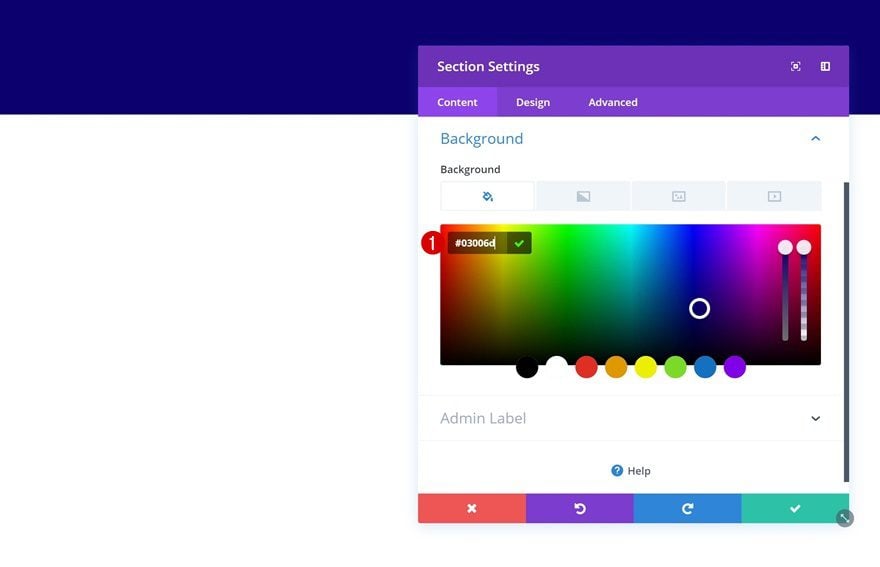
Open a new or existing page and add a regular section to it. Open the section settings and change the background color.
- Background Color: #03006d
Spacing
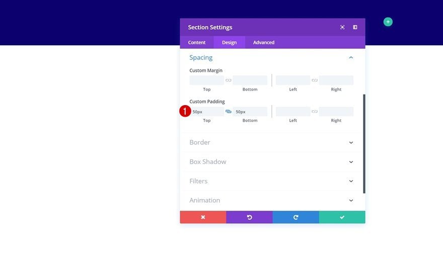
Then, go to the spacing settings of the section and add some custom top and bottom padding.
- Top Padding: 50px
- Bottom Padding: 50px
Add New Row
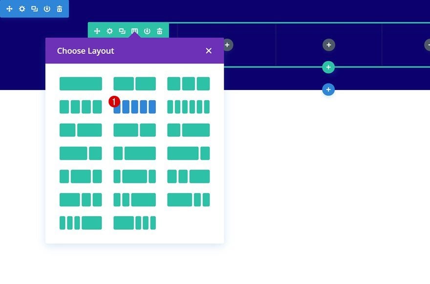
Column Structure
Continue by adding a new row to the section using the following column structure.
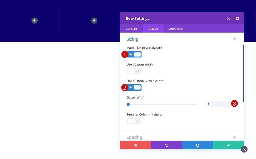
Sizing
Then, go to the sizing settings and allow the row to take up the entire width of the screen. This is an important step because it’ll allow us to determine the distance manually, using viewport units.
- Make This Row Fullwidth: Yes
- Use Custom Gutter Width: Yes
- Gutter Width: 1
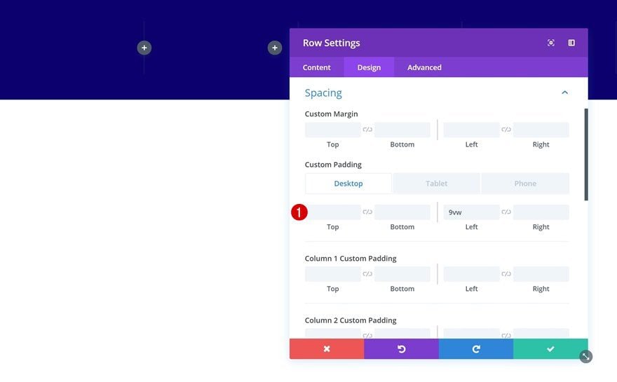
Spacing
In the previous step, we’ve gotten rid of all the default sizing settings that come with a new row. We do, however, need to add some padding manually. Here, we are using viewport units to make sure the result remains the same throughout all desktop screen sizes.
- Left Padding: 9vw (Desktop), 5vw (Tablet & Phone)
- Right Padding: 5vw (Tablet & Phone)
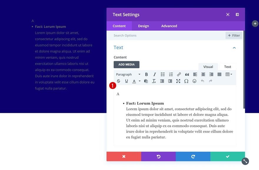
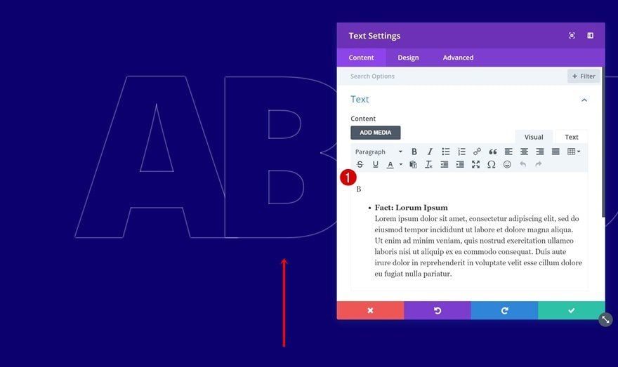
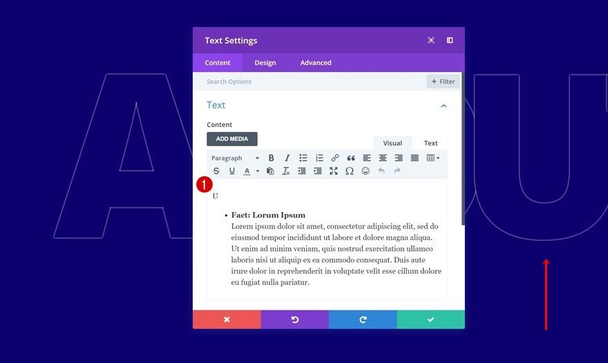
Add Text Module to Column 1
Add Content
Once you’re done modifying the row settings, you can go ahead and add the first Text Module to column 1. Add the first character as paragraph text and the content you want to appear on hover as list text.
Default Text Settings
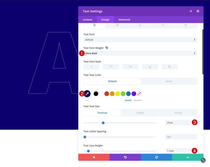
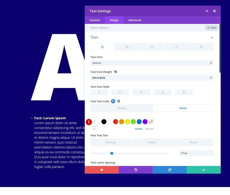
Then, go to the design tab and modify the default paragraph text settings. Make sure you use the same color for both the text and the section background.
- Text Font Weight: Ultra Bold
- Text Color: #03006d
- Text Size: 27vw (Desktop), 0vw (Tablet & Phone)
- Text Line Height: 1.1em
- Text Shadow Blur Strength: 0.01em
- Text Shadow Color: #ffffff
- Text Orientation: Left
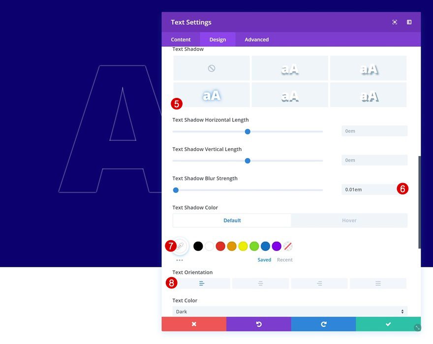
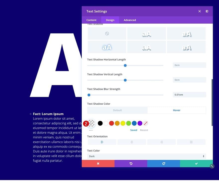
Hover Text Settings
To create the nice hover effect, we’ll need to modify these paragraph text settings on hover. Notice how we’re now using a completely transparent text shadow color to make it disappear.
- Text Color: #ffffff
- Text Shadow Color: rgba(255,255,255,0)
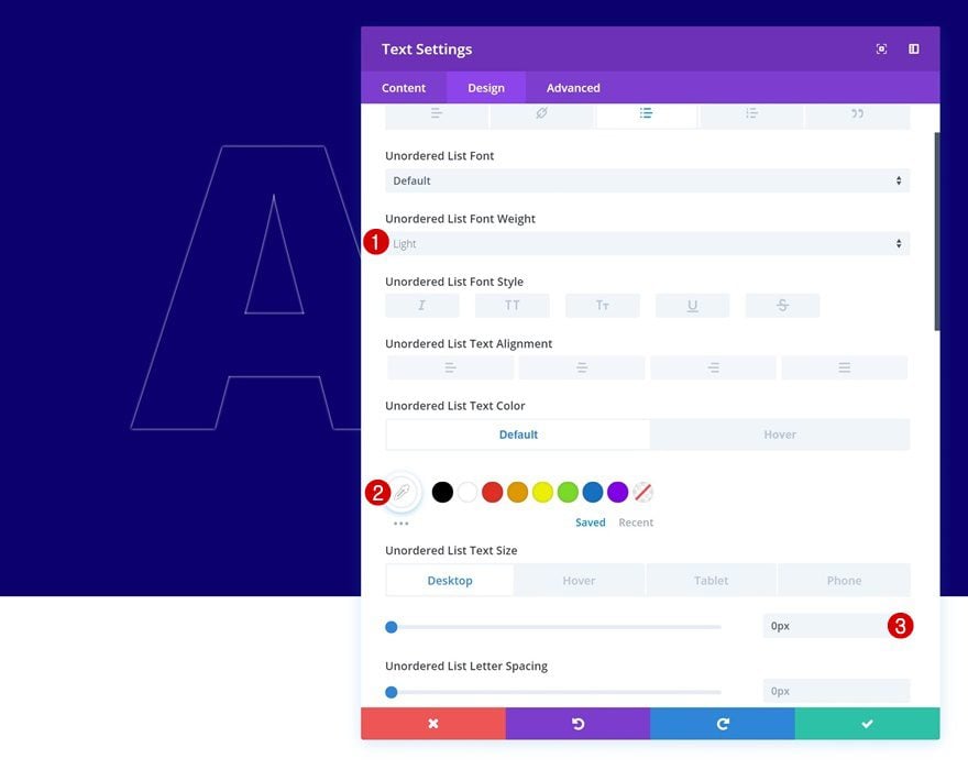
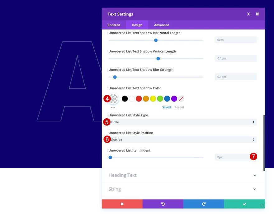
Default List Text Settings
Continue by going to the list text settings. An important part of these settings is making sure the text size on desktop is ‘0px’, but adding ’18px’ as the text size for smaller screen sizes. This will make sure the list text shows up on smaller screen sizes but doesn’t on desktop without it being hovered.
- Unordered List Font Weight: Light
- Unordered List Text Color: #ffffff
- Unordered List Text Size: 0px (Desktop), 18px (Tablet & Phone)
- Unordered List Text Shadow Color: rgba(255,255,255,0)
- Unordered List Style Type: Circle
- Unordered List Style Position: Outside
- Unordered List Item Indent: 0px
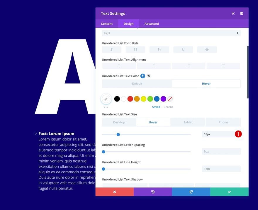
Hover List Text Settings
We do want the list text to appear on hover. That’s why we’ll change around the text size on hover. Make sure the text size you use on hover is the same as the text size you use on smaller screen sizes. This will help ensure that there’s no hover effect on smaller screen sizes.
- Unordered List Text Size: 18px
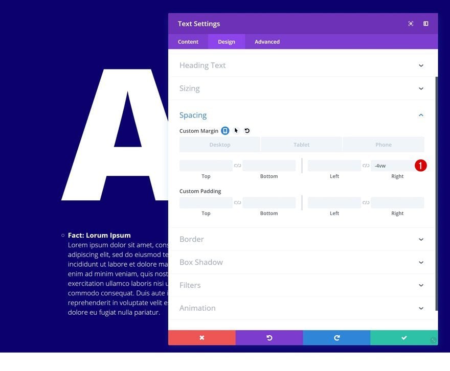
Spacing
Continue by going to the spacing settings of the module and make some changes there as well.
- Bottom Margin: 50px (Tablet & Phone)
- Right Margin: -4vw (Desktop), 0vw (Tablet & Phone)
Clone Text Module 4 Times & Place Duplicates in Remaining Columns
Now that we’re done modifying the first module in column 1, we can go ahead and clone the module four times and place each one of the duplicates in the remaining columns. In the upcoming steps, we’ll modify each one of the duplicates to match with the new character.

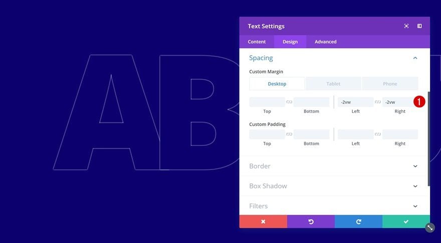
Change Text Module in Column 2
Change Content
Open the duplicate in column 2 and change the content.
Change Spacing
Then, go to the spacing settings and change the custom margin values.
- Bottom Margin: 50px (Tablet & Phone)
- Left Margin: -2vw (Desktop), 0vw (Tablet & Phone)
- Right Margin: -2vw (Desktop), 0vw (Tablet & Phone)
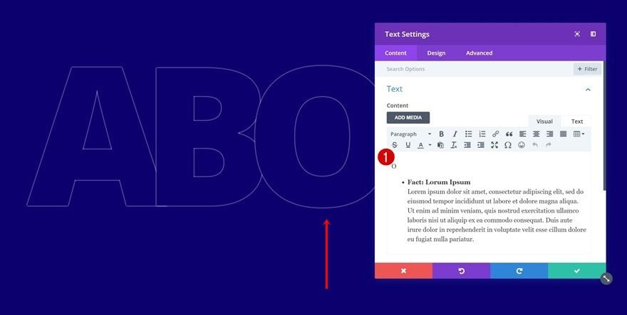
Change Text Module in Column 3
Change Content
Change the content of the duplicate in column 3 as well.
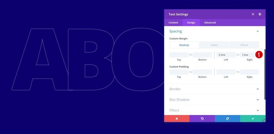
Change Spacing
Along with the spacing settings in the design tab.
- Bottom Margin: 50px (Tablet & Phone)
- Left Margin: -5.5vw (Desktop), 0vw (Tablet & Phone)
- Right Margin: 1.5vw (Desktop), 0vw (Tablet & Phone)
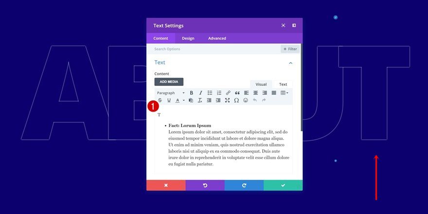
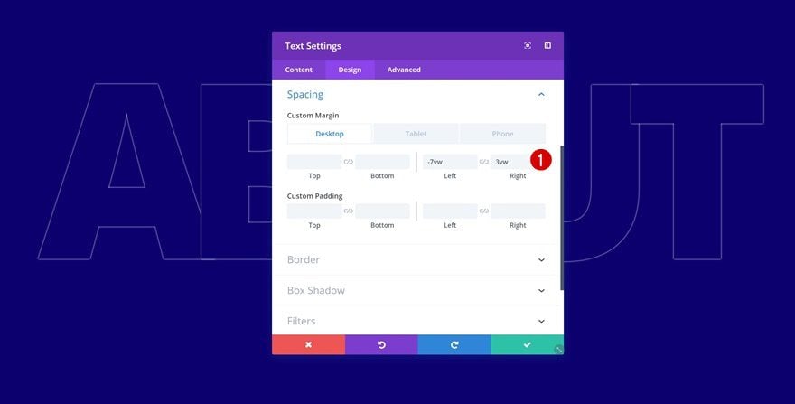
Change Text Module in Column 4
Change Content
Continue by opening the Text Module in column 4 and change the content here too.
Change Spacing
Then go to the design tab and change the custom margin values in the spacing settings.
- Bottom Margin: 50px
- Left Margin: -6vw (Desktop), 0vw (Tablet & Phone)
- Right Margin: 2vw (Desktop), 0vw (Tablet & Phone)
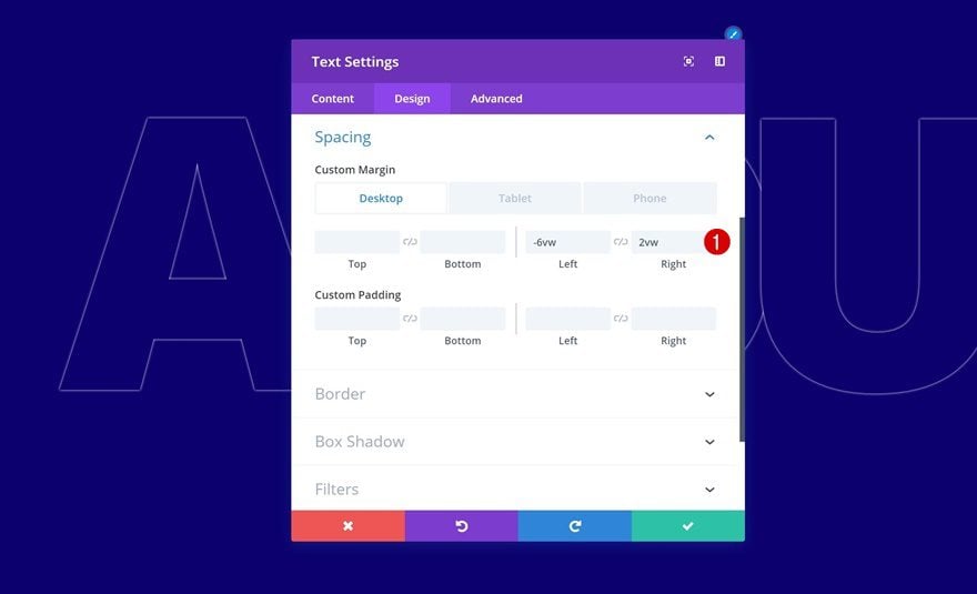
Change Text Module in Column 5
Change Content
On to the last duplicate. Change the content in the content box.
Change Spacing
Along with the custom spacing settings.
- Bottom Margin: 50px
- Left Margin: -7vw (Desktop), 0vw (Tablet & Phone)
- Right Margin: 3vw (Desktop), 0vw (Tablet & Phone)
Preview
Now that we’ve gone through all the steps, let’s take a final look at the outcome on different screen sizes.
Desktop
Mobile
Final Thoughts
We know how important it is to make your website stand out from other websites out there. With Divi’s built-in options, you can get as creative as you want. This post is an example of how you can create interactive content on hover while making sure everything remains straightforward on smaller screen sizes. You can use the example we’ve recreated for any about page you’re currently working on. It’s a great way to share some facts and additional information about your company while having an interaction going on with your visitors. If you have any questions or suggestions, make sure you leave a comment in the comment section below!
The post Using Hover Text Shadows to Create Interactive Content with Divi appeared first on Elegant Themes Blog.