How to Change the Column Count in Divi’s Filterable Portfolio Module
As a designer or creative, it’s always a good idea to have a portfolio to show your work online. In the digital era that we’re living in, building a personal brand is a great way to set yourself apart from the competition. Bearing this in mind, using Divi to create your portfolio website is a great idea. Divi has two native modules that can help you build your portfolio. We have the Portfolio Module, as well as the Filterable Portfolio Module. Both allow you to showcase your portfolio in two ways. While the Portfolio Module is a good way to show your work, the Filterable Portfolio Module allows you to showcase more of your work and comes with a filter that will enable you to better present your work in a more organized way. By default, our portfolio modules showcase your work in either one or four columns, depending on the layout you choose. However, in this tutorial, we’ll be using CSS to change columns in Divi’s portfolio module.
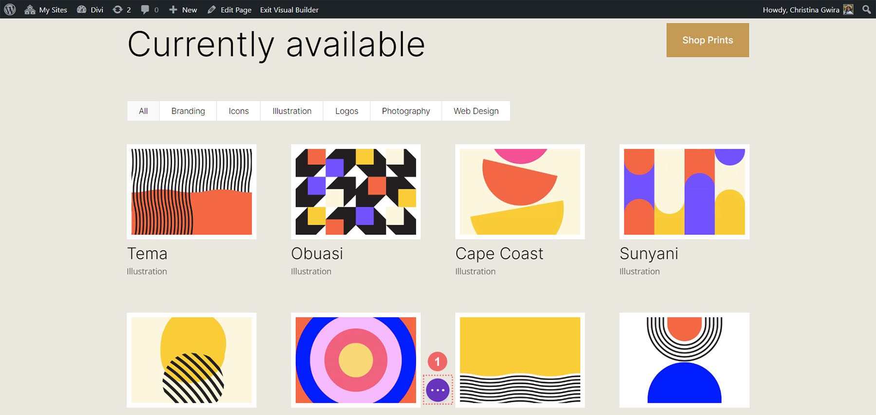
In this tutorial, we’ll be using Divi’s Filterable Portfolio Module within the FREE Print Designer Layout Pack. Specifically, we’ll be using the Print Designer Gallery Page Template from the layout pack. There are two layout styles within Divi’s portfolio Modules. The Grid Layout comes with four columns. The Full Width Layout comes in one column. We’ll be using the Grid Layout and CSS to change columns in Divi’s portfolio module. With CSS, we’ll change the columns within the module to 2, 3, 5, and 6 columns. The module will also be mobile responsive for both tablet and mobile devices.
Examples of Different Columns in the Filterable Portfolio Module
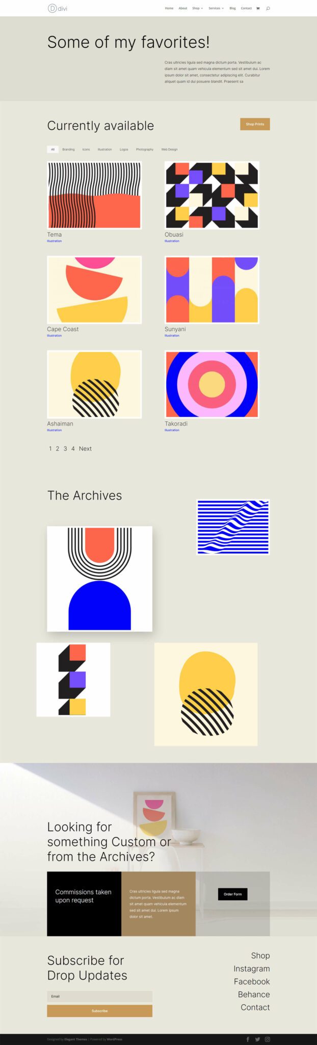
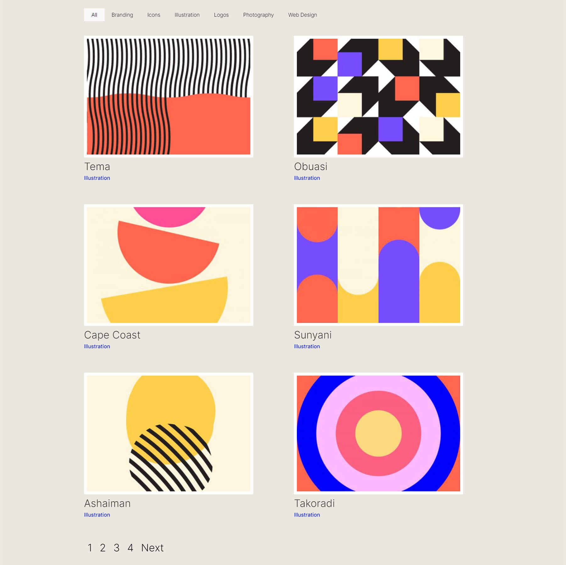
Here’s the end result of the work that we’ll be doing in this tutorial:
Change Divi’s Filterable Portfolio Module to 2 Columns
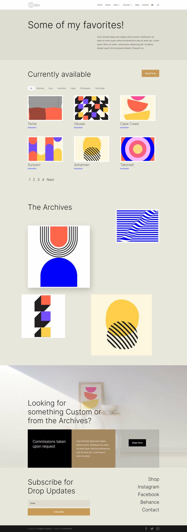
Modify Divi’s Filterable Portfolio Module to 3 Columns
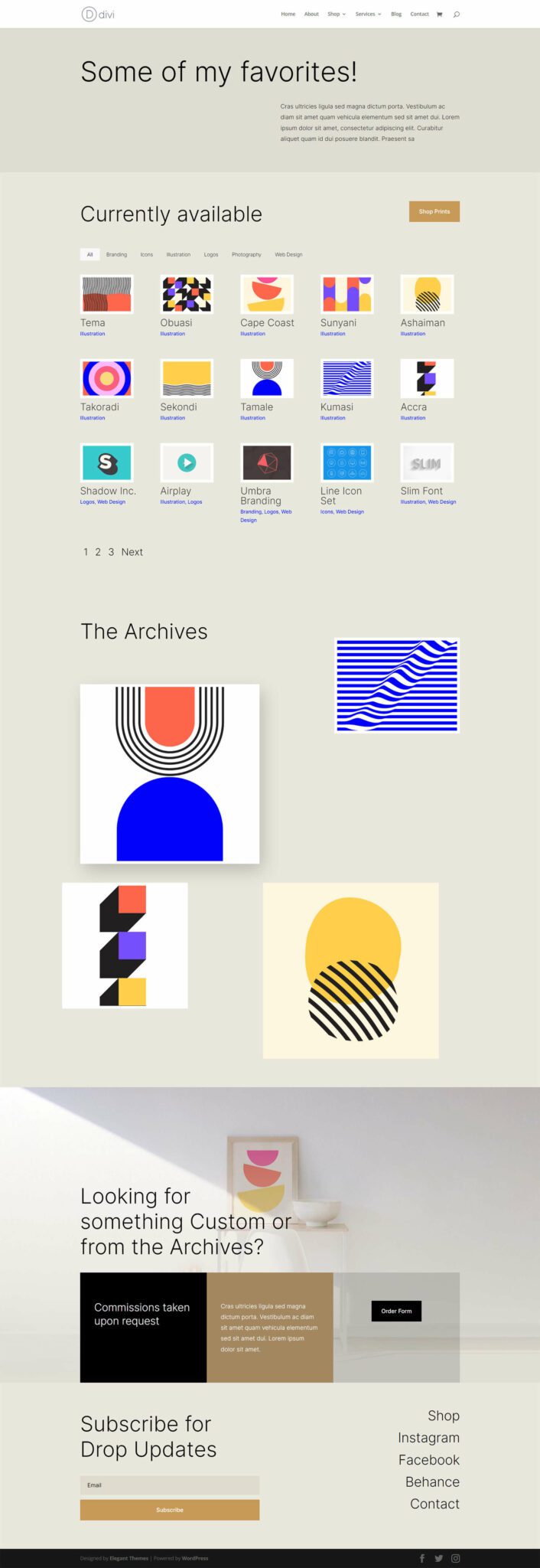
Update Divi’s Filterable Portfolio Module to 5 Columns
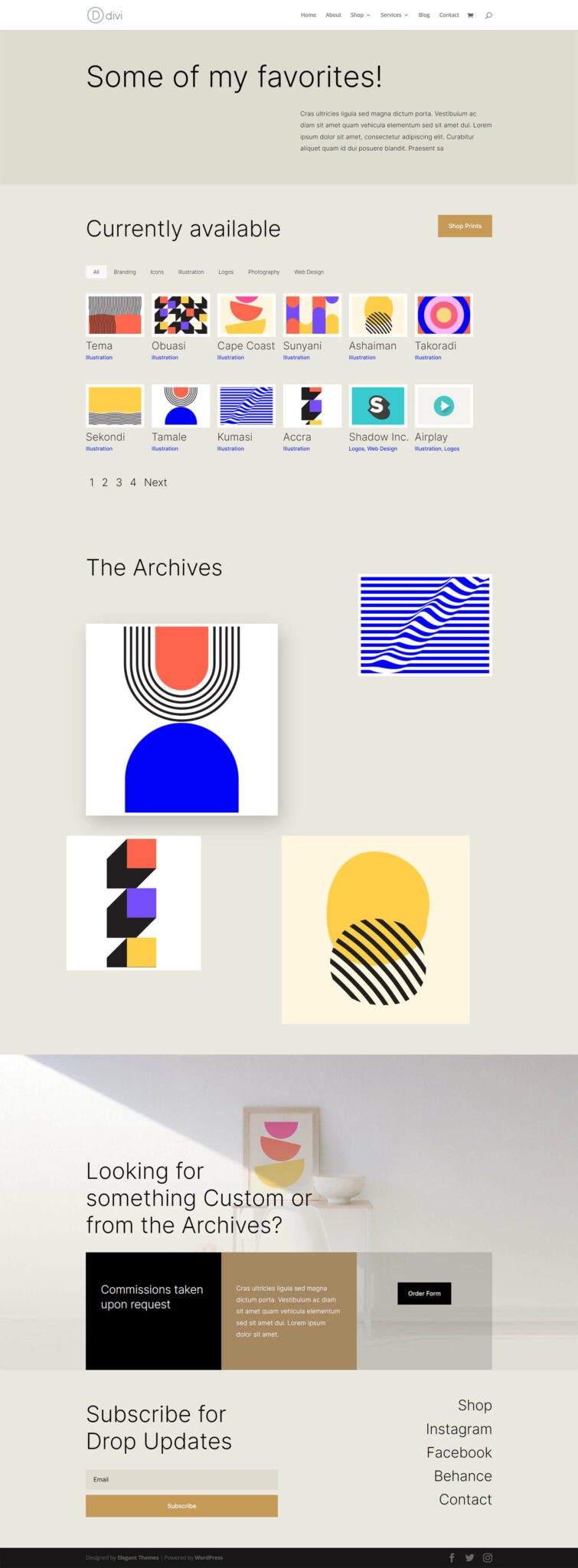
Edit Divi’s Filterable Portfolio Module to 6 Columns
Styling the Filterable Portfolio Module
Before we apply CSS to change the number of columns within our Filterable Portfolio Module, we must first style it to match our template.
Changing the Layout
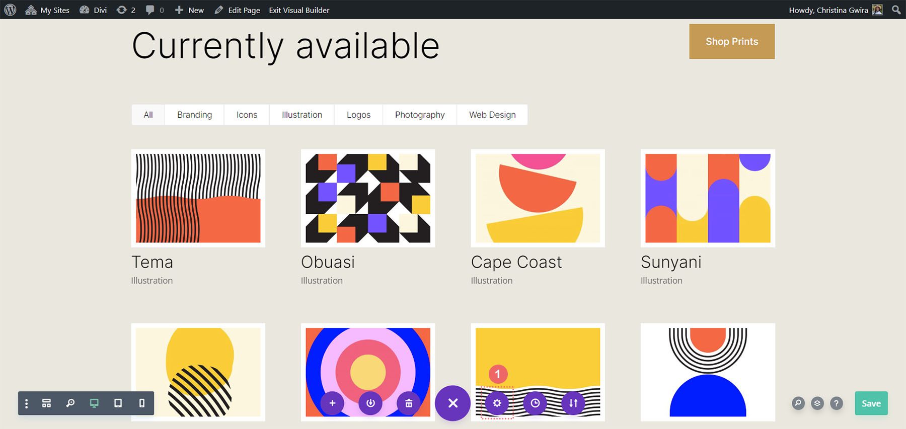
To start, we must change our module layout. To do this, we click on the gear icon to enter the module settings for our Filterable Portfolio Module.
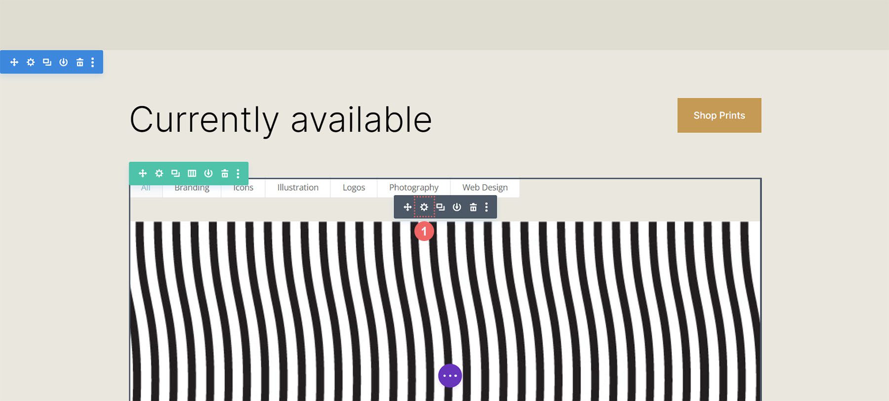
Next, we click on the Design tab. When we enter this tab, we will now click on the Layout tab. Then, we will change the layout of the module from Fullwidth to Grid.
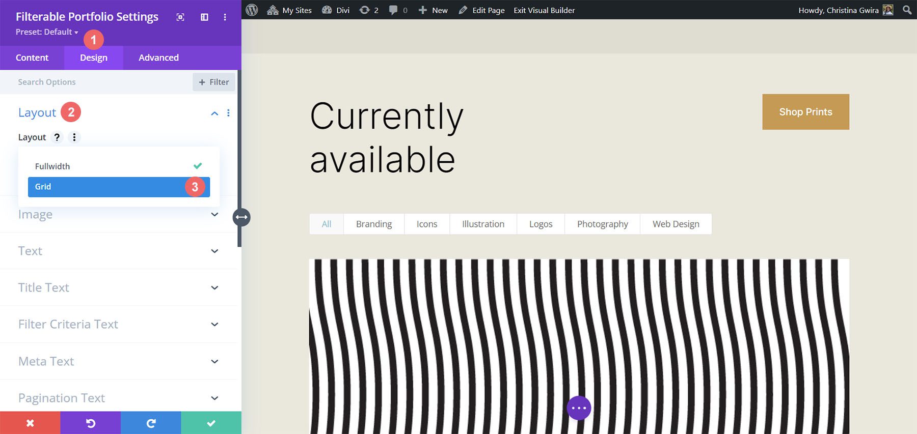
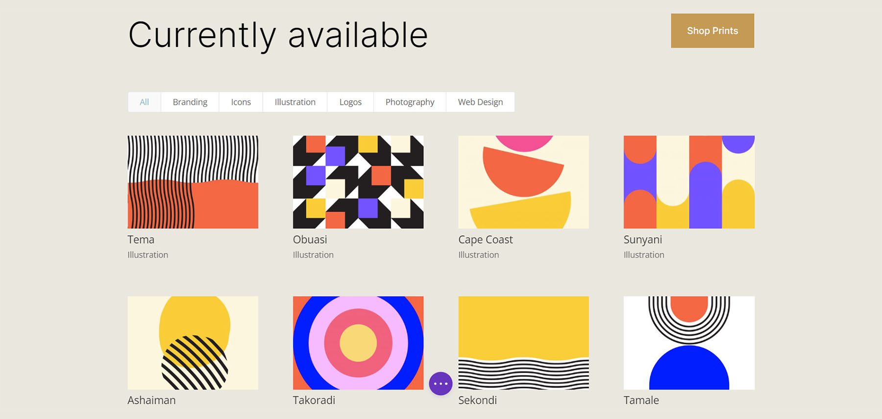
Here, we can see the default Grid Layout contains four columns.
Style Portfolio Image Thumbnail
Now that we have our Grid Layout in place, let’s style the portfolio image.
Styling the Image Overlay
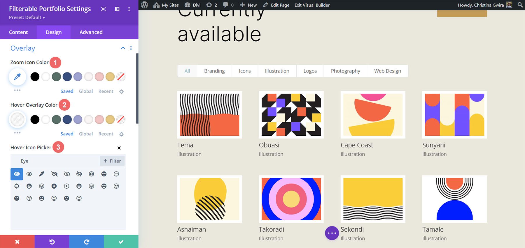
First, we begin by styling the Overlay. Scroll down and click on the Overlay tab. Use the following settings to add a white, translucent overlay to the Image:
Overlay Settings:
- Zoom Icon Color: #000000
- Hover Overlay Color: RGB(255,255,255,0.9)
- Hover Icon Picker: Refer to the screenshot below
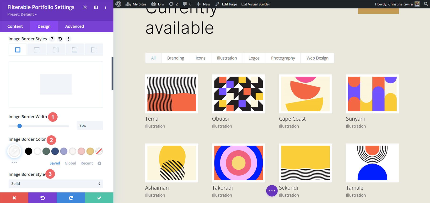
Adding Image Border
After styling the Overlay, we will add a border. To do this, scroll down to the Image tab. Use the following settings to style the border:
Image Settings:
- Image Border Width: 8px
- Image Border Color: #ffffff
- Image Border Style: Solid
Styling Title Text
Next, we will style the Title Text within the module. Let’s scroll down to the Title Text tab. Next, we’ll use the following settings to style the title:
Title Text Settings:
- Title Font: Inter
- Title Font Weight: Light
- Title Text Color: #000000
- Title Text Size: 28px
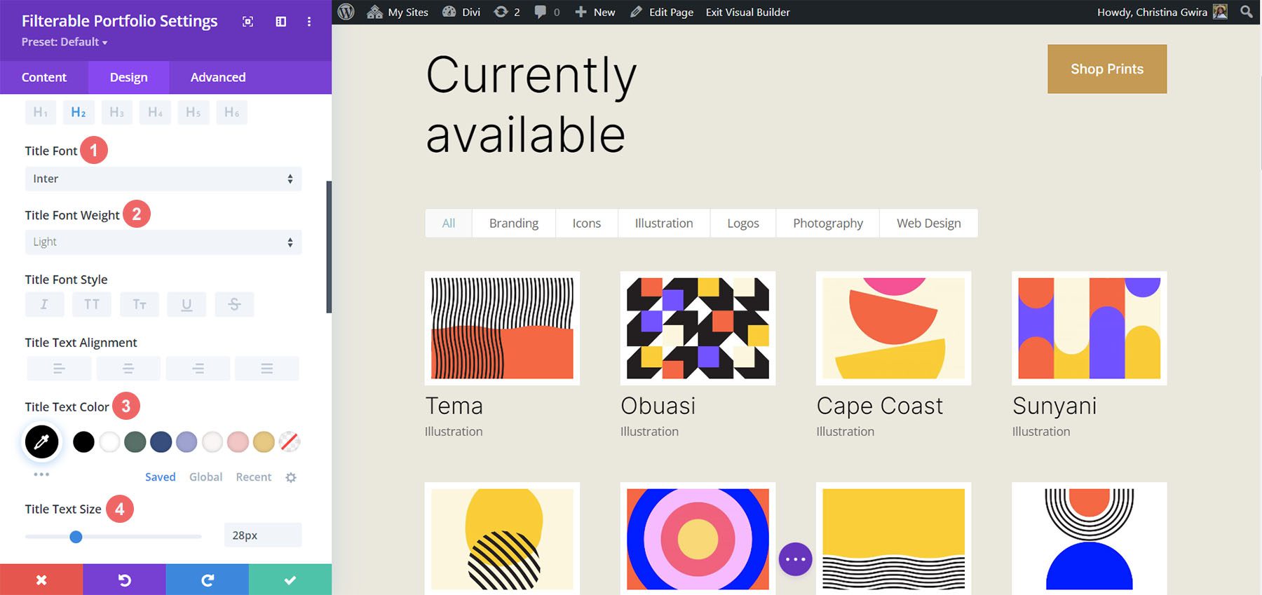
Notice that we are using the same font that is used through the Print Designer Layout Pack.
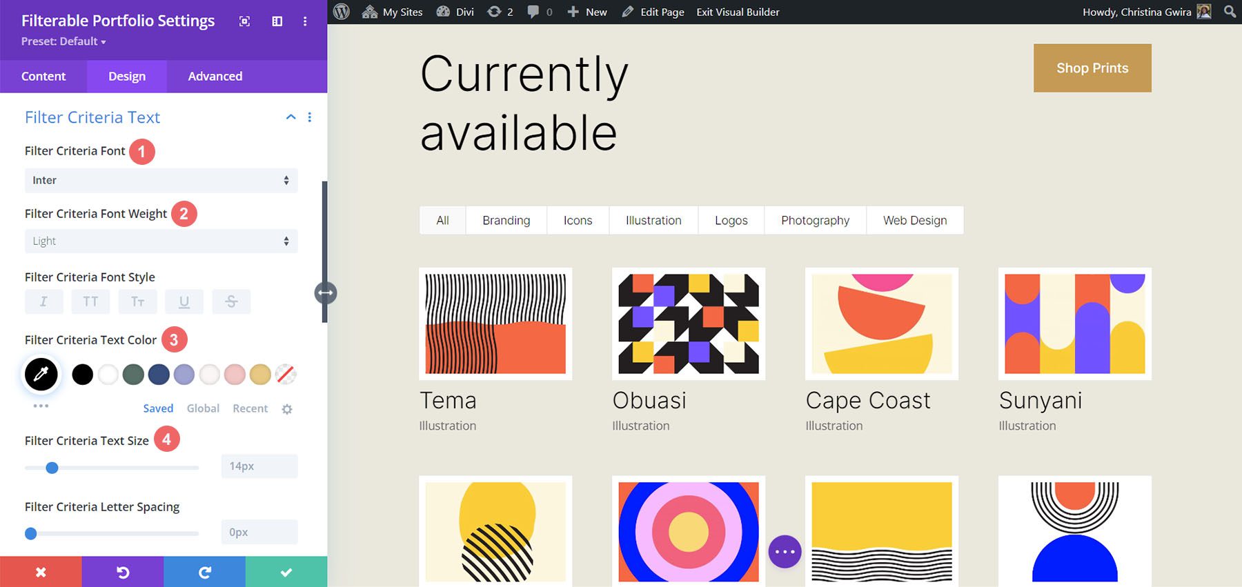
Styling and Adding CSS for the Filter Criteria Text
For the Filter Criteria Text, we’ll be using a few lines of custom CSS within the Advanced tab of the module settings. Before we add the CSS, let’s style the setting. First, we’ll apply the same font family and color to the Filter Criteria Text.
Filter Criteria Text Settings:
- Filter Criteria Font: Inter
- Filter Criteria Font Weight: Light
- Filter Criteria Font Size: 14px
For now, we’re going to save our changes by clicking on the green checkmark of the Filterable Portfolio Module’s modal box. However, we’re not finished with the Filter Criteria Text just yet. We’re going to navigate to the Page Settings to start building the custom CSS for our project. To do this, we click on the purple circle with the meatball menu in the center of our screen.

Once we have clicked this button, we’ll be able to click on the gear icon. The gear icon will take us into the Page Settings modal box.
Once in the Page Settings modal, click on the Advanced tab. Next, paste the following CSS into the Custom CSS box:
/* Change background color of filters */
.et_pb_filterable_portfolio .et_pb_portfolio_filters li a {
background: none;
border: none
}

.et_pb_filterable_portfolio .et_pb_portfolio_filters li a:hover {
background: #ffffff;
color: #323741 !important;
}
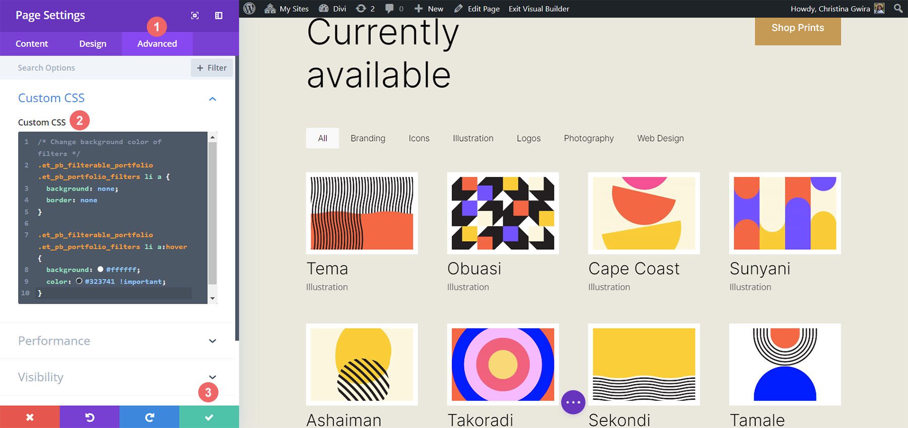
Notice that we are commenting our CSS! Don’t forget to do so as we’ll be coming back to add to our CSS as we progress through this tutorial. Save your changes by clicking on the green tick button at the bottom of the modal box. Now, let’s move back into editing the Filterable Portfolio Module.
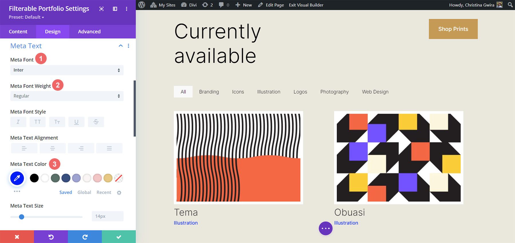
Styling Meta Text
We’ll now be styling the meta text that appears below the portfolio item’s title. We want to make it stand out a bit more from the title. To do this, we’ll navigate to the Design tab of the Filterable Portfolio module and scroll down to the Meta Text tab. As with the other text components of our module, we’ll be using the font family Inter. We’ll follow this up with the supporting design selections listed below:
Meta Text Setting:
- Meta Font: Inter
- Meta Font Weight: Regular
- Meta Font Color: #0102fa
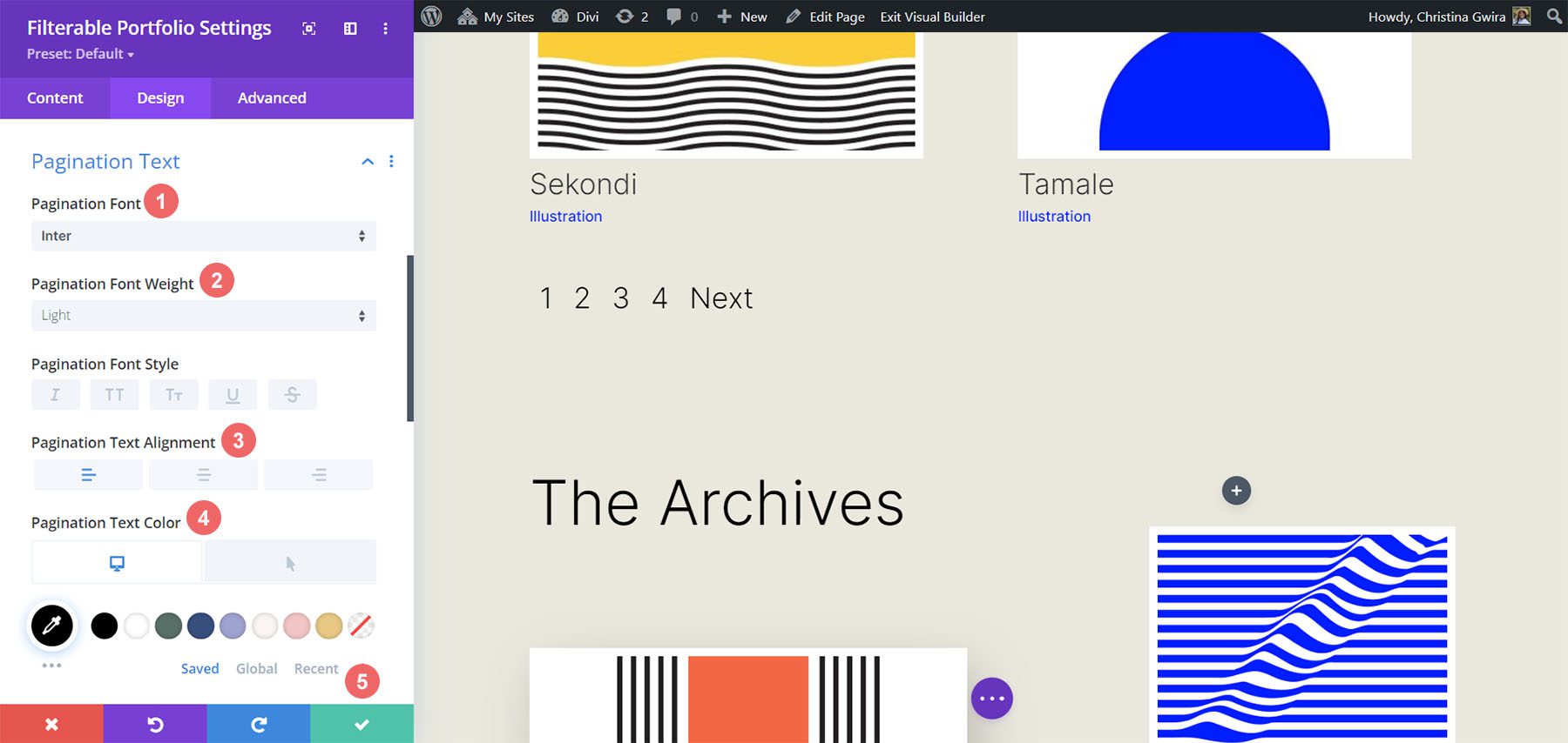
Style Pagination Text
Next on the styling block will be the Pagination Text of our module. We’re going to call back our Printer Designer Layout Pack by using the same font. However, we’re going to add a hint of our blue to the hover of this aspect of the module. Also, we’re going to create some interest by making the pagination text significantly larger than its current size.
To do this, firstly, we’re going to scroll down to the Pagination Text tab and click on it. Next, we’re going to use the following styling settings:
Pagination Text Settings:
- Pagination Font: Inter
- Pagination Font Weight: Light
- Pagination Text Alignment: Right
- Pagination Text Color: #000000
- Pagination Text Color (Hover): #0102fa
- Pagination Text Size: 28px
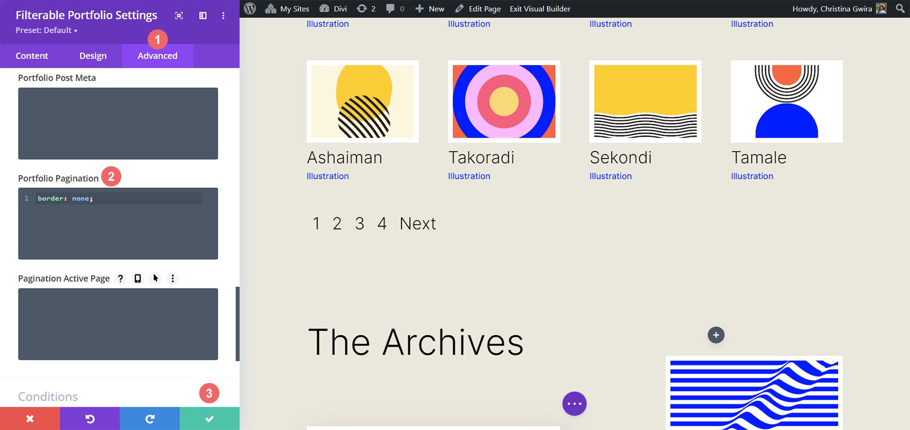
We’re going to go a step further with our Pagination Text. We want to remove the default border that appears on top of the Pagination Text. To do that, we’re going to click on the Advanced tab within our modal box. Then, we’re going to add the following line of CSS:
Portfolio Pagiation CSS:
border: none;
Once you’ve done this, we can now move on to adding some custom CSS to add the finishing touches to our module. Click on the green checkmark button to save your changes. You can go ahead and also save the page as well, just in case you weren’t saving your work along with the tutorial (don’t forget to do so!).
Customizing the Filterable Portfolio Module with CSS
Now that we’ve finished designing our Filterable Portfolio Module in Divi, we’ll now be using CSS to change the number of columns that we’ll have in our module. But first, we’re going to make one minor tweak. We’re going to use CSS to remove the initial transition that comes default with the module.
To do this, we’re going to move into the Page Settings to access the Custom CSS tab.
Then, we’re going to add the following CSS to our Custom CSS:
/* Remove transition */
.et_pb_filterable_portfolio .et_pb_portfolio_item.active {
transition: none;
}

.et_pb_portfolio_item {
animation: none!important;
transition: none !important;
}
We add this underneath the previous CSS that we added for the styling of the filters. This is what our Filterable Portfolio now looks like, with all our styling edits.
Now, let’s change the column number from 4 to 2.
CSS Design Changes for Our Filterable Portfolio Module
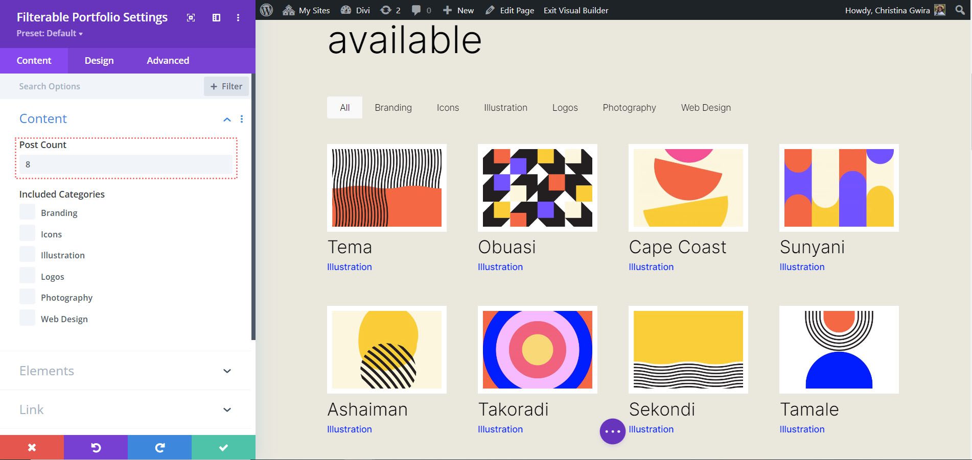
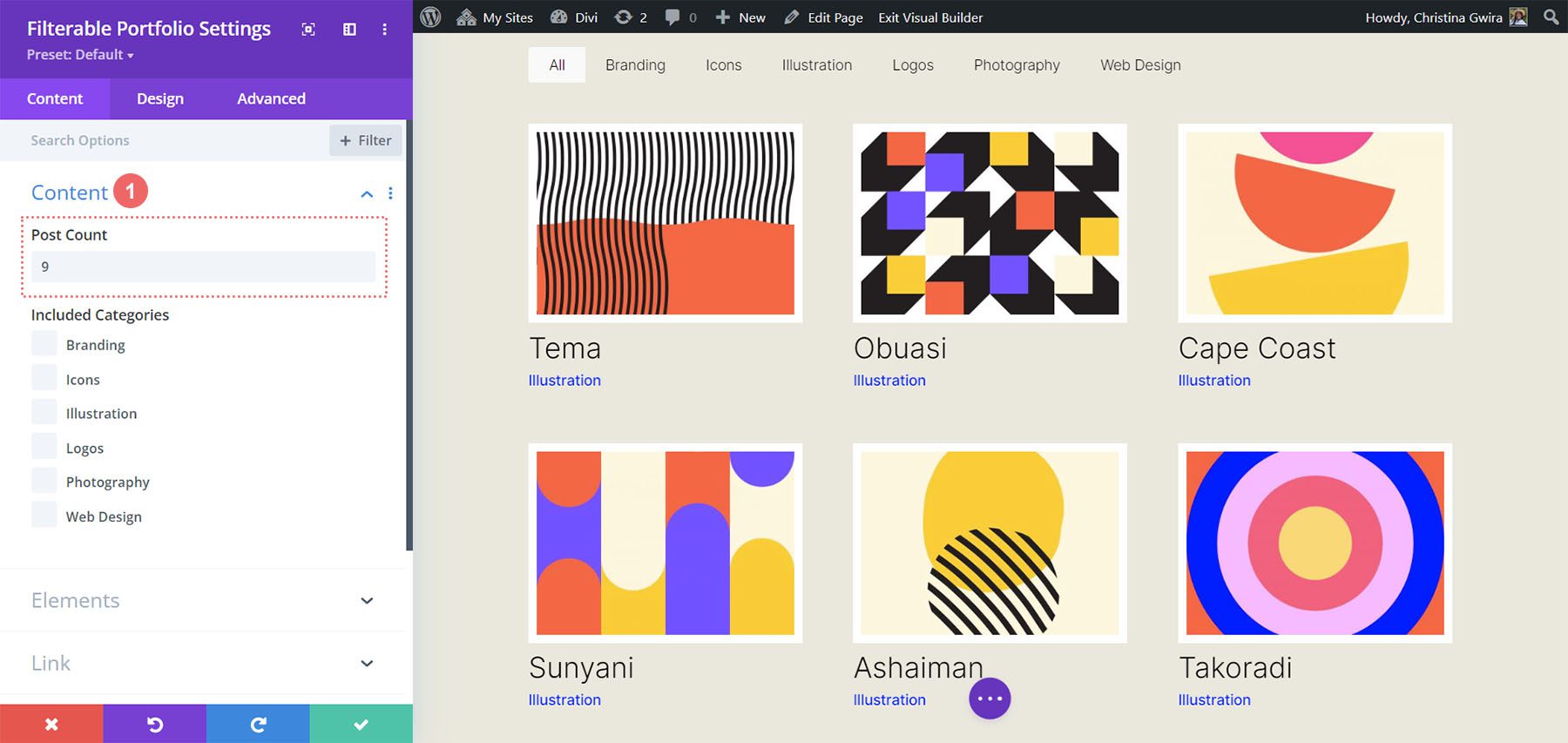
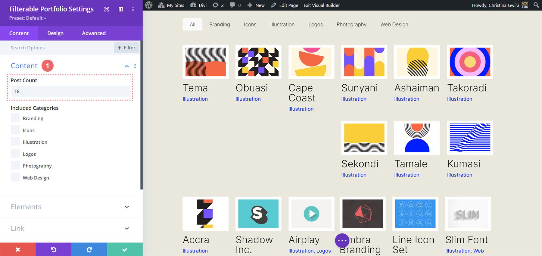
Firstly, one important fact to remember when using this module, is to take note of the number of posts that you want to showcase on each page. For our CSS to work correctly, remember to showcase a number of posts that is divisible by the number of columns that you have. For example, if you want to show your portfolio in 6 columns, it would be best to show a minimum of 6 posts in your post count. If you would like to show more posts, it would be best to do 12, 18, 24, etc. posts within the module.
You can find the post count within the Content tab of the Filterable Portfolio and Portfolio Modules.
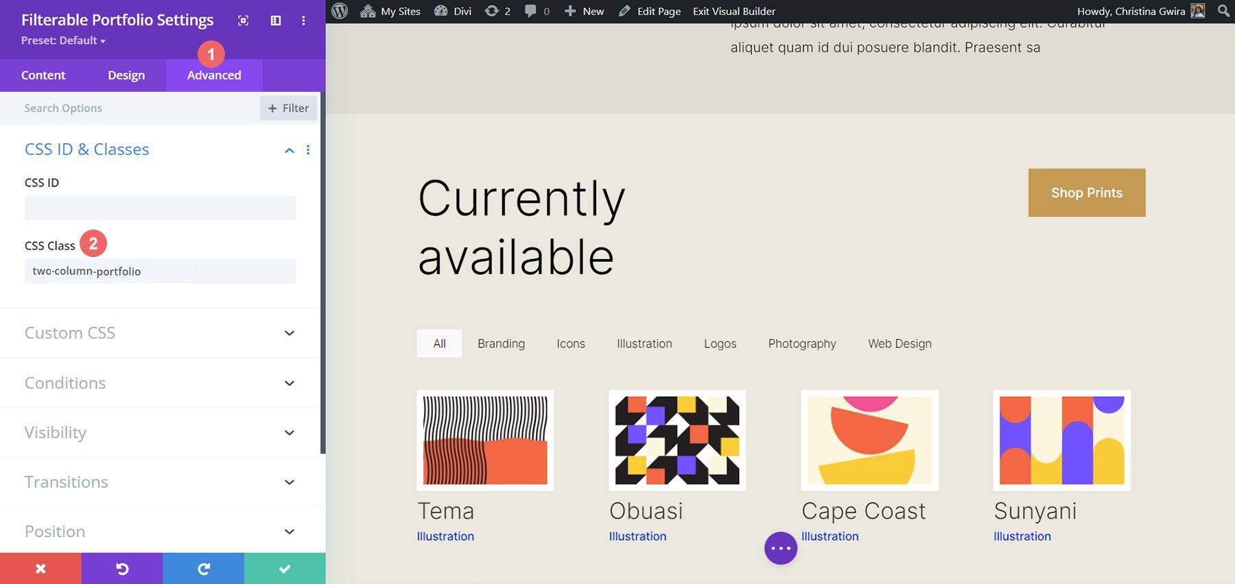
Before we add our CSS, we need to attach a CSS class to our module. To do this, we’ll re-enter the module settings, click on the Advanced tab and add our CSS class to our module. We’ll use the class column-portfolio. So that we don’t get confused as we move through this tutorial, we’ll prefix this class with the number of columns that we’ll be creating.
Changing the Filterable Portfolio Module to Two Columns
To change the number of columns in our module from 4 columns to 2 columns, we’ll once again, go to the Page Settings. Then, we’ll add the following CSS:
Custom CSS for a Two Column Filterable Portfolio:
/* 2 Column Portfolio */
@media (min-width: 981px) {
.two-column-portfolio .et_pb_grid_item {
width: 47.25%!important;
margin-right: 5.5%!important;
}

.two-column-portfolio .et_pb_grid_item:nth-child(3n) {
margin-right: 5.5%!important;
}

.two-column-portfolio .et_pb_grid_item:nth-child(2n) {
margin-right: 0!important;
}

.two-column-portfolio .et_pb_grid_item.et_pb_portfolio_item:nth-child(4n+1) {
clear: none!important;
}

.two-column-portfolio .et_pb_grid_item.first_in_row {
clear: unset;
}
}
The width of our first selector (.two-column-portfolio .et_pb_grid_item) determines the width of the column. The margin-right property that we use throughout this CSS snippet adds some padding (or gutter) around our portfolio items. Here’s what our new, two-column module looks like.
Using CSS to Change the Filterable Portfolio Module to Three Columns
Now, we’re going to change our module from 2 columns to 3 columns. Here’s a new CSS snippet to do this:
/* 3 Column Portfolio */
@media (min-width: 981px) {
    .three-column-portfolio .et_pb_grid_item {
        width: 29.66%!important;
        margin-right: 5.5%!important;
    }

    .three-column-portfolio .et_pb_grid_item:nth-child(3n) {
        margin-right: 0!important;
    }

    .three-column-portfolio.et_pb_grid_item:nth-child(4n) {
        margin-right: 5.5%!important;
    }

    .three-column-portfolio .et_pb_grid_item.et_pb_portfolio_item:nth-child(4n+1) {
        clear: none!important;
    }
    .three-column-portfolio .et_pb_grid_item.first_in_row {
        clear: unset;
    }
}
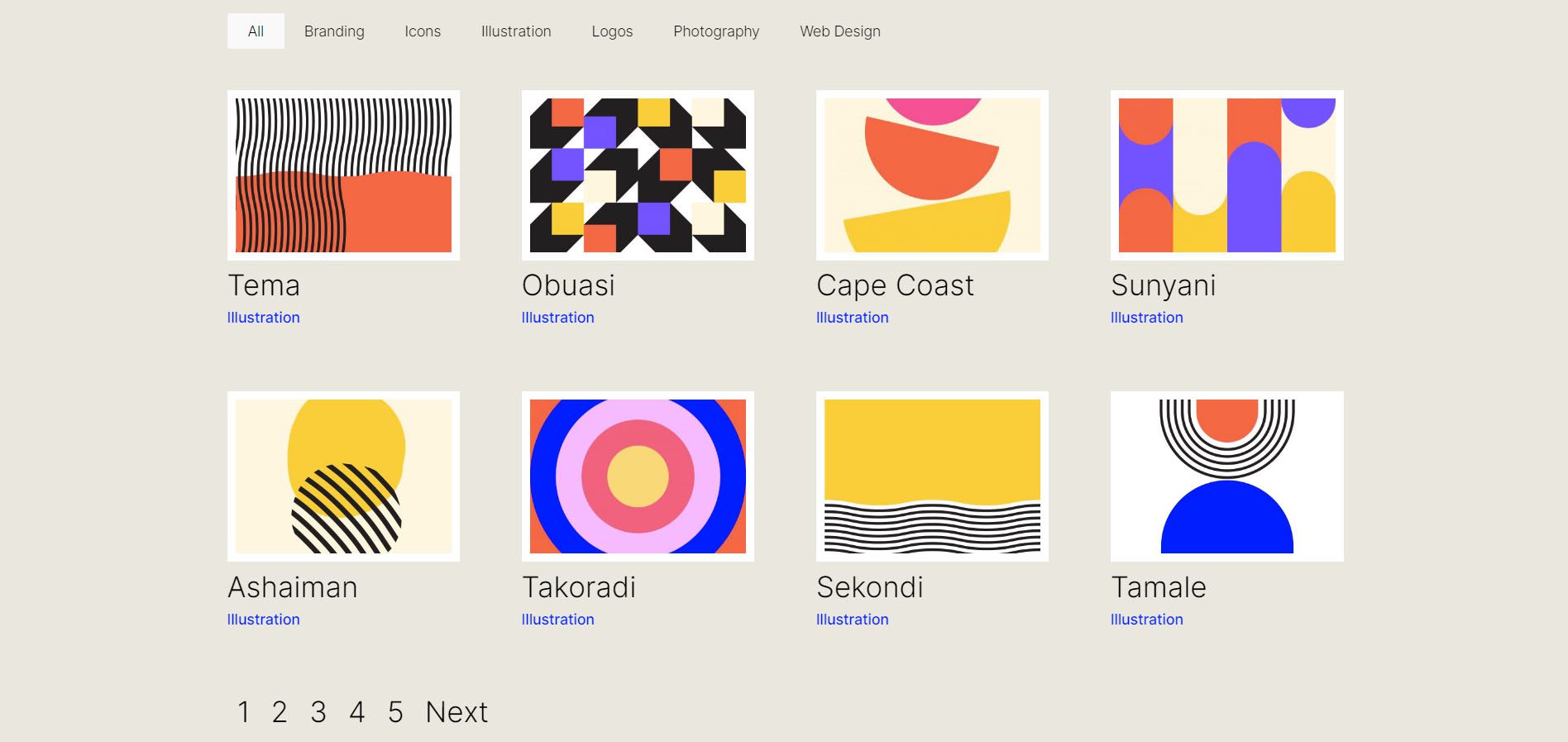
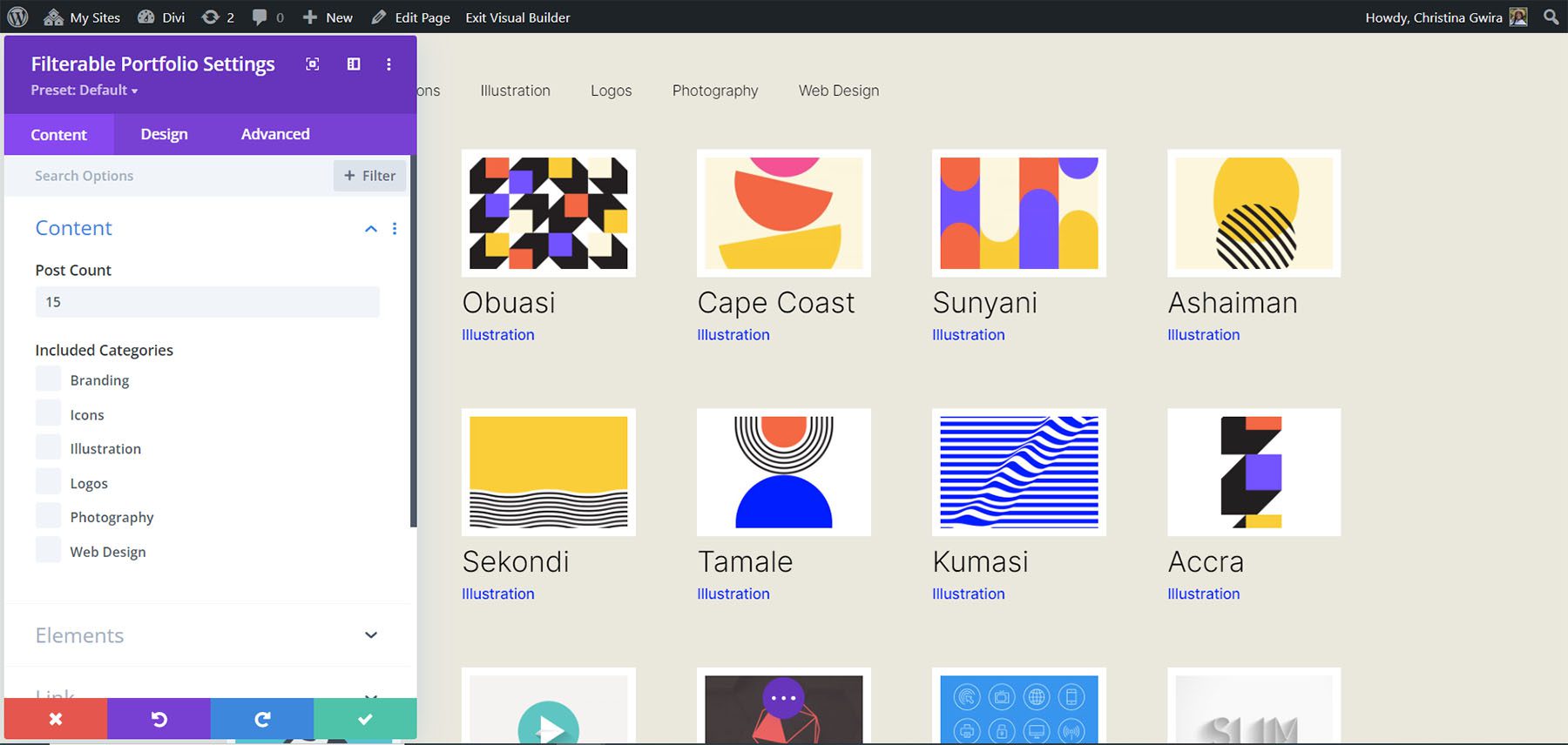
Remember, after adding this CSS, we’re going to have to change the post count to a number that is divisible by 3. Let’s go with 9.
Change the Number of Columns within the Filterable Portfolio Module to Five Columns
Here is the snippet for making our module have 5 columns.
/* 5 Column Portfolio */
@media (min-width: 981px) {
    .five-column-portfolio .et_pb_grid_item {
        width: 15.6%!important;
        margin-right: 5.5%!important;
    }

    .five-column-portfolio .et_pb_grid_item:nth-child(3n) {
        margin-right: 5.5%!important;
    }

    .five-column-portfolio .et_pb_grid_item:nth-child(5n) {
        margin-right: 0!important;
    }

    .five-column-portfolio .et_pb_grid_item.et_pb_portfolio_item:nth-child(4n+1) {
        clear: none!important;
    }

    .five-column-portfolio .et_pb_grid_item.first_in_row {
        clear: unset;
    }
}
Again, remember to change the post count! We’re going to go with a higher number here… we’re going all the way up to 15!
Edit the Number of Columns in the Filterable Portfolio Module to Six Columns
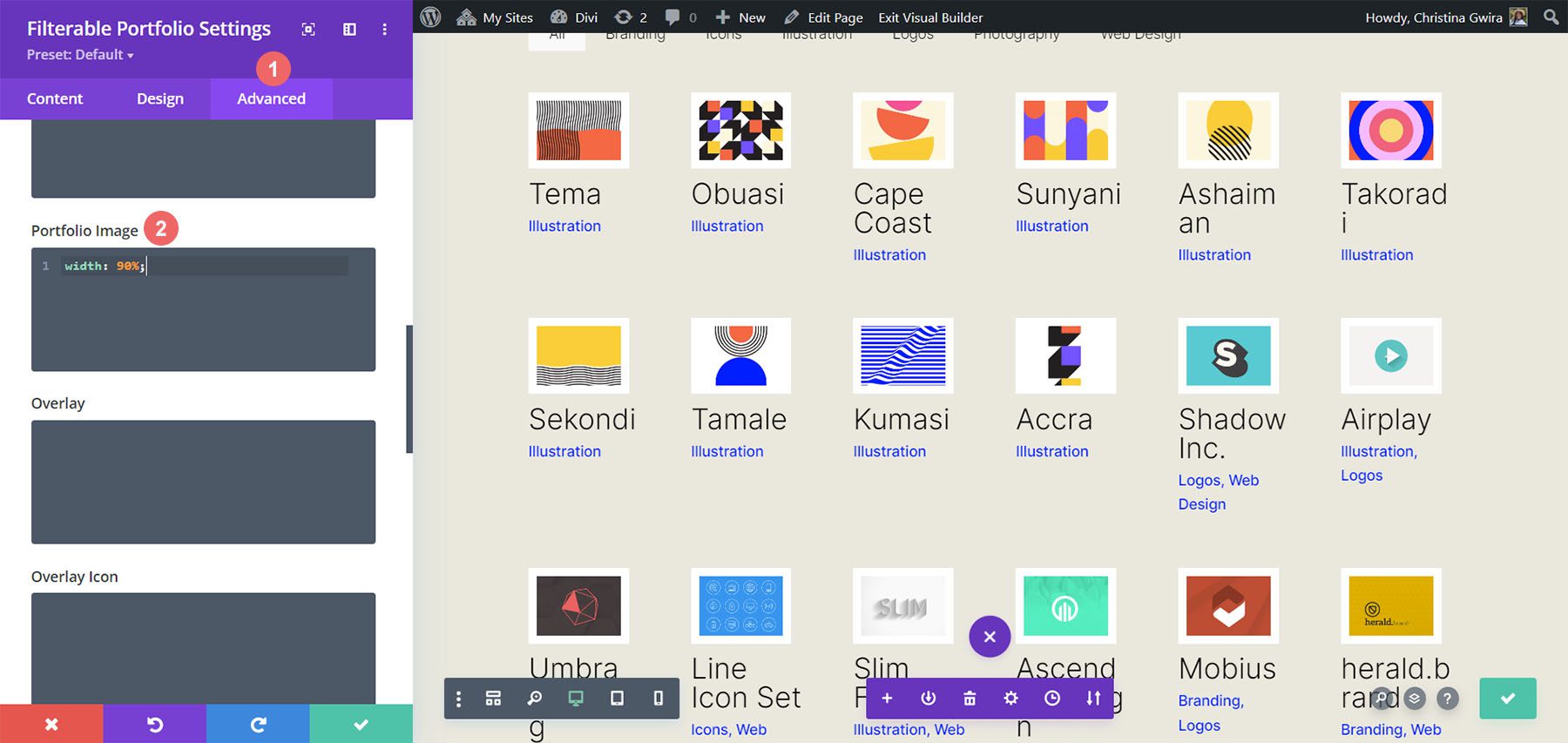
Finally, we’re going to change our portfolio to six columns. However, we need to make a small tweak when using the following CSS snippet. We’re going to go into the module settings one final time and add a line of CSS. This CSS will change the size of the Portfolio Image. The reason we do this is to ensure that we can fit in our padding (gutter) and border within the six column layout.
To do this, we’re going to navigate to the Advanced tab of our Filterable Portfolio module, and add the following line of CSS to the Portfolio Image option:
Portfolio Image Custom CSS:
- Portfolio Image CSS: width: 90%;
Now that we have this CSS in place, we can go back to the Page Settings and add this CSS snippet to make the module have six columns:
/* 6 Column Portfolio */
@media (min-width: 981px) {
    .six-column-portfolio .et_pb_grid_item {
        width:16%!important;
        margin-right: 5px!important;
    }

    .six-column-portfolio .et_pb_grid_item:nth-child(3n) {
        margin-right: 5px!important;
    }

    .six-column-portfolio .et_pb_grid_item:nth-child(6n) {
        margin-right: 0!important;
    }

    .six-column-portfolio .et_pb_grid_item.et_pb_portfolio_item:nth-child(4n+1) {
        clear: none!important;
    }

    .six-column-portfolio .et_pb_grid_item.first_in_row {
        clear: unset;
    }
}
For this snippet, you’ll notice that we’ve changed the measurement of our right margin. The reason we do this is so that we can still maintain the thick white borders that we implemented in the design phase of this tutorial. So, we reduced our margin to 5px. We also used 18 posts within our post count.
Let’s Wrap it All Up!
As we have come to the end of your tutorial, I hope that you have been able to see how we can customize the default modules that come with Divi by using CSS. As we are living in an ever-growing digital age, it’s always a good idea to invest time in building an online presence. That could look like adding your work online in the form of a digital portfolio! We hope this tutorial will help you make your portfolio unique.
The post How to Change the Column Count in Divi’s Filterable Portfolio Module appeared first on Elegant Themes Blog.